Search the Community
Showing results for tags 'affinity designer' or 'designer' in content posted in Share your work.
-
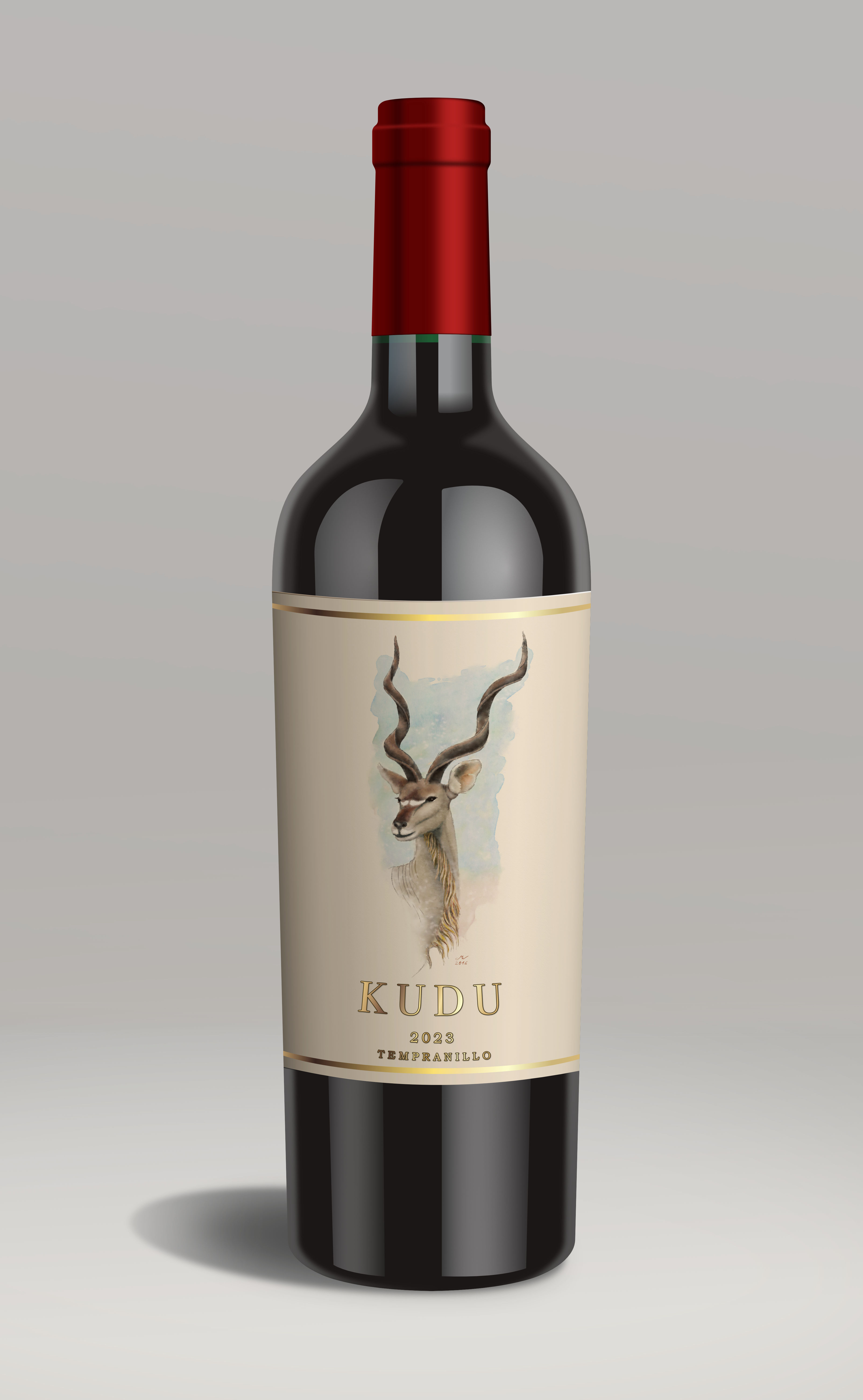
My first foray into a photo like vector illustration! All Designer apart from the watercolour of the Kudu which I actually painted back in 2016 with ArtRage (it's good to recycle!).

-

affinity designer New work - Our Lady of Brighthelmstone
Greggry P posted a topic in Share your work
New work - Our Lady of Brighthelmstone. This was my recent submission for a call to artists put out by a new gallery opening in the city of Brighton & Hove - sadly rejected. The theme was metamorphosis, so I painted the city morphed into a fabulous drag queen, in the style of an Uber-kitsch religious painting (taking “Our Lady of Guadeloupe” as my main inspiration - Brighthelmstone is the old name for the city of Brighton). There are a total of 33 visual “easter eggs” contained within the picture, some architectural, some cultural. If any of you are familiar with the place, have fun spotting them! (Created on Affinity Designer 2 for iPad)
-
Hey guys, I'm not an expert. I just started using the software about 3-5 days ago. I'm looking for any tips on my logos. I'm starting a new small business, so I want to get some shirts done. please help. Thank you.
-

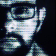
affinity designer What to do when you're bored? Don't ask me!
Kasper-V posted a topic in Share your work
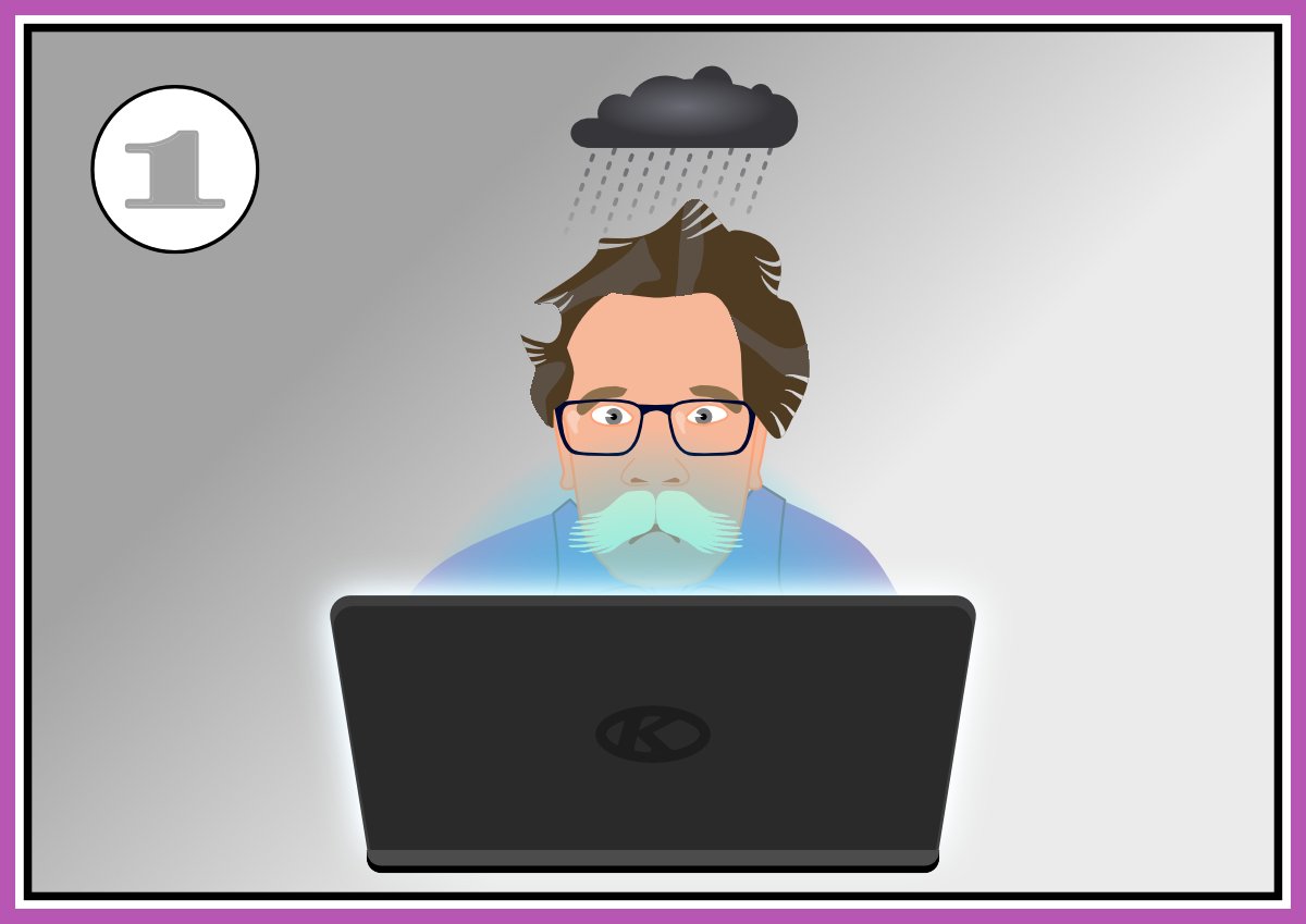
Bored. Bored, bored, bored . . . Inspiration! Do what all artists do when there's nothing to draw: a selfie! Result!! SIGH What am I going to do now . . . ?
-
I don't know where these ideas come from, nor why they pick on me. But there we are; more unsolicited nonsense made flesh (digitally speaking). Mostly vectors with a few Effects here and there. First off: a mock-Tudor house, a style popular between the Wars, and the Lombardy poplars that were also all over the place. City gent in his working clothes and housewife in her posh frock. Next, the balcony of Buck House (that's Buckingham Palace to you) with a warm sunny queen and a damp soggy king. I have an idea or two more, which I'll post when I get round to them.
-
Adapted from a design in 'Designa' by Wooden Books.
-
The collection of fanart I created in Affinity Designer over the years of characters from Mobile Suit Gundam Wing. Instagram: Austiemo Webstie: Austiemo.com/portfolio Facebook: Austiemo
-
 The description for this forum is "Post your fantastic designs for all to see". Well I don't claim that this is a fantastic design, but it is (to me) an interesting experiment… I was troubleshooting a file for someone else who couldn't see why an element in their design was transparent, when the transparency tool clearly said 'none'. That got me thinking about the number of different ways in which an object can be made transparent in AD - I thought of 8 examples, and I suspect that there are others! Some are a little convoluted, but most probably have their place at one time or another. The experiment shows me just how versatile AD is, but I think that comes with a cost: If I didn't know how the transparency had been applied to each of my 8 squares, it would be quite a task to figure out the various methods used - especially to a newcomer to vector graphics, or Affinity. Can you find other ways that I've not discovered? Opacity Experiment.afdesign
- 5 replies
-
- 1
-

-
- experiment
- transparency
- (and 2 more)
-
A ‘Visual Treasure Hunt’ inspired by the music of Pink Floyd. This is Part One, which covers the albums ‘Piper At The Gates of Dawn’, through to ‘Obscured By Clouds’, and non-album tracks & B-Sides. Created using AD2 (Beta). My previous Prog illustrations were created using PS. It very much felt like I was learning whilst creating. There are things that AD does that were incredibly helpful, but also things that I could do in PS that I couldn’t do in AD. As I said, it was an education. I use photo-textures to give a collage-like feel. www.mdaillustration.com
-
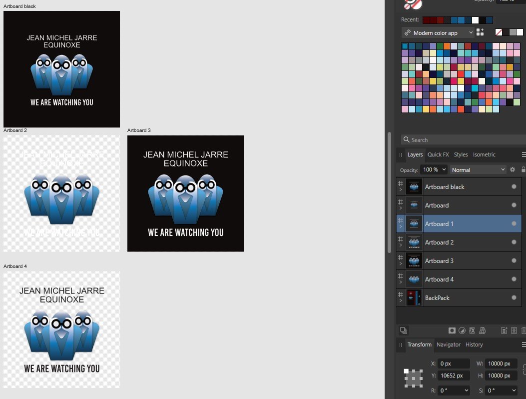
My reproduction of one of Jean Michel Jarre's covers Made in Affinity Designer - 100% vector.
-
https://www.artstation.com/artwork/VJYr95 Had some fun painting one of my favourite Spider-Man villains, Venom. Had a blast working with more painterly brushes for the skin.
- 5 replies
-
- 7
-
-
- painting
- affinity photo
- (and 2 more)
-

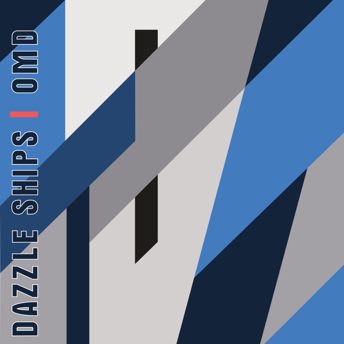
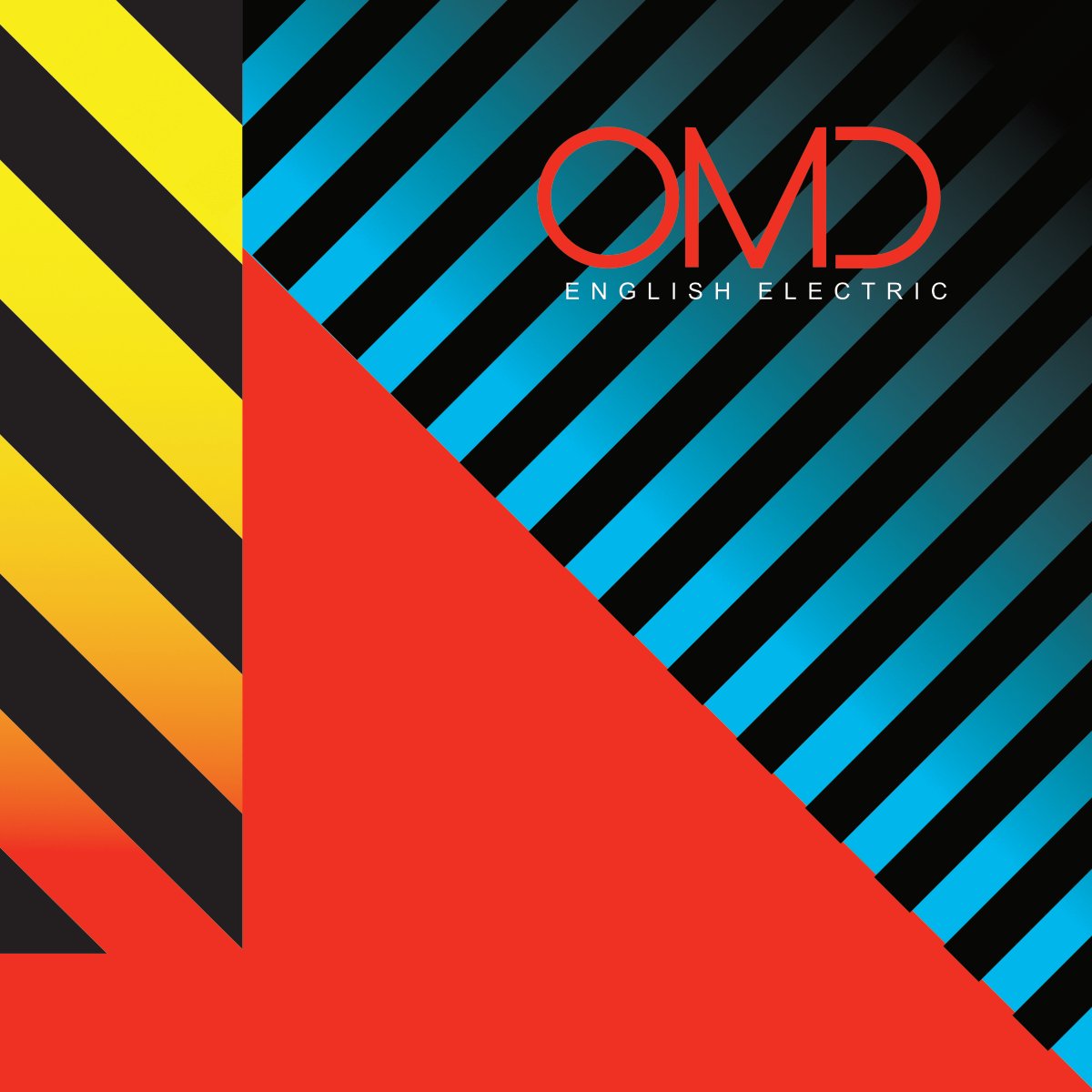
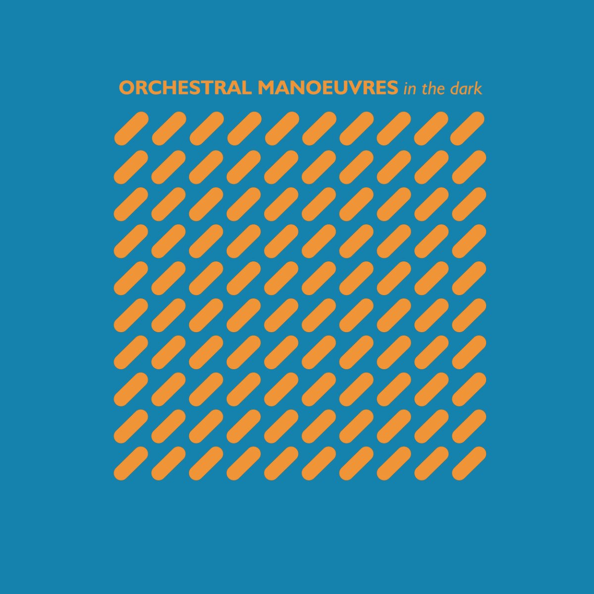
affinity designer Reconstruction of OMD covers, 100% Vector
adam1762 posted a topic in Share your work
My reconstruction of OMD covers, 100% Vector, Affinity Design and export to jpg.
-
The Lotus 108 track bike as ridden by Chris Boardman who won the 1992 Barcelona Olympics 4000m pursuit riding one and claiming a new world record on the way.
-
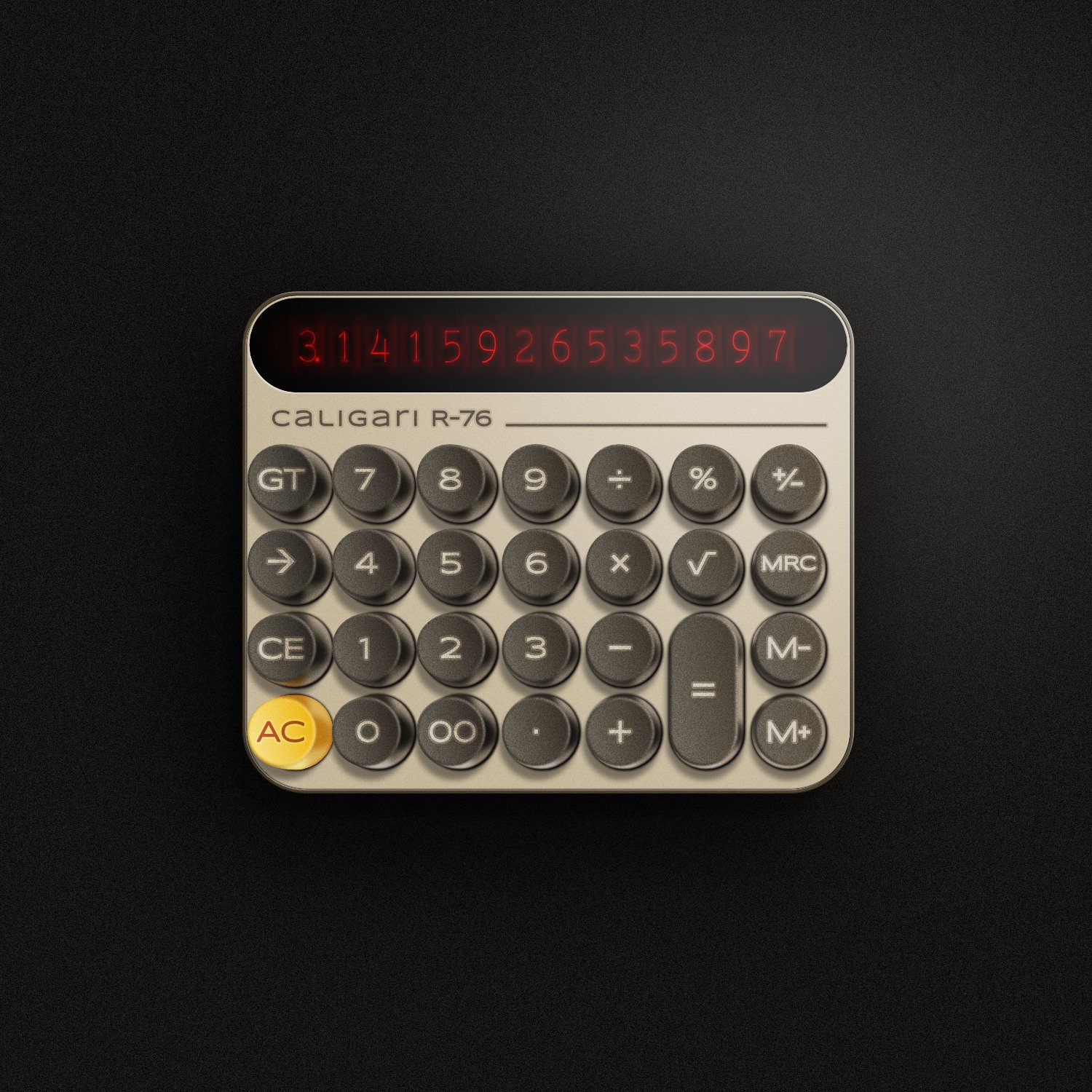
It's all about the "retro" vibe. I grew up in the 80's, I was raised by 80's style items and by the designers of those items. So I'm just filled with that vibe and sometimes I need to express it. I have always admired the keyboards of the first personal computers - their texture, their shape, the way characters were applied to them. Also the tube displays and their magical glow, which no LCD screen can render, bring back good memories of distant times. Here I tried to reflect the style of those machines. The inspiration for this drawing came from a modern calculator with round buttons, whose designer apparently took advantage of the sentiment with which people sometimes refer to objects from the past. #affinitydesigner #calculator #nixietube #80s
- 6 replies
-
- 9
-
-
- calculator
- nixietube
- (and 1 more)
-
Who's in dribbble so i can follow you? My accounts: https://www.instagram.com/heavyblazenight/ https://dribbble.com/heavyblazenight https://www.behance.net/heavyblazenight
-
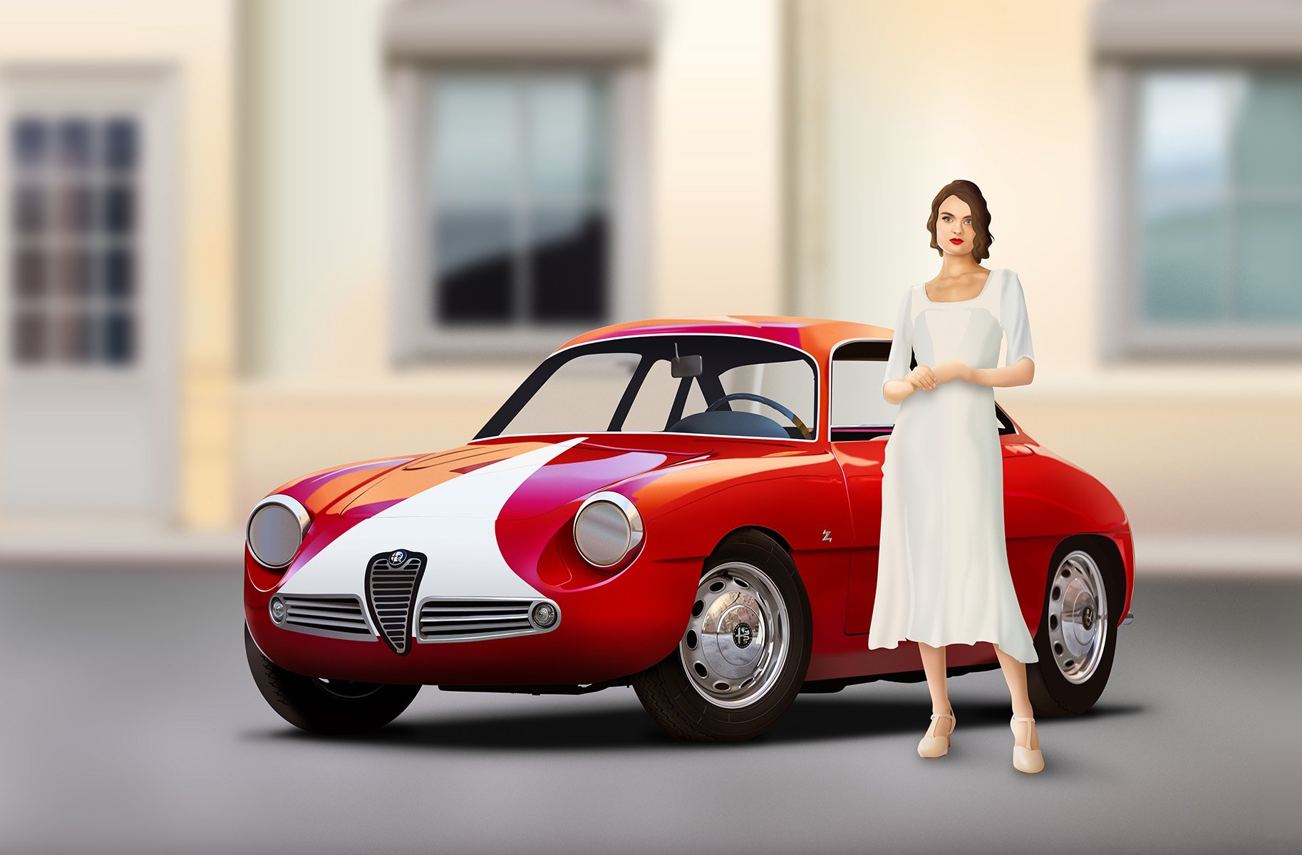
Yeah another Alfa! Just showing where I started blocking in and doing a few bits all over the place and then a week later. Can't decide on the lady so not quite finished either, perhaps a different pose, facing the car? Not sure. Anyway will update when I've decided and I'm done.
-
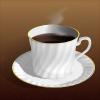
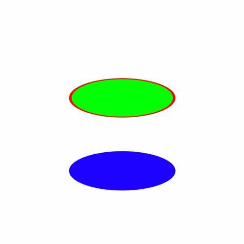
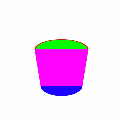
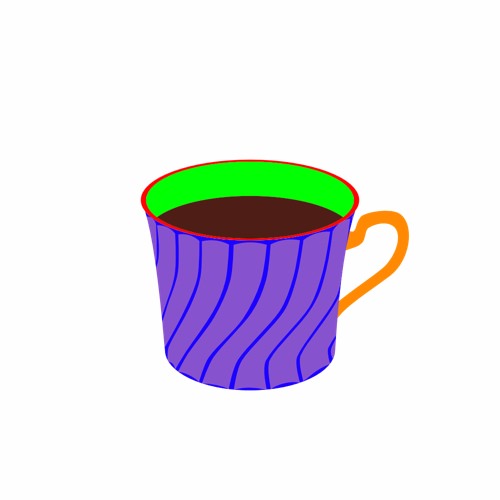
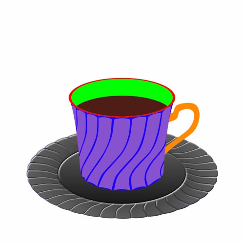
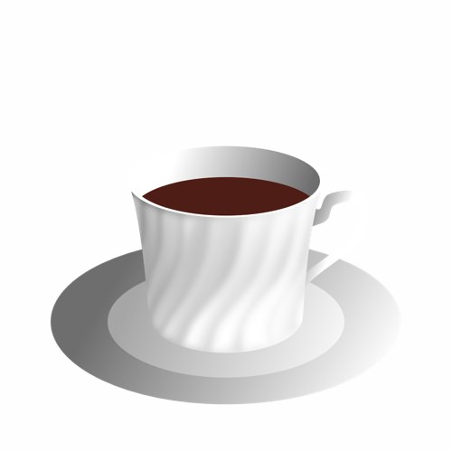
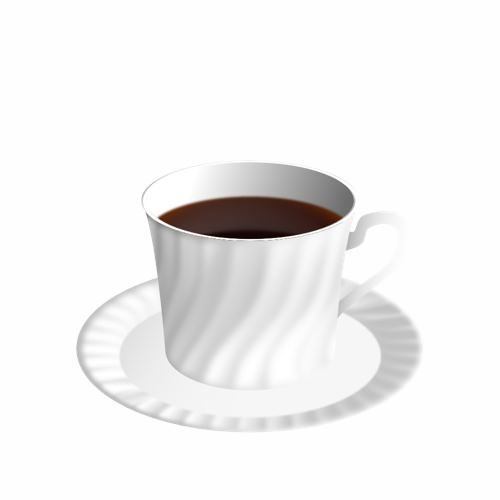
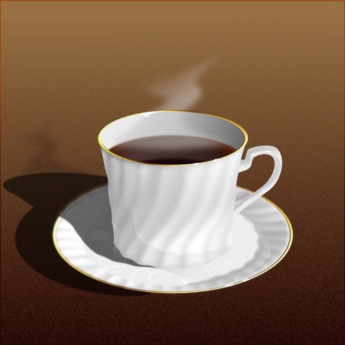
“Coffee Time” I’m really not very good with hand drawing (stick figures only!) so I really like the concept of vector drawing in which I can make changes after the fact and tweak to my hearts content. To learn how to use Affinity Designer (I have played with some vector stuff before in Inkscape but nothing much at all), I decided to make something look as real as I could that wouldn’t need too much raw drawing skill and I came up with “Coffee Time” : 100% created from scratch vector drawing (no brushes or pixel layers except for the use of the fx “Layer effects"). I did use a photo for reference but I didn’t do any tracing or anything. I’m really, really happy how it turned out. I tried out all sorts of things and learned a lot but it was a lot of fun :) As this is a "Learn and Share” forum, I thought I’d share exactly what I did (see the other other attached pictures). It’s not perfect and I’m a beginner, but hopefully others might be able to learn something, too Enjoy! :) My Process: 01 Create 2 sets of circle shapes to represent the top and bottom of the cup. Squish the top and the bottom with the move tool. The top circle has a smaller one on top to remove later to make a lip for the cup. I deliberately used bright colours to make the shapes easy to distinguish from each other. 02 Join the circles with the corners of a rectangle shape to form the side of the cup. 03 Shape the rectangle with the node tool. Add a handle. Clone the top circle and move it down to make the surface of the coffee. 04 Create a set of “shading shapes” to put on top of the side of the cup. These will then be given a gradient colour and transparency to give the illusion of a bumpy surface. 05 Create some circles and overlay some shading shapes . I used the the smart duplicate function to repeatedly rotate duplicates of the shading shape easily. 06 Squish the saucer with the move tool and move into place under the saucer 07 Change the colours to something closer to the final version and play with gradients and transparencies. I also blurred it to make it blend more naturally. Once I got something that looked good, I made a style of it and then applied it to the others and then hand tweaked each one. 08 Do the same to the saucer. Also added some detail (reflection of the inside of the cup and blurred it) to the coffee. 09 Add a background with a gradient. I used the noise slider to give it some texture. I also added some steam with just a hand drawn shape. 10 Add a shadow. I just duplicated the cup and saucer, blacked them out and then put them in place underneath everything and used the shear tool to project it out. I also added some fine detail on the edge of the side of the cup to add to the bumpiness illusion. Made the lip a nice shiny gold with a slightly tweaked version of the built in “metal” style. Added some self shadowing to the saucer and further deformed the circle shape it to give a more 3D look to it. 11 Added reflections and spectral highlights to the cup and saucer. Now it looks nice and shiny. For the final version, I also added some bubbles to the coffee (lots of circle shapes) and the text, converted to curves and then given a steam like style (actually the same one I used for the shading shapes!) and then each character rotated and scaled to make it look like steam from the coffee.
- 10 replies
-
- 13
-
-
- coffee cup
- vector
- (and 3 more)
-
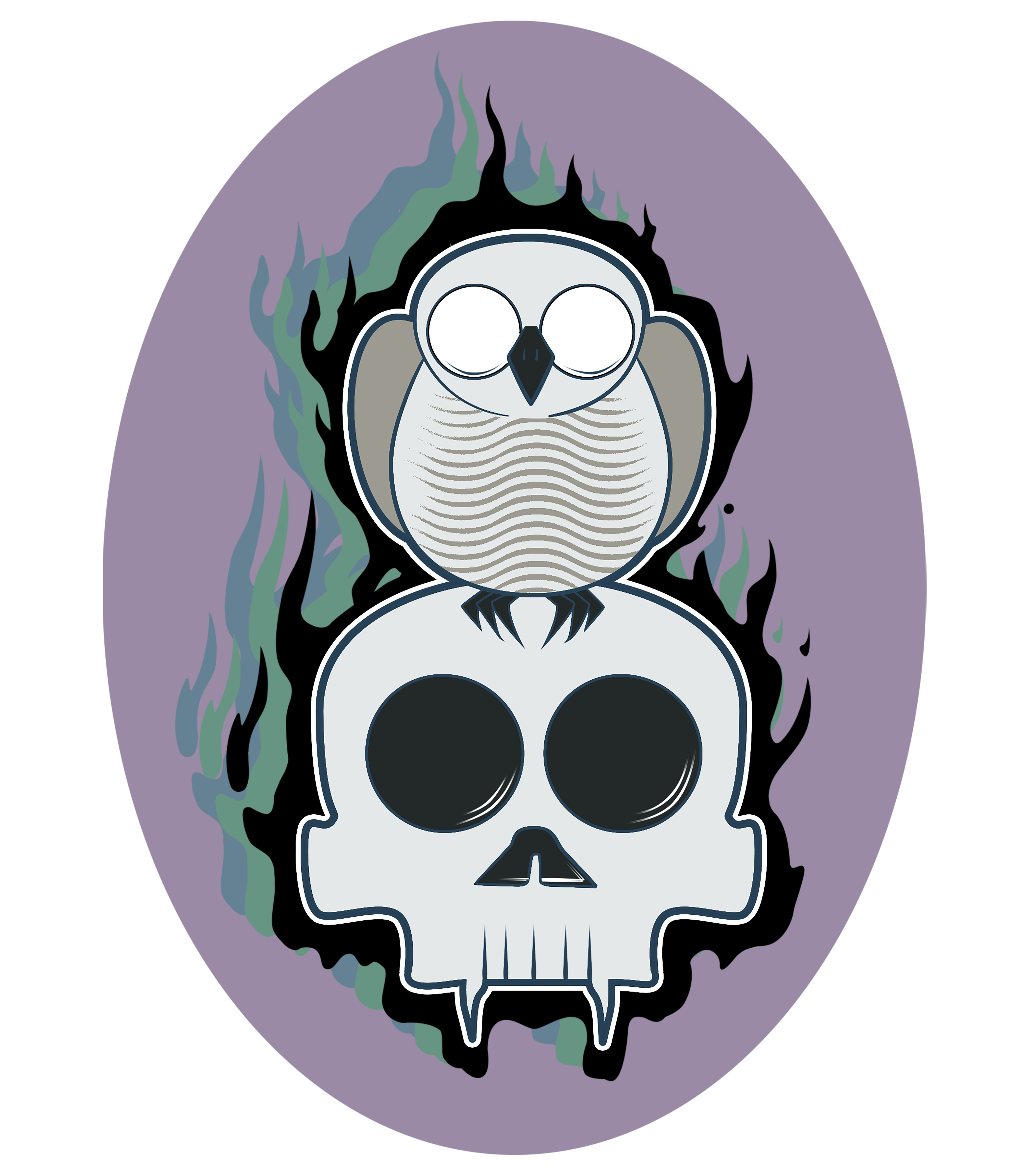
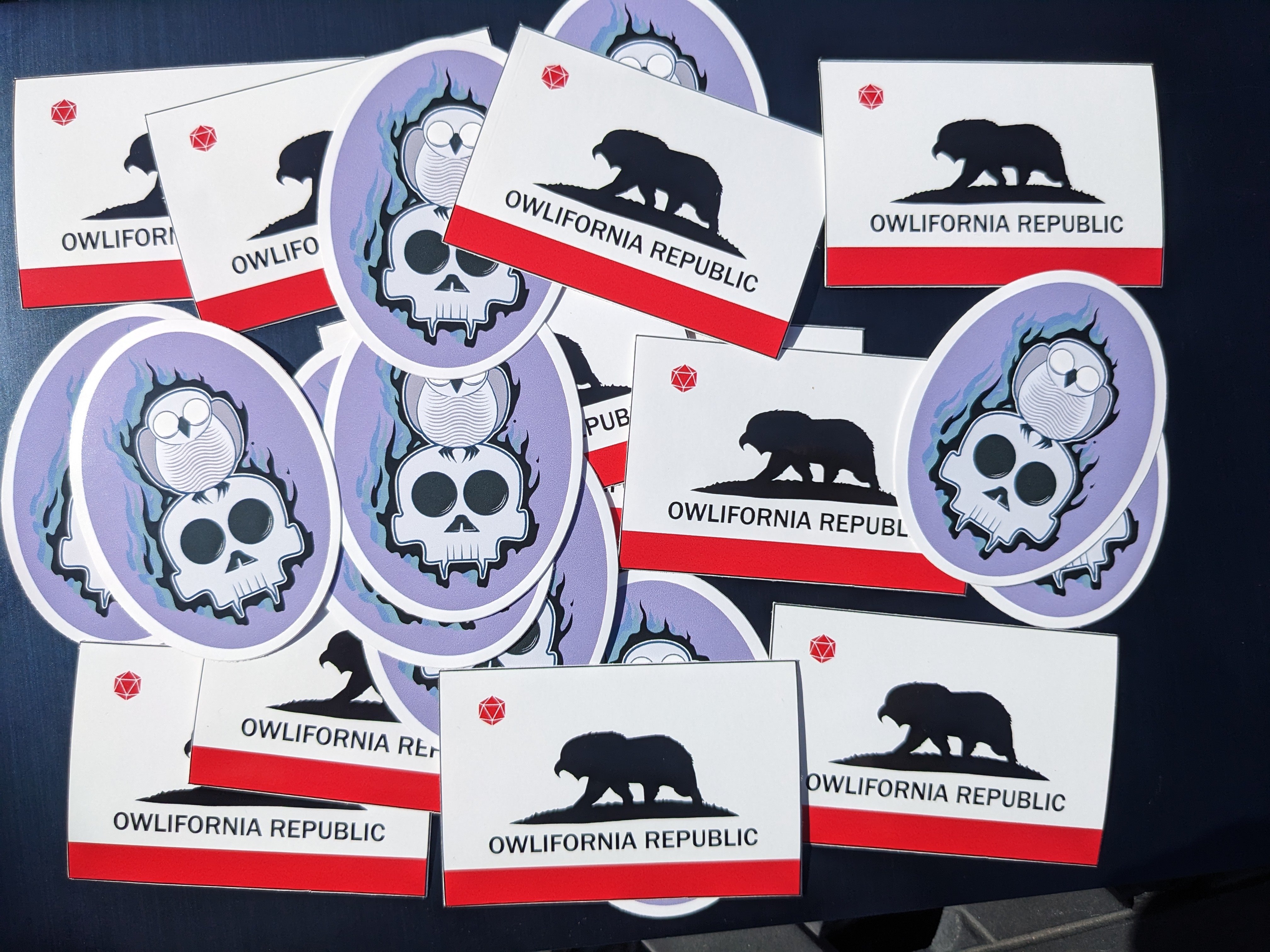
 I sent these designs to a printer. They are printed w/ digital inkjet and cut with a laser. We gave away a bunch in the swag bags at our film festival.
-
I really like the feel of this one
- 1 reply
-
- 4
-
-
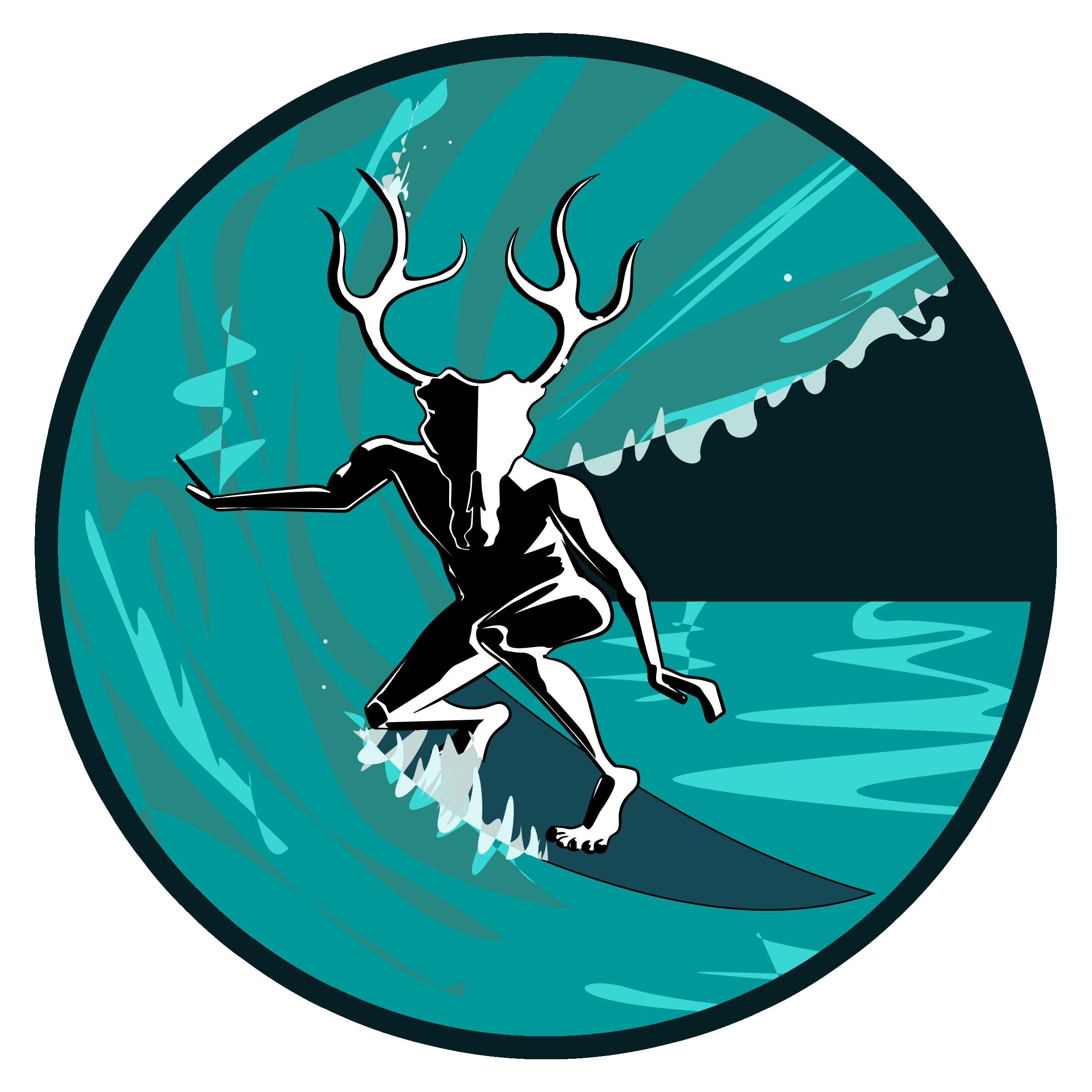
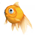
Here's another surfer I drew. People refer to the surfer as "he" but I used a reference photo of a woman shredding.
-
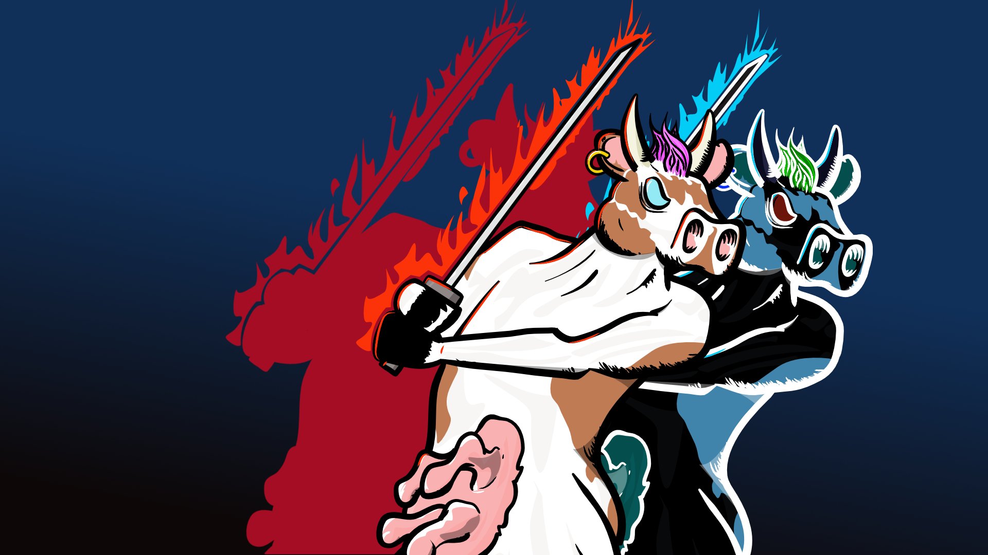
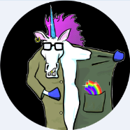
I said to myself, "What this Xbox needs is more awesome flaming sword cow stuff."


.jpg.a98919af83fbe15865bc392e5b4108c4.jpg)
.jpg.9ff0f30996ccf894f6c6b7376d2c48a6.jpg)
.png.30912abe97258cc1ec0d54fdfbc383d1.png)


.png.c3b4edfe46bb79ed5894e3cb7bd5bde3.png)

.jpg.3ec1a65ef1dc16bb8d0266e7d8fec3dd.jpg)

.jpg.ea8df5c4d74280ad4e4f38ac5725a4b8.jpg)