Search the Community
Showing results for tags 'affinity designer'.
-
 Hey folks, I've noticed a problem in Affinity Photo 2, affecting both iPad and desktop versions, where changing a layer's fill opacity via the FX options from 100 % to anything between 100 and 0 % doesn't hide the layers contents as expected. Instead, the contents remain visible 100 % at all times. This seems similar to a previously mentioned, but seemingly solved issue with the 3D effect in Affinity Designer, indicating a possible consistent rendering issue with layer effects and fill opacity settings. To reproduce the Bevel / Emboss visibility issue, follow these steps: Open Affinity Photo 2 on either an iPad or desktop and create a new layer. On this layer, draw anything using any colour of your choice. Apply the Bevel / Emboss effect to the drawn layer. Reduce the layer's fill opacity to 0%. Expected Outcome: The layer contents should become invisible, leaving only the Bevel / Emboss effect visible. Actual Outcome: Despite reducing fill opacity to 0%, both the layer contents and the Bevel / Emboss effect remain visible, suggesting that the expected change in visibility does not occur. I'm looking for insights or workarounds from anyone who has encountered this. Any feedback or suggestions would be appreciated. Cheers Dennis
 -
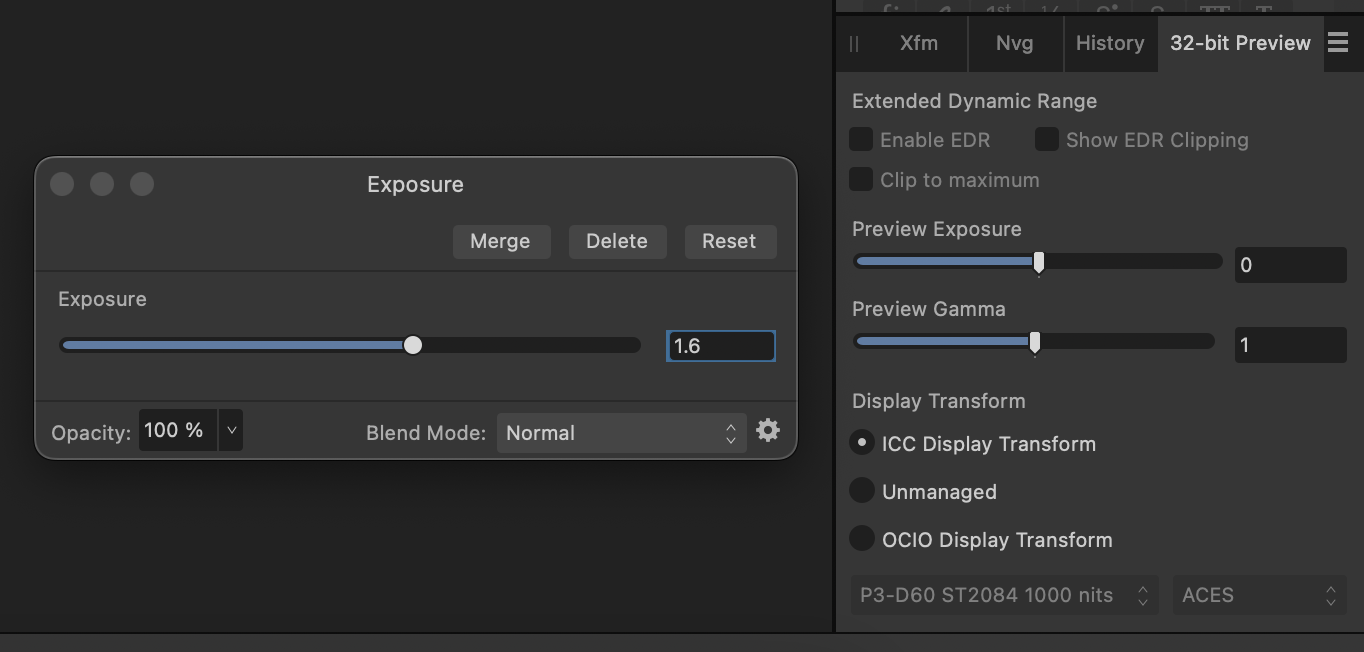
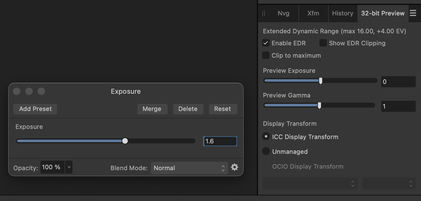
 I'm trying to do some HDR mockups in Designer 2 but haven't gotten it to show extended brightness inside the app (on MacBook Pro internal XDR display). I created an RGB/32 document and applied an exposure adjustment greater than 1 to the layer I'm trying to brighten beyond "normal" display levels. I've tried applying the exposure adjustment to both vector and pixel layers. The 32-bit Preview panel doesn't allow me to click `Enable EDR` and instead of seeing extended brightness it's just desaturating the colors. I've repeated these steps in Photo 2 and the 32-bit Preview panel allowed `Enable EDR` and triggered the display's extended brightness as expected. Is there a different workflow I need to follow to see EDR/HDR in Designer?
-
 🇬🇧 Hi, the interface of the three software programs in the Affinity suite seems very well done and quite productive. But everyone also has their own specificities in their workflow and the addition of a utility like Keyboard Maestro can fill certain gaps or innovate with advanced functions. In addition, KM knows how to perfectly replace many other utilities for macOS… 😉 As I am working on a document alternating between RGB mode and CMYK mode, I was wondering about the opportunity to be able to visually know, and without action on my part, the current color mode and the possibility of quickly changing it. to change. Unfortunately, AD does not indicate the current color mode and the procedure to switch from one mode to another requires a lot of clicks on the part of the user (from memory, on other graphics software [?], there is a simple and direct submenu within a menu, associated with keyboard shortcuts…). I haven't found a keyboard command for this function in AD!… The Keyboard Maestro utility has solid arguments for performing macros. This software is a marvel of efficiency and provides very valuable services, whatever the software used or the context. Below is a screencast of the KM interface in AD. Sorry if the action is rapid, but that is also the goal, to make it as transparent as possible. macros live.mp4 Attached is a set of two macros KM for AD. Affinity Designer Format de couleur RVB CMYK Macros.kmmacros.zip In detail, this set includes a first macro for the conversion to RGB and a second macro for the conversion to CMYK. The macros simulate the call to display the “Document Setup” dialog box (Command + Shift + P), a first click on the “Color” Tab, a second click on the “Color Format” Menu and a third click in this Menu on the desired profile. And a final press of the “Escape” key to close the dialog box. The initial position of the mouse is maintained during the macro. The two macros are displayed in a palette, in the form of a button, alternately, one replacing the other with the help of a simple toggle. When opening AD and a document, the last state of the button is displayed, the toggle being managed by KM (with a system variable). It is therefore up to the user to make their choice by clicking on the mode they want. In KM, everything is almost configurable. So, pallets have several options. Their positions are defined by the user, using the mouse while pressing the Command key. For the two icons which symbolize here the RGB mode and the CMYK mode are simple copy and paste of two small illustrations created with AD, inserted in the KM interface, on each of the two macros. There you go, I hope this post will give you ideas to perhaps further improve your workflow… NB: we can also add a function (clicks) to the macro to modify the profile of the “Color” Palette at the same time. Finally, porting this set of macros for AP and for AP is possible, you just need to modify the call up of the dialog box because the menus are different... 🇫🇷 Bonjour, l'interface des trois logiciels de la suite Affinity me semble très bien faite et assez productive. Mais, chacun a aussi ses propres spécificités dans son flux de travail et l'apport d'un utilitaire comme Keyboard Maestro peut combler certains manques ou innover avec des fonctions évoluées. De plus, KM sait parfaitement remplacer bon nombre d'autres utilitaires pour macOS… 😉 Étant en train de travailler sur un document en alternance entre le mode RVB et le mode CMYK, je m'interrogeais sur l'opportunité de pouvoir visuellement connaître, et sans action de ma part, le mode de couleur courant et la possibilité de rapidement le changer. Malheureusement, AD n'indique pas le mode de couleur en cours et la procédure pour passer d'un mode à l'autre demande beaucoup de clicks de la part de l'utilisateur (de mémoire, sur d'autres logiciels graphiques (?), il y a un simple et direct sous-menu dans un menu, associé à un raccourcis clavier…). Je n'ai d'ailleurs pas trouvé de commande clavier pour cette fonction dans AD !… L'utilitaire Keyboard Maestro possède de solides arguments pour effectuer des macros. Ce logiciel est une merveille d'efficacité et rend de très précieux services, quelque soit le logiciel utilisé ou le contexte. Plus haut, un screencast de l'interface de KM dans AD. Désolé si l'action est rapide, mais c'est aussi le but, qu'elle soit la plus transparente possible? Joint aussi le set de deux macros KM pour AD. En détail, ce set inclus une première macro pour la conversion en RVB et une seconde macro pour la conversion en CMYK. Les macros simulent l'appel de l'affichage de la boîte de dialogue “Configuration du document” (Commande + Majuscule + P), un premier click sur l'Onglet “Couleur”, un deuxième click sur le Menu “Format de couleur” et un troisième click dans ce Menu sur le profil souhaité. Et un dernier appel de la touche “Escape” pour fermer la boîte de dialogue. La position initiale de la souris est maintenue durant la macro. Les deux macros sont affichées dans une palette, sous forme de bouton, en alternance, l'un remplaçant l'autre avec l'aide d'une simple bascule. À l'ouverture d'AD et d'un document, c'est le dernier état du bouton qui est affiché, la bascule étant gérée par KM (avec une variable système). C'est donc à l'utilisateur de faire son choix en cliquant sur le mode qu'il désire. Dans KM, tout est presque paramètrable. Ainsi, les palettes disposent de plusieurs options. Leurs positions est définies par l'utilisateur, à la souris tout en appuyant sur la touche Commande. Pour les deux icônes qui symbolisent ici le mode RVB et le mode CMYK sont de simples copier-coller de deux petites illustration réalisées avec AD, insérées dans l'interface de KM, sur chacune des deux macros. Voilà, j'espère que ce post vous donnera des idées afin de peut-être améliorer encore votre flux de travail… NB : on peut aussi ajouté une fonction (des clicks) à la macro pour modifier en même temps le profil de la Palette “Couleur”. Enfin, le portage de ce set de macros pour AP et pour AP est possible, il faut juste modifier l'appel de la boîte de dialogue car les menus sont différents…
- 4 replies
-
- 1
-

-
- affinity designer
- macros
- (and 2 more)
-
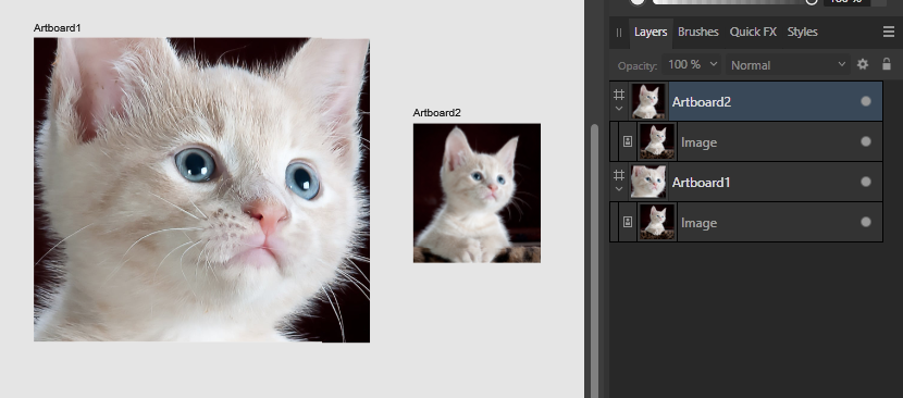
 I have a bunch of artboards, all different proportions and sizes. They all have the same background image, but the image is manipulated differently on each artboard. How do I swap the background image for another one and retain all the original image manipulations in all the artboards and without having to copy and paste to each artboard individually? For example: Thanks!
-
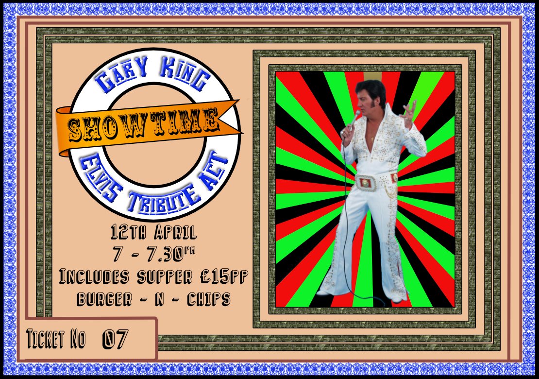
Latest ticket template 9.4x 6.6cm. everything created in Designer apart from Elvis image and creating the page numbering in and printing from publisher. Size is designed to give me an n-up print of 9 to an A4 page on a colour laser.
-
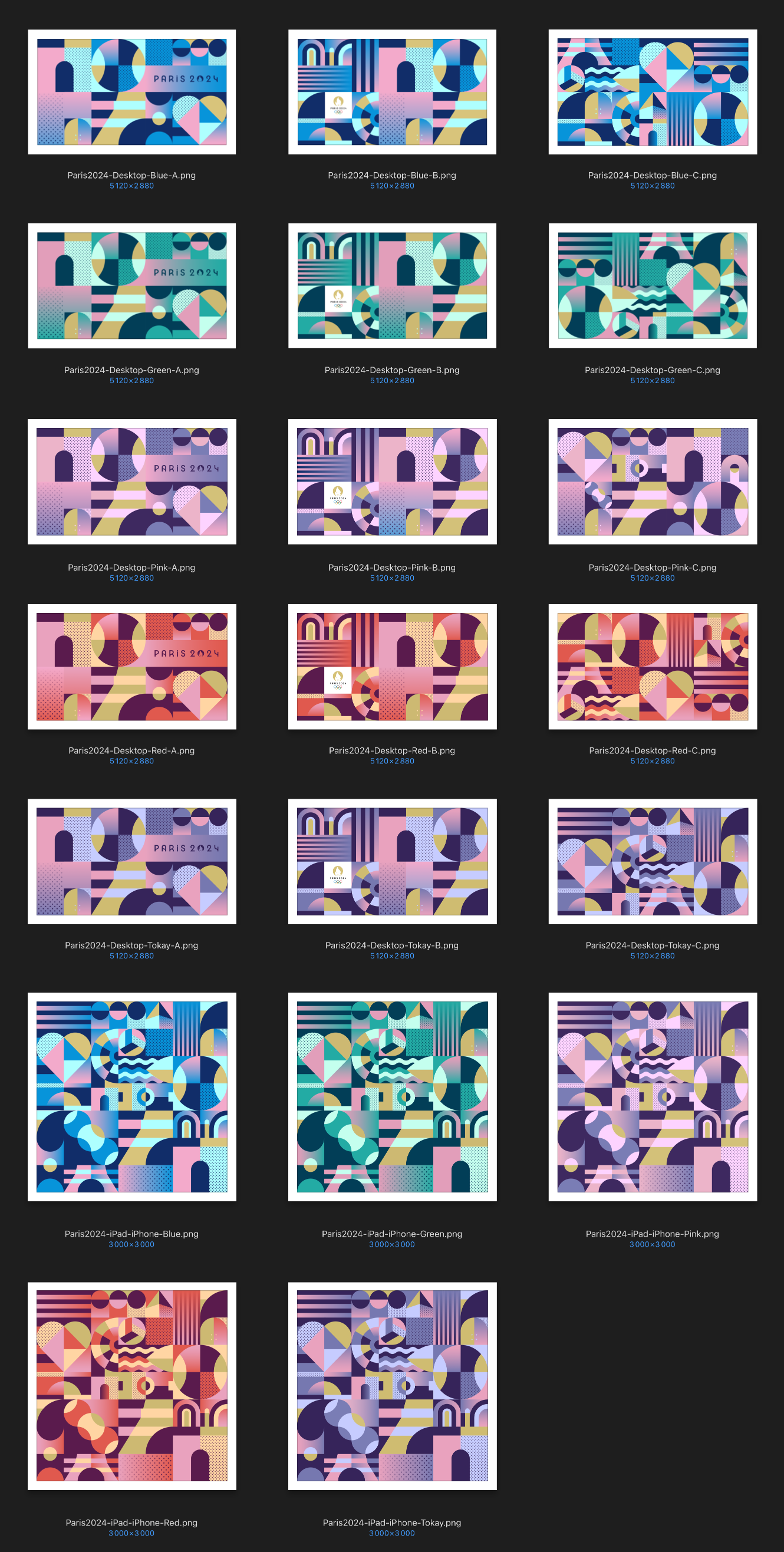
🇬🇧 Here is a series of wallpapers (desktop, iPad and iPhone), in HD, on the theme of the Olympic Games. 🇫🇷 Voici une série de fonds d'écran (desktop, iPad et iPhone), en HD, sur le thème des Sports Olympiques. Paris2024 Desktop Blue A Paris2024 Desktop Blue B Paris2024 Desktop Blue C Paris2024 Desktop Green A Paris2024 Desktop Green B Paris2024 Desktop Green C Paris2024 Desktop Pink A Paris2024 Desktop Pink B Paris2024 Desktop Pink C Paris2024 Desktop Red A Paris2024 Desktop Red B Paris2024 Desktop Red C Paris2024 Desktop Tokay A Paris2024 Desktop Tokay B Paris2024 Desktop Tokay C Paris2024 iPad iPhone Blue Paris2024 iPad iPhone Green Paris2024 iPad iPhone Pink Paris2024 iPad iPhone Red Paris2024 iPad iPhone Tokay
-
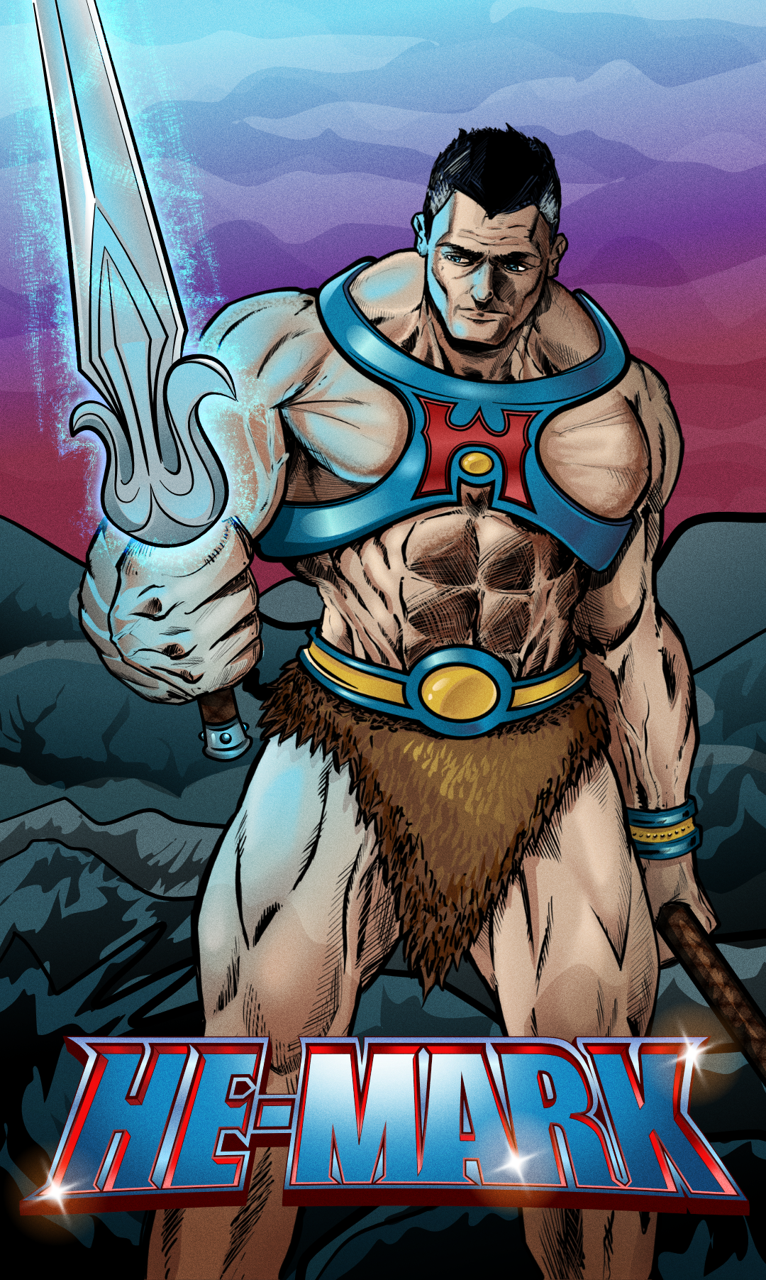
Millenia pass and with Mark as its Emperor the Viltrumite nation grows from strength to strength. With peaceful expansion now on his mind, Mark reaches out to the farthest corners of the universe, discovering new planets and lost civilizations… not all are thriving. On one new planet, darkness has taken over, and its Masters have gone. A whisper calls out to Mark as he wanders the baron land, drawn to a castle in the distance. Wedged in its mighty wooden doors is a rusty old sword. Mark reaches out to grasp the hilt of this leftover relic. A sentence screams into Marks mind… “By the power of Greyskull, I HAVE THE POWER!!” Don't know why but I felt compelled to create this! lol Initial sketch - Artflow Inks - Clip Studio (I did attempt to ink in Designer with vectors, but just wasn't happy the results) Colours and Logo created in Affinity Designer. I also used Affinity Photo do to some liquify and fix elements. It's not perfect, but I'm attempting to create more!!!
-
 Flyer I designed.
-
 I recently started using Affinity Designer 2 on my iPad Pro and was a bit baffled that common keyboard shortcuts are absent. When I place my cursor between two letters and press Option + Right Arrow, it jumps to the end of the line of text rather than increasing the kerning. Cmd + Right and Ctrl + Right do the exact same thing, so I don’t see a compelling reason why Option + Right Arrow wouldn’t be available for use as a kerning shortcut instead. I recognize that the iPad interface is (necessarily) optimized for touch, and I think it’s done quite well for that purpose. However, kerning is buried fairly deep in the menu, and the traditional Option + Arrow shortcuts would be a major convenience for those of us using keyboard and mouse on iOS. It doesn’t look like enabling them would interfere with any other functionality, so please consider doing so! I would add that there are a number of other shortcuts in the same boat which I think could be added without causing issues, such as Cmd + and Cmd - to zoom, or Esc to back out of editing a text object.
 -
 Version: 2.3.1 OS: Mac OS Sonoma 14.3.1 Hardware: M3 Max 2023 Macbook Pro 16" Issue: I am a long time user of Affinity Designer. I normally use a 16" 2019 Intel Macbook Pro and have had no issues on both Affinity Designer 1 & 2. I have now recently switched to an M3 Max Macbook, which is significantly faster than my older Intel machine. However, Affinity Designer 2 on the new machine is very frequently laggy (zooming in/out and panning very choppy, obvious lag when clicking between objects) even with very small documents containing a small number of items. Other times it goes back to normal with 0 lag. I am not running any other high-demand applications while using Affinity Designer. I have checked my performance settings but everything is set very high, including the use of OpenGL. Is this behavious normal? Is there something I am missing? Has anyone else encountered this issue? Would appreciate all insight, thanks!
 -
🇬🇧 Hi, attached is a short video concerning the centering of objects: in one of them (the left one), there is a mask which partially obscures another object which overflows. The centering is not correct. I had never noticed this “indelicacy”!… 🇫🇷 Bonjour, ci-joint une petite vidéo concernant le centrage d'objets : dans l'un deux (celui de gauche), il y a un masque qui occulte partiellement un autre objet qui déborde. Le centrage n'est pas correct. Je n'avais jamais remarqué cette “indélicatesse” !… Oops-Center.mp4
- 8 replies
-
- 1
-
-
- affinity designer
- object
- (and 1 more)
-
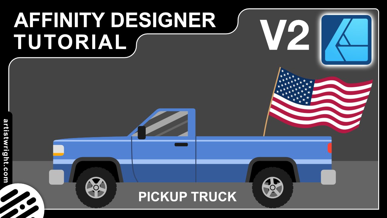
 In this video we are going to create a pickup truck. It’s beginner friendly and we will cover many many tools https://youtu.be/aReIBk3VXjo
-
- 1
-
-
- affinity designer
- tutorial
- (and 2 more)
-
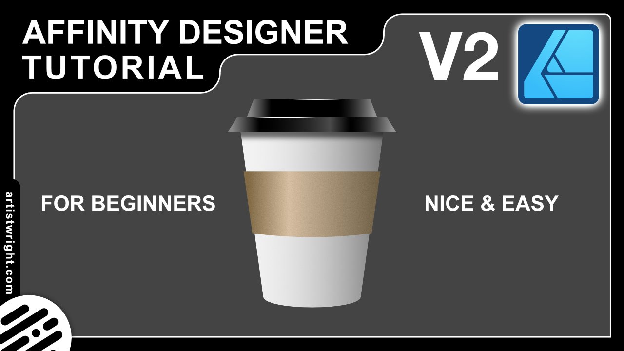
In this video we are going to create a takeaway coffee cup. It’s beginner friendly and an easy project to get started on. We will cover many tools in this tutorial but I’ll take it slowly and teach you step by step so you can follow along with me. Affinity Designer V2 (2.3) Used in this tutorial. https://youtu.be/LFMAdOMuWyU
-
I began the illustrations for this in AD V1, but it went on the back burner for ages. I recently finished them -- all in V2 -- and yesterday I put the video together. Billy Bennett was a very popular 'comic turn' on the Variety stage in the 1920s and 1930. He specialised in songs an monologues, includng parodies of well-known 'straight' monologues.
-
- 4
-
-
- movieplus x6
- video
- (and 2 more)
-
 I'm trying to look for an angled/tilted brush for hand writing with my pen tablet. I know it sounds extremely simple – it's one of the default brushes on Adobe Illustrator – but I can't seem to find it on Affinity Designer. Everything is rounded... Some taper off a the ends. But none are actually angled. Please help!
- 61 replies
-
- 3
-
-
- brushes
- affinity designer
- (and 1 more)
-
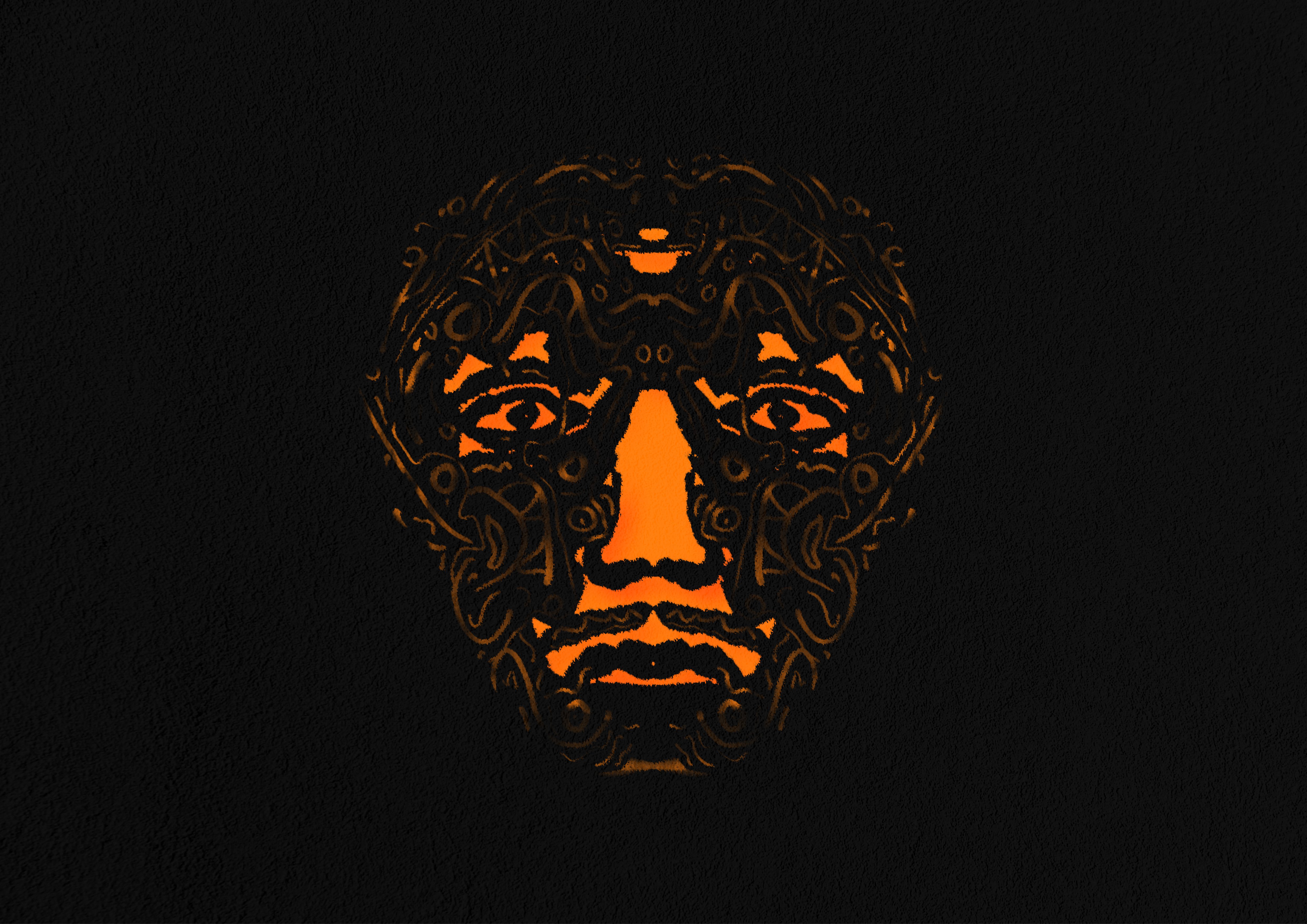
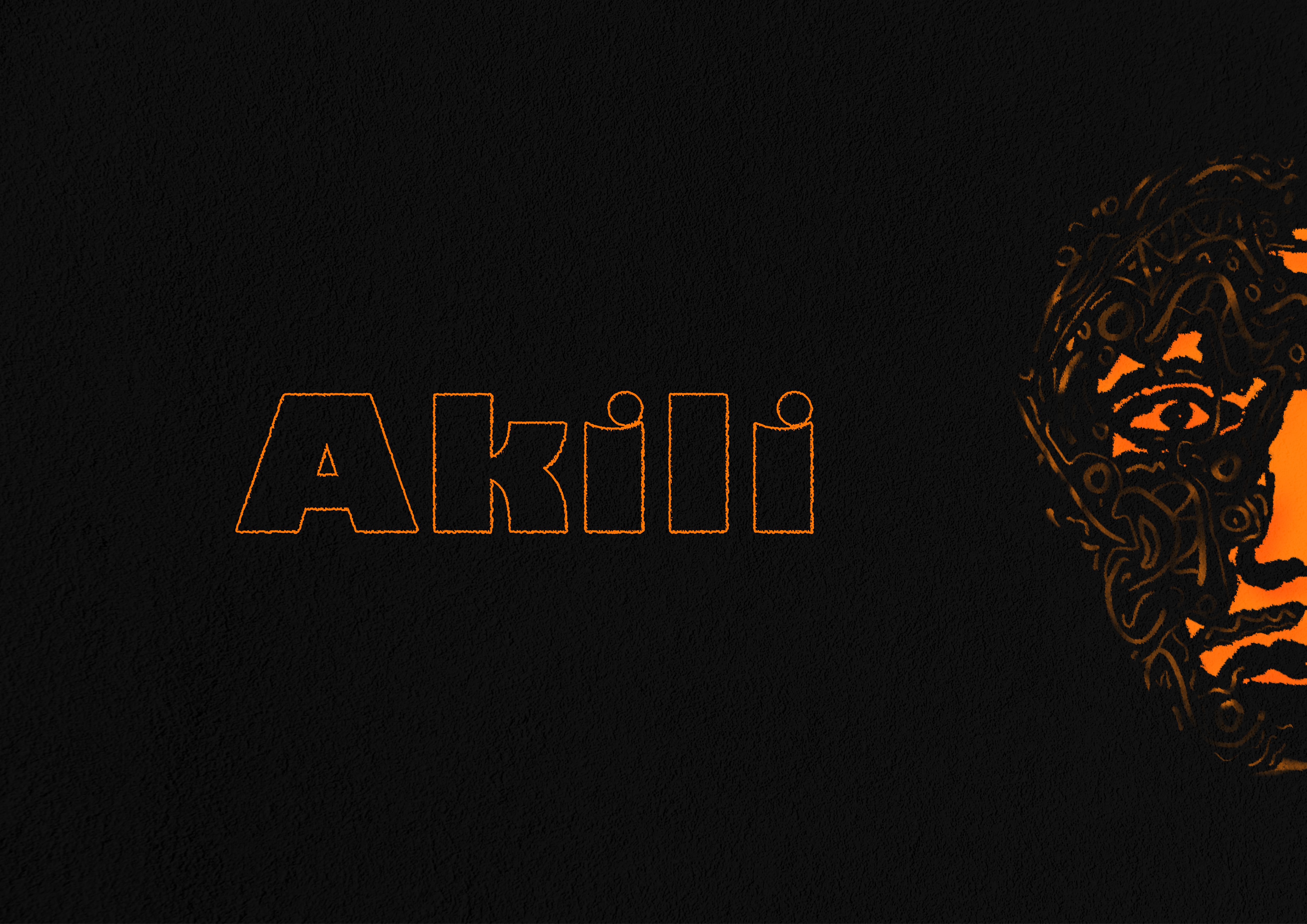
This is an update 1.1 of project Akili. Which version do you prefer? Thanks. Tools: Affinity Photo, Affinity Publisher Let's connect: https://www.behance.net/bah-is-life https://www.instagram.com/bah_is_life/
-
I recently illustrated a Zebra Swallowtail Butterfly (Protographium marcellus) for my brother. He wanted a photo, which I did not have, so I decided to create an illustration for him instead. I used AD v2.31., but spent a lot of time in the Pixel Persona. I also made a few trips to Affinity Photo for a few features that AD does not support. Hope you like it.
- 2 replies
-
- 17
-
-

-
- pixel persona
- butterfly
- (and 3 more)
-
I am having trouble with Affinity Photo and Designer(Mac OS) today. When I open the app it asks me to sign in?? After signing in the app crashes. It did manage to open once but the toolbar is floating and will not dock(weird), then after a minute it crashed again. Tried opening again, and was asked to sign in....then it crashed everything was working fine yesterday, but I am unable to use the app at all today. any suggestions thanks crash report1.txt
-
 Hi everyone! I recorded this quick tutorial on how to draw the Tik Tok logo in Affinity Designer. I hope you guys find it interesting.
 -
Our authentic marble and stone Affinity textures are perfect for creating stunning digital collages, product packaging designs and more! Introducing an authentic, user-friendly marble and stone texture pack for Affinity Designer! Our marble and stone textures were sourced from 100% genuine stone and marble and have been saved as seamless repeat patterns so you can fill infinite-sized areas without the disappointment of untidy edges and messy tiling. This marble and stone collage creator also features grout brushes and two grout texture styles – gold embossed and classic grout. This gives you everything you need to create stunning digital collages, packaging designs, and eye-catching backgrounds or add a touch of class to any design project. Check out the screenshots to see what’s possible with this complete texture tool kit. >>GET IT HERE!<< THIS COMPLETE TOOL KIT FEATURES ALL THESE HANDY DESIGN TOOLS AND FEATURES: The Marble & Stone Textures: Seamless, repeat patterns supplied as Affinity Styles. Use them to fill infinite-sized areas with ease. Grout Brushes: Add undulating edges and outlines to your designs. Grout Styles: Add embossed gold or classic grout effect to your outlines. An Example file: Backwards engineer this finished design. Not compatible with Affinity Designer 1. A Quick Reference Guide: Navigate this extensive collection of Affinity textures quickly and easily. Instructions: Learn how to use this marble and stone design tool kit. Technical information: All texture tiles measure 2000 x 2000px but because they tile seamlessly, you can fill infinite-sized areas. >>GET IT HERE!<<
-
 Hello, See example screenshot. This is a vector eps file downloaded from DepositPhotos. It does not open in Affinity Designer with layers...it opens as an "image"...how do I change this for editing?
-
In the “Resources” section, I posted all of the vectorized pictograms that I used to create these visuals in the form of Assets…
-
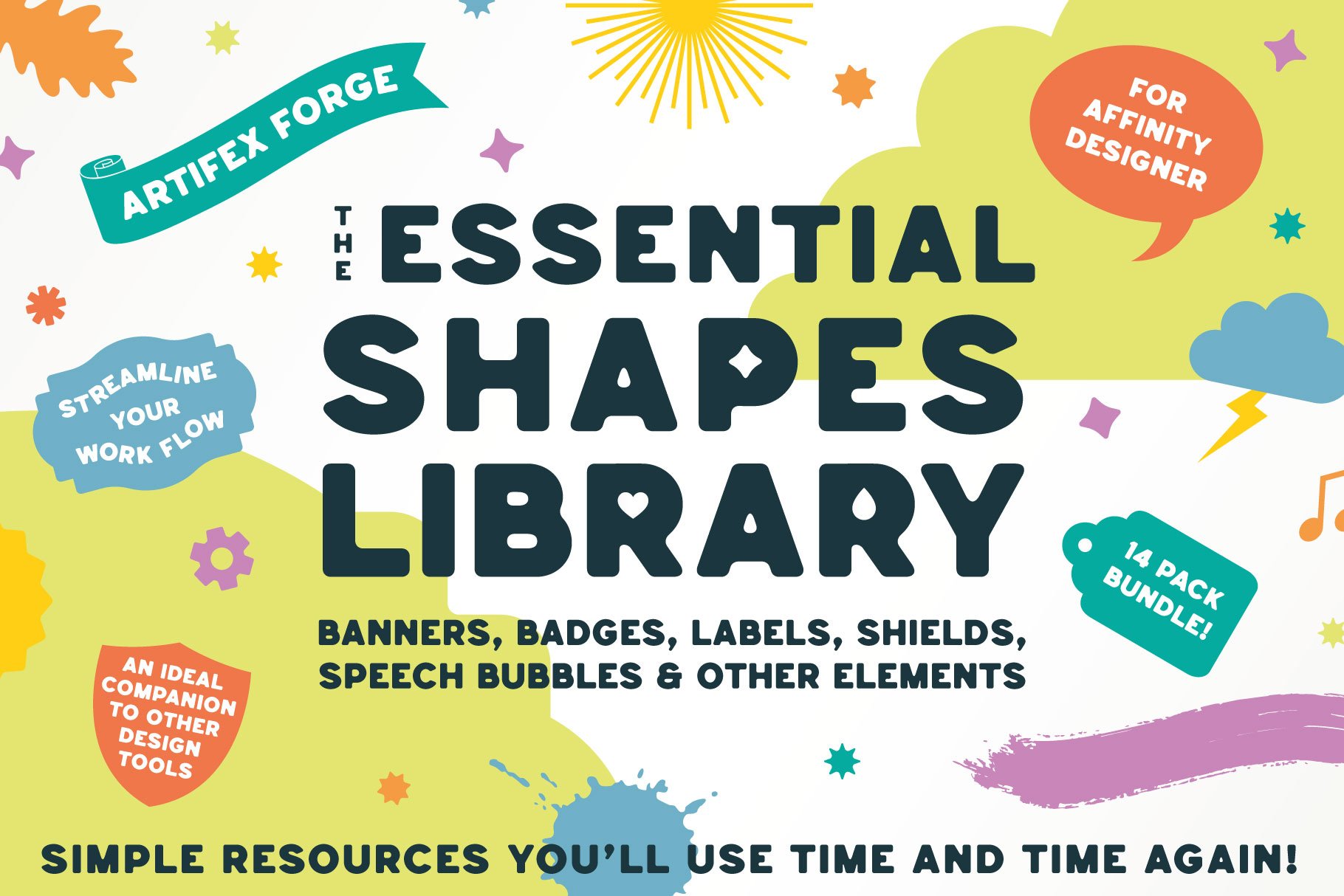
 Introducing a colossal vector shape bundle for Affinity Designer, featuring banners, badges, labels, shields, speech bubbles and more – shapes for any project! >>SEE IT NOW!<< This comprehensive vector shapes library for Affinity Designer is the perfect addition to your design tool kit! Read on to find out why… Affinity Designer comes equipped with the square, rectangle, circle and other basic vector shape tools and these have become the designer’s go-to, speeding up the design process (just imagine if you had to draw each circle by hand?!). This massive shapes bundle builds on the idea of ready-made vector shapes, supplying those most commonly used by designers and digital illustrators in one comprehensive shape bundle, which will save you time, again and again. What can the vector shapes be used for? Most product packaging, brand designs, catalogs, magazines, book covers, giftware designs and websites use simple shapes as part of digital designs and illustrations. These might promote sales, highlight import type, show off a logo or form an integral part of a wider design. Our shape library is useful for all of this and more. If you frequently create any kind of digital design then this massive bundle will become an indispensable addition to your design arsenal. Why vector shapes are so versatile: Easily add patterns, textures and gradients. Adjust the edges using brushes. Add shadows and other effects in seconds. Scale to any size without loss of resolution. Round the corners. Edit and re-shape by adjusting nodes. Warp non-destructively. They’re also compatible with other Artifex Forge products! To buy equivalent shape packs separately would cost $70+ Get the bundle today and arm yourself with this indispensable tool kit at a bargain price! The Essential Shapes Library features the following handy shape packs (supplied as Affinity Assets): Decorative Label Shapes – For logos, packaging design, and more. Simple Badge Shapes – Ideal for flashes, labels, logos, editorial design and more. Banner Shapes – Including classic banners and scroll banner designs. Cloud Shapes – A range of simple cloud shapes – use them for flashes, logos and packaging design. Shield Shapes – Perfect for logos, branding, packaging design and more. Splat and Splash Shapes – Good for creative-themed designs. They also make great flashes. Sunburst Shapes – Perfect for backgrounds and retro designs. Use for big impact! Tag and Label Shapes – Great for giftware, packaging, festive themes and sales graphics. Painted Shapes – Add a hand-made aesthetic to designs. Rough/Torn Edge Shapes – Ideal for digital scrapbooking, rustic or grunge-themed designs. Speech Bubble Shapes – Classic speech bubbles and thought bubbles. Amorphous Shapes – Quirky shapes with a liquid-like quality – ideal for packaging, editorial design and branding. Leaf Shapes – A range of simple leaf designs. Bonus Assorted Shapes – Handy shapes which could not easily be categorized. …Along with a set of instructions! >>GET OUR HUGE SHAPES LIBRARY NOW!<<
- 2 replies
-
- 1
-
-
- assets
- affinity designer
- (and 1 more)
-
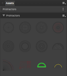
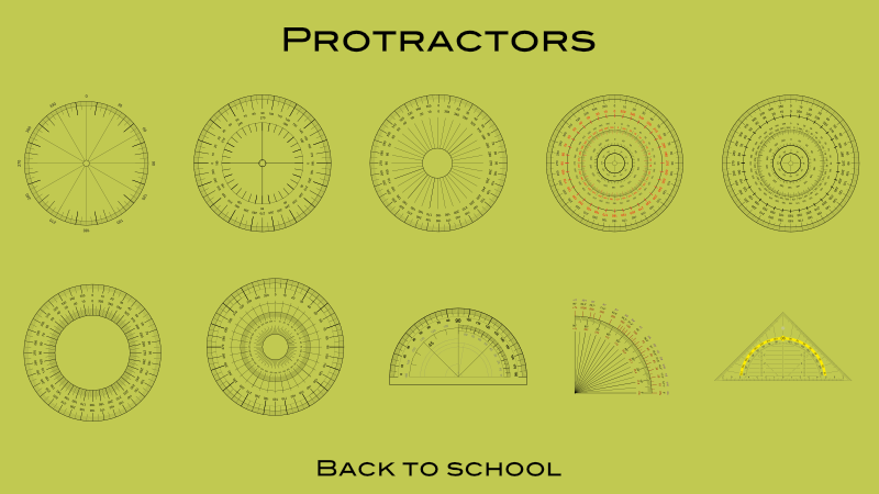
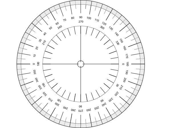
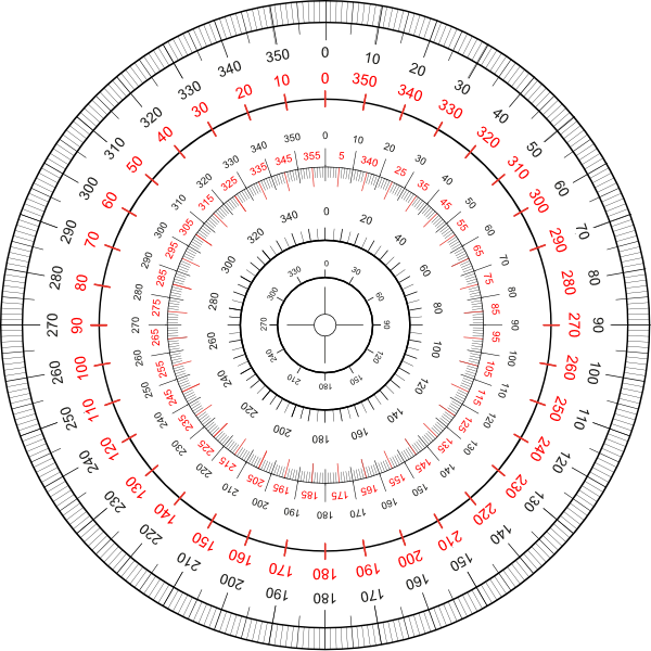
Let's go back to school, with some of those common and well known school protractors for measuring in degrees. ... etc. The protractor assets shared here ... ... are all vector based and do have printed on degree scales. You have to adapt/size the default assets protractor sizes to your document needs and thus scale them up/down so they nearly match your doc measurements. Note that all protractors are just a bunch of grouped/layered together vector parts (curves and text) thus they can be modified in colorings and the like. Also you should always move & size etc. a whole reused protractor group/layer when needed! Here is the associated assets file: protractors.afassets Have a nice school day!
- 3 replies
-
- 10
-
-
-
- vector
- protractors
- (and 4 more)
-
The 'Erase' blend mode in the appearance pane does not work on fill and stroke. When setting Erase in the Layers pane everything works as expected (the whole object including the stroke erases the objects behind). This is not true for Appearance. If setting the blend mode for stroke or fill to Erase it just makes the stroke or fill invisible. However, the other modes in Appearance seem to work. For me this would be very helpful if it worked correctly. For example when combining to cliparts, which technically overlap, but visually should not and one is cut out around the other with a distance. Now I have to set a stroke, expand it, subtract the expanded stroke from the object, etc...


.png.0493b51bb4b0cbd229c375e9d77fb772.png)