Search the Community
Showing results for tags 'affinity designer v2 for ipad'.
Found 4 results
-
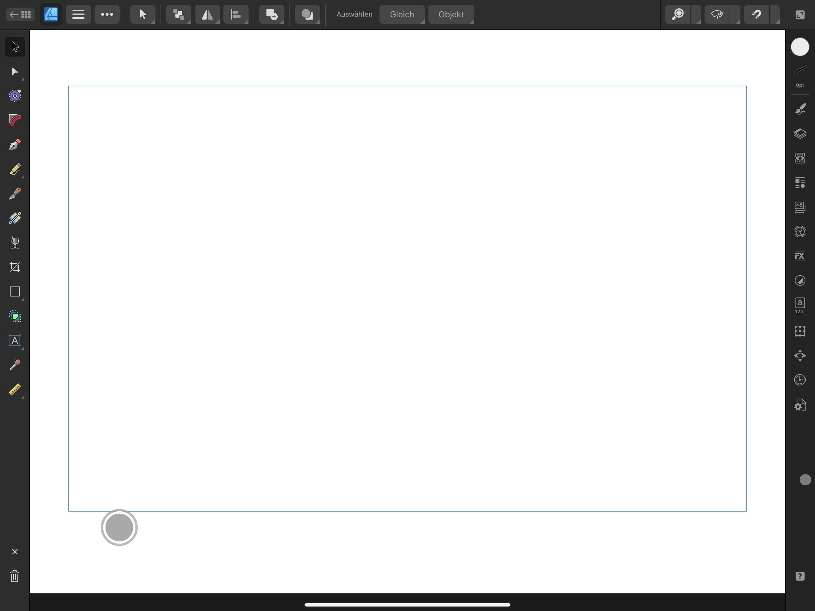
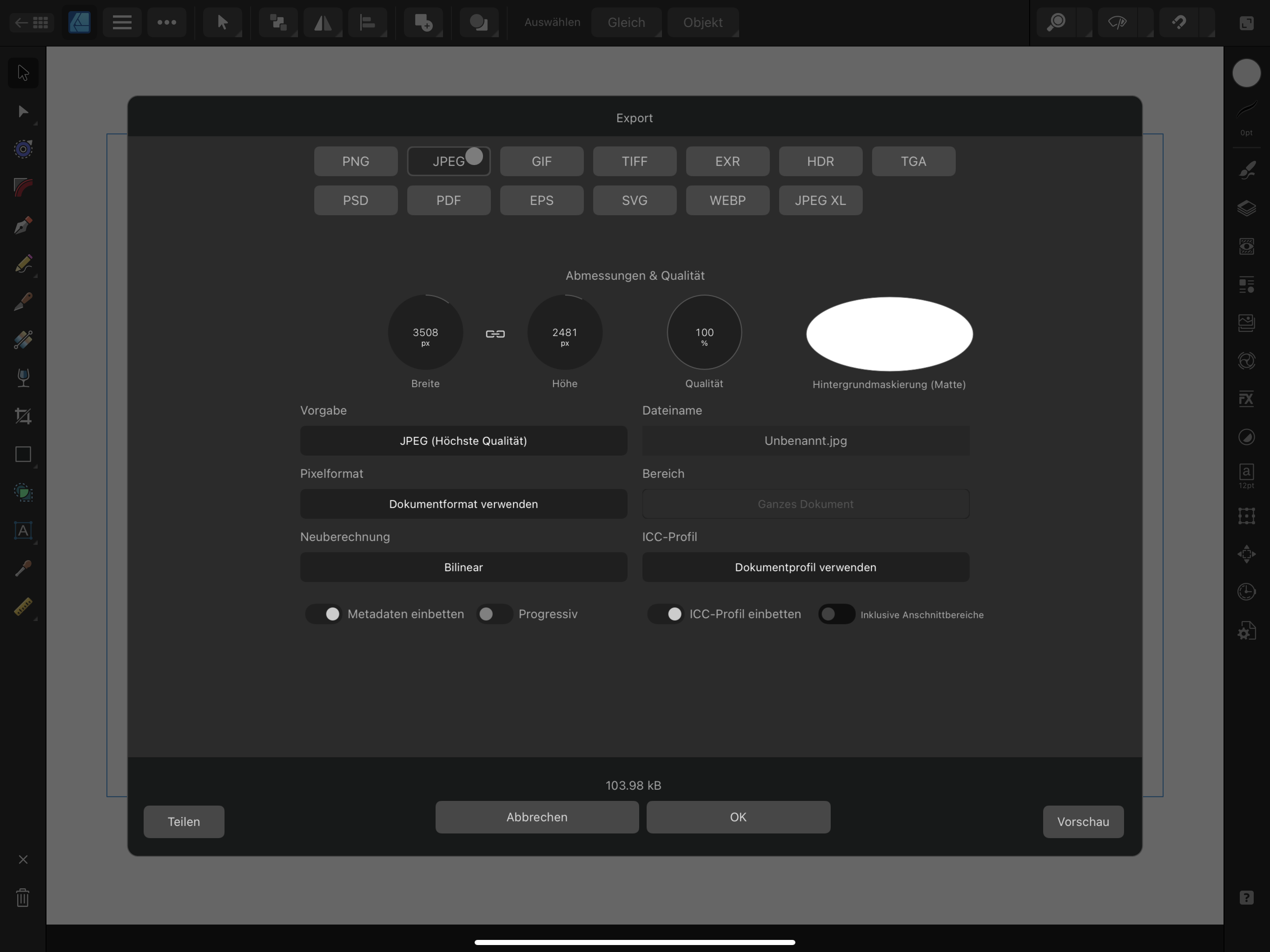
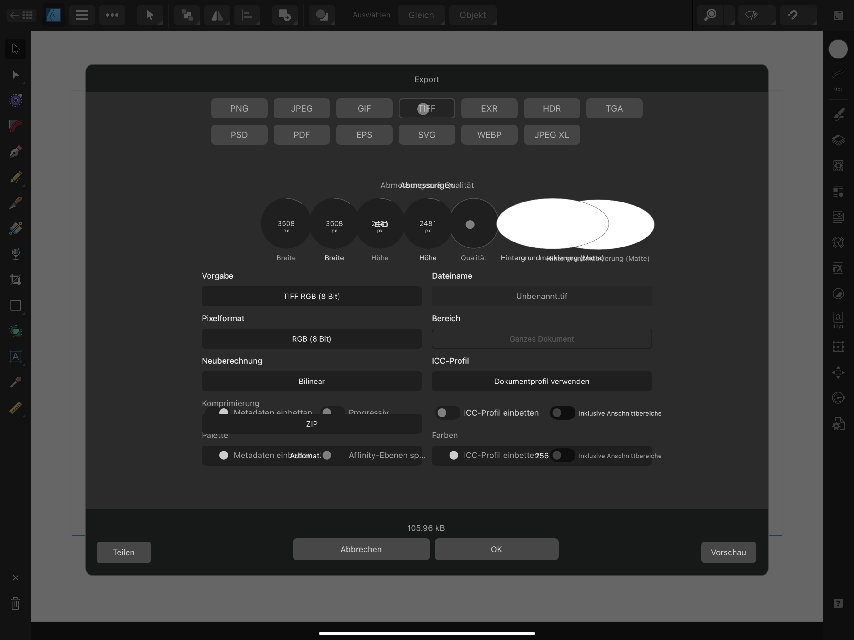
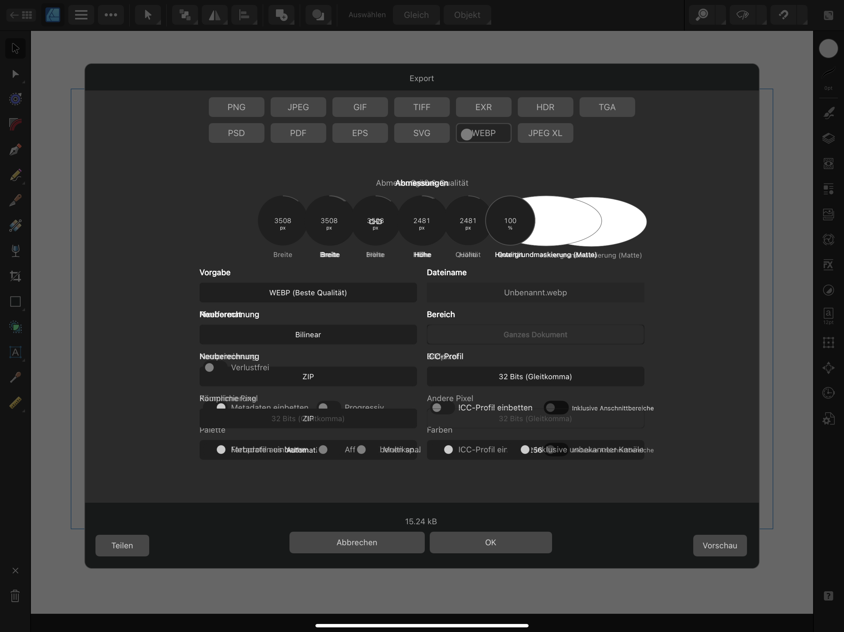
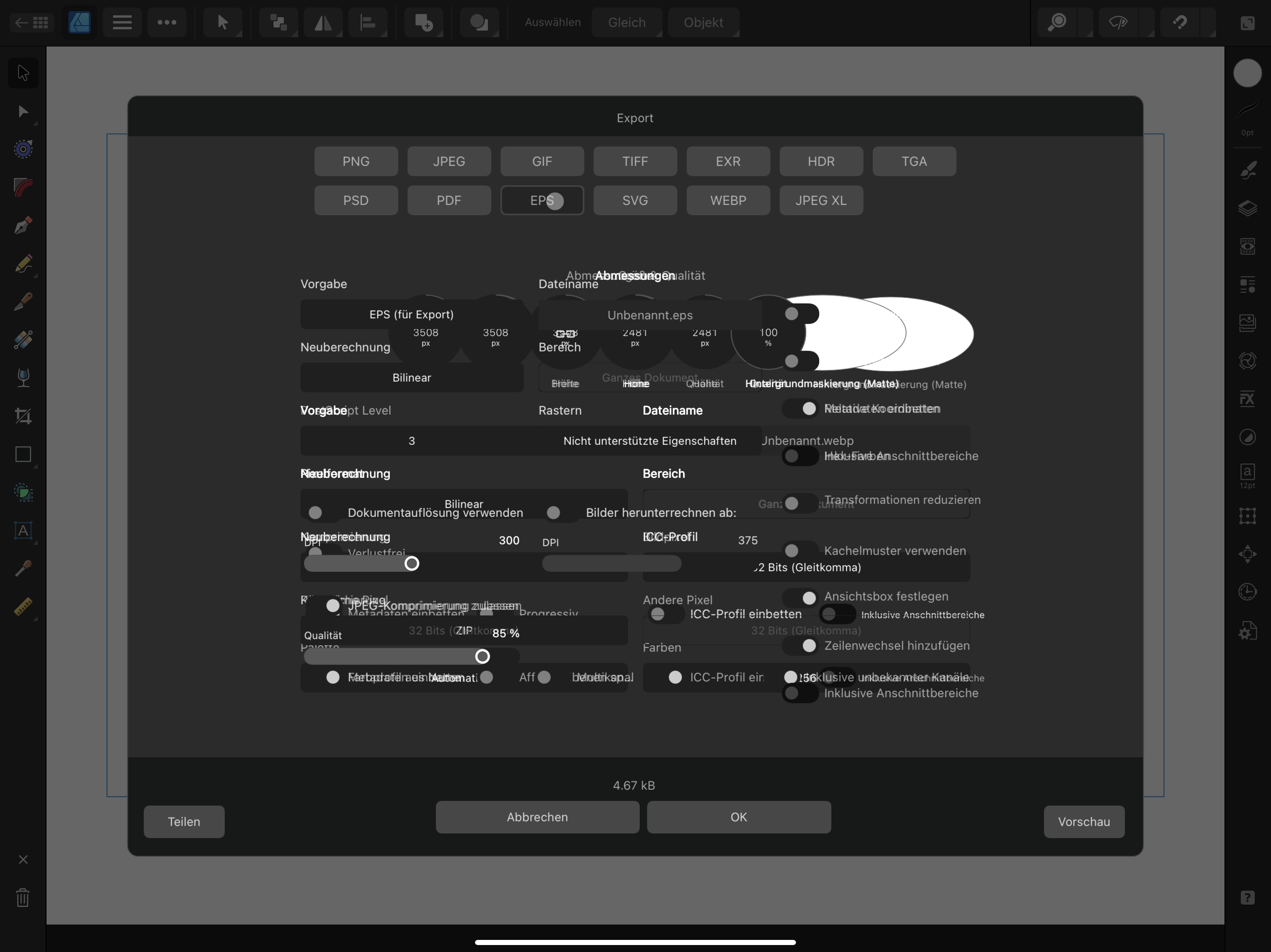
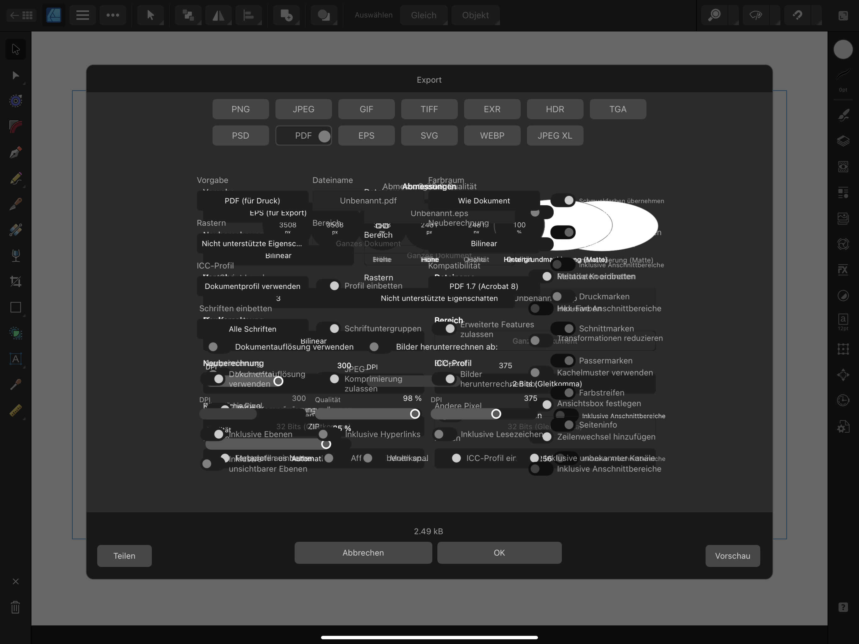
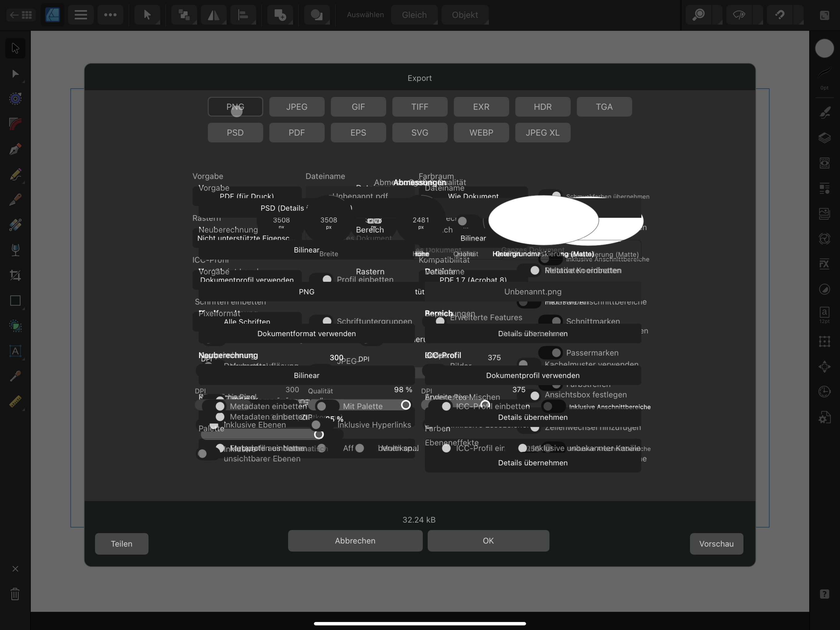
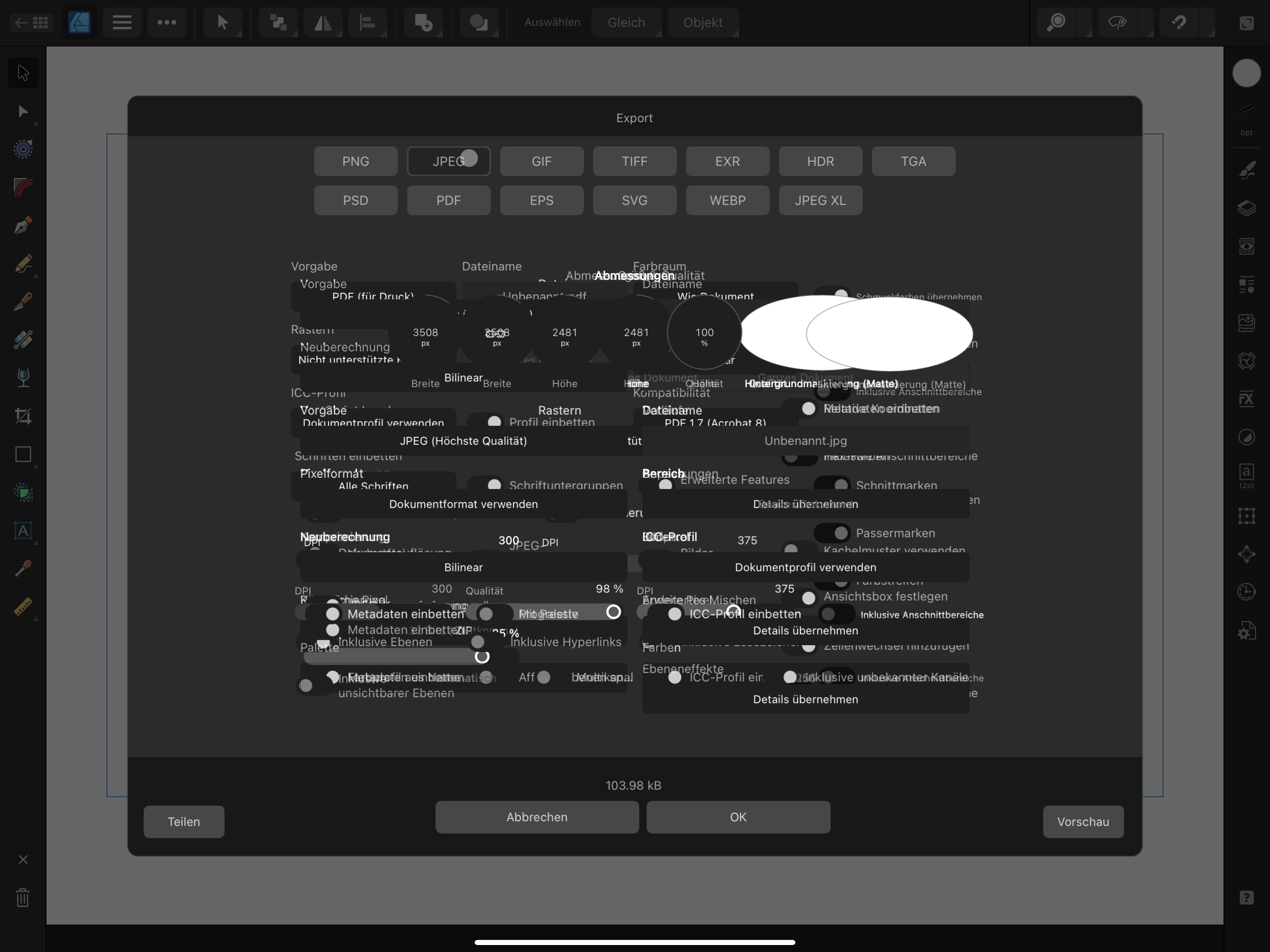
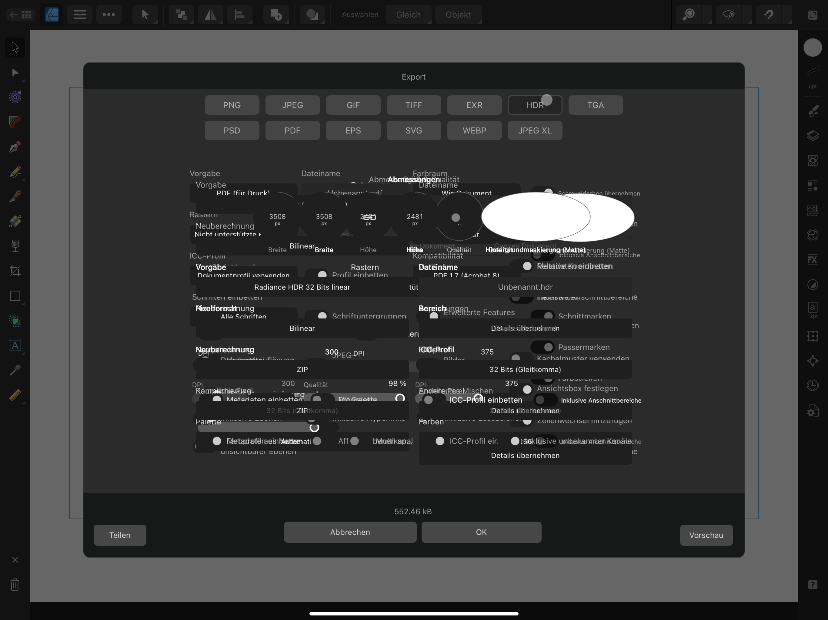
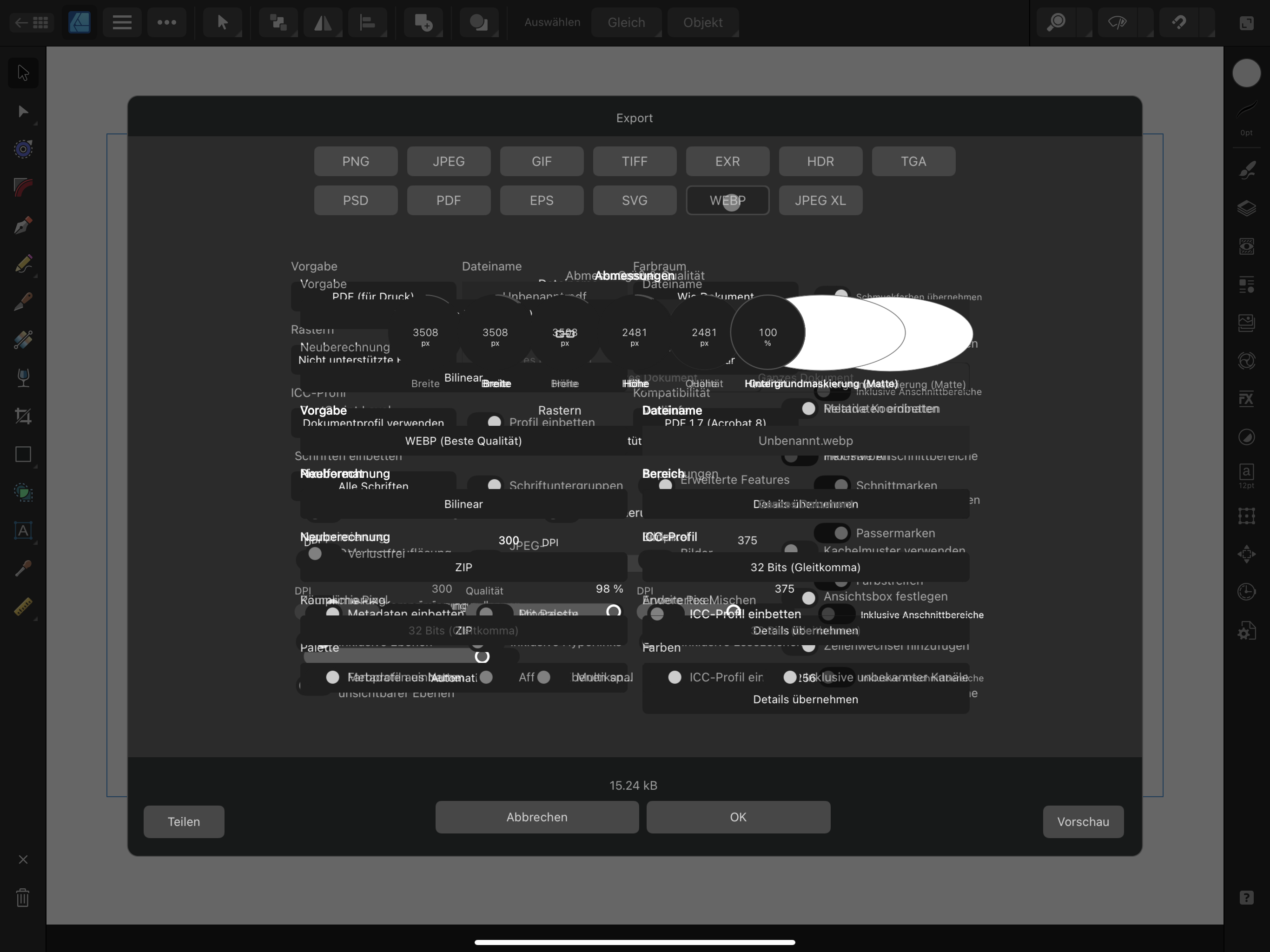
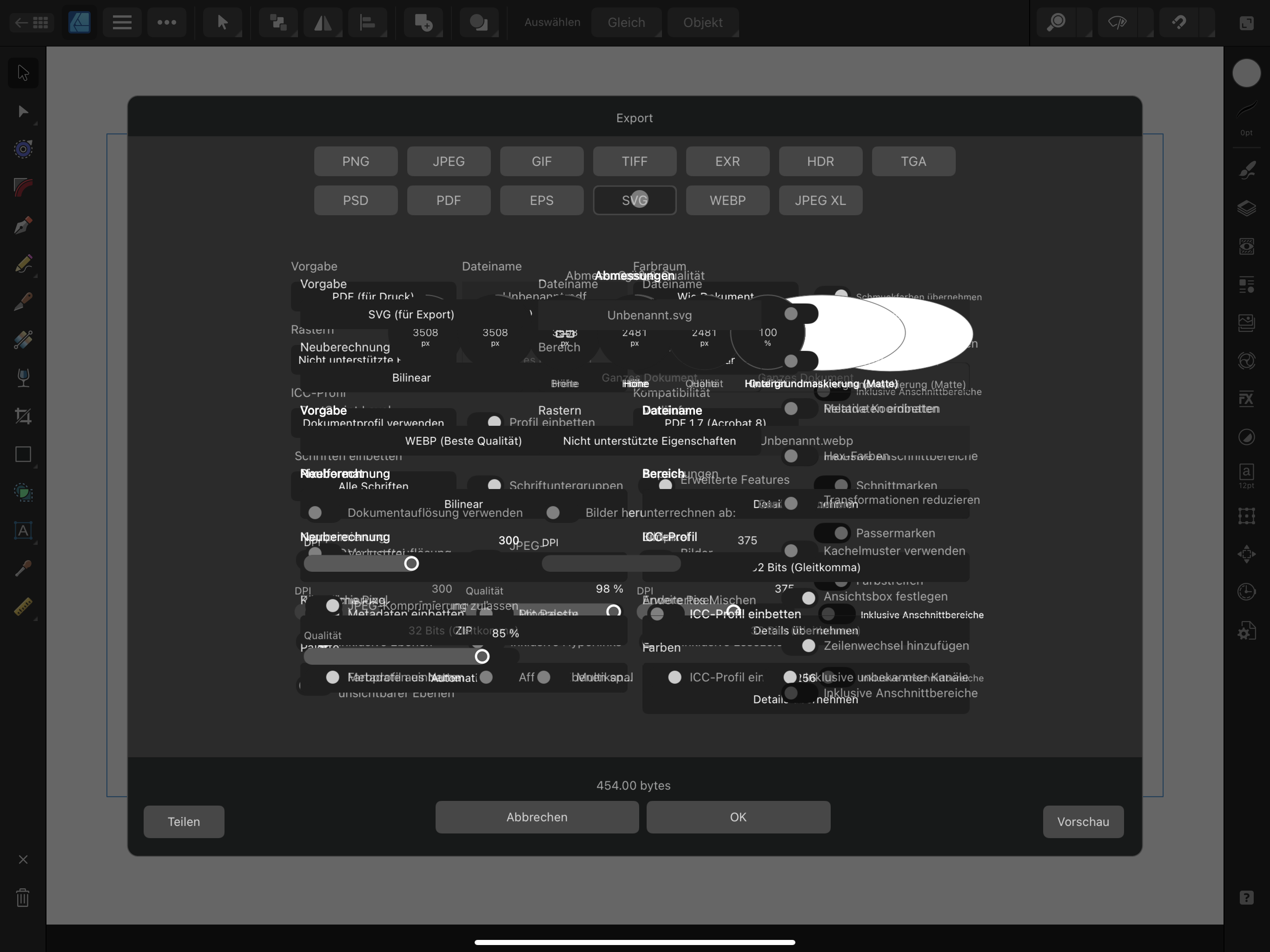
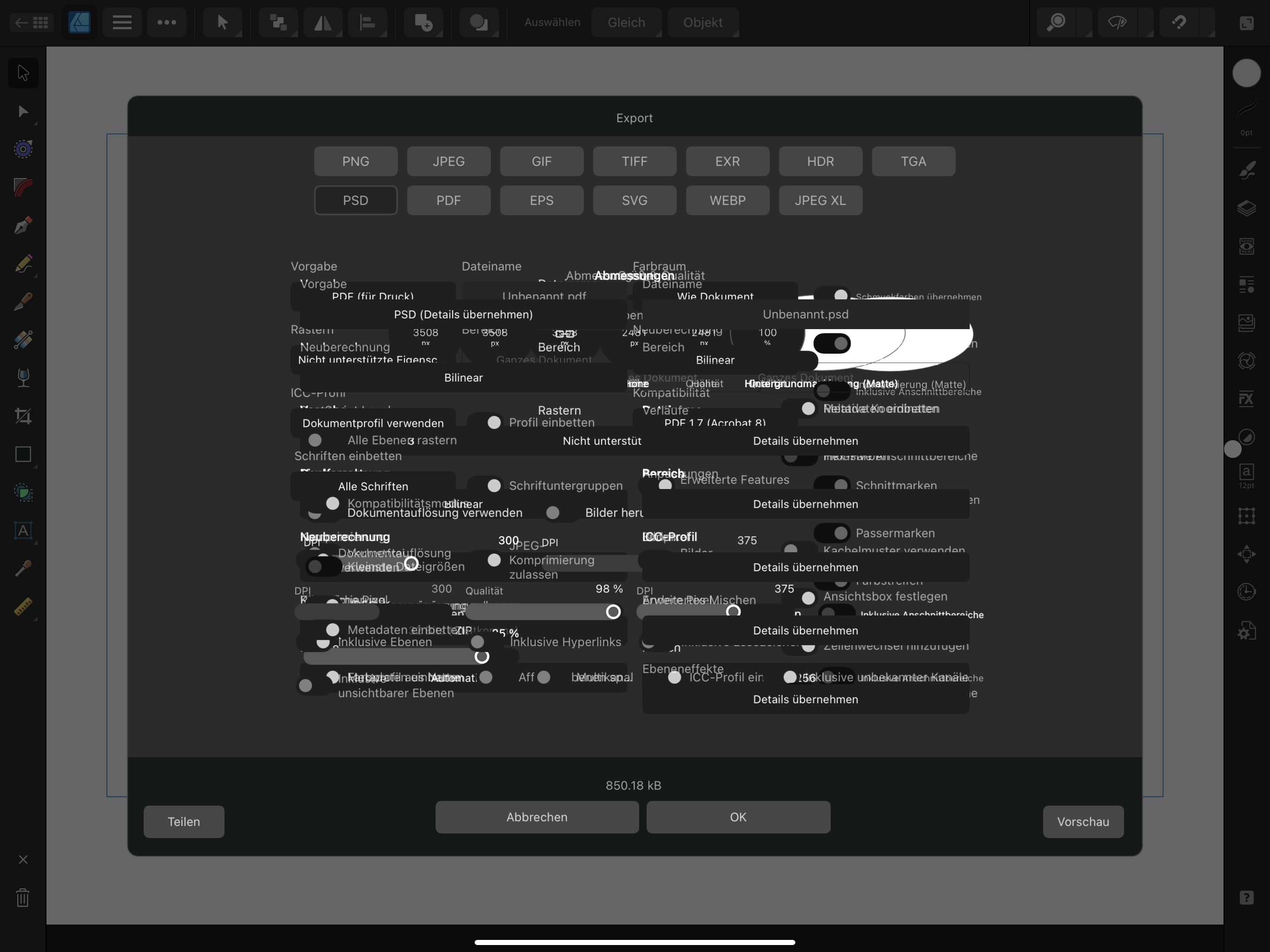
 Hi there, having a bug in the export UI. Please look at the screenshots in the attachements. The UI is messed up and visually destroyed when exporting a new, blank file or any edited file. I updated the newest iPad OS Version 16.3 and the newest App Version: 2.0.4.5 (after the Export UI fix). Still there is a mess when skipping through only 2 file-format buttons (like PNG, JPEG) and also if I skip through all file-format buttons (like PNG, JPEG, GIF, TIFF, etc.). Every newly chosen file format menu, creates a new layer over the earlier menu. Please help me with this!! Have a nice day. Best, Gregor OS: newest iPad OS (16.3) App: Affinity Designer 2 (Version: 2.0.4.5)
-
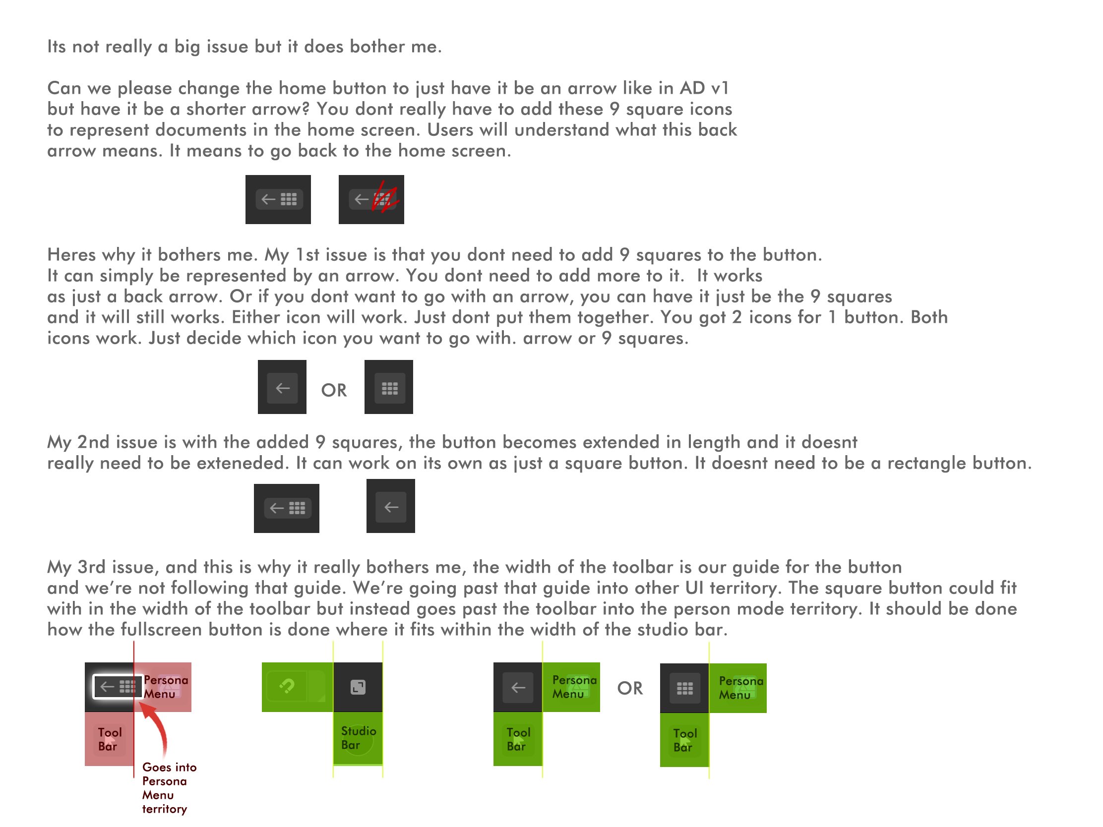
 Its not a big issue but can we fix the home button?
-
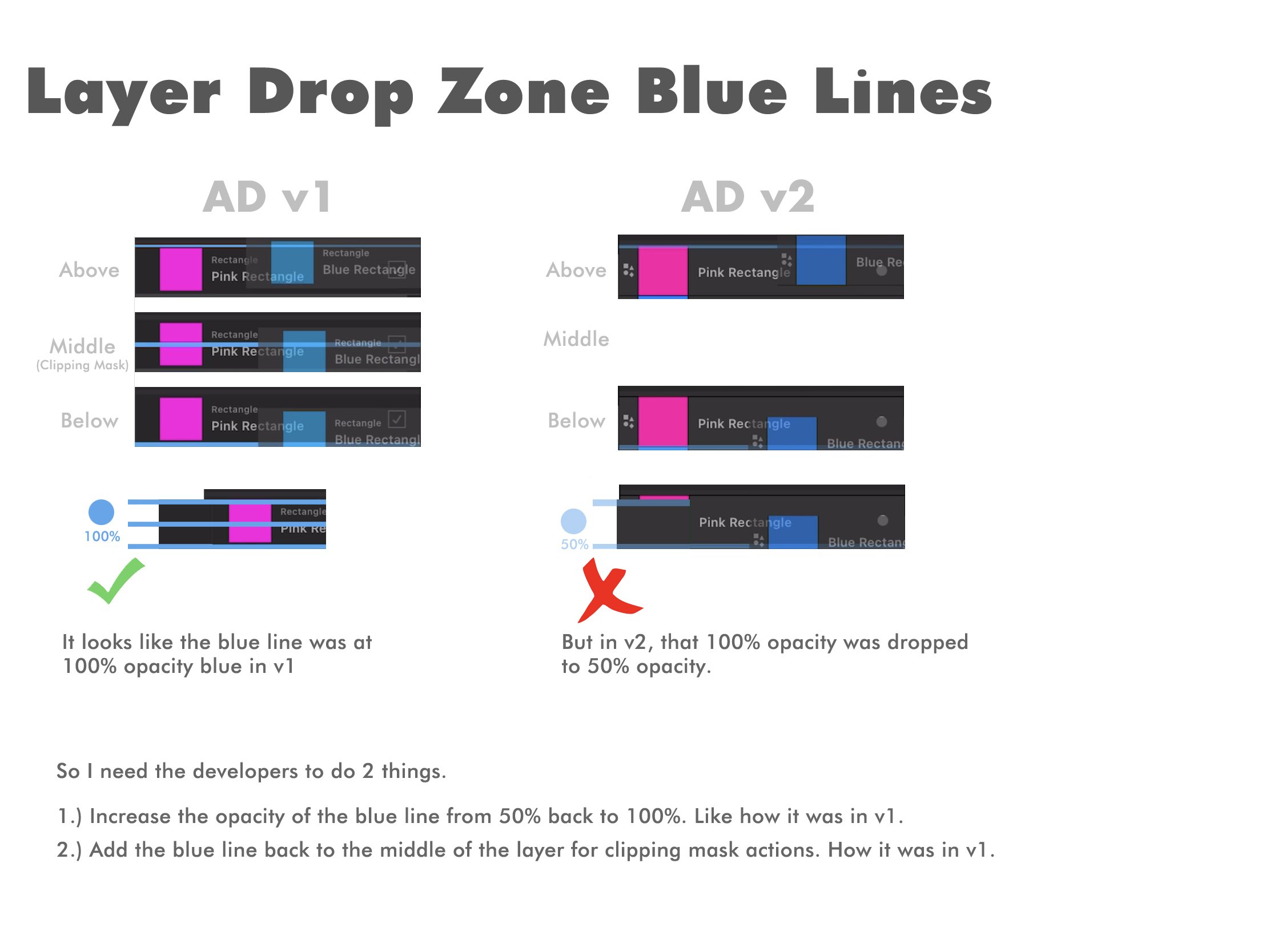
This was already mentioned here on the forums, but I wanted to post it again because I show you examples of the issue. In AD v1 for ipad, there were blue lines on your layers that showed up you when a layer was being moved above and below another layer or in the middle of a layer to show a clipping mask action. It was a thick blue line that was used as an indicator to show this above, below, middle layer movement. I loved it! It was easy to follow. Its a simple and easy concept to learn. A blue line above to show you moved the layer on top of another layer, below to show you moved the layer under that layer, and middle to show youre clipping something to that layer. Super easy. Now, in v2, that blue line has faded in opacity and theres no longer a middle line to show a clipping mask was made. The blue line has faded in opacity so now its hard to tell. Its hard to tell if you moved your layer above or below a layer. The middle blue line is also gone. I think now the clipping mask is a blue line at the bottom of the layer but moved slightly to the right. Its just......sigh😔. It was easier in v1. It didnt need fixing. I dont know why it changed here. I think it was changed to match the desktop version. The way it was in v1 was the best. Truthfully, it was the main reason why I used AD for ipad instead of desktop because that middle blue line to show a clipping mask action was such a good indicator for a clipping mask. I hate the way it is on desktop. I hate it. i dont know why its even like that. Why is this above, middle, below, concept hard to grasp? Sigh. So I need it to go back to the way it was in v1 because this was never an issue. This thick blue line in the layer drop zones was awesome in v1. I need it back. Lowering this blue line's opacity and removing the middle drop zone for a clipping mask action is a mistake. It needs to go back to the way it was in v1. Increase the blue line opacity back to 100% and bring back the middle blue line drop zone for clipping masks. Please look at the image below for reference.
-
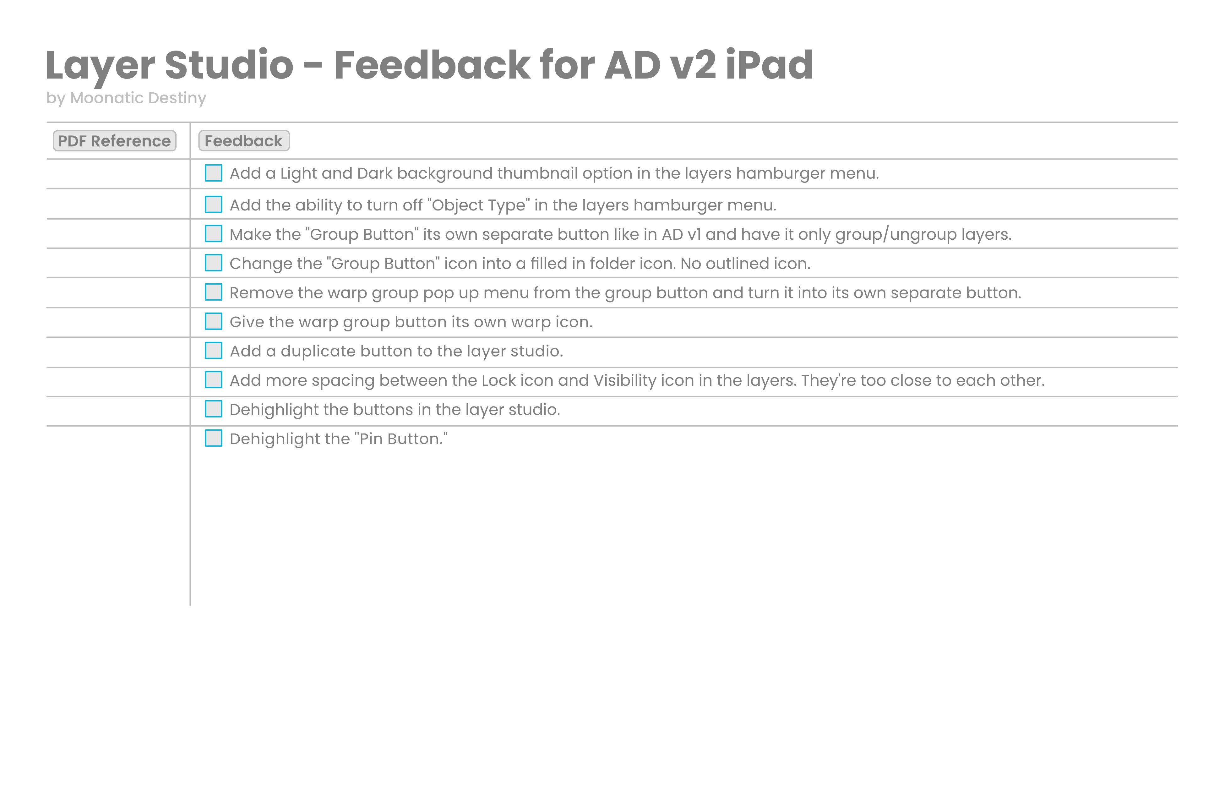
Im going to start a little roadmap/feedback list for the layer studio in AD v2 for ipad. I should have done this a long time ago for v1. I was just blurring it all out on here on the forums. I should have made a list of everything to keep everything organized and on track. Im only starting with the layer studio. Ill be adding more to it later.