Search the Community
Showing results for tags 'WIP'.
Found 9 results
-
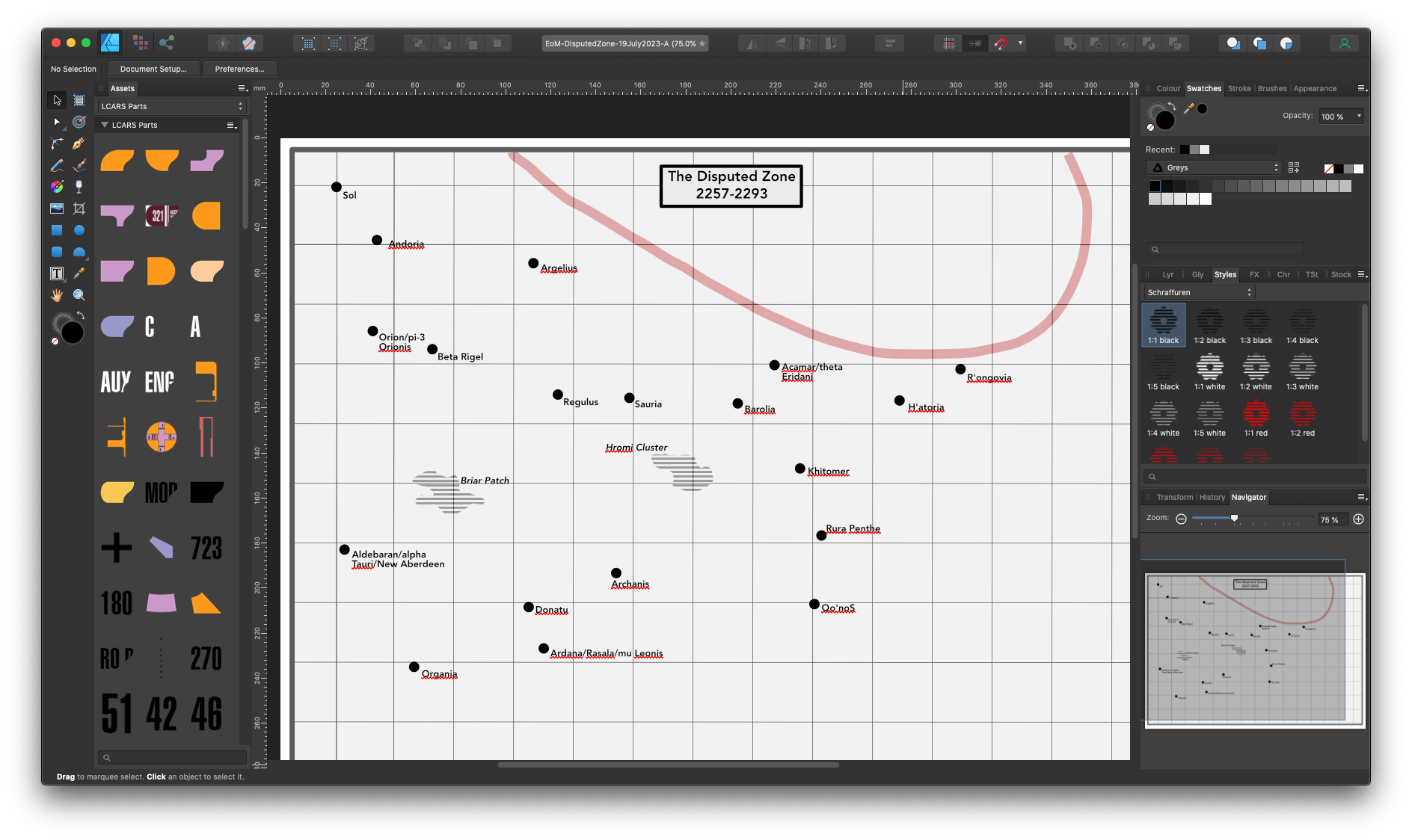
I'm working up a historical starmap for a fan fiction project, with data adapted from Star Trek, and stylistic cues from the old Dent's Canadian/School Atlas' front half material, which was usually produced in black and white with usage of tones and/or spot colours. This is intended to be ink-usage-friendly for other fans' purposes. I expect to creative derivative works devoted to marking systems particularly notable for "key" resources specific to that mythology, and possibly other spin-offs as well. I'm working in Affinity Designer 1.10.6 because that's as far as my hardware and budget will currently allow. I guess I'm looking for additional "tone"/"Style" resources that may be particularly useful for this project. If you have any recommendations...?

-
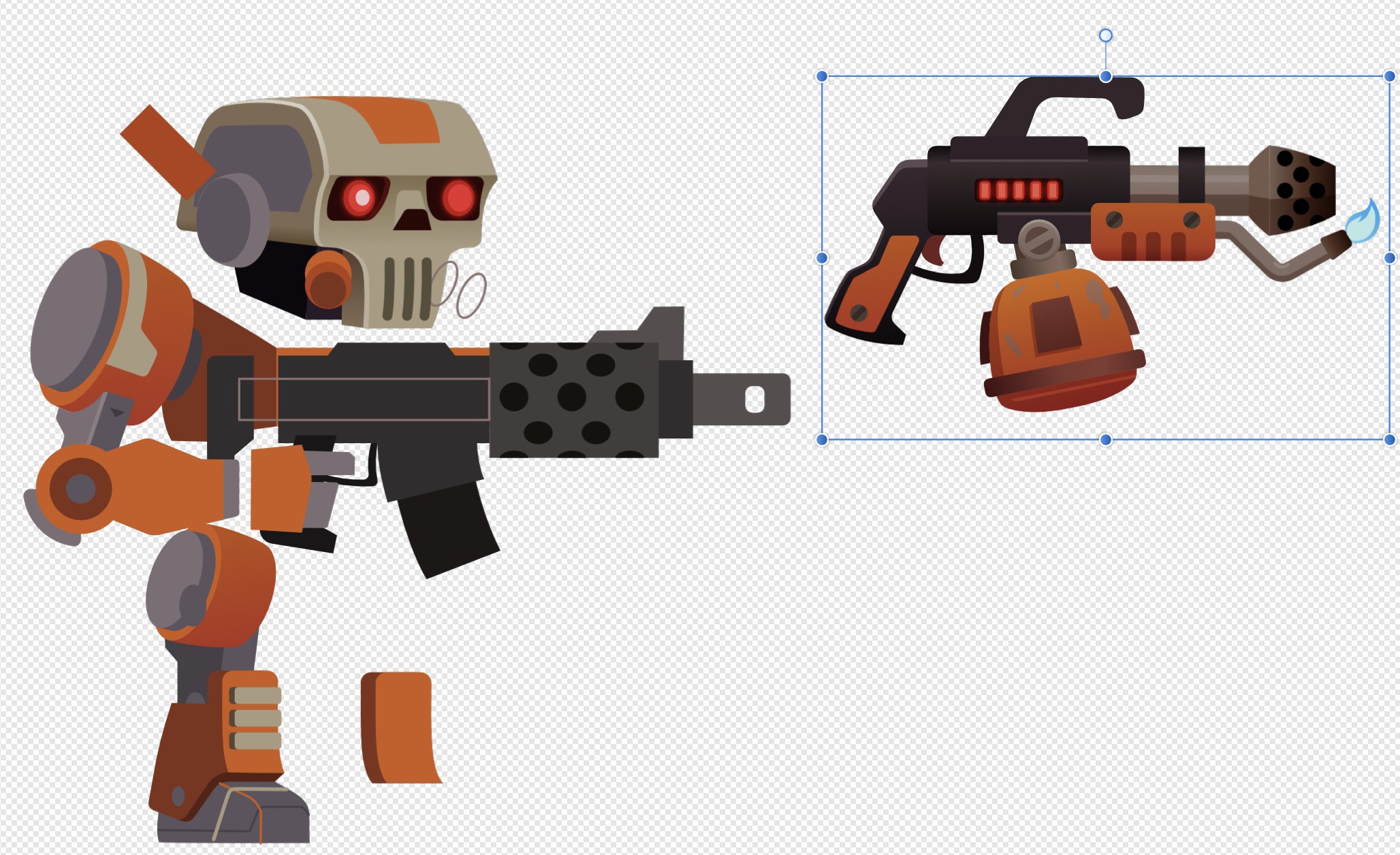
Getting up to speed with Designer on iOS. I’ll hopefully rig these two in Unity when they’re done - which is another thing I need to get up to speed on.
-
Hi all, I'm a French gamedev and now I will share my drawing workflow with Affinity Designer on youtube. If you like this kind of content, comment and like to help me stay focus on it :) Surf video
-
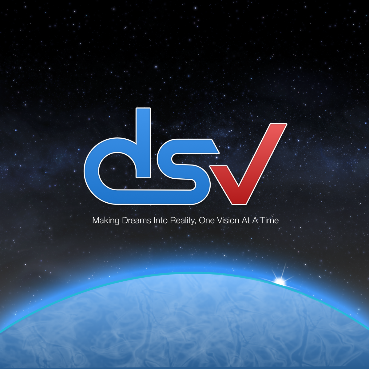
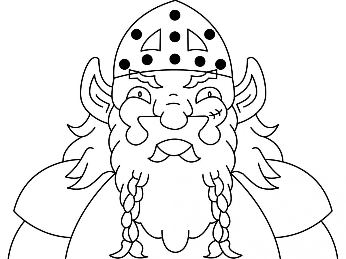
Here are a couple files I'm working on. One is a drawing of a dwarf I made some 20+ years ago and AD finally let me bring it digital in a satisfactory way. (Been trying for 11 years. 1 hour in AD and I finally had it. Take that Adobe!) The other is my company logo on a lock screen I'm working on. The planet atmosphere isn't where I want it and the space aurora is missing. Pure AD except the startled, which is a stock image. Making all those white circles in AD is an overwhelming notion to me.
-
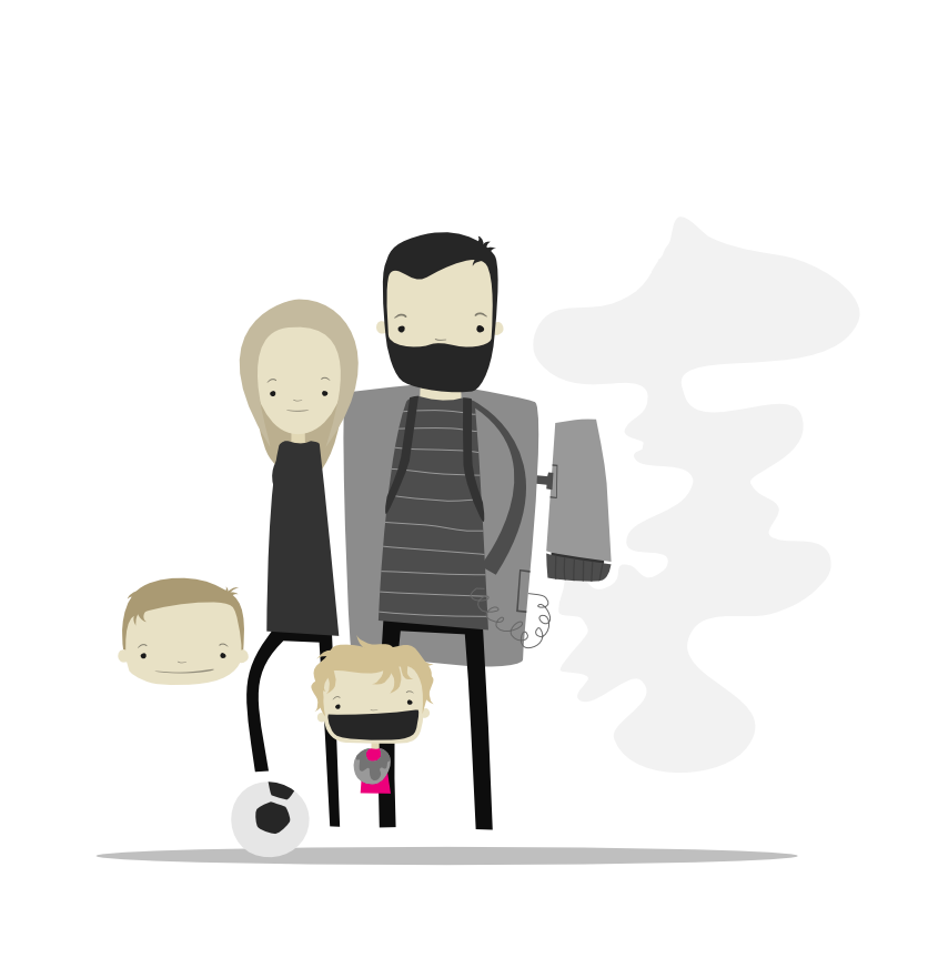
Hi everyone I've been visiting this forum for more than a year now, and thought it was about time to post something. I'm working on a poster of my small family that I intend to print if it turns out good. Still a long way to go, a lot of details I want to add and textures etc... I have never been good at posting the things I make, but thought it would be a good place to start here, since Affinity is the reason I started enjoying working with vectors again :) Thanks for watching. Michael
- 9 replies
-
- 9
-

-
- illustration
- character
- (and 1 more)
-
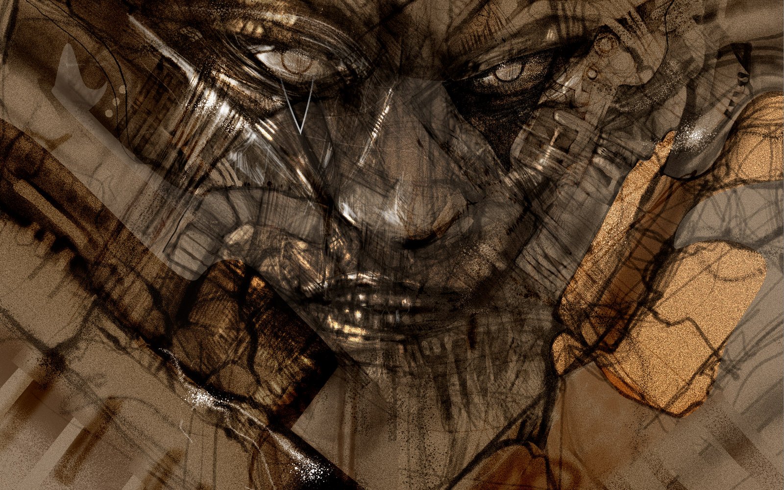
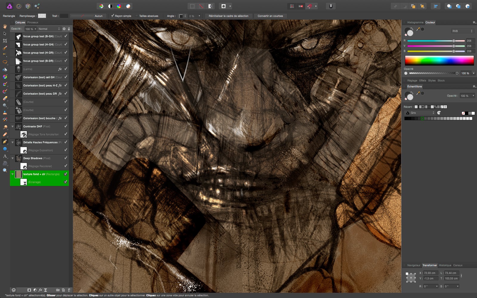
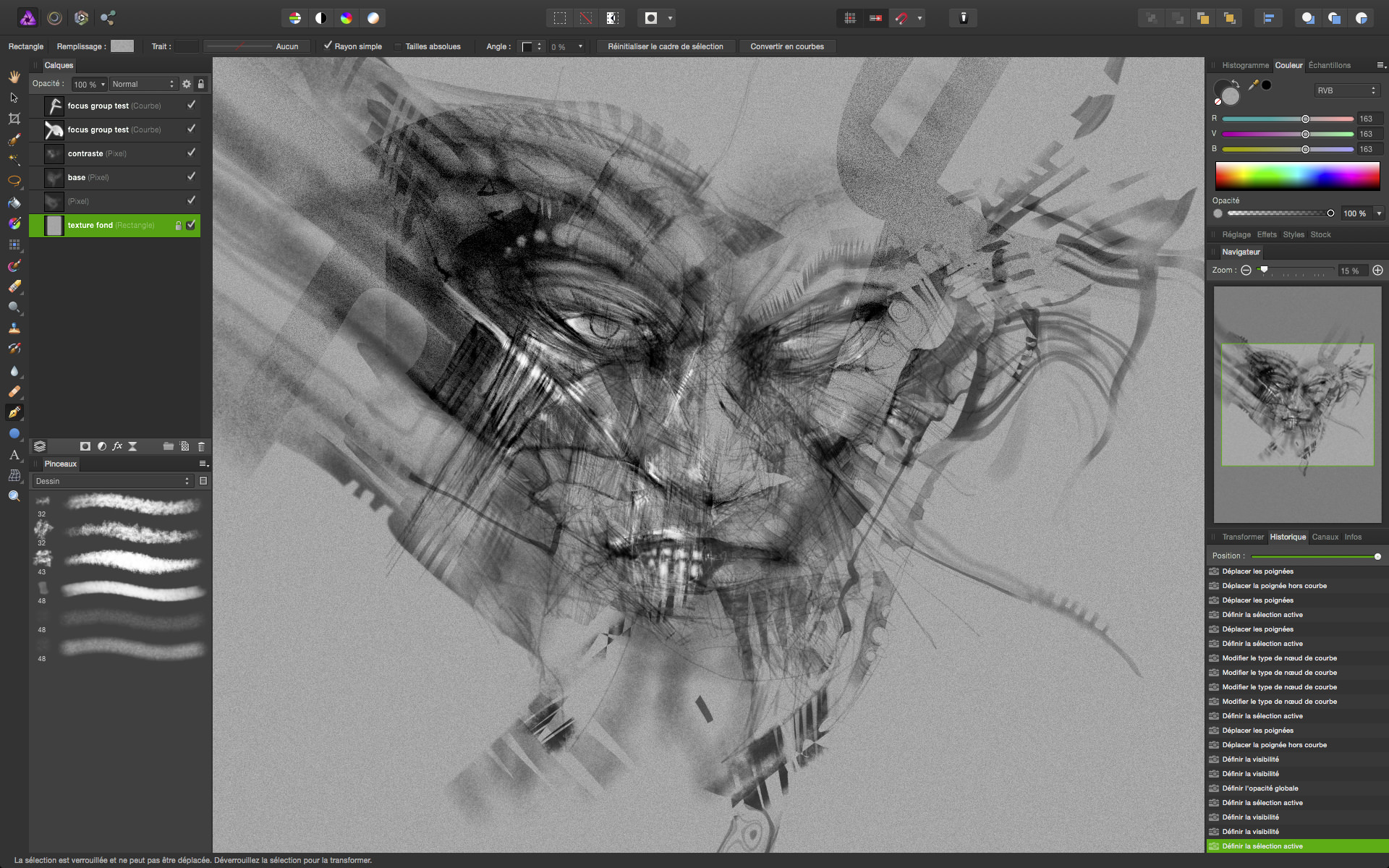
 Bonjour à tous, Hello everyone, 1st post ever on the Affinity forum. I just wanted to share my first Affinity Photo drawing and work in progress with all of you and a little review that will be posted for the months to come. So, let see the drawing wip first : Plus a nice layer workflow screenshot in detail : Here is the recorded time laps from yesterday : Last but not least, here is a kind of teaser for the french users/readers around that launches my deep investigations on Affinity Photo. I hope you'll like it. Affinity Photo, la "killer app" pour photographes "next-gen" ? (Affinity Photo, the "killer app" for "next-gen" photographers?) That's all for today :) richarre P.S. : the early sketches looked like this : and this
-
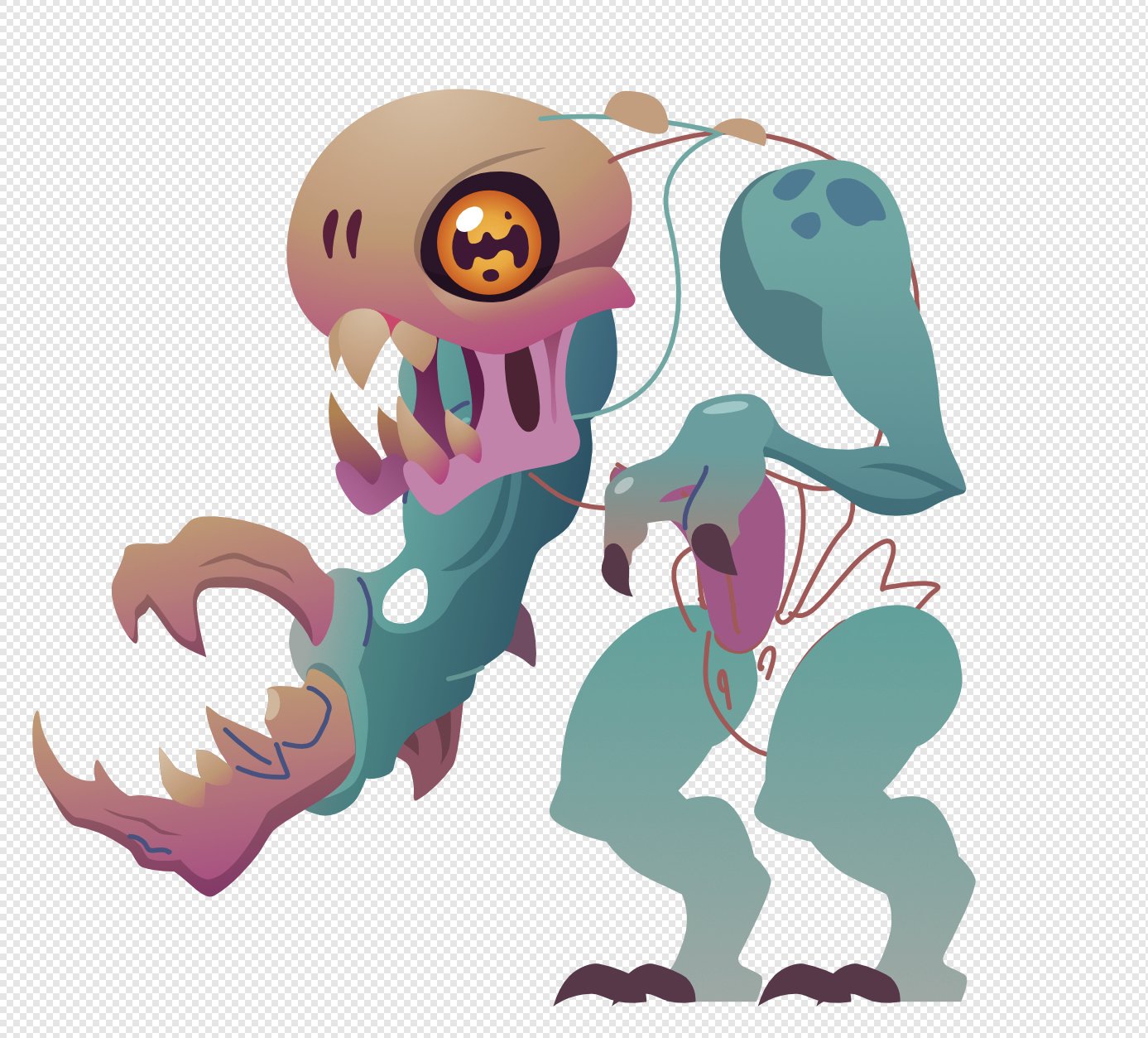
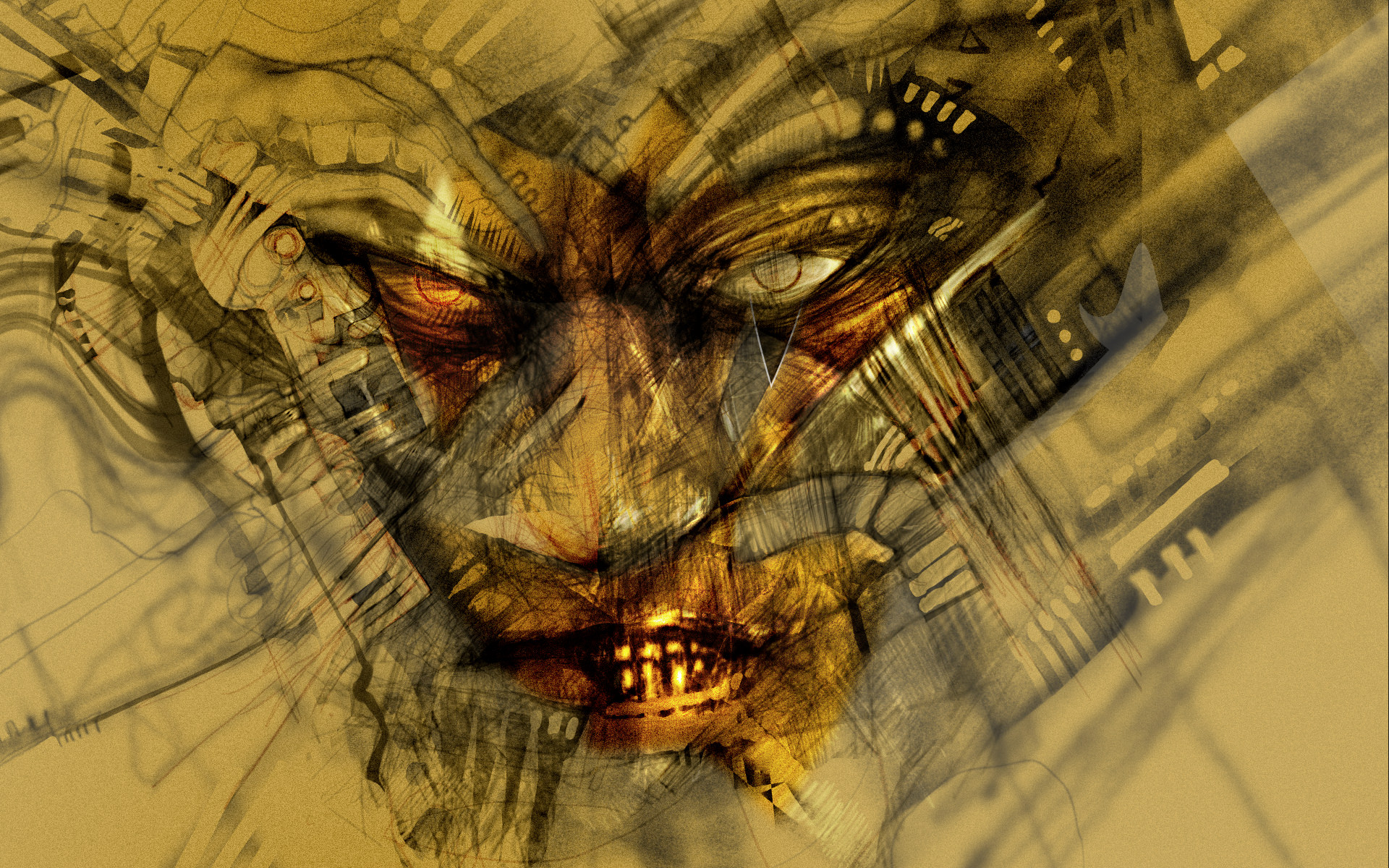
This is a work in Progress. I not sure where I want to go with this or if I want to move further with it. The idea was to have him flight through a cloud. I kind of want it to be some what abstract. Thought any comments or ideas are welcome.
- 22 replies
-
- 3
-
-
- illustration
- wip
- (and 3 more)
-
I'm trying to use AD together with FontForge to create a font. Didn't find any free ones that suited the app I'm creating so might as well create one myself - added benefit of infinite font weights with font interpolation. Inspired by FF DIN and the like. I've only created the numbers in weights 400, 350...100 so far. All the numbers have equal widths since I'm using it for a timing interface so I haven't done any kerning. Suggestions etc. are more than welcome. Black weight sketch
-
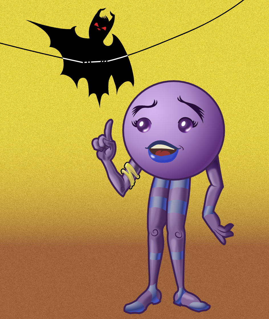
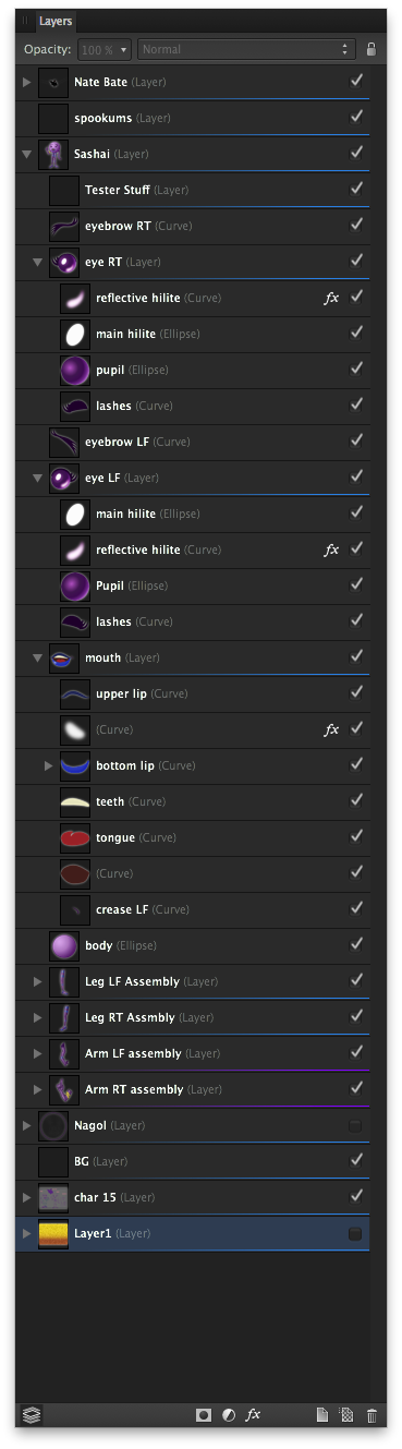
Hi all! Thought I'd share a work in progress. This is one character sheet for a possible webcomic, Glorious Junk. The purple character is Sashai and the bat is still looking for a good name (suggestions welcomed!). Basically this was a test to get a good feel for using Affinity Designer. As far as testing goes, I'd call it a major win. The best thing that I finally got was that Layers are storage for curves and objects. The Layer_org.png is a screen cap of Sashai's layer structure. I made extensive use of the masking abilities that curve objects offer: the legs, arms and head all use them. All shading (except for the gold yellow arm band) is from closed filled curves with gaussian blur FX and I used the Transparency Tool a lot (way cool tool, btw). I'm not too happy with the shading on the arm with the gold band, but that's why this is a WIP. :) For the interior curves (the detail on the hands and the spirals for the knees and elbow were done by just making a curve and then selecting the curve with the Node tool and adjusting the pressure profile. It took a bit of playing around with to get a good handle on how best to use it, but once learned -- it's a really wonderful feature to add some life to curves. When the pressure sensitivity of tablets are working better (in the next beta for AD if what I've read is correct), then it should be just awesome to use in order to really fine-tune line thickness. The Move and Node tools are better than any other equivalent tool in other vector apps. Only minor gripe, is that when a node is smooth the indicator changes from a square (for corner node) to a circle. The fill color for the indicator is the color for the layer (right click on the layer's name and in the contextual menu is where layer colors can be selected). In some instances when there's a lot of nodes, the I clicked on the "wing" of the node and accidentally created a new node when I thought I was clicking on a node. If the node "wings" (the actual name escapes me at the moment) indicators could be filled with a lighter tint of the layer color it would be easier to see which is which. I like how when clicking on the handles, when the handle indicator turns red, it's aligned with the opposite handle and if I let go of the cursor then, the node is now a smooth one, if I continue moving it remains a corner node. Absolutely brilliant usability feature that took no time at all to appreciate and take advantage of! One thing that has stopped me from doing a lot of art in vector apps was the struggle between what I wanted to do and what the interface allowed me to do. In Affinity Designer it's like the interface makes it easier and quicker to do the art I want to do, in the way I want to do it. Sure there's this and that thing I wish AD could do, but for a first release version, it's the most stable (have yet to crash on me!) and easy to figure out app I've had the pleasure to use. To go all Spinal Tap, I'd give this app 6 out of 5 stars!
- 12 replies
-
- 3
-
-
- cartoon
- character design
- (and 1 more)