Search the Community
Showing results for tags 'User Interface'.
-
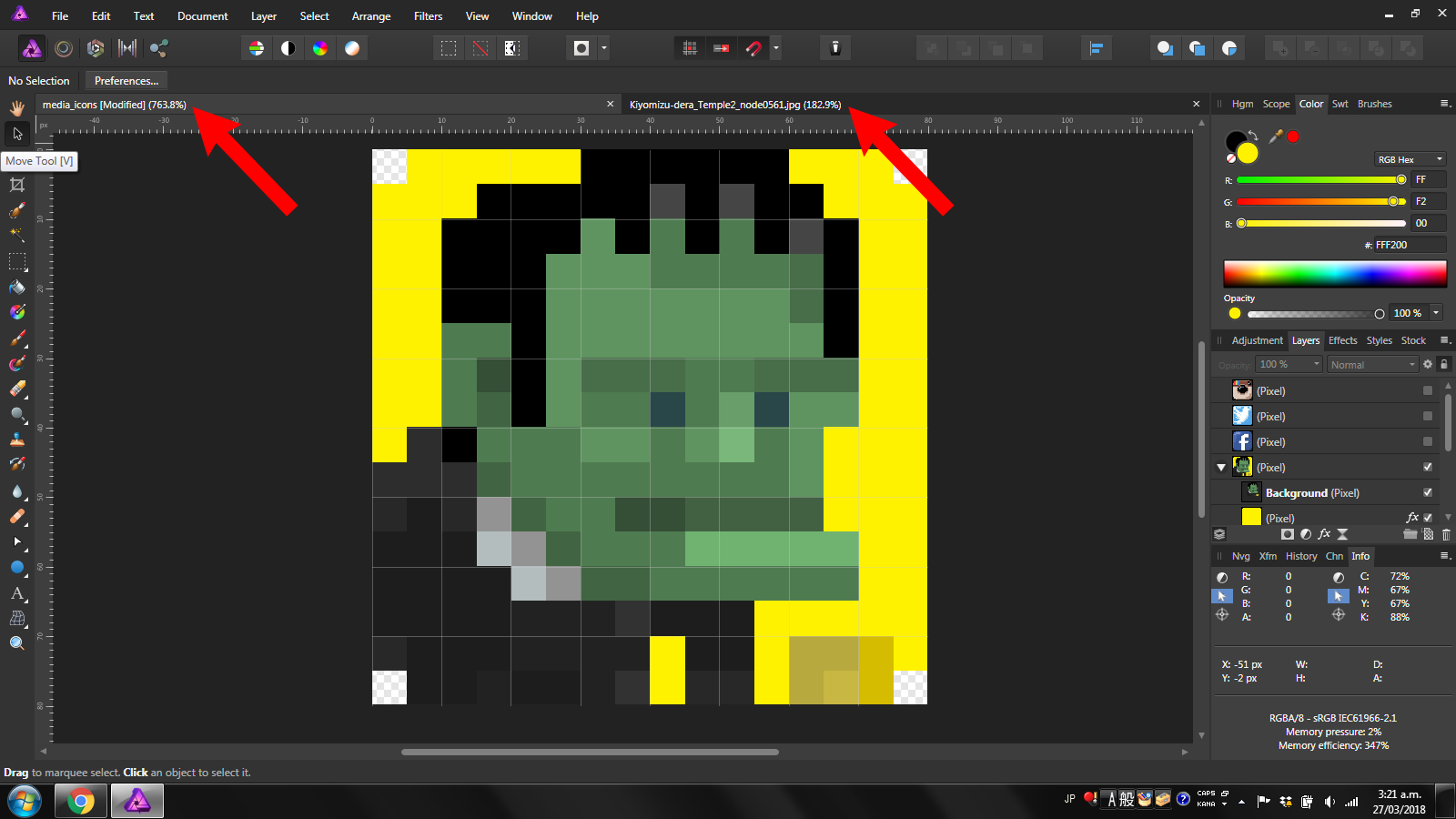
 Please help!! How can I see how big my images are without extra clicks? Take a look at the following image: For the life of me, I can't find anywhere that shows the image dimensions except for if I'm using the view tool or if I'm resizing the thing. I mean, isn't that a thousand times more important than knowing how much the image is zoomed in? Hopefully I'm just missing something blatantly obvious because its really late. I put giant red arrows to point where I would like to see them, but then I guess I should be posting that in the suggestions bit. P.S. Any help is super appreciated.
-
 I've noticed that both in the video tutorials and in the Affinity Photo Workbook, that when a layer is selected in the layers panel, it is highlighted in blue. In my version of Affinity Photo (1.6.6), the selected layers are highlighted in a brownish/gold color. Is this highlight color something that can be changed? Should I be concerned or not worry about this difference. I'm still learning Affinity Photo. Thanks! Ed
 -
 Recently I have not been able to see the document that I am working on or any of the following at the same time: * Toolbar * Tools * Context Toolbar *Studio I can tab to toggle the UI on and off. When UI is off and I can see the document if I use the View menu to see any of the above then the document disappears from view. I have tried resetting all the default but this does not solve the problem. I have the same problem with the beta version. I am running Windows 10.and experienced other problems (with restarting) after Windows updates were installed on 12-13 September; the latest Windows update has fixed this.. This may be a coincidence but AP worked fine before (I am not sure of the exact date but certainly after 1 September). After the Windows updates I did not try AP until a couple of days ago. Have I accidentally changed something? Has anyone else ever had the same problem? Update 30/09/2017 I have found the cause of the problem as the settings for AMD Radeon™ R5 Graphics card. The drivers for this card were updated with the Windows updates and the new driver appears to have either caused the problem or changed the settings. The setting for the Affinity Photo now default to "Unassigned". If I change these to "Power Saving" the problem disappears when I restart AP but reappear if I select any other setting.
 -
Affinity Photo version 1.5.2 1. Auto select existing parameter to speed up data entry When the user clicks on the value box to enter a parameter value, the cursor is place at the position of the mouse click. It usually requires the user to select the entire contents and type over or backspace to clear the existing value. Data entry would be faster if AP auto select the entire value string when the user first click on the value box and the user just needs to enter a value over it. 2. Tone Mapping Persona - Collapsible Preset Area The tone mapping preset area is displayed permanently which occupied precious screen real estate especially if you are working a small monitor (eg. laptop). The preset is useful to get a starting point to work on, thereafter, most of the adjustments are carried out on the "studio" panel on the right. A collapsible preset area would give the user a bigger space to work on the image. 3. Default UI color Dark gray on even darker gray is hard to distinguish. This is especially true for the dynamic toolbar that shows the various mode for each tool the user is working on. For example, in the Pen tool, it is hard to distinguish at a glance which mode (pen mode, smart mode, polygon mode, ...) the pen is currently in. 4. Crop tool. Provide a modifier key to change the cursor from selection to move (vice versa) When the user first select the crop tool, the cursor is default to selection point even though the crop frame is displayed. The user can click on the edge handles to reside the crop frame or directly draw the crop frame using the selection point. If the user first change the the crop ratio, the selection point remains even though the crop frame is already displayed. There is no way to move the existing crop frame other than to draw a new one. It would be better to have a modifier key to toggle between selection cursor or move cursor. 5. HSL dialog. Ability to display all the colours instead of using a drop down In the HSL, it would be nice to display the colour swatch for the user to select instead of using a slower drop down menu. This way, the user can quickly and intuitively select the colours to adjust. 6. Photo / Developer Personas. Adjusting saturation & vibrance. In the Photo Persona, colour saturation is adjusted on the HSL adjustment whereas vibrance has a separate adjustment. In the Developer Persona, saturation and vibrance are grouped together. Would it be possible to standardise these adjustment in the two personas? 7. Blend mode I am a novice in using the blend mode and I find it hard to visualise the result. I'm wondering if an assistant and/or some presets would be useful to help users in utilising this feature.
-
Hi, I feel there's one little big detail missing from Affinity Photo: it would be great to have a progress indicator when opening a documents. Sometimes it happens to load very large documents and it's just saying "Loading 1 document" without any progress indicator. It looks like to program is stuck and doing nothing: it would be nice to have a percetage indicator or a progress bar. Thanks a lot ! F.
-
 First, I have to say I really like this program. I have Photoshop and Pixelmator but try to use AP as much as possible. And it's that potential which makes my comment more frustrating. I don't know what it is, but there is something about AP which doesn't make sense. I have used graphics programs for 30 years so I generally know what I'm doing, but I constantly find myself "trapped" by AP. Things happen for no apparent reason. For example, today I extended the canvas size and saw the extra transparent area appear, but there was nothing I could do with it. None of the tools worked. Then I tried to copy pixels from the background later. I couldn't. Why not? In the end I had to do a screen grab to the clipboard, paste to a new layer, then merge the layers! Huh? It could very well be my ignorance, but I thought what I tried to do made sense. There's something unintuitive about this program some times. Just sayin'... Maybe concentrate on making the UI more intuitive next upgrade?
 -
 The black and nearly black backgrounds of Affinity Photo windows, toolbars and palettes entirely distract me and I'm sure Serif knows that reading white type reversed out of black background is a strain. How do I change the UI preferences to display white or light backgrounds?
 -
 I have recently installed the trial version for Affinity and was trying to understand the basics of the program. When I launch the program and open any photograph, histogram is not shown on the right side. I am also unable to see the Filters menu on the top. Even simple tools like sharpening are not visible to me. Can anyone guide me in this interface with these three things - How do I see the histogram on the right side? Where is the filters menu? How do I start the sharpening tool? I am also attaching a screenshot of the freshly installed program on Windows 7 professional.
-
 Ok Serif / Affinity guys... This is driving me crazy! Previously I have submitted this suggestion, though I don't believe I was heard. IMO Affinity products desperately need the ability to auto-hide panels. See [https://forum.affinity.serif.com/index.php?/topic/31218-multi-uiux-suggestion-auto-hide-panels/] I am using a very large notebook computer with a 17" screen. Large screen for a notebook, though smaller screen size for graphic design work. With this monitor using the panel controls in Affinity products is frustrating. There simply isn't enough room! I group panels needing more vertical space (layers, effects, history, brushes, etc.) together. Panels needing less vertical space are also grouped. Regardless how it is organized I do not have enough vertical space to effectively use the panels. Some of the panels require large vertical space, some medium, some smaller. With 3 stacked sets of panels the larger panels are way too cramped. Even if I group the medium and smaller panels together (which puts way too many panels in the smaller panel group), there still isn't enough vertical space for the larger panels. With smaller monitors, having panels on both sides of the screen (without auto-hide) is obviously impractical. Working with cramped panels is extremely clumsy and frustrating. Affinity UI panel design is not elegant for smaller monitors!!! If I could auto-hide panels (as was implemented in Serif *Plus applications), I could put panels on both sides of my monitor and have all the panels I find useful easily accessible. Current implementation forces users with 'smaller' monitors to make significant concessions in their use of panels. Regardless of screen size, the ability to auto-hide panel groups would be useful for all/most users, as this would allow users to better organize their application interface, and enable users to have more panels immediately accessible. This would make the use of panels in Affinity applications significantly more elegant. PLEASE consider implementing an auto-hide feature in panel groups in Affinity applications.
 -
Hi. Sorry if this has already been covered by I gave up looking through 170 pages in the forum! When I find an image on a web page I want to process in Pixelmator I can drag it directly from the web page to Pixelmator's icon and it will open. Why can't I do that with AP? Also, I would just like to formally ask for the one step crop feature I mentioned in a previous comment. That is: use crop tool, choose specific pixel dimensions, drag rectangle around content required, also rotate as necessary, commit. Image inside selection is resized (might involve increasing or decreasing) and cropped to size specified. I know this isn't a traditional crop but it is very useful. If the user wants a traditional crop (no resampling) they just don't resize the drop rectangle. I know Pixelmator is a more basic program than AP but there are some UI elements in there you guys should have a look at! Thanks.
-
I decided to create visual journal to keep things organized. Due to work, i won't be able to post regularly. But i will try to keep things organized here. You can check out my Dribbble account to see my work. I haven't started posting work on Dribbble using AD yet as i got the software for 2 days only. But i would soon. You can also checkout out my DeviantArt account where i upload the source file of the design if you are interested in downloading the files and examining.
-
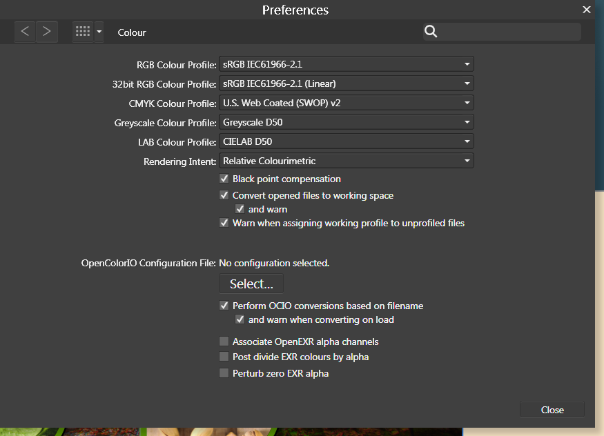
 For some reason, the AFD interface is scaling to beige where it should be scaling to white. This doesn't affect any final renders, but while it substitutes white for beige in the interface, I can't make any accurate design judgements involving colour. So this is happening on my new computer. I booted up my old computer with Designer and it doesn't have the same issue. Whites are white. I open up the same files on my new computer and whites are now beige (see attachment). Note in the toolbar where fill and stroke should be a red line in a white box, its a red line in a beige box. I tried changing the renderer from my GPU (nvidia) to WARP but this has had no effect. I am running Windows 7 on both computers and I have attached my Nvidia information file for more details. I have not noticed this problem in any other applications running on my system. It is not a monitor calibration issue. I have no idea what colour profiles I should be selecting in preferences. I have attached a screenshot of my colour settings. NVIDIA System Information 01-05-2017 09-51-49.txt
-
Hi I use the Affinity Photo v1.51 and in settings made the Font UI size from default to Large ,but need even bigger User Interface with all the tools at the bar etc on the left side specially bigger (all the photo tools). i Have a iMac 5K screen and the program is so small in size with all the tools on screen. Could you make in settings the UI -size overall even bigger? so there would be an "Large 5K" settings for UI on Affinity Photo?!! i Hope you understand my feature request :) Sweden // Johan
-
Please, folks, work on the user interface. Just making the sizes of the icons in the tool dock adjustable would make a substantial difference. I confess, I was really surprised to find that ability was not there. The default list of tools on the left side of the window (a) takes up only about half the space on my 27" imac monitor, and (b) is impossible to read without my leaning over and squinting. I'm 79 and my eyeballs are not in great shape, and no doubt I'll die pretty soon, so please hurry.
-
 I really hate the black background of Affinity Designer. Is there a way to change that?
 -
 I am new to Affinity and am having problems changing the font in Preferences for the User Interface. Could you please tell me how to make the user interface fonts and or icons larger on a MacBook Pro.
 -
It would be great to have the possibility to minimaze the palettes. Every pallet could have an icon and this icon would be showed when the palette is minimazed. Actually it should be like in Adobe (or even better). ;)
-
Hello, I have been waiting with excitement for the Affinity BETA to come out on windows. After opening Affinity, i was not convinced. I really got this "not bad" feeling.. This is because of 1 main issue; i don't like the user interface. Functionally speaking, its great. It beats photoshop in my opinion. But its not even close to what i had hoped for.. I am a big fan of "minimalism" and "flat" design, not just for its looks, but for the overall experience. I came accross a photoshop redisign made by Aurélien Salomon on Behance: https://www.behance.net/gallery/19600227/Photoshop-redesign This is how a modern and new photo editor app/program, in my opinion, should look like. Design is contantly evolving, so the tools that are used to create design should be designed with this in mind. My suggestion: create an user interface that works with templates. Give the user control of how Affinity looks like. What would be better then an editor that by itself gives inspiration to create more beautifull & smart designs?
-
 Feature Request: A black dot in the center of the red "close" button to indicate the current open file has unsaved changes. This is common to many Mac apps. I know that attempting to close a file with unsaved changes will bring up a prompt to save the file before exiting. It is just a convenient visual indicator of the state of the file. Regards, John mac unsaved changes indicator.tiff
 -
 Please make Distribute options easier to find in Affinity Photo. They aren't on the ribbon, they apparently aren't in the Arrange or Alignment menus--why not?--and it takes some clicking around to finally find them hidden in the pop-up you get when you click on the Arrange icon. It blows my mind that the Arrange icon offers functionality not available (or at least, I can't find it) in the menu system! How about adding a Distribute icon to appear along side the Arrange icons in the ribbon?
 -
Hello At this moment, the input fields in the Affinity programs behave in a way that is not native to OSX. I don't know if this is a deliberate choice, but I feel like it would be nice if they behaved consistent with other OSX apps. I also noticed that not every input field behaves the same in Affinity. An example in the Transform palette: - When hovering over an input field, the cursor should transform to the text-selection icon. - Clicking in an input field yields the expected behaviour; you can start typing where you pointed the cursor. This works perfect. - When using the tab key to jump from field to field, I expect the content of that field to be selected so I can immediately start typing thus replacing the previous content. But right now, if I start typing, my typing replaces the quantity while the units (i.e. px or mm) stay put. I get that you designed the input field this way because in most situations, the designer wants to adjust the size in the same unit. But when this is not the case, a few extra actions are required to clear the input field. Often I want to use the expressions in those fields like "sh" or "sw/2" (which are terrific by the way!). So if I jump to the height input field and type "sh" and press enter, nothing happens because it keeps the px unit and thus the expression is incorrect. In my opinion, this wouldn't be a problem if the whole content of the input field was selected on tab-jumping to it; if I just wanted to change 200 px to 400 px I could type "200", and Affinity would automatically append "px" (as it does now), but if I wanted to use expressions, I wouldn't be hindered by the sticky unit. I'm looking forward to hear your opinion! Bauke
-

Please go back to the previous arrow style
Jilly posted a topic in Older Feedback & Suggestion Posts
I really dislike the new layer arrows. I find them incredibly ugly and distracting. Please go back to the previous style. It wasn’t broken and didn’t need fixing. -
Hello This feature was requested by me when discussing a bug, so now I'm requesting it here at the right place. At the moment, when a user has OSX in a non-english language, the OS offers a translation of certain common font styles like bold, italic, regular etc. In a few applications made by Apple such as Numbers or Pages, and also in the Font Book app, these translations are used when selecting fonts from the fontmenu. Most professional design applications however use the original (non-translated) names in the font selection. At this moment, Affinity applications use the translated names, even though the rest of the user interface is English. I personally think the way OSX translates font styles is quite primitive, and I often encounter fonts where half of the styles are translated in Dutch, while the other half are not translated because the typedesigner chose non-traditional names for these styles. Other design-related applications ignore the OSX translations and use the original style names, which is more practical in a professional environment. As long as Affinity doesn't offer application wide translation, I personally think it's better for Affinity to ignore the OSX translations, because we now get a inconsistent user interface with two languages. I'm looking forward to hear how you think about this.
-
 Hello, Can you help me please restore my screen to the standard/normal default. I don't know what I've done but I can't seem to get it quite back to Normal mode. Thanks! Cann
 -
One of my long-standing pet-peeves with graphics apps on the Mac was Apple's early decision to make it necessary to hold the shift key down to scale an object proportionally. To me, that is default behavior, and should be doable without a modifier key. Thankfully, Apple is moving in that direction (which I particularly notice in apps like Pages), but the picture on the Mac as a whole is very spotty. It's my impression that there are plenty of apps out there that adhere to the old-school way of things. As things currently stand with Affinity Designer, when I want to resize an object proportionally (which is most, but not all of the time), I don't know when I'll have to hold the Shift key down to do so and when I won't. I think by sheer chance the first few times I scaled objects in AD, I did so without having to press the shift key, and I thought to myself, "Yay, Affinity-Serif, you got it right." But that turned out not to be true, and over time I've come to realize there's a 50% chance each time I want to scale an object that I'll have to hit command-z because the operation won't go as intended. I suppose there are a couple ways this problem can be solved. The ideal solution, to my mind, is to make scaling behavior the same across all classes of objects, be they text, curves, simple objects, compound objects, or groups (made up of any combination of the aforementioned object types): proportional scaling should be the default when the object is selected and manipulated, with no modifier key necessary. If, for some obscure programming reason, it's impossible to implement the above goal, can we have a scaling indicator that reliably tells us whether the selected object we're about to scale will do so proportionately or not, depending on the currently pressed keys? Thanks very much. Andy