Search the Community
Showing results for tags 'Usability'.
-
 Hi, I use AD for quite some typography projects, hence I often need to cycle through many font-faces before I select the one I want to use for a particular element. AD is making this however quite hard - as everytime I select a font face for an object when I want to go back to the list of fonts to evaluate other font options, I'm back on the top of the list (in the area with recently selected fonts). This is making it quite annoying, as I each time I want to keep moving on the list, I first need to manually scroll to the place where I left off (selected the last font)... I understand that having recent fonts on the top is quite useful, but, as it is easily accessible with HOME key, when selecting a text object, I'd rather be placed on the list in the place where the current font is placed, not on the top in the recent fonts area. (if you think this would annoy other users PLEASE make it an option).
 -
I read in an announcement that Affinity’s products now feature an optional white user interface. So I wanted to give Designer another spin. So far the black interface is a show stopper for me (don’t shout at me, I just hate black UI). However, in Version 1.5.5 I can only use a slider to choose between black and blackish. Am I missing something? Is this a hidden feature?
-
From the first day AP was released for Windows (even the beta) I was desperately trying to make AP work for me .... I wanted AP to be the THE (first real) alternative for PS (considering I couldn't find enough swear words for Adobe and their cloud policy). I was accepting and reporting all bugs you obviously had to expect from a sw that complex. I was trying to make the product better as quick as possible by generating test cases, videos to show bugs and even offering Serif my support in development and localisation. And seeing the sw that had great features, good customer support, a big crowd of (active) fans and users - what could go wrong to make AP the new PS in a long term? As you can see I'd do everything to make this baby mine. One can hardly approach a product more positively than I did with AP ... After all that time I see myself closing PS6 tonight working on a customer project and I'm asking myself: why do I still not(!) use AP? AP actually hast most (>95%) of the functions I frequently use in my daily work as a photographer. Even the plugins work in AP. Some functions are even more powerful than in PS6. Still I don't even think of AP when it comes to productive work for customers. And it's not because I'm used to PS ... not because it's a habit - there are very real reasons for it. Some of them I often mentioned before but serif keeps ignoring them up to the stage of not even bother to make any kind of comment. So I though I'd open this topic and bring my issues (again) to the attention of serif staff and other users ... maybe I'm not the only one. To find some good examples for my problems I decided to take a current project that requires stacking (where I feel AP is a lot easier with than PS). 7 RAW pictures that require alignment and focus stacking to adapt different areas of the picture. And what I'm describing now is not an exception ... things I describe are not necessarily reproduceable ... but it does not happen with ANY OTHER PROGRAM I use on my machine (just for those who already start blaming the state of my system as a scapegoat!). And whenever I start AP known and new things like that happen. I'm using lots of memory and disk space ... a still reasonably quick graphics card and processor on Win 7! After taking some time for reading the 7 big RAW files, aligning them and doing the focus stacking I get the processed picture. As well as a source list including all of my stacked single pics and the resulting pic. I add a levels filter and a curve filter to the file. Already after adding the curve filter the histogram is not displayed any more. I know this bug. It has been reported quite a while ago by me (and maybe other people) - apparently wasn't looked after. This does not always happen ... and is not clearly reproduceable, but since levels and curve setting are pretty useless unless you can see the histogram (except for those who do not know what they are doing) it is a bit of a bummer. Certainly knowing that it can only be solved by saving the picture and restarting AP. So I skipped this step and clicked on the first single stacked picture in the displayed list. First of all not even the focus did change to the newly selected picture I clicked on. 5 Seconds later AP completely disappeared and Lightroom was the active application (first I thought AP did crash, but it did not ... it just completely lost it's focus) ... so by clicking the task list I could get it back ... the behaviour interestingly was reproduceable. Now going to the develop persona and coming back to the photo persona the "source list" was reduced to one file called "untitled". Where did all the 8 files disappear to? OK, better don't ask. Now I want to compare the newly stacked picture with another similar picture I took. So I decide to undock the current window. Really a bad idea ... the new window does not resize but moves somewhere mostly outside the current working area. (Just as ONE example: when I do this in PS the new window resize to the layer size and displays with a certain distance at the top left corner of the workspace. PS comes with ready made presets for windows alignment. PS allowns a window to adapt to the picture size all the time. With AP it takes me ages to adjust this new window to the working area I'd like to have. And believe me I really tried hard to get it working or to adapt to this ridiculous user-hostile attitude - no chance. For those who did not get it yet: There is a good reason why the PS Window Menu has more than 25 additional commands for window adjustments - it's not because they had nothing else to do!) But many other things really set me up .... it's this lack of responsiveness of the UI (sometimes) ... you sometimes can drag sliders and they will not move ... or maybe with significant delay (seconds later). Sudden changes of focussed windows for reasons I don't understand (so you have to click in the window again you want to work in). Trying to confirm an action e.g. in a Windows UI manner (pressing Enter if you want to confirm a setting) and nothing will happen. Lacking "OK" and "Cancel" buttons so dialogs will remain open unless you find this tiny cross at the top. Settings I can't save (standard values in dialogs), paths AP will not remember (saving a picture where I loaded the original from). The export persona tries successfully to hide my user setting for standardised output format (bi-cubic,sRGB, JPG) as the last(!) entry in an extensive long list of useless "Standard" setting ... and it makes me search my standard setting for EACH picture I do export ... it seems to me like Serif is challenging my stamina and endurance in so many ways. I could go on and on on theses topics... my conclusion and answer to the question "why there's still no love" would be the following: Serif build an high performance Aston Martin Sports car ... but when you want to open the door you break your finger nails, the steering wheel is covered with nettles and the safety belt will come loose while driving. The gas pump nozzle is mounted in the middle of the roof, the bonnet occasionally opens while driving and it takes 15 switches 3 hooks and an armoured metal plate to get to the opener for the boot as well as many other obstructions. In a race against the Adobe Maserati it can easily keep up, is quicker in some curves sometimes even drives offroad ... But what car do you like to drive and will you choose to drive to work? Sadly Serif does not realise, understand nor care for these essentials at all! They can't stop celebrating AP won races (now on an iPad) ... and seem to forget that there a people around need to use the car on a daily base ... I'm not waiting for Affinity Publisher ... I'm waiting for AP to get a daily working horse! Cheers, Timo All descriptions refer to the latest final Version 1.5.2.69
- 25 replies
-
- 7
-

-
- Performance
- Workflow
- (and 3 more)
-
 Congratulations – Photo for iPad seems like an incredibly capable tool that finally opens up iOS for more professional work. My iPad Air is not supported, so here are my initial impressions based only on the tutorial videos (which do work fine on iPad Air). These are what I think are the most pressing issues that, if fixed, would get this thing even closer to perfection ;) Putting something like "Deselect" into a contextual menu isn't that great – I think if each Persona had a few buttons next to the Persona selector for quick access to very frequently used operations, that would be much more fluid. This would also solve having the "Develop" command being only visible when you have the Hand tool active and having to dive into a menu for toggling clipping preview, which is something that is often used in a "switch it on, change something, switch it off to check how it looks, switch it on again" type workflow. Maybe it's just the videos, but I didn't see any way to use a brush to paint selections. It would be good to have a setting that switches the Adjustment and Filter studio panels to a simple list or icon view, or, alternatively, add buttons to the Layers panel that show popovers with filters a iPhone-style sliding categorized navigation list. The current design seems to require way too much scrolling and also has very colorful icons that distract from the document. If I just want to add something fast, the current design is not great. Also, a "previous filter" item at the top like on the desktop version might be a good idea. Levels does not have any histogram whatsoever – if the intended use is to just use the scopes panel, some kind of indicator where the selected black and white points fall inside the histogram/waveform is needed for precise control, as well as a way to make the histogram/scopes bigger than they currently are. Quick access to clipping highlights also (which would actually make more sense as a global option that's available in the other Personae as well, excluding Liquify). Output levels are missing as well. Double tap to fit to screen is nice, but quick pinch to fit like in Procreate seems more fluid to me (it might just be that my middle finger is somehow abnormally long, but two-finger taps are often recognized only after the second or third try for me) Straightening seems a bit fiddly – it would be nicer to be able to drag out a line and then have the end points movable even after you release the touch. Basically with an "Apply" button instead of committing right away. Right now, if you get it wrong or wonky, there seems to be no way to cancel and no way to get it really precise. Similar problem with the Inpainting and Mask Refinement brushes – an "apply on release" check box would make this more convenient. If disabled, it would allow you to paint multiple strokes and then press an "Apply" button. Same on the Desktop – I can't count the number of times I've used one of these brushes, hit the screen edge and had no way to scroll the document without the incomplete operation being applied, leaving no way but to undo and repaint a potentially complex selection. The curves UI in Develop (and possibly the regular Adjustment, it's not shown in the videos) seems to be too small for precise adjustments. A button that pops it out over the full screen like Procreate does by default would be very nice. Also, like with Levels, there needs to be a way to see where a point falls on the histogram/waveform, numeric coordinate inputs and a clipping warning for it to be really useful. It would be much more useful if dragging on the layers would adjust Opacity instead of doing multi-select. Selecting could be implemented either by having an additional column with checkmarks permanently shown to the left of the layer name, or by having a "Select" mode that makes that column appear after press of a button like in many other iOS list views to prevent accidental selection. That would also be more intuitive for new users. A "Hide Selection" option would be very useful to see what selection edges look like after an adjustment. Goes for Desktop as well. This is nitpicking, but the square buttons in the Layers panel don't match the round look on the other buttons, like "Return", "Document Menu" etc. The Inpainting Brush "Inpainting in progress" overlay seems like it would get really annoying if you have to do a lot of inpainting because it would make your screen flash after every brushstroke. It also makes it harder to compare before and after since you get to stare at that blurry wall instead of before/after images in direct sequence. A smaller progress indicator like the non-intrusive "Marked as Pick/Reject" feedback popups in Adobe Lightroom or a global progress bar next to the Persona selector would be a lot less distracting. A lot of the Develop UI is really colorful and could distract from the image. I already mentioned the Adjustments previews as another case of this. In Develop, for instance, the RGBCMY sliders could just have their knob colored instead of half the slider (background of the slider indicating the percentage could be gray instead of R/G/B/C/M/Y), or maybe the colored part could just be a thin line like on standard iOS sliders. It's not clear from the tutorial videos if this is there, but a "double-tap any numeric input, slider or option to reset to default" feature would be great. On the desktop as well. Or alternatively or additionally, a "default" button in the popup calculator would seem like a good idea to me. Develop seems to lack an option for numeric inputs. This is essential for precise corrections. It would be nice if the popup calculators could do basic maths, like those in Flame. So something like "current setting * 1.5" would be really easy to do. History seems to have no "Purge History" button that would save storage space on complex documents, especially ones with a lot of paint strokes. The only way to do this currently seems to be to do a "Save as". Also, having the initial document state in the history list would be useful. And an option to use the great split-screen compare mode with history steps would be nice (though admittedly not essential). The size of the application bundle is extremely large, more than a GB. Anything you could do to reduce this would be greatly appreciated since storage is usually extremely limited on Apple devices, there is no way to use memory cards, and the images being worked on potentially get rather large, especially considering that they are saved with history by default and that 41 megapixel raw files are within the norm these days. Hope this feedback is helpful, congratulations on the spectacular launch! :)
 -
 At the moment it looks like the magic wand selection tool doesn't generate partially selected pixels. This results in the horrible jagged / harsh edges as below when attempting to isolate an element. Photoshop on the other hand supports anti-aliasing which gives a smooth transition from fully opaque to fully transparent. This feature is an absolute must in my opinion, especially for quickly cutting out well defined objects in an image / removing the background. Feathering or smoothing the jagged edges (another extra step that shouldn't be necessary) just doesn't give as good of an effect.
-
- 2
-
-
- anti-alias
- photoshop
- (and 2 more)
-
1) When resizing a document, unselecting “resample” disables the ability to change the physical dimension. It would be nice to autocalculate the DPI change (assuming aspect ratio is locked). 2) In order to do the above, I need to change DPI instead. Since my goal is to get to a specific physical dimension, I can change DPI until the dimensions are as desired. But the dimensions don't update in the pane, I can only see them once I click OK and choose "Resize document" again.
-
Hi, Here is a collection of observations/requests for focus stacking. 1) Please provide a keyboard shortcut to toggle source preview. In the retouching phase, it can slow things down considerably to move the mouse over to the tiny toggle button to change the view. 2) Similarly, up-down arrows (or similar) to cycle through source images would allow the mouse to stay over the area of interest where the retouching is going on. 3) When changing tools (e.g. from stamp to zoom and back to stamp), the source image pane always reverts to a state where it is scrolled all the way to the top. This is cumbersome when working with large stacks. Please make the state of the pane "sticky." 4) It seems to me that after the initial stacking is done, I can work with the original stacked images but cannot clone from one part of the working image to another, or choose coordinates from which to clone. After I close the image and reopen, I can clone from any coordinates in the working image but no longer have access to the original stacked images. Is this true, or have I missed something? Are there ways to access the alternate sources? I would like to be able to mix and match these operations. Thanks! Peter
-
 I'm very impressed with Affinity, but I'm no professional. However, it would be nice if guidelines, and other objects dragged off page would be visible without having to select all, zoom out and find them. I drag a lot of elements around and like to park them off page. Guidelines off page should just be deleted automatically. I haven't tried this in art-board mode, so maybe it works there. And, is there a way to reset the rulers to align with an object, not just the page corner?
 -
 Read that you were working on more/ changeable shortcuts. Nice! :) I think shortcuts and the ability to change them have a big influence on your overall software experience. The less you have to navigate to menus and panels, the faster you can draw. What I think would benefit the Affinity Designer experience: Adjustable shortcuts Save your under your own name and be able to change them all. Shortcuts for everything I understand that the developers might not want to add a shortcut to every program "action", but as a user if there is something that I do a lot in my illustrating process, I want to reach it superfast through a shortcut. If it's under a dropdown, menu or even submenu that takes too much time. I want to shorten that time. The "everything" part is about the clickable icons and sliders that don't have a (default) shortcut. (New layer, lock layer, increase line width) Giving the user the freedom to edit those. Changing the location of your shortcut file. So you can put it in your Dropbox, or on a part of your Mac you wont format when doing a clean install. It could be a window during install like the one asking where it can install. "Where would you like us to save your keyboard shortcuts (for easy backup if you do a clean install later)" Default shortcut sets Based on different other (vector) software. This would make it easier for a person coming from Adobe illustrator, Coreldraw, Sketch or Manga Studio to jump in and use the shortcuts he's been using for years. I imagine a window after first start asking the user: If you tell us which software you used most before finding Affinity Designer, we will make sure (most of) the shortcuts are in the same place. Kind of like the browsers do after install, trying to get your bookmarks and stuff from other browsers to increase the chance you never go back to your old browser. ;) Live editing Being able to edit the shortcut of an icon by (cmd?) clicking on it and having it open a small window with the current (if there is one) short cut and the option to add your new one. Now there are just too many steps to edit a shortcut. 1. Remember what the function is called (i.e lock layer / increase line width) 2. Find the shortcuts menu. 3 Search for the function. 4. Edit it. 5. Save it. 6. Close the shortcuts menu. Being able to do that on the fly could reduce the actions by half. I think shortcuts with the options stated above would translate to (super) speed & focus. Compare it to wanting the interface to be as calm and subtle as possible so you "see" it less and focus on your drawing. Being able to add a shortcut to everything allows you use the interface less and focus even more.
 -
I am a new convert to Affinity, and so far it is the best thing going in my world. It has all the features I need and more. My problem is my transition from Adobe products. Others have complained about the size of the icons down the left side of the screen and I too would like larger icons as I learn. I have plenty of screen real-estate with multiple monitors etc, so larger icons would be a big help with no down side. What would be an ever bigger help is text labels on each icon. There are over 100 tiny icons, and each just might make sense to the originating programmer, and they may eventually make sense to me, but until I learn, having the ability to turn on a text label to the right of the icon would make my learning process much faster and just might increase the speed of adoption of your great software by others. You already have text labels on the icons across the top and the ones on the left, so how about some on the right. I can hear the programmers now: "That is not possible because there can be multiple columns of icons with multiple languages." My reply is as I stated at the start of this request - Screens are cheep and most of us have plenty of screen real-estate so if I select labels, make columns of icons with labels. As for languages, I suspect if you asked, there would be hundreds of volunteers to provide translated labels. Yes it will be less elegant, and it will take up lots of screen space, but it would make my life and the life of other adopters much, much easier. As a side note, that is why I do not use Olympic brand cameras. They only have icons for functions and I was unable to operate the camera without a manual in my hand and I tried for over 3 months. This is where I am with your software today. Nikon has a better answer I can read the screen in english for every function. Could you please follow Nikon not Olympic! Finally - Thank you for an excellent replacement for Adobe products. I only commented to make an excellent product even better. You will be receiving more of my money even though I need to keep a paper manual nearby with function names.
-
 I don't know why but dragging files from the finder into this dialog is not working. And I don't think that this is a feature because that should be a default behaviour.
 -
 In Affinity designer box selection currently selects objects that are fully inside the selectioin box by default. This can be changed to select objects that pertially intersect with selection box in preferences. My request is to make Alt key temporary invert selection behaviour, so if you have default options, you can hold Alt while making selection box to select objects that intersect with selection box, and if you enabled alternative behaviour in preferences, holding Alt lets you select objects thet are fully withing the selection box. Currently holding Alt while selecting objects doesn't do anything.
 -
There are some things on the Help engine that could be improved: It doesn't highlight search results. I think this is essential, specially because some pages are very long. Search is quite slow when typing the first one or two characters. I noticed some improvement in the latest beta builds, but as of version 1.5.0.29 (Windows) it's stil very noticeable. Help should be context-sensitive. No bookmarks. Many more hyperlinks. (This is not directly related to the engine but to help authoring.) The real power of a good Help system relies on it having hyperlinks whenever possible (think Wikipedia).
-
I am currently using the Affinity Beta for PC and altough I am thinking to switch from Illustrator to Affinity Designer, there are some points that could need some polish. Most of them are minor UI changes. One of them, and maybe the biggest, is how Affinity handles layers. I cannot count how often I just wanted to drag one layer on top or below a certain one and ended up masking them or grouping together. I know there is a dedicated button to do that but I want to know exactly where my layer is right now and not guess and count how often I pressed to "move layer up" button. Second issue I had is the way Artboards are managed. Right now they simply behave like a regular layer which often leads to unwanted selections or movement of the artboard, when I just wanted to select an object. This could be easily improved by giving the Artboard tool more "power" and just allowing to resize or change artboards when the Artboard button is clicked. Otherwise I like the clean UI of Affinity Designer very much and hope that the developers will improve the software wisely and avoid it to become a second Photoshop or Illustrator with 1000 hidden menus and functions nobody can find anymore. Keep up the great work! Regards
-
 Hello, I'm a little confused about using the scroll wheel in the layers panel. It seems that you are only able to scroll if you follow this steps: First there must be no scrollbar Than you have to expand a group so there will be a scrollbar Than you can scroll Is this something that will be fixed? It will be awesome if you can use the arrow keys to go up and down, and expand layers.
 -
One of my long-standing pet-peeves with graphics apps on the Mac was Apple's early decision to make it necessary to hold the shift key down to scale an object proportionally. To me, that is default behavior, and should be doable without a modifier key. Thankfully, Apple is moving in that direction (which I particularly notice in apps like Pages), but the picture on the Mac as a whole is very spotty. It's my impression that there are plenty of apps out there that adhere to the old-school way of things. As things currently stand with Affinity Designer, when I want to resize an object proportionally (which is most, but not all of the time), I don't know when I'll have to hold the Shift key down to do so and when I won't. I think by sheer chance the first few times I scaled objects in AD, I did so without having to press the shift key, and I thought to myself, "Yay, Affinity-Serif, you got it right." But that turned out not to be true, and over time I've come to realize there's a 50% chance each time I want to scale an object that I'll have to hit command-z because the operation won't go as intended. I suppose there are a couple ways this problem can be solved. The ideal solution, to my mind, is to make scaling behavior the same across all classes of objects, be they text, curves, simple objects, compound objects, or groups (made up of any combination of the aforementioned object types): proportional scaling should be the default when the object is selected and manipulated, with no modifier key necessary. If, for some obscure programming reason, it's impossible to implement the above goal, can we have a scaling indicator that reliably tells us whether the selected object we're about to scale will do so proportionately or not, depending on the currently pressed keys? Thanks very much. Andy
-
 Ok so I'm trying to make a gradient stroke object which is converted to curve. I'm Trying to make a material design FAB for mobile interface (Which you guys lack even the most basic components needed for making it) I attached a Video of it A FAB button for mobile has the following: 1. Black Stroke Gradient that starts with 4% opacityto 0. From buttom to top 2. White stroke Gradient that starts with 12% opacity to 0. From Top to bottom 3. A 6px blur shadow with 0 offset (both x and y) with 12% opacity, color black 4. A 6px blur shadow with y=6 , x=0 offset with 24% opacity, color black Unless you can apply these simple basic needs of a material design, (multi shadow, multi stroke, Gradient stroke) You shouldn't call yourself the opponent of softwares such as sketch in terms of mobile design bug report - Gradient Opacity.zip
 -
 Just started using AP. In considering AP for an upcoming workflow, after years of photoshop, I wondered about the .afphoto filetype. PSD is widely supported on the mac, but what will open .afphoto? The embedded help file had no entries for afphoto...How does one store the edited files? ps: why doesn't serif directly offer tech support for AP?
 -
Editing Colours in the Gradient Map panel needs to select the colour point and then clicking on the Colour field. I supposed editing Colours just by double clicking the round colour point on the gradient. I think this would be more intuitiv and more efficient.
-
I think that Affinity photo/designer are both great products, although there's many instances where the interaction is far from optimal. I don't use the product so often but every time that I try to do something, it either takes me a long time to get familiar with the tools, or I just can't get what I want easily. The last examples: 1) if I select a vectorial element I can see the "curve" section in the main toolbar (top left), and edit the stroke properties. If I select two vectorial elements instead of just one, that toolbar disappears. Why is that? How do I edit stroke properties globally then? Please don't tell me that I have to edit them one by one... 2) how do I copy the #value of the colour of the selected element, so I can apply it to another one? 3) why can't I define a #value for the stroke colour? I can only edit that in the right hand panel, but that seems to apply to fill even when I select a line that has no fill. 4) if I multiple select objects and then move arrows keys to move them, they jump to a new location that has nothing to do with the initial position, and then start moving as expected (but from the new location, not the location where they were when they were selected). 5) why can I hold shift to resize a rectangular shape maintaining the aspect ratio, but I cannot do the same with an image? Cmd seems to work instead, but it does not resize from the corner being dragged, and the whole thing is very cumbersome. 6) why is it so difficult to crop an image, or copy and paste a portion of it? I understand that some of these issues might disappear once you get familiar with the tool, but also believe that it should be easier to make changes in the first place. A good UI doesn't need any explanation or long series of trial and error.

-
 If I select two (or more) layers in the layers panel and chose Select • Select from Layer I suppose a selection from all Layers. Just a suggestion from user experience.
- 4 replies
-
- 1
-
-
- suggestion
- usability
- (and 1 more)
-
 When working with any type of adjustment that has the option to enter values into a textfield (e.g. HSL adjustment where you can manually enter values for color shift, saturation etc.) I've noticed that when you click the text field, none of the text in the box is preselected. This means that when you want to change something from "0%" to "50%", you either have to double click the value again or manually delete everything that is in the text box to enter a new value. I would find it far more practical if clicking a text box would immediately preselect all the text in the box so that I can simply type a new value and press enter right after clicking the box. This would improve the usability and smoothness of the workflow significantly. Cheers!
 -
When working with AP it sometimes happens to me that I select a new Live Adjustment Layer or Adjustment Layer that I don't really want (either because I change my mind or because I selected the wrong adjustment). Right now a new layer is created and after closing the adjustment window I have to delete the new layer (that has no adjustments) by hand. This is not practical in terms of usability. I would suggest this workflow: 1) Creates a new adjustment layer. 2) The adjustment window appears 3) The user either makes changes or doesn't do anything. These cases should be considered like this when the adjustment window is closed: - Changes were made: keep the new layer with its changes. - No changes were made: remove the new layer because it doesn't do anything to the photo anyhow. Does this make any sense? I think it could be useful to add this functionality.
-
Choose a tool from the toolbar that comes with a dialogue, for example the crop tool. Then you should be able to cancel the tool by pressing the ESC key and the cmd-. (dot) Apple-shortcut.
-
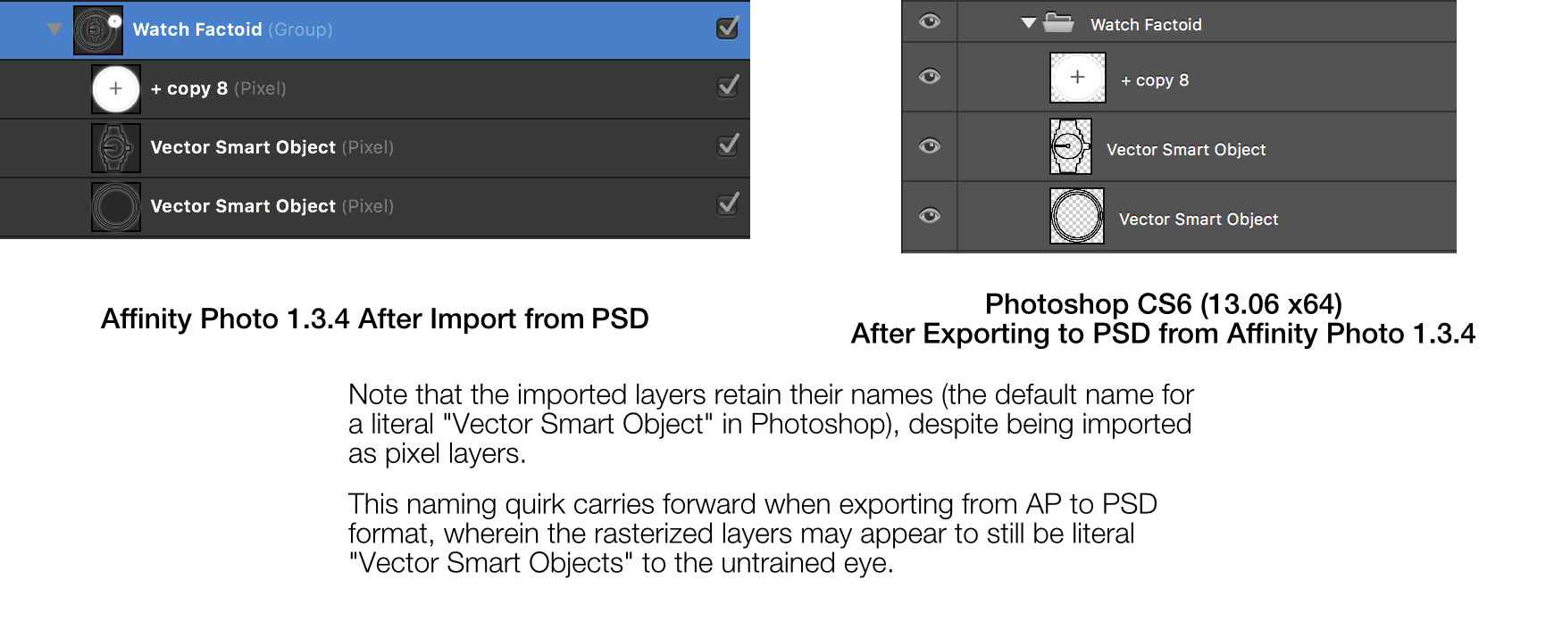
 Affinity Photo (henceforth "AP") does a stellar job of importing from PSDs, but there are some usability improvements that would help to properly set user's expectations about the nature of the import process. For example, AP appears to rasterize Vector Smart Objects and Embedded Smart Objects into "pixel layers". Fortunately the user can determine the type of an imported layer quite easily by looking at the parenthetical text following its name, but AP's attempt to preserve layer names has the potential to set false expectations at-a-glance, as this image describes: As also noted in the above image, this can have significant usability implications for exporting to PSD, as rasterized layers may keep their default names (as imported by AP), but are in fact be pixel layers within the exported PSD. This confused me the first time I exported to PSD after initially importing from one. There are similar caveats for the layer names of other imported layers. For example: type layers are imported with their names, which suppresses AP's automatic layer naming for type layers based on their text content. It's likely that these layer names originated as auto-generated names in Photoshop to begin with. – Based on these observations, I have a few recommendations in the form of optional PSD import options for layer names: A "PSD Import" option to append " (Rasterized by Affinity Photo)" to the end of layers in a PSD that become pixel layers upon import into Affinity Photo A "PSD Import" option to remove names of type layers if the entire layer name exists as a substring in the type layer's text content, starting from the first character An option to review layers that have been rasterized upon importing a PSD Cheers, Joe