Search the Community
Showing results for tags 'UX'.
-
Hey, I've recently started using Affinity Designer (on Windows) for UI design, coming from Photoshop. While I think it's much nicer to work with overall, there are a couple of things that I think make the program very frustrating to use (at least on Windows). One big thing I find annoying is that when I ctrl select a layer, it doesn't select the layer in the layer panel (or at least expand the group it is in). I can see some people maybe don't want that, so I suppose giving the user the choice would make sense in this case. The second and most annoying thing for me is the double click rabbit hole I need to go into when working with nested groups. Usually for UI design you end up having a lot of nested groups. While there probably isn't a better way to handle it, I think some work needs to be done about when it exits a group. It's very frustrating to go into this 5 level deep double-click loop and then a misclick (or the program not understanding your intention) brings you all the way back to the top. One specific thing that does this is deleting a layer. It should leave me at whatever hierarchy level I was at. A third annoyance I find is using CTRL to zoom. Not just because it is ALT in Photoshop, but also because CTRL is at the same time assigned to the deep selection. When I'm moving around the document, I use panning and zooming. Sometimes this leads to moving a layer unintentionally. This is maybe more a performance issue though, almost feels as if the keyboard is not being polled often enough to detect when exactly a button has been pressed. In any case, I would like the option to remap zooming to ALT+scroll. Other than this and a couple of small things (why can't I enter a number for opacity in strokes or fills? why cant I use pixel values for strokes?), AD is fantastic and certainly the best tool available on Windows. Thanks
-
 So this request is a follow-up to the one I made on this thread: Apparently, according to fellow forum user @toltec, this feature was already implemented, which is absolutely great. What is not so great, however, is its discoverability (or, in this case, its blatant [edit: partial] lack thereof). [edit: user @R C-R made me realise that the Status Bar already has a “cheat-sheet”/tooltip with said shortcuts, but I still feel that is not enough and that my suggestions are very sound, so please bear with me…] Please, for the sake of other users who may not frequent the forum or wish to spend hours perusing user manuals and tutorials (because this feature is, after all, something that pro users expect and may try for themselves [edit: even without, as was my case, paying any attention to the tips provided ], as it is a staple in brush tools not just in AP but also in other competing packages), make it [extra] visible and [even] more obvious. Basically, when pressing each modifier, please do make the appropriate tab (Matte | Foreground | Background | Feather) become temporarily highlighted/selected. This feature would, then, become easily discoverable to more seasoned users like myself, because as it stands, the UX feels “broken”. I mean, it will still feel that way to me even if I already know the feature is there, because visual feedback is just nice to have, as it shows that the app is working as it's supposed to. As it currently stands, you always display the same tab selection and, when pressing modifiers, you get a different, incongruous and non-explicit – even if completely desired – behaviour, which is indeed confusing, muscle-memory notwithstanding. It really is important for us to always have a “sense of place” when it comes to our tools. If I may offer another completely on-topic suggestion, I wonder if you could add some further visual feedback to the brush cursors themselves (and that would obviously be extensible to the Selection Brush tool), such as plus/minus signs floating outside of their outline (quite unlike their current behaviour in Ps – which centres them inside of said outline –, so as not to conflict with the cursor crosshair for those users who may have it configured to be visible)? I know that small as this suggestion may seem, it would add some visual clutter (I guess it could always be off by default and be selectable on the preferences dialog, just like the crosshair), but it I believe it would further enhance ease-of-use and differentiate AP from the competition. Thank you for your attention and keep up the good work!
 -
 Hey guys, Some months ago I saw a redesigned Apple Music, I liked the idea, so made my own. To check out all the story behinds it, I made a huge publication on medium, with images and screens all made on Affinity Designer and Photo. would love to you guys check it out! https://medium.com/@gustavoantoniogonalves/i-saw-a-redesigned-apple-music-so-i-kinda-redesigned-it-again-8b3dfb5c5abf?source=linkShare-92ff1568a988-1507110699
 -
when I choose to export TIFF e.g. it does not make a whole lot of sense to offer PNG etc. options and presets? cheers
-
 Hi! Just started working with AD and really love it, but I've got a couple of things that don't work so smooth. First of all, I work with a Cintiq 22' touch. I would like to use the zoom slider on the back but it doesn't zoom. How can this be fixed? Undo in AD is different than in photoshop. I would like to change the shortcut to 'alt-command-z', but when I do this it only enters 'z'. How can this be fixed? Many thanks!
 -
I would find the ability to import and export swatch palettes incredibly valuable. Furthermore, the ability to re-arrange my swatches by drag and drop would be very useful when working with large palettes so I don't have to be mindful of the order I add them in. Finally, is it really necessary to ask the user Are You Sure you want to delete this? Especial;lily considering I've already had to tap and hold on a swatch, only to be presented with a menu which then asks me to pick between rename and delete. Is the modal pop-up Are You Sure needed? - Along those lines, when in swatch list mode, a double tap on a swatch to start renaming would be appreciated. Little details which I hope would help make the management easier, fun and swifter. But especially swatch import please.
-
if you have a pixel layer (photo) and some adjustment layers (like 5 curves, HSL, vibrance) and the underlying image is a pixel layer only toggling off the layers (shift select, toggle off) above should instantly reveal the pure image below it takes some time, half a second or so, though in theory Affinity should not have to do any processing, just straight display the image below this would make before/ after comparisons much more enjoyable/ faster cheers PS this may be related https://forum.affinity.serif.com/index.php?/topic/44671-snappy-popups/
- 26 replies
-
- 1
-

-
- photo
- perforamnce
- (and 2 more)
-
 Lines can't be turned off for active objects. Problems this causes: Accurate colour decisions can't be made while an object is selected. Myriads of unnecessary clicks to constantly deselect, select, call up the tool again, adjust the value, da capo. Accurate placements to non snapping objects because it's impossible to see past the UI edge overlay. Given the problems this causes, I think it qualifies as a bug. Also arrow key movements with the hand tool selected were once possible (so the outline overlay isn't in the way), but then it got broken.
 -
The editing is still slow but time is money. Not talking about performance, it is a really good here. It is about UX. For one editing it is good, but face it not to much photographer like&need to spend hours in editor. Usually you want crop, clean, and fine tune an excellent shot in really fast way. But here you need to scroll a lot and select from the huge list, even if usually using only (levels, Shadow/highlights, Color balance...). - As an improvement to disable all unnecessary adjustmence (in settings). - Possibility to see (Open) all editable handlers (sidebars) by default, like in lightroom. Also for batch editing, let say copy and paste presets from one to second one is really needed. - quick save (cmd+S) in already selected somewhere format, without any dialogs Thank you.
-
At the moment, I'm engaged end the design UI/UX for mobile applications. I can no longer imagine my work without Affinity, here is my new job at Affinity Designer. I know that over time you will become even stronger and better! Thank you for the incredible product!

-
this example is from the latest AD beta but is the same for AP when you click "preferences" (having the hand tool selected), the dialog does not open until you "release" the "click" therefore it takes longer to "klick" the dialog than to hit "cmd + ;" in constrast: the adjustments layer dialog (the circle down in the layers panel) pops up immediately upon the "key press down" which makes it feel more snappy can this be enabled for other popups/ dialog/ persona switching/ switching tools as well? cheers PS this may be related https://forum.affinity.serif.com/index.php?/topic/44673-toggle-off-layers-lag/#comment-222876
-
Telegram (on iPhone at least) has a pretty nice curves adjustment feature in their photo sharing dialog you do not add points onto the curve but give the curve a gentle push to either side this gives more subtle results and feels just right on a touch surface maybe this is something that could be added to the iPad as well to even better use the touch input method cheers
-
Hello, I have been waiting with excitement for the Affinity BETA to come out on windows. After opening Affinity, i was not convinced. I really got this "not bad" feeling.. This is because of 1 main issue; i don't like the user interface. Functionally speaking, its great. It beats photoshop in my opinion. But its not even close to what i had hoped for.. I am a big fan of "minimalism" and "flat" design, not just for its looks, but for the overall experience. I came accross a photoshop redisign made by Aurélien Salomon on Behance: https://www.behance.net/gallery/19600227/Photoshop-redesign This is how a modern and new photo editor app/program, in my opinion, should look like. Design is contantly evolving, so the tools that are used to create design should be designed with this in mind. My suggestion: create an user interface that works with templates. Give the user control of how Affinity looks like. What would be better then an editor that by itself gives inspiration to create more beautifull & smart designs?
-
I decided to create visual journal to keep things organized. Due to work, i won't be able to post regularly. But i will try to keep things organized here. You can check out my Dribbble account to see my work. I haven't started posting work on Dribbble using AD yet as i got the software for 2 days only. But i would soon. You can also checkout out my DeviantArt account where i upload the source file of the design if you are interested in downloading the files and examining.
-
 Hello, I'm just starting out with Affinity (AI user), and i found some User Interface incosinstencies. One of them is checkbox and radio button behaviour: Case Example - Pen tool Some button groups Mode, behave like radio buttons - you can select only one of many, and one of them always has to be selected. Other button groups, like Snap, behave more like checkboxes, you can select many, you can select none. It would be great, if user interface would distinguish it. There are obviously no standard "web" form elements in main UI, but there are some ways to distinguish it - for example rounding corners of multiselect that is just "select one only" type.
 -
 Hi I hope I'll explain my problem well. I am trying to use Affinity Designer as my new UX tool for wireframes and mockups, and so far so good. But there is a little something that is irritating. Every time I want to center some text inside like a circle or a square, it is never truely centered. My snapping tools are on. but still even if I put my text on the red and green line, the text is always a little off. I saw that every text got a little space between his bottom and the bottom of the selection box. So I think it is because of that, I am looking in the transform text dialogue box to see if I can do something... but no good conclusion. What should I do? Thank You
 -
 Hello, We're a startup and we currently use Sketch. Our processes look like this. Sketch > Upload to Zeplin > Add Zeplin notes > Developers. I'm a non-designer, but I participate in all phases, but I do not work on a Mac. So it's a hassle to change Sketch texts, titles, or copy, and I think it would be better going forward to if we worked on a system that was compatible with Windows. I'm wondering if anyone can describe to me some great Affinity workflows for developing applications, as well as the tools you use to share/store/deliver/comment the designs? Thanks everyone! Robert
 -
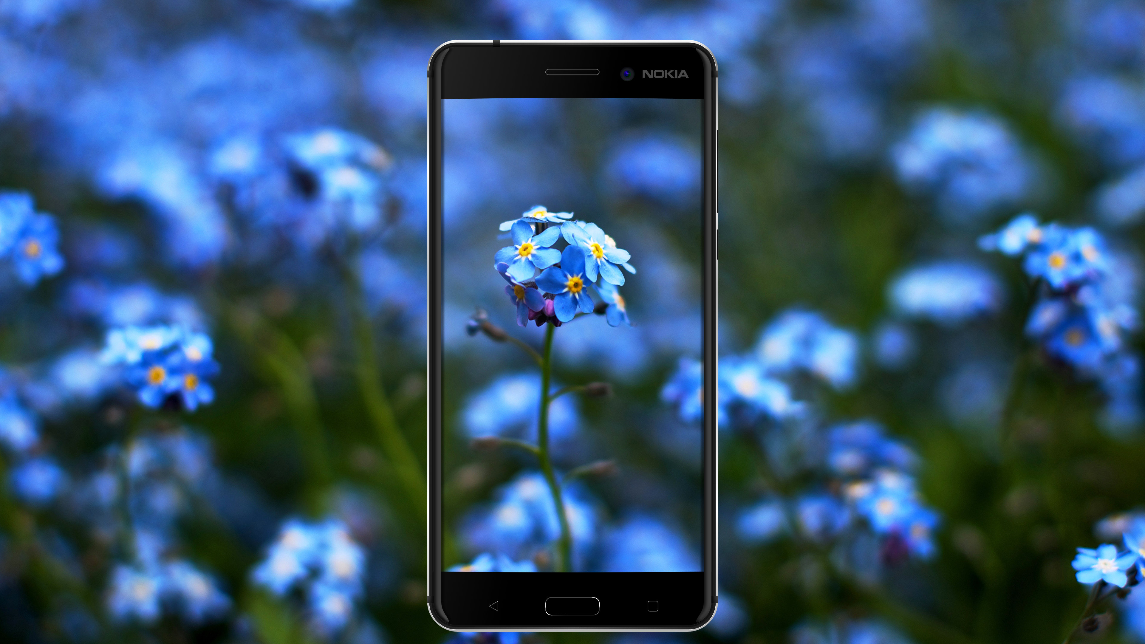
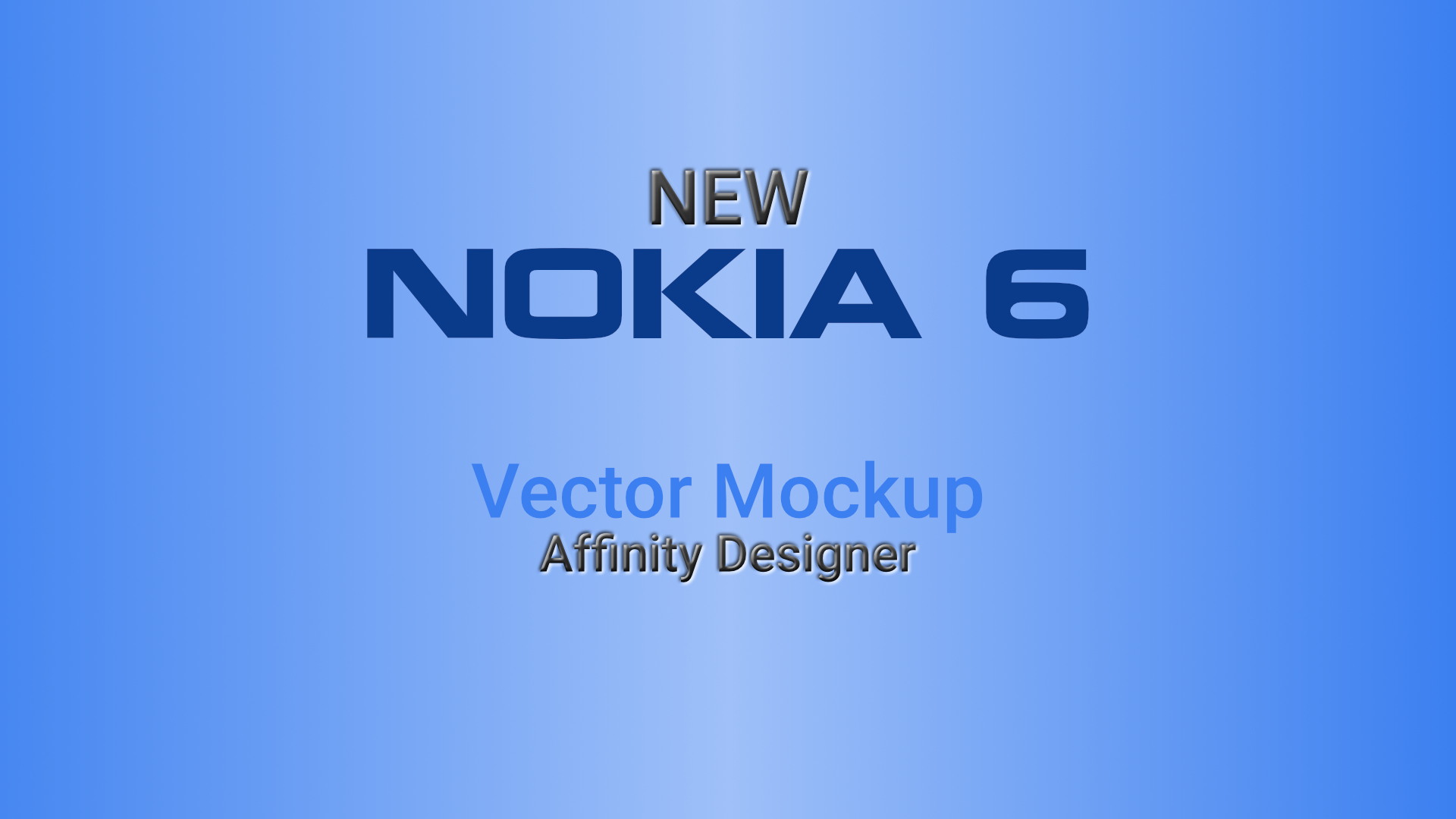
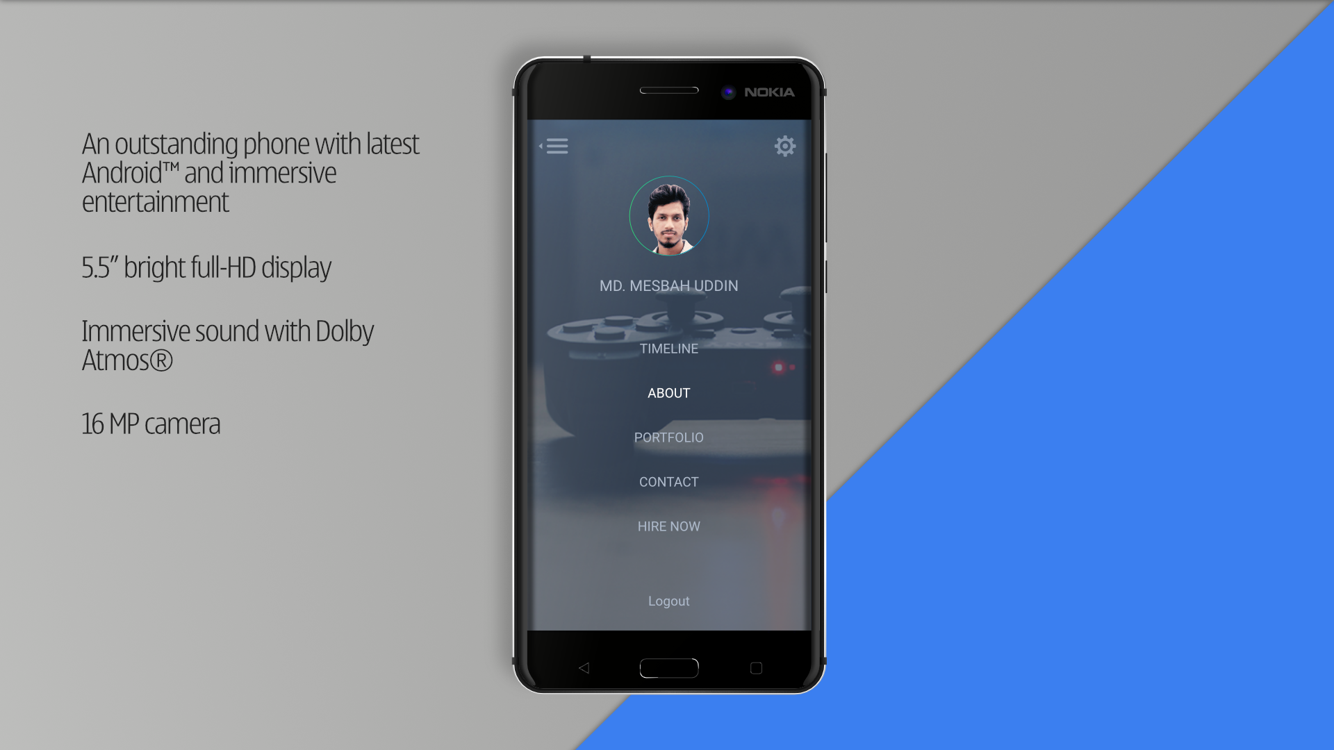
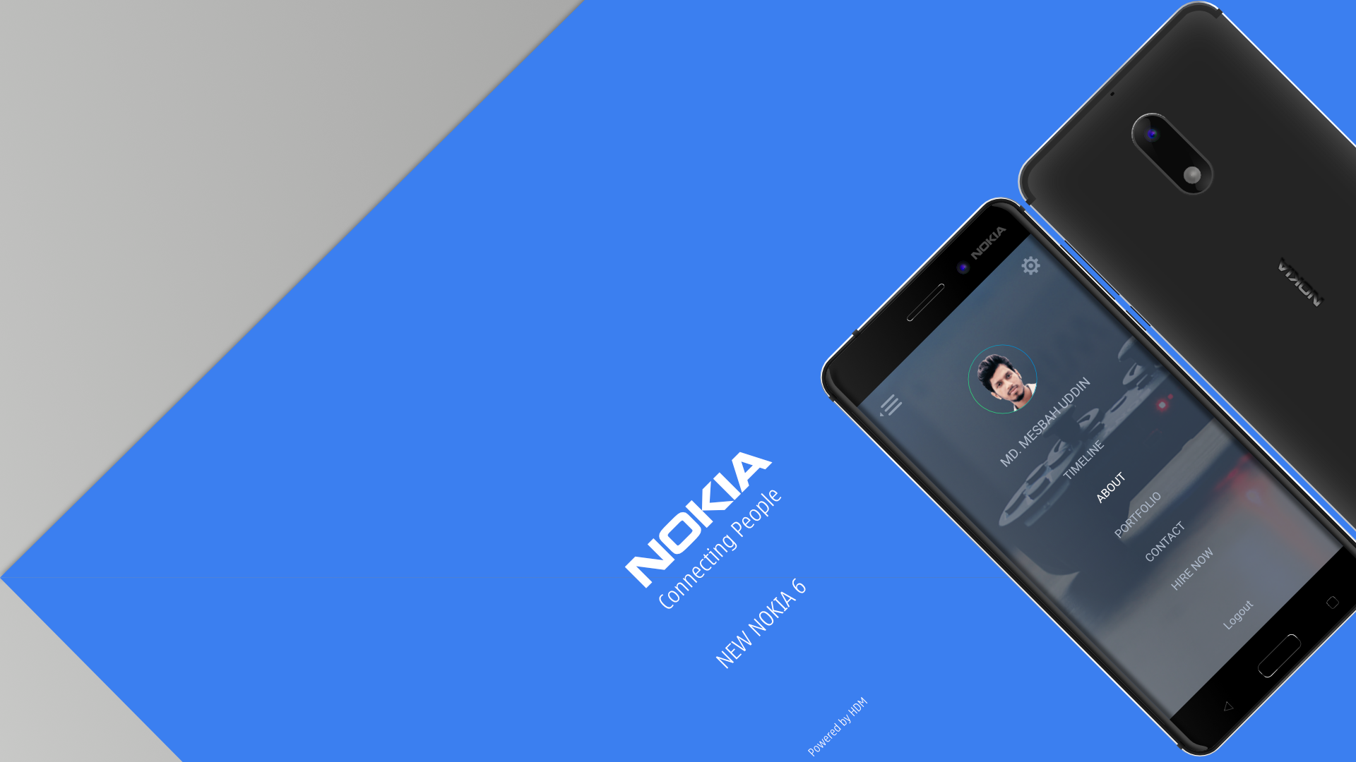
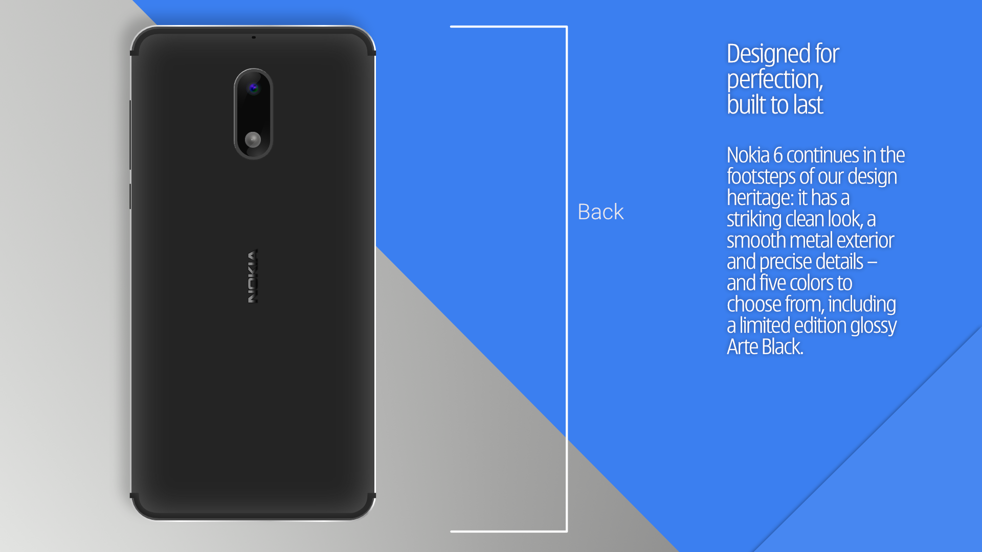
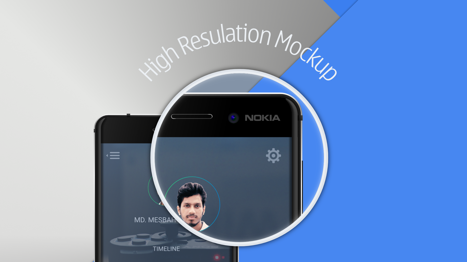
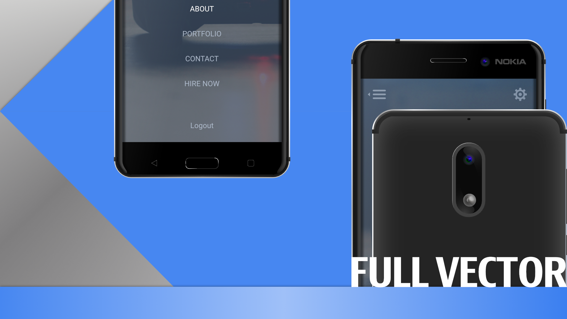
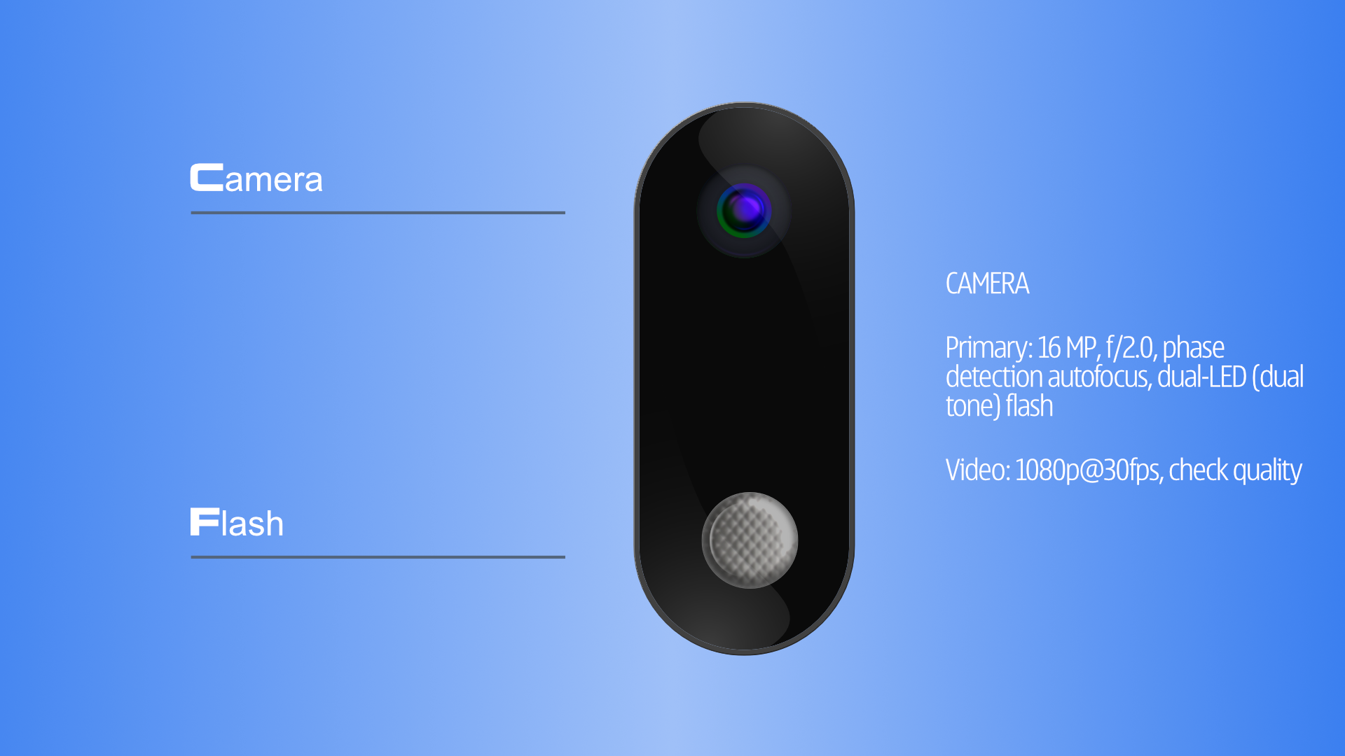
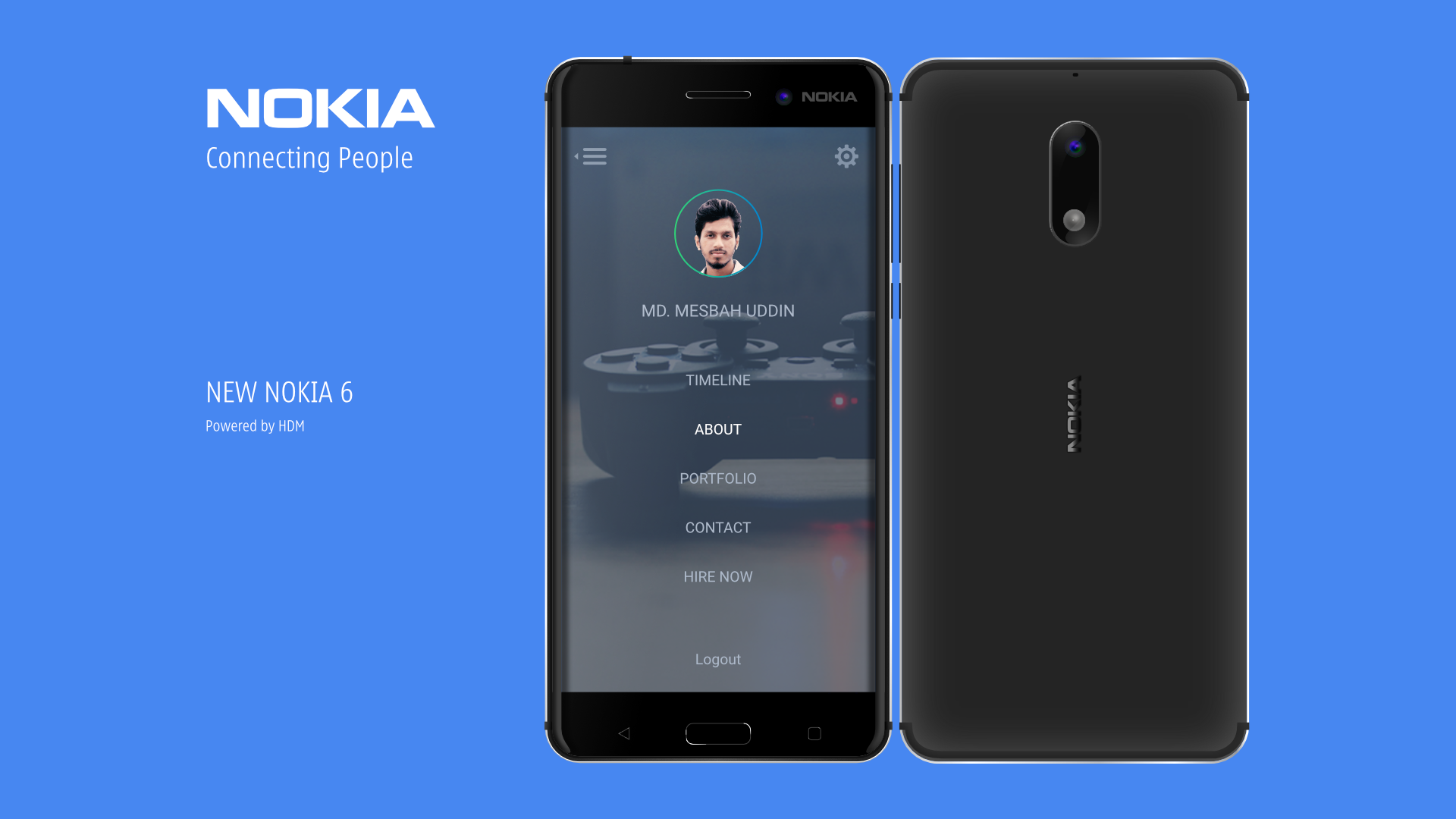
 New Nokia 6 Mockup vector Illustration . AffinityDesigner https://goo.gl/0YlLFt Visit the Behance link to view full design . Dont forget to click appreciate button https://goo.gl/0YlLFt
-
- 2
-
-
- android mockup
- illustration
- (and 4 more)
-
Hello You guys doing awesome. My suggestion is, add a basic animation timeline/some video editing option . So that UX UI designer use it for their portfolio and also for other purpose . You can start with some basic . I dont know is there any 3d text effect already or not . But only 3d text is very basic . And a 3d model support with live paint and texture will be awesome . Thanks
- 8 replies
-
- 1
-
-
- animation
- video editing
- (and 6 more)
-
 I love Affinity Designer and I'm really pleased that both Designer and Photo are starting to provide stiff competition to Adobe. In my many years I've used a range of tools .. from xfig (!) .. through to CorelDraw! ... Inkscape .. Google Drawing ... Adobe Illustrator ... Gimp .. Lightzone ... Photoshop ... etc etc I think Designer's UI works well. Some bits need a new way of working and thinking but once you've invested in the effort to overcome them .. you can see the reason why it is a better way. BUT I don't have the same feelings with Affinity Photo .. the UX is overcomplicated .. too much of the screen is taken by the pre-set tools which also seem to behave in counter-intuitive ways .. They also hang around with the last used settings (which may have been regretted experiments) .. and it isn't clear how to undo them or re-layer them in the stack of applied filters ... Inconsistencies also around where to locate filters .. some are in the fliers menu .. others in the 'apply layer' .. Has user research and testing been done with the Photo UI? I would love the next Affinity Photo (2.x?) to have a redesigned UI ... I would pay again for that .. Am I the only one who dislikes the Photo UI and UX .. despite putting some effort in?
 -
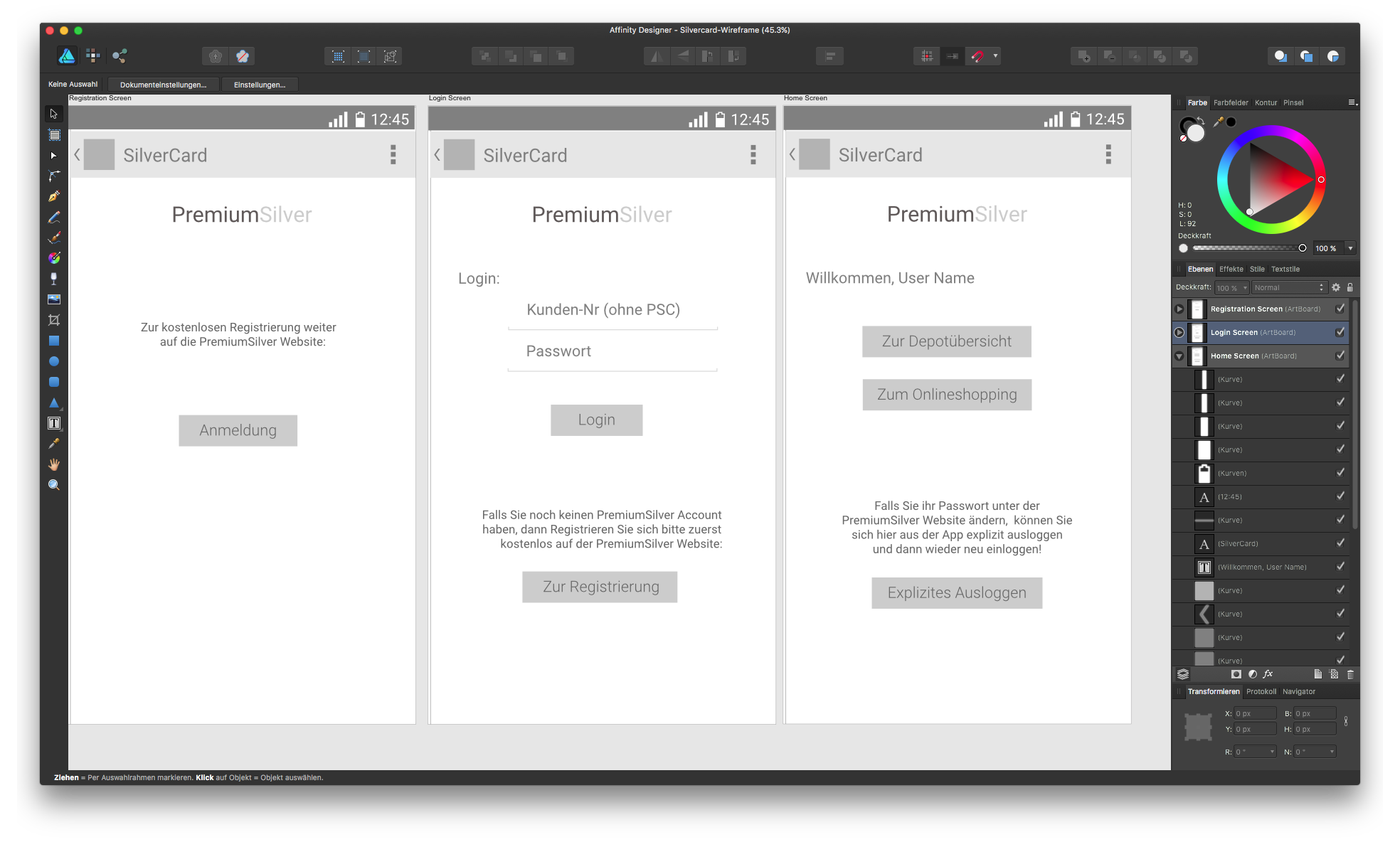
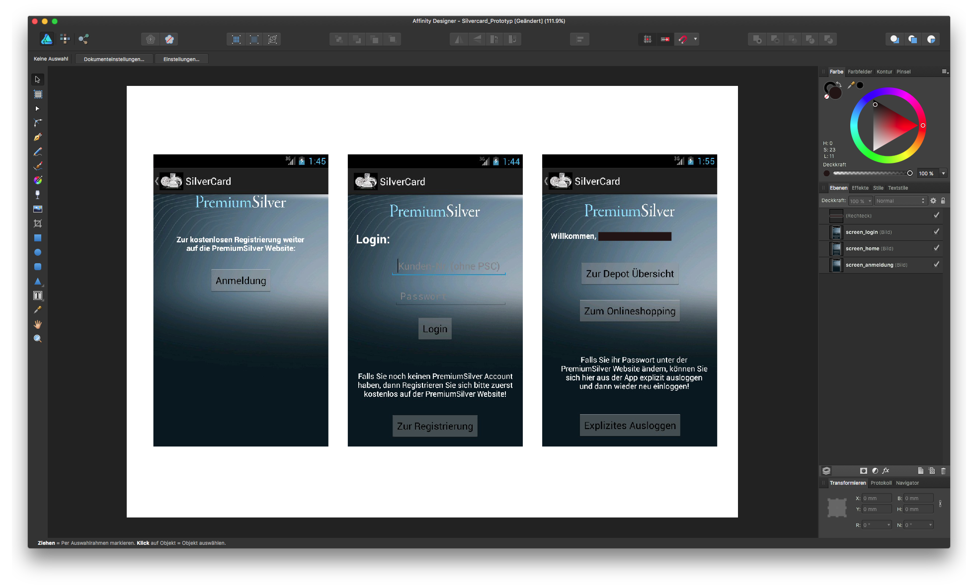
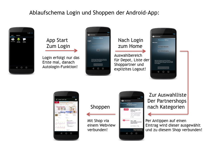
Had tried AD for some UX Wireframe stuff for a little Android App, though honestly I'm by far no UX Designer. Afterwards made a functional prototype out of that, which hopefully came close enough. - Well at least it looked somehow similar in the bloody AndroidStudio Emulator. :D
-
 Hello, I have downloaded the iOS UI assets file that comes with AD which is a great showcase of restraints and a great resource, but at my company we design all UI at 1x and the iOS assets are in Retina scale. Scaling doesn't work properly on these assets so I thought I'd make my own collection of UI elements for iOS and Android. How should I save/export the file so that I can import it in the assets panel and use them in any projects? (BTW here's a nice article about the benefits of designing UI at 1x - https://medium.com/shyp-design/design-at-1x-its-a-fact-249c5b896536#.bhxum5ugk) Thanks, Fernando
 -
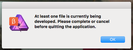
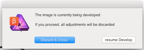
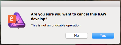
 I'd like to raise awareness to an issue that's bothering me (and apparently a few others) for over a month now. At first I hoped that my muscle-memory would get used to it; but a few hundred raw photos later, it's still as annoying as the first day. I'm referring to the way one can exit/quit/cancel development: it's very counter-intuitive. - It's totally understandable that one cannot proceed editing the image, if it hasn't been developed first. - It's also understandable that the adjustments in the develop persona, cannot be retained, unless the image gets developed. here are the quirks and some workarounds: - If develop persona were implemented as a modal, the Esc key should allow one to... escape. - If develop persona is not a modal and is a window/tab then Cmd+W and Cmd+Q should both allow you to close the document just like pressing the Cancel or X button (of the tab). The current message box when pressing Cmd+Q/W, is not meaningful: it's merely stating that you have to click elsewhere to cancel/close/quit. Why all the hoops and loops? This is particularly inconvenient when having dozens of develop personas open and you decide it's time to quit the application (or close them all). What could had been done with Cmd+Q is now mouse gymnastics! You have to close every develop persona individually, with the mouse, before you can quit the application. - The cancel button, and the X button, shouldn't act differently: As it is, the X button never asks for confirmation, whereas Cancel always does! - when you haven't made any adjustment in the develop persona, canceling should not ask for confirmation. It should be performed silently. - The confirmation should be rephrased. The yes no buttons are not very helpful. Yes, I want to cancel? Yes I understand? Yes I want the file saved? Yes I want it developed? If it were a rare occuring dialog, it would be okay to have and read all the text to know the meaning of Yes/No, but I see this dialog more often than I am asked to save a file, and I guess others too; so the buttons have to be as self-explanatory as possible; or the text as short as possible. eg. "Discard Changes?" Yes/No An example (not the most thought out apparently) follows - it shows two self-explanatory options: "Cancel & Discard" and "resume developing". It could had been "Discard Changes" and "do not discard" or it could even had been 3 buttons such as "Discard Changes", "resume"/"return" and "develop and Save as...", but you get my drift: it needs rephrasing. - Pressing the Esc key while the confirmation is displayed, should work (currently it does nothing). Hope this helps :) -Fotis Now that I got it out of the system,I have to say that I've started to really appreciating the Serif raw engine (and its speed) compared to other raw develop options!!!!
-
Hello, guys! The following questions are aimed just to pleasure my own curiosity, but you can as well see them as requests. 1. Are you guys planning on bringing some kind of UX prototyping directly in AD? Be it with AD's own tools or opening the program for plugins? I've had AD for a while now and I'm really happy with what it gives me and that raises the question "what next?". I've seen the roadmap on this forum, but I'm really wondering if some UI/UX prototyping is planned at all? Maybe a different persona, maybe a different app? 2. This maybe is something even bigger than UI/UX, but will there be any sort of cloud sync? By any means I know it can't be like CC, but something that syncs our assets like brushes, fonts, etc? As I said, I saw the roadmap and I know that these things aren't there, but the main question is are they considered for future additions? Bottom line - I'm really, really happy with AD. For the past few days I'm doing all of my work inside it and I'm not having any problems at all. Well, I still can't afford the luxury to delete Ps and Ai, mainly because of some work collaborations with people that use them, but if you keep up the good work and if AD continues to improve compatibility with Adobe apps, I can surely see myself buying Photo too and ditching all of the Adobe apps. I hope someone from the devs will give at least some partial info on this :) Have a great day, guys!
-
Hi, i hear that you want to make some prototyping tool (link). It's great move and if it's will be as great as i hope, i will be jumping meter high with pure joy. I love your Designer and it's very helpful to me. But thinks like prototyping and wireframes is make my life much more easier. Unfortunately now i must thinking out how to make prototypes with only .png or .jpeg files, and it's not very nice think. And i'm not talking about that i can't install any third-party plugins for Designer like Quant-UX or Craft. These programs make my life much more satisfying. I'm very supporting you in this idea, and when this will be done, the Affinity designer will be unstoppable :) I have only few tips for you: 1) please make it more like Quant-UX, it's a great program for prototyping it has logic elements, build-in wireframe widgets, great screen grid with lines connections. (Only bad think is that i can't import my screens from Designer, only as .png) 2) layer animation, please make it, the Principle will be useless than. 3) Fixed header, fixed footer, very useful think 4) Own css, android or ios animations. Lot's of prototyping tools has only standard easing and when you want make some own animation or make material animations it is impossible to make it and than you are stuck because nobody want to see linear animations anymore. 5) Browser testing or live preview. This is indispensable. I want always see prototype in action and if i can't test on demand device it it's useful. The perfect solutions for this was on Pixate, only problem was, that they don't have browser testing, but they have developer tools like Chrome has. I don't want telling you what to do, you are professionals, but maybe will be these tips useful :) I'm really exited about this :D Thank you for your great work!