Search the Community
Showing results for tags 'Typography'.
-
 It would be great if the paste style feature worked on typography as well, like a format painter.
 -
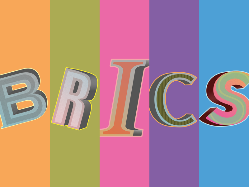
Have made these letters for a newspaper coming out this September in Japan. This image is a preview, the letters will be published one by one each in a square. 100% Affinity Designer (which is super-cool!)

- 6 replies
-
- 2
-

-
- lettering
- illustration
- (and 1 more)
-
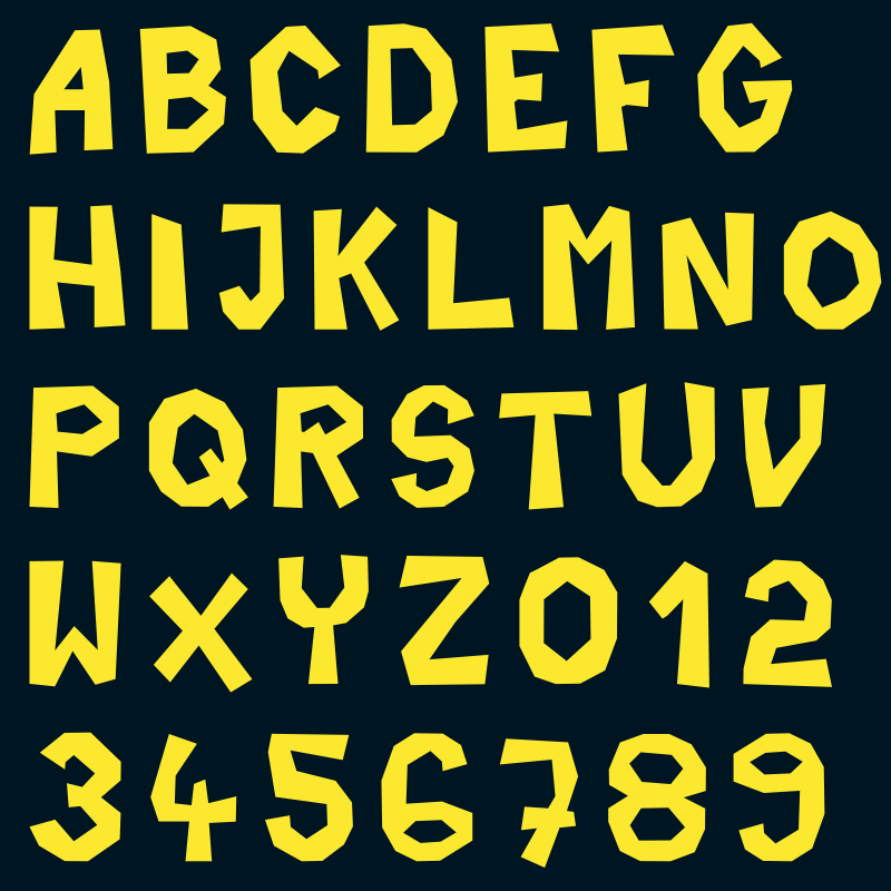
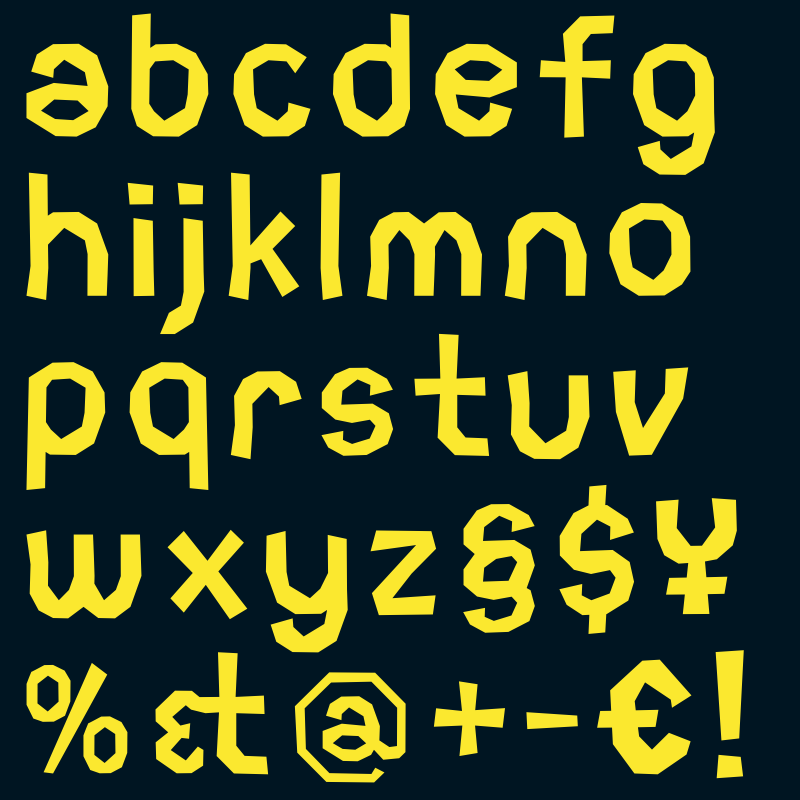
Just doodling with the Typography Tools and a little Texturing effect in Affinity Designer.
-
 Hello, is there a way to disable text antialiasing? Or choose a degree (eg PS "crisp", "smooth",…) thanks!
 -
It would be awesome to have sliders to control text size more interactively in the menu bar as well as in the Character window. I think a slider would be better and more flexible instead of the current drop-down menu with pint sizes. That goes for Affinity Designer as well as Affinity Photo. Love your products — keep up the great work! Florian
-
This might become a larger project. Biggest problem is narrowing down all the options...
- 19 replies
-
- 4
-
-
- ABC
- illustration
- (and 1 more)
-
I will make this quick. The default font for affinity designer doesn't look pleasing. I don't like how the panels look overall because on the top and left hand side the buttons are all rounded. This clashes with the hard corners the panels have and other buttons that are not rounded. The program is great though, I love it. Keep up the great work!
-
- Color libraries like Pantone would be welcome. - Support for Suitcase Fusion for type management. - Multiple Page layouts
-
 I’m just using the Designer beta to lay out some typography, and I’ve noticed that the snapping tool only works with the usual object geometry of bounding box, midpoints, centre points etc (for both art text and text frames). Obviously with typography, the baseline is an important point of alignment, and Illustrator currently includes it in its snapping options. I’d love for the Affinity suite to include the same functionality.
 -
Recently in my graphic design class we went over glyphs inside of Adobe Illustrator to adjust the printed text from text boxes. I'd like to see the same or equivalent feature in Affinity Designer. Glyph/Special Characters window: http://helpx.adobe.com/illustrator/using/special-characters/_jcr_content/main-pars/image_0.img.png/tp_27.png
- 2 replies
-
- 1
-
-
- typography
- glyphs
- (and 1 more)
-
a fontface in preparation .. to become a truetypefont .. out soon
- 3 replies
-
- 1
-
-
- typo
- typography
- (and 8 more)
-
 PLEACE ONE SINGLE MENU WINDOW FOR TYPO FONT DESIGN if i set a frame for font i want to manage all things in ONE TYPO EDIT WINDOW .. i don't like click and click to find all hidden features for a proper font design management .. once i loved Freehand's .. Quark's is also super for huge text masses .. Illustrator / Indesign / Photoshop are ok .. once Apples Pages 4 had a sweet font design menu window .. but now in new Pages i have to search and check out a lot of (hidden) submenus .. and AFFINITY's is very similar to pages submenu click orgies for a well doing typo design management .. i repeat PLEACE ONE SINGLE MENU WINDOW FOR TYPO FONT DESIGN
 -
Hi there! Firstly I'd like to say that this is one amazing program ideal for artists! A real treat to have come across. I have recently been creating my own font, It's great fun but can be tedious and I came across a cool plugin for fontlab studios which harmonizes the characters. Its called RMX harmonizer -http://remix-tools.com/harmonizer I thought that a tool like this for my artwork would be ideal! Not just for fonts! It would help make everything look really smooth and sleek and cut loads of time in the design process. I also think it will give the software a one up on illustrator as theres nothing like it for illustrator ;) I also had an idea a few years ago which I thought would be really helpful, I sent it to another company but unfortunately they haven't got back to me. Perhaps you'd like to have a look- Ive attached a pdf.. Its a tracer tool that would save a lot of time of cutting paths, joining paths.. I really hope you like the ideas and I look forward to hearing from you Matt Tracer Project Proposal.pdf
-
I thought I would bring this open-type interface initiative to your attention. The type community is going to lobby Adobe very hard to improve their open-type interface. It seems to me that Affinity Designer can probably do a better job here. The information about this can be found here: http://ilovetypography.com/2014/10/25/why-a-better-opentype-user-interface-matters/ And designers are starting to mock up the interface methods that they'd like to see; something to look to for inspiration, perhaps. Cheers, Peter.
-
 I try to convert some work from Adobe Illustrator. I made some logo design in Adobe Illustrator. As Illustrator format basically contains an embedded PDF it's pretty easy to see a preview just using QuickView in Mac OS. The format was imported without issues but there might be a general issue correctly respect the kerning information from the font. There are some huge gaps between specific symbol groups mostly related to the uppercase "A" character. At least this is the place where it's most obvious that there is something wrong. I did two PNG exports of the original file rendered by Affinity and Illustrator. I think it's pretty obvious what's wrong. Is better font support on the roadmap or is that some specific issue with some font files? Thanks for support and clarification!
-
 I am running the beta of Affinity Designer, but I cannot find a way to use the typographic features of some fonts, especially a way to enter old style numbers. Normally I can use this features with the standard OSX "CMD-T" window (I use a Dutch localized version of OSX, and I do not know how this is called in English), but Affinity Designer uses a non standard window. For a graphic designer extended attributes of fonts are a must, so I would be disappointed if these could not be used.
 -
Please add a feature to manual kern, like using [opt]+[arrow] in ai for example.