Search the Community
Showing results for tags 'Type'.
-
 I am trying to "left justify" some copy and it only goes to "justified left/ragged right", no matter what I try. I don't understand why it won't justify on both sides. The other options work, center justified, full justified, but the left justified option only goes to a regular left/ragged right. Is there a special way to create a text box? I just typed out the text and it seems to have created it's own text box. thanks.
 -
Hi, It wold be lovely to have google fonts browser integrated directly into Affinity Designer for iPad. So you can browse through type catalog and have search criteria like serifs, sans-serif, condensed, display etc... Also Adobe Type would be nice but i konow that is far fetched :) Cheers! Igor
-
 Hello, New to Designer but not vector programs. Looking to create a vertical arc with type. I've done it within Corel and illustrator but not in Designer. What am I missing? Thank you in advance. Lars
 -
 I see lots of typography-based feature requests for Affinity Designer. This is not surprising since a lot of us are designers using very mature Adobe software and text wrap, linked text boxes, bullets, columns etc are all essential features for layout. However, we have Photo for photo editing, Designer for illustration and [hopefully soon] Publisher for layout. I think a lot of these "essential" typo features are being requested because Publisher has not yet been released. Designer should not get these advanced type features because they are aimed at layout, not illustration. Typo features that should be in Designer, should be limited to artistic effects like envelope distortions for warping and advanced text on path. My rule of thumb would be "if I can use the feature to design a logo, then it should be in Designer, if it's needed for a brochure, then it should be in Publisher". If we look at the Adobe line-up... sure Illustrator has got a truckload of text features that allow you to do typographic layouts, but I think that's part of Adobe's failings. I have designers who work for me who make me tear my hair out when they insist on using Illustrator for a 20 page brochure – it's possible but it's not the right tool for the job. Then they go and design a logo in PhotoShop – again, possible, but not the tool for the job. (Illustrator REALLY lost the plot when they added multiple pages/artboards) I think this comes from the fact that for many years, Adobe has been adding features from other applications and calling them "upgrades". Instead of innovation and reworking old tools, we just get shared feature sets. This is exactly what I consider to be "application bloat". I hope the developers at Affinity don't give in to all the requests to add missing features to Designer, when these missing features are actually a request for a missing application. Please Affinity, keep your apps focussed, efficient, streamlined and well-considered. Please don't turn all of them into a Jack-of-all-trades. Your pricing is low enough to force me by Publisher if I need typographic features. I'm concerned that when Publisher comes out, customers will pick and choose which, single app they want based on a collection of broad features that satisfy 70% of their needs, and then complain that it's missing features. Rather, we should buy the suite and get all the features we need, than try to get one app upgraded to the point where we don't need the others. I guess my post could also read "Please speed up delivery of Publisher", or at least give us a few more teasers – even just a full feature list of version 1.0 so we can stop asking for what is already on its way. Thanks guys for great software. I'm very optimistic for the future – a future without the need to have Adobe software on my computer. (and great typographic tools in Publisher is the last stepping stone to that future) :)
- 2 replies
-
- 2
-

-
- Publisher
- Typography
- (and 2 more)
-
 I see in the roadmap for Designer that a Mesh Warp tool is on the way and know there is such a tool in Photo already, but the feature in both Illustrator and Photoshop, that I use the most, that is missing in the Affinity apps is the ability to apply different shape transformations: wave, arch, circular arch, arch top, arch bottom, etc. to live typefaces and to edit the amount and shape of these transformations at any time. In Photoshop, for instance, I can create a type object, apply various effects to it, then arch it, but later come back and edit kerning, the actual text and even the typeface. This feature is also available in Illustrator. This ability is the what I need most to fully replace Photoshop and Illustrator for my art creation purposes, which is my goal. I'd like Affinity Designer and Photo to be my full permanent replacements for Adobe apps. They are super close and I am using them for most things already, but the Live Type warping tool would really seal the deal. Thanks.
 -
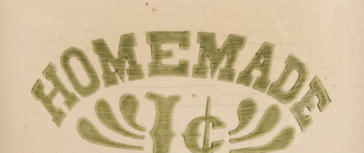
I am trying to warp or manually curve a type design. I am baffled that a vector design program doesn't have this feature...it's a critical tool for any vector design. Type on path is NOT what I want because that tool does not address the bending perspective that warp creates. (see homemade type solution) any suggestions or advice?

-
 try it on these logos - whether grouped or as a multiple selection, the type is not sizing with the rest of the elements coco logo variations 1a.afdesign
 -
Hi guys! I needed to create a custom design for a Brand manual and I was struggling with the fact that there's no layout grid option like sketch. So I decided to download the illustrator templates of the 960.gs grid system and adapt it to affinity designer using the constraints (so no matter how wide your artboard is, the grid will always strech porportionally). Hope you find this as useful as me. You've got three files: 12 column layout 16 column layout 24 column layout Happy designing! 960_grid_12_col.afdesign 960_grid_16_col.afdesign 960_grid_24_col.afdesign
- 13 replies
-
- 21
-
-
 Hi all- New here! I'm trying to figure out how to write words in my logos (I know, the typing tool). What I mean is how do people write the words of a company name- do you usually download custom fonts from online websites, and if not, how does one make their own font? Maybe @ostrysharpcould help- I really loved your work in this feed.
 -
 I just discovered, to my chagrin, that PagePlus X9 doesn't support ligatures, those special characters which, in Open Type fonts, "stand in" for certain letter combinations, usually those involving 'f'. See the png below for an example. Now, I know that only old-school has-beens like me care about such things, and I also know that there's nothing to be done about (legacy) PagePlus. But InDesign does it with elan, and it would behoove the Affinity team to at least consider doing it in Publisher. It's a nice touch that veritably screams professionalism.
-
Hello Dave & Crew, Any chance of supporting descriptive names in stylistic sets? I can send an updated version of the font you have of mine if you would like one to test if you desire. Mike
-
-
Hi! I know this is far from being prioritized, but it would be great if there was a way to write math in Affinity Designer without having to manually draw lines for fractions, etc. Perhaps implementing just a few typesetting features from LaTeX would greatly help in my scenario, which I will most likely still encounter a lot of times in the future. Thanks!
-
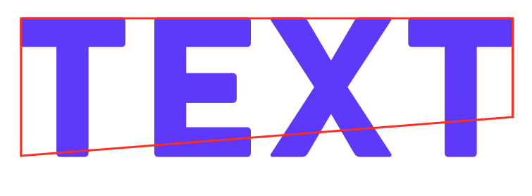
 Hi everyone, Is there any way other than perspective distortion or maybe mesh-warp to transform/skew text like in the image?
-
 In Affinity Designer my character panel will not open. I click on the tab and in the drop down menu and it simply does not open. I have tried to find where I can do a reinstall. Does Affinity permit a reinstall? At this point I'm sorry I bought it. If this isn't resolved I'll just go back to Illustrator for good. i do a lot of type layout.
 -
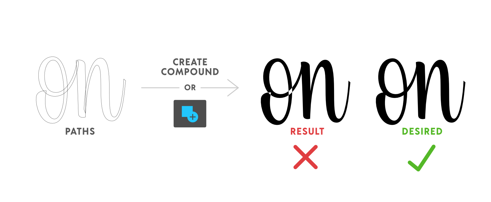
 Hello! I'm new around these parts (first post) so I apologize if this question has already been asked and answered. I did some searching, but I couldn't find anything regarding this. My question is: How does one merge or combine a self intersecting path/curve (to make a compound path) in Affinity Designer? I design type and it's desirable—crucial really—to overlap a shape/path within itself for maximum flexibility and ease of manipulation while working. Unfortunately, when it comes time to combine the final artwork I'm left with compound holes where the paths intersect themselves. :( I've attached an example of what I'm referring to. I've tried all of the options that can think of (Geometry, Create Compound, etc.), but none seem to work. I'm assuming that this is just the way paths combine in AD, but I'm desperately hoping that there's another technique that I'm missing. Also, I love AD thus far. Great work! Thanks for your help! :D
-
 When I copy and paste from a document it does a block of colour behind the text, how do i remove it? (Picture Attached) Text problem.afphoto
 -
 I would like to make my own fonts. I saw a video about an add-on for Photoshop and Illustrator, which I think offers some great features. This add-on is called Fontself. It would be amazing to have something like this in Affinity Photo!
 -
 I'm not sure if it has been requested yet but it would be great to be able to convert Artistic text to Frame text because the text content doesn't always stays the same and for example, when you want to change a title to a paragraph at the moment you're force to create a new object (Frame text) and overlay it on the same pre-existing Artistic text. It just takes a lot of time if you need to repeat this action several times. And then again, if you need to change it back you have to start over replacing paragraphs with Artistic text.
 -
 For instance if I wanted to have stars follow along a curved path...or the letter C follow along a line.
 -
If you search "rtl support" or "support arabic text" you'll find that it's a very old and frequently wished feature. So please add rtl support to AD or at least add it to your road map as it is a very basic feature. Affinity designer is called to be a UI design tool. But what is the use of it when one can not type and work with text an typography? Currently you can't work with persian, hebrew, arabic, urdu ... and all the rtl languages in AD and it's not even mentioned in the introduction of the app in the Appstore or in the website!
-
Hey, I've started trying the 1.6 beta for Affinity Photo, and when playing with the text tool, this strange thing happens: https://www.dropbox.com/s/0a2hln891pw7aos/type%20rendering%20issue.mov?dl=0 The navigation feels smoother than in 1.5, but there are ,,leftover" pieces of the text when they are moved away. You can clean up when moving over them again, it's a similar game I've used to play on Windows when I was a kid.:) Is it supposed to be normal? Cheers, b
-
 Will Affinity Photo and/or Affinity Designer be able to use the new color fonts that are starting to become available? So far they only work in Photoshop CC 2017. https://www.colorfonts.wtf
 -
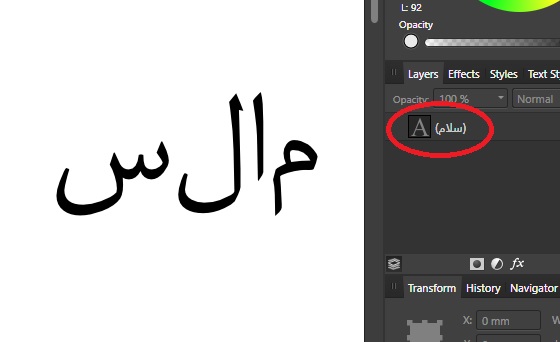
Please add support for rtl languages. you are showing it right in the layers panel, but in the Text Tool it's wrong. see the attachment.
-
First I want to say that you guys are literally the only ones who have made the Touch Bar on the MacBook Pro useful. Seriously, it's great execution on having appropriate adjustments and functions on the bar. Most app devs treat the bar like an after-thought and, if implemented appropriately (which it almost never is), it's quite useful. Something I'd love to see implemented is a more robust Touch Bar for the character menu. Currently there are only the three bold, italic, and underline options, all of which often aren't applicable for most fonts. I can imagine having things like tracking, leading, and font size dials available, perhaps with a few options like all-caps or small-caps. And while I wouldn't want the actual font-picker menu on the touch bar (way too much swiping), having a picker for font variations within a family would certainly be valuable (slightly less swiping). I can even imagine seeing ligature or Open-Type variants pop up when highlighting specific characters.