Search the Community
Showing results for tags 'Tutorial'.
-
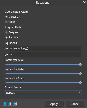
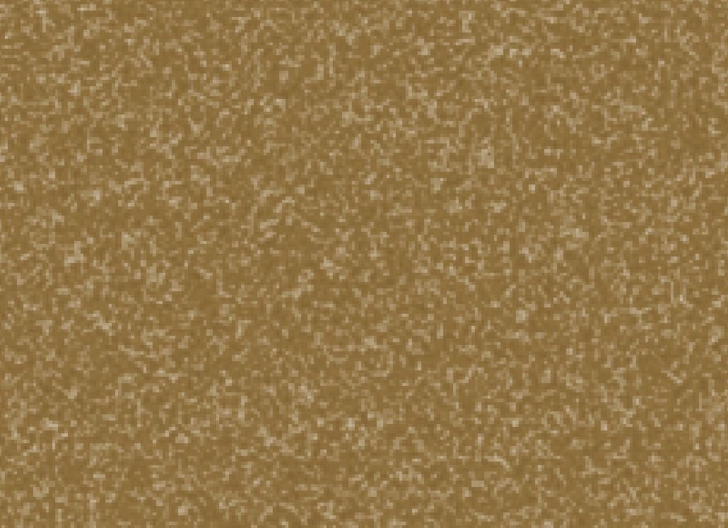
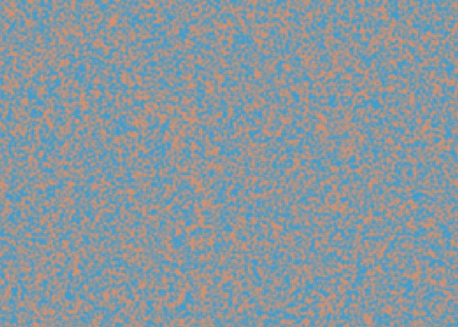
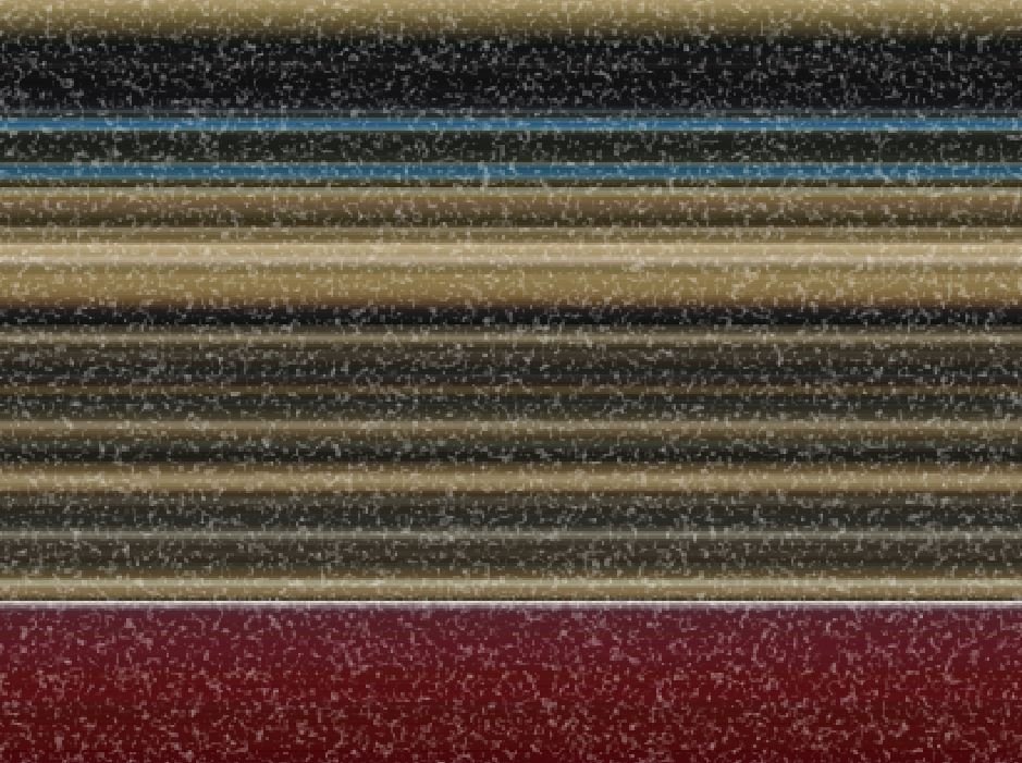
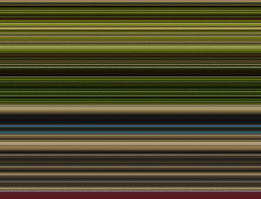
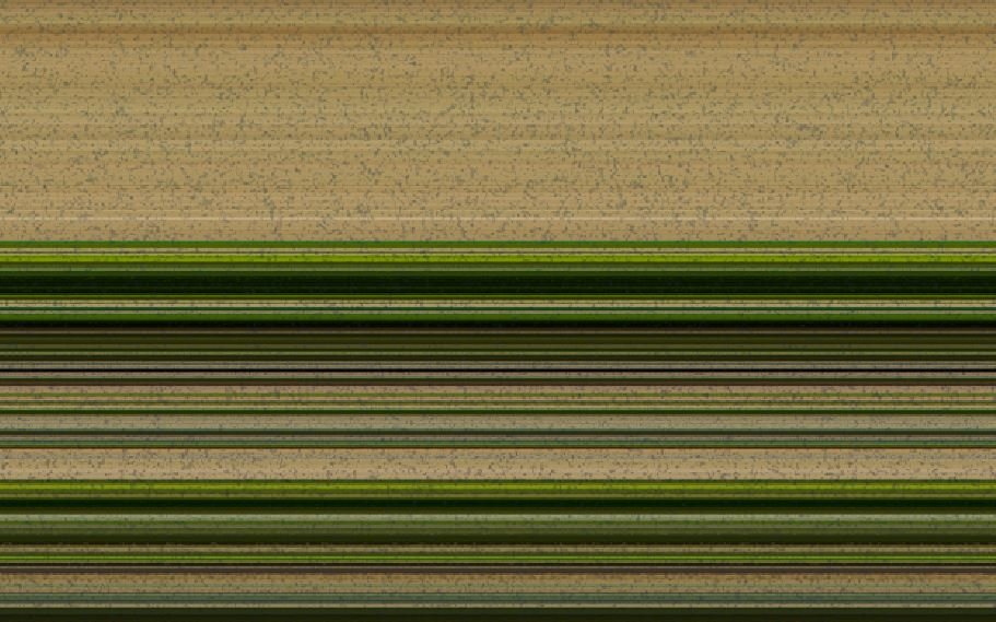
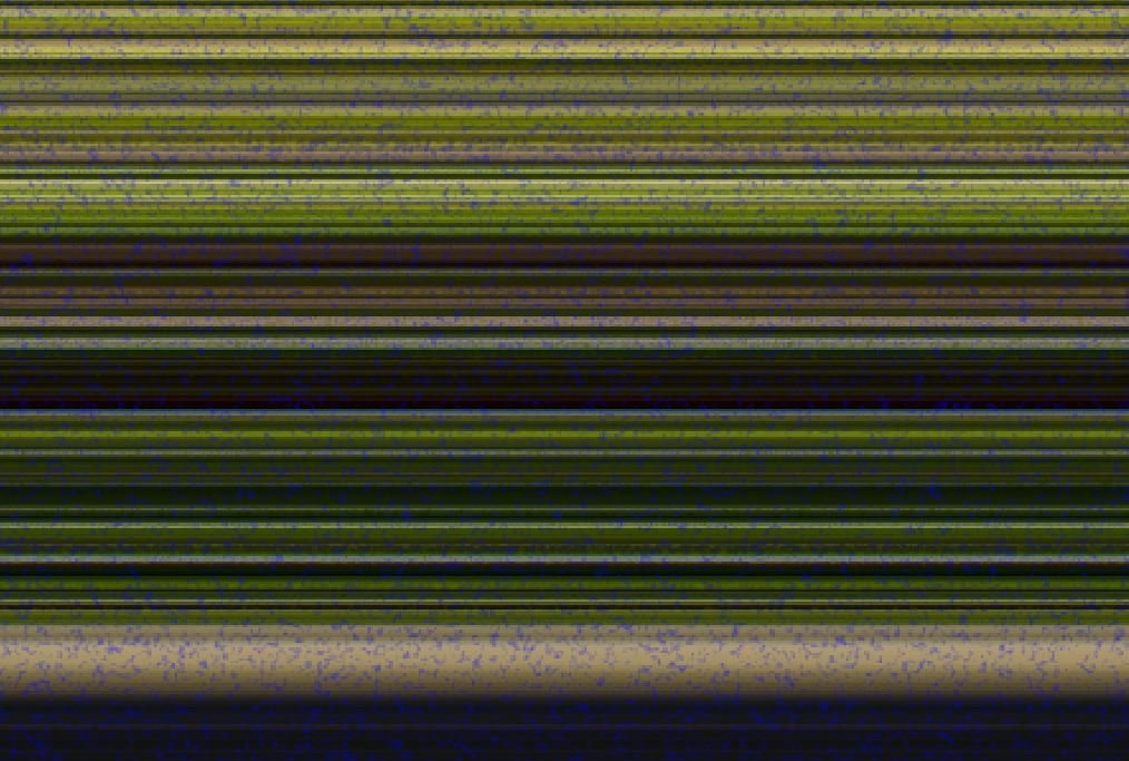
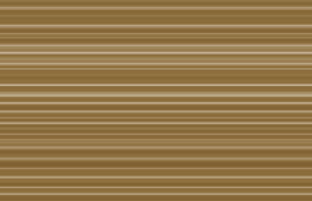
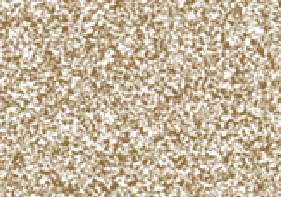
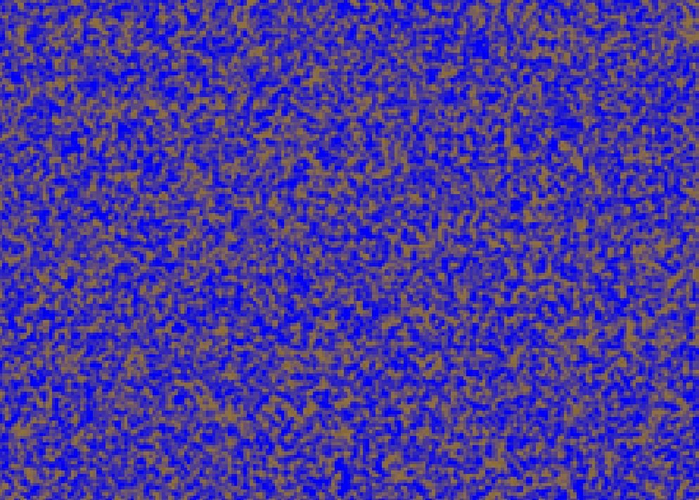
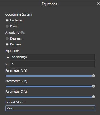
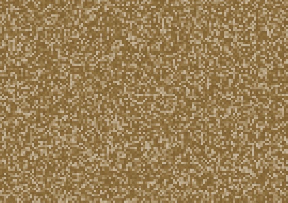
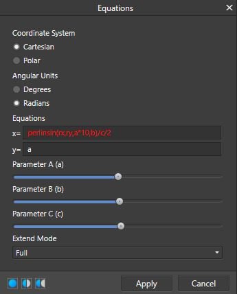
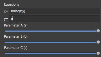
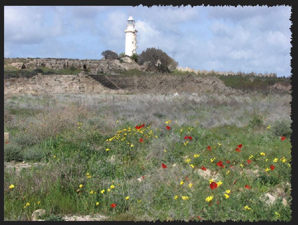
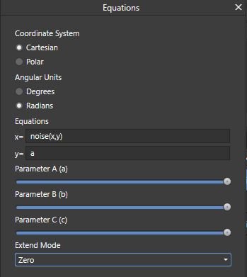
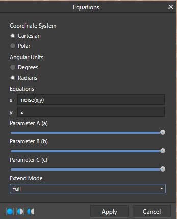
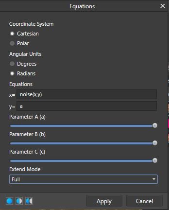
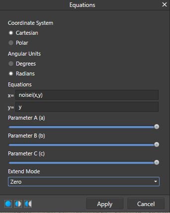
 Summary This tutorial: Is aimed users with little or no knowledge of the Equations filter. Explores what “noise” is, in the Affinity Photo filters – particularly how it appears in the Equation filter. What the effects of “Extend Modes” have on noise generated in the Equations filter. What the effects are of using the “a”, “y” or other equations in “y=” part of the Equations. Shows how noise equations can be used effectively on an empty pixel layer. Offers some practical uses for noise equations with macros. Introduction The aim of this tutorial is to explore the inner workings of the “noise” command as it’s used in the Equations filter in a practical and experimental way. I am not a computer programmer or a mathematician – so this is layman’s perspective, not a technical tutorial. The goal is to help users who have only a rudimentary understanding of the Equations filter get to grips with and find uses for the noise function in the Equations filter. Hopefully, any inaccuracies will be picked up by other users in comments. I’d like to thank John Rostron, whose more technical article about the noise function made me curious – you can read it on the forum HERE. Preparation If you want to follow in Affinity Photo the experiments I’ll make in this article, you’ll need to do the following: Open a test image or download mine – link at the bottom of the article. Make sure the image is a pixel layer not an image layer. If it says “Image” on the layer in the layer palette, right-click and select “rasterise…”. Duplicate this layer with Ctrl+J. Create a new pixel layer above the bottom Background layer and fill with a blue colour (eg. R:0, G:0,B250). This will enable you to see any transparent areas made by noise in the top layer. Noise vs Procedural Noise So, what is “Procedural Noise”? In digital imagery like digital photos and scanned images, noise is unwanted artifacts in the form of random variations in the colour and tone of pixels in an image, which are not part of the original image. They are generally produced as a result of electronic interference. If you push the ISO on your digital camera to its highest rating and take a photo in low light, zoom in and you will likely see spots, speckles and coloured patches which were not a part of the scene (see image below). A noisy image produced on a high ISO on an older camera. Usually (and mainly in photography) this noise is unwanted, but it can be used creatively for special effects or for artistic purposes by graphic designers and artists, so software like Affinity Photo usually provides effects filters which let the user add various forms of noise to their images. This noise is produced by a mathematical algorithm or piece of computer code, and so is made by a procedure – hence “Procedural Noise”. Here are couple of examples of procedural noise used artistically: In the image above, I used the Filters>Noise>Perlin Noise filter in combination with the Displace Filter for a quick artistic effect on the right-hand side – the left side is the original image. Both the background and the text textures in the image below were created using noise equations in the Equations filter. Affinity Photo provides the user with four main ways to introduce noise, all found in the Filters menu. Add Noise… and Perlin Noise… are found in the Noise section of the Filters menu. These are the simplest way to add noise, since they have a user-friendly interface. Noise can also be introduced through the Procedural Texture and Equations filters found in the Colours and Distort sub-menus. Both these require the user to enter equations, which can make them seem daunting, if not a no-go area, as there virtually no guidance on how to use them in the help file for those without any technical knowledge. If you want to begin understanding and using Procedural Textures in an accessible way, try my absolute beginner’s tutorials here – which also uses noise functions. Procedural Textures – Key Features The single most important/useful thing about procedurally produced noise is that it can be produced at any scale or resolution of image without degradation. Because it is a random pattern (pseudo-random, if we’re being pedantic) produced by an equation, the pixels it produces are not fixed or ‘real’ until the apply button is clicked. Instead, like vector graphics, the work at all sizes and scales of image. You can fill a 1mp or 100mp image with noise and the pattern will never repeat or degrade. One feature I have discovered, which is often overlooked, is that procedural noise is composed essentially of two areas: areas with the noise pattern and the areas between, which I am calling negative space. It turns out, the negative areas are just as important as the bits of noise, as we’ll see later. More precisely, it seems that there are parts (pixels, ultimately) which are solid colour, and others which are increasingly transparent – which become more evident when using noise in the Equations filter. Let’s take a look at very basic noise in the Equations Filter: Check to make sure the top layer of the test image is still selected. Open the Equations filter dialogue by going to Filters>Distort>Equations. Enter the following equation exactly as it is in the with no capitals or spaces: In the x= box type noise(x,y) In the y=box type the letter a (Which I’ll explain later). From the Extend Mode list, select Full. Coordinate System should be Cartesian, and Angular Units should be Degrees, by default – from now on everywhere I describe inputting an equation in the Equations dialogue the default settings of Cartesian and Degrees will be assumed. DON’T click apply, leave the dialogue open so you can follow the experiments below. To see the noise more clearly, hold down Ctrl and scroll your mouse wheel forward to zoom in. You can now see clumpy, fuzzy blobs of solid colour with fuzzy white patches of negative space. Zoomed out, it’s the coloured bits that we perceive as noise. I’ll explain the reason for the strange colour in a moment. What’s going on? What’s really happening is that the noise command generates random vertical and horizontal bars of tone shaded from white to a solid colour. We can see this by changing the equation. At the moment noise(x,y) is an instruction to make noise in the x and y directions - horizontally and vertically. Change the equation so that it reads noise(x,1). You should see random vertical bars in various tones of colour like this. Now change the x in the equation to a y, so the equation reads noise(y,1). You should see random horizontal bars in various tones of colour like this. This indicates that noise(x,y) is really a blend of the two. What the deal with the colour? When the noise(x,y) equation is used in combination with the Full noise Extend Mode, the filter generate noise which is a kind of average colour of the whole image, though this is not exactly the same colour as would be produced by the Blur Average filter. From my experiments, these white areas are, in reality, appear to be areas of transparent and semi-transparent pixels, depending upon the tone of the pixels. Pixels of the true averaged colour are opaque whilst lighter tones are increasingly transparent, until you get to white which is entirely transparent. At the moment, we are seeing the light pixels as white because, in this instance, the Extend Mode we’re using is Full, which makes the white areas opaque. I’ll explain a bit more about transparency later, when we look at other Extend Modes. There’s more than one kind of noise! Until now, I’ve been using the word “noise” to talk about procedural noise in general terms. In fact, in the Equations Filter the word “noise” is the name of just one particular type of noise. In the programming language used to generate procedural noise in both Procedural Textures and Equations, there are dozens of different types of noise (noise, noisei, noiseh, noisecubic, noisesin etc.), each producing a slightly different type of noise. The differences are, perhaps, more noticeable in Procedural Textures where you can magnify them to create interesting patterns, effects. You can see the full list if you look up Procedural Texture in the help file. Scroll down the page and you’ll eventually come to the lists of different noise types. For a very different kind of noise add the letter “i” after the word noise, so the equation reads noisei(x,y) in the x= box (till with a in the y= box and the Full Extend Mode). This makes noisei type noise, which is blocky and pixelated. noisei type noise Now try substituting the letter “i” with an “h”, so you have noiseh(y,x) in the equations. You should end up with something like this: noiseh type noise You can now clearly see the coloured fuzzy blobs of noise with the negative white areas between. Extend Modes make a MASSIVE difference Let’s prove that white areas and lighter tones are, in fact, areas of transparency. Just to remind you, Extend Mode is last option at the bottom of the Equations filter dialogue. It contains a drop-down list with Zero, Full, Repeat, Wrap and Mirror. Each mode has a different effect upon what the equation does to the image. Change the Extend Mode to Zero. noiseh(y,x) with Zero Extend Mode. Suddenly, you can see the underlying image (the blue layer) through a veil of noise. Experimenting with different extend modes To experiment with different Extend Modes, we’ll use the first noise equation we started with. It should still be open, but if it isn't, set it up the Equations dialogue as follows: That letter a in the y= box essentially activates the Parameter A slider, turning it into a sliding controller. I’ll come back to this later. Try testing out the Equations with different Extend Modes, at the same time as sliding the Parameter A slider back and forth. Here’s what I observed. Zero Extend Mode produces noise with transparent negative areas revealing the layer underneath the current layer. The noise pixels are made more transparent by sliding the Parameter A slider to the left. There is an initial brightening of the noise before it begins to fade, never quite going completely transparent. Full Extend Mode fills the layer with white overlain with noise. The noise pixels are made more transparent by sliding the Parameter A slider to the left. Repeat Extend Mode produces sparse noise (with this image) on a solid field of averaged colour. Moving the Parameter A make the noise and background colour lighter. Note: in one image, I found that the Repeat Extend Mode filled the layer with averaged colour and zero noise. Wrap Extend Mode is unpredictable from images to image. In the image, it averaged colour noise on a background which is the inverse colour of the noise. Moving the Parameter A to the left changes the relationship of the positive and negative colours, intensifying the background colour whilst making the noise more transparent. Mirror Extend Mode, gives identical results to Repeat, in these experiments. Dealing with the “y=” box So far, we have only had the letter a in the y= box. That is because the the y= equation box cannot be left blank. It must contain a value of some kind; either a letter*, a number, or another equation (which I’ll come back to later). If you enter the letters a,b or c in the y boxes then the A,B or C parameter sliders become active, giving customisable control of Equation depending upon which extend mode you use. *note: only letters that have a function in the Equations filter produce a result when used alone in x= or y= boxes. I will list other useable letters at the end of the article. However, if you leave the default letter “y” in the y equation field, you get completely different results with different Extend Modes. Try the following tests using noisei(x,y) in the x= field and y in the y= field. You’ll need to zoom out at little to get an idea of what is happening (hold down Ctrl and scroll the mouse wheel backwards). You should see something like this. Zero extend mode (above) produces random horizontal bands of colours which are averages of the area the bands cover. The negative, transparent and semi-trasparent areas of the noise pattern punch holes through the current layer revealing the layer underneath. Full extend mode (above) produces random horizontal bands of colours which are averages of the area the bands cover. The negative, transparent and semi_transparent areas of the noise pattern are white instead of transparent. You need to zoom in to see this more clearly. Repeat and Mirror, both produce random horizontal bands of colours which are averages of the area the bands cover with little or no noise. The Wrap Extend mode (above) is a weird one. It creates the same horizontal bands of colour, but this time, the negative spaces are of varying colour, perhaps inverse complimentaries? Using noise equations in both x= and y= boxes Adding a noise equation to the y= box in addition to the one in the x= box has the effect of adding a second layer of noise to the image. The resulting noise is now similar to the earlier noise where we put an a in the y= box. If the y= box contains the same equation as the x= then the effect, though, appears to be to increase the contrast between noise and negative areas. However, if equation in the x= box is noise(x,y) and the y= box is noise(y,x), the effect is to increase the overall amount of negative/transparent/white areas. What this means is that you can overlay two different kinds of noise, if you wish. Try for example, using noiseh(x,y) in the x= box and noiseh(y,x) in the y= box. This concludes Part 1 of the tutorial. Part looks at putting all to use with some practical examples. Scroll down for the link to Part 2. Notes Useable letters which can be use in the x= and y= boxes a, b & c – activate the parameter sliders in the dialogue h produces light, near neutral noise - Try h+a and h*a in the y= box with various modes. x & y Noises with the letter “h” in their name like (noiseh, noisehpsin, noisehcubic etc.) create harmonic noise, which has greater negative areas. Special note re. Perlin Noise Perlin noise, which you may have come across in the list of noise types, is a particular type of noise invented by Ken Perlin, who was looking for a way to generate more natural/realistic looking 3D textures. It has a more “clumpy” look to it. When it is scaled in 2D imaging software like Affinity it can create wonderfully versatile natural-looking textures from clouds to hair and even wood grain. Sorry to say, I have yet worked out how to scale any noise in Equations. Nevertheless is still a useful variation of noise. The Perlin noise command requires four pieces of information to work properly. I don’t want to go into any kind of technical depth here, so just try the example below (note the position of the Parameter A, B, and C sliders): Explanation: Perlinsin – a type of Perlin noise. rx,ry – generates the noise. The r before x and y means you can click in the image and drag the noise around. a*10 – Activates the Parameter A slider which seems to control softness and brightness b – Activates the Parameter B slider, which seems to control softness and graininess. /c/2 _ Activates the Parameter B slider, which acts as a sort of contrast control, change the spread of midtone pixels. GO TO PART 2
-
 I am trying to extend / recreate this image so that it is higher than it is. So I need to create this part manually. But I have now idea where to start? Are there any videos of tools i should use to be able do draw this image to become higher? Thanks.
-
 Affinity Photo tutorial in less than 60 seconds. Get more precise clones by rotating the clone tool. #affinityphoto #tutorial #clone #digitallyfearless #shorts https://youtu.be/8GD0JwzoNqI
 -
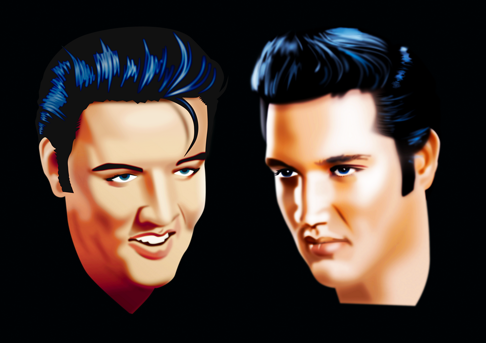
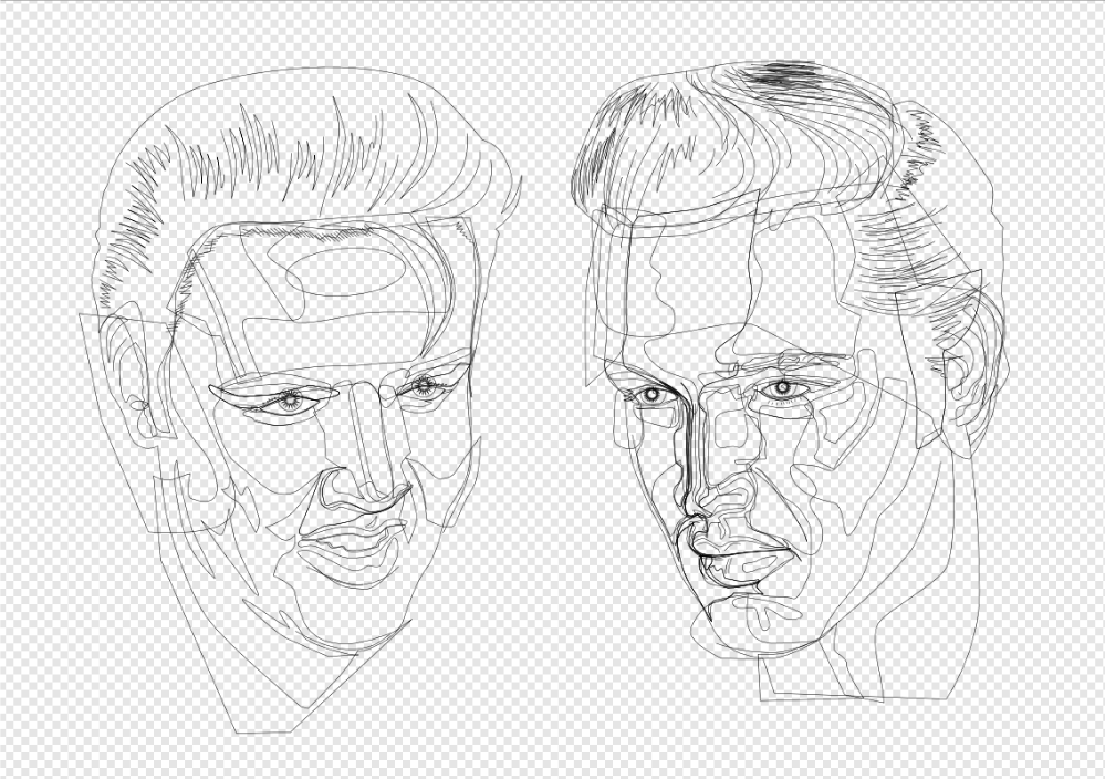
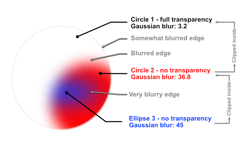
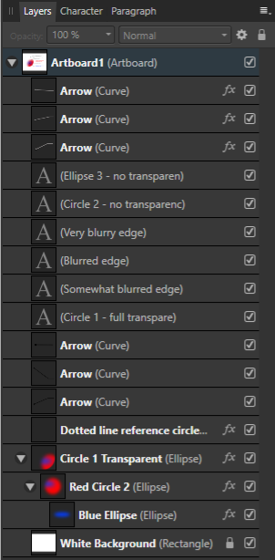
 In the images below cartoonish vector portraits of Rock & Roll legend Elvis Presley can be seen. This image was created in Affinity Designer. After having worked with Adobe Illustrator professionally, CorelDRAW privately and Inkscape occasionally for decades, I have come to the conclusion that Affinity Designer is better suited to create vector portraits that do not have hard edges in the face, even if it does not include the Mesh Fill function, that is very time consuming and tedious to work with. The drawing and editing process - particularly when editing the drawing at a later point in time - in this program takes far less time and effort. Progress sequence of the portrait on the right can be seen in an other blog entry: https://communicats.blogspot.com/2020/07/this-is-other-vector-portrait-of-elvis.html?fbclid=IwAR1Yp4CNvlXspX1W_S5LV5Q0UzM1sWsn_TibSegexxHwWyH6C7ayKQ3LJG4 The image below this paragraph is a screen dump of the vector outline of the double portrait. Extensive use was made of Affinity Designers Gaussian blur function, which allows to avoid hard edges in the facial features, as are often seen in vector portraits created in Adobe Illustrator. Many of the curves with which areas on the face were drawn are made by applying multiple node gradient fills and gradient transparency. This method allows to quickly edit (also afterwards) of the drawing which is much faster than while using mesh gradient fill tool that isn't present in Affinity Designer. Personally, I don't miss it. A brilliant Russian artist who works with mesh fills in CorelDRAW once revealed that it took him months to draw a vector portrait, while it is possible in Affinity Designer to make the same effect in much less time. I used CorelDRAW for many years, but only after accidentally running across Affinity Designer I was able to create realistic vector portraits a lot quicker, while making editing afterwards easier and faster. Examples of (more) realistic vector portraits and illustrations can be found in my website at: https://vectorwhiz.com/Vector.html To create (gradient) tints and blurs in the facial area of a vector portrait, it often is necessary to draw curves that have a variable level of blur along their edges, meaning that some edge parts are just slightly unsharp, while other parts are blurred and yet other parts are very blurry. To achieve this effect, I apply the following technique that is below this paragraph: In these vector portraits a Gaussian blur trick was applied in Affinity Designer, as can be seen in the third image. Ellipse 3 is clipped inside Circle 2 and circle 2 is clipped inside circle 1. In the image below you see, Circle 1 is transparent, the other two objects are opaque. Circle 1 has a minimal blur rate, Circle 2 has a higher blur rate and Ellipse 3 has the highest blur rate. The result of these settings are that circle one has an unsharp edge, circle 2 has a blurred edge to the left and an unsharp one to the right, while Ellipse 3 has a very blurry edge on the left and a less blurred towards the right. The blur values are indicated in the third image. The circle with the dotted line only serves to indicate the position and size of Circle 1 that is completely transparent, slightly blurred and used to clip the other objects. In the image below the Layer panel is shown containing the hierarchy of the objects in the image above this paragraph. Objects that are indented to the right are clipped inside the ones above them. The object names correspond with those in the Example drawing. The circles and ellipse are at the bottom of the panel. The objects marked with an 'A' thumbnail refer to the text in the Example drawing. In addition all parts can be given a colour gradient and gradient transparency, all settings that are independently editable of the ones described above this paragraph. In doing so the annoying hard edges of shadows in the face of a vector portrait can be avoided that are almost always seen in vector portraits created in Adobe Illustrator. Affinity Designer allows to create more realistic vector portraits in a much easier way that vector portraits created with the mesh fill function. The added benefit of working in this way is that at a later point in time all the parameters can be edited and tweaked to the preference of the vector portrait artist. Working in vectors with this method allows to resize the portrait without any loss of quality. Of course this technique can be applied to any shape you can draw, not just to circles and ellipses, that I used in the example above, as can be seen in the completed vector double portrait at the top of this blog entry and the vector outline view screen dump below it.
-
- 5
-

-
- affinity designer
- gaussian blur
- (and 5 more)
-
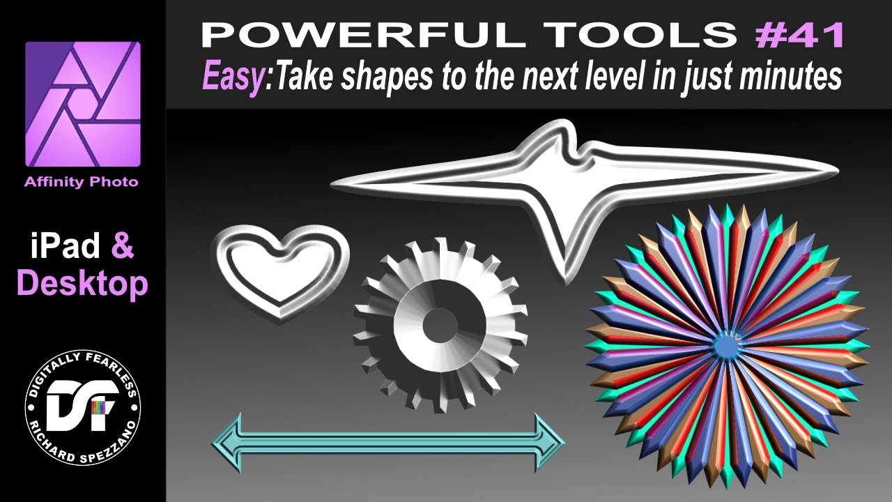
Easily take Affinity Photo shapes to the next level. Don't settle for the default shapes this Affinity Photo beginner tutorial shows how to change the shapes and add effects (FX) and blend modes to create unique graphics. This is number 41 in my Affinity Photo Power Tools playlist. the link to this playlist is below. https://youtu.be/JZrGgtn3RAA #madeinaffinity #affinityphoto #affinityserif #tutorial #photomanipulation #graphicdesign #affinity #digitallyfearless #AffinityiPad #iPad #shapes #fx #3D #blendmodes
-
 The people of School of motion are a big fan of affinity and today they posted this very detailed and wonderful tutorial on how to export from Affinity Designer® to Adobe® After Effects@. It may seem a little bit cumbersome, but I think it's worth it...specially if you try to avoid illustrator. The link: https://www.schoolofmotion.com/blog/save-affinity-designer-vector-files-after-effects Have a nice one! B.
 -
Easy chalkboard from a photo. Affinity Photo Tutorial In number 39 of my powerful tools of my Affinity playlist I turn a photo into chalk and place it on a blackboard, This Affinity Photo tutorial is shown in iPad and Desktop. https://youtu.be/IIqL44O9jbk
-
- 2
-
-
- photo manipulation
- diffuse
- (and 6 more)
-
 Hi, I shot some photos and stacked them together to a manipulation. I used several methods like photo stacking, crop, perspective warp, color changing, create shadows, selective exposure and dodge & burn. I wish you fun with this video und feel free to show your results and ideas. Ciao Jack
 -
 Hey guys, I am a real beginner and thought about buying the Affinity Designer Workbook. My Question is now, are the books even up to date? The Affinity Designer Workbook is from 2016. How much has changed in the program itself and the features... Would you guys recommend me to buy the book or is it not worth it anymore?
-
Hi, this is a Affinity Photo tutorial on YouTube. I took 5 photos to create a new one. Fantasy Island. This video is not in real time, but as a kind of speed art tutorial. There are a lot of steps and layers. Selections, transform, warp, color corrections, shadows, water splashes etc. ... I wish you fun with the video. Ciao Jack P.S.: You can activate english subtitles with the gear icon in the YouTube window.
-
- 1
-
-
- affinity photo
- tutorial
- (and 3 more)
-
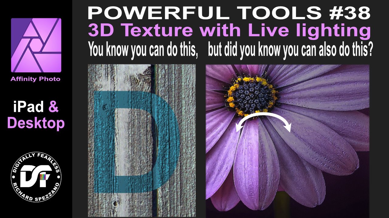
3D texture with live lighting Affinity Photo tutorial on iPad and desktop. First I show the way I believe it was meant to be used, but then I tried something different. I used a photo of a flower and gave it live lighting with 3d texture. https://youtu.be/lFK-Gqz1x2I
-
 I was wondering if anyone had any suggestions on how to make a poster similar to Obama's "hope" poster. I've seen a a few tutorials done using photoshop but im reluctant to try those because i know i would get lost eventually trying to follow along on affinity photo. Anywho, does anyone have a good tutorial they could link me? Thank you. If there are none to be found then its ok. i just wanted to try it out. My Favorite learning tool so far have been youtube videos where i can follow along. thanks.
 -
Hi, this is a Affinity Photo tutorial on YouTube. I shot this photo on a photo walk. It was already autumn, but I show how to create a very colorful changes. I show two methods. So you can choose your workflow. And because there are different layers, you can choose the the colors and the intensity. Have fun and feel free to show your results. Ciao Jack P.S.: You can activate english subtitles with the gear icon in the YouTube window.
-
- 2
-
-

-
- affinity photo
- tutorial
- (and 2 more)
-
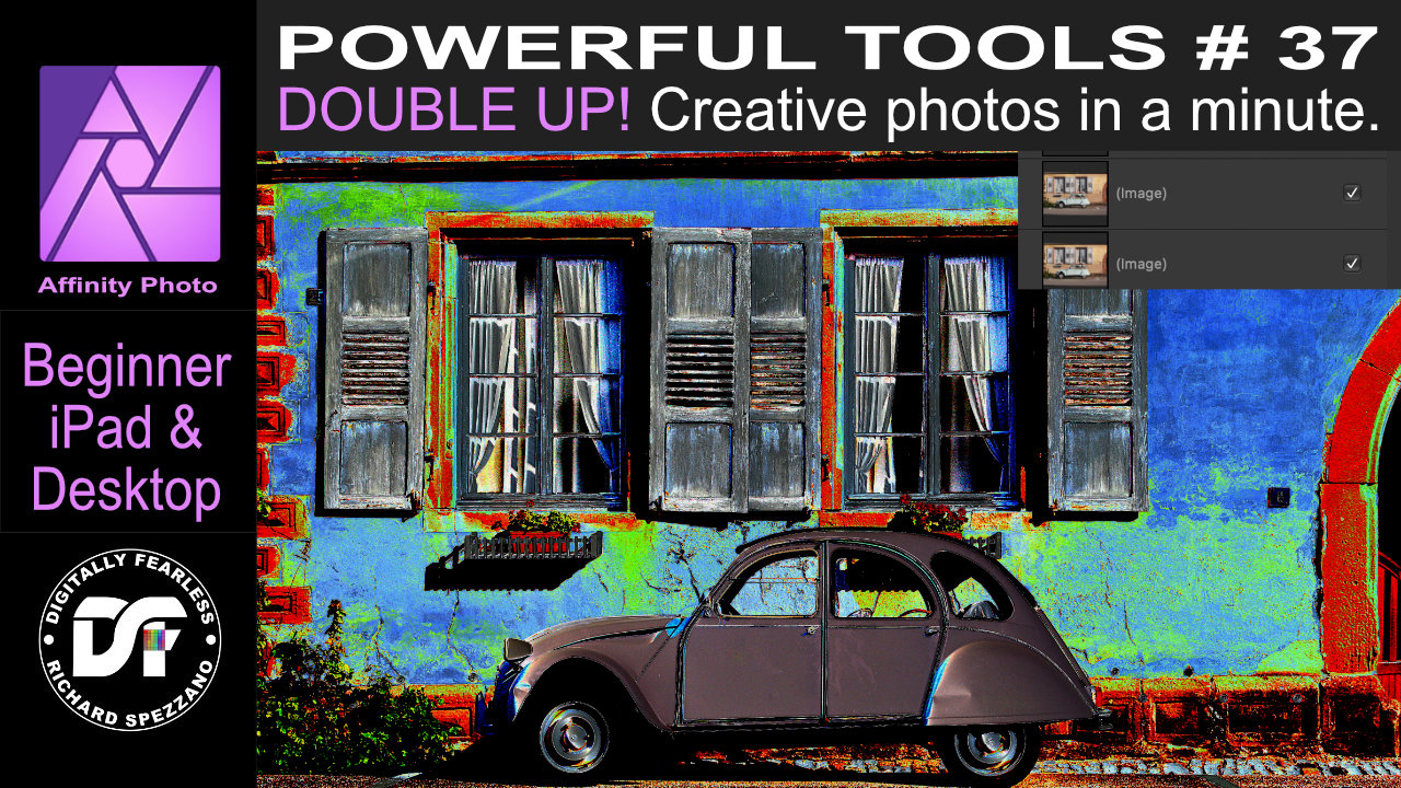
Double Up! In this beginner Affinity Photo tutorial I double the photo and double the blend mode to produce some interesting photo manipulations. This is number 37 of my Powerful tools of Affinity playlist.This tutorial is shown in iPad and Desktop. https://youtu.be/0fE7Du_-4-M
-
- 1
-
-
- affinityguides
- tutorial
- (and 4 more)
-
Hello, in this Affinity Photo tutorial, I show a problem of a shot at dusk after the sunset. There is a low light situation, you have to shot with a high ISO and so ... you will get noise! I show, how to denoise the photo and how to sharpen it. I wish you fun! Ciao Jack P.S.: You can activate english subtiles with the gear icon in the YouTube window
-
Hi, I made à tutorial, where I show, how to remove unwanted and complex objects, which sometimes ruin a photo. Have fun with this Video. Ciao Jack P.S.: You can activate english subtiles with the gear icon in the YouTube window YouTube Link
-
 Hey guys, as a first video on my new channel, I created a tutorial for a basic astrophotography editing workflow in Photo. Hope some of you will find this helpful - any feedback appreciated!
- 12 replies
-
- 6
-
-
- astrophotography
- tutorial
- (and 1 more)
-
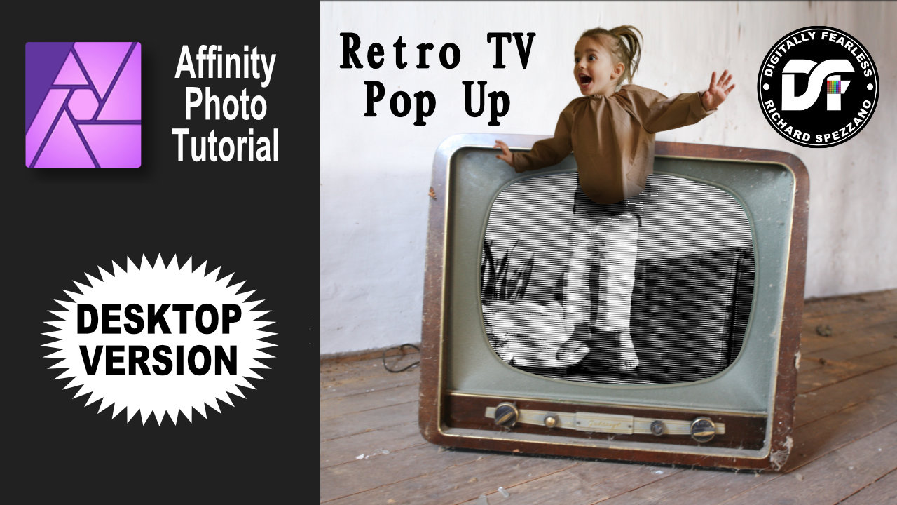
Retro TV Pop-up Affinity Photo tutorial photo manipulation. Desktop version. In this photo manipulation in Affinity Photo (desktop version), I create scanned lines and show a girl jumping out from a retro tv to real life. Halftones makes shapes and the pen tool are used. The link to the iPad version of this tutorial is in the description. https://youtu.be/EKR7IdFw6Os
-
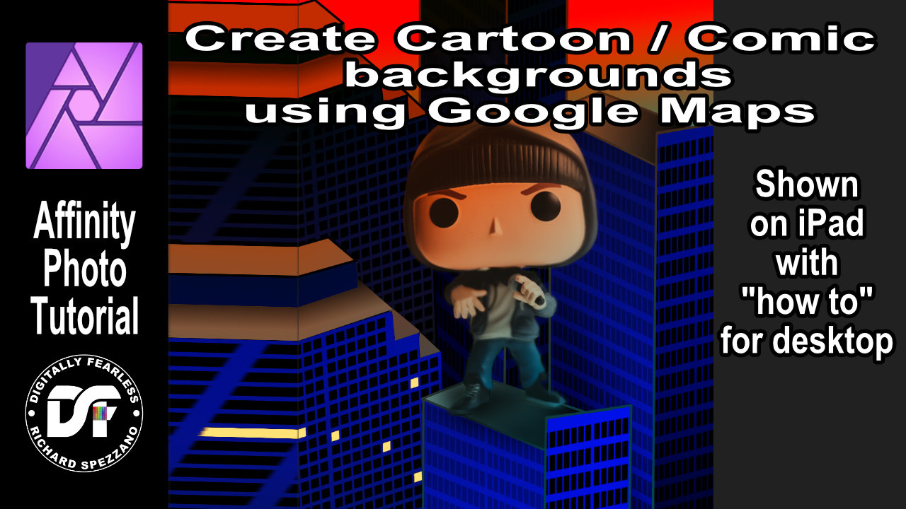
Create comic or cartoon backgrounds with the help of Google Maps. A Digitally Fearless tutorial shown on iPad with explanation on how to do it on desktop. https://youtu.be/gn4-tGAC6SI
-
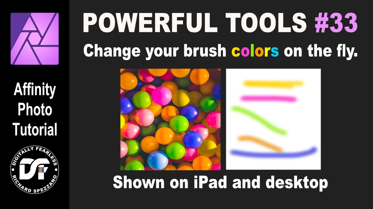
Change Affinity Photo brush colors on the fly. In this Affinity Photo tutorial I show in both iPad and desktop how to change your brush colors on the fly. It is number 33 of my Digitally Fearless Powerful Tools of Affinity. https://youtu.be/xh9oMoIxE_w
-
- 2
-
-
-
- ipad.
- desktop apps
- (and 5 more)
-
 I am a B&W photographer. My RAW files end up a bit too dark and, consequently, lose detail. I am trying to learn how to use the radial gradient tool to lighten up areas. I would appreciate being pointed to a few good tutorials for beginners on this topic. I am not talking about using the Gradient Map. Thanks,
 -
 Hello designers! I have a new Affinity Designer tutorial for you. This one is all about the pen tool & node tool. It's a long one and goes from beginner to advanced and I cover pretty much everything possible. I also go over the corner tool and there are a bunch of exercises. Enjoy! https://www.youtube.com/watch?v=3iowyjv8ezA
-
- 2
-
-
- affinity designer
- pen tool
- (and 5 more)
-
 A vector illustration of a beetle car with a cool vintage 60's look. The other vectorial elements and color gradients add to give this illustration a warm summer vibe . This flat design image was created by following a tutorial by visual artist Isabel Aracama (www.isabelaracama.com). If you wish to see more of my visual art designs: https://www.instagram.com/anacardoliva
- 4 replies
-
- 5
-
-
- flat design
- vectorial
- (and 7 more)
-
 Hi All, I'm trying to learn Affinity Publisher via video tutorials. The challenge is that all the tutorial videos I've viewed online on YouTube on my laptop the features (words) are too tiny to see. So, you can't see the features you're supposed to be clicking on or selecting. I can hold down the Ctrl key and enlarge the screen but it doesn't enlarge the words on screen in the tutorial. Has anyone watched a YT tutorial where the features are easily readable? I've uploaded a screenshot of what appears on screen. Thank you.
-
 Hello everyone! I'm new to the Affinity scene and love it so far. I've been a Lightroom user for years and decided that it's time to put the presets and sliders aside for a while and really take control of my editing. Enter Affinity. The purpose of this thread is to discuss workflows used when editing multiple photos from a photoshoot. I can't seem to figure out a truly effective way to edit 50+ photos without creating a mess. Any pointers, videos, web articles, or books are welcome. Thank you all for the support and I look forward to reading your responses.