Search the Community
Showing results for tags 'Texture'.
-
 I would love to see something like what Tandent Lightbrush supposedly does (see this article) implemented inside of Affinity Photo. It is basically like frequency separation, except that it separates illumination and surface detail instead. It could be implemented in conjunction with a blend mode that would re-combine these two passes, just like Linear Light re-combines the high-pass layer with the low-pass one for frequency separation. I don't know if the algorithm is described in a Siggraph paper or something like that, but I believe there have been several published approaches to estimating illumination and so on. I was fully expecting for something to show up in Photoshop soon after because it would be spectacularly useful for photo editing, but so far Adobe hasn't done anything in that direction yet. I'm not even sure if the original product is still around.
 -
 I would very much like to see a Texture "Pane" Option in Affinity Designer (and Photo): In addition to being able to paint with texture brushes (in vector or pixel), or simply import a pixel layer with texture, I would love to be able to save and use an entire Texture "Pane" (as in window "pane") Option from a panel of options like the brush window offers. I would like to have the ABILITY TO MAKE A TEXTURE "PANE" TRANSPARENT (or translucent; either vector or pixel) IN ADDITION TO BLACK, WHITE, AND COLOR and be able to choose whether it will cut through all layers, or only a selection of layers. (I have searched and not found any method for doing this.) (I'm a newbie when it comes to the technical jargon, hopefully you get the idea. If anyone knows how to do this, I'd love your direction!) Thanks, H
 -
Hello! This is my first sharing here, I don't use to do it but I start to love this program. I created for this work some base with textures, and effects, on the top I've created some digital painting for the cracks (hope is the right word :) ) As you can see the difference from locked and unlocked levels are the luminosity of the numbers and base, in the unlocked levels we have a glow inside and outside and in the locked we have the deep engraving with shadows. You can find my UI portfolio on my FLICKR UI Album Enjoy
- 2 replies
-
- 1
-

-
- game
- levelselection
- (and 3 more)
-
Hey guys! Just wanted to share a little character I made for fun with Designer using some of my texture brushes. Any comment will be more than welcome as always! Cheers!
- 13 replies
-
- 8
-
-
- illustration
- brushes
- (and 3 more)
-
 Hello When I open .fh11 files I miss my texture (on my WinXP in Freehand I see them). Is there any way to activate the texture I added in my old files? thx ADD
 -
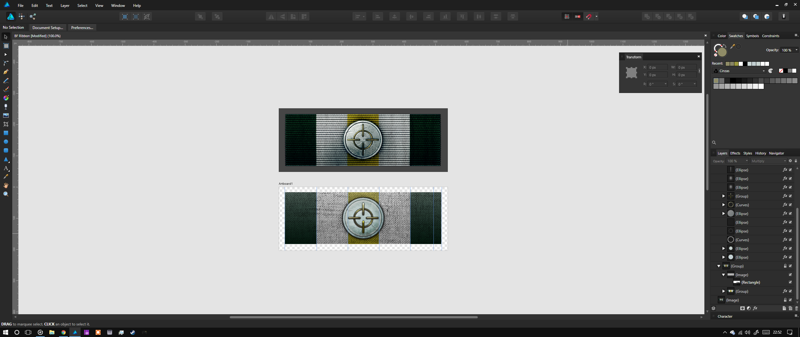
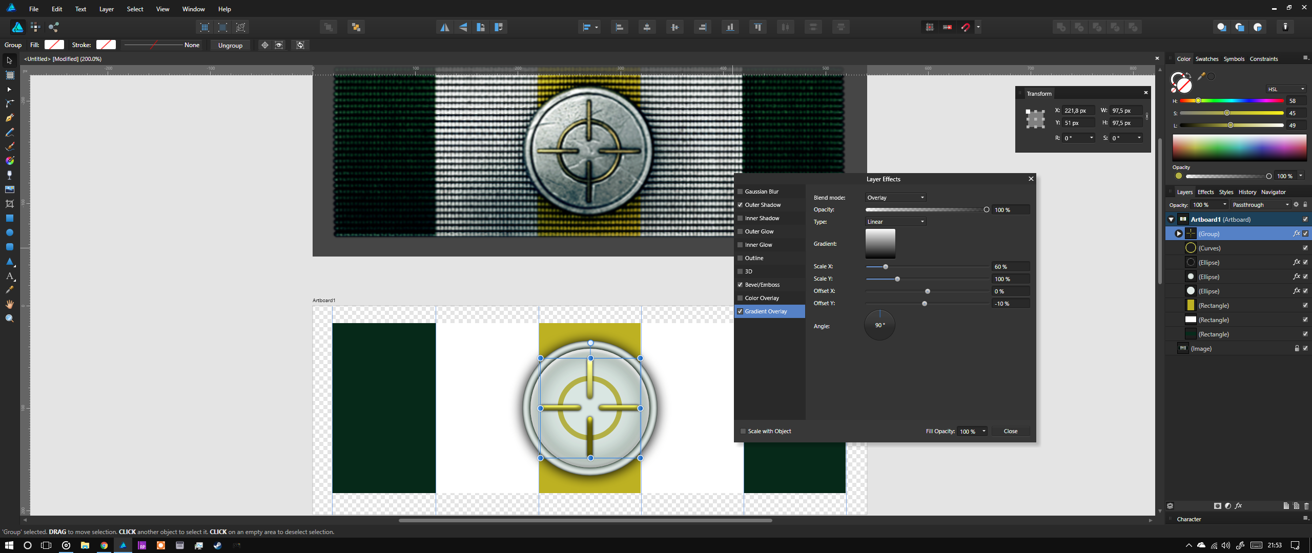
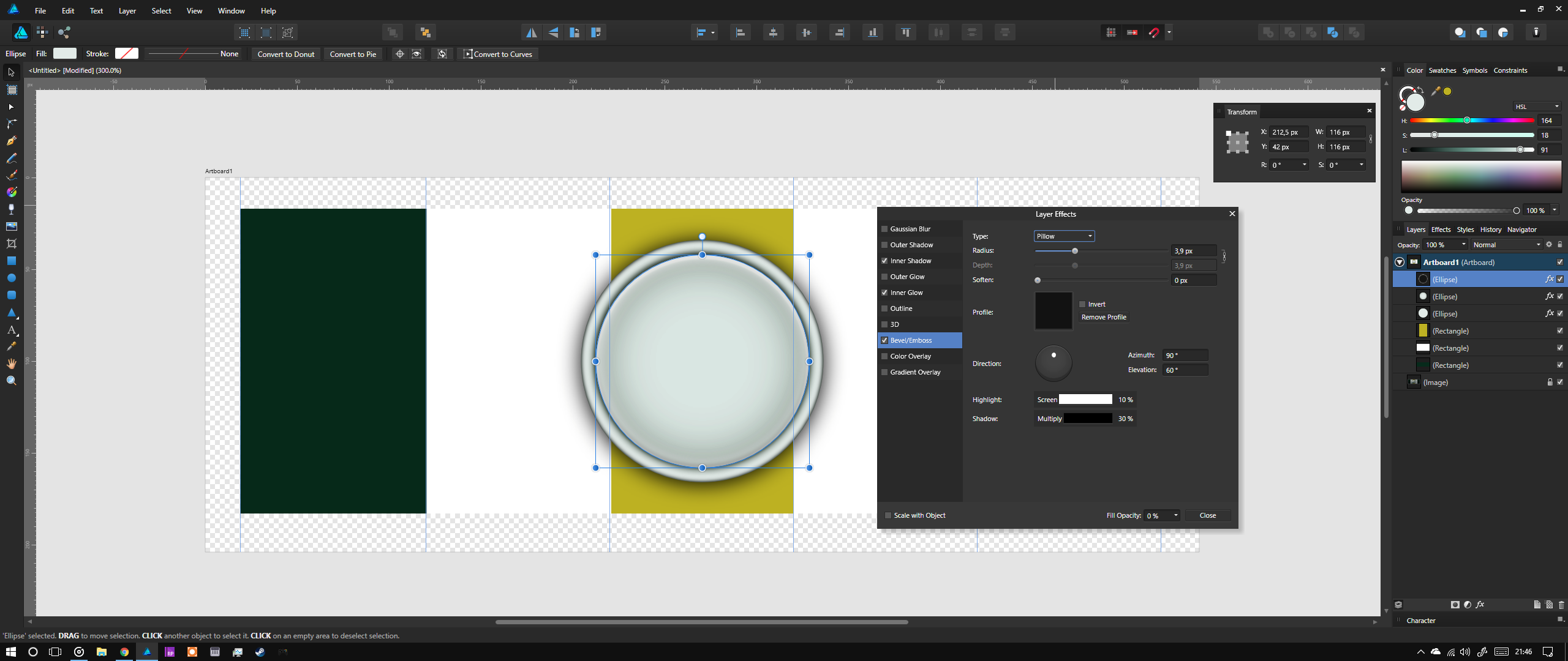
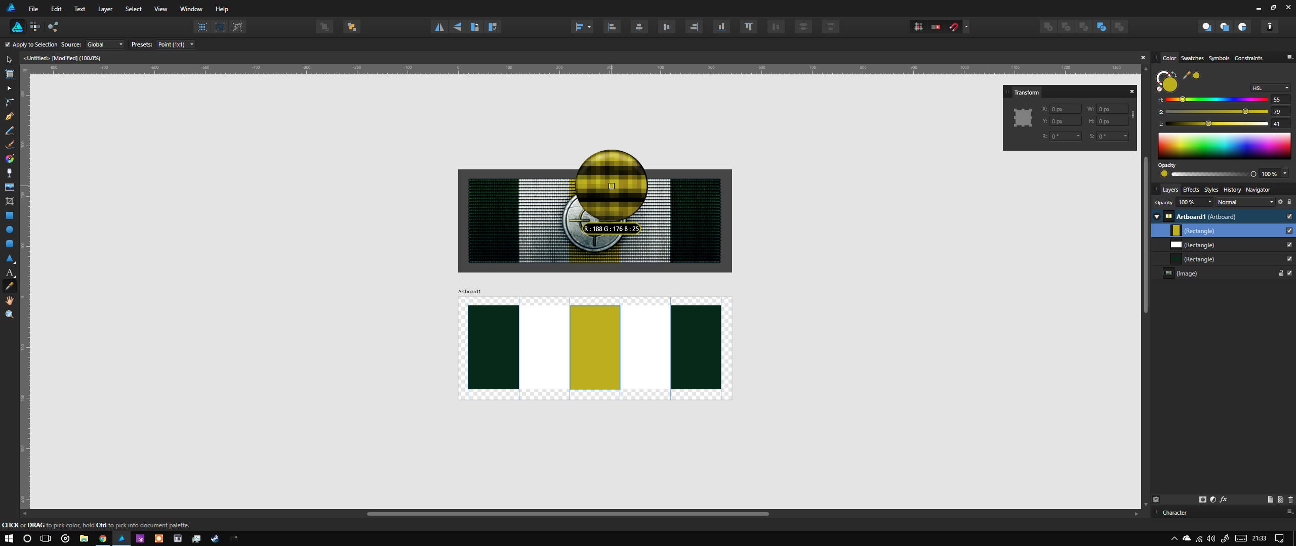
 Hello, I wanted to create something quite simple for the community, so I thought I'd go back to my realistic icon design days and apply some of my methods in AD. For this I digged out the Battlefield 3 "Accuracy ribbon" design. This was originaly made with 3D software but it's not too hard to replicate in 2D. http://battlefield.wikia.com/wiki/Ribbons/Battlefield_3?file=Accuracy_Ribbon.png The basics are: Import the ribbon image into AD and create a new artboard below it Add guidelines for the sizes of objects and where the background color bands meet Start by recreating the shapes over the original image - the background colors, then the golden circle and the rounded, long squares of the aim Try to select colors similar to what you see on the top image Play around with Outer Shadows, Inner Shadows, Bevel and layering different effects until you have the same feeling of volume Add shadows and other lighting details to the illustrationRemember that 100% black shadows on most objects feel unreal. Try to base the color of the shadows off of the object itself or off where the shadow "lands" Finally use images in Color Burn and Multiply mode inside masks to add the gritty feel to the metals and the fabric texture to the background Play around with the saturation of the colors you chose to find the right spot for added realism. Metals that have been "through war" are not polished therefore they shouldn't shine, they should be dull. Please find the final file attached. The texture images in it are for demonstration purposes only and I do not have rights over them. BF Ribbon.afdesign
-
 Hello, just got myself Affinity Photo for my personal use at home as a game artist, replacement of Photoshop. I understand that AP focus more to the Photography industry rather then game industry, hope it's ok if I make a request more towards game dev. Ok, first of all, I'd love to see the texture preset added to the new document setup, such as; - 1:1 1k Texture: 1024px*1024px - 1:1 2k Texture: 2048px*2048px - 1:1 4k Texture: 4096px*4096px - 1:2 4k Texture: 2048px*4096px etc...all with transparent BG enabled. Another thing is that the Flaming Pear's Photoshop plugin, especially the Solidify (free plugin) to create a padding doesn't seems to work well. It keep on asking me to run the filter on a layer that has a 'transparent region', even though I run it on the fresh new layer with only 1 brush stroke in it. Or am I missing something regarding how Affinity Photo handle transparency on the pixel layer? I noticed that there is an alpha layer on that channel tab, this seems function differently then Photoshop alpha layer. Feel free for any game artist out there to put more suggestions depends on your workflow needs. That's it for now, would really love to hear what you guys think about it.
 -
Hi there everyone :) I am very happy to have completed a winter illustration entirely in Affinity Designer using a Wacom Cintiq Pro 13. I have been experimenting with Designer in my spare time in order to try out a few ideas combining vectors with texture brushes. This one was done in designer 1.5 and I have to say it has treated me very well as I progressed towards making the piece work as a whole. I do quite like clean shapes with a painterly/texured feel to them, and so with this one I feel that I am moving in the right direction at last. The project was sketched out from scratch and colour completed in Designer with a resolution of 5500x5500px. My main takeaway I belive was to be patient util I could start getting a good feel for the paint performance in relation to zoom level. Also, being able to customise and set up custom brushes for my liking and to match previous experience for a more traditional illustrative approach. For brushes I started out with the Daub concept brushes pack but ended up picking them appart and to set up my own in the end :) It would be great to hear about your experiences and feedback in general towards using affinity designer in illustration based workflow :)
-
 Hello, I purchased my copy of Affinity Designer this morning and I'm having fun using it. Whilst I was experimenting with the software I was struggling to change the outline of a vector shape. I wanted it to have a textured outline. For example I drew an oval, switched to Pixel Persona, clicked Line, Texture Line Style then Properties but all of the options are greyed out (General, Dynamics, Texture) I've attached a few pictures for you to look at. Am I doing something wrong? Keep up the great work Cheers
-
These are all my bookmarks i've collected since i started to use AD. The most of them are free resources, and i'm amazed how good quality resources you can find for free. Free vectors, photos and PSD Downloads | Freepik [CG Textures] - Textures for 3D, graphic design and Photoshop! GraphicBurger | Tasty design resources made with care for each pixel. Have a bite! Free vector icons - SVG, PSD, PNG, EPS & Icon Font - Thousands of Free Icons IM Free - Free Design Resources | Free Images, Free Icons VectorStock | Vector Art, Images, Graphics & Clipart Subtle Patterns | Free textures for your next web project. Handpicked free fonts for graphic designers with commercial-use licenses. | Font Squirrel WhatTheFont! « MyFonts Free High Resolution Textures - gallery Palette / dreamscape :: COLOURlovers The Day's Color dafont.com Free Flyer Templates & PSD Party Flyer Design Blog http://freebiesbug.com
-
Hey all, here's a redo experiment of an illustration project I had a few years ago for an article about how "Successful People" manage their thoughts... The goal here was to revisit this illustration and try to only create it using a "pixel painting inside vector shapes" workflow in Designer for a new look. I'm really happy with the process and the outcome and plan to adopt it to a few more ideas I have on the drawing board. Trying to keep the process as simple as possible, I used only one brush for consistency and didn't employ any effects or multiply/screen layers for shading or highlighting. It's all painting. It was a lot of fun and surprisingly pretty quick. I like the background, but I also like it without.... Hope you like. Cheers, Kevin
- 13 replies
-
- 6
-
-
- illustration
- editorial
- (and 2 more)
-
I just saw Kubo and I can't get over how amazing it was so I decided to create some fan art. This seemed like as good a time as any to try out the Noise option in AD to give a textural, paper-like feel. I absolutely love how noise is seamlessly integrated into this program. I've avoided texturing things like this in past programs because it was too cumbersome, time consuming, and CPU intensive. None of that frustration here. What a wonderful feature. Great job Affinity!
-
So I found myself wanting to come up with a basic stipple brush, of a more vector-style and less painterly variety. Going for that more retro-modern shading look inside of vectors that's quite popular these days. Pretty basic, but I think this is what I was going for! Works best sticking to applying with straight paths, no vector handles. The nice thing shading this way is you can vary the opacity and get quite a nice buildup on top of gradients. I threw together this trippy abstract to give them a go. :) Edit: Sorry, this post seems to have gotten mysteriously duplicated, and the attachment isn't showing up here consistently. Basic-Stipple-Brushes.afbrushes.zip
-
 Hey folks – I created this illustration as a parody of a quasi-famous NY designer I recently saw. It was my first attempt with AD, and at using variable brush strokes / curves. I found the experience pretty straightforward, almost fun. I typically use illustrator for renderings like this but wanted to test out how AD worked since I had just purchased it recently. I think the only major challenge I had was that I didn't like that I couldn't use the eye-dropper on different colors to select the color. That part wasn't intuitive to me. After watching some youtube videos and some snippets on the site, I got the hang of it after a while. This is one in a series of character illustrations I'll be doing. His name is Tobison Vanderherd: Senior Design Strategist (for now anyway). I'm going to be fleshing out an entire agency based on endangered species because, after all, agencies are sort of dying out. Anyway, don't know how far I'll take it, but it's certainly fun getting familiar with the tool and experimenting. I'm eventually going to take the illustration into After Effects and try some puppeteering/ voiceover work to see how that holds up. I'll share my results if anyone's interested. Been enjoying watching what everyone has been posting and looking forward to seeing what other creations folks come up with. Thanks for your time and feedback, Anthony
-
 Hi. I just started to explore the beta and already enjoyed it, it seems to have great potential. And it's the first program that has a bit of the intuitive usability I loved so much in Ulead PhotoImpact! It's still a shame that Corel stopped development. I already found the "Styles" in Affinity Designer and it currently seems to have some limited attributes one can define as a style. But only single effects. From the roadmap I read that they might get improved in future? -Text features including Text Styles, Bullets and Numbering -Multiple Effects/Fills/Strokes per shape Will this make it possible to have an Style- and Effectslibrary like in PhotoImpact? In PI one can even right every style and modify all values and use bumpmaps etc. I have attached a pdf-file with some examples and screenshots of the possibilites. It's still possible to donwload a trial (~170MB) for Ulead PhotoImpact X3, but there are not all of those styles included. I don't expect it to be possible to directly use / import those Ulead-Styles? upi.pdf
 -
 How can you add a texture (in either AD or APh) or is this possible yet? See pics.
-
Sorry, duplicate post somehow—not sure how that happened. :rolleyes: :blink: Admins may delete. :) Search by same title for the other post. :)
-
Hi! I am one of the movers from PS to Affinity ;-) There's one thing I am really missing: In PS I can easily fill areas with patterns. There are lots of patterns that come with PS, and I can find many on the internet and load them into PS. But, more important than that: In effects functionality I can use the STRUCTURE of patterns to overlay the other fx (like color, gradient, shadow etc.). This makes big letters look great (structured) in spite of just one color or a gradient. And I can adjust the depth and scale the effect. Great! Please add this pattern functionality, especially in the effects section, to Affinity products! :-) Best, Dietmar
-
 Dear Affinity team To me there's a missing feature in APhoto: I would love more adjustments in brush preferences panel to structure / texture, such as scale, brightness and contrast. I love to change the interaction between texture and brushstrokes during painting. [Did a search first, no results to this topic] Canvas rotation is an other essential feature to me. This seems to be solved with the newest beta. Thank you. And congratulations to your well done apps. It’s fun to explore and compare it with PS, AI, Painter, ArtRage…
 -
 I had the need for a charcoal textured vector line and found no such texture in the default brushes that come with AD, so I watched some tutorials on creating my own textured vector brush. I did succeed, I might say, but have the feeling there are a few improvements the developers could make: I’d like an option to keep the size of the texture the same when changing the stroke size. Currently the texture (i. e. the image it’s based on) is scaling with the brush. I needed a relatively thin charcoal-style line but the texture was almost not visible anymore, so I had to go back an forth with exporting the properly sized image to use as texture for the exact stroke size I want. That’s not very flexible. Ideally a separate option to scale the texture inside the stroke would be awesome. And one can check a checkbox to either scale with stroke or stay as is. And related to that, I’d appreciate if actual vector graphics could be used as texture images for vector brushes, so that it doesn’t look blurry if the stroke size (and the pattern that is scaled with it) gets larger than the original image. Sorry if it turns out that there is already something like this implemented and I just didn’t see it. In that case kindly point me in the right direction.
 -
 Hi! I'm very new to Affinity. It was one thing I suddenly discovered when I just experimented. And that was that I can select a texture as a brush and paint and also zoom the texture in and out. I don't know what this is called, but I hope someone out there understand what I mean. My problem is that I can't find this anymore. I don't remember where I found it.
 -
Just doodling with the Typography Tools and a little Texturing effect in Affinity Designer.
-
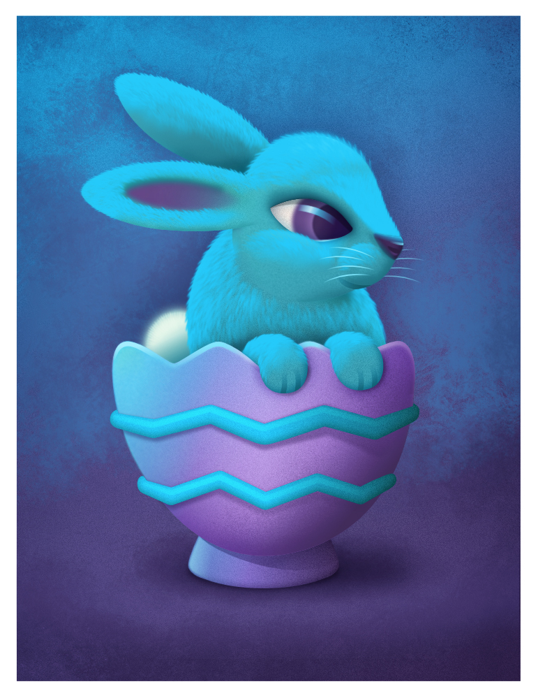
Meet Blue Bunny, he's a happy little fellow... :) Continuing the Bunny series from some client concept sketches that never got beyond the proof phase. Thought I'd try something different on this one and play with some pixel painting texturing and also attempt at adding fur to this little guy. The fur is made up of repeating individual groups of "fur shapes" copying, rotating, skewing, repeat... each with transparent gradients and blur to add softness and hide some of the edges and yes it was a lot of work... ;) Really loving the ease of vector and pixel workflow!
- 36 replies
-
- 11
-
-
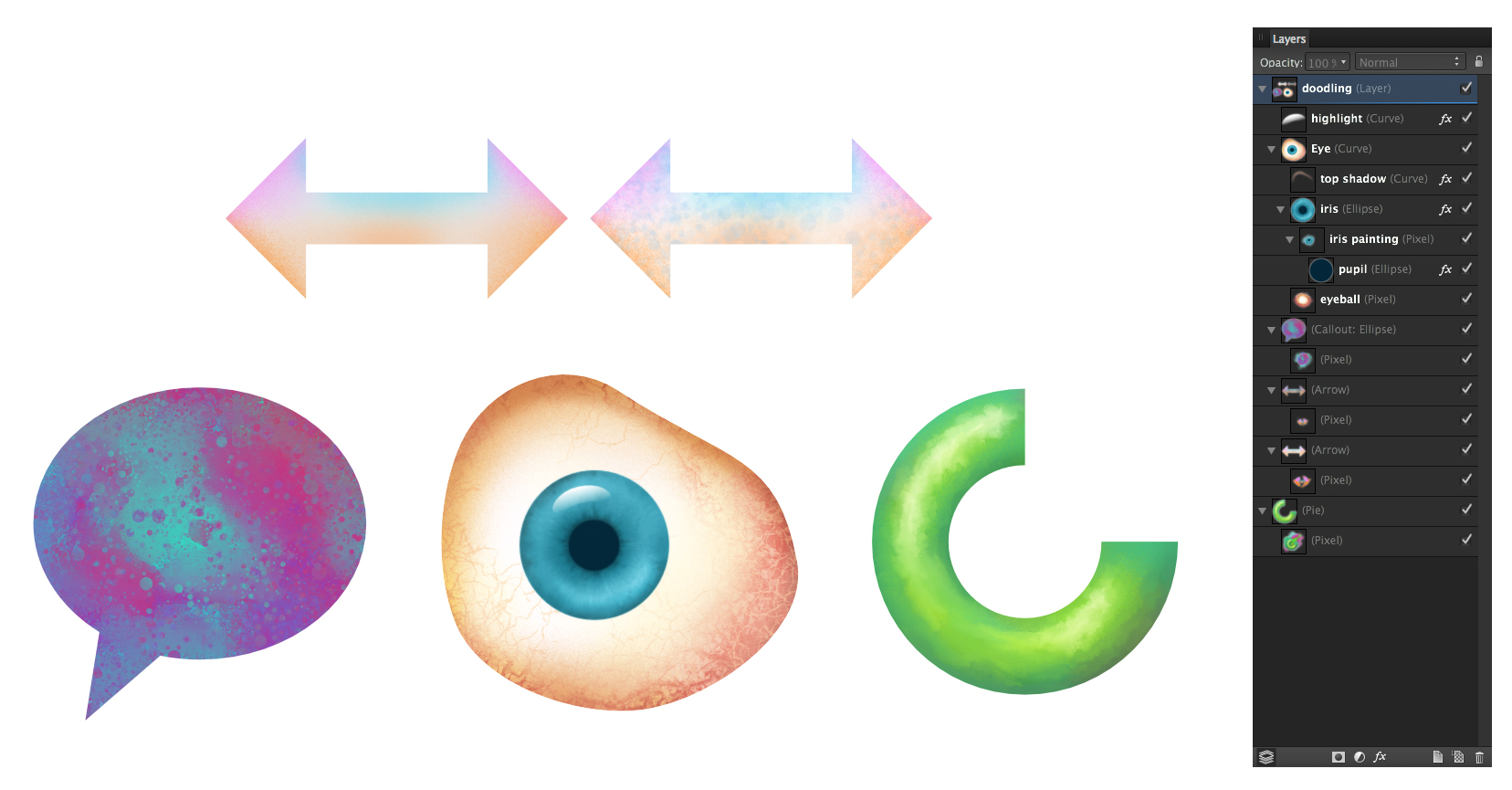
Hi all, just some doodling here trying out painting inside of shapes in Designer. Started playing with Paolo's blender brushes he so graciously created. When using them in conjunction with the smudge tool you get some really nice mixing abilities. In the call out shape for instance I painted a mixture of the 2 main colours then applied some "blending" using one of Paolo's spatter blend brushes. It just spatters using the underlying colour and doesn't put any new colour down. Changing the size of the brush changes the size of the texture it paints. For the eyeball, (I didn't start out to do an eye it just ended up that way) I used a mix of painting and blending especially in the white of the eye with the blood vessels and texturing... then in the iris I painted inside the circle shape laying in the colour in the general areas and using Paolo's blenders to really gave it a nice complex feel. I usually add a .01 gaussian blur to take the hard edge off the shapes. it tends to soften the paint work a bit but it's a reasonable trade off. On the donut-pie shape I was just playing with a nice painterly play of light and shadow. The blenders are great for adding that "painterly" feel with tons of control. Again by reducing the blender brush size the blend effect gets smaller and more precise. This is all in Designer, which for me is probably where I will spend most of my time. The fact that I can get these type of results in a "vector" app is incredible. The hardest part of all of this is knowing when to stop! :D