Search the Community
Showing results for tags 'RGB'.
-
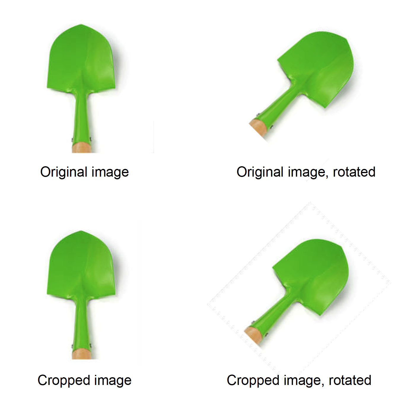
 Our customer has notified us that some images on the latest pdfs have noticeable jpg noise on the edges of the image. This noise is very noticeable because the images have white background. After researching and testing, we have found that this only happens on images that has been cropped and rotated, and only when the pdf is exported to RGB (with the document being made on CMYK), so the "noise" is generated on colour conversion on the cropped image on export. Attached image shows the noise, which is more noticeable the lower the resolution of the exported pdf. Steps to reproduce: Place an image (with white background for better view of the issue) on CMYK document. Crop the image (in our case, to reduce excessive white area) Rotate the image Export to PDF in cmyk, high res (X1A): image has no issues Export to PDF in RGB, any resolution: image has jpg noise in borders of the crop area We checked and it also happens converting to Gray and limitless RGB, and the noise disappears when there is no pdf color conversion. A stopgap solution is to rasterize the image, but this results in an embedded image, unlinking the original, and also doing it on a 4000 image catalogue is a no-no. Exporting in higher resolution and less compression mitigates the issue, but it is still there. In our workflow, this is an issue, because we made the design for printing and later export a digital rgb version from the same document for web publishing. PUBLISHER 2.3.1 MAC OS Sonoma 14.2.1 (23C71) Checked and reproduced on different computers.
-
 I will rant for a minute. I have yet since purchasing Affinity 1 1/2 yrs ago been able to complete a project without running into continuous problems and having to spend too much emailing Affinity about them. I should be getting a paycheck for all the technical troubleshooting reporting I have done. I experience a new problem each week that I use the software. I already reported 2 this week and today is the 3rd and it's only Tuesday. Has anyone noticed that the software is not saving the conversion to CMYK? I created 108 images. I chose the artboard to be CMYK. However, when I exported them and opened them back up to increase the DPI they were all RGB. Okay. So maybe I did something wrong I thought. So, I go to the document properties menu and choose color profile as CMYK => save then Export. Every last one showed in the History of the document that document properties were applied. Yet when I opened each up they all showed RGB. I did all 108 images again. The same thing above no conversion. They all opened as RGB and the software didn't ask if I wanted them converted to RGB. I just opened 4 images I had already saved on my system. I opened them they were RGB. I went to the Document properties => changed to CMYK => saved => Export. The history menu showed document properties applied. Yet when I opened them up they all showed RGB. I thought maybe when I close them out and it asks me to save, I need to select yes. I did. Guess what? No change. I am so sick of Affinity. If I could get a refund I would. I wanted a program I didn't have to pay a monthly subscription for but I am doing too much free labor using this software. I am selling products online that will be printed so the image must be in CMYK so that what customers see is what they get. However, thanks to Affinity. I will have to redo for about the 4th time over 120 images. I am p*ssed! This is not the first time I have had problems with the software. It doesn't even handle EPS and PDF properly. I'm just ranting because my expectation for this software is extremely low. Almost 2 years and not being able to do simple stuff is ridiculous. If anyone knows another app like Adobe that's not a monthly subscription please let me know.
 -
 Hi everyone, I'd like to bring back a bug report that has been totally ignored since 2021, which I think is urgent and deserves to be discussed. Below you can find two very old threads talking about it. to summarize: the white balance tool is not working properly for non-raw files both in the develop persona and in the photo persona (through the adjustment layers). -what the tool should do: colour pick a pixel and equalize the RGB values to convert the colour of the pixel to a neutral grey (RGB values equal to each other) then apply the same RGB shift to the whole image. -what the tool really does: in develop persona with a raw file it works properly, when used on tiff, png, jpg (etc.) it does not work. What we observed: -the sliders in the develop persona with a raw file open are called "temperature" and "tint" and both of them are properly moved automatically when using the white balance tool, in this case it works properly; -however in the photo persona (white balance adjustment layer) they are called "white balance" and "tint", and only the "white balance" slider move when colour picking the image, we don't see why they should be called and behave differently since it is the same tool that already works properly for raw files in the develop persona. A possible way to fix the bug: -just apply the same rule applied for raw files (in the develop persona) also to non-raw files (both in the develop persona and photo persona adjustment layers). kind regards: Riccardo
 -
 So I'm just trying to find an easy way to take a grayscale image and put it into one of the RGB channels of a different document. I figured out a method but it takes many steps for each channel and I'm assuming there is a much easier way that I'm missing. I was hoping that I could simply copy a grayscale image; go to a specific RGB channel and paste it into that channel but that just creates a whole new pixel layer. Any suggestions are appreciated! Cheers!
 -
 Hello - I have a basic question: In the past, when I was still working with Photoshop, I always had to convert RGB images used in a file for printing to CMYK in Photoshop beforehand. If I didn't do that, I always got a call from prepress that RGB images were in PDF X3, and that it wouldn't work that way. But I have also had the experience that this did not cause any problems. (I can also open the Affinity Designer file in Affinity Photo. But there I can't find a way to convert a single image to CMYK). Can you guys give me an answer on this? Thanks a lot - Marc
 -
 Fix a muddy paintbrush iPad and Desktop In this Digitally Fearless Affinity Photo tutorial I show how to fix muddy edges when using the paintbrush to create art. This is number 31 of my Powerful tools of Affinity playlist and shown in both iPad and desktop. https://youtu.be/QfgzMdRlduw
-
 Sorry for appearing to ask a question that's been asked before. This is the first time I've been in this position and I'm not sure what the correct workflow would be. Previous answers on the forums don't appear to help in my specific case. I've created a print project which was initially specified to be delivered in RGB as it was mainly scanned watercolour art (with vector and text overlays). Now the job has been moved to a new printer and now I need to provide it in CMYK. I'm being asked to use the FOGRA 39 profile. I've already had signoff from the client on the RGB artwork so I'm hoping I can minimise any pain in going back around that loop again. Here are the main things I've discovered: Setting the profile in the PDF export creates a substantial colour change. Changing the document colour profile to FOGRA39 creates a substantial colour change. I'm using AD because of the vector work, I notice that in AP there is a document conversion menu option, trying it out caused the same colour shift. First, are my concerns about the colour shift valid? Second, what is the correct way to convert the profile and at the same time minimise any colour change? Here's a small sample where the red component changes noticeably (top CMYK, bottom RGB): I should probably add that adding the Soft Proof at the top of the layer stack in the RGB document doesn't show a colour change like you see with the profile change. Also, I fully understand the difference between additive and subtractive colour systems, out of gamut colours and calibrated and wide gamut displays - all of which play a role in how I'm perceiving this shift in colours. My concern is that I thought (maybe through ignorance) that the colours being used wouldn't be out of gamut as they aren't near the extremes of RGB.
-
 Would be nice if you could enable K Only option for RGB mode as well.
 -
 [English version below] Hallo zusammen, ich erstelle Pläne und Grafiken für digitale Präsentationen (Fachgebiet Architektur). Folgendes Problem: Ich stelle die gewünschten Farben in Affinity Designer mit dem HEX-Code ein. Wenn ich die Grafik exportiere, wird diese immer mit knalligeren Farben exportiert, als eigentlich eingestellt. Ich benötige PNG, JPEG und PDF-Formate. Mit allen Formaten, mit allen denkbaren Einstellungen habe ich bereits herumprobiert. Das Programm, das Dokument und im Export haben die gleichen RGB-Einstellungen und ICC-Profile. Eine zeitlang ist bei der Einstellung Neuberechnung: Lanczos 3 die gewünschte Farbe bei einem Export als PNG-Datei herausgekommen. Seltsamerweise funktioniert auch das nur ab und zu. Da ich mich mit Farbeinstellungen und ICC-Profilen nicht sonderlich auskenne, hoffe ich, dass mir hier jemand weiterhelfen kann! Anbei ein Screenshot aus Affinity Designer (nutze die Windows-Desktop-App) und ein Besipiel für die exportierte Grafik. Die gewünschten Farben waren: 000000 (schwarz), AED9E0 (hellblau) und D36135 (rot). Heraus kamen schwarz, AED9E2 und D76436. Ich würde mich freuen, wenn jemand mein Problem erkennt und mir weiterhelfen würde! Danke! Hello everyone, I am creating plans and graphics for digital presentations (architecture). The following problem occured: I set the desired colors in Affinity Designer with the HEX code. When I export the graphic, it is always exported with more gaudy colors than actually set. I need PNG, JPEG and PDF formats. With all formats, with all conceivable settings I have already tried around. The program, the document and in the export have the same RGB settings and ICC profiles. For a while, the setting Recalculate: Lanczos 3 brought out the desired color when exporting as a PNG file. Oddly enough, even that only works once in a while. Since I don't know much about color settings and ICC profiles, I hope someone here can help me out! Attached is a screenshot from Affinity Designer (using the Windows desktop app) and a sample of the exported graphic. The colors I wanted were: 000000 (black), AED9E0 (light blue) and D36135 (red). Out came black, AED9E2 and D76436. I would be happy if someone recognizes my problem and helps me! Thanks!
-
 Hi there. Well, I found an annoying trouble, I think, in reference to color spaces. I did a design using a rgb document. Well, I have the rgb reference of the color of one element but when I change to cmyk in the right side dock (or in the document itself) the referece doesn't match with other conversors like https://www.calculadoraconversor.com/cmyk-a-rgb/ or https://www.rapidtables.com/convert/color/cmyk-to-rgb.html I think the conversion is wrong. In example: #00146B in RGB >>>> Designer gives CMYK 100, 97, 24, 25 while both conversors above writed and other softwares give CMYK 100 81 0 58 It´s imposible to have a secure work if the conversion is not real. Where is the problem? Thank you in advance.
 -
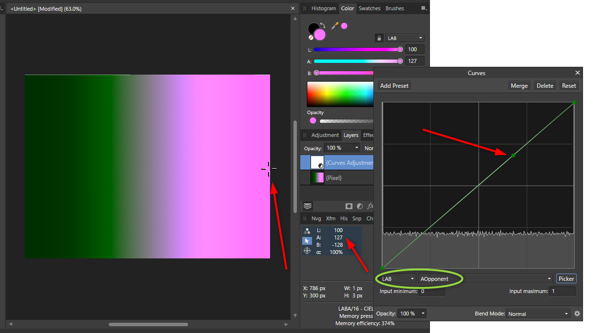
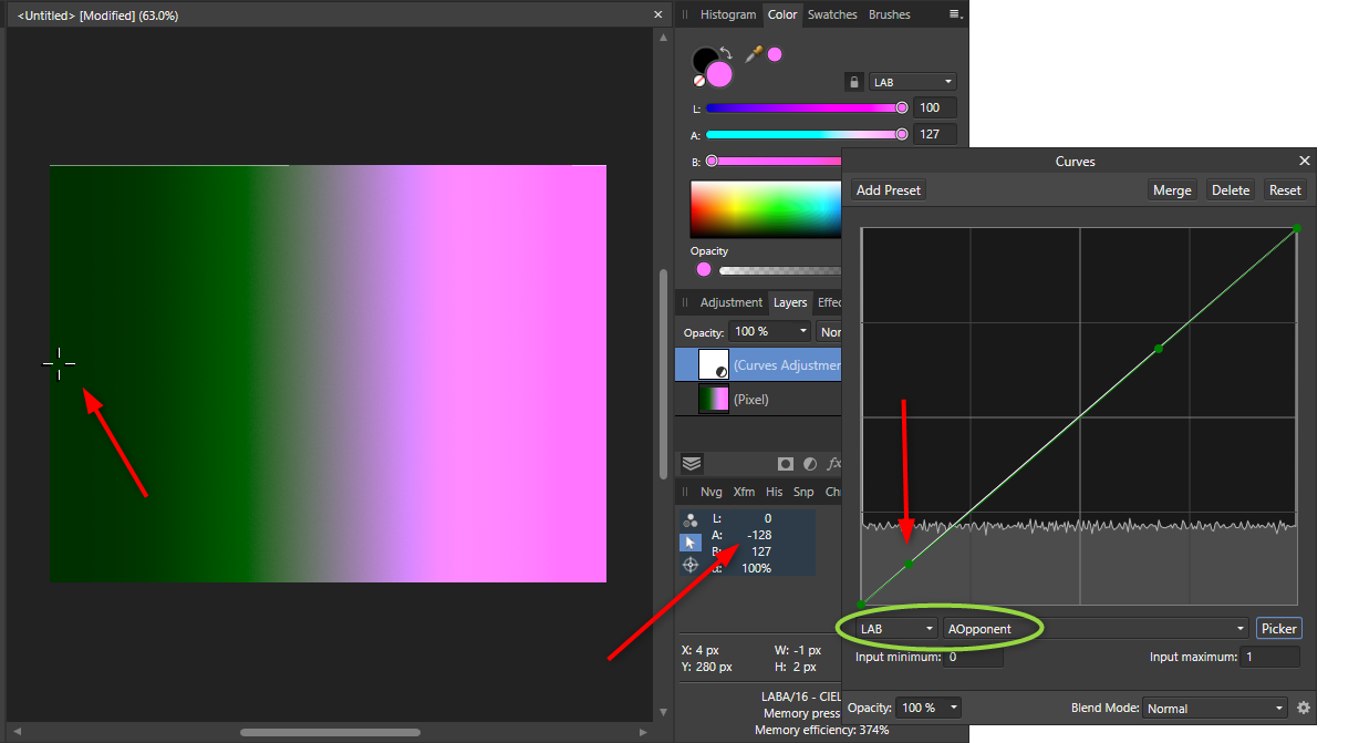
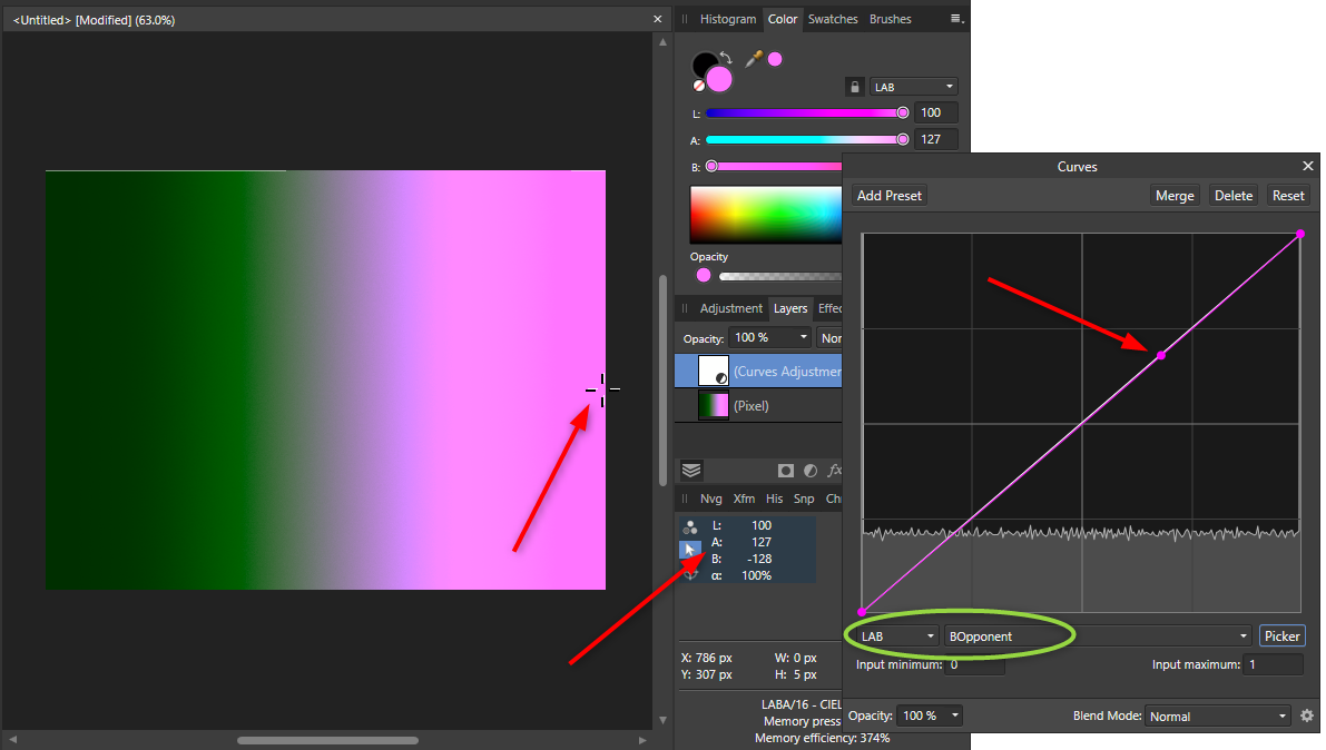
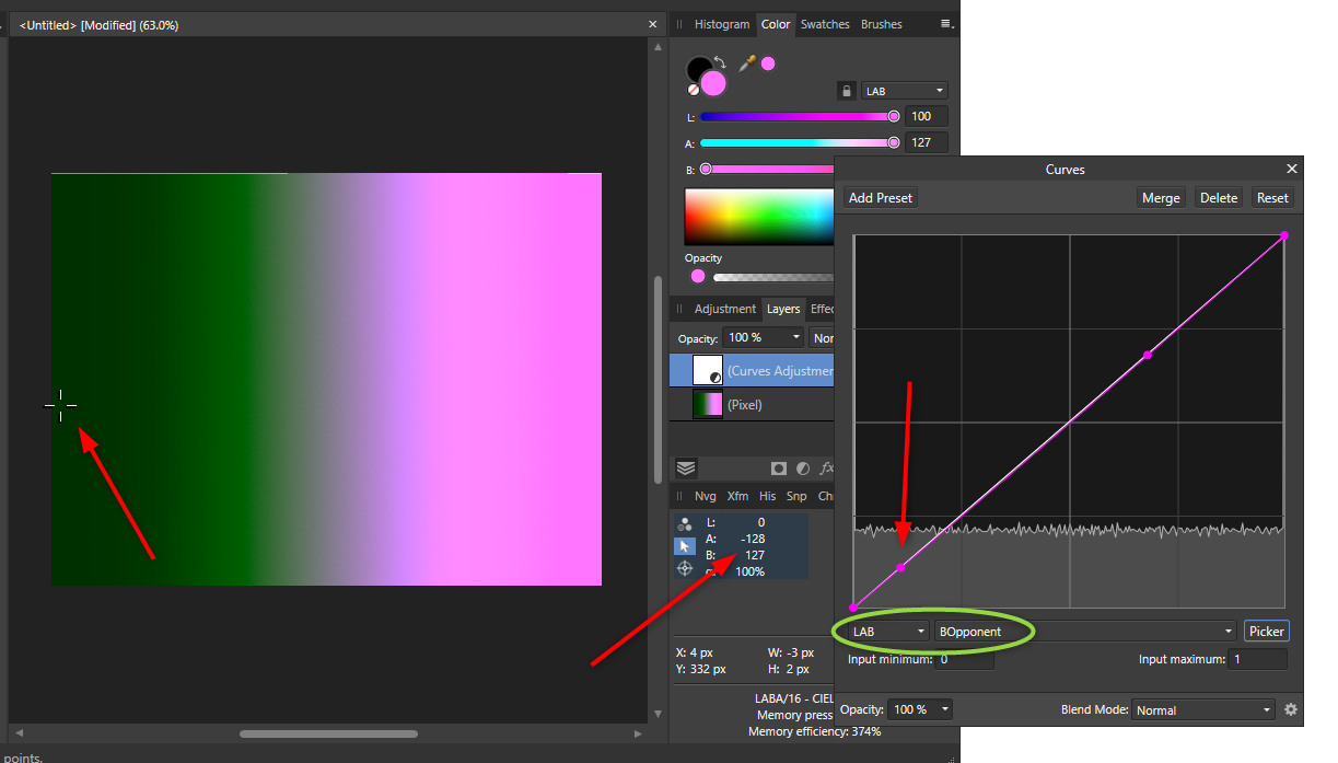
 Hello, I think this is a bug but not 100% sure. In a nutshell, using the picker to create a curves node in a specific color channel (within the curves tool) does not place the node according to the color, but rather according to the overall luminosity. I'm using Affinity Photo 1.8.5.703 on Windows 10. I first noticed it with a photo I was editing in Lab Color mode, but I can repro with a fresh document with a simple color gradient. I've also reproduced it in RGB mode, but let me outline the steps in Lab mode: Create a new document. Convert to LAB Color mode. (I'm not sure if this matters.) Add a pixel layer, and fill it with a linear gradient going from {L=0 A=-128 B=127} on the left, to {L=100 A=127 B=-127} on the right (note the negative symbols). Add a Curves adjustment layer, and choose LAB from the first curves dropdown. Choose AOpponent from the second curves dropdown, and click Picker. Now, notice from my screenshots that if you use the Picker and drag from a point on the far right of the image, it adds a node to the curve. Note the LAB values of that pixel from the Info panel, and see that the A and B are complete opposites of each other. However, if you then do the same thing with the BOpponent selected, it adds the node to the same point in the curve. What I would expect here is that the node is added far to the right in the BOpponent curve, when the B is high for that pixel (and to the left when low).... and similarly for A. However, what appears to be happening is that it places the node based on the brightness (maybe the L value?) of the pixel, no matter what channel is selected in that second dropdown. I have attached my file so you can try yourself. Please let me know if I'm doing something wrong, or... if it's a bug, that would be great to know too! Thank you! :-) curvesGradientTest.afphoto
-
Hello, I have just recently started getting into Affinity, and so far I'm really enjoying it! Today I wanted to try something a friend told me he does in Photoshop, but it appears (to me) to be buggy in Affinity. I have an image in Lab color mode. Create a curves adjustment layer (it shows as default the Lab "Master" channel). Switch to AOpponent channel in the curves dropdown. Click "Picker," pick a spot in the image, and drag slightly up/down to create a curve node. What I would expect here is a node on the curve corresponding to where that pixel lies on the A channel's axis.. but instead I seemingly get a node corresponding to where it is on the L axis. In other words.. If I pick a bright white cloud, I get a node way far to the right.. even though I've selected the A channel, not the L channel. And if I pick a dark pixel, no matter the color, I get a node way far to the left. If I pick a midtone pixel, I get a node near the middle. For fun, I converted my image to RGB mode and tried it with curves in RGB channels, and had the same result -- the picker picked seemingly based on pixel brightness, not channel value. I hope this makes sense. Perhaps I'm missing something and this is not a bug. :-) Thanks for reading.
-
 I'm not sure if I'm not understanding the gradient colour selection dialog boxes. I have two artboards of the same poster side by side, one is my CMYK version and the other is RGB. I'm switching between them and trying to ensure that each one has the correct colours set. How ever, when I edit one, say RGB, then go to the other CMYK one the dialog box isn't switching to CMYK, so I tell it I want these colours to be CMYK. Then back over to RGB artboard and select the same item, but now the dialog box is saying each step is CMYK. I'm confused to say the least. Isn't it meant to show me the colour of the step selected and not the last colour used? Put two boxes next to each other, fill one with RGB and the second with CMYK (can be a solid or gradient), now go back to the first box and it's suddenly a CMYK. I'm losing the battle here (and my sanity slightly). Is it that a single document can't have CMYK's and RGB's? Thanks for any direction on this as I'm trying to get things out for clients and this is making my already late project later.
 -
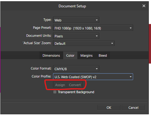
 Hi there everybody, thanks for tuning in. I've been working with a document created using a template for the web, whcih automatically assigns a sRGB color profile. Now, just for example, if I want to switch the color mode from sRGB to CMYK I see I have two options: one called "Assign" and the other, which is default by the way, called "Convert". I do understand the different gamuts between RGB and CMYK and that converting from the first to the last may produce dull shades to the colors. What I do NOT understand is what the difference is between ASSIGN and CONVERT in the Document Setup Menu under Color. One thing I've noticed is that Converting the colors do make a change to the color sliders, whereas assigning the color mode doesn't. Can someone explain how theese two features work in detail and preferably in a context for printing? Thank you so much for your help in advance! Dimitar Z.
-
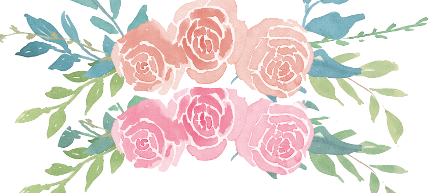
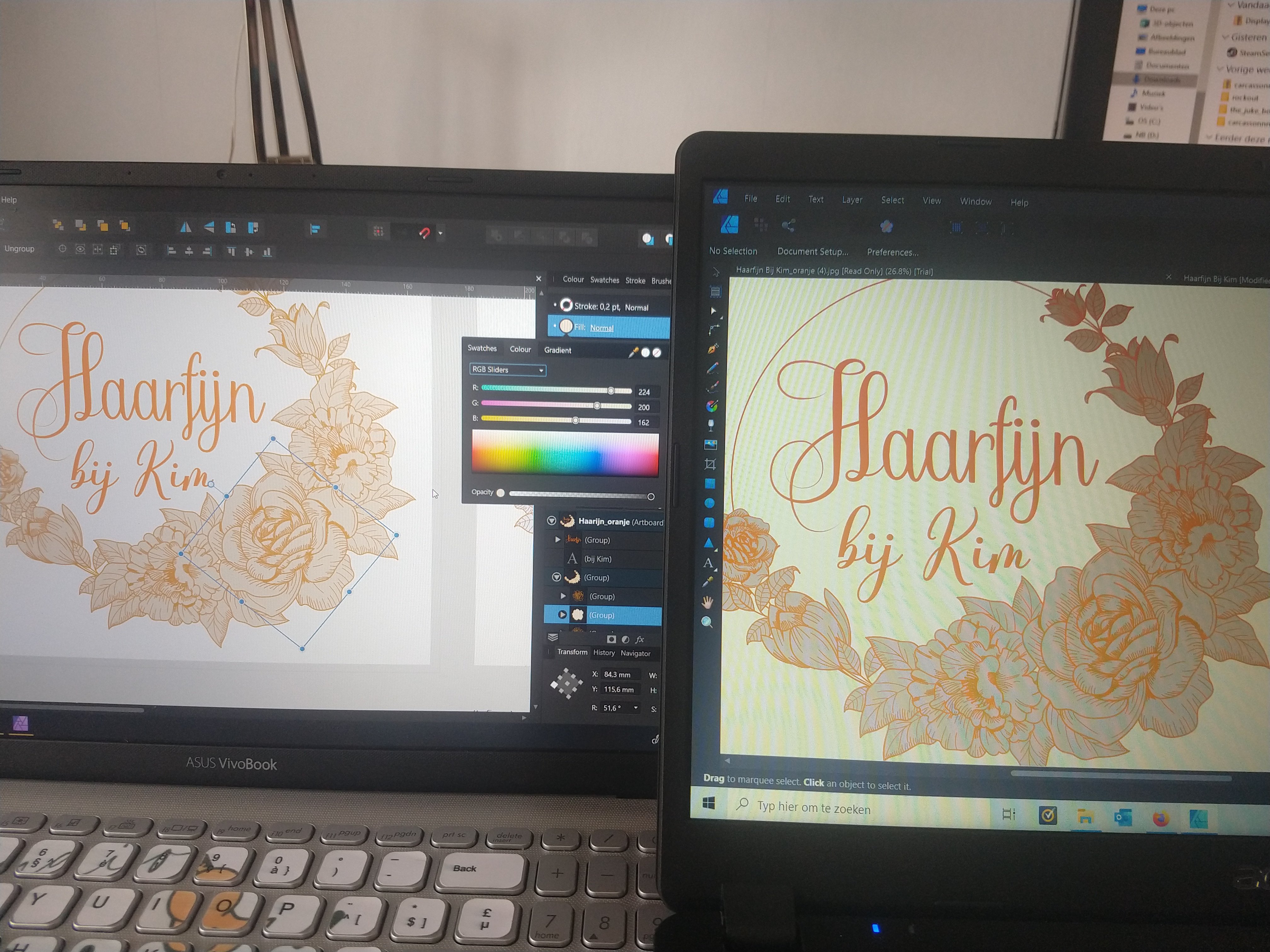
 Hi, When exporting a file the other day and sending it to someone else they saw different colors on the file. I took a picture of both my PC (left) and the other. I hope the difference is clear. The orange fill of the flowers is more blue. The letters don't have the same bright orange color. I noticed that the color wheels on both laptops look totally different. Can someone explain how this comes and what I can do about it? Thank you! Nils
-
 Hi, I'm really new to affinity designer and I have a problem where my color wheel only has grey, black and white colors, and I can't figure out how to switch back to being able to choose any colors. Does anyone know how to fix this?
 -
 Is there a possibility in levels to control the colour clipping separately by colours? I just see the clipping in master level with pressing ALT while using the sliders. This doesn't work in RGB colours separately - but would be extremely helpful.
 -
 What I want to do is apply an unsharp mask in Lab mode on only a and b channels, is this possible? In photoshop (desktop) I would convert to Lab, select the a and b channels, apply an unsharp mask with a large radius (say 80px) then convert back to RGB edit: figured it out finally, tap document icon with three dots then convert document, then it shows up at the bottom
 -
 I've been corresponding with MagCloud/Blurb tech support, trying to pin down what they think might be the right Publisher settings for PDFs submitted to them. It's uncharted territory. They don't have experience yet with Affinity Publisher — they have InDesign and QXP templates but none for Publisher — and Serif hasn't commented much about Magcloud/Blurb that I know of. I did a lot of book pagination in the past, but it was always someone else who did the final prepress work. Blurb has a page that could be useful for people like me who don't have much experience with setting up documents for CMYK processes. The most rudimentary color-management info on the page, I already know. It was the soft-proofing bit that caught my eye. https://www.blurb.com/blog/color-management-printing/ The web page contains a link to the company's own ICC profile, useful for soft proofing. Scroll down to the What is a Color Profile? subhead, then look in the second paragraph below it for The Blurb ICC Profile is based on the GRACoL2009 reference (etc.). The link to the ICC profile is in that sentence.
 -
By now I've learned enough about Affinity Publisher that I'm ready to create a small book of photographs to be printed by an online book service that uses a four-color process. I have just noticed something in creating a template, which I first set up in CMYK color space using the default color profile for CMYK: In Publisher's dialog shown via File > Document Setup, there an option to select "Assign" or "Convert." However, the option to select Assign, versus Convert, does not appear in the dialog displayed via File > New. Thus the option appears only after you've created the document. I assume these terms have the same meaning here as they do within a program like Photoshop—what should the program do color-space-wise when an image is opened or placed? Is this option's absence from File > New intentional? If so why would that be? Whichever option is selected—Assign versus Convert—what is the effect when placing images exported from a RAW editor in, say, sRGB or Adobe RGB once they are imported into the document? There doesn't seem to be any "leave in native color space" option—it's assign or convert. The purpose of selecting CMYK is that the book company requests that text be in CMYK color space. This is presumably to avoid "full" black which can cause problems on the press. But now I am wondering if this kind of document should be in an RGB color space throughout its creation, and then converted to CMYK on export to PDF—with Publisher instructed to leave images in their native color space at that time. Advice much appreciated.
-
My first goal in learning Affinity Publisher is to make a few small books of photographs—my own, and friends' photographs. After seeing a photographer's enthusiastic endorsements of a service called MagCloud (a division of Blurb) I decided to give that company a try. They have packages that enable you to make very short books at low cost—a good way to experiment. From what I've seen of the photographer's samples on the MagCloud site, they do a good job, including with black and white images. MagCloud doesn't offer a template in Publisher format, but creating probably wouldn't be difficult even for a newbie like me. My major point of confusion has to do with their color space requirements. My source images will be exported as 8- or 16-bit TIFF files from a raw converter (Capture One), likely converted to sRGB—I don't know if Adobe RGB would be overkill in this case. Friends' photographs will all be JPEGs—again, sRGB. MagCloud states that they expect RGB image files, but insist that all typography must be done "in CMYK color space" (their wording). I don't know why they insist on it. After all, they also say their process converts the entire PDF submitted to them to CMYK before they print the work. How to proceed here? If I start with a new Affinity Publisher document set to CMYK, what happens to RGB images placed within it? Does Publisher immediately convert them to CMYK? Or do they remain in the RGB color space? (I know already that Publisher has an option, when exporting to PDF, to convert to CMYK while still preserving the images' existing color spaces. Or would it be better to stick with RGB all the way through and simply blend colors using the CMYK sliders within Publisher*? MagCloud's own tech support people don't seem to be able to explain these things very well, so I haven't heard yet why they insist on CMYK for just the text within the source document. It might have to do with a need to specify something other than "hard" black for the typography. Apparently the four-color process doesn't like "hard" black. But the reasons for their requirement remain a bit murky. (They also say they don't support spot colors. This also makes me wonder what rendering intent I should choose, assuming Publisher has that option during exporting.) - - - - - - - * But surely setting color values that way isn't the same as converting a document to CMYK.
-
 AP Color sliders can be changed to see the reference RGB Hex #. My question: Is there a way in Swatches Panel to type the known Hex values to add the color to the Swatches Palette? This is a very simple process in Procreate Swatches to add colors to the Swatches Palette. Type Hex number, click color and it's added, maximum 30 per Swatches Palette.
 -
 Hey! I am really happy with the new 1.8 versions! Thank you so much, guys! Till now I have only found this odd thing (in all three apps the same). I guess the color format should update accordingly to the preset (print with CMYK and the rest with RGB) - at least at the start up until I change it manually: Just wanted to tell you - nothing bad I think. All the best Chris
-
 Attached is a macro set for splitting RGB image into separate layers for a number of colour models. RGB: Basic separation RGBW: New model! Like CMYK but Red, Green, Blue and White RGB-W: Like RGBW but only two layers for separate colour/tone editing CMY: Effective inverse of RGB CMYK: Standard internal model CMY-K: Like CMYK, but with only two layers for separate colour/tone editing HSL: New model! Hue, Saturation and Luminosity on separate layers! HSL-RGB: Same as HSL, but with Hue broken down into separate RGB layers Principles used in doing these: Start with 'Merge Visible' to create flat layer for base (saves tripping over adjustments) End with single layer group (so you can delete it in one go if you don't like it Named layers, so you know which is which Keep it simple (just the layers, no 'edit ready' adjustments such as curves, sharpening) Fast as possible (so RGB done with channels, CMYK with curves, etc), though new ones need Apply Image which can be very slow! Any bugs, etc. please let me know. Do be patient with Apply Image adjustments and don't try to 'Esc' out as this can leave you in limbo. Enjoy! Dave's Colour Models V1.afmacros
- 12 replies
-
- 15
-

-

-
- colour model
- layer separation
- (and 5 more)
-
 How do I change the "color" window from HSL to RGB?