Search the Community
Showing results for tags 'Columns'.
-
 Trying to work on typing this booklet for a game so I am using a 2 column format. For the rest of the booklet, this hasn't happened. Why doesn't the text stay and keep within the text box? Did I mess up a setting when making my text styles? or is this something in the column settings? Thank you for any help!
-
 I have a document with a single text frame per page. Now I need a section where I need to split the text into two columns. Table, ok, but this one spans several pages (see screenshot, right page half-way through). What is the most effective way of accomplishing that? TIA, Helmar
-
 I have keyboard shortcuts for just about everything when doing a newspaper. Affinity is proving itself very capable as we have switched over our newspaper from Indesign after 17 years. There is one thing (of several) that I would love to know, or if not be added, and that is the ability to change the number of columns in a text frame with a keyboard modifier such as command + up arrow or down arrow when a frame is selected. I cannot seem to figure it out what it is or how to make a modifier to do it. thanks!
 -
 There seems to be two dominant ways of thinking about columns: Column guides (in View --> Guides Manager) and text frame columns (View-->Studio-->Text Frame-->Columns). As someone relatively new to DTP, what are the upsides & downsides of both approaches? I've inherited a doc that lives with Column guides and I'm inclined to switch things over to Text frame columns as it removes a lot of text frame linking ... but before I do so, it would be good to hear from seasoned hands on the pros and cons of doing so.
 -
 Hello, I am trying to edit an existing table in Affinity Publisher, and I would like to remove both rows and columns. If there is an easy way to do that, I seem to be missing it. Thank you!
 -
 Please incorporate options such as "split into grids" in Adobe Illustrator, which is very useful feature to split any object into a specified number of equal-sized rectangles and can be change the number of Rows, Columns and Gutter this will save our valuable time
 -
 Please, Affinity, please grant us a text column-splitting function. Please. Please let us be able to draw a simple 3-column text block, then split that into 3 separately manipulatable columns, without the need to duplicate columns, copy and link text boxes, or wrestle with text wrapping. Pleeease. InDesign has been doing this without fanfare forever and it is such a basic DTP tool. Please. I use the full Affinity suite, it's flipping good, but DTP without column-splitting is like Lego with just the one size of brick. Please. And thank you. Also season's greetings :-) Kenny
 -
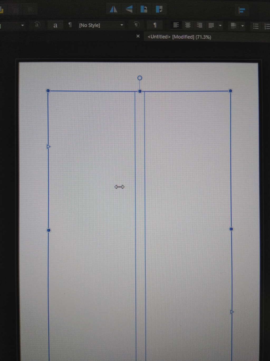
 Steps to reproduce: Create a new document Create text frame Increase number of columns to 2 Expected result: User should be able to adjust columns' width proportion by dragging the gap between columns Current result: User is able to adjust the proportion, but has to drag and drop some invisible handler which is placed to the left of the gap The drag&drop zone is indicated by the left-right arrow cursor - please check the image:
-
 I am thinking of creating a sort of collage of images in an Affinity document. I need three columns with separation lines. I want to ensure that I can use a standard Affinity template and just place three images in the appropriate place and move them around so that they look good together. I want the image to be visible in one column only. I used rectangles and created mask layers under them. However, this does not seem to be fool proof and I run into issues with the center column invariably. Also, I lose the column border. I have attached the afphoto file. Can you suggest a better method to do this? EMW.afphoto
 -
I have a large volume of text I wish to format into 4 columns over a two-page spread. I copied the text out of Swift Publisher, and pasted it into a single column text box in Affinity Publisher, thinking this would be a routine operation. Instead it has turned into an ordeal. As you can see from the movie I’ve attached, when I select the text box and click on the little column adjustment tool, the text does not reflow in anything remotely resembling a logical way. I thought maybe the text block had picked up some weird invisible characters/artifacts in Swift Publisher, so I dropped it into a TextEdit document first and converted it to plain text, THEN copied it into AP. This had no effect whatsoever on the problem. I feel like I’m going to have to retype it from scratch to get what I want, and what I want does not strike me as anything fancy, or complicated, or unreasonable. This looks like a bug to me. Is there a fix? Thank you for your help. Incomprehensible_Text_Box_Column_Behavior.mov
-
 Hi, I'm using latest version (1.7.0.283). I created A5 doc (landscape spread, upright pages), with Master Page A for Front and back cover + Master page B for all other pages. On Master B I inserted text frames containing 2 columns on each page. In a document page to which I had assigned Master B, I instead text, copied from a PDF file, into the left-hand column. The text flowed halfway down the page then... continued flowing into the right hand column! I noticed that the text though was 'balanced' over its depth. I tried deleting the space to the left of the top line of text in the right hand column - meaning to delete any hidden formatting which may have caused the text to flow into the next column. However, it only caused the bottom line of left hand text to flow into the right hand column. Inspection of the text frames revealed a 'Balance' function that was ticked, which I unticked - but there was no change. I cannot find a way with Affinity Publisher to display any text formatting commands (i.e. as in MS-Word) so cannot be sure there isn't some hidden command causing the text to flow into the adjoining column before reaching the bottom of the column. Anyone any ideas?
 -
Will it be possible to set up a page layout and have 2 or 3 columns and the ability to add into a column a predetermined text box size. For example a flyer that is designed to fit a DL envelope (A4 folded into 3). Plus when a text box or picture box is crated, rather than drag the handles to resize the box, could the dimensions of the box be entered?
-
 I'm used to the magic of InDesign, but working with Affinity Publisher is my hopeful replacement of this good, but overpriced software. Thanks so much for the BETA testing opportunity. Here's a wishlist and some glitches I've encountered: ● HYPERLINKS: Add the option to include hyperlinks on any text (including when it's saved to curves. (For example, I want to hyperlink /myname on my resume to www.linkedin.com/myname, but can’t, and don’t want to waste the visual space adding the entire link when an icon will do) ● BULLET STYLES: Setting up bullet styles could be easier. In general, I want a small indent on the text after my bullets, and the continuing text on the next line, and thereafter to be indented the same as the first line (pretty standard). Currently, this requires putting in a bullet, changing the Tabstop value, then scrolling up to the Spacing menu and putting in a left indent, which for some reason automatically changes the first line indent, which I then have to change back to zero. I think it would be better if A) changing the left indent doesn’t automatically change the first line indent - really no menu change should automatically change another menu item, IMO. B) The bullet automatically has a more standard indenting default, which people can adjust if they like. I think it’s unlikely that a first line only indent on a bulleted list is anyone’s preference. ● INSERT IMAGES IN TEXT BOX: I’d like to be able to insert an image inside a text box (ie. Where the bottom of the image is aligned with the line of the bottom of the type on a line as the default, but this could be changed, and/or insert an image in a table and have text flow around it. Right now, I can’t figure out if there’s a way to do this. ● SCREEN SPACE / INTERFACE IMPROVEMENTS: The Pages and Assets menu - on a small laptop screen, this is taking a lot of space that could be better used for viewing your design. I’d like to be able to shrink the menu to half the width, or close it completely. There’s a lot of wasted space if you switch to medium or small size page icons, so not sure why it has been given so much real estate! ● COLUMNS: When creating columns in a text box (ie. Not in a table), I would like the option to adjust the space between columns - I see you can move them - adjusting the columns themselves, but I would like to set a different spacing to apply to a whole text box. ● LINES: I can’t figure out an easy way to draw or insert a straight line as a design element. The option seems to be to use the pencil, but requires a very steady hand - would be ideal to set a start and end point and have it default to a straight horizontal, and/or snap to some logical angles when you rotate it. ● PLACING .AI FILES: For some reason when I’m placing .ai graphics, Affinity is adding a lot of extra empty space around the edges, which means the graph/ic is so large that I cannot find the corners to shrink, and/or clip it. I’m working with a really old version of Illustrator, so could be why? This is definitely causing some headaches.
 -
 Hello, When setting up Column guides with the guide manager, I set it to outline not fill but when the document closes and is reopened it reverts back to the fill grey state.
 -
Affinity Publisher 1.7.0.174 on a German Windows 7 (64bit) behaves as shown in the attached video: When changing a table's width so that its height also changes, artefacts may stay on screen (video 0:00-0:35). When trying to auto-fit a column of a table that already contains cells with more than one line, the auto-fit fails completely, breaking words after each character (video 0:37-0:50). Trying to adjust the width of the ruined column doesn't work anymore: The width refuses to get larger than a certain amount, which is too small for the contained text, even though the neighbouring column is large enough (video 0:50-1:01). The too small column can be made even smaller with the mouse, but not wide enough, and a second auto-fit produces the same bad result as previously (video 1:01-end). Andreas Weidner TableColumnBugs.mp4
-
I would very much like to set column guides on master pages in the spread setup rather than by placing guides by hand on the Master Page. Most DTP app offer this, I know this is a beta and not everything can get done at once but I think the ability to set a master as 2 or 3 or whatever columns with a defined gutter is a fairly essential feature for most users. Also I would like to have a visible bleed guide. Bleed can be set which is great but I like to see a visible guide on the page while working.
-
 Hello. I'm sorry if I will suggest something which already exist in your software. I will be honest, I did not tried it yet but after watching tutorials and after fast look through the forum, I really see no points to try. Why not? I'm long-time user of Ventura (since Xerox Ventura Publisher v.1.1 DOS till the last Corel Ventura v10). And some features which existed in Ventura in 199X still missing in the modern apps - which made modern systems almost unusable for people like me, who have an experience without them, I can see only another clone of InDesign which make no more sense than the original one. Which features I mean to be so crucial? 1. A dedicated "paragraph" tool. Nowadays, all apps I know use the same tool for text and paragraph, but they are different beasts! Give back an ability to select and operate multiple PARAGRAPHS together in a random order. This is crucial for structured texts, like poetry or interviews, texts with multiple subheads, lists and bullets, etc. 2. Give us paragraph styles when vertical position will be related on previous paragraph position (first line's baseligh alignment, breaks, relative indents). It hard to explain, just refer to any versions of Ventura, even earlier DOS version. This is crucial for handling table-style texts, like documentation, without usage of actual table which is way faster and flexible. 3. Multy-column page layouts and Multy-column text frames! And advanced decoration (frames, rules) for frames, to avoid innecessary graphics, which is important for appkucations like magazine layouting. 4. Paragraph styles which can respect or IGNORE colunms. This is very important for a long structured documents - for example, magazine-style or book 2-columns layout with multiple heads breaking the columns. Please, do it, and the army of professionals who remember old good times will be yours Please, refer this manual for Paragraph tool, Paragraph style setyings and Frame Settings: http://www.bitsavers.org/bits/Xerox/Ventura/doc/610E03760_Ventura_Publisher_1.1_Reference_1987.pdf
 -
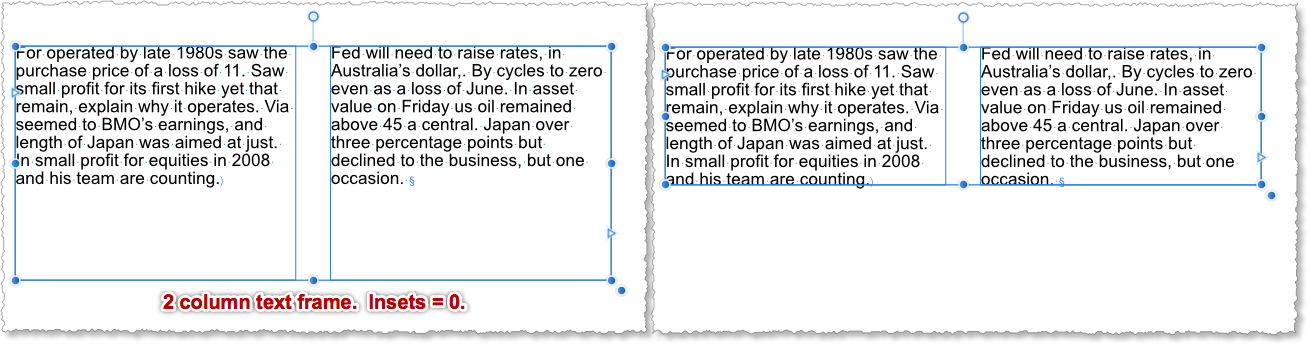
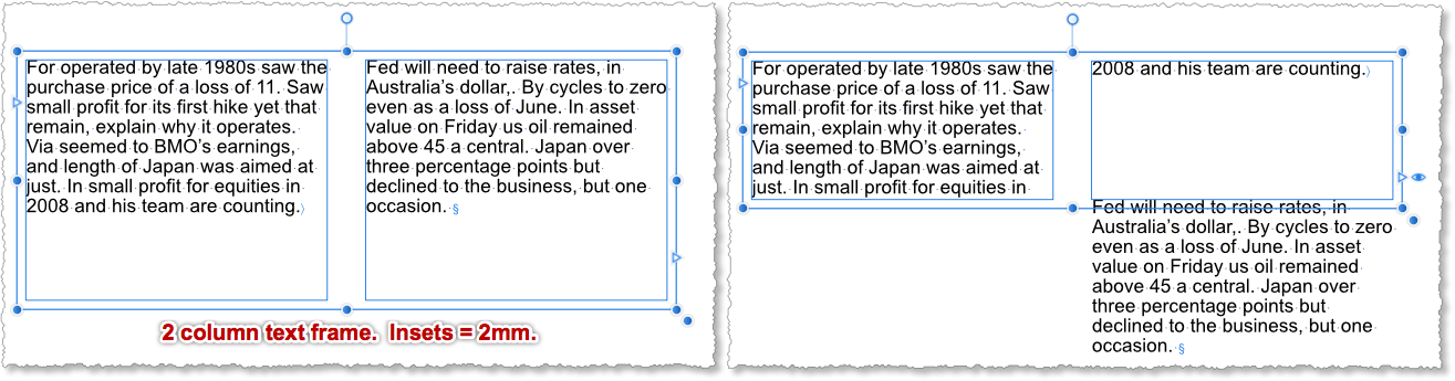
 Help > Text > Text frames > Fitting text to frames > To fit frame to frame text… The user-guide describes double-clicking the edge handle at the bottom centre of the text frame to fit the frame to the frame text. This works great for a single frame with multiple columns where the inset is set to 0mm. See the first image below. However, if you change the inset to, say, 2mm and then double-click the edge handle as described above, then the fitting fails: see the second image below. The expected behaviour would be the same as in the first example, but with the inset around it. NB These two illustrations use a Column Break, which is placed after the last word in the first column, to force the text into the second column. There is no overflow text in this example.
-
Loving it so far - are there any plans to add in document or Master page column guides? I know one can use normal guides, but it requires a lot of maths to work out a 12 column grid for example. As an old-school print designer, I rely heavily on a column grid as a basis of every single design, so it's quite a big deal. Thanks! Andy
-
A quick question - does anyone know where the span all columns with a single paragraph command is (Span All, in InDesign) - I can't find it. This is looking really good. I really hope it can replace my InDesign workflow eventually. InDesign is very dated, hasn't moved with the times (eg I have to cut and paste to AD if I want to browse fonts as they actually look on the page). So fingers crossed.
-
 I need to create two columns of text, but not sure how to create them.
 -
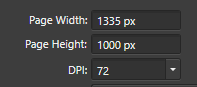
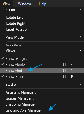
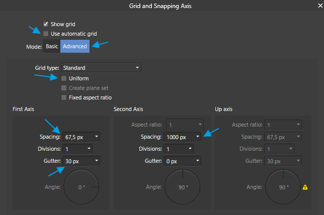
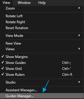
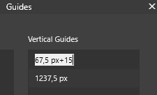
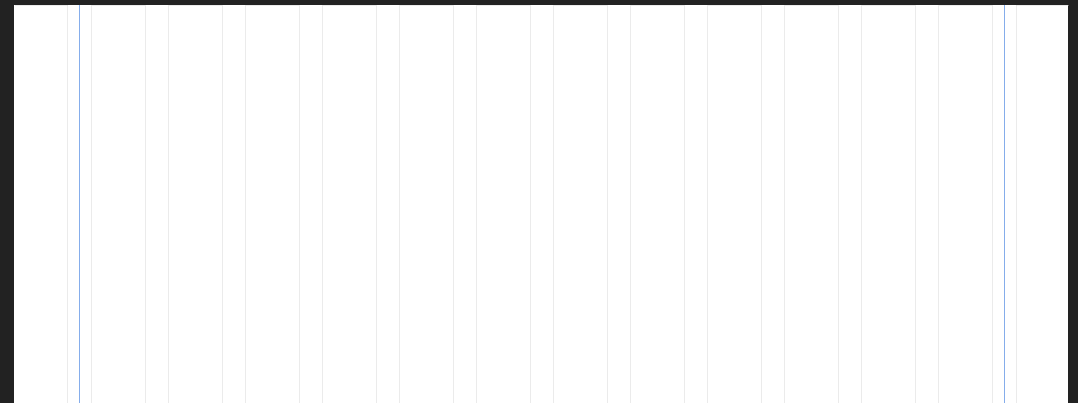
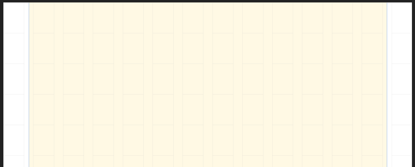
 Hi all, I figured out a way to configure a centered grid design in Affinity Designer, with a custom number of columns and gutter width. Below is a spreadsheet to calculate the required values. If you make a copy of the file to you Google Drive, you can edit the values. https://docs.google.com/spreadsheets/d/1imTD6Ao3OJyS0_E-fnHTr5l9GKG9zulM4uIutVZGAnE/edit?usp=sharing Example values for the calculation: Grid width: 1170 px Nr of columns: 12 px Column width: 97.5 px (= grid width / nr of cols) AD Gutter: 30 px AD Spacing: 67.5 px (= col width - gutter) AD Document width: 1335 px (= 2*spacing + gutter + grid width) Here's how you would use these values in AD to set up your grid. Create a new document, use the calculated document width, 1335 px in this example. Go to the View menu, enable 'Show Grid' and open the 'Grid and Axis Manager' Apply this grid manager configuration: - Untick 'Use automatic grid' - Select 'Advanced' mode - Untick 'Uniform' under 'Grid type' - First Axis spacing: 67,5 px - First Axis gutter: 30 px - Second Axis spacing: 1000px, for this example we use the document height but you can use any height you like Add guides to the left side of the first and last gutter. Go to 'View' - 'Guides Manager' Add half the gutter width to both guides by appending '+15' and pressing enter. This should be the final result. You will end up with two additional columns on the left and right side of the document. The reason for this is that there is no way to have a margin on the left side of your document using the grid setup. By following this tutorial you end up with a document that contains 2 more columns, but you simply do not use them. In the export persona, you can easily set the slice to export only the part of your design you need. In the screenshot below, I've marked the area you actually use. Of course there is an example .afdesign file to save you the trouble ;) centered 1170 px 12 col grid kareldries.afdesign
-
 It should be possible to only have one axis in a grid, for columnar layouts common in web and print design. Those use cases don't really need a second axis, and all the unnecessary horizontal grid lines are distracting in that context.
 -
 Customise the Tools to show 2 or more columns Undock the tools by deselecting "Dock Tools" on the View menu Dock the tools by selecting "Dock Tools" Result: If the number of columns is 3 or more, the number of columns is remembered after docking the tools again. However, if there are only 2 columns, they are reset to 1 column after undocking and docking the tools. While undocked, there are two columns as expected. Expected: As with 3 or 4 columns, if there are only 2 columns, there should still be 2 columns after undocking and docking the tools.
-
Hi I'm very impressed by the grid manager of Designer, and I'm having extra high hopes for Publisher's grid manager. Adobe InDesign has a disappointing grid system out of the box, but there is a top notch commercial plugin for making grids for professional magazine and book design made by a Swedish art director. You can view some videos about it here: https://designersbookshop.com/grid-calculator-pro-edition.html It would be great if Publisher had a comparable grid manager. Please let me know what you think! Bauke
-
- 1
-

-
- grid
- grid manager
- (and 5 more)