Search the Community
Showing results for tags 'Colour'.
-
 Hello This is my first post here. I just bought Affinity Photo for iPad and the first thing I tried to do I can't seem to do. I want to use a brush and select a color from the photo. I have the brush tool and see the color picker but cannot see a way of getting the color from the photo. Also I have no idea what the little circular tools are next to the color picker. Is there a manual? Cheers. Martin
 -
 When I start a new document with a non transparent background the BG is shown in white ... when adding a pixel layer now BG is shown white but the thumbnail shows the BG in black (or similar). Is this a bug? From my understanding unless the BG is NOT transparent there needs to be some kind of BG colour (and consequently some kind of "layer" containing this colour). Even if only a textlayer is applied the BG is exported as shown (white). Is it some kind of imaginative BG that still is exported but can't be edited nor it is shown in the layers list and where I can't choose the colour of? This seems not easy to understand and somehow inconsistent to me. Maybe I did not fully understand the concept? Cheers, Timo (latest Beta)
 -
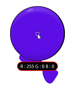
I launched AD beta build 1.6.0.74 (in Light UI mode) for the first time, drew a closed curve with the Pen Tool and clicked on the Colour Picker colour well in the Swatches panel. The colour displayed in the colour well was the default RGB red (#FF0000) but the fill applied to the shape was purple (#5C0EE4). Closing and relaunching the app has made no difference, nor has switching to Dark UI mode. If I go to the Colour panel and enter #5C0EE4 for the fill, the colour I actually get is #5097AB.

-
 Looking to upgrdade my graphics card, and seeking to establish which cards are compatible with Affinity that will offer a 10-bpp display. I know Photoshop has a real compatibility issue regards displaying in full colour 10-bits per pixel with anything other than Quadro or Firepro cards which are a tad expensive if you want one capable of running the odd game or two. I am looking at something like the RX580, or the GTX 1060 - both of which I understand offer full 10-bit displays. Neither of them will offer 10-bit in Photoshop. Question is, will they offer 10-bpp in Affinity? Does Affinity actually have a list of 'recommended / supported' cards? i5 4670 16GB Hyperx Fury (possibly looking to bump this up to 32 in the near future) GA-Z87 Motherboard XFX GA 7870 Graphics card 2GB [which will be replaced imminently!] Dell Ultrasharp UP2516D 2560x1440 [100% Adobe RGB, 100% sRGB] Thanks in advance,
 -
 Hi, finally the moment has come that I have to ask for your help. Untill now I have always managed not to take your time, but now I am simply stuck. I am trying to make an HDR using 3 perfectly aligned photos of different exposures... Ususally I have no problem in doing that but in this case the result is terribly "posterised". Below are the source photos, and two results - one with all merge options unchecked and one with all options checked (by options I mean "align" and "remove ghosts" etc.). Does anyone have any idea of what might be causing such behaviour?
-
 This question hasn't been asked since mid 2016 so I thought I would ask again mid 2017. Can we select same fill and stroke colour in Designer like you can in illustrator. This is a pretty important feature in my opinion, one that I use on pretty much every file I work on. Thanks.
 -
 Is there a way to keep a swatch name when creating a palette from a document, All colours that are created have the document file name followed by a number, Not easy to identify when colours are similar to each other.
 -
 Will Affinity Photo and/or Affinity Designer be able to use the new color fonts that are starting to become available? So far they only work in Photoshop CC 2017. https://www.colorfonts.wtf
 -
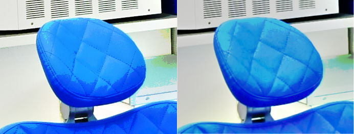
 Hello, I am fairly new to Affinity photo. I have taken a number of photos and need to edit, however when I open them up in Affinity photo the colour is dulled. I have checked and it is set up in RGB format. Any ideas how I can fix? I have attached a comparison from when I open up normally in the standard picture viewer. Thanks.
-
 How do you change text color? I've selected the text and am hunting for something to give me new colour options for the text, and something to apply it. Thanks
 -
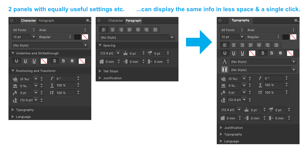
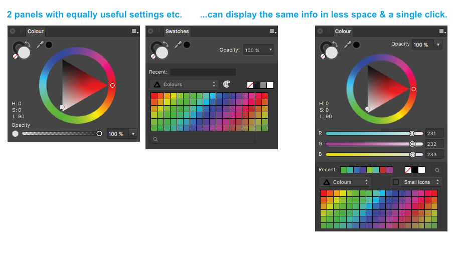
 Just a wild, crazy thought... why do paragraph and character have to be separate panels at all? Can't we have just one single, long panel with all text settings together. We could call it "Typography". If I'm editing text, I inevitably have both panels open at the same time anyway and it will remove some redundancy. Here's what I'm thinking: The same thing with colour and swatch panels. I also always have both of them open at the same time so they might as well be in the same panel like this... (Note the pull down menu for choosing different swatch display styles – small icon, big icon, list view etc. Just a little idea thrown in for good measure) Since your roadmap includes multiple fills and strokes, perhaps strokes & fills should also be crammed into 1 panel. I'm worried you're going to take Illustrator's approach to multiple fills & strokes... 1 panel for stroke 1 panel for fill 1 panel to list them to define which you have selected. and another panel for for effects, just for good measure?
-
 It's been a while, but it seems to me that in the MegaCompetition's apps, if you pressed D, you got a default black stroke & white fill. Is there any equivalent, or other shortcut strategy, to accomplish this in Designer? thanks in advance, - pbass
 -
 Hello community, thanks for the possibility to take part here. Trying to figure out how "selecting by colour" works, i am not able to find the solution. Does anybody perhaps know how to do it? Similar to the Illustrator function "Select ... same colour". It would b nice if someone could help. Greetings from Berlin :)
 -
Very, very easy one! In photoshop you can click D and it sets the foreground/background colours to black and white. Useful if you've been painting in another colour and you want to do mask work. If you wanted to go an extra step, you could allow setting of a range of fg/bg colour pairs that can be selected/rotated.
-
It would be a welcome addition if we could make a swatch based on another swatch, not unlike Sass (https://robots.thoughtbot.com/controlling-color-with-sass-color-functions). In interfaces for example, I could create a green button with a darker green border. The darker green would be based on the original green and have the same hue and saturation, but the lightness would differ. That way, if I later change my mind and want to make all green buttons blue, the dark border would shift along. I'm looking forward to your thoughts!
-
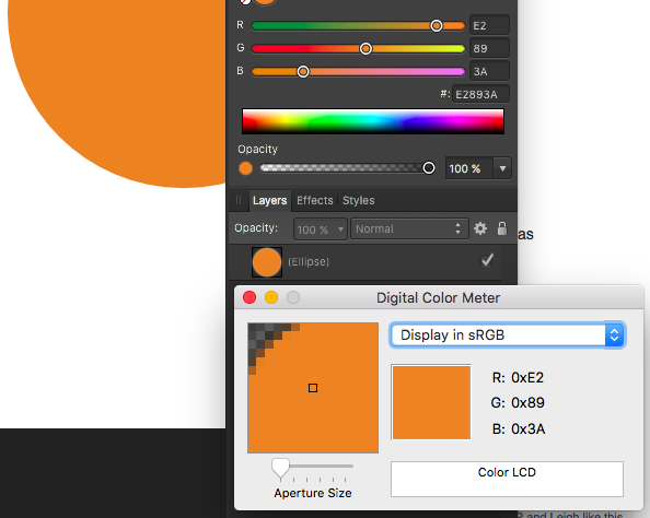
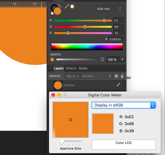
 Document: sRGB 16 Color Value: #E2893A Digital Color Meter (sRGB) on color pane: #E2893A Digital Color Meter (sRGB) on element: #E28939 colormismatch.afdesign colormismatch.afdesign
-
Since I don't want to mark everthing I don't get within AP as a bug I post my question here ... maybe someone has got an idea ... (Final Version 1.5.1.54, AP Windows) Dealing with this picture. There's only one pixel layer visible and activated, The paintbrush is selected. The mixmode is normal and selected colours are black & white as can bee seen in the tool panel. Now painting on the pixel layer with the brush gives my this result (painting in white): switching to black looks like this: I have no idea what goes wrong ... Maybe someone can help. Cheers, Timo
-
 I have just installed Affinity Photo 1.5.0 on my Mac with OS X 10.12.1 (Sierra). I use an Epson printer. I am entirely new to Affinity Photo, so please forgive me if the answer to this is obvious. In Photoshop there is the option to let the printer's own colour controls manage the printed colours or to disable these and let PS manage the colours; I usually opt for the latter. I could not find an equivalent place in AP where I could make this choice, and when I printed a photo the print that resulted was grotesquely too dark and with bad colour balance. I should be very grateful for information about this. I am aware that back in 2015 there was much discussion about the limited nature of the AP printing interface, but I hope that in the major upgrade to v. 1.5.0 this has been resolved.
 -
 Hi! I've been trying to prepare one of my clients business card design for printing using cold foil to give certain elements a metallic effect. To do this I need spot colours for the elements that I want to give the metallic effect to (might have to add overprint as well). Spot colours seem to only apply to color fills and not to outlines so these need to be expanded first. The logo, however, is made up of advanced brushes which apparently cannot be expanded. Simply recreating the logo isn't an option either because it's one of those dry brush effects. Is there any way to get these designs ready for cold foil printing when expanding isn't an option? Any help or advice would be really appreciated as I'm nearing the deadline.
 -
Would welcome an option like "Do not color manage this document", "Do not assign color profile" or "No Color Management" in both AD / AP. :)
-
Hi, I think affinity misses heavily on some good colour correction options. Other software brands allow for almost automatic correction or profiling using great/xrite colour checker cards, e.g. passport, SG24 or DG which are all industry standard. Without that option of automatic profiling Affinity photo is not really to be any valuable tool for pro users who take colour processing seriously. Please add this feature. Thanks.
-
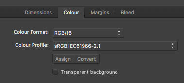
 Hi, i want to assign / convert a documents color Profil but the buttons "assign" "convert" are grey and not active... Why?
-
 Obwohl ich Text in Schwarz (RGB 0-0-0) angelegt habe, wird er im PDF-Export zur Mischfarbe (CMYK 89-78-62-97). Was mache ich falsch? Although I created text in black (RGB 0-0-0), he becomes in the pdf export the mixed color (CMYK 89-78-62-97). By the way: I tried CMYK 0-0-0-100, also the Black/White Circle. No differenz. What do I make wrong? Kalle
 -
 Sometimes, while working in a doc with text frame text above a box with colour I make one click in the box with colour and suddenly it no longer has that colour. I suspect that somehow I have initiated an AD method that allows one simply to click on a box of colour and drop in the previously used colour (or no colour, as the case may be). However, I have yet to figure out just what sequence of clicks has done this. The mouse clicks are not used CMD, OPT, etc. but only a simple left-mouse click. Is this an AD method or a bug? Thanks.
 -
 Hello, It would be really nice to be able to see a live preview when selecting a sampled colour in Pixel Persona as an overlay or black and white mask. Currently it shows an approximate result while dragging a slider ( dashed lines ). Extracting clour range ( sampled colour ) and using it as a layer mask or fx layer is a common practice in compositing. Architectural visualizations for example. I can select a sampled colour and click Refine to check if what i did was ok, but it is always a guess. Designer is a GREAT program, but I really miss this feature. I am testing Affinity Photo Beta for Windows and I can't see this kind of tool as well. ( Pixelmator has it BTW ;D ). I know it is a beta so maybe it is a good time to point it out. Performance-wise, maybe taking a screenshot and previewing selection mask on a low-res image is a good idea? Best Regards, Marcin Mirkowicz.