Search the Community
Showing results for tags 'Colour'.
-
 So, since the first beta came out I keep testing and hoping that the colour palettes finally work "right". Now with release .238 (mac) this bug is still not fixed. Obviously whats happening is, Designer scans all the colours using "RGB-view" and includes shadow effects and placed images, which produces: A) way too many color swatches (if you have an image placed or a text with simple shadow effect) B) the wrong colour values if (it should be clear, we are talking about a dtp-app) the colours are mostly CMYK. C) the colours are not global AND are not used by (or applied to) the objects (in which the function found it to begin with) Especially in desktop publishing, you have to have a clean view over used assets, links, colour-swatches, fonts used in the document. Unlike in a photograph, you cannot use a "slightly brighter" red or a "subtle darker" grey in different places of your pages, just so that the overall "feeling" is the same. These must be, by default, "global colours" and you have to rely on the accuracy! I understand there is "some" complexity as all three apps re-use the same engine. Most users probably don't need this behaviour in Photo and some more need it in Designer, but in Publisher it is essential to have consistent values across multiple related documents.
 -
 Affinity photo is great. But something I really miss when editing raw files is the possibility to adjust tone, saturation and luminance of the picture by colors. This is something that you can easily do on Lightroom and that I´d really like to find here in order to process my raw files completely with Affinity photo. I attach a picture of this feature in Lightroom for ipad. Thanks!
-
I've created several colour palettes for printing with CMYK values. I use them in my work. So far, most of colours reproduce quite well in CMYK printing. I haven't tested all of them, so there may be some dull outcomes. They may also look different when reproduced on other printers. My palettes are sorted in few groups: blacks, blues, greens, reds, violets and purples, yellows and oranges. Each colour is individually named with CMYK values. I have used colour cördinates provided on Wikipedia (i.e. Shades of green) and few other sources. To import palettes, go to: Swatches tab (or activate it in View -> Studio -> Swatches) -> click a little menu icon top right of the window -> Import Palette I hope you will find them useful. Enjoy! PilcrowPalettes.zip
-
 Is there a way to switch the brush colours back to the original black and white with "one" click?
-
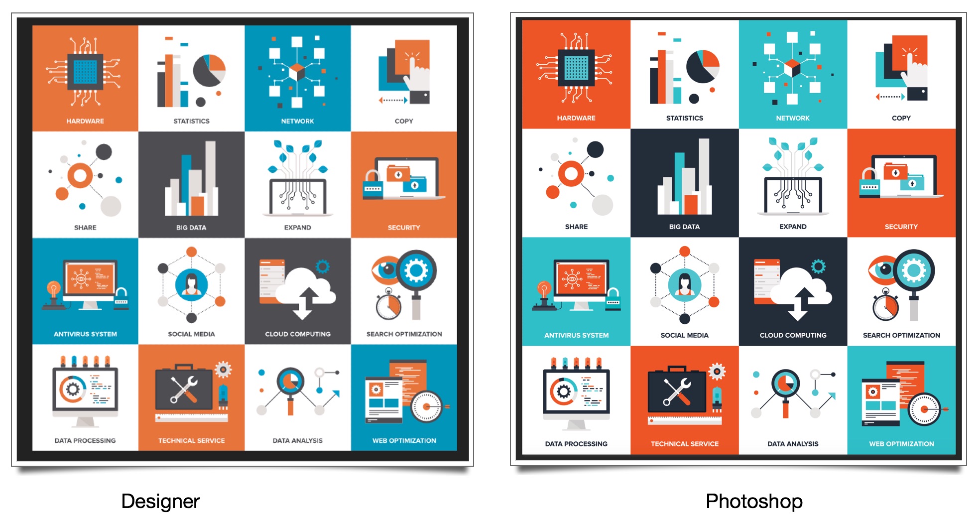
 I have some stock AI files that I purchased from a stock library and when I open them in Affinity Designer, all the colour shift from what I'm wanting them to be. I can't figure out how to shift them back! When the files are opened, I get a message popping up saying a profile has been applied to the unprofiled document. It applies US Web Coated SWOP v2. Is there a way to change what profile is applied by default? What am I supposed to be doing? I have been to the document setup panel and tried both assigning a profile, and also converting to a profile, but the colours always remain the same and don't match the colours of the same file when opened in any other applications. Here is the same file opened in Designer and Photoshop. This is a drastic colour shift that I can't understand.
-
Don't know, if it really is a bug or not. Not sure, because I first thought it has sth to do with monitor profiles. It only occurs with the attached external monitor. With notebook screen only everything okay. I noticed it when I placed a logo-eps of a customer. I wouldn't have listed it here if it hadn't been okay in Indesign!! I create an eps in Affinity Designer. Blank Background (white), black empty rectangle, into this rectangle I place a rectangle, filled with white. Store it as test01.eps. I started wondering, when in Affinity Designer, the workspace background was yellowish and the white rectangle the same. (That's not nice, but consistent, because both yellowish.) When I open it in Adobe Illustrator, everything okay (white background, white rectangle) Then I open Affinity Publisher, place the test01.eps. The workspace is okay, white. The inner (should be white) rectangle is shown yellowish. No matter, if it is linked or embedded, no matter if it's preview mode or not. Placing the same test01.eps in Adobe InDesign, everything is okay and white. Exported pdf out of Affinity Publisher, everything is okay and white. In Affinity Publisher, the workspace background is white, but the colour swatch is ..... yellowish!!!!!! Showing CMYK 0/0/0/0 See attached screenvideo and example files. ?????????????????????????????????????????? additional hint: If I open the file, before attaching the 2nd monitor, everything is working fine and white as it should be. white_is_yellow.mp4 test.pdf test01.afdesign test01.afpub test01.eps
-
 Doesn't seem to be possible - or am I just being stupid …? Also could there be a way - if there isn't already to layer shapes on top of a photo…? I'm redecorating my bedroom at the moment and I've laboriously converted all the colours I'm considering into RGB and Hex values, I just need a way of playing around with them. I don't see any way of adding additional swatches to a palette (it is almost 03:30 though, but I do better at night). Yes, I know that screen colours are not going to be the same as the actual paint (wouldn't it be wonderful if there was a way of reconciling them somehow, some kind of intermediary colour space).I've already found that one green I was considering was far bluer 'in the flesh' than it was on Dulux's website.
 -
 HI I purchased Affinity a while ago and when I import images they always appear to have a green colour cast and are less saturated than they appear in Lightroom or Photoshop Elements, I have tried assigning and converting colour profiles. Assigning my monitor calibration profile seems to help slightly but it still doesn’t match the way it appears in Adobe’s software. Can anybody help?
 -
Every time I try to change and replace the text's colour it crashes. I've converted it to curves but then I don't know where to change and replace the colour unless I select element by element manually or on the layer panel. Any tips until this bug is sorted? Thanks, IR
-
 Windows 10 - Publisher 1.7.0.139 I've tried three documents - two from previous versions of APu, one new document - and the colour picker - on the Swatches panel - isn't picking up colours from the document canvas; it always comes back with 0,0,0. It picks colours from the UI and other Windows apps, just not within the document canvas itself. Doesn't matter is anything is selected or not. Although, I have noticed that the colour picker on the Colour Chooser palette does work, and the picked colour is transferred to the Swatches colour picker. Edit: Actually, that's stopped working now too. Another thing I noticed is that the CMYK of the RGB 0,0,0 that is picked shows in the Colour Chooser as 72, 68, 67, 88. I don't know if this is meaningful.
 -
 I am used to adjusting individual colours, both saturation & luminence in Adobe Camera Raw. Affinity's Develop mode does not seem to provide this. Global saturation & hue are there, but no adjustment for individual colours. Have I missed something?
 -
 I once saw a very good Affinity Photo video on how to apply a colour to a greyscale tiff. I need to review this but cannot locate it although searching through the official list. Anyone know where I can find it or the link to it?
 -
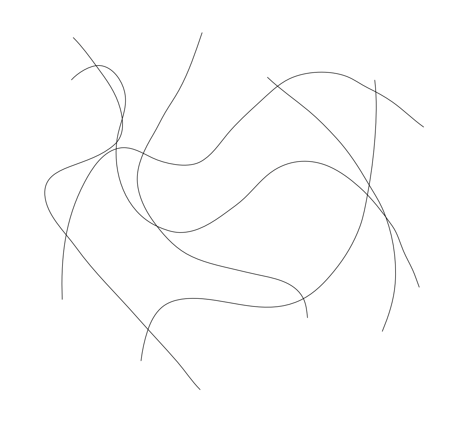
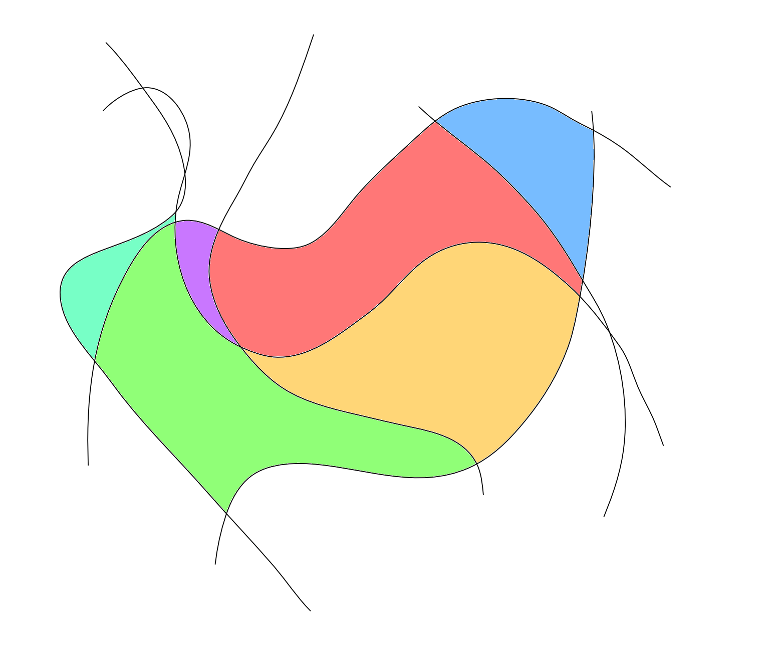
 The image below shows some curves I drew with the pen tool. How would I go about filling in the space in between each curve with a different colour? Here is an example of what I need: All help is appreciated. Thanks, Dan
-
Would be great to define different colours for the helplines (activate one or more and choose the colour). Also the ability to delete one after activating it by just pressing the delete-button on the Keyboard.
-
There is inconsistency in the colour rendering between what is viewed on screen (2017 MacBook pro – calibrated) and some of the default pdf export options. I have tested this on the defaults for PRINT, WEB and FLATTEN. The document is set up as CMYK and the placed image is also set as CMYK – as are all the colours used in the document. The image enclosed here is a screen capture of the Publisher working document. WYO-AS-Screen Capture.pdf
-
 Maybe I'm missing something here, but I am at a loss as to how to save a colour For example: create a box Fill it with a certain colour Now I want to save that colour so I don't have to mess around with wheels and sliders to create that colour at some point in the future
 -
Windows 10 - Publisher 1.7.0.58 Work-flow to show problem: * Create a new document; * Create a Rectangle (as an example, could be anything); * Double-click the fill colour icon to open the Colour Chooser dialog; * Click in any of the '#' fields; * Enter any value; * Press Tab. The focus shifts back to the 'R' field but only when you input+Tab in one of the '#' fields. If you're in any field other than one of the '#' ones, Tab takes you to the next field as expected after input. Tabbing from a '#' field without making any input puts the focus onto the next expected field so the problem only seems to occur when input is given.
-
 Hi, I'm wondering why Affinity Photo and Designer are opening PDF file in different colour than I can see it on MacOS native Preview app? File is package print design I got from client in PDF format. I believe it has been made originally using Illustrator. When I open it in Designer I see extra red layer with blending mode multiply over graphic layer. Not sure what is it's purpose. Any idea what I'm dealing with? Best, Juha
 -
 CLOSED Hi, recently on Affinity Photo my colours seemed a bit off, after doing some test's I found out, that was the case. Are you aware of this bug, if so can I fix it? Image showing this:
 -
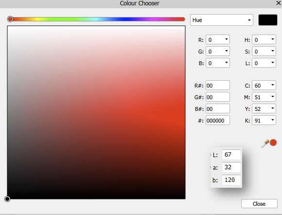
I would be nice to have lab colours in the colour chooser as per attached. Kind Regards
-
 Hi, I'm working on a file at the moment and suddenly the colours won't change in it. I'm selecting everything properly and using the eyedropper and nothing is happening. Again, this isn't an problem with selecting objects. It literally only happens in this one file. Perhaps I've selected something I shouldn't have? Thanks for your help.
 -
In my never ending quest to simplify or streamline workflow in Designer, here is my latest request. Please allow users the ability to set a default colour palette. One that always shows up upon opening the app. Might be as simple as enabling users to just drag their chosen palette to the top of the stack of palettes in the list. :-) ...if there is a way to do this now please let me know. Thanks. Small thing. Big frustration.
-
I'd like to see the option to change a colour of an artboard when working in Designer. At the moment I'm using extra colour-filled layer to work on design when artwork is in white. It works, but it's not ideal. Thanks.
-
 I have some design to be done in white. How do I change colour of the artboard? I was looking for half an hour and can't find it. I know, I can add a coloured layer beneath everything, but I would prefer to do it without adding the extra layer.
 -
 I'm evaluating Affinity Photo in a work flow that uses DxO PhotoLab to apply lens as well as basic colour & exposure corrections. When I export from DxO into Affinity, photos look significantly different. Is there something I'm overlooking? Can someone please suggest how I can carry forward all of the work done in DxO before I begin more detailed work in Affinity Photo? Thanks.