Search the Community
Showing results for tags 'Colour'.
-
 I have large images with pixel shapes (representing cells) and each cell type has a certain colour (6 in total, plus black background). I need to rapidly colour-test different colours to find the best combination for visibility. I have not been able to find a solution anywhere, as most such approaches are about defining a recognisable shape and then altering colours - this is about changing many 'cells' across a large image in one go. Thanks
 -
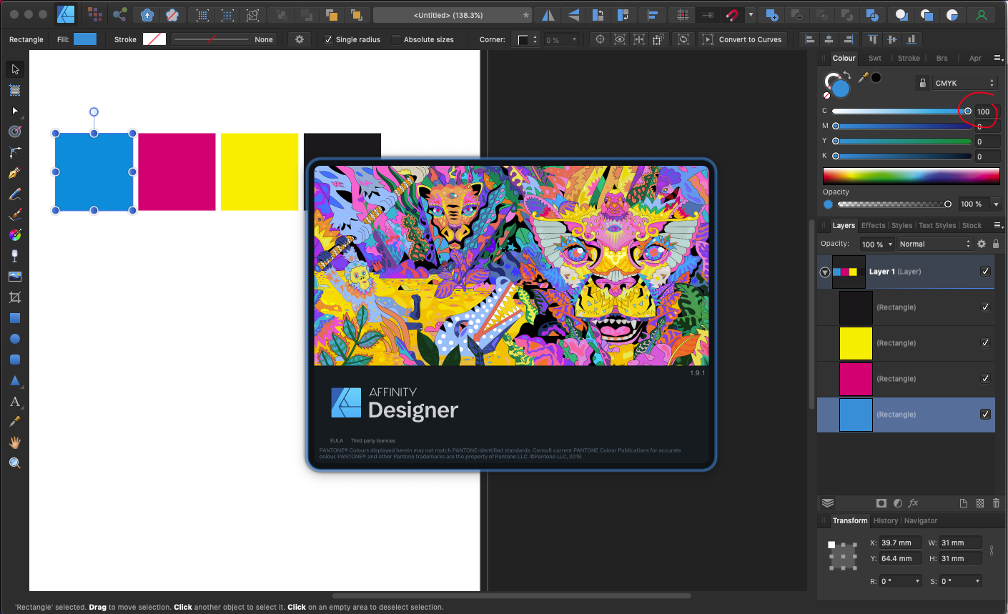
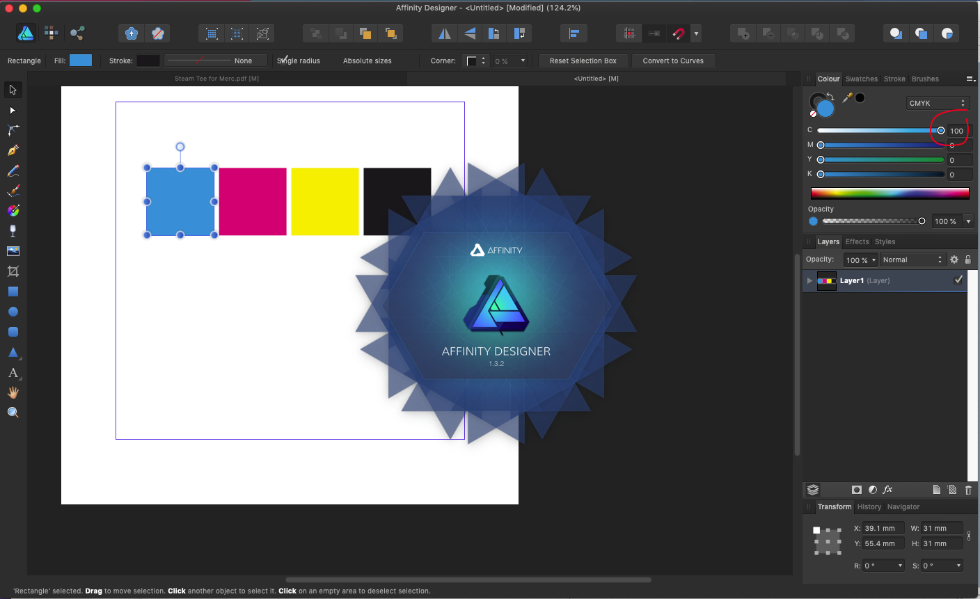
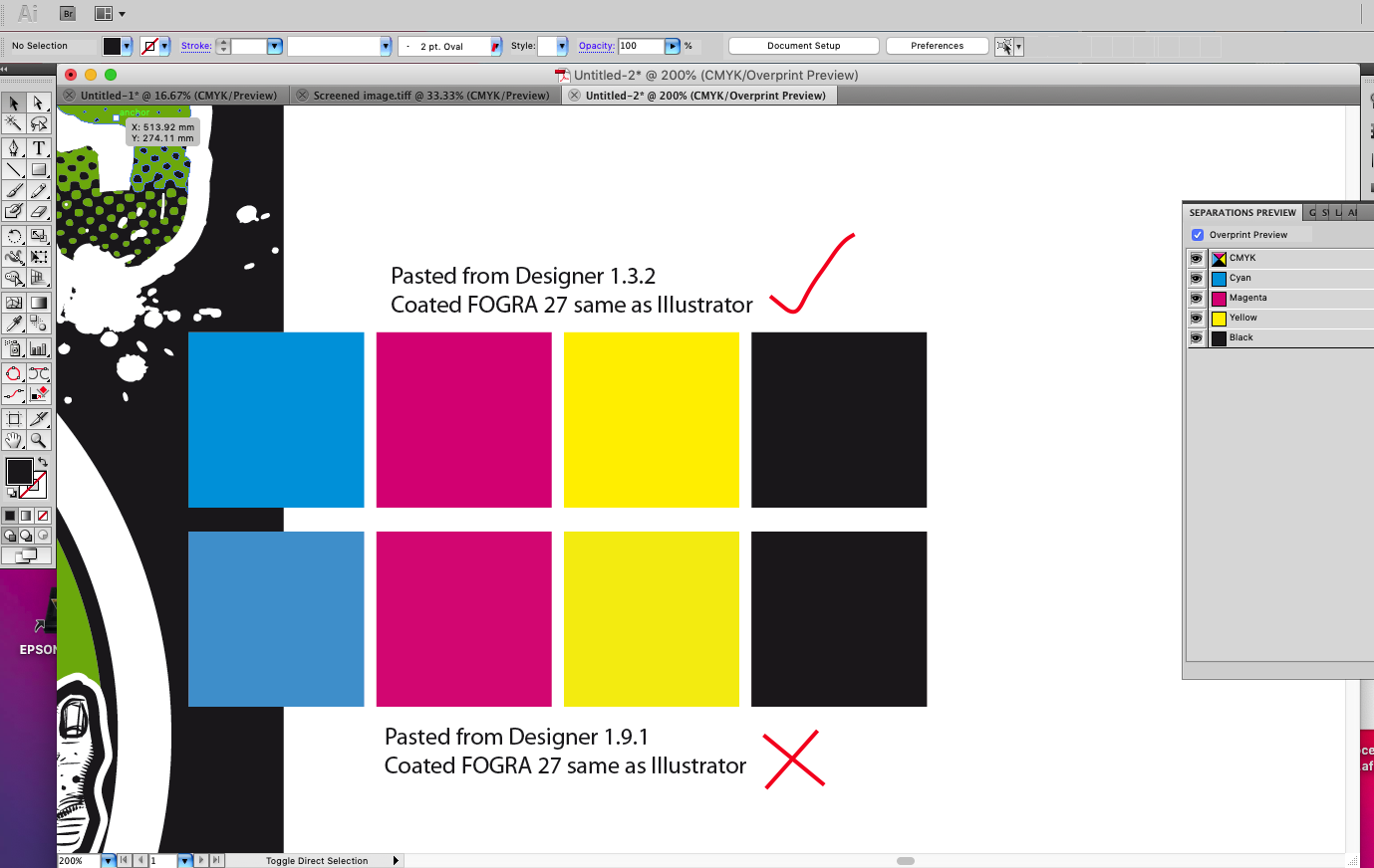
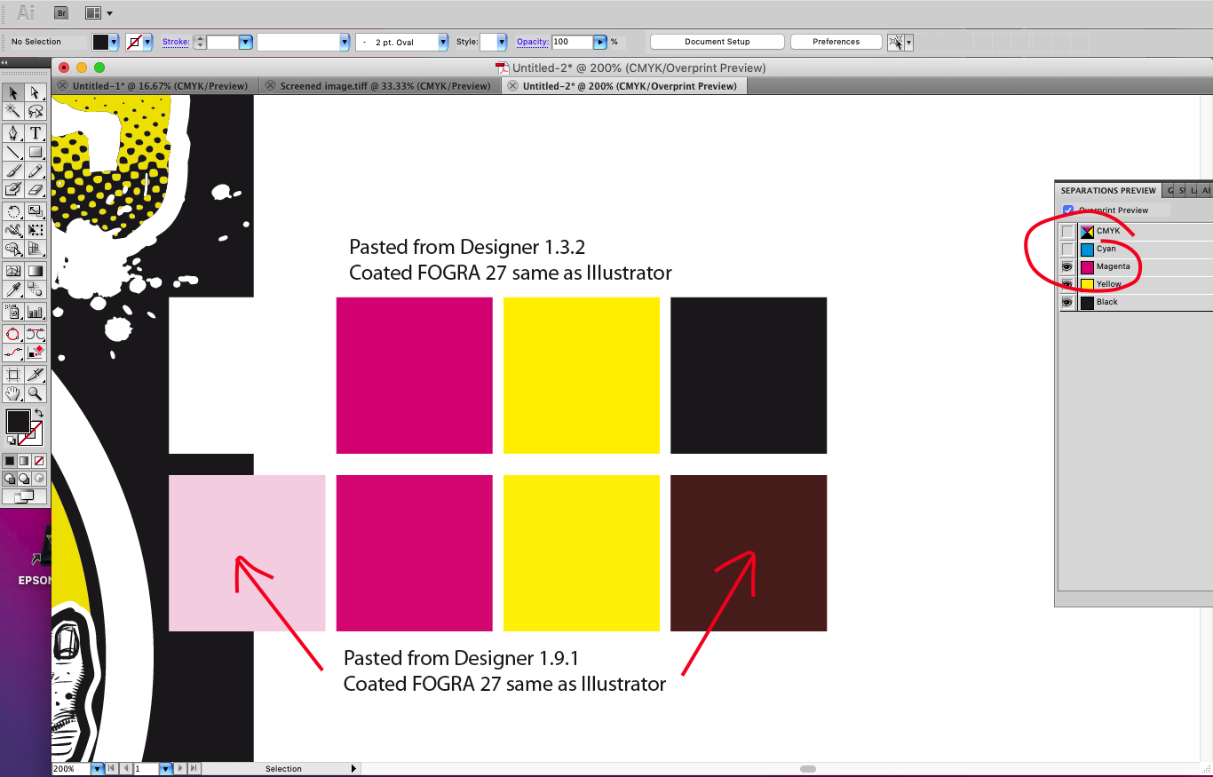
Just got a job on where I need to copy and paste from Affinity to Illustrator CS5 for vector distortions and simplify path, but have noticed that there's a colour shift once pasted into illustrator using the same CMYK profile (FOGRA 27) this has always worked great before, copying and pasting back and fourth retaining colours perfectly so looks like a bug with 1.9.1 Pasting back into Affinity from Illustrator works as expected (no colour shift) so looks to me like the Affinity clipboard as reverted to copying and pasting RGB for external Apps (bad news for a CMYK workflow) I've tried switching on and off the copy items as SVG which makes no difference, even fired up Designer 1.3.2 which works perfectly copying and pasting back and fourth see screen grabs As a temp workaround I'm exporting PDFs from Affinity which open correct in Illustrator and copy paste back to Designer correct

-
 Hi, I have created a basic black PNG watermark and loaded it onto a new image brush. So far so good -- it applies. My understanding is, as this is a brush, I should be able to set the colour, e.g. white. But nothing I do changes the colour when I apply the brush. What am I missing here?
 -
My first piece of work done entirely on iPad. Absolute game changer, thanks for all your efforts Serif. It was worth it. (Hi-res of this will end up on instagram later, once I’ve worked out how to reformat for square on iPad)
- 11 replies
-
- 18
-

-
- digital art
- retro
- (and 7 more)
-
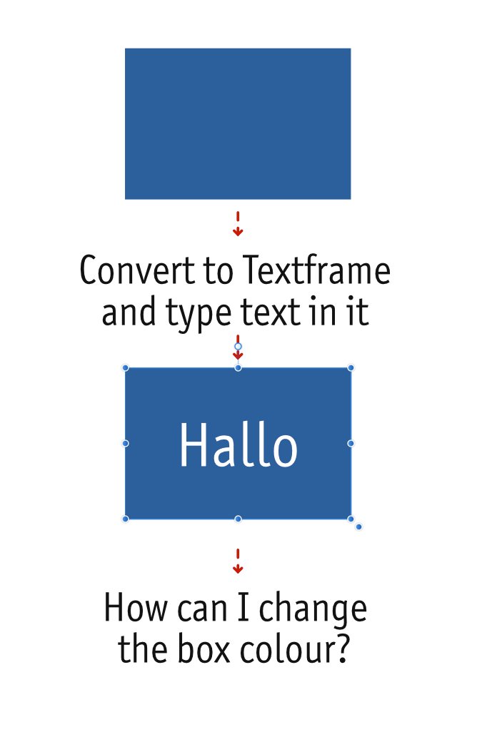
 Is it possible in Affinity Designer to change the colour of the box after changing to Textframe? That would be a nice function for me.
-
 Hello: The stroke colour of the table is different from the thumbnail of the table pannel: Thanks.
-
 Whenever I edit a global colour value I have a chance the popup will move around the screen after the edit. See the attached video, it makes more sense when you actually see it. I can’t find a way to consistently trigger it, but it feels like the closer the popup is to the bottom edge of the screen, the more likely it is to happen. But it’s not a certainty as you can see. I feel this might have something with the physical screen size of my device? It’s a 9.7” iPad Pro and the screen is getting cramped by today’s standards, maybe the low amount of space is making the popup be “unsure” of where to stay? I also feel like this is less likely to happen when the device is in portrait orientation, it still happens though, just less frequently. Thanks! IMG_0538.MP4
 -
 Hello again! I was given a hand-drawn logo to make into a digital EPS. I used the pen tool to create a black outline. Now I want to fill in with colour and some gradients, but I won't let me. I searched but couldn't find a solution. I've included screenshots to show you the layers(a few of them). Thanks so much!
-
 I'm having a problem; I think I mentioned it before; I'm just hoping that there's been an update or something since it seems like I'm missing something. I have white text on a black page that overflows (correct term?) into black text on a white page. When text is part of the same paragraph I can't seem to alter it without altering the entire paragraph. Ideally there'd be a way of having the text automatically change style when it becomes a part of that text frame. But even if that's not possible; can I not change the colour of the text if it's in the same paragraph? And even if that's possible it's frustrating because if I change any of the layout I have to keep on going back to make sure no text has crept into the wrong section and is the wrong colour which is even harder because it may be white text on a white background and black on black and, thus, invisible. Maddening! Video of the problem. Affinity_Colour_Prob.mov
 -
 [English version below] Hallo zusammen, ich erstelle Pläne und Grafiken für digitale Präsentationen (Fachgebiet Architektur). Folgendes Problem: Ich stelle die gewünschten Farben in Affinity Designer mit dem HEX-Code ein. Wenn ich die Grafik exportiere, wird diese immer mit knalligeren Farben exportiert, als eigentlich eingestellt. Ich benötige PNG, JPEG und PDF-Formate. Mit allen Formaten, mit allen denkbaren Einstellungen habe ich bereits herumprobiert. Das Programm, das Dokument und im Export haben die gleichen RGB-Einstellungen und ICC-Profile. Eine zeitlang ist bei der Einstellung Neuberechnung: Lanczos 3 die gewünschte Farbe bei einem Export als PNG-Datei herausgekommen. Seltsamerweise funktioniert auch das nur ab und zu. Da ich mich mit Farbeinstellungen und ICC-Profilen nicht sonderlich auskenne, hoffe ich, dass mir hier jemand weiterhelfen kann! Anbei ein Screenshot aus Affinity Designer (nutze die Windows-Desktop-App) und ein Besipiel für die exportierte Grafik. Die gewünschten Farben waren: 000000 (schwarz), AED9E0 (hellblau) und D36135 (rot). Heraus kamen schwarz, AED9E2 und D76436. Ich würde mich freuen, wenn jemand mein Problem erkennt und mir weiterhelfen würde! Danke! Hello everyone, I am creating plans and graphics for digital presentations (architecture). The following problem occured: I set the desired colors in Affinity Designer with the HEX code. When I export the graphic, it is always exported with more gaudy colors than actually set. I need PNG, JPEG and PDF formats. With all formats, with all conceivable settings I have already tried around. The program, the document and in the export have the same RGB settings and ICC profiles. For a while, the setting Recalculate: Lanczos 3 brought out the desired color when exporting as a PNG file. Oddly enough, even that only works once in a while. Since I don't know much about color settings and ICC profiles, I hope someone here can help me out! Attached is a screenshot from Affinity Designer (using the Windows desktop app) and a sample of the exported graphic. The colors I wanted were: 000000 (black), AED9E0 (light blue) and D36135 (red). Out came black, AED9E2 and D76436. I would be happy if someone recognizes my problem and helps me! Thanks!
-
I found a bug in User Interface - which is not changing interface colour after choosing default OS option on macOS Catalina. The bug include just "Artboard Background Grey Level" which stays at the same position no matter which option I will choose - either dark or light. Sometimes it runs with random setting with dark background on Light option and light on dark option. I though it will sop doing that after setting your preferences for both options but it seems like with every instance of the software runs with different background, so every time I need to go back to preferences and change it manually. I'm using automatic options on macOS so either Photo App or Publisher adjust automatically but not a Designer. It's not a huge dealbreaker but it's a little annoying. I would love to see that fix in the next update. I'm using Designer on daily basis so I need to adjust background colour every day. I tried to find that topic before writing that post but I couldn't find it. I think it's worth mentioning. Thanks in advance. Adrian
-
 Hey guys, im new to affinity photo and i have a big problem. You see i want to recreate this poster (credit : dribble) does somebody know how to make the colors of the background image match? so does the mix of the rounded square and the background looks clean. thanks
 -
 Is it possible to access swatches from the context menu as shown below? Of course I mean document palettes should be listed here shouldn’t they, logically? If not, why not? Thanks
-
 URGENT HELP REQUIRED Colour output is not correct when printing to PDF. Keeps adding 2% Black to an item that does not have black in the colour mix. Can anyone help Many thanks
-
Below is a snap to help explain what I'm saying. I want to change the green fade to a blue fade. In order to do this I must type in the four CYMK or the three RGB numbers since I cannot drag a color or use the swatches panel to change a color in an effect. One day I hope this can be worked out, I would really be happy if I could use the eye dropper tool to click on the blue adjoining the green fade and have that happen as I work in the color area of the effect panels. That would be a huge help rather than looking up the colors numbers and typing them in.
-
What are color fonts? They are the next big thing in graphic designThey bring multiple colors, shades, textures and transparency to type They include vector shapes, bitmap images or even both into font filesAnything I write here, would just be copying from this website, http://www.colorfonts.wtf/ Have a read through it, then decide if you want colour fonts. I know, that I want it!
-
See illustration. Clicking the colour block in the tool bar brings up this pop-up (as well as via other places). I use Swatches a lot - most of the time in fact. Because I'm working with branded designs 95% of the time with prescribed colours. Even when not, I tend to be disciplined about colour - creating palettes of colour to work with as I go along. This means swatches are my default modus operandi. I really wish the pop-up would remember the last thing I accessed and therefore, go straight to Swatches. Sure, if I then choose Gradient one time, the next time I go in, it'll go to gradient - totally fine with that. But every single time - every single time - there's this extra click involved - and it gets really irritating, really quickly. It's especially irritating in Designer on the iPad for some reason I can't articulate right now. I'd expect it to logically be a setting in preferences. Tick/untick: Remember last used.. or something similar. I've had a search through all the preferences and not seen it. I've a weird feeling it's in other apps in the suite like Designer desktop? (not checked). Maybe I'm just remembering from other non-serif apps. So, yes, consistency again please, all apps, all platforms (ipad, desktop). If you're really clever, there'll be other places this could apply to as well... super consistent nirvana. Yours ever hopeful
- 6 replies
-
- 1
-
-
- colour
- colour management
- (and 1 more)
-
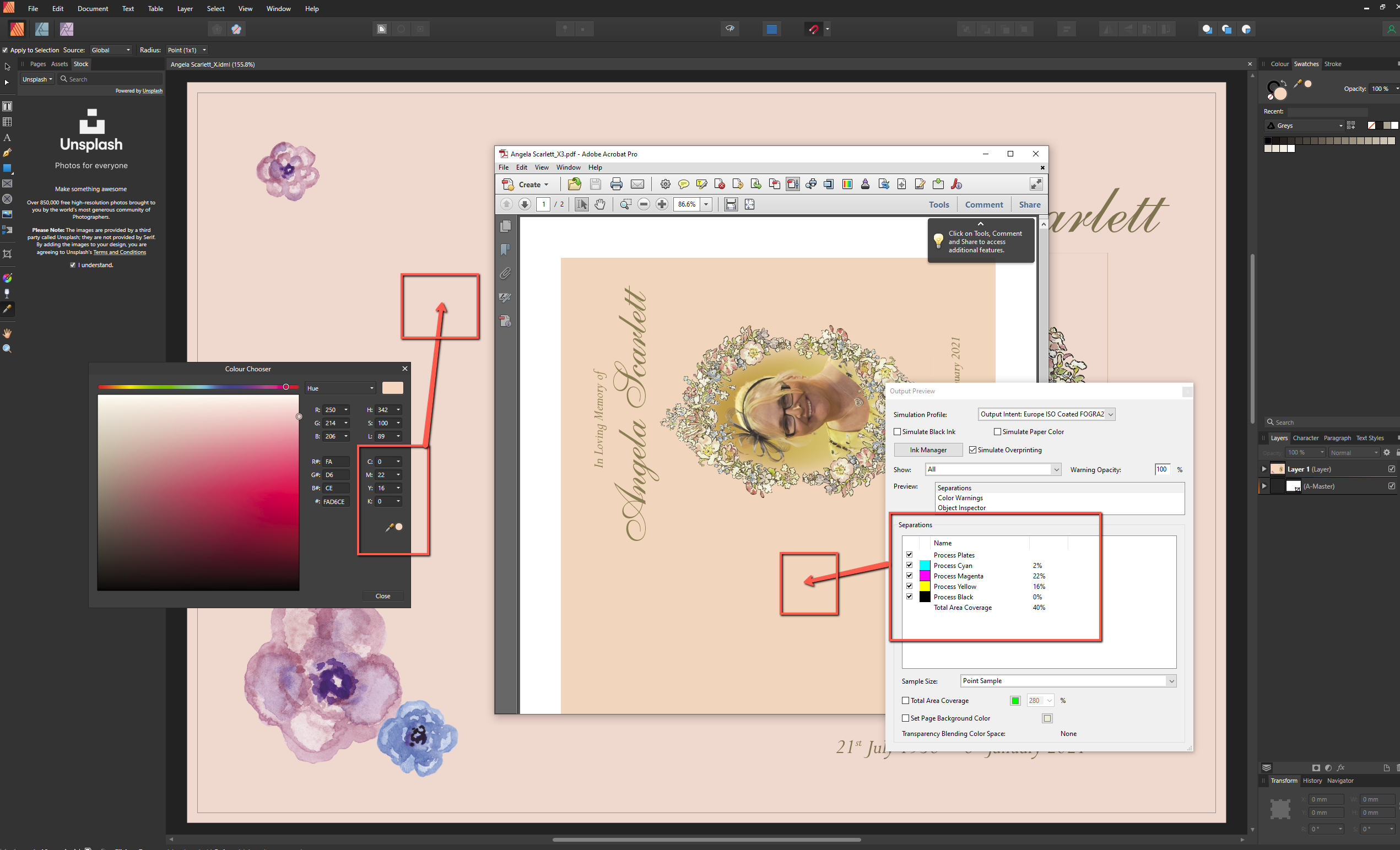
 Dear All. I am creating artwork in Publisher which combines text and CMYK images and will be used to produce litho print from. I have (believe I have) created a 'text black' swatch. This is purely 100% K. No other colours. No Cyan, Magenta or Yellow. However, when I export as a pdf and review in Photo. The 'text black' has reverted to a CMYK black. Please help. Andrew PS. Is there a way to see seperations in Publisher?
 -
 Using the colour picker in the "magnified" mode, the RGB values on the document (e.g. fill layer) are different from the same colour in the swatches panel. For example, in a new layer filled with R:242 G:13 B:13 the corresponding colour on the swatches panel is R:220 G:51 B:17. It's the same for every choice. Is the swatches panel able to show the right colour? Thank you
 -
I have two spreads. One has white text inside a text frame and the other has black text inside a text frame. The text is set to flow from one box to another. I select the text frame and set the font to my body white font and body black font (respectively) but whenever I delete something or move something and the text moves from the black frame to the white frame it keeps its colour thus I have black text in the place I want white text. Does this make sense?
-
 Don't know if any one has run into this, but when going back and forth between two canvases I would use the colour picker tool, grab a colour to use, but upon going to my second canvas to use said colour the swatches swaps out to a different colour. Is there a way to stop this from happening so that I can keep the selected colours and swatches as I use them across the different canvases?
 -
 Designer 1.8.5.703 on Windows 10 (same fop beta 1.9.0.743). I don’t know if this is by design, or a bug, or just a missed opportunity, so I thought I’d mention it. As you can see in my attached video, when I have multiple shapes with differently-coloured strokes, swapping the stroke colour for the fill colour makes all the shapes the same fill colour. I thought it might be nice to have the stroke colour and fill colour of each shape to be swapped individually. Is this something that other people might want, or is there a good reason why it works this way? 2020-09-22 09-09-18.mp4
 -
 Hi, I'd like to set a colour (not the default black) for the workspace background which is different to the document area, but I can't see how to do this. Can anyone help please? Cheers, H.
 -
 Hi guys, I'm at a loss. To confirm I run Spyder to colour manage my display and I have read the display calibration spotlight before writing this. However, when I export images from Affinity the colours come out wrong. See the attachement. I have included my export settings.
-
 Can you modify the tint of a global colour? From what I've found you can edit the CMYK / RGB etc. values, but no tint. So if I need to globally change a colour from 95% to 85% tint I have to find every instance of that colour or am I missing something? I've tried so many different ways with opacity and tint, but can't figure it out. Many thanks!


2019-06-2810-11-59.jpg.0b1c5caec2aa0911c27ae534ac557843.jpg)
2019-06-2810-12-22.jpg.226acf66d58efadcb60a09ae777db39b.jpg)
2019-06-2810-12-41.jpg.1f4163d1f7048a0a9a0bcd2a1b3176b1.jpg)
2019-06-2810-16-18.jpg.b14805643482ebd511e8b2b97fabb0e5.jpg)