Search the Community
Showing results for tags 'Colors'.
-
 Although the range of picker types you have is quite wonderful, I'm used to working with HSB/V (Brightness or Value) instead of HSL (for lightness.) It's a common way of specifying colors especially in the land of video. HSL is a similar user experience, but there are a lot of times where it just makes sense to think of 100% brightness (which, to get the same RGB value, somehow works out to 50% lightness.) (And as you probably know, Adobe Photoshop's picker has HSB, not HSL.) This website does a great job of dynamically showing the difference: http://colorizer.org Would you consider adding this option to Designer/Photo/Photo for iPad? Thanks.
- 27 replies
-
- 13
-

-
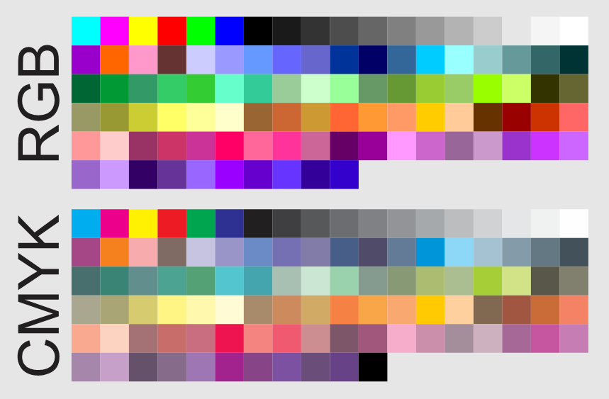
Hi all, im up this zip containing two pallets rgb and cmyk basic. colors set.zip

-
It's nice that Affinity Photo has got such good support of the 32 floating point mode but it is somehow unfinished. There are particularly two things that I desperately miss: 1. The ability to show the 32 bit float color values in the info panel. How should we work accurately with 32 bit float values if they are displayed nowhere? All that I can see are the conventional RGB values from 0 - 255 but these are meaningless in 32 bit float. 32 bit float per definition contains color values below 0 (actually a bad thing) or above 1 (actually a good thing). 2. Please make the curves dialogue zoomable so we can also edit values that exceed the white point of 1. The values beyond the white point are in fact one of the main advantages of 32 bit float.
-
Free download on my website http://www.andreacaliendi.com/affinity-resources/
-
 Alright, I have to fix this mystery once and for all. I do not know what else needs to be done in order to fix this issue, however when I save my images in Affinity, they turn into a completely different colors when I import them on other programs such as a video editor. Now I open the same image and save it as the same file from Adobe Photoshop, and the colors are kept as the original (how it should look) Video demonstration of what I mean https://youtu.be/TcIIPjjtxE4
 -
 I've tried manually dragging them apart and back to their original locations, as well as searching the 'View' and other main menus but haven't yet found how to uncouple them. Additionally, when I select something from the Color-panel...it 'leaps' in front of the now combination Layer/Transform-panel. I'd love to know the 'How & Why' to this as it may come in handy in the future. But for now, I'd like to return the 'studio' to its original default panel set. *AD 1.5.4 on a MacBook Pro* Would someone please enlighten me? Thanks much, -Christo
 -
Based on https://material.io/guidelines/style/color.htmlI created swatches for Affinity with all Material Design colors, properly named nad sorted. Enjoy Material.zip
-
 For fantasy book covers like the one below, they always have colorful skies. Among a host of fantasy effects, I desperately need to learn how to change the colors of sky, so they have multiple unnatural colors. Or even just to change the blue in a stormy sky to like a diff color. Any help? Even just tell me what tool to use? Thank you so much!! Seriously, I would pay money if someone made a course on book covers for Affinity.
 -
 Hi there, I'm quit a newbee with Afiinity Designer. I love the software program and how easier it is compared to Adobe Illustrator. I have a question. I made a business card for myself that i want to be printed out in CMYK or PMS colors. I have included an example how it will be. 1) The color in picture A is a bright neon color, this is how i love it to be in a printed form. But this was made in RGB/8 . I know if you want something to be printed professionally that it has to be made in CMYK. 2) The color in picture B is the same design, but with the colors converted to CMYK. It hasn't the same effect as the one in RGB. Less brighter. How can i have the same bright color from the RGB version in a CMYK or Pantone version so that i can be send to a professional printing office. Could you please show me in a few simple steps how i can achieve this? :) Thank you in advance. Visitekaartjes Four Four RGB - front 2017.afdesign Visitekaartjes Four Four CMYK - front 2017.afdesign
 -
Procedural workflow has and is growing and becoming a large driving force in content creation. Something I always knew would be make things very quick to iterate or change, and also keep things consistent and simple, would be referenced colors. So maybe your documents has a palette with named slots, and when you go to select a fill/stroke color, you can optionally select one of these named slots. Other fills or strokes can reference this same slot. Then if you decide you want to change colors later, you simple adjust this palette and every object using those slots gets updated. To extend this concept, it could almost be like symbols but for object appearance where you can have synchronized styles, that way all the parameters are shared, like stroke width, profile, etc.
-
 I like to post on top of a colored area transparent black and white patterns, for example dot fields or hatchings. I cannot find patterns and how to fix them on top of colors.
 -
 When I open a picture in APwin, the picture looks a little colorless. It is not much, but noticeable. In IrfanView, Corel, Internet, and other programs) the picture looks more powerful. See attached files. When I edit the image in APwin and export it, the exported picture is again more powerful. But this is not good, because I have altered the picture as I saw it in APwin. Then I don’t want a change in the colors. Is this a bug in APwin?
-
 I got really used to a similar feature in Sketch – when the color picker is activated, all the guides and gridlines are automatically hidden. When you click and pick a color, they reappear. That's a little touch, but it makes picking colors quicker and error-proof. I'd love to see a similar feature implemented in AD. :)
 -
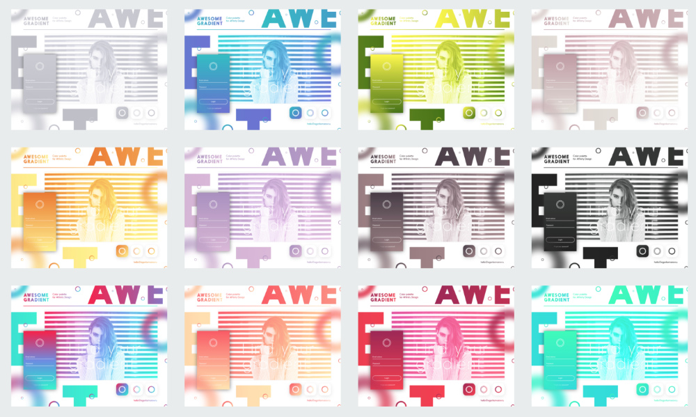
More than 150 ready-made gradiens in .afpalette format. I picked up the best solutions for your creativity. WORK WITH VERSION 1.5 Beta AND HIGHER http://www.demo.egorkomarov.ru/Gradient-palette-for-Affinity-Designer/
- 27 replies
-
- 12
-
-
 Hello. I am thrilled to learn about Affinity Designer, Photo, and soon also Publisher! From the tutorials, these seem like great programs, and from what I have read, the software is of top quality that rivals or exceed Adobe graphics programs. I am very excited about Affinity! I also hear about the amazing responsiveness of Affinity to consumer needs. For instance, I hear that the cost per program is not excessive at about $50, that the programs are designed to be wholly compatible with Mac OS X El Capitan on the iMac or the new Mac Pro, that Affinity will not be going to the Cloud, and that all software updates to new program versions are free; it is bought once. I am delighted to hear this. Can it be true? Please send me an email to confirm this. Any further information would be welcome. For instance, does Serif have plans to create Affinity video editing software? I have one small concern that is important to me. I have noticed that in every Affinity screen I have seen so far, the entire on-screen area of the program is colored black, except for the actual artwork or photo. I would like the option to choose other colors than black for these areas. What other colors are now available, and if no others, will this feature be included in updates in the near future? Thank you!
 -
 Hi AD team, love the product - terrific! Here's my problem: I'm switching from adobe illustrator and would like to take the color swatches with me. CS5 even has an export option to export a given swatch to .ase which I could then import in AD. However, the gradient swatches ('Brights') are not exported with the gradient, just as base colors. Can anyone recommend how to move my AI gradient swatches out of AI into AD? Thanks so much!
 -
 There doesn't seem to be a nice way to manage swatches after you created them in a custom Document Palette, e.g. select multiple swatches and then delete them. Any ideas?
 -
Hello, so, it's easy to create custom color Palettes in Affinity Designer, but I have some problems to change colors in complex layouts - maybe there is a way I don't know ... So, it would be very cool I you have the option to Name a color, maybe as "Background" and one as "foreground" Example: background = white foreground = black For every color I can choose I'm able to define - this is my foreground color, this is my background color or whatever. Now if I change the color defined as foreground from black to green, every Element with this color changes to green - independently in wich folder it is. Also with complex Styles it would be so easy to change colors on the fly. What do you think?
-
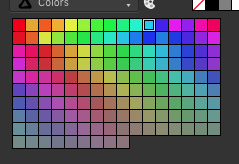
 Which Reset option in the Miscellaneous panel of Designer's preferences will do the least resetting of all my options and still return my color palette to its original layout? As you can see from the attached screenshot, several colors have been accidentally dragged out of position (imo, it's too easy to move them; I'd like to see a modifier key needed in addition to a drag in order to move the colors around), and I'd like to return the order to what it was originally:
-
I'd like to be able to to select an object, then be able to click and drag its fill or stroke color down into the swatches. Likewise, being able to drag a shape with a certain color into the swatches and it creates a new swatch would be very useful. Maybe there is a way to do something similar to this and I just haven't found it? I've been having the hardest time with creating new swatches.
-
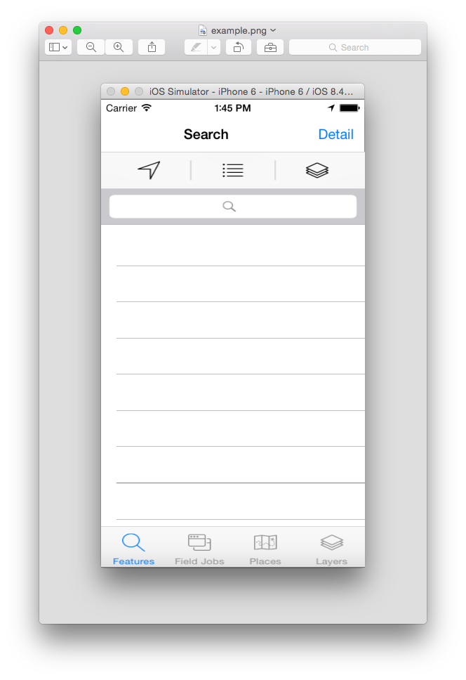
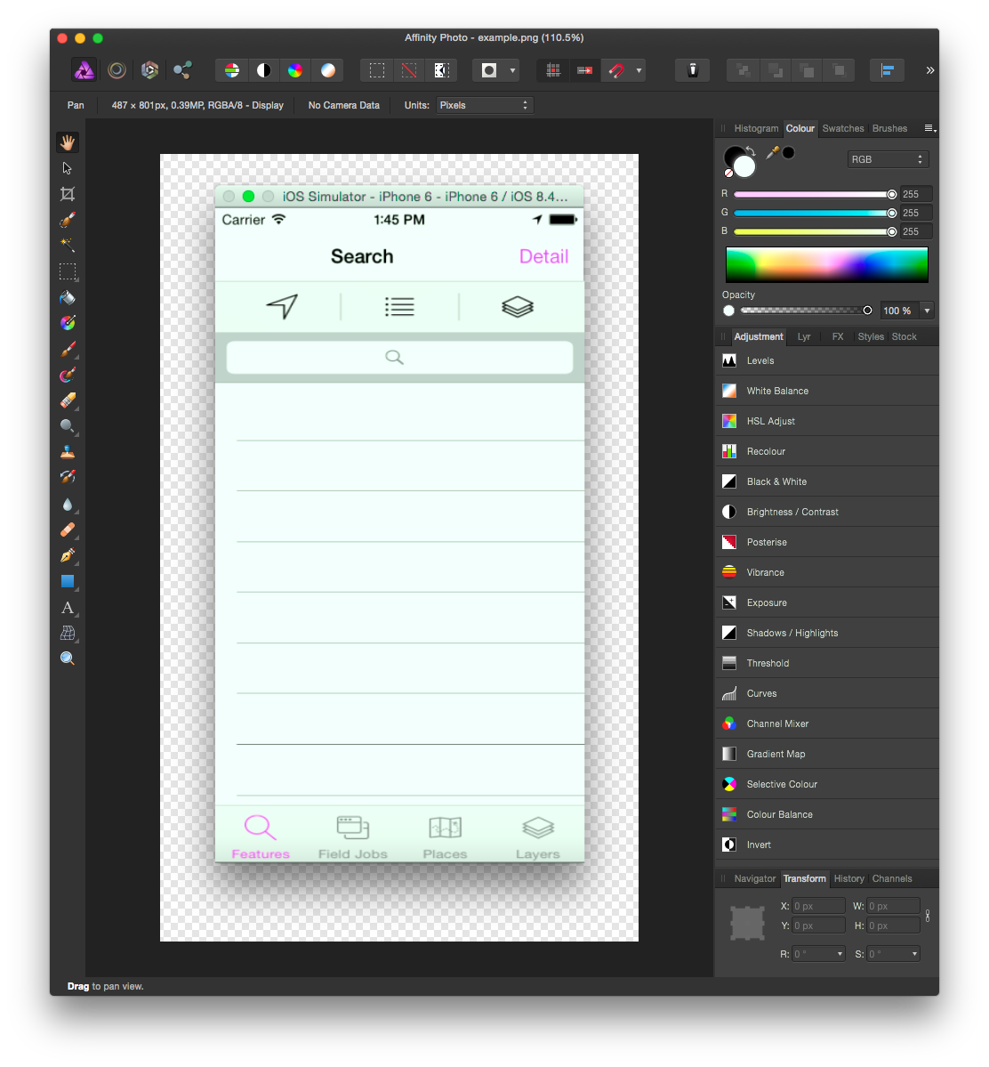
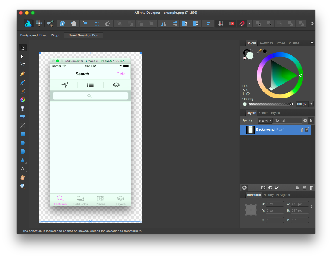
 Hi All, I'm experiening an odd issue with both Affinity Photo and Designer whereby opening a screenshot (taken using the built in Mac screenshotting tools) seems to mix up the colors. For example, here is an original screenshot: here is a screenshot of opening the original in Preview: and here is a screenshot of opening the original in Affinity Photo: and here is a screenshot of opening the original in Affinity Designer: Not sure if this is a bug or I've just mis-configured something? (I think my settings are all just the defaults). I'm using Affinity Photo 1.3.5 and Affinity Designer 1.3.5 (but the issue has occurred in all versions i've had (from the app store). The issue does not occur on photos taken from digital cameras or other sources. Cheers, Chris
-
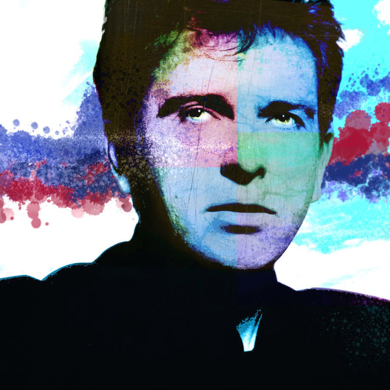
Peter Gabriel comes with some special effects from AP :)
-
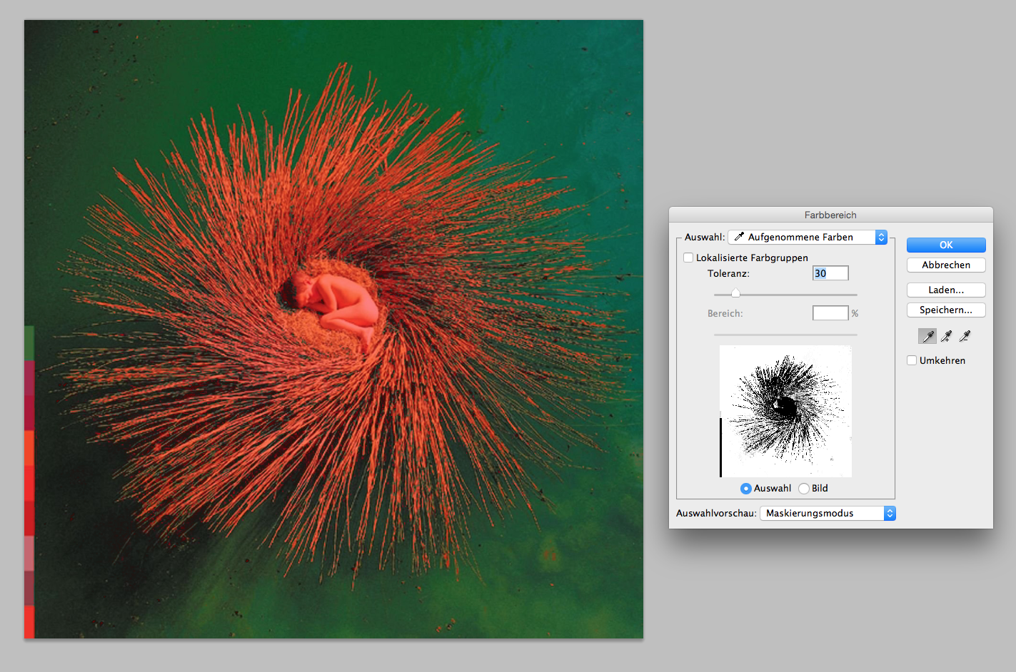
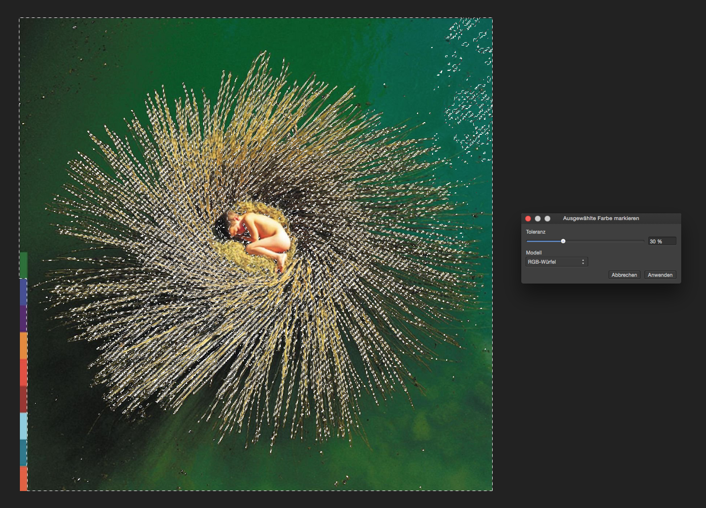
 Hi, I played around with Affinity Photo and I love it so far. But for some use cases I am missing Photoshop a bit. I think color based selections was way more effective in Photoshop than it is in Affinity Photo. In Photoshop you could press and hold Shift key to add more colors to your existing range, before playing with the tolerance slider. The result usually comes a lot closer to what you are looking for. Does anyone have an idea how to create a selection based on a whole bunch of target colors? Sorry for my German screen shots ;)
-
 I am wondering if there is a way to add additional color styles. I see that there is glass, metal, rainbow and others. I want to use some sort of gold foil or glitter. Is that possible?
 -
 Hi As a former freehand user I am happy that affinity has answered most of my needs, but freehand had the ability to pick Pantone colors for printing purposes and that is vital to my work. I hope this will be an addition to future releases.