Search the Community
Showing results for tags 'Color'.
-
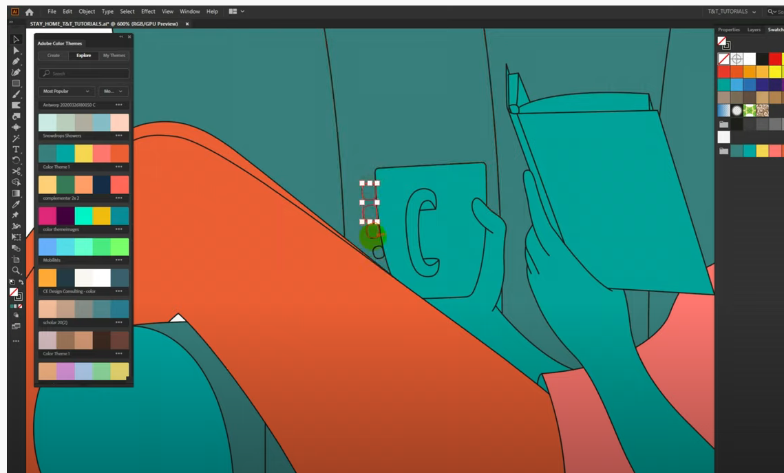
 Can any one please let me know once I have finish tracing my image in Affinity Designer, can I apply pre defined color combinations from the color panel for my image like in Ai? Please refer attached example of the same in Ai
-
 I have no idea what the affinity programs do in the background ... 😞 I have a christmas cap as .EPS. Colored. Open in AD - all in grayscale... (?) Affinity Feature? I tried to convert the file or profile... nothing. Open in Gravit-Designer - looks like it should look like. Preview in Finder - correct. And the help pages in Affinity with the 7pct font are too tiring to read. Close and open the software - no effect But I have found nothing either Any ideas...?
 -
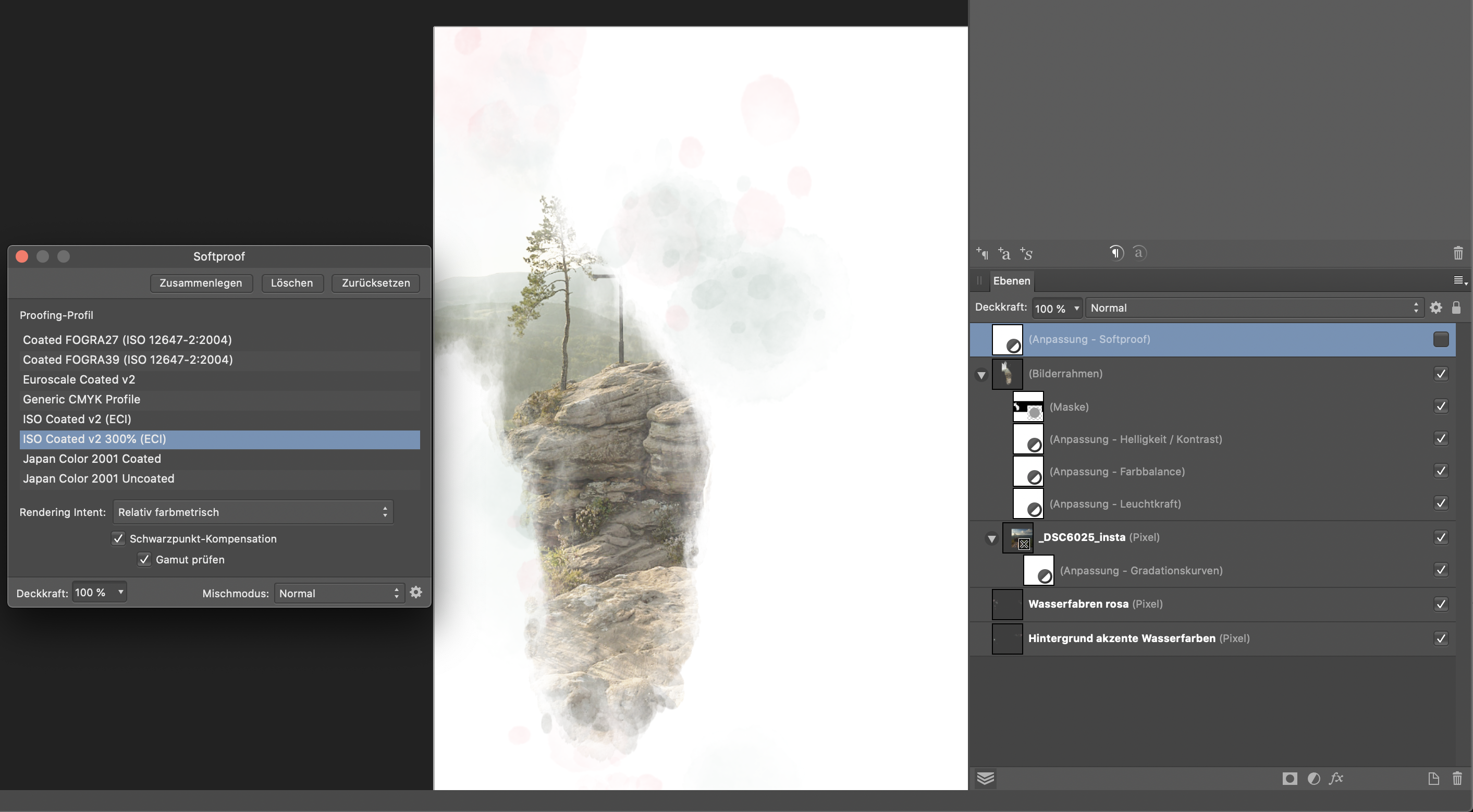
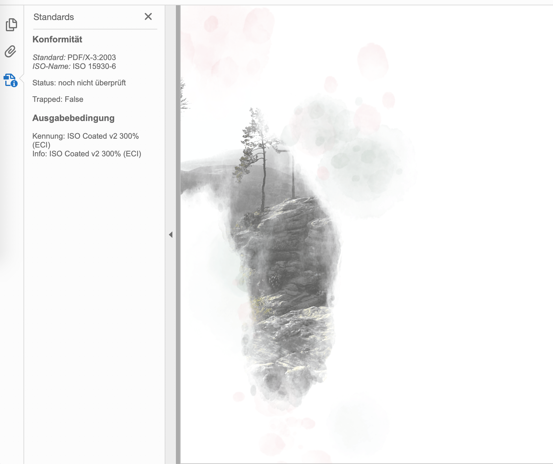
Hi guys, I'm currently having strange color shifts when exporting from Affinity Publisher into PDF. The color of the imported RGB .jpg image is strongly shifted close to grayscale when the document is being exported, even if the used gradiation curve layer (for matching the target color space) is only slightly affecting the overall colors of the image. When exporting the pages as .jpg with CMYK format this color shift is not visible. For better understand of the effect, I attached three images: 1st image: screenshot of page within Affinity Publisher without softproof 2nd image: screenshot of page within Affinity Publisher with softproof 3rd image: screenshot of the exported pdf opened in Acrobat Reader DC (but I get the same behavior also in other PDF readers and even when reopening the pdf in Publisher) I'm exporting into ISO coated v2 300% (ECI) color space. In publisher I'm using the corresponding preflight for softproof and disabling the softproof layer before export. The behavior seems not to be dependent on the selected PDF compatibly version (I'm using PDF/X-3:2003). I'm using Publisher 1.8.4 under Catalina 10.15.7. Many thanks for your help!
-
 I took a color from a picture and used it for text on that page. Now I need to find that color and use it elsewhere. When I select the colored text, I cannot tell what color swatch is assigned to it. Does it show up somewhere? Thank you.
 -
 Don't know if any one has run into this, but when going back and forth between two canvases I would use the colour picker tool, grab a colour to use, but upon going to my second canvas to use said colour the swatches swaps out to a different colour. Is there a way to stop this from happening so that I can keep the selected colours and swatches as I use them across the different canvases?
 -
 Hey everyone! The background color is bright even though the normal UI is set to dark. This isn't great to work with. I am using iPad mini 5, iOS 13.4.1, Designer 1.7.1. Best wishes, Shu
 -
I have a X-Rite ColorMunki Display to calibrate my screens. It even has support for iPad/iPhone, so I calibrated my iPad Pro 12.9" Mk.I with it and my iPhone 7 too. I can use an app called ColorTRUE to view my photos in real color on my iPad/iPhone. X-Rite says that other apps can be made to use the ColorTRUE profiles, so they will show true colors. As a photographer on the go, I often don't bring my heavy laptop with me with the calibrated screen and I rely on my iPad Pro 12.9" Mk.1 (which by the way has a terrible calibrated screen out of the factory). I edit a photo in Affinity Photo for iPad, export it and then check the real colors in the ColorTRUE app. Then go back to Affinity Photo and adjust colors, white balance, etc. if I need to. This is very cumbersome. If Affinity Photo for iPad could use the ColorTRUE Profile of my iPad, this cumbersome work around would not exist and I could use my iPad for more color critical photo work more easily. Are there plans for Affinity Photo for iPad to use ColorTRUE profiles? If not, are you willing to think about it? This would really make Affinity Photo for iPad justify the Pro in iPad Pro IMHO!
-
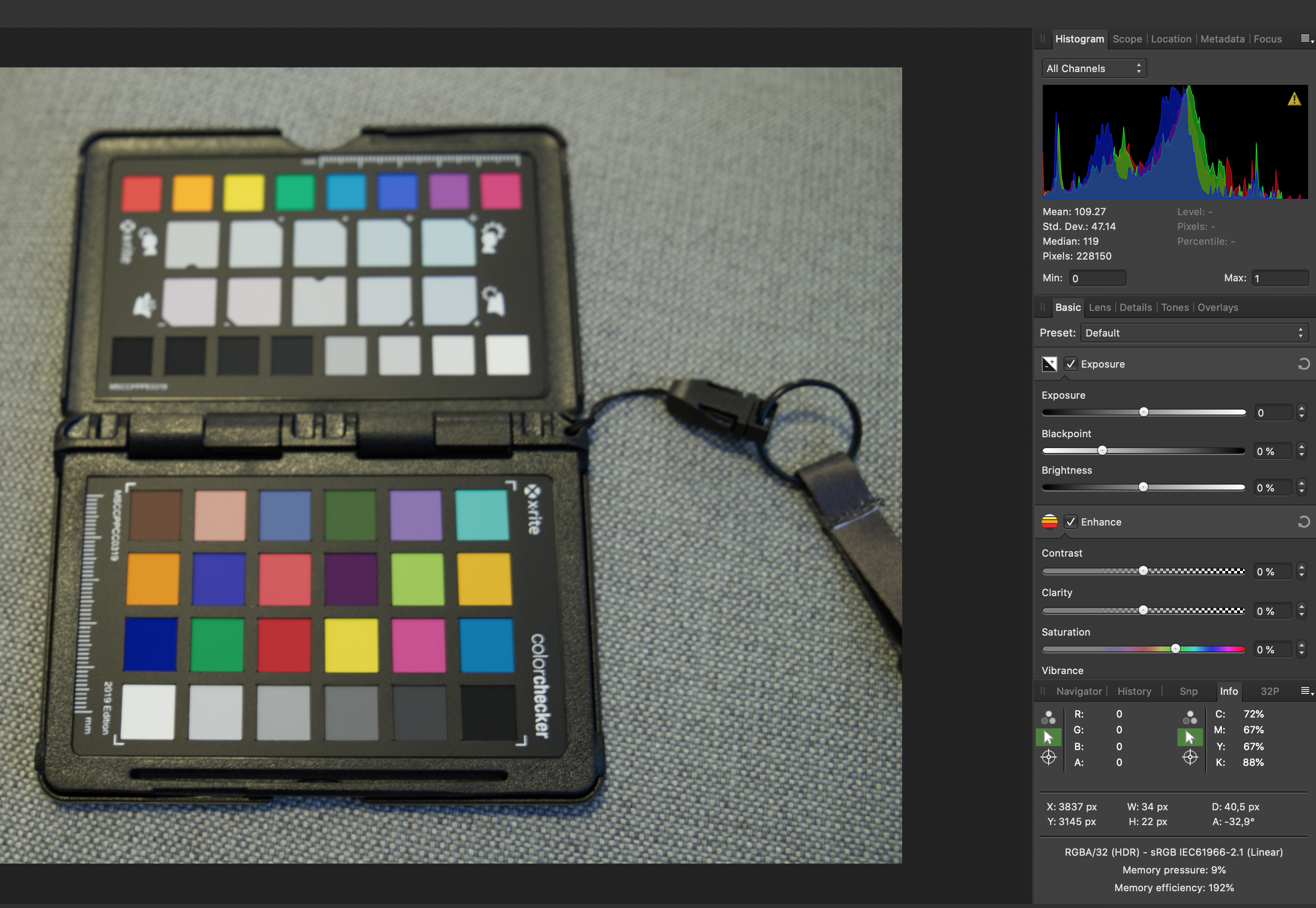
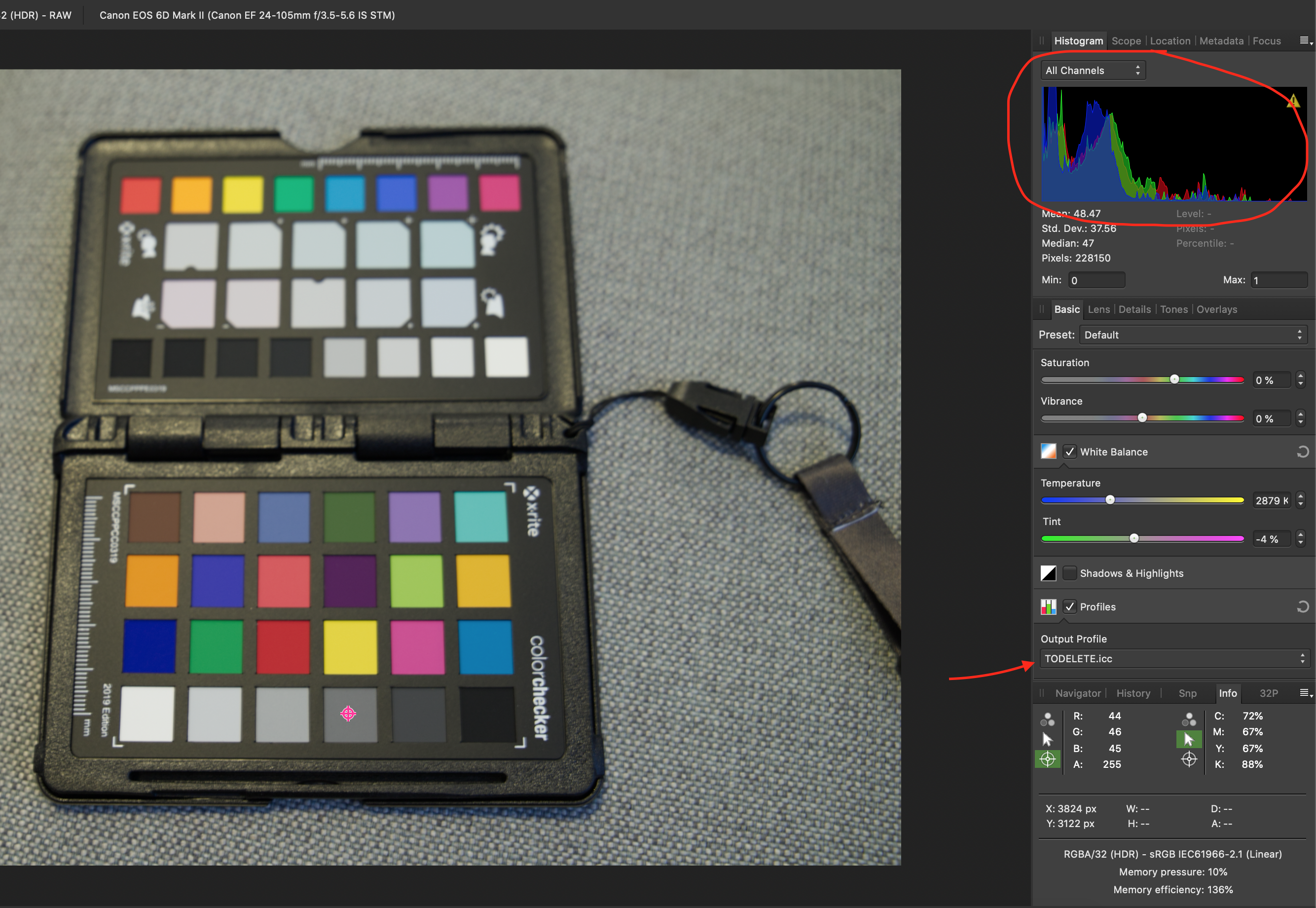
 Hi, I've been trying to use the XRITE Color Checker Passport and I'd like to ask for help. I'm not sure if I'm doing this correctly. I saw in another message in this forum the steps to generate the ICC file. So, to verify if the ICC was correct, in my understanding, I can use it in the original picture and I would expect NO changes in the color or anything. It actually squeezed the colors towards the black and the image became darker. The original image, only with WB corrected is the Pic 1 Then, after the ICC was succesfully generated and loaded in Affinity from that image, when I apply the profile, see the Histogram: Pic 2 If I develop the picture, it will be darker. BUT... if I load the image, after the WB correction, and develop the picture, from Document -> Assign ICC profile, the picture is corrected, but the contrast decreases and it looks washed (picture Pic 3). So, is it a bug with Affinity? How could I verify the colors are truly corrected? Can I use the RGB values in Info panel to double check the color palete values? The ICC profile I generated I called it TODELETE. Thanks! Sergio PIC 1: PIC 2: PIC 3:
-
 Hey there- I'm new to Affinity products. I'm working on a mock-up for a mobile app. In Designer, I've grabbed some of the glyphs from the asset manager for the navigation bar at the bottom of the phone display. I needed an image that wasn't in the asset manager so I found something that worked for me from elsewhere. The image file is a png. Now, I'm trying to figure out how to make it function like the included glyphs do. For instance, while trying out different color schemes - with the glyphs - I just have to select the glyph and then choose a color. That's not working with the png file. Is there a way to convert the png to the same file type as the glyph so it will behave like one? Thanks
 -
 I am also a newbie although I have used Adobe photoshop for years without a problem with text. I want to print one line of text in white on a coloured sheet and have selected Lucida Bright at 26pt and with the white colour font. Whenever it prints out it is colourless with a thin black edge to define the letter. What could I have done to make this happen?
 -
 I'm a complete newbie to Affinity and Designer and vector drawing. I've been working with simple shapes and lines and text while exploring Designer. Once GarryP helped me get started, things were going well until yesterday when my plain and/or italic text turned bright bold magenta. I did not change the color that was the default in the text-color box. I do not know what I did to make this happen, whether creating new text, or moving previously created text. I cannot get rid of this color, or the bold. New text is bold magenta, despite the color box's being black. Moving previously-created text turns that text magenta. Close that document and create a new document—the new text is magenta. Opening Designer preferences, resetting text styles to factory, still magenta. Clearly I have inadvertently changed some basic setting, but what? Where should I look now? Thanks.
 -
 When I replied to this, I thought a bit more about the way color swatches work atm. I just don't think there is a need for a color swatch that is not "connected" to the objects that are using it. If I change a color swatch, I want to change all the objects that use it. InDesign does it this way, and it makes sense. I know that Illustrator does have "unconnected" swatches as well as "global" swatches -- but I never understood the reason for that. If there's a use case for "non-connected" swatches, please let me know I believe any such use should still be possible with "connected" swatches only. So all the swatches should behave as if they were a "global swatch". Or do "global swatches" have additional features that I haven't found out yet?
 -
 Hi guys, I'm at a loss. To confirm I run Spyder to colour manage my display and I have read the display calibration spotlight before writing this. However, when I export images from Affinity the colours come out wrong. See the attachement. I have included my export settings.
-
 Hello, I was messing around with Affinity Photo the other night and accidentally found a feature that I cannot find now. I was in the Color window and I believe I double clicked on the selected color and a window popped up PREVIEWING color chords. It could have just been showing me near shades to the selected color, but i definitely remember seeing "+1" and "+2" labeling corresponding shades with the actual color displayed. I was able to replicate popping this window up a couple of times before I shut down for the night, but since then have not been able to get this to happen again. I have no problem making color chords the normal way, populating in the swatch panel, but Id rather being able to see the colors before committing swatch space. So did I stumble across a little know feature, or did I fall into the matrix somehow? Thank you for your time, Dustin
 -
 Hey y'all, I have inserted embedded documents into my file (layers with images) so that I can duplicate them and change them all simultaneously. I am having difficulty changing the color. Usually, if I place an image, I can select it and then go to the color wheel to change the tone of the image to whatever color I please. In this instance, when I try to change the color of an embedded document it either a) doesn't work or b) changes the whole layer to the selected color and the image is no longer visible. Any tips on how to fix this?
 -
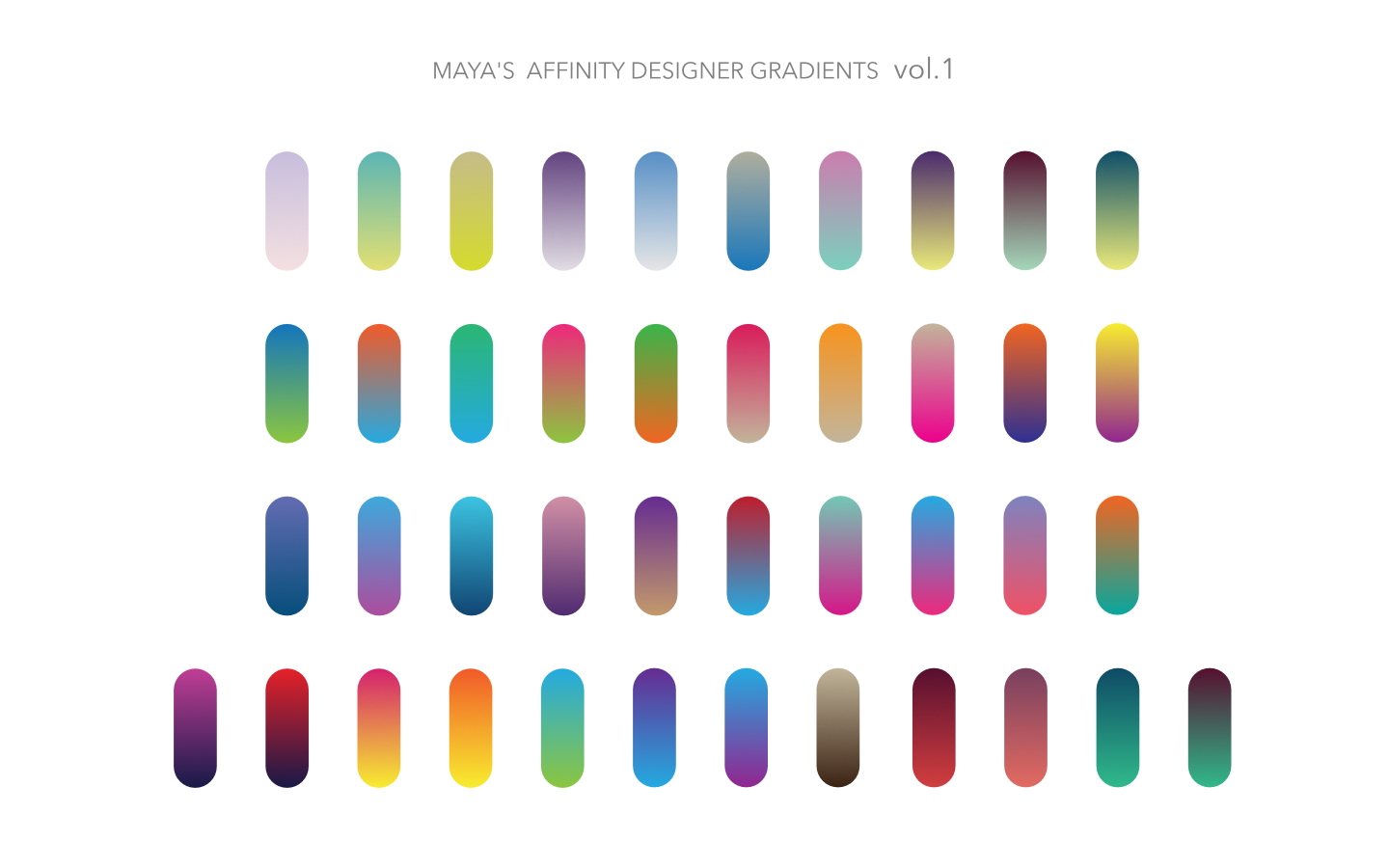
I made a set of gradients for Affinity Designer. My first attempt at AD gradient set! Tada! :D I originally created the set to be used at work (using Illustrator) and I made this to share with the nice folks here at Affinity Forum. Hope you guys find this useful. Thanks! - Maya MAYA-GRADIENT-VOL-1.zip
- 30 replies
-
- 40
-

-

-
 Greetings I just created a few new cool pixel brushes for Affinity Designer. However when i tried them out I can't change the color. if i create a brush with a black .png it only brushes in black. If i load a whited .png it only paints white. Can someone educate me on what i am doing wrong? Thanks Dave
 -
 I am exploring the use of ICC profiles in photo processing and printing. I have had some success, but am not sure that I fully understand why. Here is what I understand (or think I do); perhaps some more experiences users will provide me with some insight. I understand that ICC profiles describe the color space that individual devices are capable of reproducing and are applied so that one device may match another. If so, then in my system there are three devices; 1) the camera/lens. 2) the display and 3) the printer. My lack of understanding is where these should be applied to a photo file. It is possible to assign a profile to a raw file prior to development. This option asks for the "output" profile. Should this be the printer profile? That is the eventual output device, but applying it here before development has not produced a good result. I suspect that output profile means output from the development process, so at this point would apply the "camera/lens" profile. Then when printing, apply the "printer" profile as the "output" profile. The "display" profile only effects the display, how the camera/lens profile is represented on the screen and does not change the file. BUT - as a printer, wouldn't I want the screen to represent how the file will print so the printer characteristics can be accommodated while editing the file? Using the above procedure gives very good matching results, but it does not display the image as it will be printed. I hope I have adequately described my question. Anyone have some insight on this issue? Thanks & Best Regards to All - DK
 -
 Hello Affinity Designer enthusiasts, I'm using the 10 day demo copy of AD.Like many here, I would like to move away from Adobe Products since their marketing plan has moved in a direction that is software rental rather than ownership. I've used Fireworks for years. One question that I haven't found an answer to yet that is related to my switching away from Fireworks is: How can I enter a hex number for a color or even rgb numbers instead of using only the sliders? I suspect there is a way, but I'm too new to AD to know it. As an example: #CCCCCC instead of using the sliders to try to achieve the color. I use the number entry feature in FWs a lot. Is it present in AD? Even if I could use RGB numbers, I'd do that. Whatever is available in AD. Thank you for your help in pointing me to the right place in this software. :)
-
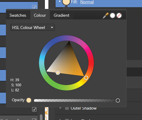
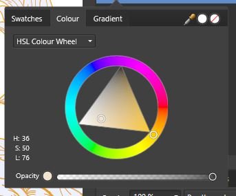
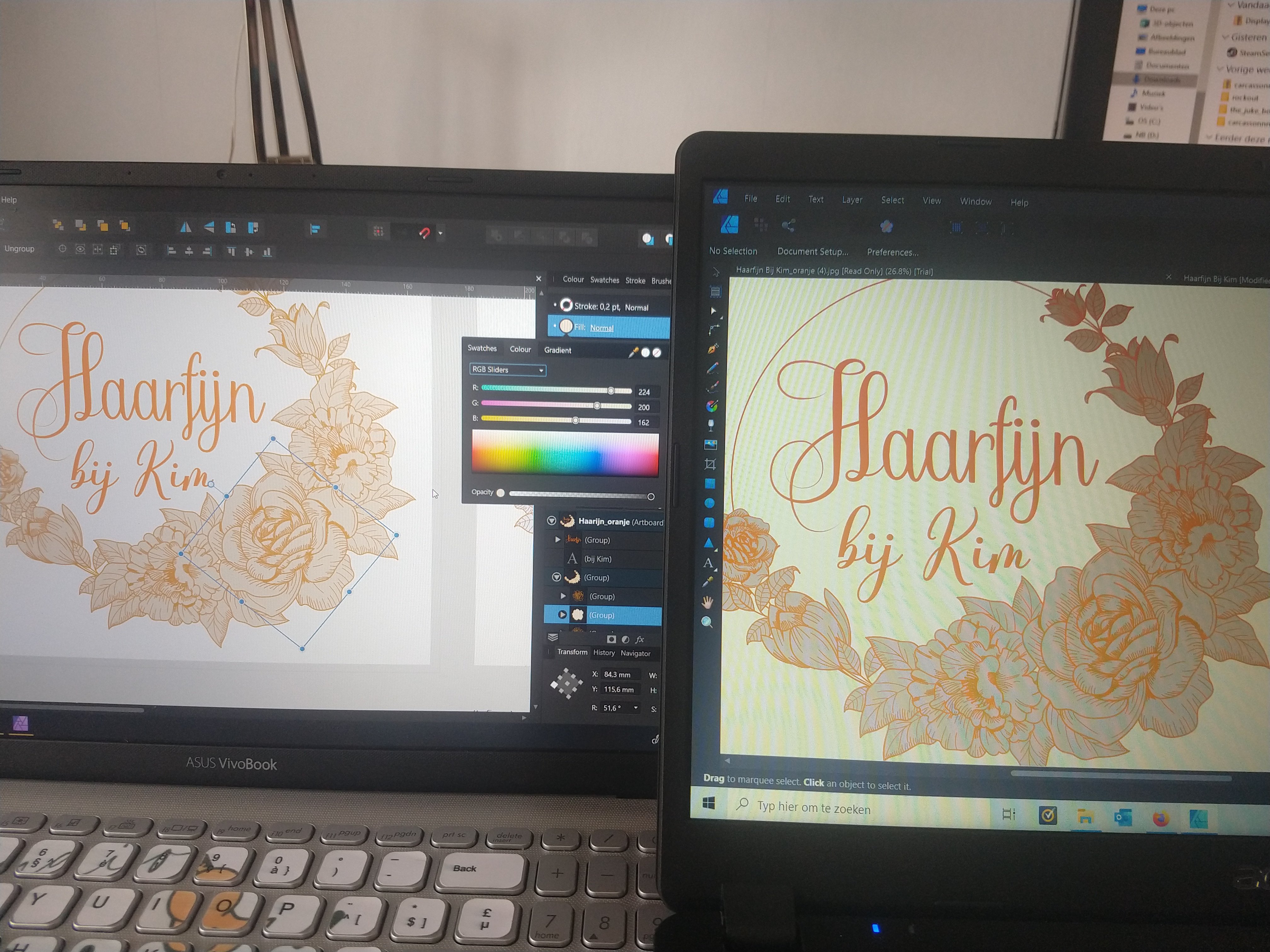
 Hi, When exporting a file the other day and sending it to someone else they saw different colors on the file. I took a picture of both my PC (left) and the other. I hope the difference is clear. The orange fill of the flowers is more blue. The letters don't have the same bright orange color. I noticed that the color wheels on both laptops look totally different. Can someone explain how this comes and what I can do about it? Thank you! Nils
-
 Can you modify the tint of a global colour? From what I've found you can edit the CMYK / RGB etc. values, but no tint. So if I need to globally change a colour from 95% to 85% tint I have to find every instance of that colour or am I missing something? I've tried so many different ways with opacity and tint, but can't figure it out. Many thanks!
 -
 I would like to know if there is such an option as "Selection by color or object." I need to change one color in an open project to another :unsure: . Manually it is uncomfortable to do for a long time :( . I very often use these functions in the illustrator. The choice of color and object does not pay due attention in all similar projects, and this function allows you to reduce time and money :wub: . I would very much like this feature to be awarded, or similar to it, for example the filter by color and outline, text and so on. Thank you for your work, very much I hope for an answer. :)
 -
 Hello! I recently upgraded to AP 1.8.2 (on a Mac Mini, OS 10.13.6). I find that the color selection panel is locked in the slider format. if I unlock it, I am able to change it to a color wheel (my preferred format) but only temporarily: when I leave the color panel and then return back to it, it reverts to locked sliders. Same thing happens every time I open a new document. This did not happen in 1.7.3 How can I permanently unlock the panel so I can move freely between formats or at least lock it as a wheel? I have found no help regarding this either in the forums or by searching in Google. Thanks, Mauricio
 -
 Hi, Hope all are well. I am a new Affinity Designer, trying to get familiar with all that Affinity has to offer for design and the likes... So here is my question, I am seeking to see how I can keep the image I uploaded in its original color, everytime I import an image it changes to a greenish color, but I can't find a way to keep the original color of the picture/image. Any assistance with this would be appreciated a tons... Thanks...
 -
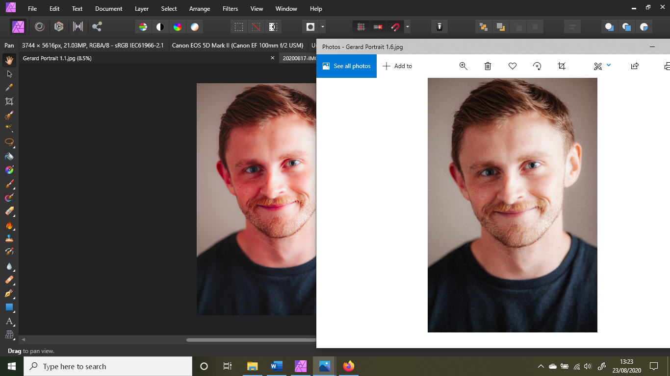
Hi! I love Affinity Designer, BUT this problem is a HUGE headache to me I set a color that looks great in the workspace (within Affinity Designer) to my text, objects, etc. I export it and ALL THE COLORS are extremely OVERSATURATED, a moderate yellow looks like a highlighter yellow, Please fix this issue and help me QUICK! The image on the right is the one after export opened in windows photos, left is affinity designer