Search the Community
Showing results for tags 'Color'.
-
 Hello. I want to change the colours of this drawing and more specifically I want to make the lifework white and the background blue, light blue, red etc from top to bottom. Which app should I use? Affinity designer or Photo? What would be the optimal procedure? Antikythera mechanism final.pdf
 -
You guys should create a tutorial on how to match the color and tone of any photo because I am completely lost on how to do this on affinity. I can only find videos on how to do this for photoshop which aren't much help. Thanks!
-
 I just switched to Affinity from Illustrator, and am very happy. However, I'm not seeing the palette options I would like coming from Illustrator. In Illustrator, I used to be able to pick a color and then see a auto generated palette of different tints / shades of that color. Is there anything like this in Affinity?
 -
 I cant find anything similar with "color lookup" pre-defined color filter (As you can find in Photoshop) on Affinity Photo. Does anybody know if exists a similar feature here? If not, is it possible to create and save pre-defined automatic color adjustments? Many thanks!
 -
 When I create a new file with objects from the clipboard AD creates a page with a transparent background. Creating a new file doesn't do this. How can I: 1) Prevent the background from being transparent when creating a new file from the clipboard? and/or 2) Change the background once it is created? thanks -B
 -
 Comparing my AD document (on the right) to the exported PSD (on the left)... is this amount of colour-shift normal?
-
Recently used colors has one problem. When selecting a previously used color, adjusting that selection (from the color wheel) completely removes the previous color in Recents. Breaking exploration of ideas. This compounds the Eye Dropper color well queue doubling travel time to ui, as well. So, if I select an object, click a previous used color in Recents, then adjust the color for variance, or testing, the old Recent color swatch completely gets replaced. If I want to adjust another part of a design with the original Recent swatch, I then have to select the Eye Dropper, select the color, go back to the color well, and click on it (/cry). A workaround is to deselect the object after color selection from Recents, then reselect [the object] to create a new Recent color item. Ideally, Recents would record a new square, versus replacing the selected Recent color swatch without having to deselect the object.
-
 Hi, we have a problem to get 100 % cmyk black. Color profile: ECI iso coated The color of the square on the attached document is 100 % black cmyk but the view on the screen and the export pdf is only 87% ? Any help? Thank you TEST Black CMYK.afdesign
 -
 Currently to get a color value with color picker tool, you have to drag it from the color palette and move it over the color you want. Only after that you can copy the color values from color palette, which is very unintuitive and complicated. Please allow to select color picker with keyboard shortcut, like I in Photoshop and allow to get color value by clicking on it - this way it's possible to copy color exactly from specific pixel. Also, Photoshop allows you to copy Hex color value directly to clipboard when color picker is selected and you right click on an area in image. This allows to easily get color values for web design.
- 1 reply
-
- 1
-

-
- affinity photo
- color
- (and 1 more)
-
 When matching a colour selected from a colour swatch book, the odds are that I want simple, rounded off numbers like 50% cyan, rather than its lesser-spotted cousin, 52% cyan. Could you introduce some way to snap to increments of 5% when dragging a slider? Perhaps holding the shift key while dragging? (this is a personal issue I have with Illustrator… the sliders always seem to hop from 49% to 51% as if it's intentionally trying to avoid the common 50%. I seem to end up having to type 50% after a few frustrating attempts) I don't have this exact problem with AD or AP's sliders, but snapping would be a great option in my life.
 -
 See the image attached. I think it would be awesome if there was a color preview to show how dragging the curves handles will affect your photo. For example I would know that dragging the highs in the red channel down would tint the photo cyan, or dragging the lows in green to the right will tint the photo magenta. This could work for RGB and CMYK as well. Thanks!
-
 I just bought Affinity Designer and created my first project for a client. I have chosen this project because it is very simple and allows me to try the software in a professional matter. Because I refuse to have my work held hostage by Adobe, I writing these comments with the best intentions to make Affinity Designer the number one software. I know Serif is working on adding Pantone Colors and other things, So I hope I just adding a new list of things that has not being mention before. Here are some problems I encountered with Affinity Designer: Guide Lines: Pulling a guideline from top sometimes works and sometimes does not. Ruler in inches very difficult to read specially when zoom very close. Need better hierarchy display. Opening a New Document: When setting a new artwork, “Include Margins” does not allow “0.125” (1/8”). It changes to “0.13” which is unacceptable for pre-press production. Default “Colour Format” is “RGB/8” when should be CMYK, specially for printing production. Should be a preference to set this very important key factor for professional artwork. Character Format: This floating window takes a lot of space, when it can be a lot smaller. “Typography” window is not available on Toolbar which is extremely important for Graphic Design. Should be shown inside Character Format window or at least available on Toolbar. Changing to different tool with “Hot Key” or “Keyboard Shortcut” after using Text Tool is not available. Swatches should be avail to show Gray Scale, Gradient and Colors on the same window. I personally feel that does not makes sense to have 3 different sections when we, the artist, use from gray scale, gradient, colors and everything in between in one artwork. ************** Suggestion: Should be an option to save my “Studio” windows settings (more than one setting depending on the type of project at hand). You may want to have an option to set different preferences when opening a new document: For Web Design: RGB Colors, Pixels Units for ruler, 72 PPI, Hex Color Swatches, etc. For Graphic Design: CMYK Colors, Inches Units for ruler, Pantone Color Swatches (Solid, Pastels, Metallic, etc.), 300 DPI etc. ************** Objects do not show if they are outside Document Dimensions. This could represent a problem and limits the design aspect. Sometimes we have different objects outside the document dimensions to be use inside the document dimensions. If we cannot see other objects to be use inside the document limits the creativity. Not to mention that some objects may remind hidden and can cause pre-press production problems. For Example a CMYK Object on a Spot color project (or vise-versa) ************** Suggestion: Should be an easier way to duplicate and move the text or objects in one action without using copy and paste and then moving the text or objects. ************** Text Tool sometimes does not select text, it tries to create a new text. Which makes you to first go to the Tool Box, select “Move Tool” (V), select text, change to Text Tool and then you can edit text. But I can always mentions the thing that are amazing about Affinity Designer, like realtime adjustment of Text Point size, or Font. I think that not only it cuts a lot of design process time, but it also increase the creativity and expand options or concepts in a very spectacular way. Ok, this is for now, because I have work to do and I have not get the chance to play with each tool. I hope Serif finds these comments useful.
 -
Hi, I talked about it during beta. I would like affinity photo to have a image / "apply image" similar to photoshop. Being able to apply a channel to a layer while changing it's blending mode. I use this to : color correct getting much better color (natural look), its different than vibrance. much better. better black and white My whole portfolio have extensive use of this feature : No other feature can create such colors : http://anstellos.deviantart.com/gallery/ ps: I try hard to get the similar result in affinity. It yet cannot do it. I find myself to go back to photoshop for this feature only. That's a shame, your soft almost tick all the boxes but this is a big one.
-
Not sure if this is a bug, or if I'm misunderstanding something here, but I'm having an issue with blend modes and I was hoping someone could help me out. I have a gradient map nested in a photo (basically turning it black and white). The photo has a Multiply blend mode. Underneath, there is a blue solid layer. For some reason, this is turning out much darker than doing the same thing, just rasterizing the image and gradient map together (see attached images). The lighter version is how I expected it to turn out, but I'd rather not destruct my layers if I don't have to. Any idea why I'd be getting different outcomes here? Shouldn't the gradient map only be affecting the image since it's nested? Thanks!
-
Note: Please excusemy poor english. There might be some errors but I hope you do understand me :ph34r: Colors: Please provide the hexcode in every (!) color-dialog and all color-spaces to simplify copy of a special color Please offer a hover-info for exact color value in the "last used" color-fields Stroke: Please let the mouse focus on the width-slider of the stroke and let arrow-keys change the values (left/right = -/+1, up/down = +/-5). At this point a direct input of a value could lead to focus the cursor into the value-input field Guides: I´m not sure how to do it the best way but the guides-dialog is not smart. It is not possible to select a guide neither by clicking it in the layout nor to identify it in the dialog by selecting it with the selection-tool. So the user has to guess or estimate which guide-value could be the right one. GUI: I´m not sure if it is useful to separate dialogs into (studio-) dialogs and windows (like guides, typografy etc.). I am working with 2 monitors and like to dock all possible and useful dialogs on my 2. screen to have a proper working-bench on my prime-screen (which shows only tools and documents). To be continued… B)
-
Hi, Could i request a shortcut to be added to reset the color swatch back to Black & White like it is in PS. The shortcut for that is D. If we have one already can you please let me know what it is? :) Thanks!
-
 If I open a scanned image in Photoshop, it opens as a single "Background" layer. And whenever you use the Eraser tool on such a "Background" layer, it Erases to White because White is the default chosen background color. Of course, if I click the little Lock icon to unlock the Background layer in Photoshop, it changes to "Layer 0" and any use of the Eraser tool in that case will erase to transparent. In Affinity Designer, everything erases to transparent from what I see, even the Background layer. In Affinity, how do I ERASE TO WHITE? Thanks.
 -
 Hi, Has anyone noticed a difference in color of the raw file in AP and that same file in PS? How can i be sure i'm getting the correct color from the adjustments I'm making? Just curious because when i try to process in AP the images don't come out as great as i believe they are in PS. Thanks!
 -
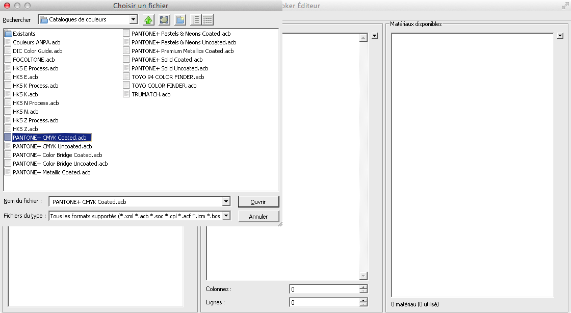
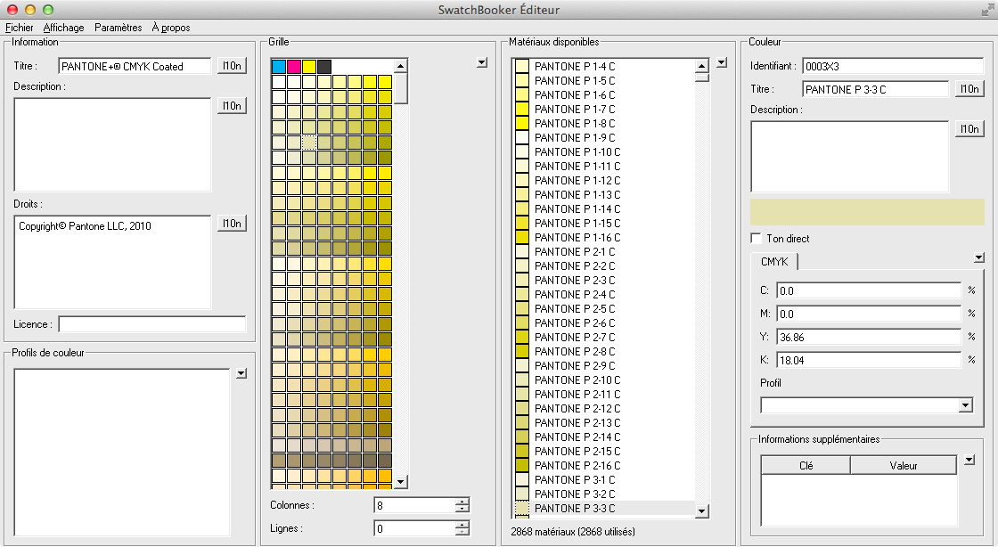
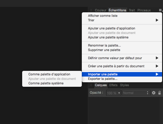
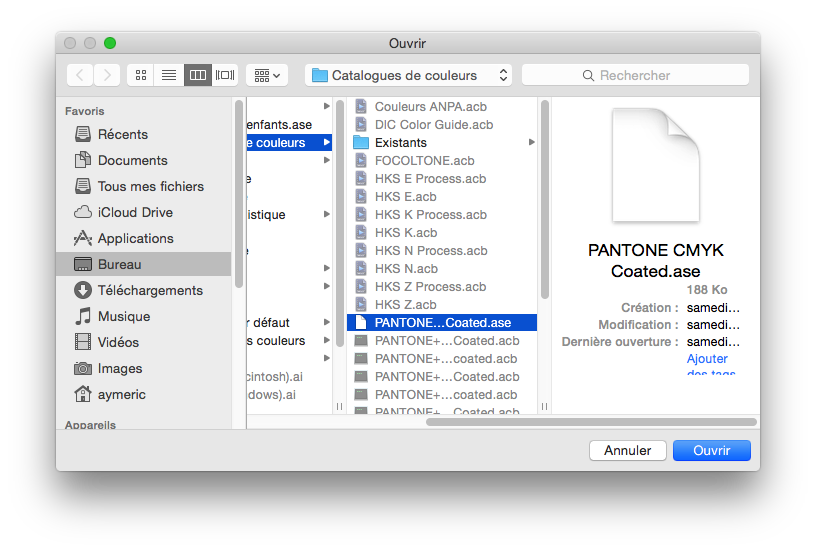
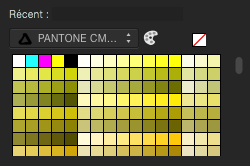
For those of you who needs Pantone colors support in Affinity Designer before the Serif team release an official support in it, here is a trick you can do. Firstly, you need an Adobe Illustrator licence to be able to do this, or install a demo version of Illustrator. Then you need to install SwatchBooker. http://www.selapa.net/swatchbooker/ Or you compile it yourself to get a Mac version, or you use it under Linux, or use it with Windows. Personally, I installed the Windows version into a CrossOver bottle and it works out of the box. Launch SwatchBooker Editor, in the File menu, select Open and choose one of your Pantone library in Illustrator. Then in the File menu, select Save as and select *.ase for the file format. Launch Affinity Designer and go to the swatches panel, click on the menu and choose import palette, as system or software, as you want. Select your exported *.ase color library. And that's it, you have loaded in Affiinty Designer your Pantone colors library.
-
 Why does the gradient change the color? see screenie. the color of the sphere should have the same color as the bg.
-
 Hi, I'm laying out a website in Affinity Designer. I'm using a lot of black and so would like to lighten up the dark gray canvas around my layout to a lighter gray. I've looked around and can't figure out how to do this. Can I change the canvas color and how? Thanks
 -
 Hi everyone, I'm new to the forum and this is my first post here. As a graphic designer with more than 15 years of experience and someone who's been looking for an alternative to Adobe products, I've been testing Affinity Designer Beta for a while and I'm really amazed what can be achieved with such great input from users and by developers who listen! Right now I use Affinity Designer Beta along with Adobe Illustrator, testing, comparing, trying to achieve similar goals using both. It is great that developers from Affinity are not trying to make a copy of Adobe products and finding mostly better solutions with users in mind, but there are times, when I'm really in a hurry and I'm forced to do certain things in Illustrator. There are things that slowing me down A LOT in Designer, and the major one is colour picking. Right now I just cannot find any other way then: - selecting an object - moving cursor to the top right corner - grabbing a colour picker - choosing a colour - moving cursor to the top right corner again - and then finally selecting it. All this takes far too much time for such simple operation, so I gave it a lot of thought, and came up with something that I believe will work great. First of all, what's needed is a one button shortcut for the Colour Picker tool like the "i" in Illustrator, and then we can use the loupe from Designer to create even better experience and this is how it could look like: - select Colour Picker tool via one button shortcut, then - pick a colour from any object by just clicking on it - OR - HOLD on any object for 2 seconds to change the cursor to LOUPE for more precise colour selection! - boom! And now the most obvious thing - if you don't have any object selected, this action will just choose a colour which will be selected when new object is created, but when you DO have an object selected, this action will APPLY the colour you've just chosen to the already selected object. Advantages: much fewer moves and clicks, less distracting and keeps you focused on what you're currently working on, intuitive and when gives more control by using loupe for precise colour selection without any additional clicks or moves. All this would speed up everything tremendously! If this or something similar has been already discussed, or if there is any solution to that which is already implemented and I simply don't know about it, please let me know. I wonder what you all think about it! Best Regards!!!
 -
 Hello! As a Fine Art Printmaker who uses Computer Design tools to create prints for Screen Printing, Lithography, and Intaglio, CNC woodcut, it would be amazing if I could separate colors and control half tones size shape (line, dot, etc) and color. I imagine being able to work in CMYK layers and being able to apply color halftones to shapes based on percentages, or change the size and shape of the individual color channel half toning. It could be applied in any document setup really RGB document with a simulated color / spot process: Red, Yellow, Blue, Purple, Green, Turquoise, Grey and control the halftone percentage, size and shape. grey scale: black, 25% grey, 15% transparent white LAB would be fun, you could control the lightness darkness of the halftones maybe have an option to constrain the gamut inside of lab to a specific set of colors like CMYK but still have lightness control. In my imagination the possibilities are endless for options like this. "MOONSHOT" : to have RIP like printing control inside this program, where I wouldn't have to worry about the printer I am on to get circular halftones (this might be next to impossible but I am ignorant when it comes to the programming side of hardware interactions) this would be just insane and might require a new type of universal file format I have no idea but it's something I dream about, being able to go to Kinko's or some other local digital print shop and be able to print out my files without having to worry about the print shop getting the settings right in their computers and on their printers, the employees being inept, or any other stupid thing that happens because you don't have enough money to buy the hardware that you need. and finally "MOONSHOT": A new type of color selection palette based off of a Warm/Cool, light/dark, transparent/opaque warm adds red cool adds blue lightness adds white darkness adds black transparent/opaque self explanatory but the twist is you pick initial colors as a base and those colors become the colors you base rest of the interactions between the colors on like paint For example: Here is a shorthand RGB two way conversion to Paint/Ink color palette equivalent Red (Pantone Uncoated 032) Yellow (Pantone Uncoated 123) Blue (Pantone Uncoated 300) Purple (Pantone Purple) Green (Pantone Uncoated 354) Turquoise (Pantone Uncoated 312) Grey (Pantone Cool Grey 8) 100% opacity White 15% opacity White mixed or printers black (R 54, G 54, B 57) Black now imagine you have picked these colors as your initial palette and have set them inside of a grid each color has the same basic controls warm/cool: add red/add blue light/dark: add white/add printers black transparent/opaque: increase decrease transparency/opacity Now for example you activate the red, white, and yellow channels you now adjust warm/cool light/dark transparent/opaque sliders around to just work within the constraints of those colors selected from you base palette this gives you a sub palette of yellows oranges and reds based of your real world/RGB equivalents this would work for CMYK as well This would be a great tool to have I think Thank you for reading and for your consideration Nathan Henry
 -
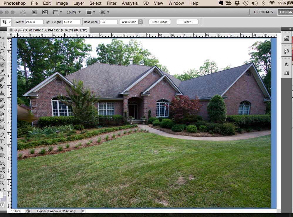
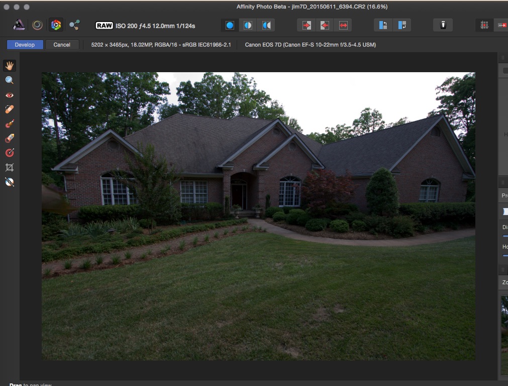
I have notice when I open my raw files in Affinity Photo, they are much darker than they are in Adobe Bridge and in Photoshop. They also appear much darker than they appear on my camera view. I'm wondering if I have a setting or preference set wrong. I have attached two screen shots. Nothing has been done to either photo except to open them in Affinity and Photoshop. You can see the difference in the brightness and color. The Photoshop clip better represents what was captured in the camera. Can anyone make suggestions or have you noticed this and what did you do? Thanks, Joe
-
Hi Can't find out how to copy sample color from canvas wile using brush or Fill tool. In PS it can be done by pressing Alt and copy or with eyedropper tool. p.s. in color pallet is eyedropper icon can't figure out what this for? http://monosnap.com/image/AQwgqrzL65B9iE5CNO9wzMObWTrf6Y ---------------------- Best regards Aleksander Tymchenko