Search the Community
Showing results for tags 'Color'.
-
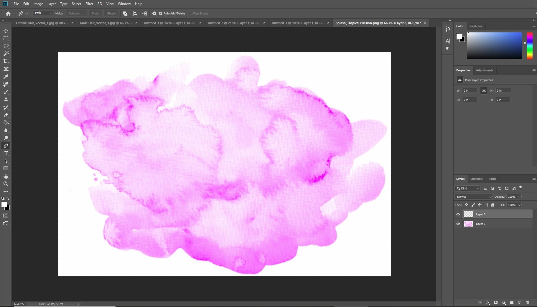
 Not sure why this is happening, but when I drag and drop a png into Affinity Publisher, the colours change slightly. Please see images for a comparison (photoshop is the original, Affinity is the changed colour):
-
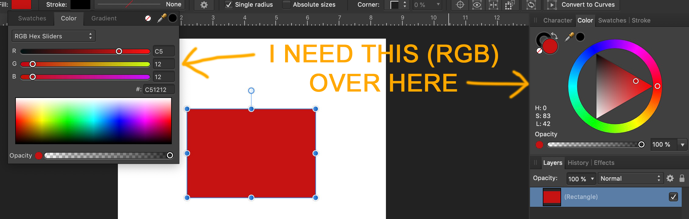
 How do I change the "color" window from HSL to RGB?
-
 Hello everyone! Right now I can't figure out how to change the background color of the Text tool in Affinity Designer. The default one seems to be white but I would want to change it. Thanks for your answer in advance!
-
 Hi, Hope all are well. I am a new Affinity Designer, trying to get familiar with all that Affinity has to offer for design and the likes... So here is my question, I am seeking to see how I can keep the image I uploaded in its original color, everytime I import an image it changes to a greenish color, but I can't find a way to keep the original color of the picture/image. Any assistance with this would be appreciated a tons... Thanks...
 -
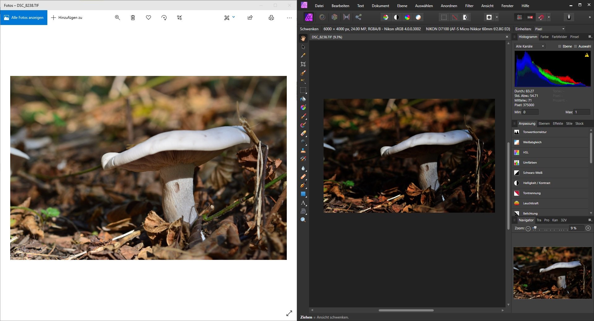
 Images appear darker and with higher contrast in affinity compared to other applications (see uploaded image). The problem occurs with different file format (jpg, tiff, raw). When the file is exported with affinity and reopened in an other application the appearance is normal. Which means the high contrast and darkness is not saved in the image. The problem started with the upgrade to version 1.7.3. What I've tried so far: - Change color profile (Appearance changes but the high contrast and darkness remains) - Downgrade to 1.7.1 (-) - Reset settings (-) - Delete affinity files in appData folder (-) - Uninstall programs I've updated at the same time as affinity (Nikon NX...) (-) How can I fix this issue? I would appreciate any help. Thank you.
-
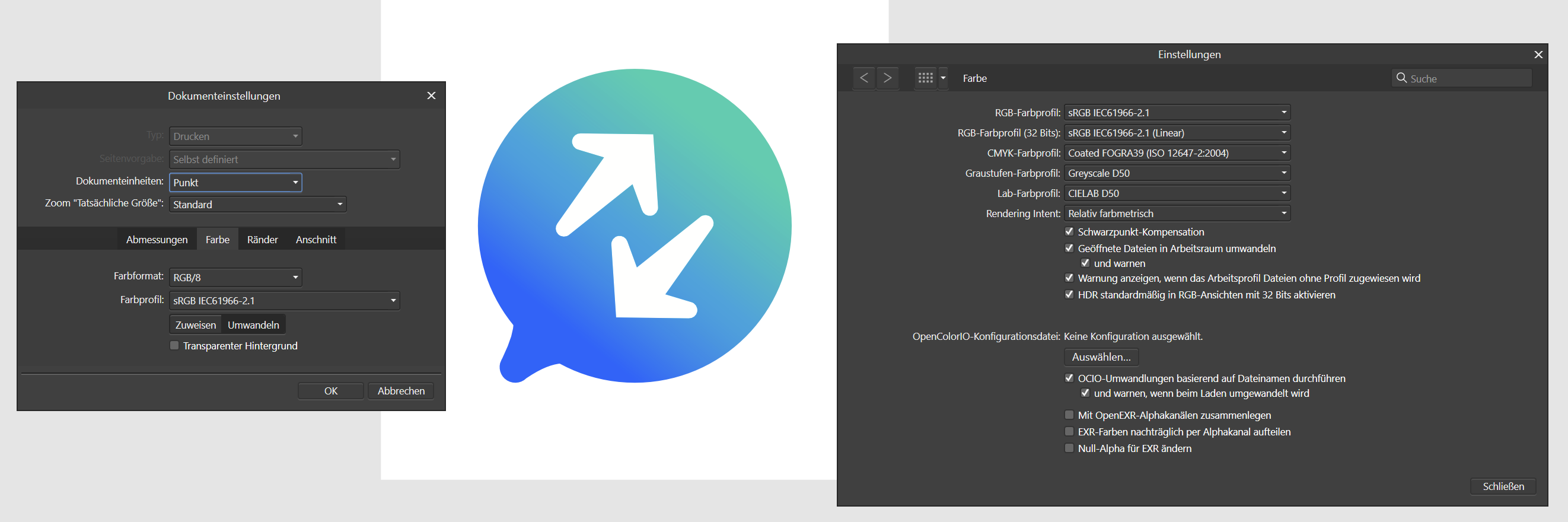
Hi folks, I'm trying to create CMYK colors with correct colors number (0% to 100%). Unfortunately the color picker give me only RGB values (0 to 255) on CMYK tab. Could I can fix this problem? Because its very difficult create color documents unknowing the color results. Its happen with any document that I create with CMYK color space, using the old ICC for Fogra 39 (coated paper). My Affinity Designer is 1.7.3.481. Affinity_Designer_2019-10-25_10-22-44.mp4
-
 In Affinity starting with an RGB value of (100,100,100) translates to a CMYK value of (60,52,52,21). -> Why so much cyan ? -> Why is it different than this ? (here or here) -> If I plug the CMYK (60,52,52,21) in reverse here I get rgb(80,95,95) with a cyan tint, but affinity says rgb (102,100,100). Why ? In the attached file the color format is set to CMYK with profile (US Web coated SWOP v2). -> Exporting the file to PNG gives me correct result (exactly as shown on screen) -> Exporting to JPEG with color profile included gives me a cyan tint. Why ? (it doesn't include the profile after all ?) ColorTest.afdesign
-
 Please someone help! Did anybody have the same issue as this:
 -
Hi, see attached the color difference of the file in the program and exported as jpg with JPEG high quality settings. Also see the second attachement for my colors settings, they are in german but I think you find the values. Thanks for any help in advance!
-
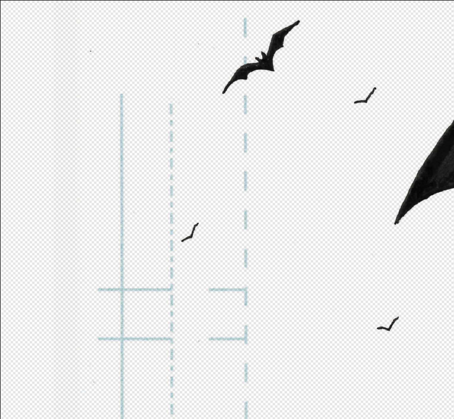
 Hello, I've been using Affinity Photo for about 2-3 weeks now to work on a local client's comic book and I am extremely impressed with the efficiency with the program thus far! However I ran into a problem when attempting to remove the blue guide lines (margins used in comic book coloring). These lines are traditionally color coded blue, so that they're "easier" to erase while in a photo editing software and with Photoshop I had no problems erasing them. However I have tried multiple selection options with Affinity but all the magic wand does is either select everything else including the black or selects individual blue pixels and not the blue lines entirely. The blue itself is slightly transparent so that might be an issue? Here is what I did to get to this stage if it helps: Filters > Color > Erase white paper CTRL + J > CTRL+ E (to make the marker lines darker and then I just merged them together) Magic Wand tolerance set at 0%. - I mean I could always erase with a layer mask, but I would prefer a cleaner way to select and erase the blue in one go. Any thoughts?
-
 Hello, I noticed that after installing the newest version of Affinity Photo the white balance in in the whole program was of by a significant bit. It's not my Monitor because it only happens in Affinity Photo. Its not only the picture view but also the color picker and other color related tools. When rendering it uses the correct colors so it needs to be a Preview or UI problem. Does anyone had the same problem and knows how to fix it? Thanks in Advance
 -
 Hi All, I have a photobook I originally created in InDesign, and am porting over (manually recreating) into Affinity Publisher. I am having problems around color consistency while exporting. When exporting to JPG, colors visually match between InDesign and Affinity exports. I am having issues when exporting to PDF. InDesign PDF colors visually match JPG exports, but for the life of me I cannot get the Affinity Publisher PDF colors to match. I have confirmed visually by opening both PDFs in same reader side by side, as well as actually physically printing (3rd party) on paper. They are washed out and dull in comparison. I am attaching a page of the book from both. Please tell me what additional settings you need me to provide. Cheers! Affinity Publisher.pdf InDesign.pdf
 -
I am working changing the Sofware from the A.Designer to A.Photo, but when I do this the color in Affinity Designer are different of what it must, I attach a Video where I show this issue, and I put it here becuase sometimes when I export an image from A.Designer, it change the color and I already check all the options to corroborate that all are the same whit Affinity Photo and they are. RJpEnoA5N0.mp4
-
 Hey guys, I'm trying to make a black to transparent fading gradient, I drew a rectangle shape on 1/3 height of the page and use the transparent tool to click on bottom of the shape and drag to the top straight, midpoint set the standard 50% but on top of the shape, it appear to have noticeable edge and not completely fade to transparent and blend in to the background image, can you guys let me know how to settle this? I try to set the midpoint to 55% because I want the black are to be a bit higher and then make a second midpoint and set it to 45% and the edge don't noticeable much but because there's 2 midpoints, the gradient looks like a 3 bar with black, dark gray and light gray shading. And how do i make sure tire's no banding problem with amazon KDP print? Please help! Gradient Test.afdesign
 -
When creating a palette from the current document the colors are incorrect. Obviously they are generated from the screen display and not from the objects in the document. So it is impossible to create correct colors of some vector objects by this function. Instead the color is correct if you create an empty palette, select a single object and click add color or global color. AD 1.7.2 OSX 10.9.11
-
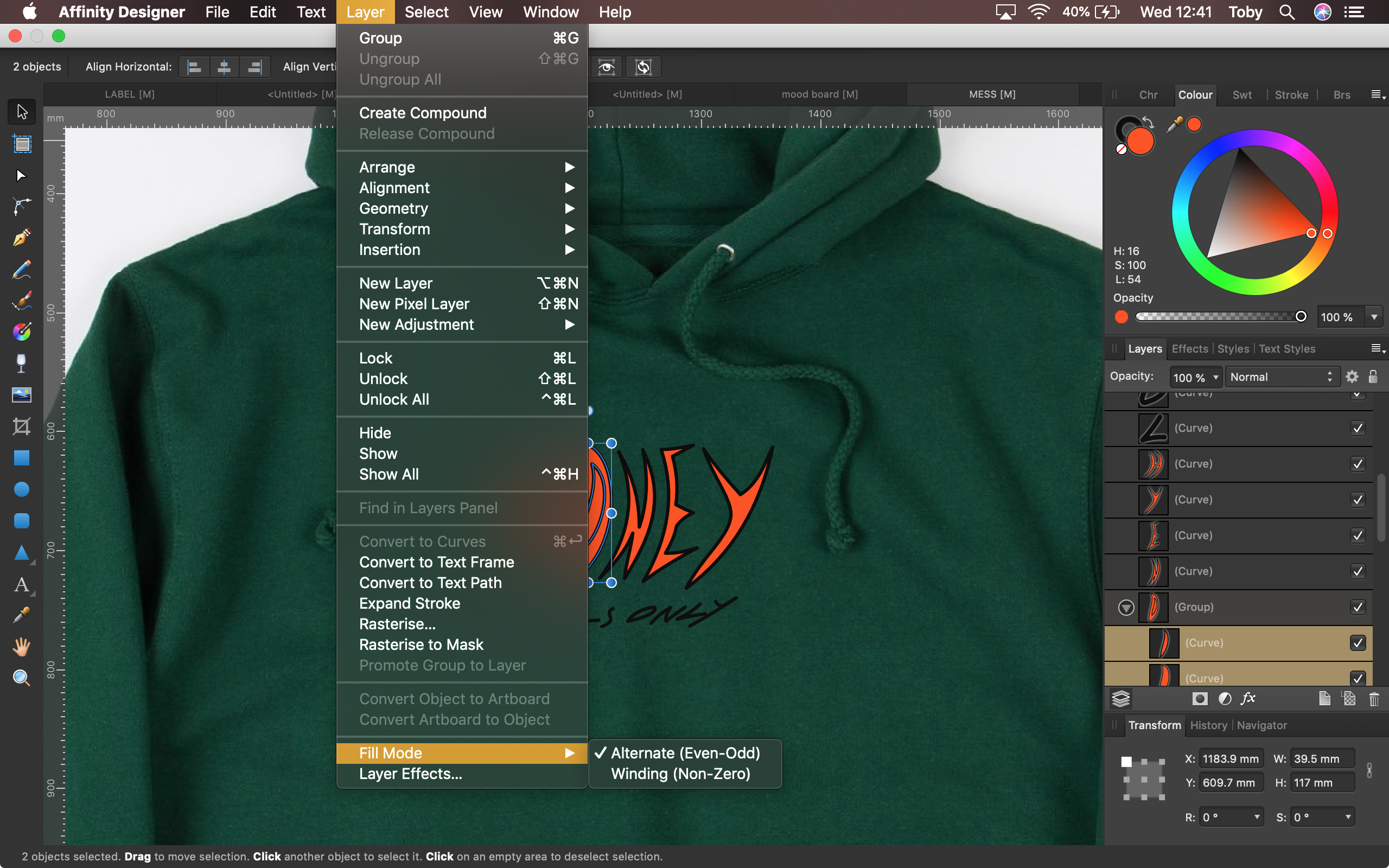
 Hi, I'm trying to fill a capital 'O' without filling in the middle of it. As seen in the attached screenshots. I found a post with the same issue, there they were told to select the individual curve layers rather than the group, and then change the fill mode in the layers menu to "Alternative (Even-Odd)". However, I tried this and it didn't seem to work. Is there something I'm doing wrong or something else that might work? Cheers
-
 Following an AP tutorial I have created my own swatches. I use 5 colours palette that to my judgment correspond well to what i see in the original (template) image. If this is not a case, the 5 colour palette by AP is incorrect, I create a swatch again with a higher number of colors and make my selection to limit them to again 5. When color grading with 5 colours I add 5 colours from the swatch palette very carefully by ensuring that the Location value on color grading scale matches the Lightness (L) value of the color an indicated in a window for color picker. When I copy the colour palette from the swatch and apply it to my own image the result is different as regards tonality. Some additional adjustments are needed to match my image with the template. However, it is almost never the same. Is it what correct? Using swatches for color grading does not guarantee that the image that is edited will match the template and there might be differences?
 -
 Hey guys, I want to toggle between gray scale values up and down, eg in 5% increments or down without having to click on the swatches panel. It would allow for full screen painting/drawing while hiding the studio. Curious is anyone knows if this is possible. Thank you! Tobias
 -
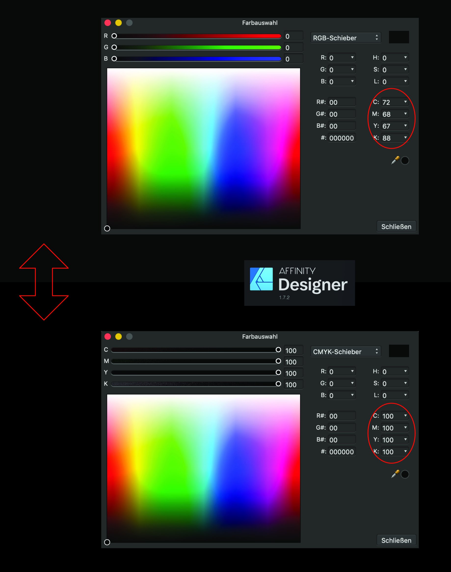
It would seem that a RGB value of (0,0,0) does not result as a CMYK value of (0,0,0,100) as it should, but as a (72,68,67,88) CMYK value. A (0, 0, 0, 100) CMYK value is converted to a (35, 31, 32) RGB value instead of (0, 0, 0) To test this, you can simply switch from RGB to CMYK color mode in the color panel on a black colored shape Is that really a bug in the conversion formula, or am I missing something ?
-
Farbauswahl.pdf
-
 So not sure how this is not done right in Affinity's programs. Global Swatches, are only in document, not available in application swatch palettes! I work in a high volume, fast paced shop, we have a number of what we would call basic or default colors we use in designing, and then tweak them from there. I have always been able to set up a swatch book in Indesign and use that swatch in all my work as a base. While Affinity has that feature as an application swatch, the colors once applied to items do not not retain any connection to the item as they should so color can be adjusted once for all items in the document that use that swatch, this is only available as a Global Color and will only work in a Document Palette, which I would have to rebuild every time. So while I really like Publisher in a lot of ways this is a really crimp on my movement away from Adobe, and is right up there with no step and repeat function (power duplicate is not the same thing) and not opening Indesign files (I know that is more difficult, but Quark can do it, so it is possible). I am also at a loss as how to get all my prints from printing so dark, no color management settings seem to change anything and all my photos come out extremely dark, but only when printed in Affinity Publisher, any other program prints perfectly.
 -
Is there any way to sync the color profiles between all the affinity apps? We have 20 seats in our office that need the color profiles prefs to be consistent throughout all the affinity apps. In Adobe Bridge we can set it up in bridge and all colors settings are set for all the adobe suite apps. Is there any way of doing this in the Affinity Suite of apps? Doing this makes the it easy for all the apps to be centrally controlled, maintained, and ensures the color profiles are consistent throughout the workflow. Setting them up individually makes room for something to be mismanaged or a setting being missed. This can be be catastrophic if somehow the wrong profile is used on one of our files when going to press. Is there a way to set up color prefs that transcends the other apps from affinity? Maybe I am overthinking this but, would someone tells me how this works when using studio link with different color settings?
-
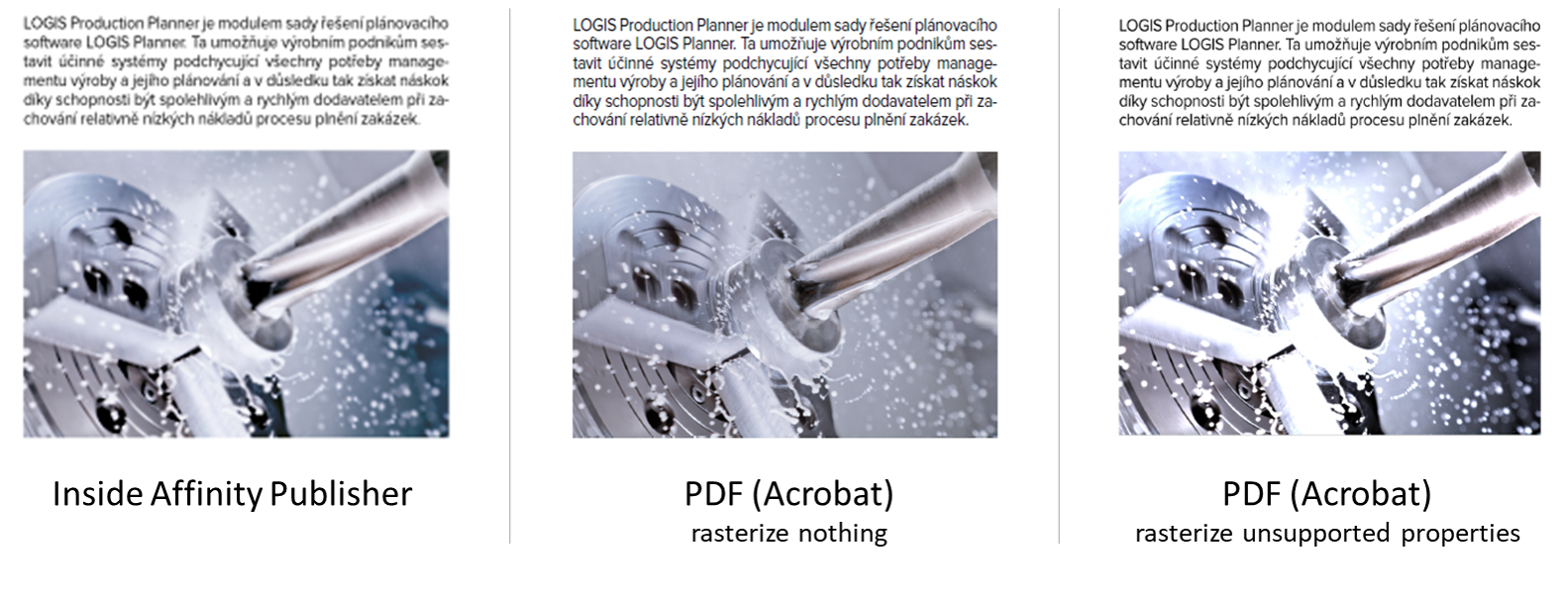
 I have a simple document in Publisher with some images placed inside. After placing them inside the Publisher document, I have edited the images using the Photo persona, just tweaking the levels a bit. The image looks correct inside Publisher, but looks bad in PDF - almost as if the edits I made in Photo persona were not applied at all. I am exporting to PDF with the "PDF (for print)" settings applied. I have also tried setting the Rasterise property from "Nothing" to "Unsupported properties", which does seem to apply the adjusted levels to the image, but in an overly-corrective way. Just to be sure: I am trying to have the PDF look as the thing I see in Publisher. Could anyone push me in the right direction, please? source_file.afpub
-
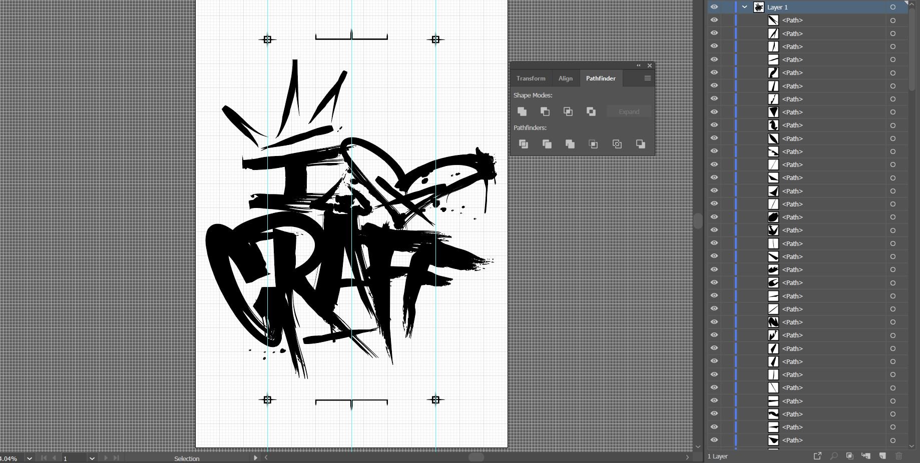
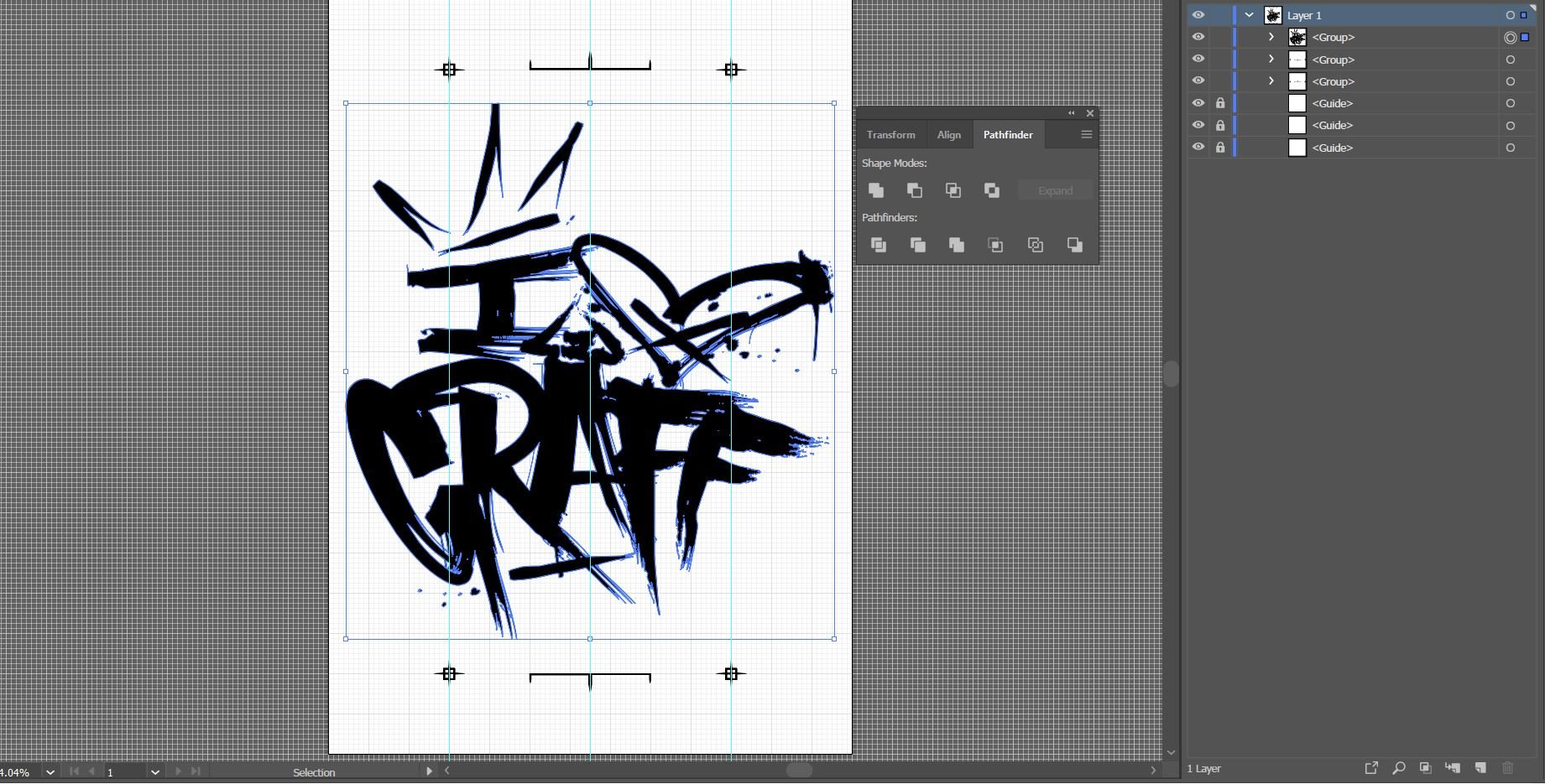
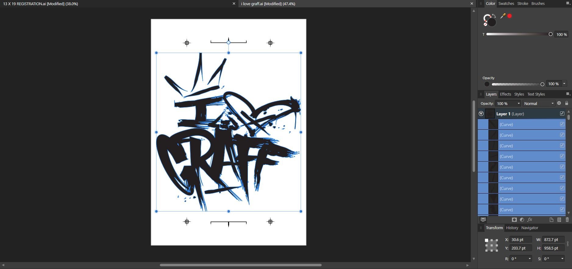
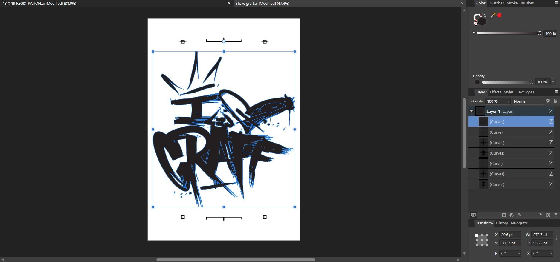
 I have an issue with the Add operation in comparison to Illustrator. As of now, I don't believe there is a feature that allows us to select by fill or color, this prohibits me from being able to select only the black infill and then add or merge them together as one shape. In Illustrator, I can select by fill color, select "unite" in the pathfnder window (which I believe is the equivialent to "add" in affinity) my design comes out perfect. With affinity, since there is no option to select on by fill color, I have to select everything, then select "add" which fills in portions of the object with solid black.
-
Tinkering during a slow work week. Inspired by the rain hammering against my office window.