Search the Community
Showing results for tags 'Color'.
-
 Hi guys, I can't find a field for entering hex colour codes in Publisher. Same problem Affinity Photo and Designer. Someone can help?
 -
 ¡Hola, amigos! Yo soy – ? – ‘bien’ ? That's close enough for government work, right? Right. Today’s Big Question: How You Desaturate Dem Layer What Got Dem Color In It, Hah? A simple question asked by a Simple Mind. Please ’splain me where I can find a simple equivalent of the Photoshop command Layer > Desaturate to remove color from a layer so that it becomes black and white and still responsive to Blend Modes. I've tried the HSL panel with spotty results. If HSL FX is applied as a PARENT layer, it functions marginally well. When the HSL FX are applied as the CHILD layer (a/k/a 'mask'), it's a whole ’nuther story. At that point, any ‘finesse’-ness is gone. Adjustments made to the Child mask layer do not play nice with the Parent layer above. Insofar as experimenting with other FX (live or not), I continue to come up empty. HSL appears to be as close as I can get to where I want to be, but it's half-a-league, half-a-league as regards color removal with xparency FX and blend modality intact. In a perfect world, there should be a way to electronically tell the ware ‘Hey! I want the color removed from this layer. Just do it, ’kay.’ … but if there is such a method, I haven't yet found it. Oh please oh please oh please … Prithee, envelop me in thy Secret Sauce which removeth Color from a layer so that it majickally becometh un Noir et Blanc (and the Blend Modes are still next door). Thanks in advance to all.
 -
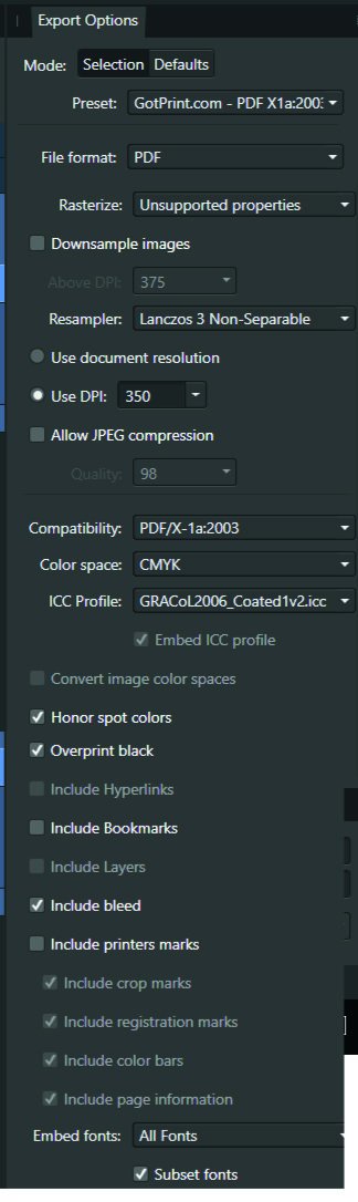
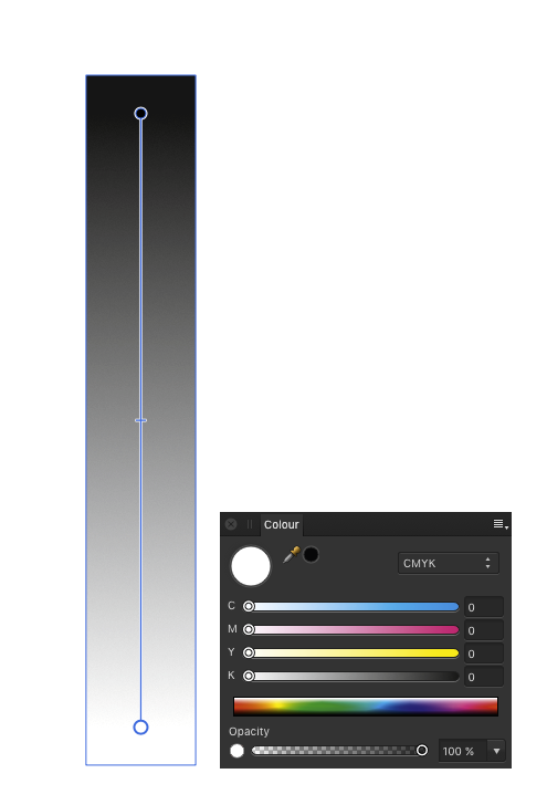
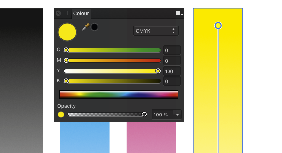
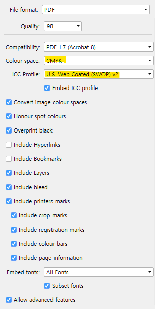
 Hi, The title is my problem. Here's how it's working. Example I make a CMYK document, and set the color of a black box to 30, 30, 30, 100. The color picker detects that exact color. I'll export the above into a PDF as PDF/X-1a:2003 or X4, and the included export setting image. Then when I import that PDF into Affinity Designer, the color picker detects different values... The box is now 79, 76, 70, 95. This same thing happens with every color. A 100, 0, 0, 0 cyan will be 72, 12, 0, 0, and so on. When exporting the same elements into a jpg, this problem doesn't happen. See for yourself in the afdesign file here. Question What can I do to get the exact values I set when printing via PDF, so I can still allow non rasterized elements to scale without losing quality?? I read around, and even InDesign seems to have this same problem... Maybe Affinity Designer is ignoring the embedded ICC profile of the imported image??... I just don't want $1,000 worth of prints to turn out bad over something so small. Thanks! problems with color values.afdesign
-
 Hello, In Affinity Publisher 1.8.5.703 I have a problem exporting the correct colors to PDF. What worked for me until October 21, 2020 without problems, now makes mistakes with the same settings. I am sending an example in the attachment. Let's focus on the logo at the top right. Its correct colors are: orange 0-50-100-0 and gray: 0-0-0-60 This was fine in version 02 of my document. In version 03 of this document, as well as in all my other documents, the colors of the linked objects appear differently than the original. The problem is only with linked sources, because the bar in the graphics is the same color 0-50-100-0 and it is interpreted correctly. When I export from document 02 now, the colors always come out badly. I tried all the basic PDF export PRESETS. Please, give me an advice. Or I'll hope it's just a small update bug. version inz_210x148_zdstzdmv_03.pdf - wrong colours of linked objects orange. 0-52-93-0 and gray: 55-45-40-6) version inz_210x148_zdstzdmv_02.pdf - correct colours of linked objects (orange. 0-50-100-0 and gray: 0-0-0-60) Thank you fb-art_CMYK.psd logo_ctverec.ai inz_210x148_zdstzdmv_02.afpub inz_210x148_zdstzdmv_03.afpub inz_210x148_zdstzdmv_02.pdf inz_210x148_zdstzdmv_03.pdf
 -
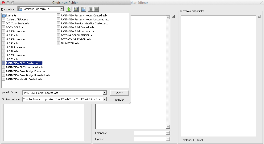
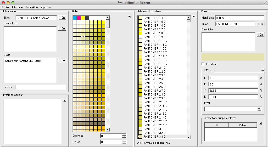
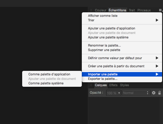
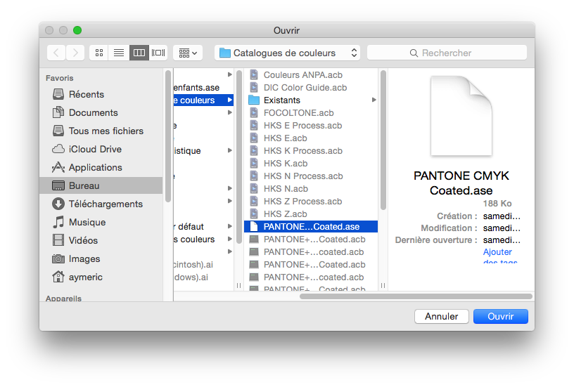
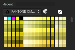
For those of you who needs Pantone colors support in Affinity Designer before the Serif team release an official support in it, here is a trick you can do. Firstly, you need an Adobe Illustrator licence to be able to do this, or install a demo version of Illustrator. Then you need to install SwatchBooker. http://www.selapa.net/swatchbooker/ Or you compile it yourself to get a Mac version, or you use it under Linux, or use it with Windows. Personally, I installed the Windows version into a CrossOver bottle and it works out of the box. Launch SwatchBooker Editor, in the File menu, select Open and choose one of your Pantone library in Illustrator. Then in the File menu, select Save as and select *.ase for the file format. Launch Affinity Designer and go to the swatches panel, click on the menu and choose import palette, as system or software, as you want. Select your exported *.ase color library. And that's it, you have loaded in Affiinty Designer your Pantone colors library.
-
 is there any issue with inferring a LUT in a full ROMM RGB environment? It looked very off (just overall bad quality) when I did so, but when I converted everything to sRGB everything looked perfect. What are your experiences with this? is there a recommended color space or did I just do something wrong somewhere? (I had original files and AFP files so I knew how it's supposed to look)
 -
 I have noticed a sizeable difference in color quality when printing the same photo using Affinity Photo vs. Photoshop, on the same printer, with the same settings. The colors I get from printing from Photoshop are truer to the original photos than the colors I get when printing from Affinity Photo. This is especially true of the blues. PS prints a wider range of blues than does AP. I recently printed a photo that had a lot of dark blue gray in it, and the print from AP was almost complete gray with little blue. Part of the issue seems to be there there are more color settings available in PS than in AP. In PS, you can indicate a rendering intent and check black point compensation. As far as I could tell, these settings were not available in AP. At the moment, I have both programs on my desktop computer but only AP on my laptop. At some point, I will no longer have PS available to me as it won't be compatible with further Mac OS upgrades. At that point, if I wanted to use PS for printing, I would have to purchase a subscription to PS which is something I don't want to do and the reason that I purchased AP. So, my questions are: 1. Does AP have any plans to improve its color management tool to get better color output? 2. Are there already color management tools in AP that allow for more fine tuning of color output, tools that I'm missing or unaware of? 3. Has anyone else noticed these differences and found a way to compensate for them, such as increasing the amount of blue in a photo with an HSL adjustment layer? This seems like a very hit or miss strategy, however. Thanks
- 14 replies
-
- 1
-

-
- printing
- affinity photo
- (and 1 more)
-
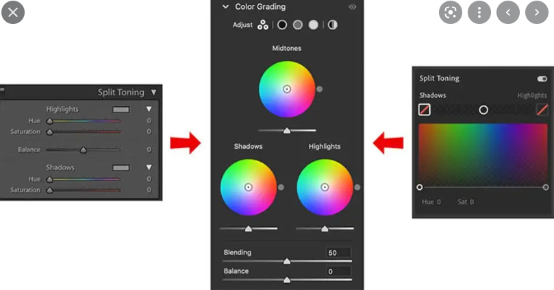
 Hello guys. I would like to ask why is there no midtone in split toning in develop persona? Is there a specific reason? Thank you.
-
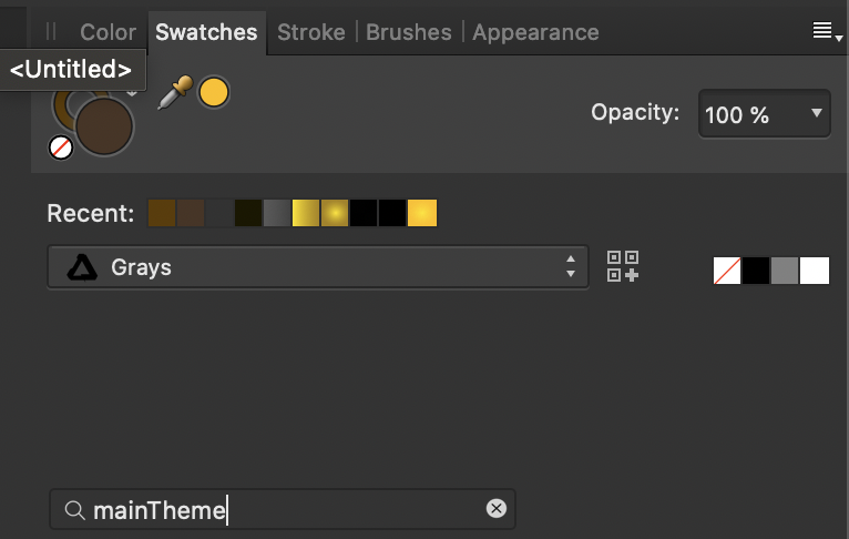
 Though I've owned affinity for a while, I've just recently started using it for a project I'm working on. I'm wondering, perhaps I've missed it, but as a developer, is there a way to store a particular colors in variables? Say I had something like mainTheme = "#FFFFFF" or something. Then I could have certain assets reference that color. If I decide to change the mainTheme color, all assets which reference it will automatically change. I looked underneath the swatches which is where I intuitively feel I would find such an option, but didn't see it. Is there another way to accomplish this? I could write it down on paper, but then if I change it, it'd be absolutely tedious to update all references. Please help?
-
 I want to remove the white from this image, I've adjusted the Levels so the whites are completely white & blacks are completely black. I've gone to the selection tab & tried the 'Select sample colour' but i can't find a way to make it work. I've spent the last 3 hours looking at youtube tutorials, FAQ's & forums yet i have no idea what i'm doing right or wrong, please help.
-
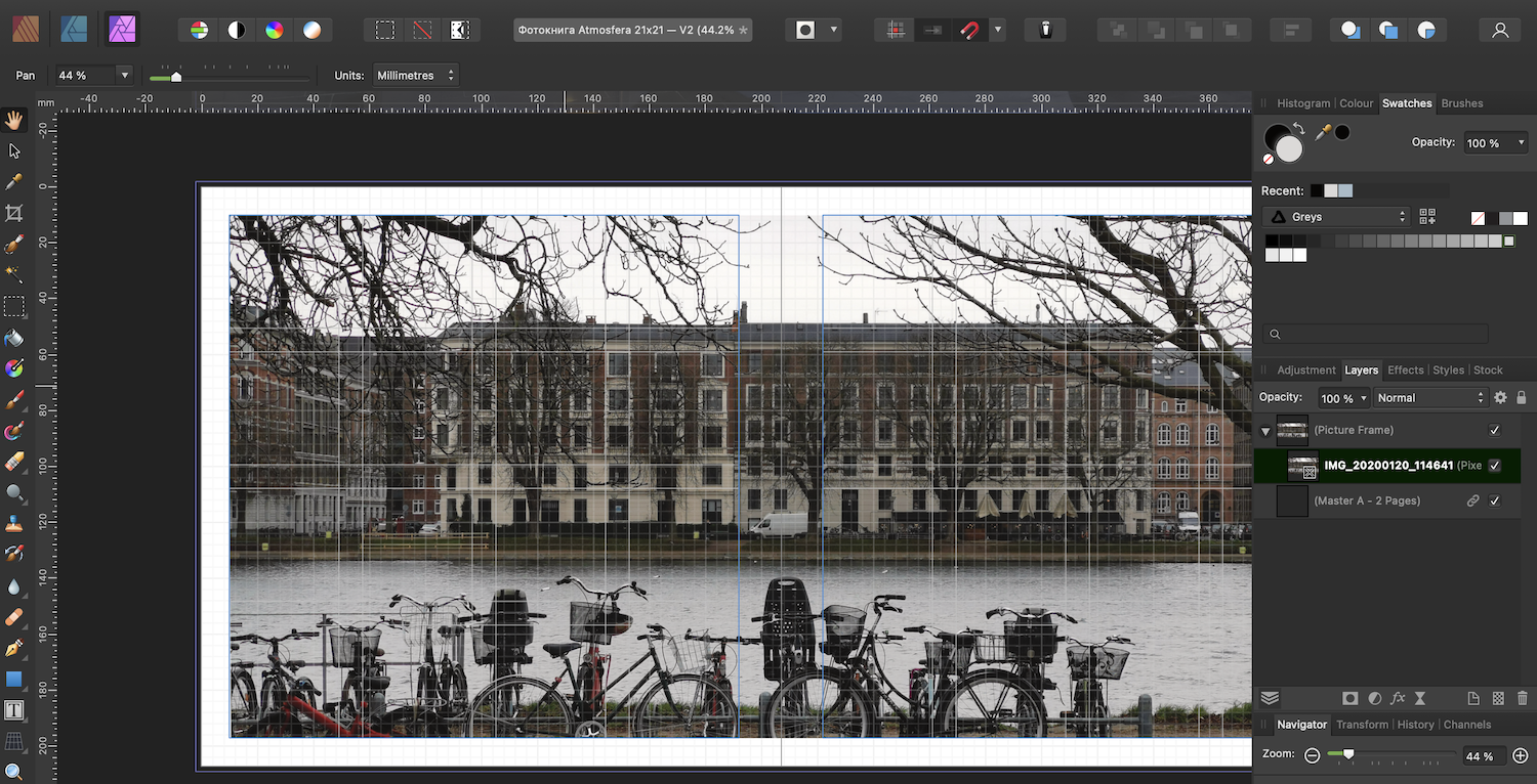
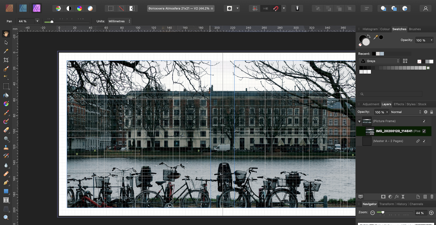
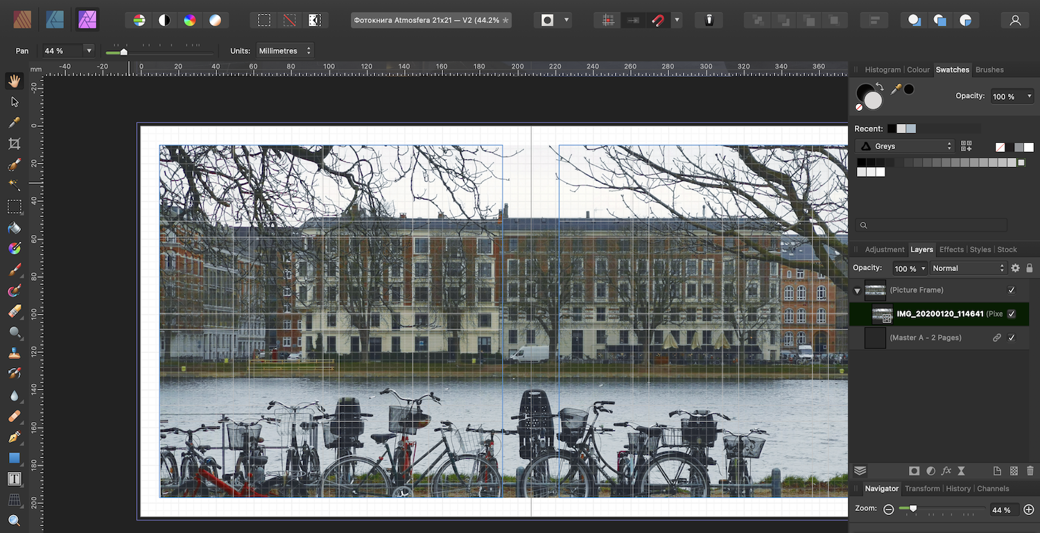
 Hej! I ordered to print a photobook a few weeks ago. I'm not professional designer, but I don't like options for print available, so I've decided to make this photobook with Publisher. When the photobook was printed it turned out that it was too dark. I can't say that the PDF that I've made was the same dark as printed, but still I've decided to make V2 of the photobook. I've never edited any pictures using Publisher, so according to youtube videos there's Photo persona for that. And tried to use auto-correction: So strange. Okay, Command+Z and let's try to use auto-color Well, it looks something is going wrong. My question is more about is in Publisher the way to edit photos slightly (brightness/contrast/colorbalance) before sending to print?
-
 Dear community, Is there any support for generating colors of your own choice on the internet for affinity softwares or something like color palletes or wheels. Please any one help out. Thanks, Aquil
 -
 Is there a way to copy a color value of an object to the clipboard for pasting in an CSS file, for example? I need to apply various RGBA values (RGB with alpha/transparency) and am tired of manually typing them for every object. OK, I just found the dropdown in the color panel where you can copy the currently selected color value as HEX. That might be useful sometimes but doesn’t help me in this case. Firstly, I need RGB(A), and secondly the color is applied as color overlay effect, not as standard background color. So, I wish I could just open any color panel and there would be a similar menu as in the color panel to copy a value in different variants.
 -
 I'm having some issues working with object properties on Designer. I want the default vector properties to be the same as a previous made object. On illustrator that was very easy, select and object and the next one you draw will have exactly the same properties. (Current object sets the defeault properties) On Designer im struggling to set the current properties. I know that i cant select and copy and object and paste properties only, but that doesn't modifies the current default properties (And doesn't preserve all properties, like gradient lines). Also i must paste style on all new objects as pasting style does not change the default properties. Question is. Does Designer have a way to change current properties based on and object as illustrator does? Is the one thing that makes me work slower than on illustrator at this moment.
 -
 I'm still new to Affinity so I'm sure this has been asked and answered but I'm not sure what to search. I drew a circle using a brush, which created the image on a pixel layer. I would now like to change the color of this circle. The only place or way I've found to do this is to do a color overlay, which doesn't really change the color of the item. Is there a better way to do this? And what should I be searching for in the help to find the answer? Thank you, Wills
-
 Question on how to change the angle of the gradient that fills a stroke. Say I have a rectangle. I want to have a stroke that appears from the top left corner and then fades away diagonally toward the bottom right corner (an opacity gradient). When selecting stroke, you can choose a gradient fill but you can't affect the direction that fill occurs at. It just defaults to horizontal. When using the fill option (like when you are filling an entire shape) you can choose to have gradients occur at any angle over any distance by adjusting the slider, but this doesn't seem to be the case when you are using a gradient for a stroke. I can come up with other workarounds obviously by building two rectangles where the front only reveals the edges of the back rectangle and then using an opacity gradient on the back rectangle, but it seems like I'm just missing one button somewhere.
 -
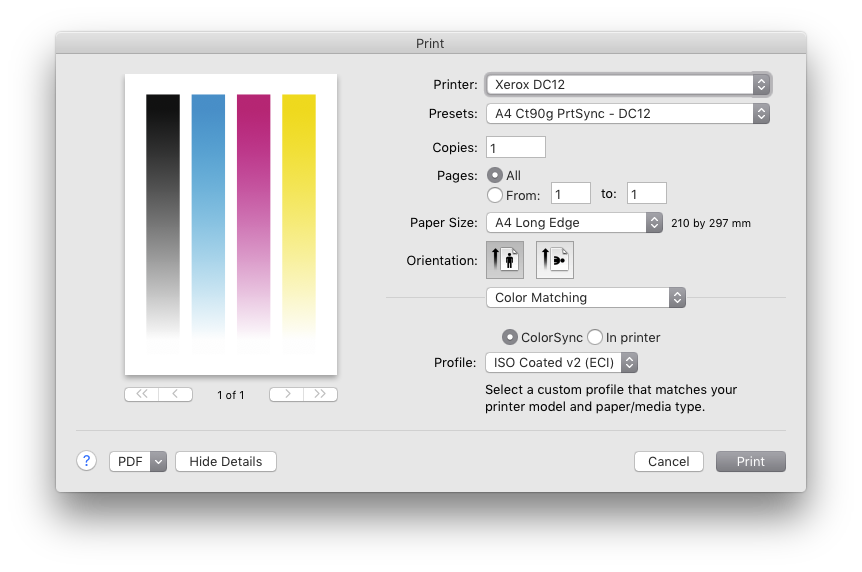
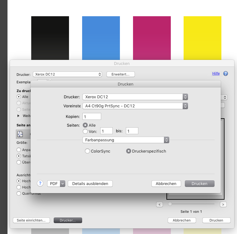
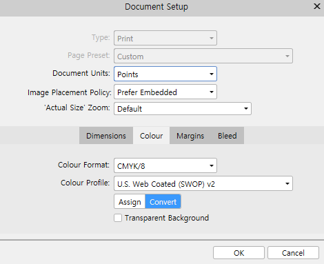
 Greyscale become multicoloured when printing from Affinity Designer. Obviously a conversion to/from color profiles happens inside Designer. How can I prevent this from happening? (This happens to all colours. It is just shown best with greyscale.) My printer expects data in the same colour profile as my AD files working profile. (ISO coated v2 (eci)) When exporting a PDF/X1a and printing with Adobe Acrobat everything is OK.
-
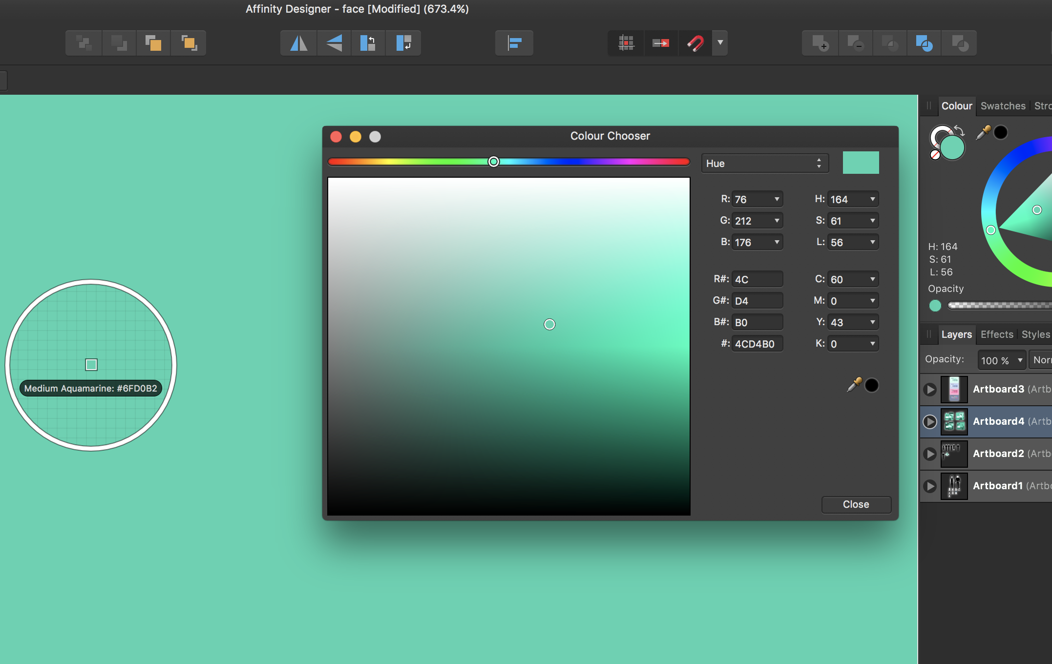
 Hello all, I've been having a bit of a problem exporting and managing colours recently whilst some vector work. It's not something that I have encountered before, but after alot of searching, I cannot find a solution that fixes my particular problem. The rendered colour is not representative of the colour that is chosen in the colour picker. Above is a screenshot of an example. using the tool 'Sip' I can see that the colour is being rendered differently to that which I picked. Below is a screenshot of the same scenario but this time in Sketch and notice that I do not have the same problem. My document and export color profiles are set to sRGB as this is the default for web browsers. Any help on the above will be greatly appreciated.
-
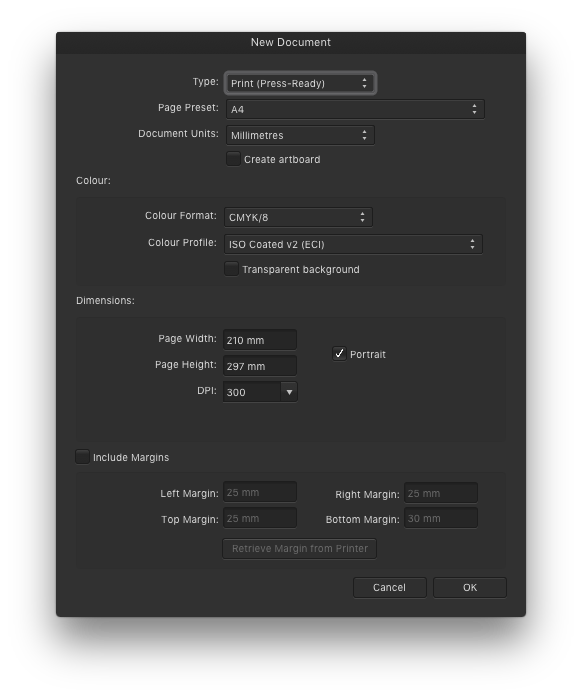
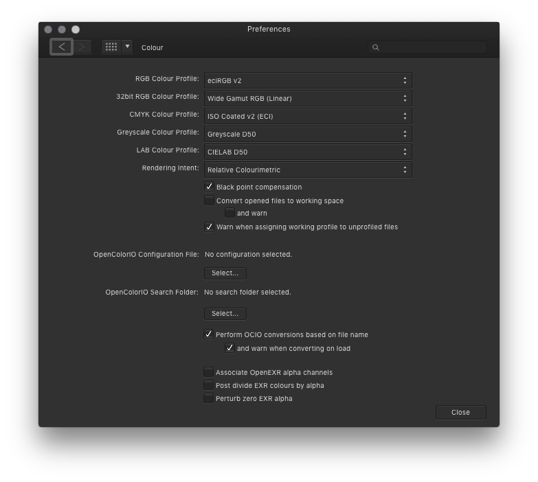
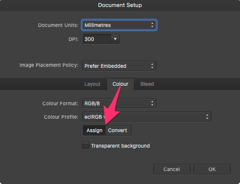
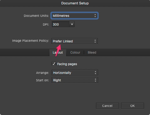
 Hi I would like to have those two settings "by default" for each new documents from presets (or not)… (see screenshots below) I cannot find how ? Can I edit the existing default presets or should I create new ones ? It also seems that sometimes those settings are changing without no reason… I would be nice to have a common synced setting for all three apps (with the colour profile setting of course) Thanks a lot ! (Mac OSX HS 10.13.6 / AF 1.10.1)
-
 I have large images with pixel shapes (representing cells) and each cell type has a certain colour (6 in total, plus black background). I need to rapidly colour-test different colours to find the best combination for visibility. I have not been able to find a solution anywhere, as most such approaches are about defining a recognisable shape and then altering colours - this is about changing many 'cells' across a large image in one go. Thanks
 -
 I make artworks in cmyk color setting and exported to PDF, The colors become Too bright. I don't know why this happens. Can anyone help me?
-
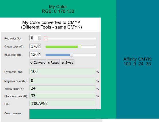
 Hello People, I might overlook something. But I really can't see what I am doing wrong. On the top left, you can see what Color i would like to work with. I was choosing the color in RGB. Because i wanna use this color also for something to print, i wanted to make my color for CMYK. I used for that multiple online RGB to CMYK converters to be sure it's the right one. On the left of the picture, you can see a screenshot from one converter. (The Document was set to CMYK). And now my problem. On the right is what color Affinity gives me when i use the CMYK color code. I also tried the CMYK colors in other programs, they all gave me the correct color which i want on the left. But not Affinity. Is there something I'm overlooking? Thanks in advance
-
I made a commission for someone and it looked fine on multiple monitors. But going to print, the colors changed a lot. The eyes suddenly became purple. I narrowed this particular issue down to the way color overlays are handled. I feel rasterizing the document will fix this, but this is a serious problem. I disabled color management in printer and chose software handling, with the color profile loaded from the manufacturer. Relative colometric. The deep purple was made a lot lighter, but then the totally colorless gray eyes were turned purple. I also had issues making prints on other printers. Can anyone tell me what's going on? EDIT - This is happening in Designer, not Publisher. Can this be moved?
-
Why is the stroke color icon not a Donut like in Designer (Designer image below). I quite have to undo as I've picked the fill color by mistake.
-
 Is there an option or a trick to keep the color whenever I create a new curve with the pen tool. It is a bit tedious to create a curve, add color, create curve, add color x 1000 times, since my selected color goes from color to nothing (as shown in video). It would make my life much more simpler if I just have to create a new curve with the color already selected. JkCWXsb8s3.mp4