Search the Community
Showing results for tags 'Color'.
-
 Hi there, first of all, congratullations for the app. Do you have plans to implement in curves, the option to see the image in background, of the histogram for every color chanel (I dont know i writing it right in english, see the attached image). I think that is imprescindible for a profesional retouching photo app. Thanks.
-
I made some channel mixer adjustments for AD and AP which I'd like to share with you. You can add them to your AP though opening the document, selecting each group, selecting the "channel mixer" adj, so that it's panel opens up, click "add preset". (I've made a feature request to make that easier) You can then access them by the "view > studio > adjustments" panel which is active by default (only available in AP) These are a bit "Instagram like" so please don't overdo it, blend modes, opacity and blend ranges can, and should be adjusted upon your needs for more information about such techniques you can have a look over here https://forum.affinity.serif.com/index.php?/topic/37125-ap-ad-beginner-amateur-pro/ cheers channel mix.afdesign PS: similar presets vor curves are available here PS: similar presets for "LUT" adj. are available here
-
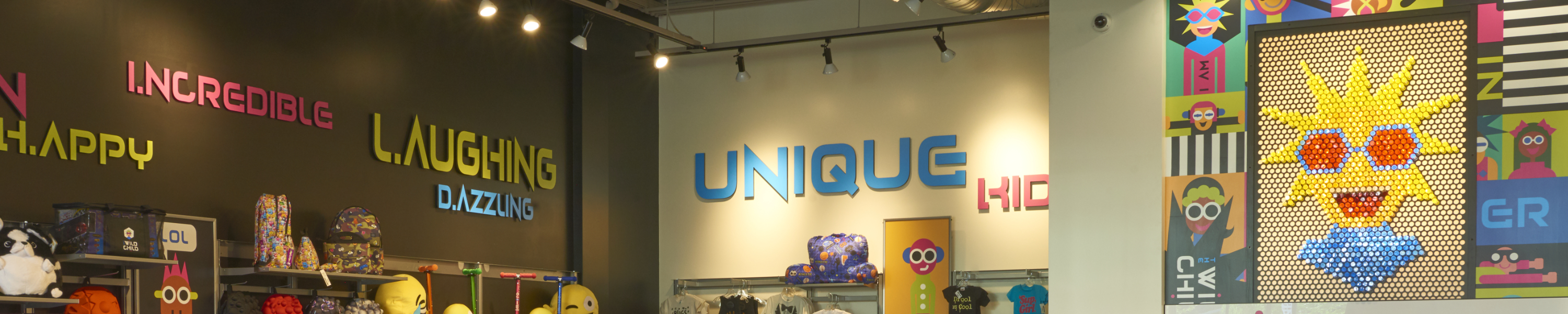
 Ok, figured out how to select an area with the tools available, however, the only adjustment that seems to work is the vibrance. Also when I'm done and deselect that area while selecting another area, the adjustments seem to affect the previous area even though thats been deselected. So basically, there are multiple areas that I need to make pop in this image, lettering and the graphic face on the wall. Suggestions? Please help, working on a clients project.
-
So I have an image where I need to highlight, i.e., bring out the color detail while making that area pop. Basically I have an image that is yellow and blue with already a lot of blue and yellow in the image so if I crank up the yellow and blue it just increases that color globally. Any suggestions will be greatly appreciated!
-
 Hello This is my first post here. I just bought Affinity Photo for iPad and the first thing I tried to do I can't seem to do. I want to use a brush and select a color from the photo. I have the brush tool and see the color picker but cannot see a way of getting the color from the photo. Also I have no idea what the little circular tools are next to the color picker. Is there a manual? Cheers. Martin
 -
 I am not sure what I have done, but colors are no longer displaying correctly. When I enter the hex code, the color should be correct. It is actually lighter than it should be. in addition, the color chooser is not displaying correctly, with the top half appearing to have a white gradient over it, This is the second time this has happened, so I am sure i am changing a setting somewhere, I just do not know what it is.
-
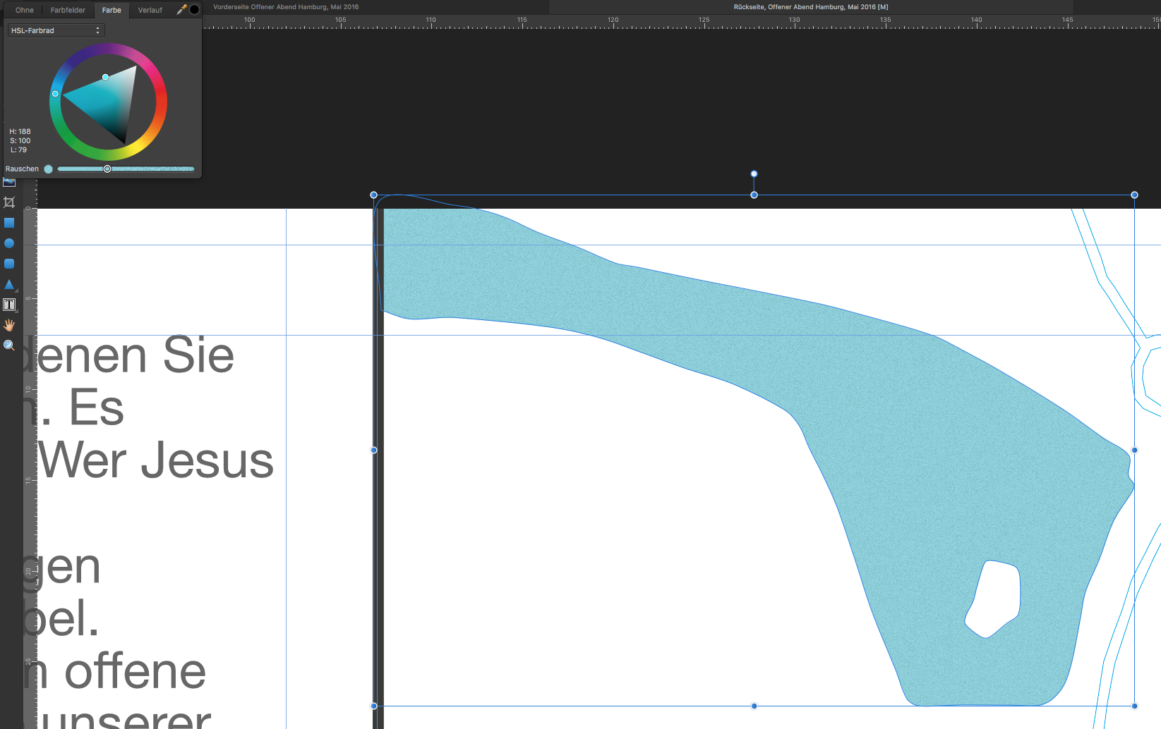
 Hey. I have a shape in a document with a specific fill color (bright blue) with noise. In another document, I have a different document i have a shape that I would like to give the same fill color and also add noise. I filled the shape with the exact same color. Everything looks identical. However, as soon as I add noise, the color shifts towards green. Even if I drag the noise slider to zero again, the color shift stays. Any ideas? I am using Affinity Designer 1.4.1
-
 I ran into something I haven't found an answer for yet. When I imported an image into Affinity Photo I noticed that the color changed slightly once the image was in the program. When I subsequently exported this image the color remained different from the color of the original image. Why does this happen? What can I do to keep these colors the same? Does it have something to do with the color profile settings? Thanks in advance for your help!
-
 Hi, I just did a tradeshow display in Affinity Designer. Back ground is full black and built to a rich black as specified by the output shop. C30, M20, Y20, K100. Using export persona or just the export to PDFx, the rich black information is lost and ends up being C63, M52, Y49, K91 when checked in output preview in Adobe Acrobat. Vendor is flagging file as having to much ink density, and it looks like I am either going to have to redo it in illustrator, or export it to eps and try to rebuild it in illustrator. Any suggestions would be highly appreciated. While I love designer as a purely illustration app. it is things like this and few other missing or incomplete features that give me serious reserve as using this app as a professional production tool.
 -
 I've noticed that the Color Picker Tool does not seem to impact other tools as i would expect, for example the Color Replacement Brush. Am i doing something wrong?
 -
I've already posted this in Questions & Feedback but since it doesn't seem to be implemented yet, I'm adding it as a request. For example, I have a square which only has a fill color (no stroke). If I click on another shape, let's say a circle and I'm changing it's stroke color, when I click back on the square, I would like the color panel to auto-select the fill attribute (since it's the only attribute the square has) instead of keeping the stroke attribute selected (from the previous change). My logic is that I would want to change it's color rather than add a stroke to it. This way would eliminate an unnecessary extra click and speed you up when you'd have to repeat the action several times.
-
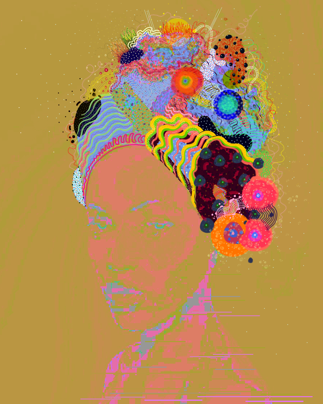
"Queen of the Coral" Affinity Photo Digital Illustration Instagram - @chaos3rdeye Website- www.chaosabzu.com Stay tuned for more!
-
 Hi, finally the moment has come that I have to ask for your help. Untill now I have always managed not to take your time, but now I am simply stuck. I am trying to make an HDR using 3 perfectly aligned photos of different exposures... Ususally I have no problem in doing that but in this case the result is terribly "posterised". Below are the source photos, and two results - one with all merge options unchecked and one with all options checked (by options I mean "align" and "remove ghosts" etc.). Does anyone have any idea of what might be causing such behaviour?
-
1. It will be nice if you can change the color stroke with the right click on the color panel 2. Allow Left Click and Right Click to be used in Keyboard shortcuts combinations
-
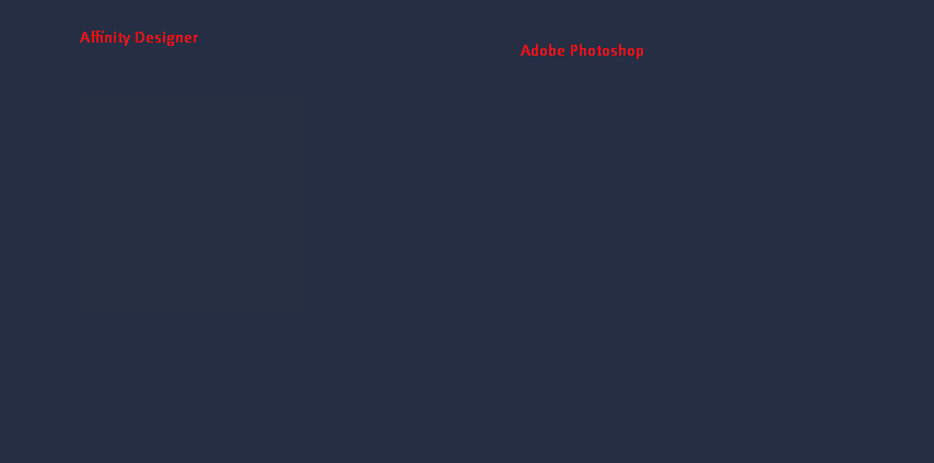
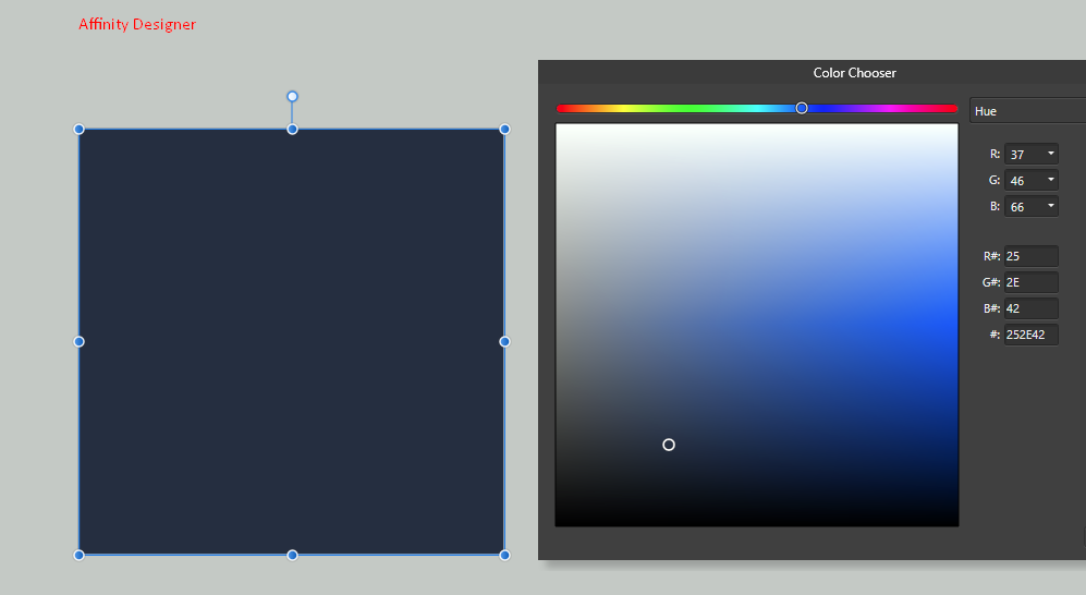
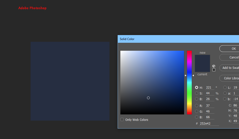
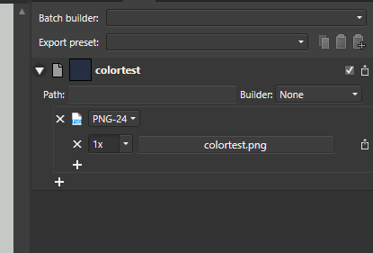
 I'm having an issue when exporting .png assets from Affinity Designer for use in a website. When Chrome (on Windows) displays the .png image, the color does not match the HEX value I've assigned in Affinity designer. Here's a quick example of a square that I made both in Affinity Designer and in Photoshop. Both have a hex value of #252E42. I embedded them both next to each other on a HTML page that also has a background-color of #252E42. I've attached the result. As you can see the rectangle exported from Photoshop is completely invisible, which is exactly what I expect. But the rectangle from Designer is clearly visible. What is going on here? Do I have to change some color profile settings in order to make this work?
-
 This question hasn't been asked since mid 2016 so I thought I would ask again mid 2017. Can we select same fill and stroke colour in Designer like you can in illustrator. This is a pretty important feature in my opinion, one that I use on pretty much every file I work on. Thanks.
 -
Hi guys and wonderful Moderators, I know it's been probably said in a few posts but I'd like to list some of what I think are a few of the most needed features in AP. 1. refine masks uusing levels and curves, this is the most important thing, I'm not talking about refine edges or similar, I'm saying that once you created a mask to have the possibility to open a curve or levels adjustement for that mask to refine its range, as things are now we are pretty much stuck with the mask as it is at the moment of creating it, I just refuse to believe such thing is not available in AP, it's a foundamental feature, I mean AP has equations, EQUATIONS!!! and we can't put in this feature? 2. Some sort of luminosity masks panel, YES I'll ask for it for as much as it takes, even if it means having you put one in out of desperation for not having to read my every post about it. And I mean a full fledged LM panel, not the select midtones/shadow/highligh thingy, I mean a zones system/varying degrees of shadow/midtones/highlight selection though masks maybe. Seriously the channel way of doing it manually as it is now is cumbersome and uneffective, resterize layer to mask? really guys? nice feature but let's just step it up. 3. color picker when using the HSL tool 4. More color selection well...selections, blue, red and green are not enough really, maybve axpand to yellow, cyan, magenta. 5. slice tool to percentage or exact slices, as of right now I find the slice tool really...casual and amateur, would be nice to tell AP to: 'slice the image in 3 part vertically', insted of the free hand tool, which is pretty much useless imo. 6. suggestion for 3 filters, one is the tonal contrast equivalent, would be nice and save a lot of time having some sort of tonal contrast in the live filters, baybe a dynamic brightness too. your glow filter, nice idea, but poorly implemented all it does is blow out the highlight, maybe making it s that it protect saturation and luminance in some way, that's be nice. 7. create a panorama out of the opened files, same goes for hdr, it's really bothersome having to export all images before having AP create a new pano. 7 1/2, come on guys, let's just have an 'align layers' option, I don't know if i'm doing somehing wrong but stack create stack in the arrange panel doe snot align anything if you're not opening a brand new set of images, we need to align layers in an opened file. Thank you guys for this platform in which you allow us to give suggestion, I know i may sounfd just like the usual run of the mill whyny customer, but I do complain because I believe in this software and its possibility. Seriously though, take into consideration these suggestion, let's not just trail behind Photoshop, let's make a clear jump foreward.
-
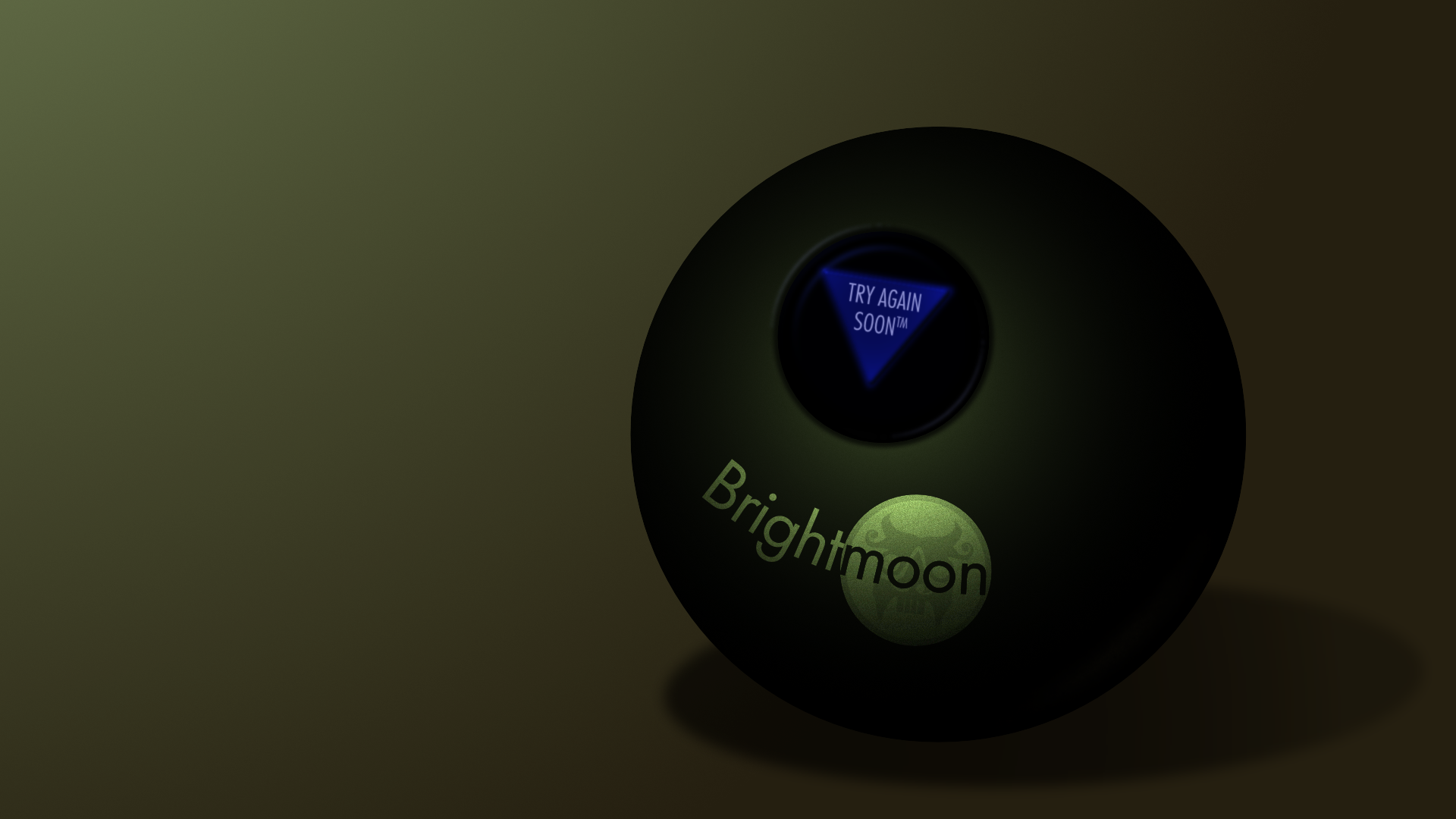
 Twice now I've run into an issue where trying to export a png with Affinity Designer results in a posterized reduction of colors, and I cannot find a setting to avoid this. In my current piece, it resulted in obvious banding of the gradients, and the reflected light being lost entirely. However, if I save the file as psd, then open that in Clip Studio Paint and save as png there, I get accurate colors and no banding. The first file is the png as saved from AD, the second is the png from CSP, and the third is the original afd so you can check and see if there's anything weird about it. Brightmoon 8-ball.afdesign Is there something I'm missing on export to prevent this issue, or is it a bug? Also, I've tried copy-pasting layer styles a few times, but it's prone to changing the values on paste--generally about double or half (i.e., 7px gaussian blur becomes 13.8px). Is there a way to prevent that, as well?
-

AP Win - Solid color adjustment layer
fotojindra posted a topic in Older Feedback & Suggestion Posts
I would like to have the "Solid color adjustment layer".... the Pixel layer does not cover the feature as well as this layer would - eg. in Groups of adjustment layers, I have problem with adding a pixel layer. Also it is faster to work with it..... or did I just miss it somewhere? Thanks Jindra -
Hola a todos los que hablan español. He estado trabajando en una forma para usar el filtro aplicar imagen de Photoshop y los rangos de color con los que se crean mascaras, en affinity photo y encontre una manera de hacerlo y quiero compartirla con ustedes con varias macros que he creado, una para aplicar imagen y otras tres para hacer la selección de los colores CMY que no estan disponibles en affinity photo ya que solo permite seleccionar los rangos de color RGB, luminosidad, medios tonos y sombras pero no CMY. Como usarlos 1. Importar las macros 2.Con la imagen seleccionada clic en la macro de aplicar imagen 3.Se abrira una ventana con unos deslizadores para ajustar los parametros de la mascara creada, estos permiten mostrar mas o menos partes de la mascara. 4.Clic en aceptar y crear una capa de ajuste como curvas y arrastrar la mascar creada dentro la capa de curvas como una capa hija (child layer) 5.Ajustar los parametros de curvas para afectar las areas deseadas. (Se pueden usar otros ajustes). 6. Disfrutar Para usar las macros de CMY, aplicar la macro a la imagen para seleccionar el color deseado y con la selección activa abrir un ajuste de curvas o el que quiera y automaticamente creara la mascara del color dentro del ajuste y mover los parametros. Esto se usa para aplicar un ajuste a areas concretas de la imagen como el cielo solamente o como alternativa a las mascaras de luminosidad para hacer HDR. Selecciones CMY y Aplicar Imagen.zip
-
- 5
-

-
- rangos de color
- aplicar imagen
- (and 1 more)
-
 See the title! Whenever I try to apply a color from my swatches to text, or a shape, or curves, etc, instead of changing the fill, a stroke appears on the item with the color I'm trying to fill with. This wasn't happening before today! I'm not sure I changed anything, although maybe I hit some hotkeys by mistake without noticing. Cheers!
 -
 Hi! I am a professional designer that has always loved Adobe Illustrator and primarily work in vector. However, I detest Adobe's new subscription model and am very attracted to the price and reviews of Affinity Designer. I downloaded the trial version last night and tried watching You Tube & Vimeo tutorials, but could not find anything like the Magic Wand Tool. I use this tool every single day and cannot live without it. Am I missing something? Is there not a way to select all of one color? The color selection abilities seemed very elementary and more similar to Photoshop which I'm not digging. I was also having trouble dragging over a group of elements to select and Group. They would not select. In my AI files, they were already grouped, but for some reason became UnGrouped when imported into Affinity. It will take me FOREVER to go in and manually click each little vector detail. Help! -Lauren
- 3 replies
-
- 1
-
-
- magic wand
- magic wand tool
- (and 3 more)
-
 Is there a way to keep a swatch name when creating a palette from a document, All colours that are created have the document file name followed by a number, Not easy to identify when colours are similar to each other.
 -
 Will Affinity Photo and/or Affinity Designer be able to use the new color fonts that are starting to become available? So far they only work in Photoshop CC 2017. https://www.colorfonts.wtf
 -
I made some LUT adjustments for AD and AP which I'd like to share with you. the attached Affinity file features embedded documents so that you can easily preview the effect of all curves on a single photo and then choose a curve that fits best/ gives you a good starting point/ idea. You can add them to your AP though opening the document, selecting each group, selecting the "LUT" adj, so that it's panel opens up, click "add preset". (I've made a feature request to make that easier) You can then access them by the "view > studio > adjustments" panel which is active by default (only available in AP) please don't overdo it :) blend modes, opacity and blend ranges can, and should be adjusted upon your needs :) for more information about such techniques you can have a look over here https://affinity.ser...er-amateur-pro/ LINK https://www.dropbox.com/s/wu96yk0j03kb0h0/MBd%201LUT.zip?dl=0 I really like the "Technicolor" one :) PS: similar presets for the "channel mixer" are available here PS: similar presets vor curves are available here