Search the Community
Showing results for tags 'Color'.
-
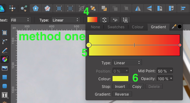
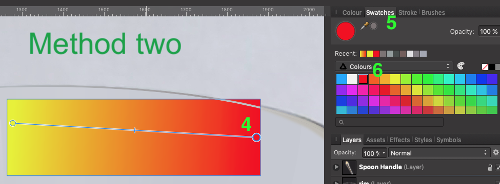
 I struggle to create gradient fills easily and efficiently. Here are the two methods that I use, and perhaps the only way. I'd be curious if someone out there has another method. Method one: Create object select "G" on the keyboard draw gradient Select the Gradient color box at the top toolbar make active a node on the gradient line select color from colour box Repeat steps 6 -7 for each node in the gradient line. Method two: Create object select "G" on the keyboard draw gradient Select the node in gradient bar Select Swatches tab in the docker on the right Select color in the Swatches pallet. Repeat steps 5 -6 for each node in the gradient line. Suggested Improvements: A) What I would like to see is the ability to double click on the color node on the object itself, not the node from the methods above, and by double click the node a swatches pallet opens for you to make your color selection. B) Another option would be to select color node, select the eyedropper in the tool bar and while holding the Shift key down select the color you want applied to that node. This method is great for sampling color from other drawings or reference images. I appoligize if there is another method alreay in place, I just haven't come across it yet. Thanks in advance. -Bill
-
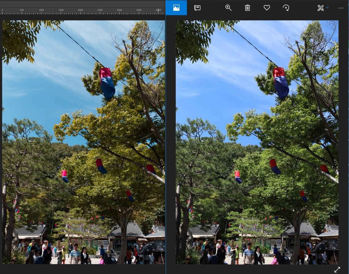
I'm getting the opposite effect with 1.7.0.145. Inserting hi quality JPGs on a page and using Print to file/sRGB IEC61966 2.1/Adobe/Distiller/ and the resulting PDFs are too hot, but the images look OK in Affinity. Especially when it come to reds and blues. Colour test photos.pdf
-
 Hi, how can I see the hexadecimal code from a selected color on my Affinity Photo/Design on iPad? Is it possible? I can't find on forum and on tutorials Thanks
-
 Hey there fellow affinity users. i have a simple question regarding Affinity Designer. Is there a a way to either copy a a color gradient or if possible to save it to use later? I typed out some text, went to fill and changed the color to a gradient that goes from light blue to pink. then i realized i need to use it again and i don't know how to copy it. i cant remake it because it wont be the same... Also if possible it would be nice to maybe save it as a custom one if possible to use again down the road..
 -
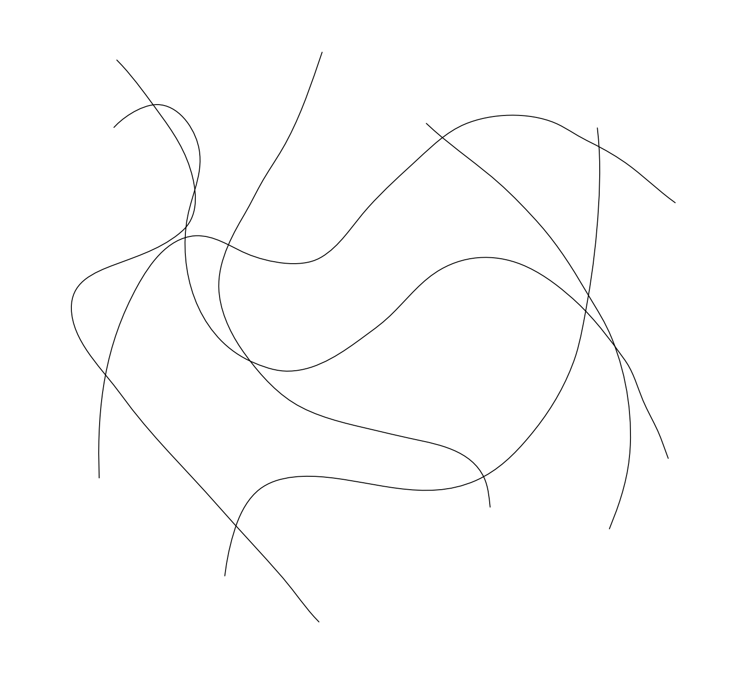
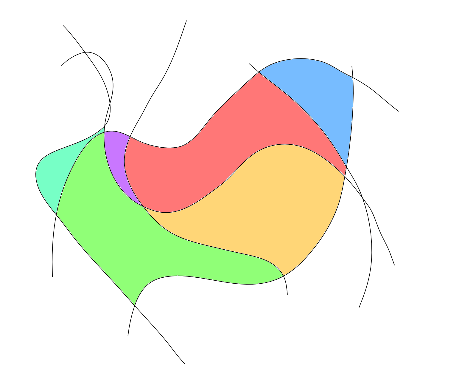
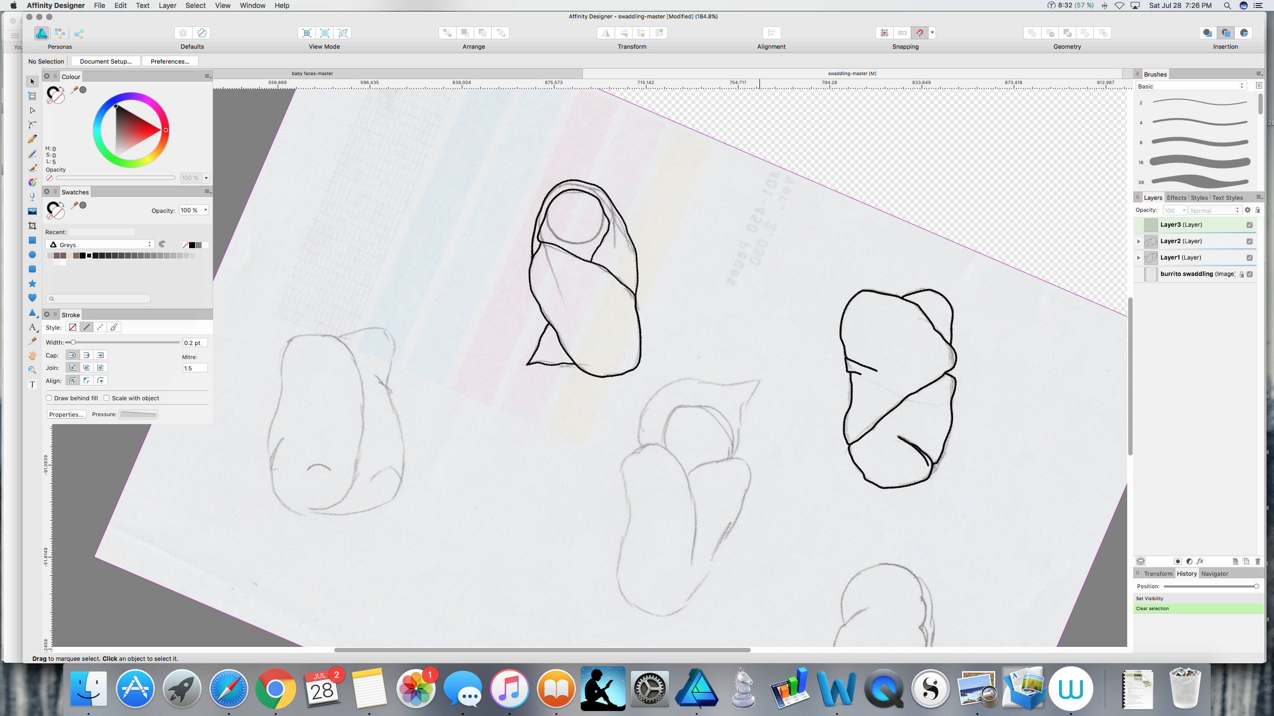
 The image below shows some curves I drew with the pen tool. How would I go about filling in the space in between each curve with a different colour? Here is an example of what I need: All help is appreciated. Thanks, Dan
-
Hello, A feature that I would like to see in Affinity Designer is that of a "color scheme generator" of sorts - or at least a color guide that displays color harmonies (with tints and shades of each color). This guide would let you pick a color, and then would generate colors in different categories that would go well with that color (i.e. analogous, complementary, split complementary, etc.) If this is not yet available, I think it would be really helpful. Thank you!
- 5 replies
-
- 2
-

-
- color
- color scheme
- (and 1 more)
-
 Hello, support team. I using affinity photo ver.1.6.5.123. And My camera is Canon 6D mark2 with EF 24-70L II Lens. Today I tooks a photos there and I connected my computer. Then I saw not match colors about Affinity photo with Windows image viewer. I like Windows Image Viewer's colors. Q1. Why I see this situation? my setting trouble? 1) I checked RGB color profile (sRGB, 32bit: sRGB) 2) I tried change Adobe RGB profile and restart my computer. 3) I checked a color profile (sRGB) of Monitor hardware profile on Windows OS. Q2. How to see a colors of windows image viewer when I start Affinity photo program. Please check my attach. (left : Affinity photo / right: Windows Image Viewer) CR2 original RAW files. Thanks. IMG_5564.CR2
-
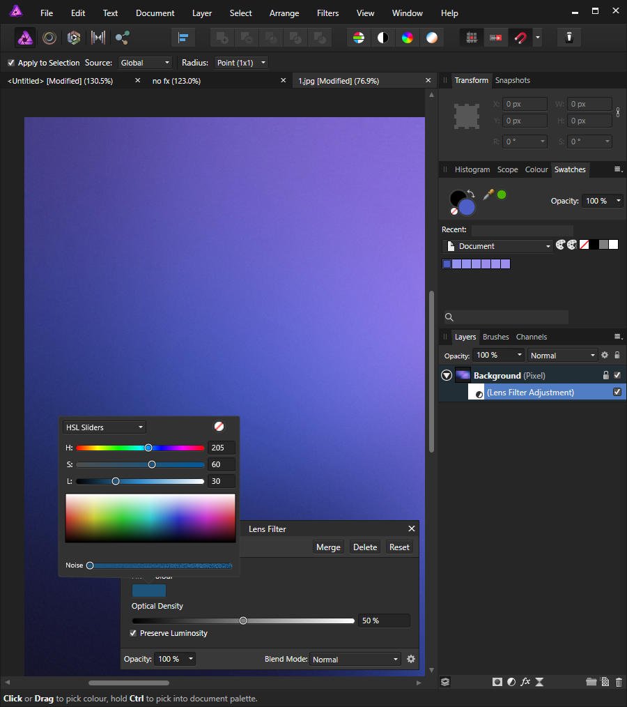
 Hi, It would be really helpful if you guys add the Eye-dropper to the color picker panel of the Lens Filter adjustment layer. Thanks!
-
 I created a custom system color pallete. In the table color pickers (text, border and fill) when I go to the pallete list the custom one appears repeated multiple times (but multiple by a lot). In the normal color pallete works well, it happens only in the table color pickers. Procedure: Create a new system color pallete - create a table - choose the custom pallete from the table context menu color pickers
-
The edit swatch pop-up pallete shows sliders and samples in RGB when in CMYK mode. The regular color pallete works fine.
-
Looking for a color replacement tool. Here's my scenario: I import pdf file vector graphics from a music notation software. Unfortunately this program is unsuccessful in exporting cmyk-colors which are absolutely needed for print. With Indesign I could search through the whole document including all linked PDFs and replace any specific rgb-color with a cmyk-color. I'm totally not a fan of the subscription model of Adobe, so this feature would make me switch to Affinity Publisher. I'm already using Designer and Photo since Day 1. Replacement presets would be killer. Any chance that's a future feature?
-
 In a new CMYK document a frame text appears as black by default. That's fine. Unfortunately this Black appears in the cmyk slider view of the color pane not to be = 100 K but mixed 87 C + 78 M + 65 Y + 93 K, which additionally is a rich Black with 323 % print color. This complys to the default Black definition of an RGB document. Any chance to fix the default Black for all CMYK documents to 100 K?
- 11 replies
-
- 2
-
-

-
- cmyk
- default black
- (and 1 more)
-
 I had created a text box and I would like to fill it with a color and even change the stroke. If this option already exist it will be great to learn how to do it, otherwise, it can be an interesting implementation because this will avoid an extra layer as a background for the text.
-
 In PS there is a function called the Fill Mode. It is different fro Opacity. What is comparable in AF?
 -
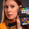
 hello! I have to shoot some paintings for a friend and therefore I would like to use a greycard or a colorcard to get the colors identical to the painting. but I can not find any tutorial or hint how I handle this in AP - maybe you can help! Thanks Andreas
 -
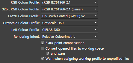
 Hi.. I use this document setup: type: print (press ready) color format: cmyk/8 color profile: U. S. web coated (SWOP) v2 But I have some issues, when I choose the color on the box, and I pick that color with "color picker tool" to coloring another object, the result is totally different, only cmyk code is the same. Yes I can just copy the #xxxxxx code to coloring another object, but I want to use that color picker tool because it's simple. And the client usually use AI to open eps file, I tried to export my files from affinity to eps file, and open it in AI, and yes the color code is changing, I'm confused :p Please help me to solve this issues. Thank you for your attention :)
-
 In various other graphics editors it is possible to blend to shapes. For example you want to blend a red circle with a blue rectangle. I imagine this function would look like this in this imaginary function in Affinity Designer: You place the red circle and the blue rectangle on opposite sides of the document. You want the blend to rotate 360° and you want the blend to arc through a specific point on the document. You select the red circle and blue rectangle. You drag the "rotation center" to the side were you want the blend to arc. You type in 360 degrees in the blend tool dialogue box. You type in number of iterations, let's say 20. Then you hit the "Blend" button. Between the red circle and the blue rectangle there are now 20 shapes arcing between the two original shapes. Each shape - moving from the circle to the rectangle - becomes more like a rectangle, and vice versa. The color changes with each shape in the entire spectrum between red and blue, and the shapes in the arc rotates from the circle to the rectangle 360 degrees (negative values would rotate the shapes the opposite way). Maybe it would also be possible to outdo the competition by making it possible to do more color combination along the arc/path. Maybe it would also be possible to place more "rotation centers" - points through which the blending would take place.
 -
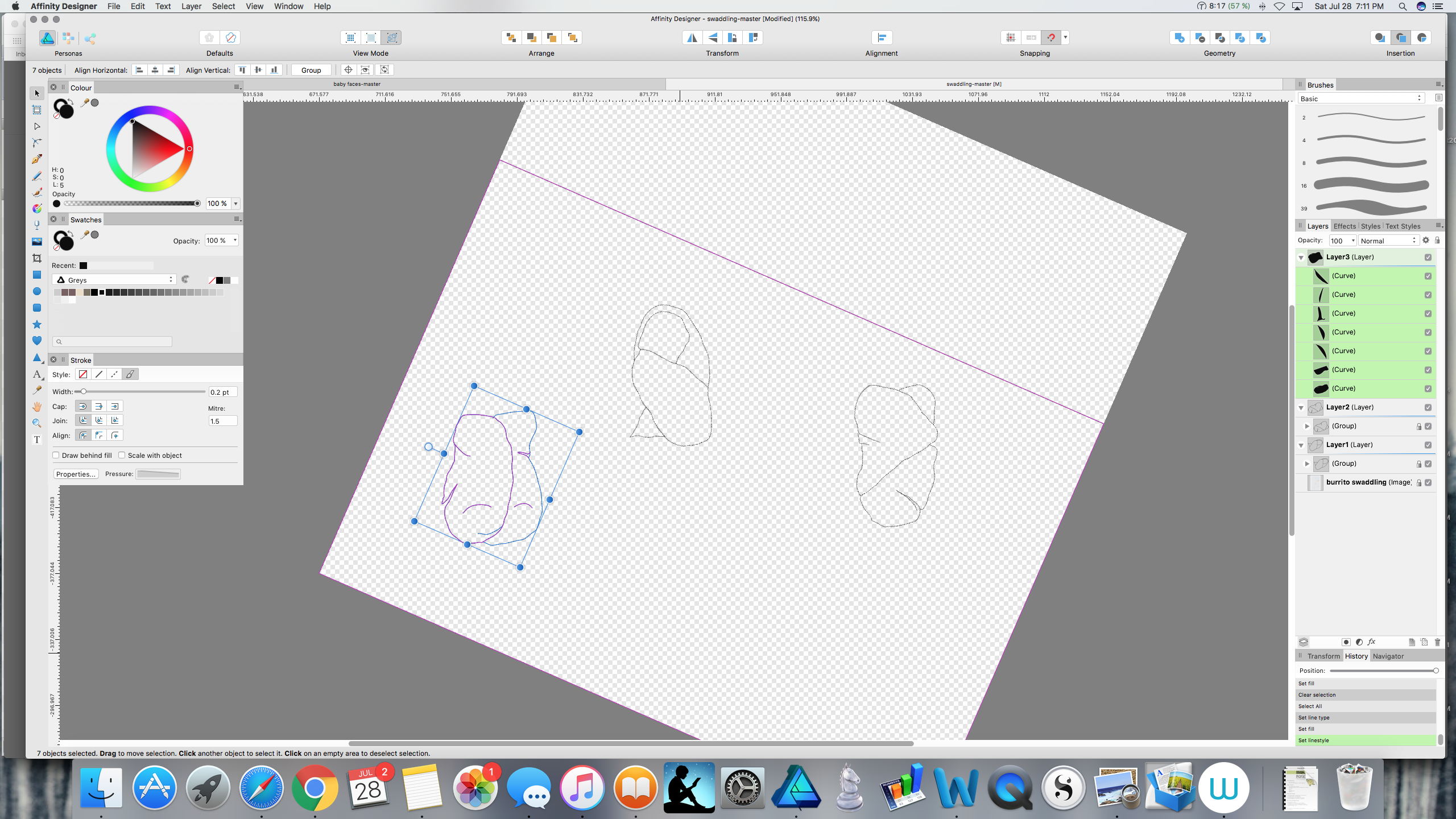
 Can anyone tell me what keeps happening to my pencil strokes, and what to do about it? I am drawing using the pencil tool. The thick black stroke in the first image is what I have been using, and it is what I want. However, in the middle of drawing something (in this case, I was tracing the shape that is on the bottom left of both images), all of a sudden all of my strokes disappear (compare images below). The pencil lines are still there, but the thick black part is gone and I'm left with just the thin blue selection lines (not the selection box; I mean the lines that make up the curves themselves are now just thin blue lines). And I don't mean just on the particular curve I've been working on, I mean when this happens every stroke in the document (even on other, supposedly locked layers) has gone from thick black lines to almost invisible thin lines. When I check the stroke settings—brush width, size variance, solid line style, etc.—none of them have changed, but my nice thick black lines are still gone. Changing these settings has no effect, and undoing has no effect—I can undo all the way back to the point at which I first drew each line, and they are still thin blue lines the whole time, not thick black ones. This has happened to me in two different documents so far, and because I can't find a way to fix the lines or undo whatever happened, I have had to start over from scratch, which really blows. Does anyone know what I'm doing wrong and how to fix it? I've searched the forums and tutorials for help but haven't found any info. If you reply please have mercy and use laymen's terms. :) I am very new to Affinity Designer, and to graphic design programs in general. Thank you very much.
-
 Hi, I'm working on a file at the moment and suddenly the colours won't change in it. I'm selecting everything properly and using the eyedropper and nothing is happening. Again, this isn't an problem with selecting objects. It literally only happens in this one file. Perhaps I've selected something I shouldn't have? Thanks for your help.
 -
Hi there, I am following the official tutorials and they say gradients are also automatically filled in recent color menu too, not only the solid ones. But in my palette there are only solid colors are automatically filled, like screenshot i’ve attached. Am I doing something wrong?
-
 Hi there! I'm astonished with Affinity Designer for ipad! I'm almost completely transitioned from my PC to iPad, just need a few more options. Suggestion #1: Select BY SAME FILL COLOR This is very important for professional work :) For example, if a group of objects (or shapes) are overlapping, what we need to do is to select them all, and divide them. After they are divided, we need to click on "Add" to merge the shapes together, and that's fine. But if we have a LARGE number of SMALL shapes, merging one by one can take forever.So, option "Select by (the same) Color" is very important and time saving for us designers. How I think it should be done: Solution 1. Click and hold the color (from toolbox) with pencil, or with finger, and while holding it select (with your left hand) three dots icon "..." and then choose "Select all" Solution 2. Add a new icon named "Select Same Color", or similar. Suggestion #2: SHAPE EFFECTS For me, as a Vintage illustrations and Logo designs fan, I would like to have a ARC LOWER, ARC UPPER, AND (possible) ARC tools. For example: Netflix logo. How I think it should be done: 1. After typing "Netflix" for example, convert curves, and than click on new icon set named "shape effects", than click on "Lower arc", or "Upper Arc". OK, that's for now, If I missed these options, if they already exist in same/similar form, please let me know.
 -
 Hello! Please have a look at the following image: https://drive.google.com/file/d/1O8yEvxtFKmYVeJZn5QgdxLKUXv_eRsdO/view?usp=sharing It's a low-res artwork of a neuron, often found in scientific contexts. The left part is the original image, the right part is the original image where black has been replaced by white (so that this image can be put on dark backgrounds). The right part is also the result of Photoshop, where I've simply used "Replace Color", chose full black to be replaced by full white, tweaked a little bit with the tolerance, and that's it. I'm having trouble getting the same result with Affinity Photo, unfortunately. I think the fact that the image is basically low-quality makes it a little bit harder. The goal would be to replace the black stroke with a white one, but leave the red color inside exactly the way it is, just like Photoshop did. Here's my first naïve approach using Curves: https://drive.google.com/file/d/140_HbrpTRi7PwpjuwgKQmbqCb6zA78k9/view?usp=sharing As you can see, I can keep most of the red color, but I'm getting some chromatic abberation around the red circle (why?). Second approach, using Gradient Maps: https://drive.google.com/file/d/1AwJtaEAy58O-O0ZWMno89S0sLIc1xbpC/view?usp=sharing The problem here is that I have to hit the same shade of red of the original image at any specific value point, which means I'm recoloring the red circle unfortunately. Any other approaches I missed, and which I could learn? I'd greatly prefer a non-destructive way (compared to Photoshop's) and keep using Affinity Photo/Designer (as always), so I'd be thankful for any help! Affinity Photo's Color Replacement Brush doesn't seem to work at all, it will try to do this: https://drive.google.com/file/d/101TrlMsApn2OfKwgkvKsM1bTs8M9-eEk/view?usp=sharing
 -
 In Affinity Designer Hi, How do you select a part of some fonts to change the color? For example I have the word "WATER" and want half of it horizontally at the bottom white and at the top blue. Thanks! David
 -
For certain photos like street, casual wear, but also sometimes for portraits, I tend to use matte color effects if those shots have to underline some more urban style. It is an easy task to apply some matte color effect to your shots, though if you need it quite often a reusable macro is the way to go for this. - Here is one adjustable matte color macro for Affinity Photo, which you can reuse for such matte effects for either color or b&w images. BEFORE AFTER LAYERS This macro creates three layers for you with corresponding layer masks: A curves adjustment layer which applies the main matte coloring to the image, which lowers contrast and flattens blacks. You can use the mask (draw with a white/black brush) to exclude/include specific areas from the matte color. For example you could exclude in portraits the eyes from being matte here etc. A contrast boosting layer which allows to give back a little bit of the contrast lost by the matte color effect. This is as default a copy of the matte layer with an applied soft light blending mode and half lowered opacity. Again you can use the mask to remove or reapply certain image areas here. Finally a desaturation layer which can be used to lower the saturation of possibly still too bright colors. You can use the mask here too in the same intended way as before mentioned for the other layers. THE MACRO matte_color.afmacro Matte color.afmacros
- 2 replies
-
- 8
-
-
- affinity photo
- matte
- (and 2 more)
-
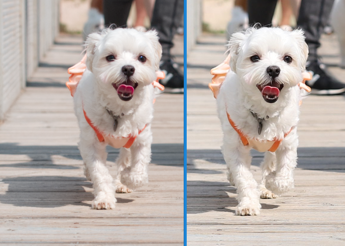
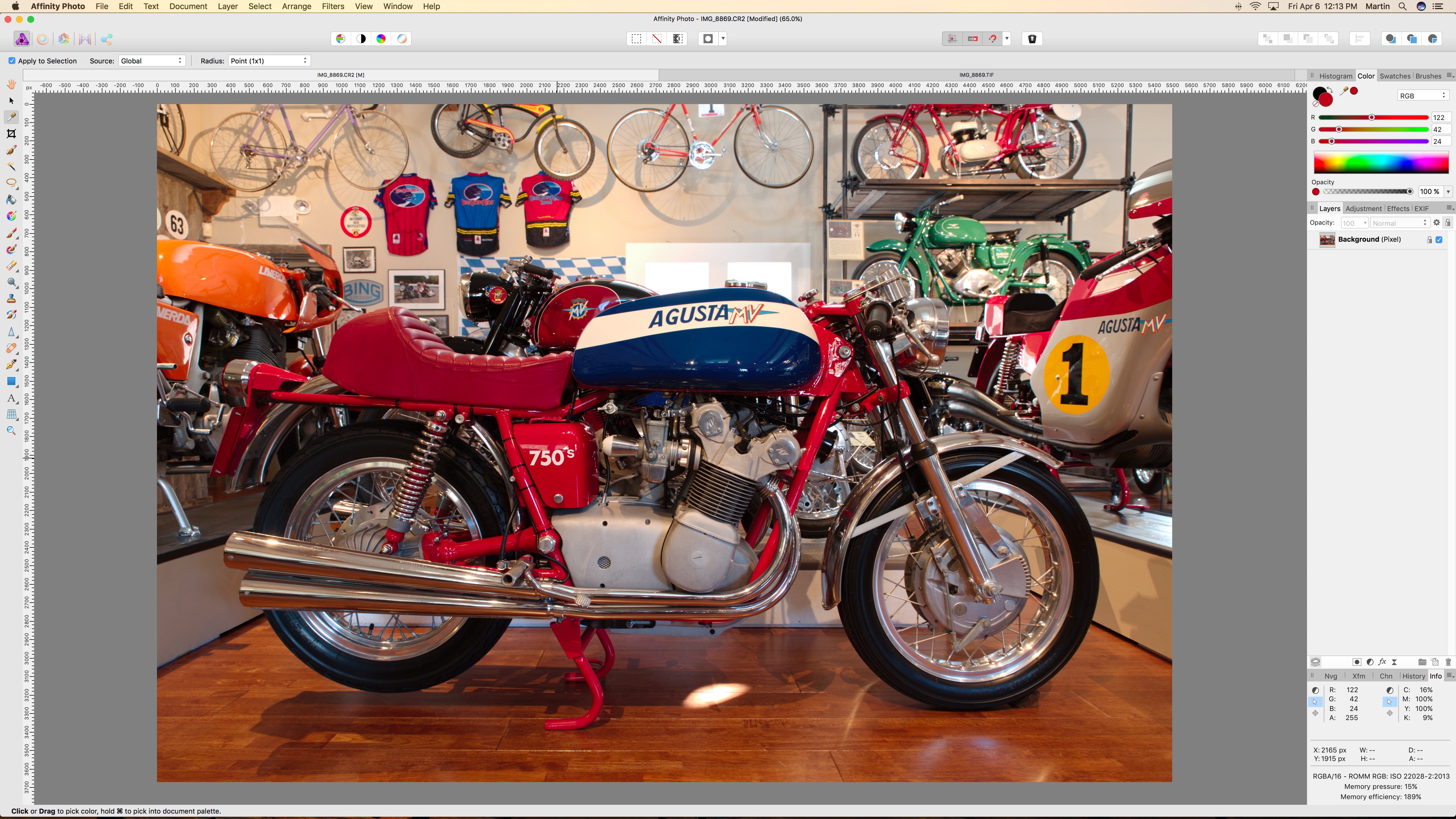
 I’ve been having an issue with the way AF renders the colors in Canon CR2 files compared to Canon’s Digital Photo Professional. I have the tone curve turned off in the Develop Assistant and am using the Serif Labs RAW Engine. I’m using these settings to enable me to have lens correction since I’m using a Tamron lens which Canon’s DPP doesn’t support any corrections. And I can’t disable the initial tone curve in DPP which limits my dynamic range. I’ll attach screenshots of 2 images, one converted by Canon’s DPP, the other by Affinity Photo. You can see the obvious color shift, especially in the reds. When I put the eyedropper inside the zero of 750s on the side cover I get these values. DPP R=222, G=4, B=3. With AF I get R=188, G=0, B=24. I’ve tried using the Selective Color adjustment and can get the red close by setting the Red channel to Cyan=-100%, Yellow=+35% but the other colors are still off and difficult. Is there any way I can color match to the Canon DPP colors? They are accurate to real life.