Search the Community
Showing results for tags 'Color'.
-
 This is so frustrating. When I create a new document, AD insists on managing my colors. Why? Why, why, why?! My monitor is properly calibrated and the system (Windows 10) driver manages the colors. But AD thinks I want it to manage the colors, too. So, after carefully choosing the right look, and exporting the image to SVG or other format, the result looks disastrous. Why is AD doing this? And how do I turn it off? There seems to be no way to turn it off. There is a myriad of options for a profile, but there is no do nothing option.
 -
 Dear Affinity-Community, I hope you can help me in this case ! I created a flyer using Affinity Designer. Colors are CMYK (ISO Coated v2 300% (ECI)). For this flyer I have approx. 50 photos of leather watch straps, where the color is one of the most important things. I edited these photos in Photoshop CC and they really looked fine in PS CC (also CMYK !). The colors are very rich and deep if you are looking at the photos in Photoshop CC. Then I exported the photos from Photoshop and saved them as PNG (CMYK / ISO Coated v2 300% (ECI)). Also the image looked fine when I opened it at the preview on the iMac. But as soon as I import this image to Affinity Designer, the colors are very very pale ! I hope you can help me get this problem under control. Thank you in advance ! Best regards Lucas
 -
Hey everyone i have found there is a great stand alone app on the web that's can be helpful to all designers and photo designer. it's called ColorWell. it's works very well and help generate palettes of color for a project on the go like the Adobe product doest but the must is that this software works offline. it's may help for demanding peoples when you can't results you want with the functionality already implemented in Affinity Designer. i myself work with both solution they help balance and do a better job of color choosing. Though this may help someone out there
-
When will real color blending is coming in ipad version . Because that mixer brush doesn't do it. It's just smudges the Colors not blending them like photoshop.please work on this feature
-
 EDIT: There is an apparently related issue with RAW files. --------------------------------------------------------------- Original clueless question Is this a setting? a bug? I am baffled. But here is the problem: in the photo below you see the Windows 10 Explorer's preview of a photos I took. I looks like the photo in my camera, and like the lighting when I took it. it also looks like that in every editor I have including photoshop. The problem is when I open it in affinity. I ahve no Idea where to go with this. How could I possible color correct it? What is this that I am looking at?
-
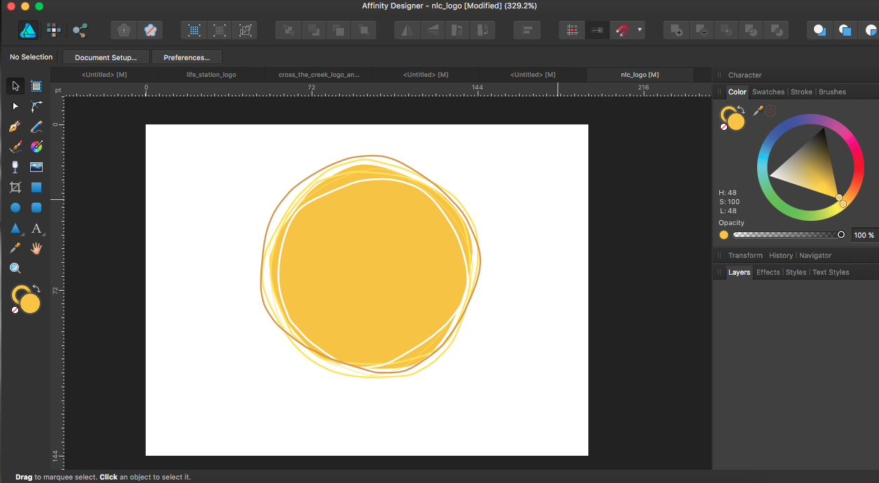
 Hi guys, For example I have a green circle, that will act as a clipping container. I add 3 other object inside this green circle, with clipping. How can I change the green circle's color without unclipping the other objects? I tried, but I can't seem to be able to. Thank you
 -
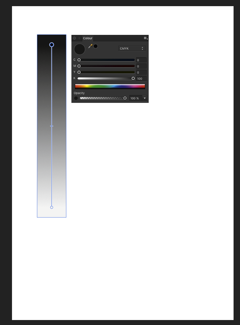
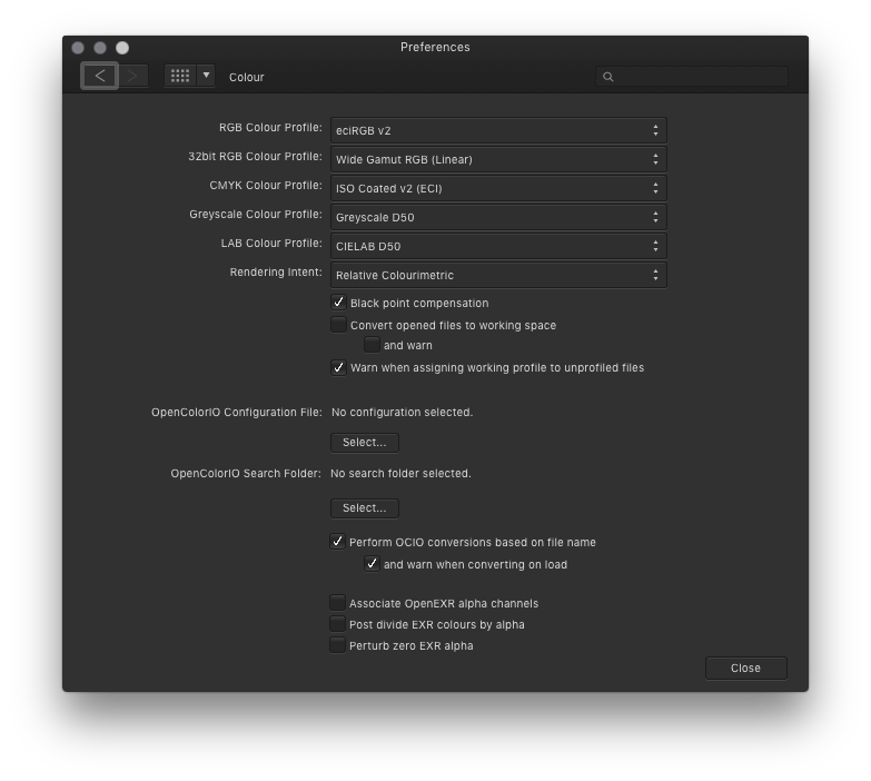
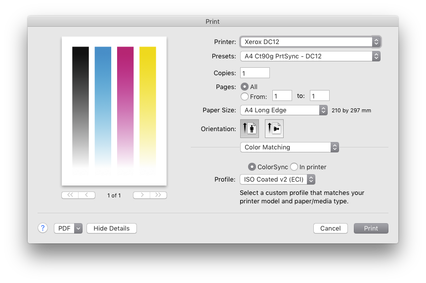
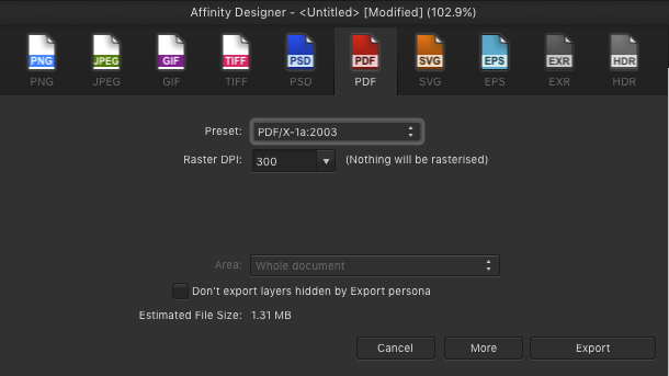
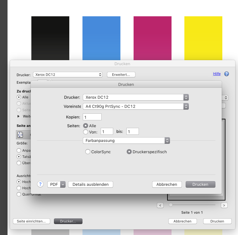
 Greyscale become multicoloured when printing from Affinity Designer. Obviously a conversion to/from color profiles happens inside Designer. How can I prevent this from happening? (This happens to all colours. It is just shown best with greyscale.) My printer expects data in the same colour profile as my AD files working profile. (ISO coated v2 (eci)) When exporting a PDF/X1a and printing with Adobe Acrobat everything is OK.
-
 Currently in Designer it's really annoying on my eyes when I'm using artboards, and the viewport frame turns from a nice dark grey to a (comparatively) glaring white. My eyes might be a bit more sensitive than usual or whatever, but I find myself being distracted by the inconsistent and glaring viewport colour. It would be really useful if we could customise the background colour a bit - either from a few preset options or just using the colour selection tools. I don't want to just use a rectangle is because it isn't infinite so when I zoom out (which I do often) I'd still get the white colour, and it doesn't save for new documents, so I'd need to make the rectangle all over again. It also covers the background of the empty areas in each artboard. Thanks
 -
 I am struggling to manage colour in my workflow from AD to a commercial printer. The commercial print service wants pdf/x-3 2002; I am hoping they can live with 2003 (since that is all that AD offers). More significantly, the AD export panel for pdf/x-3 is not providing me with the opportunity to set the ICC profile or rendering intent. In particular, the AD export panel for pdf/x-3 does not include sRGB or Adobe1998; it includes only the profiles for my own printer (and these are not useful). Furthermore, the ICC option starts off blank, but if I choose any of the profiles then I can't get it back to blank -- and, I have no idea what it means for export when it is blank. Whereas, the later pdf export options (e.g. 1.7) do provide many ICC profile options. None of these provides the ability to set rendering intent. By the way, I can see the difference between colour in pdf/x-3 vs pdf 1.7 (exporting x-3 with the ICC field in its initial blank state, and exporting 1.7 with sRBG) by viewing them in ColorSync Utility. The x-3 export is dull and dark, whereas 1.7 looks as it should. Thanks for any workarounds or advice. Martin Brooks
 -
Just released a second color palette with support for Affinity's .afpalette format. It's a set of bright, happy colors to lighten up any illustration or design. Get it at creativemarket
-
 Hello, When I go to copy and paste a component of one art board to another, the color hue often becomes tinted. It is driving me nuts! Can someone please tell me if there is a resolution to this? I don't know if I accidentally made an adjustment in my settings that may be causing this. Any help is much appreciated! To help illustrate what I mean, the first image is what I wanted to copy & paste. The second image displays how the image was pasted into the new artboard - tinted with a more transparent look. I did check and opacity for this layer is at 100%. THANK YOU!!!
-
 I would like to change in the picture the color black to orange. I tried it with and without selecting everything, adding adjustment layers over the menu, the tool window, I tried the color replacement tool - but nothing worked as expected. I am sure that there is an easy way - but I am to stupid to find it. Any help is highly appreciated. project-management.afphoto
 -
 Hello! A picture probably says more than thousand words. Please have a look at the attached image. I'm trying to recreate this "polygon" look. I know how to create a gradient over several objects by selecting them at the same time. Is it possible to add these artifical "steps" over the gradient's colors? Similar to the orange-to-red gradient in the attached image. Or is it all done manually? If you know any other hints on how to create this or similar polygon looks, I'd be happy to know them as well!
-
 I've accidentally closed the Color Tab and now I can't find where to go to open it back. D: (Affinity Photo)
 -
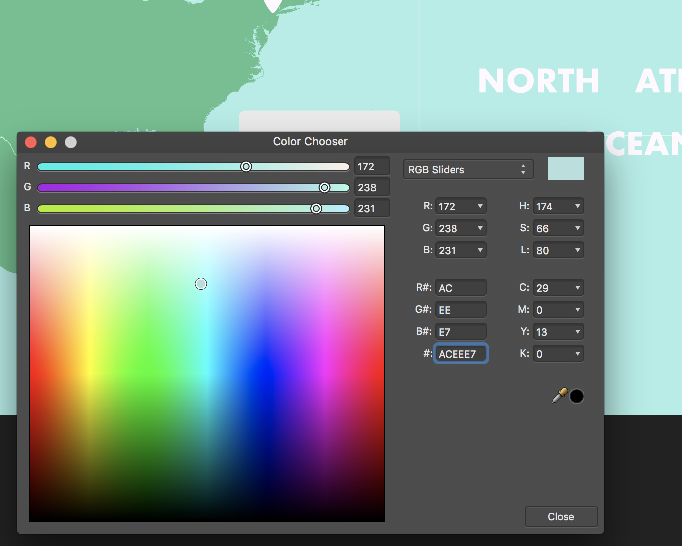
 Hi there! I copied and pasted a rectangle from one document in Affinity designer to another, and noticed the color looked different. To affinity, both show the same HEX code of ACEEE7 with the same specifications, but it's clear that they're different colors. What's going on here and how to fix it? I assume it's related, I've also noticed the color picker has recently taken a different hue of the color I'm taking. Attached are screenshots.
-
 Hi guys I mainly work with 32bit rendered EXR files. When I'm comping rendered objects into backplates, I need to be able to have coloured masks. This is to ensure shadows that are in alpha (masked), creates the correct tone on the backplate. A coloured mask can for example produce a blueish shadow, where a grey scale mask will produce a grey shadow. Is there perhaps a setting I'm not seeing? Whenever I convert a layer to a mask, it goes greyscale!
 -
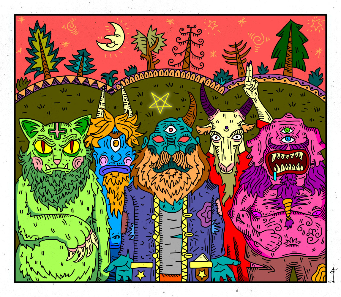
They just came to torture! Inked with brushes with new affinity stabilizer, they are cool! And as always my favorite EGA palette )
-
Hey guys, It would be great if we could have the HEX value input text on all color examples. For instance, when you create a shape, in the top bar properties panel you have the fill color and stroke color, and you have all sorts of color pickers (hue, rgb sliders, hsl color scheme, etc), but only the HEX SLIDERS picker contains the actual input field for the HEX code. It would be great if all these color pickers would contain the hex color code, in UI design this is used a lot Thank you for a great product I am very grateful.
-
 Hi I am new to photo-editing and I've spent a few days watching various tutorials and have played around in Affinity Photo. I am struggling though so I thought I would ask if anyone can point me in the right direction. I understand how to select diffrent things in pictures and I am familiarizing myself with layers and adjustments. I have played around with all of that stuff. So I feel like I have some small basics now. Here is what I am working on, I sell bedsheets. I have taken a few photos of some sheets on a bed which apparenlty is an intresting photo to photographic. However, I have about 20 diffrent colors. How do I properly change the color to make it very smiliar match the color ? Is this possible or do I need to photographic each diffrent set ? I've tried to select the bedsheets and I can change their colors but I can't figure out how to do matches. Say change a white set of sheets to a brown/chocolate or a red. Have it look similar ? However I'd like to learn any suggestions ? I know its probably possible given I look on websites and see they have photos of sheets/ curtains that sort of thing and they are the same picture with different coloring. Thank you very much for any advice.
 -
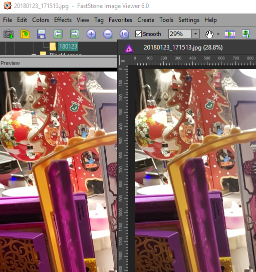
 Hi I'm trying to figure out why original photos viewed on system and external photo viewers looks different than opened in Affinity? I was trying to change every possible RGB colour profile, uncheck "convert working space" option, and "renderin intent" - nothing helps. So - why? Attached image: Left - Fast Stone Image Viewer, right Affinity. (I agree, this picture on left is oversaturated, but it is still an original).
-
 Color not right on print I know this is a big topc so let let me calarify a litle first When printing from Affinity (making minor adjustment in RAW) hitting develop and send to print, the color is way off on paper. Doing the same thing in Canon DPP the final print looks close to what you see on monitor. I have not assign any ICC or color profile to the software. It's set to software manage color Monitor is color calibrated Paper is color calibrated on printer In the preferenses the RGB Color Profile is set to sRGB IEC61966-2.1 32bit RGB is set to sRGB IEC61966-2.1(Linear) CMYK Color Profile is US Web Coated(SWOP)v2 Rendering Intent to Perceptual Blackpoint compensation is marked So the question is way is the color way off when using Affinity but looks ok when print from Canon DPP, do anyone know what to do to get good print from affinity
 -
For certain photos like street, casual wear, but also sometimes for portraits, I tend to use matte color effects if those shots have to underline some more urban style. It is an easy task to apply some matte color effect to your shots, though if you need it quite often a reusable macro is the way to go for this. - Here is one adjustable matte color macro for Affinity Photo, which you can reuse for such matte effects for either color or b&w images. BEFORE AFTER LAYERS This macro creates three layers for you with corresponding layer masks: A curves adjustment layer which applies the main matte coloring to the image, which lowers contrast and flattens blacks. You can use the mask (draw with a white/black brush) to exclude/include specific areas from the matte color. For example you could exclude in portraits the eyes from being matte here etc. A contrast boosting layer which allows to give back a little bit of the contrast lost by the matte color effect. This is as default a copy of the matte layer with an applied soft light blending mode and half lowered opacity. Again you can use the mask to remove or reapply certain image areas here. Finally a desaturation layer which can be used to lower the saturation of possibly still too bright colors. You can use the mask here too in the same intended way as before mentioned for the other layers. THE MACRO matte_color.afmacro Matte color.afmacros
- 2 replies
-
- 8
-

-
- affinity photo
- matte
- (and 2 more)
-
 Hi! I am in the process of creating a new workflow for my portrait photography, using Affinity on iPad Pro, instead of PS on Macbook Pro. There is one of my PS procedures, for which I just can’t seem to find a substitute in Affinity. In PS I use the Color Adjustment layer, to shift a range of e.g. reds towards orange, and thus fix problematic red skin tones. The thing is, that you can use two sliders to finely tune the exact range of reds that you want to affect. Is there any way I can achieve the same in Affinity? (Using e.g. the whole RED channel is way to coarse.) Thanks
 -
 Hi, I'm new to the Forum. I have a question about the select sampled color feature. I wanted to use it to remove some purple light reflections on some roofs. I selected the purple colors and it worked perfectly. I copied the selection and pasted it (as a new layer as always). The strange thing is that it is not only copying the selection. It copies a shade of the picture along the selection. I thought that's not a problem and I wanted to invert the selection (wich is seeable all the time btw...) and remove the rest. But for some kind of reason it removes the content of the selections along with the rest. Idk maybe I'm doing something something wrong please help me out. I attached a photo of the shade and the selections. Greetings from Germany!
-
 I cannot for the life of me find the Global Color option on the ipad photo app. I imported a project I was working on in Designer and it shows the global color swatches but I don't know how to edit them.