Search the Community
Showing results for tags 'Color'.
-
 Hey! Is there an easy way to synchronize color palettes so that I have the same colors swatches in all three apps (Windows Version)? Would be helpful as I work a lot with my own collections of colors and sometimes adjust them in one app but have to remember to do it in the other apps too... Thanks for the help. Chris
 -
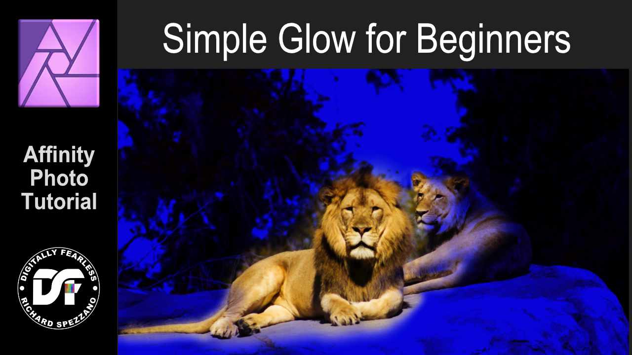
 A simple glow - photo manipulation for beginners. Affinity Photo tutorial. This is for those just starting out in Affinity Photo. I kept the video short and there is so much more to improve the look of the photo, but I just wanted to give you a start. It uses layer fill, HSL, masks and blending modes. https://youtu.be/lsX9UW_rMps
-
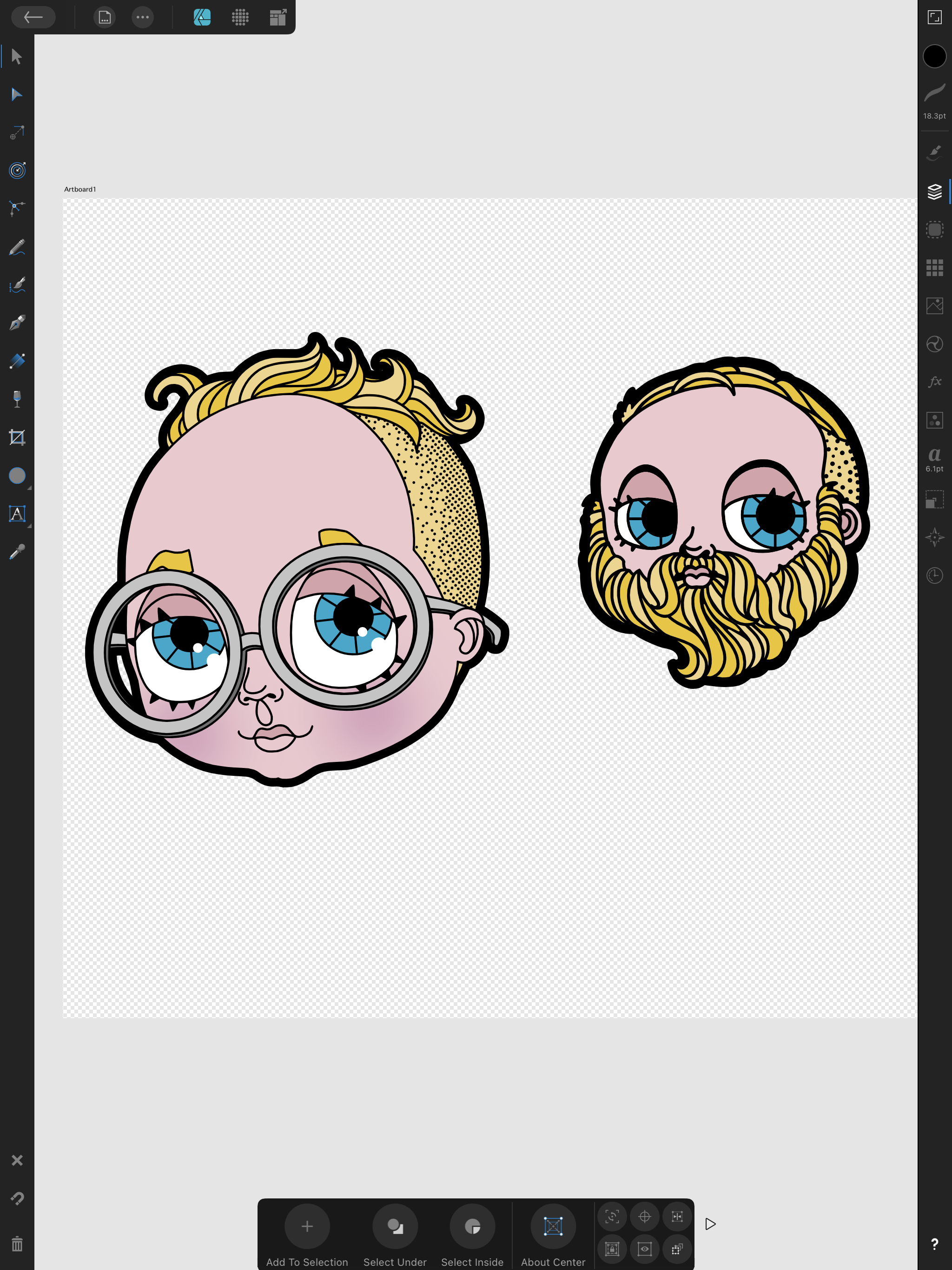
I made a quick update to my avatar since I recently shaved. I drew the image in Medibang, traced the image in Inkscape and then cut apart and colored in Designer. This is my go-to process for illustration work.
-
 Good day. Anybody can share the proper way to convert RGB photos to CMYK?
 -
 Hello! So in affinity publisher, I have a photo of an illustration with a solid color background and I wanted the background to fill a larger space while keeping the illustration the same size. So I used the shape tool (behind the photo layer) around the photo, and used the color picker tool to make the shape the same color. the issue I’m having is once I try to export the page, the color of the shape changes slightly while the color of the photo stays the same. does anyone know what might be happening? thank you so much in advanced!
 -
 I cannot for the life of me find the Global Color option on the ipad photo app. I imported a project I was working on in Designer and it shows the global color swatches but I don't know how to edit them.
 -
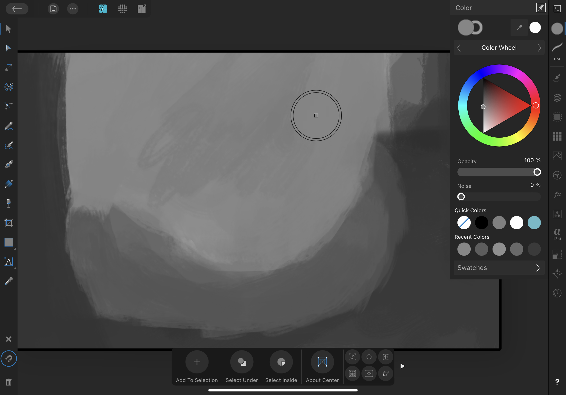
 I’m having trouble with the color picker’s ability to keep the same color value of the previously selected pixel. It seems to switch the color to a darker value with each pick. I’m working on Affinity Designer on an iPad Pro and I know the retinas aren’t malfunctioning. Is anyone else having this issue? In the photo below you’ll notice that there are more than 3 gray values even though I was only trying to work with 3. Thank you for your help, SlaveMaster9000
-
 I am transitioning from InDesign to Affinity Publisher. I have an InDesign document that has text with a black stroke and green fill. The letters really pop! (I'm attaching a sample.) Is there any way to achieve this effect in Publisher?
-
 This did not happen before, but now every time I finish drawing a line (black) with the Vector Pen Tool and my Tablet, I go to fill the new shape (Red). When I click the Vector Pen Tool, the stroke is now RED instead of black, forcing me to constantly switch back to black. This is the first time I've seen the color change based off of whatever color I used to fill a shape. Does anyone know how to keep the black as default and stop changing?
 -
 Would be nice if you could make it more distinctive. It's too vague.
-
 I purchased Designer and Photo years ago but I just couldn't replace Illustrator & Photoshop because of a few missing features that are just workflow basics. I've moved to the Windows platform and just downloaded new trial versions of them to give them another chance, and these problems persist. Most of them relate to features that prevent the user from making critical, unprofessional mistakes like inconsistent color use across multiple documents. If you are deigning a flyer, a business card and a name badge, you can't have variations between them. These are a few [very] minor omissions that I am missing that risks me making amateurish mistakes: - Global swatches don't carry to another document when copy-n-pasting a logo from one document to another (same as in Publisher) - Swatches not carrying over to the new document also means that overprint setting are lost because overprint is defined in the swatch, not in the object. - I can't tell what color mode I'm working in. If my mode is RGB for a flyer, I need something to shout out at me, or at least give me a clue that my print job is going to be disaster. A simple RGB/CMYK icon would suffice. Even Photo displays its color mode in the document's header, but Designer [where it's more important] doesn't. - The colour picker only picks up RGB/CMYK values, not a global swatch. Even if I've pasted a logo into a new document and it's displaying a global color, the eyedropper doesn't read it as a global color so I can't even reliably copy colors from my source logo. - To duplicate an object by dragging it, I have to press the Alt key before I select the object, not during the drag. Most of the time, I need to be certain I have selected the correct object before I duplicate it, however, now I have to duplicate something and then find out if I selected correctly. I don't know how many times I have moved items I want to duplicate and duplicated items I didn't want to duplicate because of this. An application is not fast to work in if I'm constantly undoing my actions. - Changing the colors of margins & guides. If I design a blue brochure, my margins and guides disappear. I need to make them red or yellow or anything. I don't expect to be able to mix my own colors, but a dozen pre-mixed swatches to choose from would solve this problem. (apart from working in wireframe mode) - Connecting the selected transform corner in the transform palette to the free transform with the move tool. It's very strange that I can select a corner in the transform palette, but then I always rotate around the center. I have to manually type rotation values in degrees to get the rotation around a corner. Why the disconnect? This disconnect is similar to the disconnect I experience between the swatches, color mixer and eye dropper. - Previewing at export. Even in Photo, I can't see the effect of the level of JPEG compression being applied to my exported files (neither in Designer nor Photo). I have to export a file half a dozen times until I hit upon that sweet spot of small file size to barely noticable quality loss. Even the open source GIMP does this with a live preview at export. I can do awesome professional work, and then break it all with a poor export... and not even realise it. - Proofing colors. I really need to be able to see how my colors will separate before I save my PDF. If I've accidentally worked in RGB, this will reveal my mistake as I go to repro. Overprinting and knockout will also be a disaster if not picked up in time. (Who here hasn't experienced the dreaded white text set to overprint and wondered where all your text went?). This feature alone forces me to keep a professional, licensed copy of Adobe Acrobat around to preview color separations. In my final repro file, I have to know if my spot colors are still spots and if I'm printing fine black text as 100% black, or a full color breakdown that will turn my single color print job into a full color one. Previewing the separations (or channels in your photo editor) points out my potential errors. - Overprinting settings. The previous point leads straight into this one. Why is over printing set in the swatch and not the object? If I want some small paragraph text to over print, but large display text to knockout, I have to make 2 identical black swatches to do this. Why can't I specify this on an object-by-object basis? I guess "Multiply" does the same thing and works as a work-around, but you're targeting print designers, and use the term overprint yourselves so why the strange and risky implementation. - Snapping to "round" values. When manually selecting a color in CMYK, we are inevitably creating a color using round number values from a color chart. It's slow and frustrating trying to select exactly 50% in a slider as it hops from 49 to 51 and back again while we search for that perfect pixel placement. How about snapping to increments of 5% by holding down the shift key? Your snapping features are awesomely powerful, but only in the document. Why not extend this into the sliders and the rest of the application? (Admittedly, I don't know any other application that does this, but it makes sense and would be welcome.) Basic features that are even in open source software seem to be missing. We waited for years to get arrow heads. You claimed it was because you wanted to get it awesome, but they are no more powerful/different to anything else out there on the market. I suspect we only got them when Publisher was released. Did we have to wait for a whole new app to be leased to get arrow heads? Now we sit with other missing basic, common features like: - Blend/Interpolate - Stroke drawing tools like a grid tool and a straight line tool. These are enormous time savers. - Tabs. (I understand you want to protect Publisher by keeping high end text features like hyphenation, drop-caps and text wrap out of Designer, but this feels like a very basic feature compared to your range of kerning, alignment and Opentype features already here from day one) I understand that everyone's needs are different and you can't satisfy everyone, but you are targeting print designers as well and illustrators and web designers, and these are all features every professional expects and is surprising that they're not here. You give us features that most professionals just leave on the defaults because few of us even understand them (like color profiles and LUTs), but then drop the ball by not pasting a global swatch from one document to another. It's confusing and just doesn't make me feel confident in the files I send to print. Please can you look at these issues before adding new features. I understand that new features are needed to sell products, but a lot of us early adopters are just wondering where the small tweaks and refinements are. It seems that your development team needs to consult with an old school designer or printer to get these fundamentals right. It feels like you've only got young designers who have grown up with an RGB workflow and have never had to bang out 6 flyers in an afternoon and send them to print with the job being rejected.
- 32 replies
-
- 34
-

-

-

-
- separations
- proofing
- (and 8 more)
-
 It would be great if Affinity Photo could create a gradient map from the colors in a selection. The use case for this would be to do an expert level recoloring or color matching from another image. The gradient map should be created from an analysis of the darkest values/darkest tones to lightest values/lightest tones. Affinity Photo can already do color analysis of the current image or other an imported image. It would take a few extra steps to create this. This is something I do using a plugin for Photoshop called Infinite Unity - please see below:
 -
 I have a question concerning colour. When I create a new Affinity Designer document, the Default Black colour isn't 100% Black, it is 72 Cyan, 68 Magenta, 67 Yellow and 88 Black. Why that colour? If it was "registration" (100% of all colours) I could understand but it isn't. It is odd because I have set the colour space to be CMYK when I created the document. Is this a bug or is it supposed to be that way? For someone who has experience working with images for print it isn't as much of a problem (it is annoying but can be dealt with) but for someone who doesn't quite understand the printing process this could be a problem. On screen it looks black but if it were to be printed commercially, it wouldn't look so good.
 -
 I have a color image that I want to reduce the color on. It is too saturated. I don't want Black & White but less color so it approaches black & black. The topic in the Help for Selective Color Adjustment is not helpful. It doesn't say where to find the Selective Color adjustment.
 -
 Hello again, all … Yes it's me and I'm back again for Round MMXXI(b) … Today's question is: Can we use Presets in Affinity Photo (or Designer / Publisher) as we would in Photoshop, Lightroom, ON1, etc? If the Majiqual Answer be-eth 'Yes,’ the follow-on query then becomes ‘How we do dat, hah?’ It's easy enough to install and use LUTs in Photo, but there seems to be no method to install or access the presets’ .xmp rider files. It seems that would be an easy trip down Code Road compared to other feats discussed in these pages. Please advise if there's a way to implement access and use of the .xmp presets files that already reside in the Camera RAW / Lightroom folders … Thanks again to all for your informed input.
 -
I add a new photo AP. I go to Color, Swatches,, and Add Document Palette, nothing happens. Am I wrong to suggest the colors from the open photo would be added as swatches? If wrong, how can you obtain photo colors to add to swatches, other then color picker one by one.
-
 Hello :) Not quite sure how to explain my problem, but here goes: I am working on a logo design and I used some curves and some type to make it. I would like to make it different colors, so I can present it to my client. The problem is, that I have to select all the curves and change the outline color for them, and then select the type (which I already converted to curves) and change the fill-colour. Is there any way that I can make the logo into a cohesive vector-file, so that I can select the whole thing and change the colour? This would also be helpful for exporting it, so the client doesn't have to deal with this issue, but can just change the color of it as needed? Thanks in advance! I'd really appreciate the help!
-
 Hello, while working on a document with Publisher, I noticed that a rectangle had lost its previous fill. I can't understand why this happened. What the heck was I doing there? Now I can't fill it, even a colored border is impossible. I copied this rectangle to a new file - same problem. Below a rectangle I created new: I have attached the Publisher file here and am very curious if anyone can tell me what is wrong with this colorless rectangle. Thank you very much and regards, Felix (I think the English translated with DeepL is horrible, sorry!) colorless rectangle.afpub
 -
 Can you convert from color to grayscale and/or black/white in Affinity Designer and/or Photo? This is very helpful for designing for the very few people who cannot see color in checking for background/foreground contrast.
 -
 When I develop the css of a website, I like copy / paste the hex code of a color. When I like a color, I copy it hex code for use in the new creations. Show hex code of the color and allow to copy it with 1 click, could be perfect. What do you think of that ?
 -
Now I like Publisher so much that I only work with it even though I have InDesign and QuarkXpress. The only big problem is separation preview. At the moment I am creating print PDF in Publisher, then exporting PDF to InDesign and switching on the separation preview. I really miss the feature! Otherwise it would be a great tool!
-
 Whenever I edit a global colour value I have a chance the popup will move around the screen after the edit. See the attached video, it makes more sense when you actually see it. I can’t find a way to consistently trigger it, but it feels like the closer the popup is to the bottom edge of the screen, the more likely it is to happen. But it’s not a certainty as you can see. I feel this might have something with the physical screen size of my device? It’s a 9.7” iPad Pro and the screen is getting cramped by today’s standards, maybe the low amount of space is making the popup be “unsure” of where to stay? I also feel like this is less likely to happen when the device is in portrait orientation, it still happens though, just less frequently. Thanks! IMG_0538.MP4
 -
 I'm having a problem; I think I mentioned it before; I'm just hoping that there's been an update or something since it seems like I'm missing something. I have white text on a black page that overflows (correct term?) into black text on a white page. When text is part of the same paragraph I can't seem to alter it without altering the entire paragraph. Ideally there'd be a way of having the text automatically change style when it becomes a part of that text frame. But even if that's not possible; can I not change the colour of the text if it's in the same paragraph? And even if that's possible it's frustrating because if I change any of the layout I have to keep on going back to make sure no text has crept into the wrong section and is the wrong colour which is even harder because it may be white text on a white background and black on black and, thus, invisible. Maddening! Video of the problem. Affinity_Colour_Prob.mov
 -
 I have viewed the above thread and the video in it. This doesn;t help. My Issue: I need to fill a certain colour space in a complex image with a colour picked from another part of that [flat] image. I use the colour picker to select the colour I want to use, and that by default paints the whole layer, which I can undo. It's fiddly but.... there we go. My issue is that I can't transfer this chosen colour from my picker to my flood fill tool. I select flood fill and then try to select the picker colour in the top right corner - by clicking on the colour it ALWAYS colours the whole layer rather than my flood fill tool. This occurs on all areas I can find the colour picker. How do I tell my Flood fill to use the colour selected by the picker. When I use a brush tool the brush correctly selects the picked colour. Cheers
 -
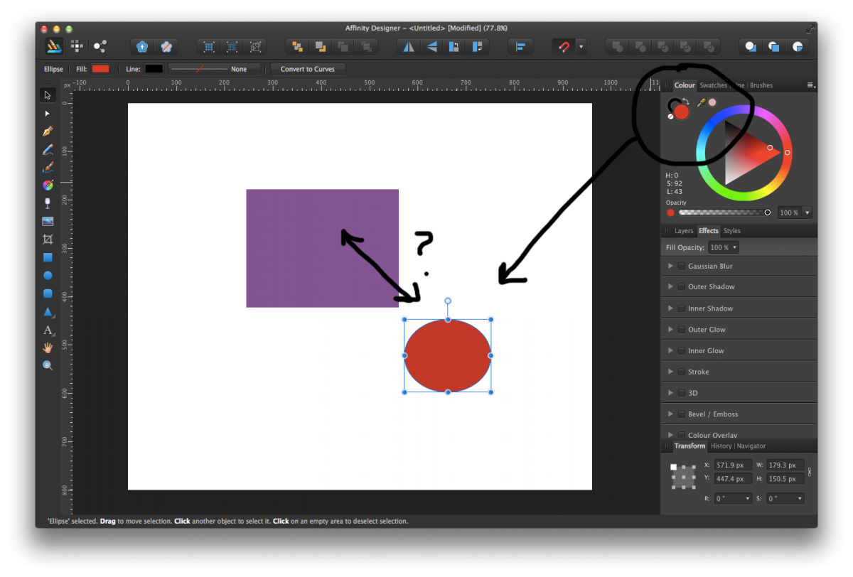
 Is there a short cut / shortcut key for quickly cloning the color of one object to another? For example, I have a square that is purple and a circle that is orange. I select the circle and would like to sample the color from the square to turn it purple. The only way I can seemingly do it is to select and drag the eyedropper tool (from the color palette), then sample the color from the square. Then I need to select my circle then click the colored sample from the eyedropper in the palette to change it's color. Basically, I'm looking for the exact same function that illustrator provides when sampling / cloning colors and I have to assume Affinity Designer would not make it a three step process when it could be one. In illustrator you can quickly shortcut key to the Eyedropper tool and it changes the current objects color to anyone that you sample. Thanks everyone!
- 43 replies
-
- 1
-
-
- tools
- eye dropper
- (and 1 more)