Search the Community
Showing results for tags 'Color'.
-
 I have a Publisher file with color profile CMYK Coated FOGRA39 in which different Publisher and Designer files with the same color profile are embedded. In all of these documents I am using the same color palette and everything looks fine in the main publisher file. But when I export it as PDF same colors clearly have different shades, depending on wether an element was part of the main file or an embedded file. If I import the PDF into publisher again, all is fine again and same colors have the same CMYK values. But as I said, the PDF looks wrong on my screen. Any help is appreciated!
 -
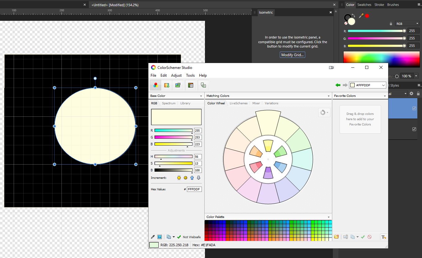
 I just made up an ad (in Designer) for publishing in print, and my husband suggested that we need to see how it would look to a colorblind reader. It would be VERY helpful to have that in all the Affinity products! I do have ColorSchemer Studio, which does have the function of showing how your chosen colors would look to someone with different kinds of color vision problems. But I can't load my ad into it and see how the gradients would look, for instance. Maybe someone has such a program, and I'll go looking for one. But it would sure be great if I could check it within Affinity programs! Maybe you could find a developer who's doing this and pay him to incorporate his product into the global Affinity program.
 -
Hi there.. I'm super new to designing and started using A.Publisher a few weeks ago. I've been designing a logo in RGB in Inkscape & using APUB to do all my file conversions especially for stuff I need in CMYK. I'm aware that CMYK colors will usually come out differently from RGB when it's sent to printers. Anway, I decided to just do a quick check on my colors and noticed that the CMYK values that's been generated by APUB don't match the RGB color's supposed CMYK color.. example. I have a color #134A84 which https://www.htmlcsscolor.com/hex/134A84 tells me should give me a CMYK value of 86/44/0/48 but in APUB, the CMYK value showing is 98/79/22/7 instead. When I plugged in the value of 86/44/0/48, I obviously got a different color and the RGB hex became #004B79. So I guess my question is, does APUB convert our RGB colors into CMYK to match what I actually see in RGB or is this a bug? This is a concern for me because I'm working on this for a client and want to make sure I deliver the right stuff. Thanks in advance!
-
 Affinity Photo for Desktop feature request: 1. Add a selection wand to select areas of related color when creating a mask, with +/- and antialias options. I use Corel Draw's "magic wand" to do this. I'd love to have this feature in APhoto.
 -
 I made a document with black Typo in CMYK. Defined color like: 0/0/0100 and exportes as PDF X4. Opened for Preflight in Acrobat and black is shown: 86/85/79/100. What can i do that the color i define ist the same in the PDF? I tried all Options and there is always the same mistake
 -
 Values in the color panel show as white (all other colors appear correctly), but not to my eyes. So I checked using another program and confirmed white in Designer is not. Just checked Photo and it has the same 'not white' issue. So I checked, of all things, Paint (Windows 10), and white appears correctly. I must have changed something for this to occur and obviously can't remember how to make it right; I need white, can someone help?
-
 When I replied to this, I thought a bit more about the way color swatches work atm. I just don't think there is a need for a color swatch that is not "connected" to the objects that are using it. If I change a color swatch, I want to change all the objects that use it. InDesign does it this way, and it makes sense. I know that Illustrator does have "unconnected" swatches as well as "global" swatches -- but I never understood the reason for that. If there's a use case for "non-connected" swatches, please let me know I believe any such use should still be possible with "connected" swatches only. So all the swatches should behave as if they were a "global swatch". Or do "global swatches" have additional features that I haven't found out yet?
 -
Hi there, as I'm likely keen on collecting fonts, I somewhat regularly look for awesome ones and stumbled over Color Fonts (https://www.colorfonts.wtf/) On the page, there is Affinity Designer listed as supporting svg-Color Fonts - which must be svg packed within otf, if I understood that right -, but anywhere else including this forums, I only found the whole Affinity Suite does not support this yet, but also found some users, that would appreciate having it supported. So am I, and as I didn't find a posting about, I opened this one - excuse me if this wasn't right. I'm using Photo and Publisher at the moment, but would also buy Designer, just to get Color Font-Support I don't really make a lot of publications, but everytime I do, having color fonts supported would be fantastic. Thanks, and so long, sistra
-
 Blend ranges are both easy and powerful. I would like to see a way to make the blend ranges a function of color (or hue). I have attached two different mockups. Option 1—the one with the curve like how blend ranges work now—would probably need (1) an option to pin the leftmost and rightmost points together to easily enforce periodicity of the curve, and (2) a way to shift what color is in the center. I used "color" in my mockups, but perhaps "hue" would have been a better choice.
-
Hi all, I recently updated to Affinity Photo 1.7.1.404 from 1.6.5.x through the Windows Store and now every image that I open, whether it's an *.afphoto, DNG, JPEG, PNG etc., opens way too dark. Documents created in previous versions are also rendered way too dark but are exported with the right colours and brightness, while new documents result in overly exposed images, more like as if the gamma went through the ceiling. The samples available in the Welcome screen also seem to not match the snapshots available on the Windows Store. From the same snapshots I also noticed that the icon for the Photo persona also seems darker. The "Color" panel also gets way too dark. My device: Windows Store snapshot: Software configurations: I tried running the trial version of Affinity Photo 1.6.5 (got it from the Downloads page) and the problem now seems to happen there as well My device is the Dell XPS 9570, running Windows 10 1903 with Intel UHD Graphics 630 (driver version 25.20.100). This issue also affects Affinity Designer but every other app on my system works just fine. Ideas?
-
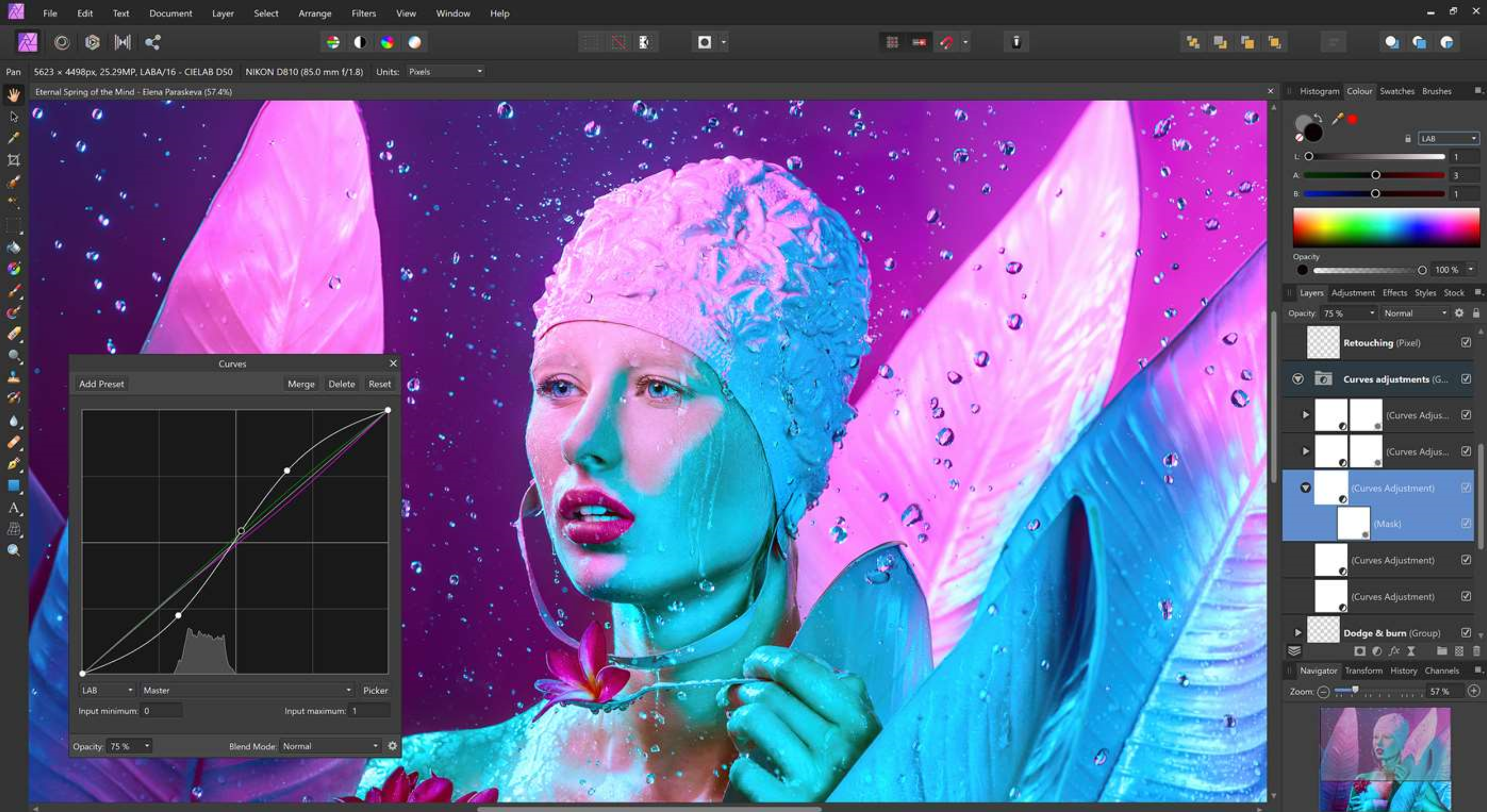
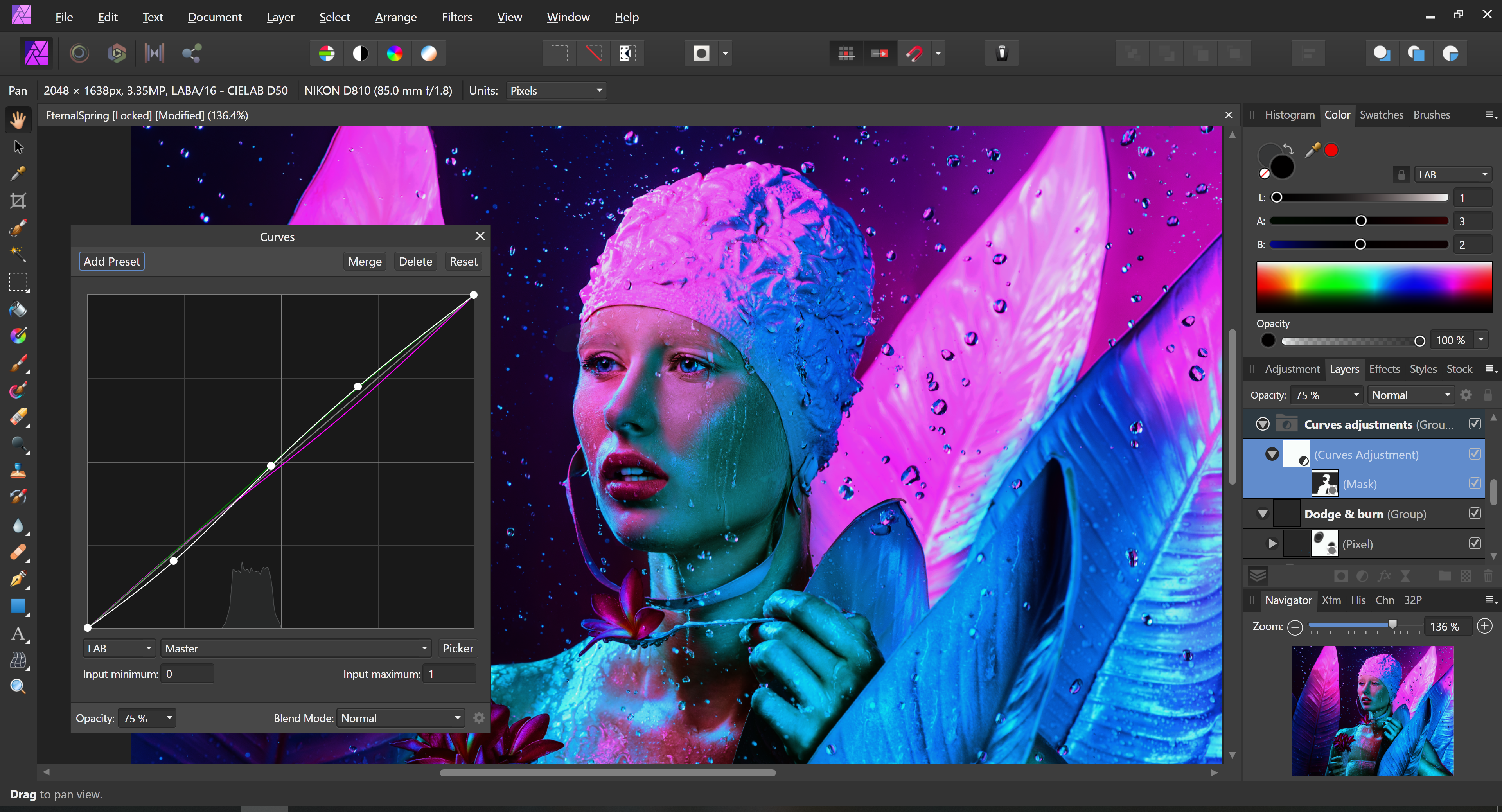
 This is a video of me talking about a couple of the problems with how Designer deals with color, and likely Affinity Photo as well. And this video should explain at least somewhat well why the gradients are too dark. If there are any Affinity devs active here, a response/acknowledgement of the problem/solution from them would be appreciated. Thanks! P.S. Shortly after I made this vid, I actually did go and buy AD. So I hope even more now that these problems get fixed. Like the point I tried to make in the video, would these issues really be that hard to program out? affinitydesignerproblem.mp4
 -
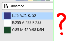
 I love Publisher but IMHO it has the worst colour system I have ever seen (in over 30 years). How did LAB, RGB and CMYK end up on the same palette when I only work in CMYK and the publication was set for CMYK? I NEVER work in LAB. I have 68 colours like this: "Rick 13-EN_No Photo 2 is the name of the publication. Useless as colour information for an in-document palette. It should be simple to create my own custom CMYK palette but instead it's horribly complicated, if not impossible. It's a monumental time waster. Why can I change a colour in this dialogue but not in that one. And then I can only change it in THAT dialogue, but not this one. A lot of things seem too clever by half in Publisher but colour handling is a serious fault in an otherwise pretty good app.
-
 Hey everyone! This feature request is for macOS as well as for iPad. It's great nested symbols is implemented now. I have a suggestion that would make things easier to see what's going on: It would be useful if there were different symbol indicator colors depending on symbol nesting depth. For example: Normal symbol: Orange Symbol that holds symbol(s): Yellow Symbol that holds symbol(s) that hold(s) symbol(s): Green ..... Blue ..... Pink ..... Purple ..... Red Best wishes, Shu
 -
I really need to be able to import swatches in the iPad apps, and I can find no logical reason not to have this feature. I can import brushes, fonts, symbols, assets, but not swatches? It is essential when working with color to be able to import a palette with specific characteristics. On the desktop it is so easy to do, but on the iPad it is impossible... Also I considered creating a swatches set myself from an imported image, but this required so much back and forth, clicking and opening menus it was a nightmare and I gave up after 4 colors. Please implement importing swatches soon.
-
 Hello Affinity Photo development team, I'm a newbie to your program, but have worked as a digital illustrator for several years. Affinity Photo is a really nice program - a nice alternative to Photoshop. It could be a great program for digital illustrators and painters... But it is missing a critical option for higher speed efficiency: a fast color picker option by pressing "Ctrl" or "Alt" This is present in Photoshop, Corel Painter, Krita, OpenCanvas, PaintStorm Studio, etc. It is very important to painters to be able to access the color picker quickly. When you hold down "Ctrl" or "Alt" and click on the color - it color picks it. Then when you let go of the "Ctrl" or "Alt" key, it goes back to the tool you were using before. When you have to switch between brush and color picker, this wastes twice the amount of time. An extra second or fraction of a second may not seem like a lot - but it adds up. A painting that would take 2 hours, takes 4 hours. A piece that would take 1 day, takes 2 days. 1 week turns into 2 weeks, etc. This would be a great addition to Affinity Photo - for all artists. One last idea... Is allowing the user to "fix" the color wheel triangle in a fixed position - instead of having it rotate all around pointing at the chosen color. Why? Because having lightness point up, darkness point down, and saturation point right - is far easier for the brain to process than having the triangle flip all around the wheel... it makes picking specific shades across different colors inconsistent.. harder to match the same saturation position on different colors... because it has changed position. It's easier for the brain to map out the color triangle when it's fixed in one position. White up - black down - and saturation to the right.. Would be far easier to remember for artists - who need consistency, and speed in color picking. Thank you immensely for viewing and considering these ideas!!
- 48 replies
-
- 6
-

-

-
- color picker
- color wheel
- (and 8 more)
-
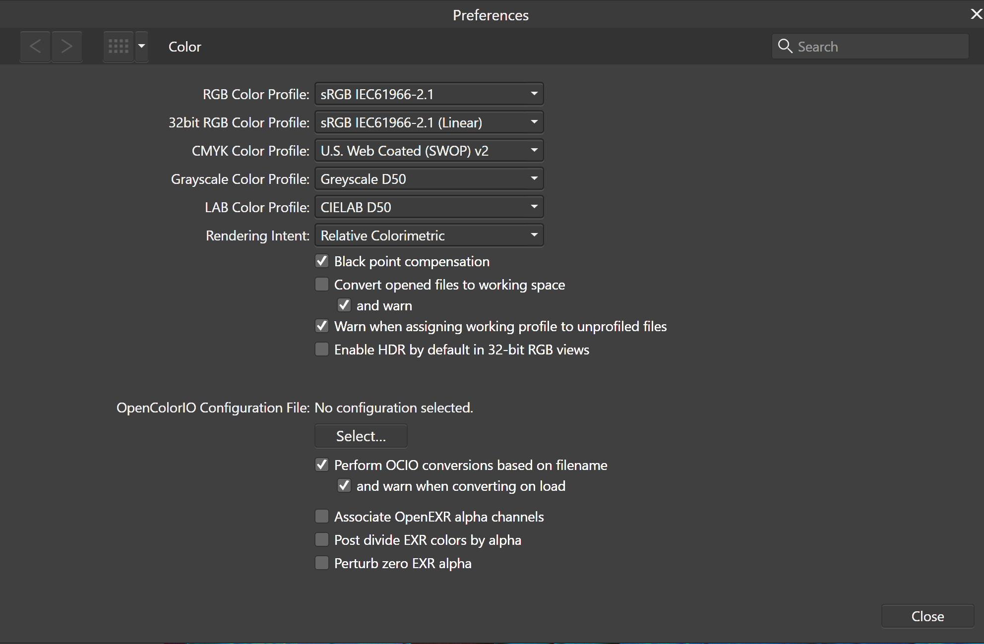
Hello guys, I'm on the latest 1.7 version in Affinity Designer. I noticed that when i select a color by dragging inside the color picker box i end up getting 3 different CMYK values as shown in the screenshot below. I think this is a bug, unless i'm missing something. Can someone explain what's happening? Thank you. Edit: When i minimize the Program window and then maximize it, it shows the correct color in the large picker box, but it doesn't refresh in the color tab on the right until i select another object.
-
 Hello all I evaluate AP 1.7 as a replacement for Lightroom but run in some very basic problems with raw file development. 1. When I develop one single raw file (DNG from Lightroom) AP writes a huge file (121MB versus 19MB original). This is no good. Is there a way to save the adjustments done in a fair way without using the alternative formats like tif, jpg etc. ? 2. I want to develop several raw files (DNG from Lightroom) at once with a batch process and saving them in jpg or tif for further processing. However, I do not manage to apply the individually made macro in Photo Persona to process the RAW files in Photo Develop, although I can select the macro. Possibly the macros are not compatible? How can I process several raw files the same way? 3. Is it still not possible in AP to save adjustments made in single raw files in an undestructive way? Thank you for your helpful answers. Best regards,
 -
Check the attachment. Default color difference between two apps. Why is this happening?
-
 Hey Guys, could anyone help me with affinity photo on IPad? I can‘t select any color with the color selection tool! Thanks for your replies Your I_like_cameras
 -
 Hi all, from one day to the next something has got mixed up with the color management in Affinity Design. The white became a yolk yellow. When I tried to change the color profiles in affinity, sometimes nothing happens and the white remains yolk yellow. With other documents the background becomes a neutral white but other elements that should be also neutral white remain yolk yellow. Like I said, I tried to change profiles, from RGB to CYMK, from AdobeRGB to the Benq-Profile (my monitor). Nothing worked. When I start with a RGB/8 and Benq-Profile everything is shown correctly, but the PDF documents I import, always have this yolk yellow instead of neutral white. I have to say that I am not a professional graphic guy. This problems I have on a Windows computer. Can someone please help me? Thank you
 -
 Hello, I've created a colour palette and plan to have a lot of layers having the fill colours from the palette. Is there any way to change all shapes with a given fill colour when changing that colour in the palette? I'm using both Designer and Photo by the way. Best Regards, Steve
 -
 I am opening a color book cover pdf in Photo. All colors are there except one in the graphic on the front & back cover. On the spine the logo vanished completely How do I see the green color in the graphic? Thanks
-
 I need some clarification on color modes available in Photo. Namely the RGB/16, is it integer or float and if float then how can I input colors below 0 or above 1? And then there is RGB/32 HDR, is it integer or float, and if float, how can I input colors below 0 and above 1? Also are these modes linear or gamma corrected? Another thing is the export to Open EXR (when I choose More... options). I can choose from 16 bit half and 32 bit float, what is 16 bit half, is it integer or float? One more thing: I have some HDR and EXR files, which I'm certain contain values above 1 (32-bit float), but Photo shows them as 1 (ie. 255 in each RGB channel in the Info panel). How to show the true value, if it's above 1 or below 0?
 -
 Hello, my question is, how to change the backgroundcolor or stainer from Affinity Designer back to white. Mine is beige (235/235/235) when i start Affinity Designer and i can not change it. So all of my pictures get an old beige look to it, that i don't want. (pictures are all with default settings, i didn't change anything after application launch) I tried resetting it and uninstalling it but nothing helped. Thanks for you help.
-
Please, unify the color settings in Colour palette. For example in Sliders mode each slider has its own box for direct value entry, but there is no cursor (circle) in the color field with the selected color (even though you can adjust the color by dragging). While in Boxes mode, the cursor (circle) is, but you cannot enter a value (direct value entry is often useful). Tint mode direct value entry has, but again it has no color field. Personally, I think that instead of specific Tint mode, it would be preferable to give Tint as one item in Boxes mode, or/and in Sliders mode.


.png.2bdd4bd5519e9306690d4e15e24c4e62.png)
.png.f87fd08908a77289a060b1aed7fb64c3.png)


.png.f18689a05ddc7d042c8b7e45f3f464bb.png)
.png.f8acd5ca1dc4da1d691179c9a5d8341f.png)