Search the Community
Showing results for tags 'Color'.
-
 Hi, In this Affinity Photo Tutorial I show you how to improve the contrast and coloring of a low-contrast photo on a rainy day. For me, this day was emotional but the photo was disappointing because of the rain and the low light. So I found a way to rescue some of my impressions of my hiking day. I wish you fun. Ciao Jack
- 2 replies
-
- 1
-

-
- affinity photo
- tutorial
- (and 5 more)
-
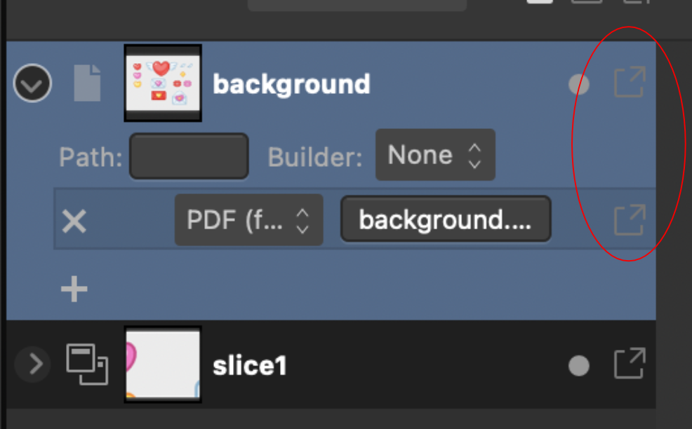
 Please fix the icons to contrast when the menu item is highlighted in blue. The icon will disappear. On the screenshot is the most painful place in ui, but wherever there is a blue backlight, the icons do not change their state, because of this they are hard to read
-
Hi, In this Affinity Photo tutorial I show how to remove haze while preserving the fog and getting the colors back. The haze filter got over the years a new and improved engine and adjustments. I wish you fun and inspiration. Ciao Jack
- 2 replies
-
- 6
-
-
- affinity photo
- tutorial
- (and 6 more)
-
 In Design 2 can the color of multiple layers, in a group, be changed without changing each layer individually?
 -
Implemented in Designer so far - the swatch reflow is tricky but this works currently. Also Mac and Windows version behave differently and affinity saves .clr files on Mac rather than .afpalette. This is the best swatch picker pattern by far as in the way it groups hues and tints makes color selection so much easier very glad to have go this to work. This version uses a 20 swatch row length.
-
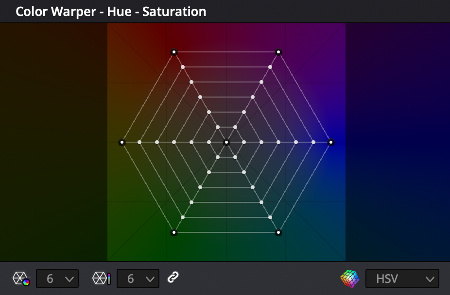
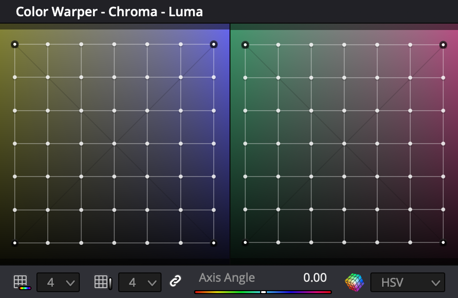
Hello. I have a question or even a suggestion for implementing an additional function for color correction. I am engaged in photography and video. And to paint my videos I wanted to use the 3D LUT program for detailed painting, but then I updated the program of that feature in Davinci Resolve 17. But mostly I edit in Final Cut, some in Premire Pro from Adobe, and not everyone has the opportunity to work with color so selectively. For this most use and load a LUT. I myself have used Affinity Photo to create a LUT for a video. But! This "Color Warper" tool gives you more options for color correction. The killer ability to create masks based on color without using the selection tool. This is just awesome! I think that you should think about implementing this function in Affinities products. It also comes in handy for photographers to edit their work. It is a very flexible tool. Thanks!
-
Hello Affinity fam! I would like to start using these forums more often and share with you the pieces I'm creating. Here is my latest completed piece. I leave you the information of the piece below. Greetings and thank you so much! https://i.imgur.com/d52WZnm.jpg
-
 Hi everyone! This is my first time using Publisher after needing a replacement for InDesign. This entire thing might be a little long especially since everything is so new to me, so I'll try my best to condense it! So far everything does what I've needed it to do, but when I export my file for printing, the colors are drastically different. I've viewed each file both on the HP laptop I am using as well as my iPad and the color differences show on both so it's not a monitor/computer issue. I'm not sure if there are settings I need to change or what. I've tried using a CMYK and multiple RGB color outputs and both give me completely different looks (CMYK makes everything blue and the RGB profiles made everything EXTREMELY dark.) I'll also be including specifics below in case more information is needed, as well as a photo comparison of all of the files. For starters, the project I'm working on is a comic so while the inside is in greyscale and I hopefully shouldn't have this same issue with it--though the blue tint effect worries me--the cover of the comic is in full color. When printing directly from my iPad for my initial tests, everything printed great, so I know it's not an issue with the specific colors I chose since, y'know... my printer could handle it fine. I'm printing everything as a booklet, at a half-letter size for the pages so I can stack two of the comics on top of each other (individual pages of the comic measure 4.25x5.5" so 2 spreads fit well on top of each other. As of now, I do not have the inside pages in the document as the main concern for the set up was ensuring the cover was going to print well. I know the layout for the booklet printing is going to have me do a funking way of placing my interior pages, but once again, it isn't my current concern. I've changed initial color profiles, final color profiles, swapped the render to perpetual, relative and absolute colormetric, used both linked and embedded files, and probably a lot more with the amount of times I've clicked, changed, and swapped settings around. Hopefully everything attaches in the order I placed them, but it will be the original, the CMYK export, and then one of the RGB exports. Each of the RGB look the same with minimal if any differences between the three that I tried so I'm just going to place one. The pdfs are also... extremely blurry by comparison. All of these colors match just about perfectly with my iPad screen with very minimal differences. Original CMYK RGB Please let me know what I can do to get the print-ready pdf to match the original! Thank you!!
-
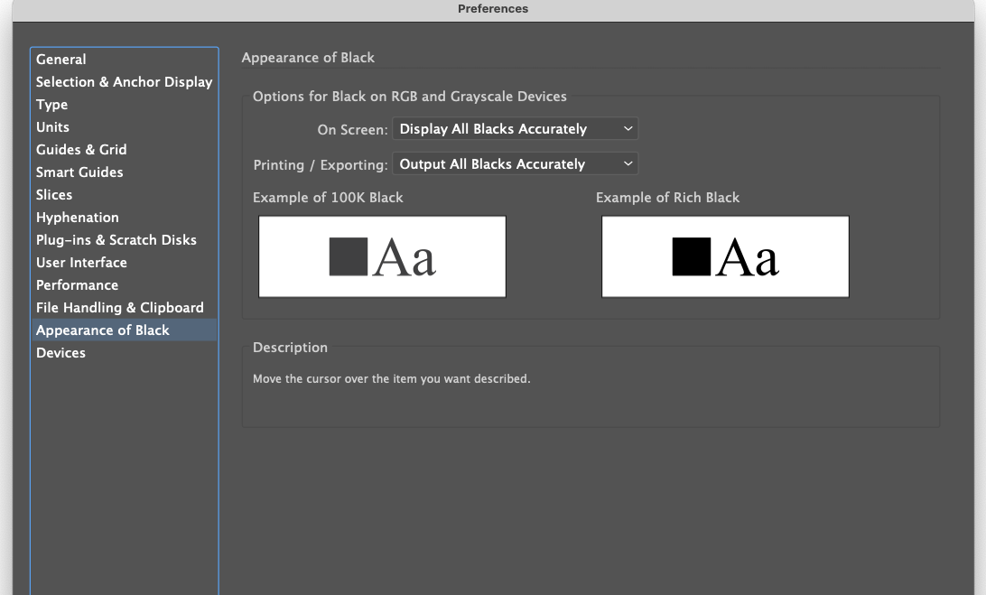
 I think an option to display K100 as 100% black in the CMYK mode in Affinity is needed. Illustrator/Indesign has the option in the Preferences to choose the appearance of black. Everyone has their taste. you should let users choose.
-
 👋 Hi there, I'm using Affinity Publisher on Mac. I am unable to get colors to display correctly. Under Document Setup, I've gone through every combination of color profiles to see if they change anything. I've attached a screenshot using the following color: #490AF5 The left color in the screenshot demonstrates what I see when I fill any shape I've dragged on to a spread using the Shape Tool. It is the incorrect color. The right color in the screenshot is the correct color. It is what I expect to see in Affinity Publisher, and it is the color I see in other design tools, like Sketch. Interestingly, I can drag an SVG on to the spread...When I change the SVG fill to the above color, the color displayed is accurate (the blue in the right part of the screenshot, not the purple at the left). Thus, in Affinity Publisher, I can use the same HEX code on one canvas, and see two very different colors for the one HEX code with transparency at the default 100%. I'm not saying this is a bug. It may very well be user error. I just can't figure it out. I'll be grateful for any help. 😀 Thanks!
-
Brush color(black/white) behave differently from on the Quick Mask or the Layer Mask. I can paint only white regardless of the brush color. I would like the brush to behave like on the Quick Mask or the Layer Mask. Is this a bug?
-
 Elisse con foro.psdElisse con foro.psdHello, in the attached file I designed two elissi on a transparent background. The smallest is positioned inside the largest. How do you proceed to color the interior of the large Elisse, however leaving the interior of the small Elisse empty? Thank you Elisse con foro.afpub
 -
 Hi all This has been the week of figuring out how to get my colours sorted in Affinity Photo. There is no direct support for the ColorChecker Passport from X-Rite in Affinity Photo unfortunately but I did figure out how to do it with some help. If you use X-Right ColorChecker Passport these are the steps on how to do it. This might be painfully obvious to some people but for me it was all entirely new and took a while to get my head around so I hope that this is some use to people. 1. When you are shooting your photos in a location take a photo of the ColorChecker Passports colour cards and the white card. Make sure they are in the same place as your subject matter and are properly exposed. 2. Import all the photos from your session along with your pictures of the ColorChecker. 3. Open your photos of the ColorChecker in Affinity Photo crop them down if you like and export them as 16 bit Tiff files. 8 bit might work but I have been going with 16 4. Open ColorChecker Tiff photos with the new beta version of ColorChecker Passport Camera Calibration software in the ICC tab. 5. Export your ICC profiles naming them something so you know what photo shoot they go along with. 6. Close down Affinity Photo and then re-open it to refresh the ICC database 7. Open your photos from the associated photo shoot and go to the Document tab and select Assign ICC Profile and select the ICC file you just created. And if all goes well your colour is mostly corrected. 8. Now to set the white balances correctly. Go to White Balance in the Adjustment section. Click the Picker button and then click on the photo that you took during the photo shoot of your white card. This will then automatically make the adjustment. I hope that helps some folks. I did not understand any of this stuff three days ago and it was no fun trying to get my head around it for the first time. If anyone has tips on how to improve upon this workflow please share. I am by no means an expert on this subject. All the best!
- 11 replies
-
- 8
-
-

-
- icc
- colorchecker passport
- (and 5 more)
-
 Picking a color for Gradient strokes and fills, only works from the gradient menu. In the gradient menu there is the option for color. However from this color panel I do not have access to my swatches. Further more, if I navigate to my swatches and select a color, that color overrides the gradient on the object as one solid color. Same goes for the color panel. Note -- For fills I can work around this by using the Fill tool to create the adjustable line for gradients, selecting the nodes on the adjustable gradient line and then selecting colors from my swatches or the color panel with out the swatches overriding the gradient to a solid fill. I should be able to select a color for gradients from swatches and the color panel while I have the gradient panel open with nodes selected. I should not be limited to the single "color selector" button that is within the gradient panel. I feel like it could almost be done away with, as I'm sure most people have their color panel or swatch panel located somewhere on their screen. Edit : I have found that within the gradient color selection there is a drop down which allows me to access my swatch colors. This provides me with a useable work around for coloring stroke gradients. However my point still remains that this color selection button could be done away with. I already have my color panel, and swatch panel, open in my work space, I use them very frequently and habitually. It is very frustrating to have these extra steps/clicks to navigate to and color gradients. When the color and swatch panel are used so frequently, it is very anti intuitive that they both do not work for gradients.
 -
 So I have a CMYK document in Affinity Photo on iPad that I have set to the profile US Web Coated (SWOP) V2 and when I exported this to a PDF, in the export menu I set the Color Space to Use Document and the ICC Profile was set to Use Document Profile. However I’ve run into an issue with colors looking off with the proof returned by my printing company who’ve told me, “the PDF is set up in ICC color profile which isn’t fully CMYK”. How do I change the document to be ‘fully CMYK’? I thought if I was exporting to respect the document profiles it would work fine? Unfortunately I’m unable to double check the color profile that’s embedded in the PDF for myself (I don’t believe there’s a way to do this on iPads at the moment?), but I’ve uploaded the PDF export if anyone was able to confirm how it’s set up. I can’t tell if this is something I’m doing wrong or Affinity Photo is doing wrong? 2020 Menu Inside.pdf
 -
 the problem would be the DJI mini 2 and 3 photos taken. no problem with photos taken with JPG. DNG photos are completely different. I have tried different settings for color profiles, hardware coding. a completely different PC i tried there too uygan this problem. windows 10 and 11 tried.
-
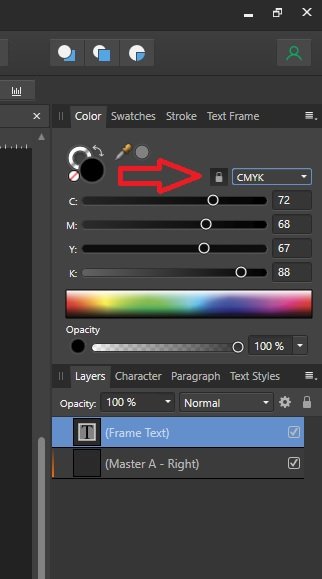
 I set up a new document (for a paperback book) and chose grayscale/8 in the initial set-up box. But when I add a text frame, it is CMYK with values of 72-68-67-88. Is this correct, or should I change the text box’s setting to grayscale too? And while I’m here, are those the best CMYK settings for type, or should it be 0-0-0-0? Thanks.
-
 Please add an option to disable the colour wheel from rotating when selecting a different colour. I want to have the orientation fixed, so I can more easily predict where I need to move the picker to.
 -
 Hi all, is there a way on Ipad to copy and paste the color between the tools or effects? On desktop I would just copy and paste the HEX value, but I don’t know how to achieve it on tablet version. Regards, Maciej
 -
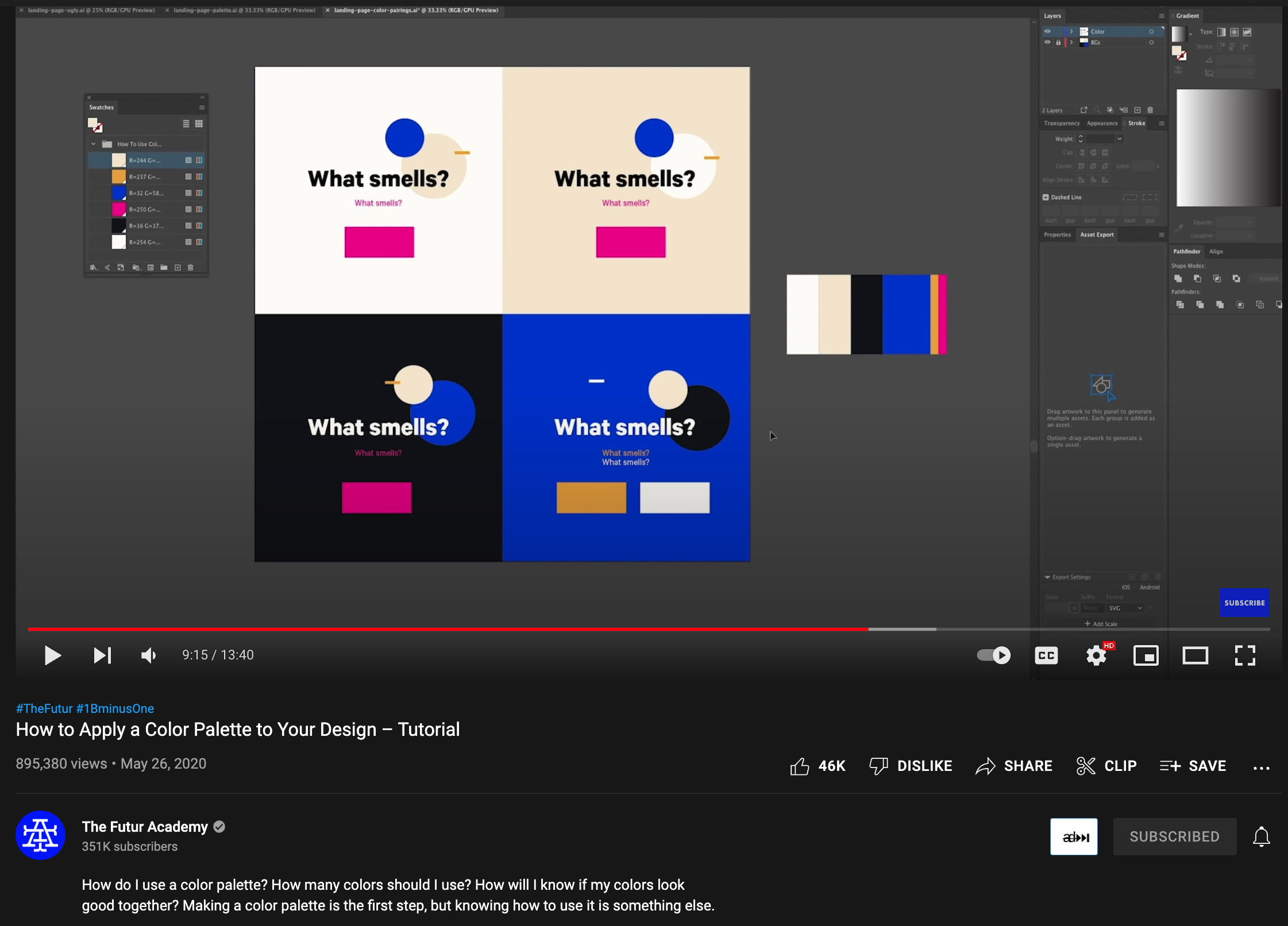
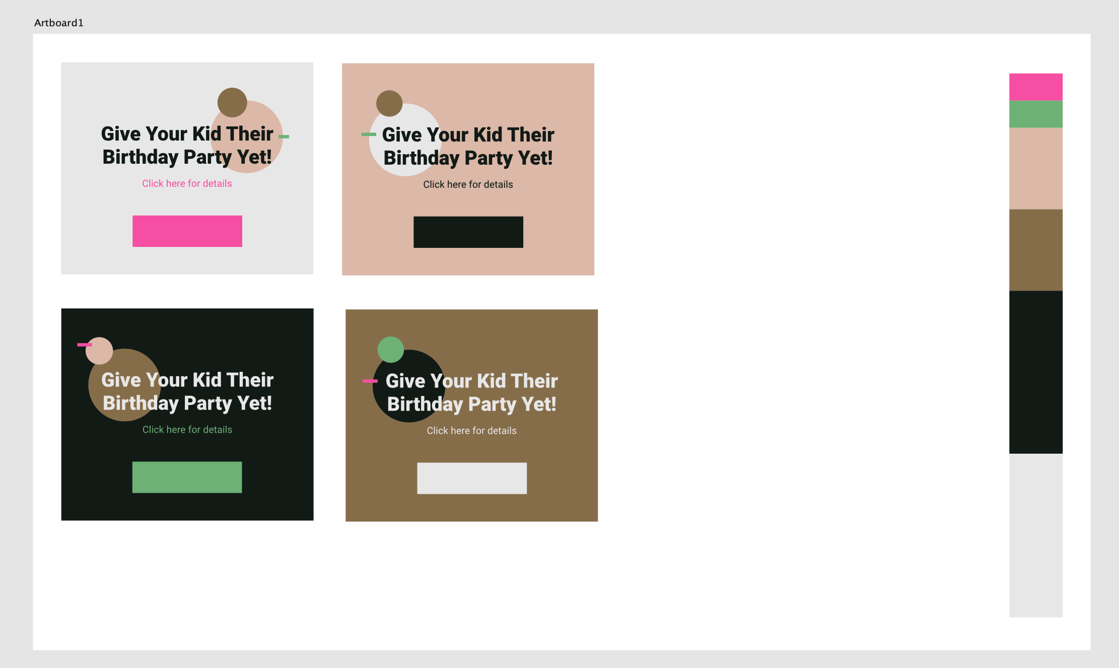
I made this based on this Youtube tutorial by Greg Gunn. It is an Affinity designer document, that lets you quickly test your color palette. Mainly aimed at website designers. Nothing fancy, it uses global color swatches, so you can quickly visualize it by changing in one place. Here are some screenshots from the file Download the template - Color test 2.afdesign
-
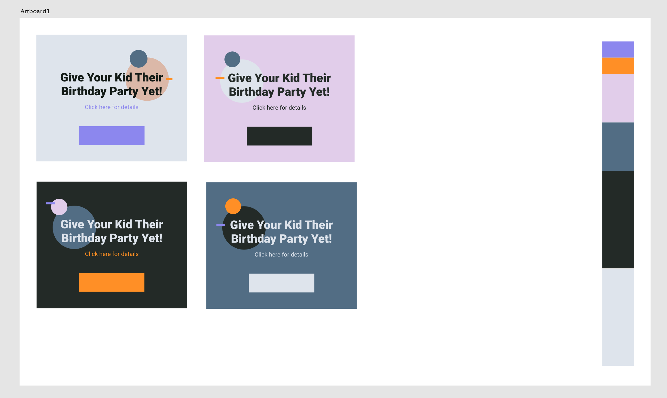
 I am using Mac Pro 2019 with Asus PA32UCX. Monitor colour was calibrated. However When I open the file with Preview and Affinity Designer, the colour is totally different. The print screen is attached here. The left one is Expansion Slot Utility and right one is print screen of that. They both are same colour but soon as I add to Affinity Designer, the colour is washed out and totally different. Which one is correct one ? How can I match the colour or get accurate colour ?
-
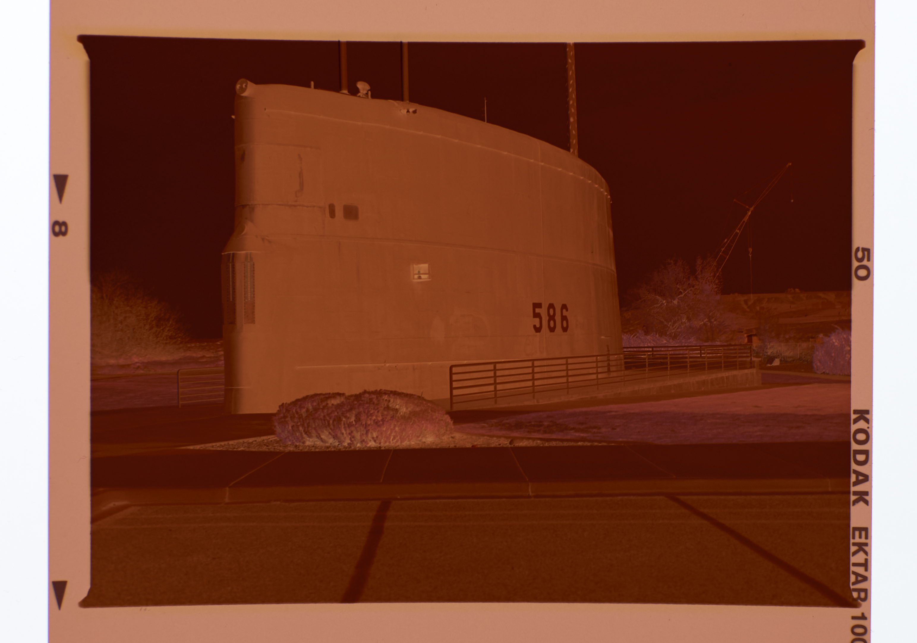
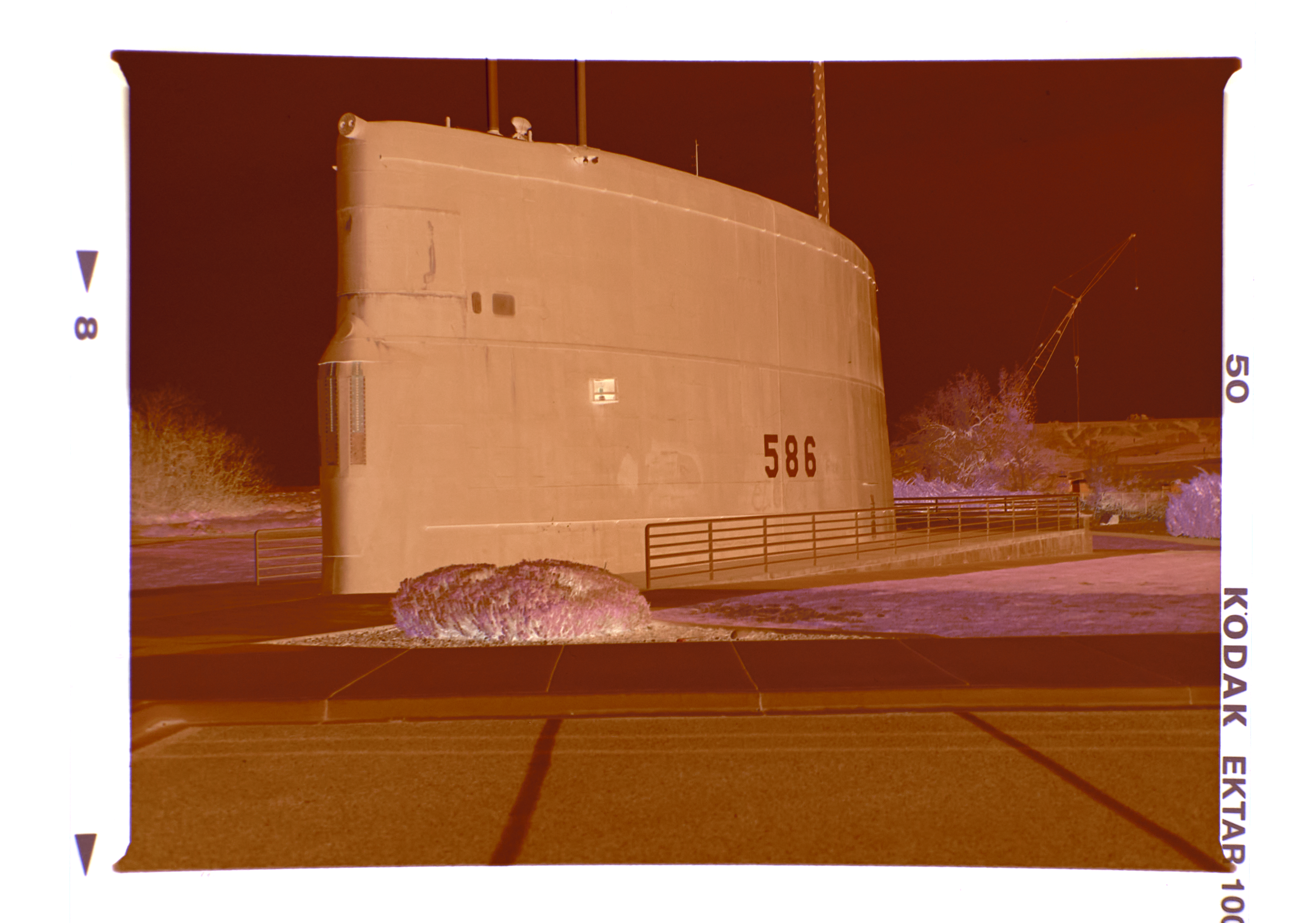
 Greetings all, I know the negative to positive conversion topic has been discussed ad-nauseam. But this is a bit different. Please stay with me on this one. Here are my first steps: 1. Bring in the color negative MF0226_Neg.png below 2. Sample the rebate color to remove the orange cast (MF0226_rebate) and create a fill layer filled with the rebate color. Then change the fill layer blend mode to divide which yields MF0226 Neg and Rebate below. The rebate has been neutralized leaving only a negative without the cast. 3. Then I use the Invert command from the Adjustment Layers which flip the neg to a pos (MF0226_Inverted). NOW here is the problem: I have an overall blue cast that cannot be balanced out. I did process this Ektar 100 film at home using CineStill chemistry. The chemistry was new and just mixed. I checked and rechecked my mixing volumes and temperatures - all OK. Any ideas?
-
 Hi guys, here's a new video about how to remove any white color in your photo with only a few clicks in Affinity Photo. I hope you enjoy this video, thank you!
- 2 replies
-
- 3
-
-
-
- affinity photo
- tutorials
- (and 6 more)
-
 The program displays all colors in a yellow-white color. sRGB, CMYK, Lab... all my color settings and calibration are correct. Both Photo and designer programs have the same error. I have uninstalled and reinstalled the program 4 times but still no solution. I need help.
-
When creating a palette from the current document the colors are incorrect. Obviously they are generated from the screen display and not from the objects in the document. So it is impossible to create correct colors of some vector objects by this function. Instead the color is correct if you create an empty palette, select a single object and click add color or global color. AD 1.7.2 OSX 10.9.11