Search the Community
Showing results for tags 'Color'.
-
Affinity seems to be assuming that my Canon RAW (EOS M) files have a colour space of sRGB, despite the fact that they are really in Adobe RGB. The reason I say this is that if I enable colour space conversion warnings, and set my working space to Adobe RGB, it does warn me that it is converting from sRGB to Adobe RGB. Does affinity support colour spaces other than sRGB in RAW files? If not, is there a way I can assign the correct space manually in the Develop persona? (I can't seem to find a way to do this)
-
 IU'm converting from Photoshop and struggling to understand something - In the colour panel, there are 2 colour circles which appear to correspond to a 'fill' colour, and a 'stroke' colour - whereas in Photoshop they relate to Foreground and Background colours. Does Affinity Photo have a concept of Foreground and Background colour or not? In Photoshop I can create a gradient from the foreground colour to the background colour - how do I do the equilavent in Affinity Photo? I used the colour dropper tool to select 2 colours in a photo, but as soon as I switch to the gradient tool I don't seem to be able to use the colours I picked, as a white gradient fills the entire layer and I cannot find an option to go from Fill to Stroke colour.
 -
 Hi, For some reason the color of the object is different when choosing 90% black from the gray palette vs setting it on the cmyk slider... Am i missing something here?? Cheers! Pedro
-
 If I need to select many objects quickly, is there an option to select by color?
 -
Since the digital industry is moving away from sRGB to a wider HDR style color profile, it would be nice to have some sort of color boundary line on the color wheel selector tool to let us know what colors are inside/outside of the sRGB color spectrum when using a HDR color profile. This might be good for CMYK as well. Perhaps use an actual color profile as a color selector option...
-
 Greetings, After using Affinity for some time, I am noticing a gradiation problem that bugs me. Because when I did a print test, the same problem has occur. This happens when I do gradient or blur on my illustrations. Is this related t the software itself, color profile or simply the lack of a proper video card can cause this issue? SPECS RAM : 8GB Intel(R) HD Graphics 520 DirectX 12 Does better video card equals to better color banding? See attachment for the issue I currently have or is this related to the color profile. Want to find an answer to this problem, so I know what I have to work on to avoid this in the foreseeable future.
-
 Hello everyone, I currently own a monitor which is used for color management, but unfortunately I am still very confused on how everything works. I read so many articles, etc., and I still don't feel that things are clear to me, mainly because when I try to experiment with these things I get mixed results. My monitor is capable of 99% adobeRGB and I set it in windows to always use adobeRGB. My concern is that the colours I see in Affinity photo differ quite a lot to those I see in lightroom (I use a standalone version of lightroom to do cataloging and some pre-editing). I read that lightroom used ProPhoto RGB as its main icc profile for the develop module. Well, I set the "RGB color profile" in the AP's color profiles as the same (I downloaded it from the icc website). Nonetheless the colors are still different. Is this somehow a conversion from the higher gamut ProPhoto RGB to adobe RGB (screen's icc profile) that uses different engines and therefore the colours are different? What are the steps between the photo's RGB values->screen when in AP? I need guidance or someone to really dumb down the information and feed it to me, because I am very confused with this ordeal. Thanks for anyone's time, all the best, -JA
 -
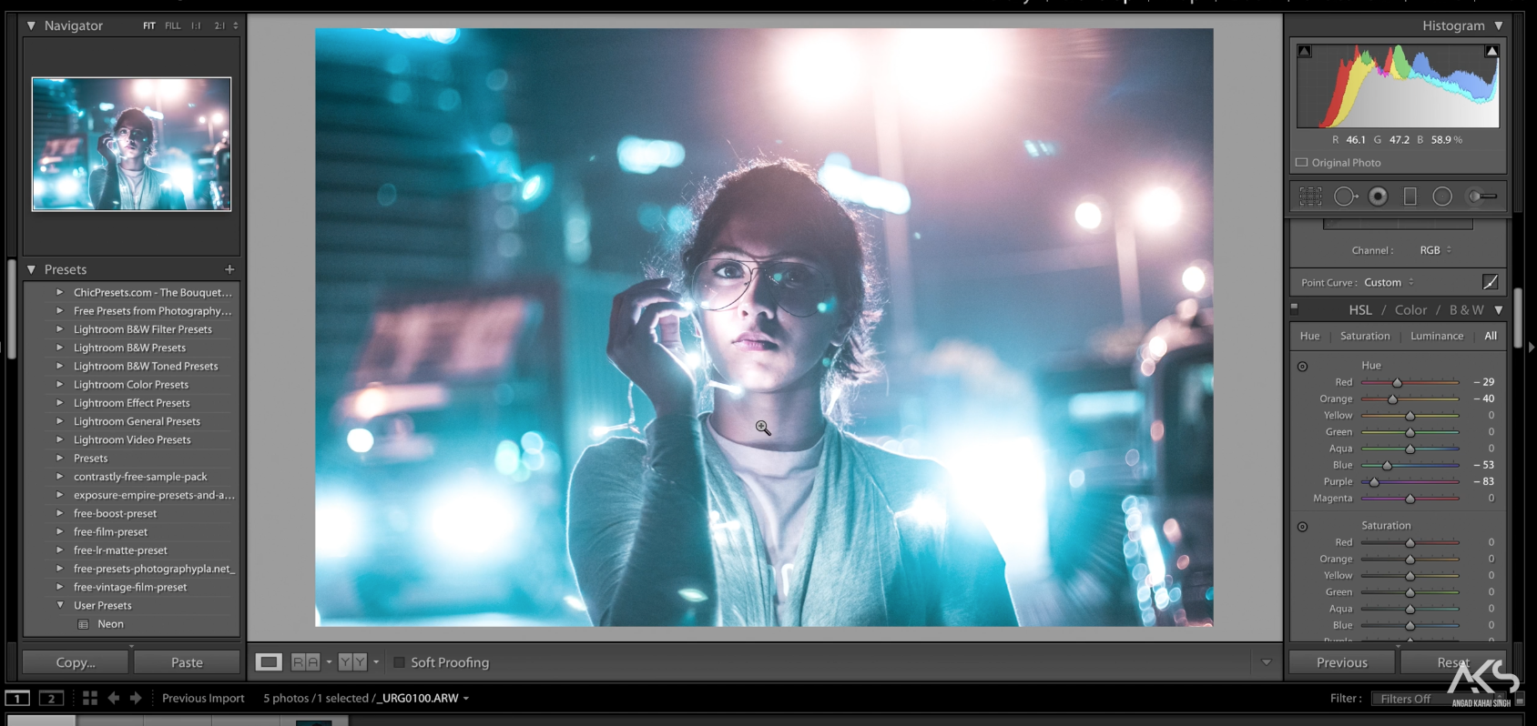
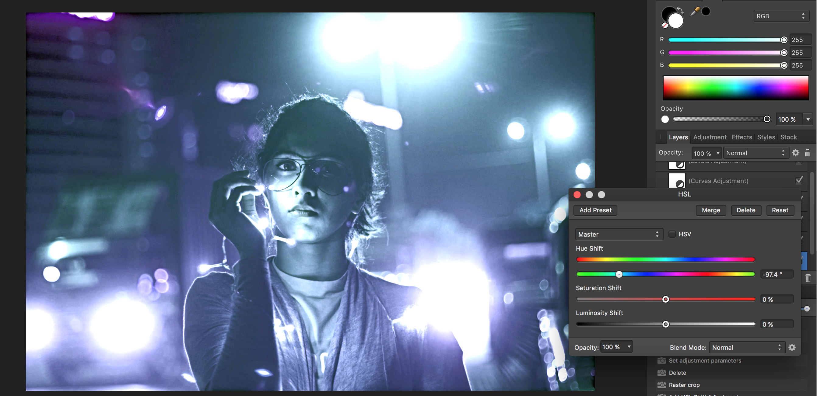
I am trying to stretch my Affinity skills a bit but following along with a Brandon Woelfel photo tutorial. The photo began looking different from the video right off the bat, with the Temperature adjustments. my main issue so far is that when the video changes the color channels to bring out a more teal color my whole photo just looks ugly and blue. it seems PS just has a much better and more specific HSL adjustment tool, is the true? Please help. I have attached the tutorials picture and mine in the same step making adjustments in HSL, Please help!! Here is the video. I just took a screen shot of the original to work along with the video.
-
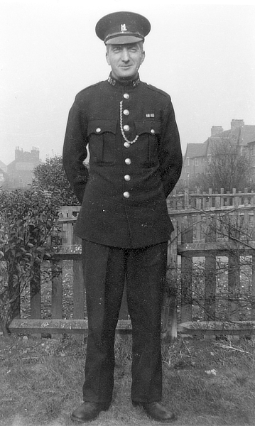
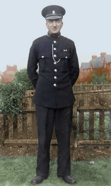
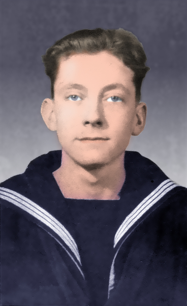
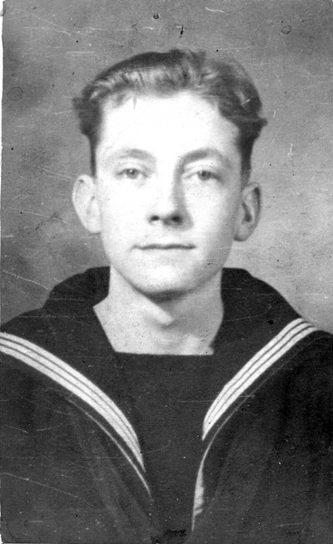
I've done some mono to colour in the past, but I've only recently begun to try it in AP. I scanned some old family photos a few years ago, and these two are of my grandfather and father (he's the younger one!) taken about 1949 or 1950, when Dad got his call-up. Granddad was a Special Police Constable, and they must have been showing off their uniforms. I'm pretty sure they were taken on Dad's camera. Anyway, to business -- I've reduced the images after recolouring, which cuts down the noise somewhat. The left-hand photo didn't look natural enough, so I tried Filters>Colors>Auto... (all four) and got the result on the right, which looks a bit more natural. Didn't work on Granddad though! I used a separate pixel layer for each colour, trying different combinations of blend mode and transparency till I was satisfied. Dad's eyes are a little stark, and there are some hard edges which need softening up ... but I'm still on the learning curve, and any constructive criticism will be welcome.
-
 Hello Serif, i´ve met a bug In latest beta (1.6.0.80) is a strange behaviour when creating or editing global colors. If you create one, set a color and then click somewhere to artboard, the color parameter is gone and sometimes global color turns into regular color (the small triangle dissapear). There is also an issue editing the color for existing applied globals to see realtime change on objects which i use very frequently. Look at video pls, thx. Am i missing something? In previous versions this worked fine. aff_designer_global_colors_issue.webm
 -
I've been wanting to do a color double exposure for a while but all of the tutorials are for photoshop and the steps don't translate to Affinity Photo. Can anyone explain this to me? here is one of the videos I've seen. https://photoshoptrainingchannel.com/color-double-exposure/
-
Dear Serif team, Have you any plan to support WTF Color Fonts in Affinity Designer/Photo soon ? https://t.co/DifE54ptXF We are hopping this great functionality in next version ! Regards.
-
 Hi everyone I am newbie and I am struggling in a simple thing I could not change the color of an object any help
 -
If me using CorelDraw, coloring Object is very easy use smart Fill or Live paint bucket in Illustrator. in Affinity Designe takes a lot of time for coloring NEED CLOSING NODE, i am work with Pen tool mode Line.
-
Is there a way to create a global color after the fact...For example...I created a document with many items with the same color...Can I add the color as a global color, and apply a color change to the rest of the document?
-
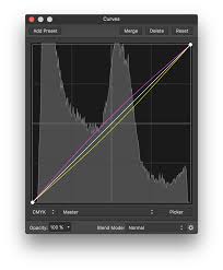
 Hi there, first of all, congratullations for the app. Do you have plans to implement in curves, the option to see the image in background, of the histogram for every color chanel (I dont know i writing it right in english, see the attached image). I think that is imprescindible for a profesional retouching photo soft. Thanks.
-
Hi there, first of all, congratullations for the app. Do you have plans to implement in curves, the option to see the image in background, of the histogram for every color chanel (I dont know i writing it right in english, see the attached image). I think that is imprescindible for a profesional retouching photo app. Thanks.
-
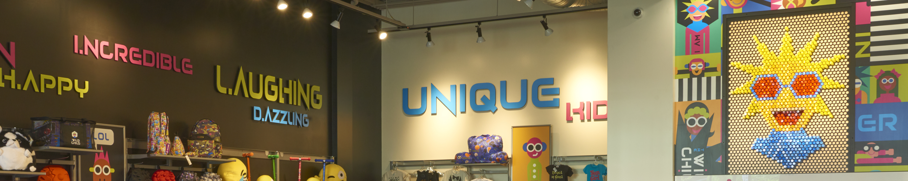
 Ok, figured out how to select an area with the tools available, however, the only adjustment that seems to work is the vibrance. Also when I'm done and deselect that area while selecting another area, the adjustments seem to affect the previous area even though thats been deselected. So basically, there are multiple areas that I need to make pop in this image, lettering and the graphic face on the wall. Suggestions? Please help, working on a clients project.
-
So I have an image where I need to highlight, i.e., bring out the color detail while making that area pop. Basically I have an image that is yellow and blue with already a lot of blue and yellow in the image so if I crank up the yellow and blue it just increases that color globally. Any suggestions will be greatly appreciated!
-
 Hello all, I've been having a bit of a problem exporting and managing colours recently whilst some vector work. It's not something that I have encountered before, but after alot of searching, I cannot find a solution that fixes my particular problem. The rendered colour is not representative of the colour that is chosen in the colour picker. Above is a screenshot of an example. using the tool 'Sip' I can see that the colour is being rendered differently to that which I picked. Below is a screenshot of the same scenario but this time in Sketch and notice that I do not have the same problem. My document and export color profiles are set to sRGB as this is the default for web browsers. Any help on the above will be greatly appreciated.
-
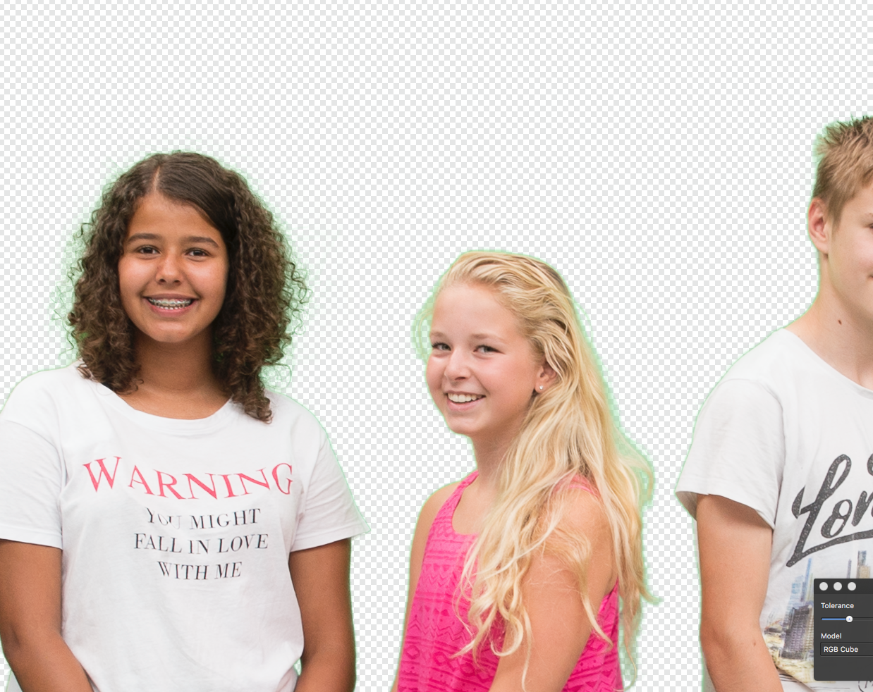
 Good morning! I have been an avid user of Affinity's Photo and hardly ever had to ask for help (I thought never but I found a question from 2015). A client asked me to take pictures before a greenscreen while I was on assignment. They had a very small green cloth and there was a mixture of sun and tungsten light. I did the best I could... Having no studio lighting I expected some color cast but it is far worse, probably because of the small screen/cloth so the group had to stand close to it Can anyone help me in regards to how to remove the green color cast from the models? Below I attached a screenshot of what it looks like. If you need more info etc, let me know. Thank you in advance! Dennis
-
 In version 1.5.3.69, icons for selecting fill color and borders were larger and more comfortable to handle. Version 1.6.0.76 is smaller and less handy. It would be better if the color of the fill was left-clicked and the color of the border was the right mouse button, as in CorelDraw.
 -
 Hello This is my first post here. I just bought Affinity Photo for iPad and the first thing I tried to do I can't seem to do. I want to use a brush and select a color from the photo. I have the brush tool and see the color picker but cannot see a way of getting the color from the photo. Also I have no idea what the little circular tools are next to the color picker. Is there a manual? Cheers. Martin
 -
 In help I found this: To convert an existing colour swatch into a global colour: In the Swatches panel, choose a Document palette from the pop-up menu. -click a displayed swatch and select Make Global. But I can't find this option anywhere. Is it implemented? Also is there a way to merge color paletes? Or import palete so it would instantly be made of global colors? Also when selecting color from PANTONE color paletes its instantly added to a document palette as global color with spot. Can users make paletes to work the same way or is it just hardcoded? ;P Also I have to say. Color paletes, global colors they work great even now, but they need a little polish in my opinion. They need a little more manipulation options. Should I add it to requests or meaby it's planned somewhere along the way? :)
 -
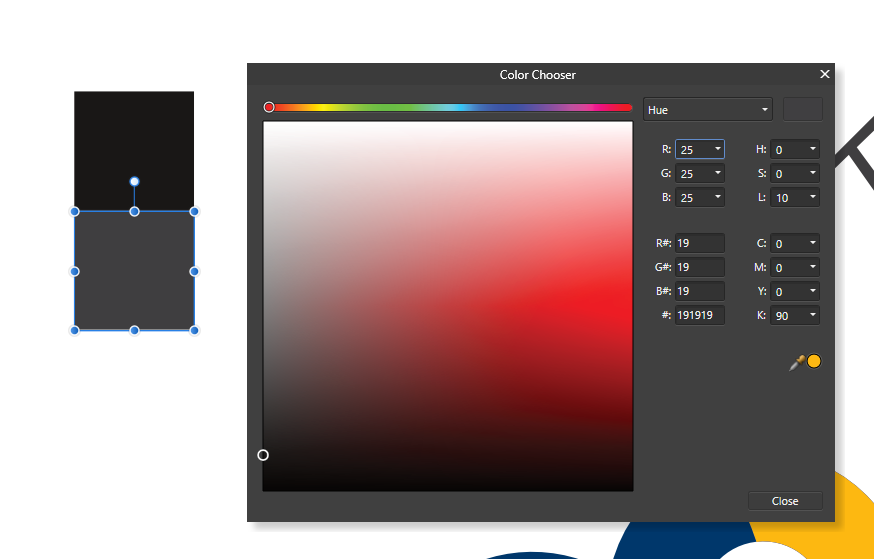
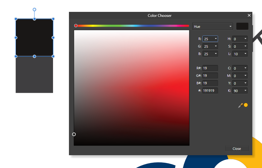
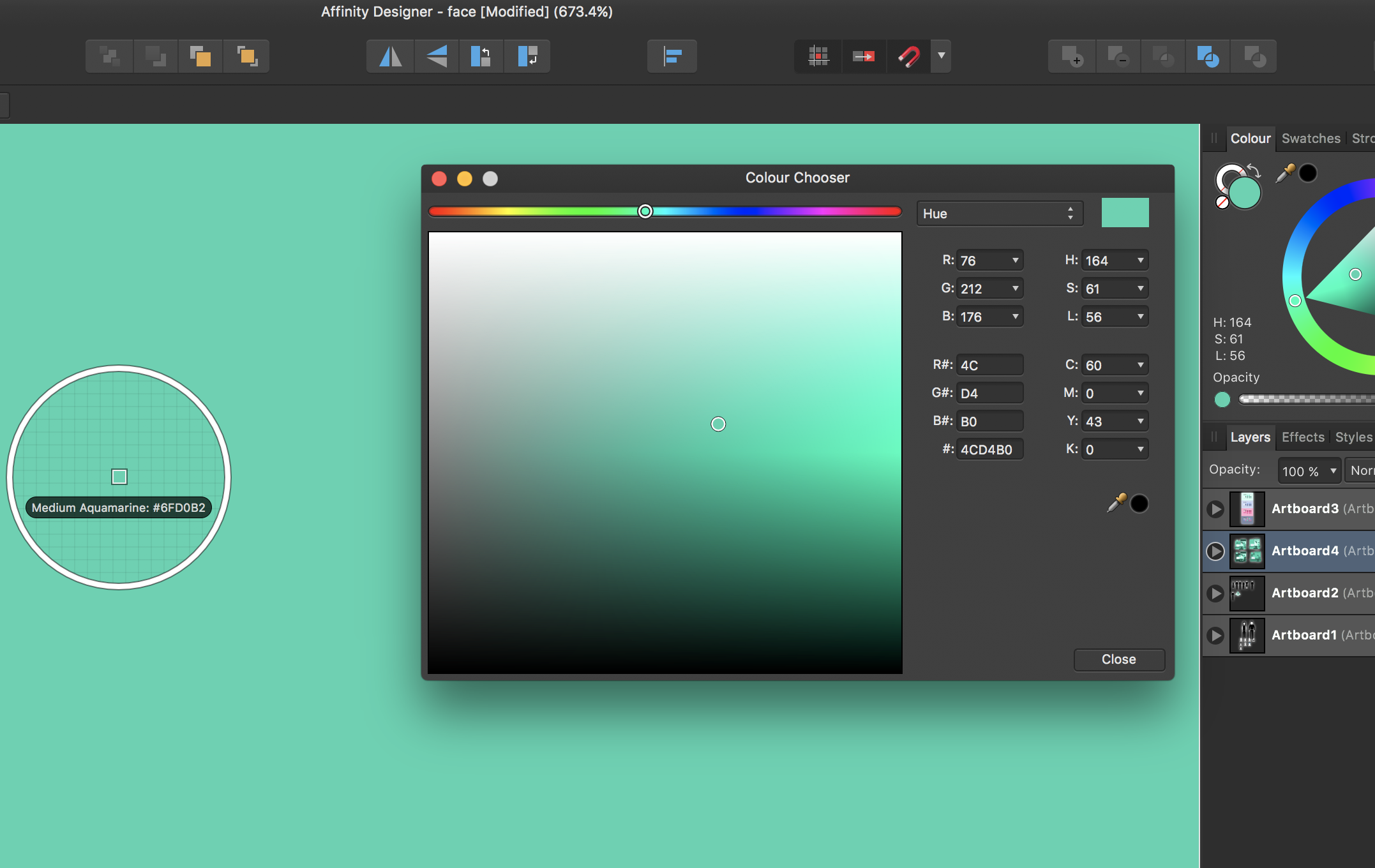
 I am not sure what I have done, but colors are no longer displaying correctly. When I enter the hex code, the color should be correct. It is actually lighter than it should be. in addition, the color chooser is not displaying correctly, with the top half appearing to have a white gradient over it, This is the second time this has happened, so I am sure i am changing a setting somewhere, I just do not know what it is.