Search the Community
Showing results for tags 'Color'.
-
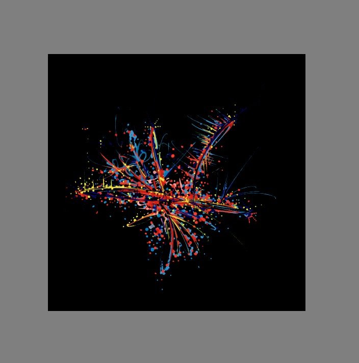
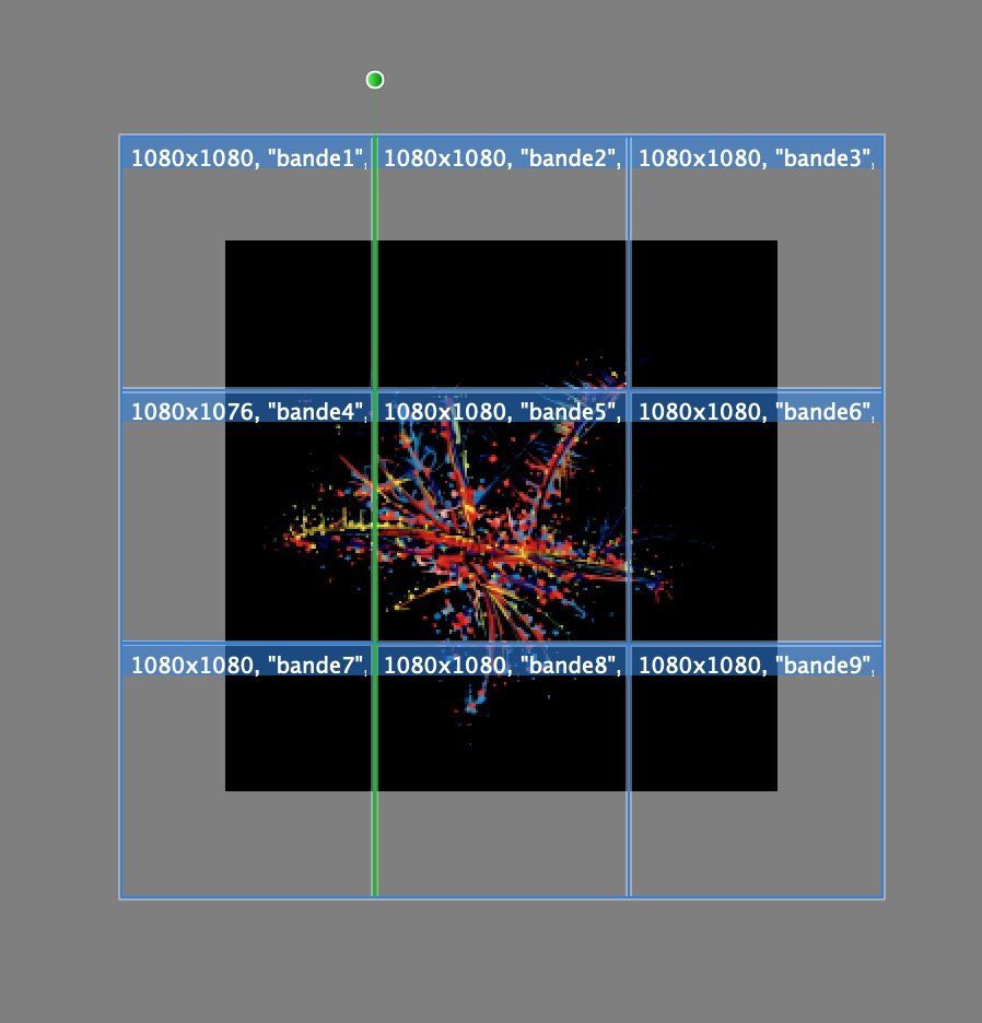
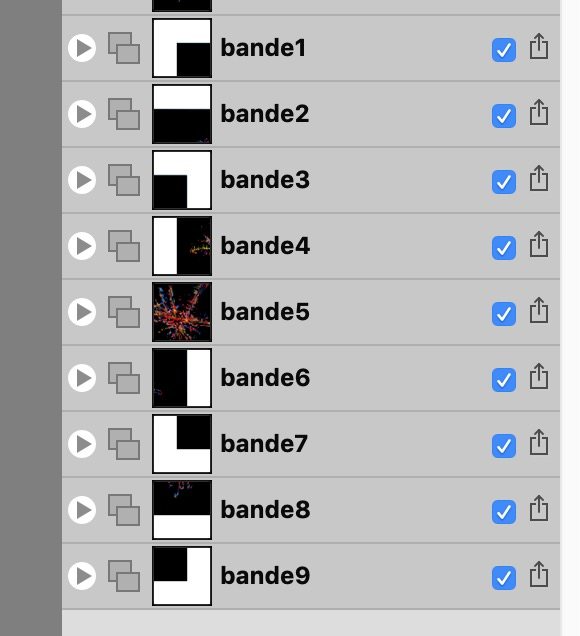
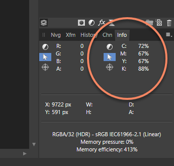
 On Affinity Photo I want to export an entire black image to a 3x3 square of slices. As this square is bigger than original image, 8 exported slices but the center's one have extra pixels. When I exported slices, these extra pixels are white. I want them to be black. I tried many tricks without success: change background color of image, add a square below the image and fill it with black... No success. Extra pixels are always white. Is there a way to achieve this goal? Original image Mosaic of slices Slices As you can see, extra background is white. Top left slice
-
 I'm new to Affinity Photo and thought I was doing something simple, lol. I have a layer that is all black. I put a vector shape on it - a star. I wanted to make the star a bright yellow so chose yellow on the colors and used the fill tool, but nothing happens. Whaaaat?
 -
 I find it hard to understand the effects that color profiles have on the colors of images in Affinity Photo. A raw image opened in Photo looks de-saturated, compared to DXO and preview in Irfanview. The JPEG from the camera looks better, but less saturated than shown in other software, like Firefox, Paint.net and Irfanview. Perhaps some setting of Photo overrides the data from the image? When developing the image I assign the ROMM RGB profile. From what I understand this profile keeps the highest number of colors available during editing. Is this true? After making adjustments I export the image as JPEG to use on Instagram and my website: during export choose the sRGB color profile and embed it. Other software like the Windows Explorer preview, Windows Photos, Irfanview and Firefox show the exported image more saturated then I see during editing. first convert the image by changing the color profile of the document to sRGB. Then exporting it the same way. Now the image is also more saturated then shown in Photo, but less than in option 1. What do I need to do differently to have the colors of the exported image match the colors I see during editing? This happens on a Windows machine with the color profile of the display set to the profile that came with the monitor.
 -
 I am having a terrible time solving what seems to be a color discrepancy between what I am seeing on my monitors within the Affinity Designer & Photo applications and what I am printing out via my office printer as well as outside print services. While Affinity Designer & Photo display bright, crips images within the monitor itself, my print jobs from any file format appear very dark and dull, even when printed through third party print shops. I have had no issues in the past with other programs and their settings. I am wondering if there might be a color setting that I need to change internally to help your program accurately display on screen what my (and outside) printers will produce. If you have any other suggestions, they would be much appreciated.
 -
 Hello Peoples, Hello Team ! Well today i want to raise a point that we often skip as we move on to more cool and nice Affinity stuffs and that point is: Layer color setup ! Yes often want to make better organization of our layers and marking them with appropriated colors (personal way to code this and that) is often what we tend to do but ! The actual way to do that is a bit of ... not as bad but ... too long and too burried/hidden : Right Click on the layer - scroll down to properties then proceed ! Now let's think of it in a different way. (that's the purpose of this suggestion). I believe that putting a clickable square or round button in front of the layer (blank in the beginning) that we can just click to reveal the same drop down thing which i think should eventually show more options than just color and name). After we do what necessary, that button or square thing would then switch from its blank/empty display to the selected color and the layer name would also update when we close it by clicking out of that drop down stuff. Being able to lock it should be great too ! Also i see that function to mark a layer with a color is missing on APhoto (recent beta) while it is something important. Well that what i drop here as suggestion and i believe some other have though or asked the same. Please guys may you think this is important or just useful please drop your comment with more details or even a drawing of how you think it could look like (to help the dev team) or just click and like this topic. Blessings !
 -
Hello, The OCIO function looks interesting but, despite a tutorial dedicated to this function, I can not understand how it is installed and configured in the Preferences Colors panel to access the "View OCIO transformation" menu. I add that I am French, that I use the last version of SC under Win 10 with an i7. Thank you so much.
-
 Hello DEVs First off, thanks again for great software, I've been sending ~250 portraits through it since I bought it, and I love how the application just simply replaced Photoshop Over to my "needs".. I really need some features from PS days, and I hope you guys see why. "Apply Image" in Affinity Photo is not alike PS CC's version of it. I used to use this often to grab an RGB, R, G or B. CMYK or C, M, Y, K or even LAB L, A or B from a layer, a document or a file on the disk, then "apply" it as a mask - inverted or not - on to the selected mask, usually in normal or luminosity mode. I even use it for blending K channel from a dublicate CMYK document in to actual documents RGB composite to enhance faint details which is almost lost. I also use it to mix one of the RGB channels from same document in to the worst channel to enhance the details and remove noise (usually B channel), its called luminosity blending, check out Lee Varis and Dan Margulis photoshop videos. I don't see this is possible in Affinity Photo with the current "apply image", and I wish I had the same blending options in it like default layers so it will be easy to fix a "bad" channel in a image Check video below in this post. I also wish I could set one of the info readouts to a default readout, LAB for example, because I use this more often than RGB or anything else. Left side could be document format. I can change to LAB right now, but it doesnt stick to next image. I love to be able to save my own defaults than white and gra. Every single time I use this I have to go and manually set left one to black and right to white anyway because I rarly use this on other things than masks. It is really annoying After pushing through those 250 portraits since I bought Affinity, I'm really getting tired to recheck "current and below", I never retouch on background or main pixel layers and wouldn't suggest anyone to do it either. Make a new layer then use the healing brush with "current and below" is the safest way to use it anyway, so could it be possible to have persistent settings on these as-well? Check next 5 minutes to see what I mean of luminosity blending: Thats all for now Best regards, Aleksander
-
Hello, What happened to the feature on Ipad that color picker appears when I press the pen 2sec on the screen? It was really useful in my workflow for blending colours... How can I pick/blend colors in the easiest and most efficient way now? Thanks, N.
-
 Greetings, while researching another issue I came across an issue I've been struggling with in the stable release for quite a while: When selecting a shape tool (pen tool, rectangle tool, circle tool, etc.) and immediately changing the colors and then drawing a shape, the colors (and stroke settings) will actually apply to the previously selected object instead of the newly drawn. This goes even further for the pen tool whereas you have to at least draw two nodes to be able to adjust color and stroke for the current shape. In my mind when I have a shape tool selected the context sensitive bar (which is actually changing depending on the selected tool, NOT the selected object, so there's an ergonomical issue, as well). should reflect settings to the shapes I am ABOUT TO DRAW. If, on the other hand, I select either the object selection (V) or the node selection (A) tool, I would expect the context sensitive bar to reflect options and functions corresponding to the SELECTED object. For me it is important to pre-set color and stroke to accurately visualize the design I am making. Right now I am forced to painstakingly readjust the shape (sometimes each node in a complex shape seperately ) if something doesn't fit. I hope I could bring my point across, and why I think this should be adressed from an ergonomical point of view. I attached a video illustrating the issue both in the beta (where I'd expect the change to be more reasonable than in the stable release), as well as in the release version (where the affected object even is the artboard which I very, very rarely change settings like color or stroke, if at all - do artboards even have a stroke?) I wonder, if other people found this to be an issue in their workflow. I am also aware, that this is a matter of workflow and taste, so I would suggest adding an option rather than changing it completely. Thank you for reading! Shape Tools Color.mov
 -
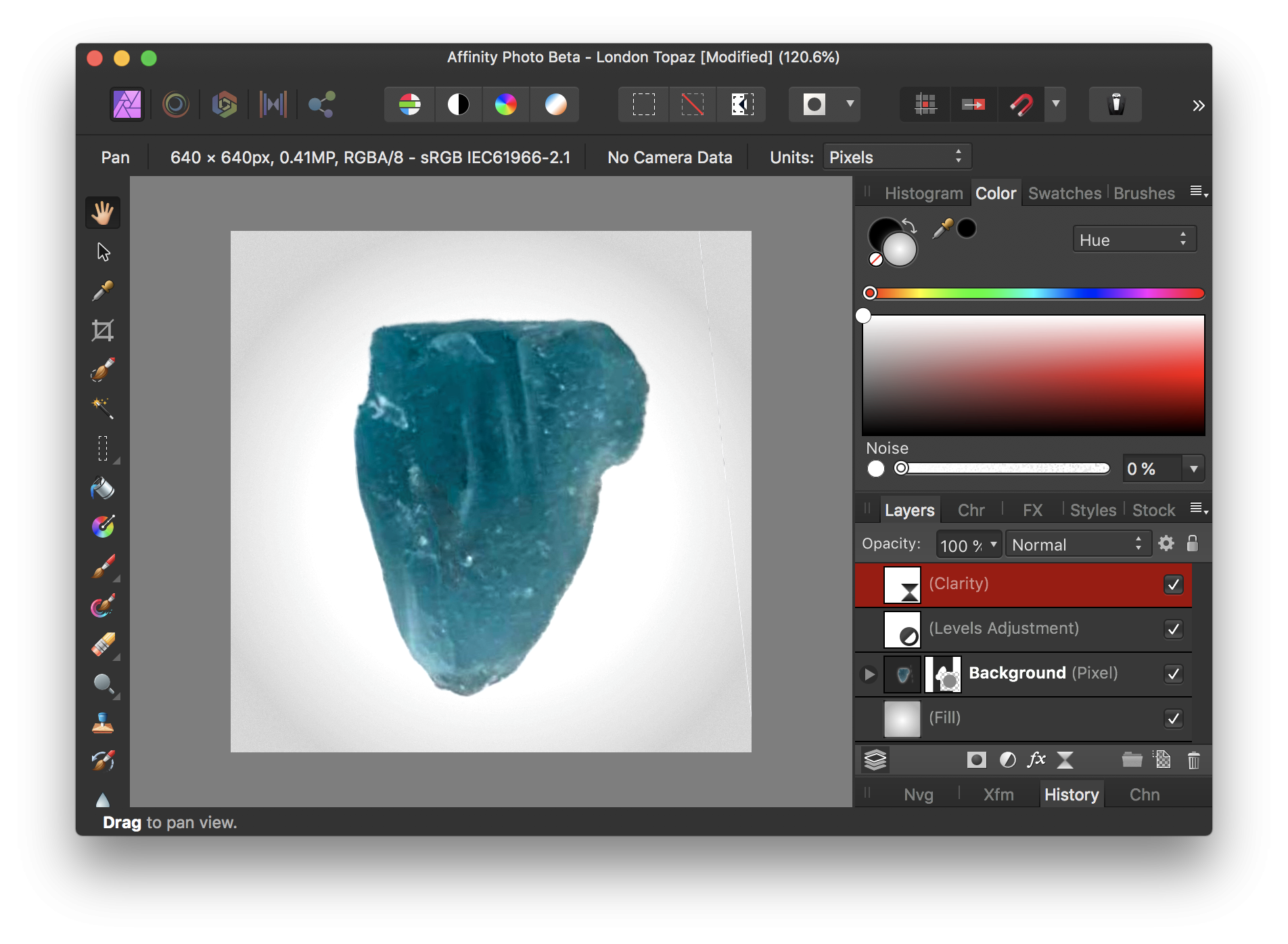
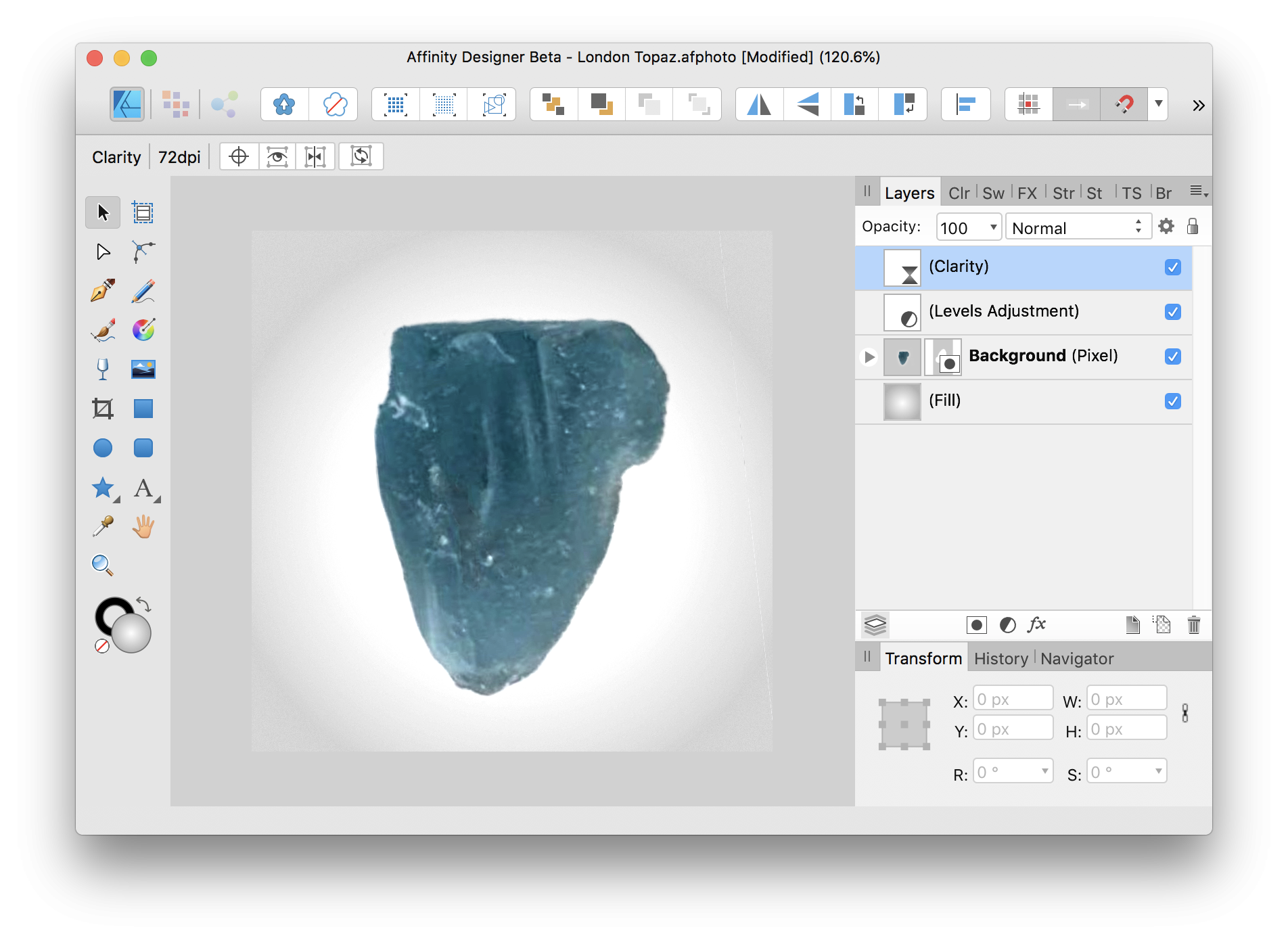
 Same file opened in both apps, colors are more saturated in AP than AD. The color space and profile are the same, I didn't change that. It's the same file. I can upload the file for inspection, just supply upload link. Thanks for all you do.
-
 Hello, I'm not sure if this is a feature or a bug. But the color toggles don't inherit from one file to another. Also eyedropper requires you to open the other file, which results in the color not eyedropping in the correct file. Edit: One workaround is to make a swatch table with the colors you need. Something I never used in Photoshop, but I guess the best option with the current workflow in Affinity. I made a video to demonstrate the bug\ feature. It's a bit of a time killer because if I have 10 files that use the same colors, I need to do alot of eye dropping over and over to get the colors I need. Video Thank you
 -
 Please add this essential functions in AD: - Background fill colour and stroke colour/width for text boxes. - Convert text boxes back to vector object
 -
 Is there a way to switch the brush colours back to the original black and white with "one" click?
-
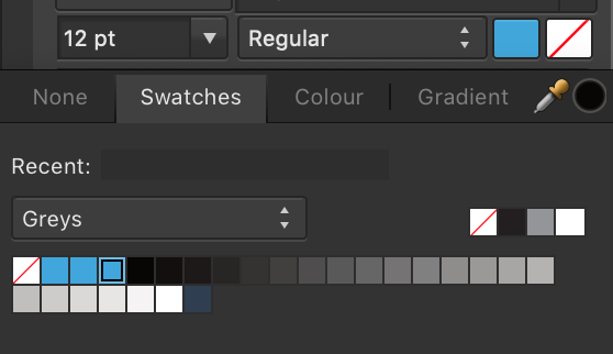
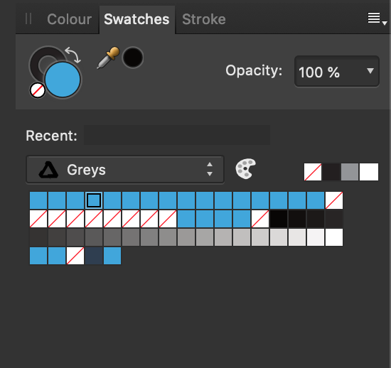
I am using v1.7.0.192 on mac and it has added a bunch of same colors into the swatch. I cannot delete these colors. What to do? I do not want to delete the entire pallet, just a few colors.
-
 Hey everyone! In the top right corner, the color picker can be dragged to increase and decrease brightness. Personally, I am disabling the UI a lot (button next to color picker) and it would be helpful if there was an option to disable this feature to prevent unintentional color change. Best wishes, Shu
 -
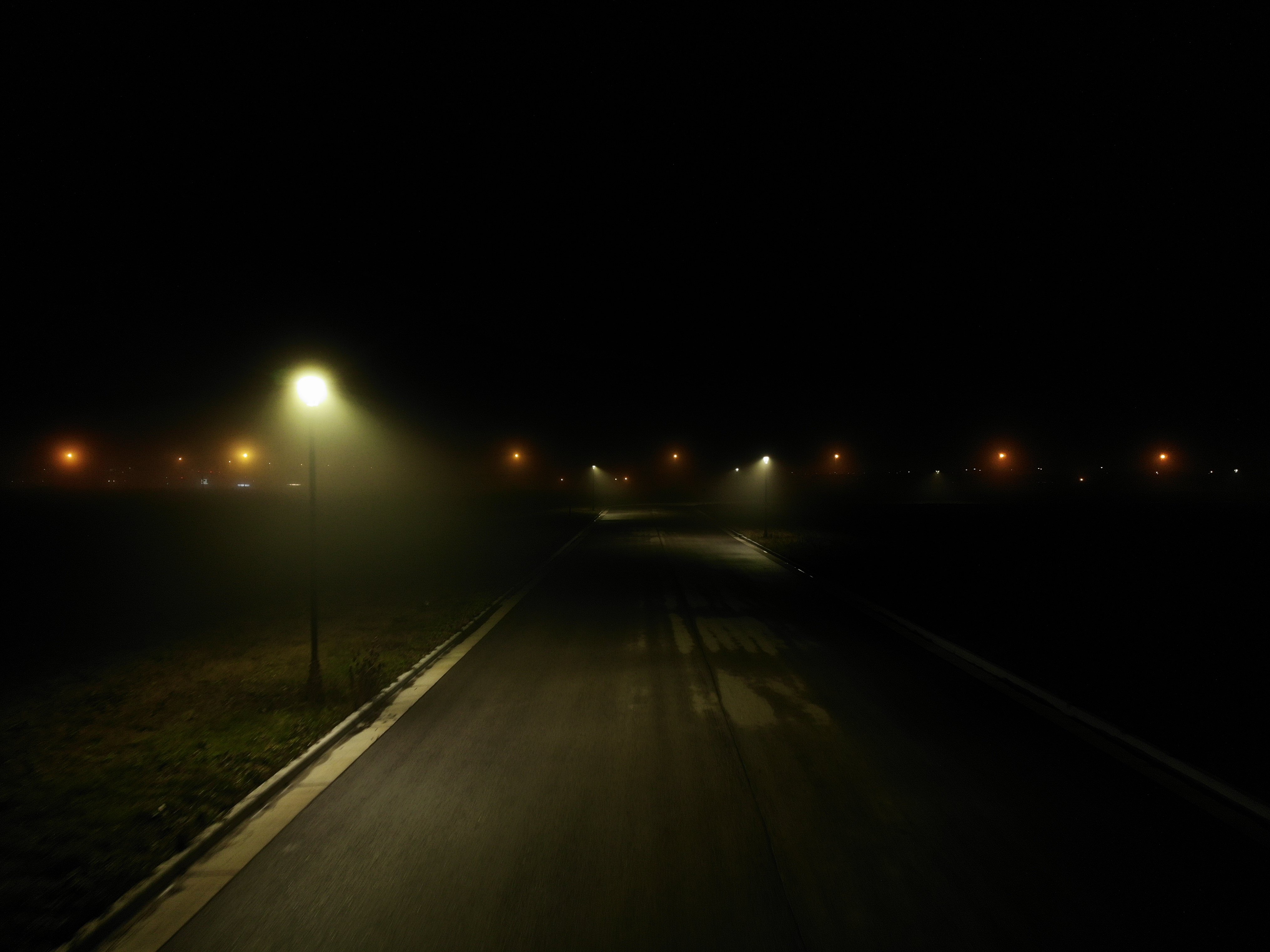
 I'm trying to touch-up my Drone photos, but they look horrible in Affinity Photo compared to Windows Preview or even Gimp Here, the original file has a very very smooth gradient coming from that lamp. But as soon as I open the file in Affinity Photo, the glow from the lamp turns in to blocky color bands.. It's almost like it tries to convert it to web-only colors or something because the quality is horrible. (below, you will probably see some banding in your web-browser, it's actually WORSE in Affinity Photo) Download this image and view it locally, to see it without banding. If you still see banding when you open it locally, sorry your monitor sucks
-
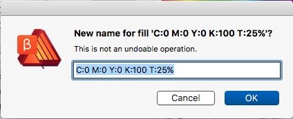
In the list view of the swatches pane any new swatch gets an auto-name with its defined values. Unfortunately these names don't auto-change when the color definition got changed by the user. This results in wrong swatch names, both for global and non-global swatches. To avoid wrong names the user has to rename any swatch manually after changing its color. To fix the name it needs several clicks to the manual renaming option window. Suggestions: – auto-change a swatch name when its color definition got changed – enable renaming on double-click the swatch name p.s.: in the actual renaming option window a hint appears: "This is not an undoable operation." – Why does it warn me that I can undo this operation?
-
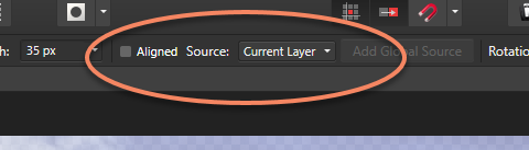
 which tool to use to change color of parts of background to color of something else in photo? For example, there are streetlights, I want to paint them the color of the sky behind the lights. I am very new to the tool. I thought brush tool could do this but it seems like you have to choose a standard color and cannot choose one from photograph. Eraser? Please advise. Thank you! Larissa
 -
Hey everyone! I'm not sure if this happens when using other Affinity software, but when exporting to .psd, Photo on iPad deletes empty layers and a layer if it has solid color and is placed as last layer and sets its color as background color. Please don't assume empty layers could be deleted or a solid color layer should be converted to background color. This is quite inconvenient. Best wishes, Shu
-
 Hi! I am in the process of creating a new workflow for my portrait photography, using Affinity on iPad Pro, instead of PS on Macbook Pro. There is one of my PS procedures, for which I just can’t seem to find a substitute in Affinity. In PS I use the Color Adjustment layer, to shift a range of e.g. reds towards orange, and thus fix problematic red skin tones. The thing is, that you can use two sliders to finely tune the exact range of reds that you want to affect. Is there any way I can achieve the same in Affinity? (Using e.g. the whole RED channel is way to coarse.) Thanks
 -
Every time I try to change and replace the text's colour it crashes. I've converted it to curves but then I don't know where to change and replace the colour unless I select element by element manually or on the layer panel. Any tips until this bug is sorted? Thanks, IR
-
 Hello, it would be great to have a variable for the color space (RGB, CMYK, etc.) of the document for creating the name of a file and the path where it is saved. That would be useful for example for exporting logos in various color spaces, for print, web, etc...
-
 I have Affinity and when I try to send it to a plugin it becomes all washed out or the colors are wildly weird.. is there a certain color setting to fix this, I have uninstalled and no change..it does it in Topaz.. nik and all others.. except smartphoto editor.
 -
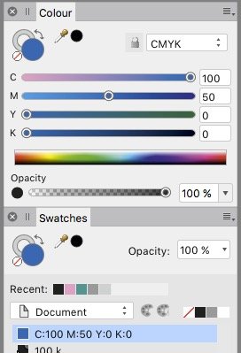
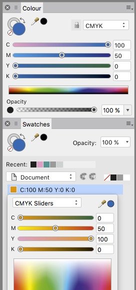
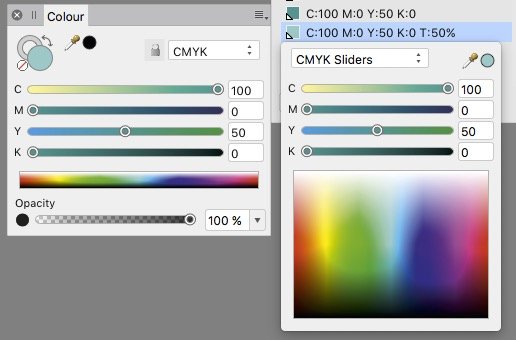
 If in the color pane in tint slider view a tint color becomes added as swatch – than the sliders & values of that swatch don't show its real value but the value of the former 100% tint. Or shorter: sliders ignore tints, the tint slider excepted. In any slider type / color system. For instance: 50% tint of 100 C + 50 Y shows in the sliders 100 C + 50 Y, whereas its real values are 50 C + 25 Y. That means you can't know for shure the values of a swatch which got created as tint. Neither its name nor its slider values appear as realiable. Related issues: • if you hit the swatch name and, in the pop-up window, hit the pipette symbol or the tiny color circle besides the sliders pulldown menu – than the color changes to the sliders values and the created tint is lost and overwritten by the 100% of the former color. • if you define the origin color as global color the dependency gets lost as soon you create a tint: Changing the origin color does not affect its child, the tint. A tint of a color, even of a global, appears not to be related to its mother.
-
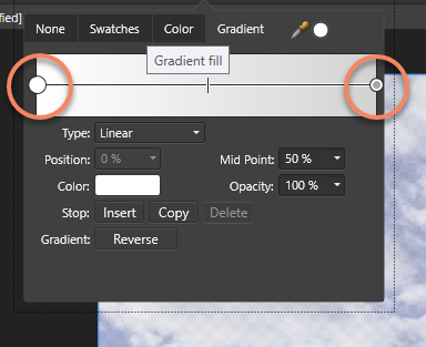
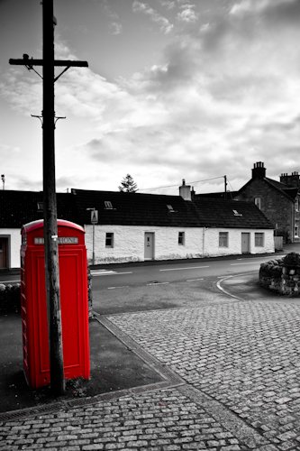
 hello, does anybody knows how to create a black and white picture, and then re-color some items in the picture ? (see example) hope to hear from you