Search the Community
Showing results for tags 'Color'.
-
 This is a video of me talking about a couple of the problems with how Designer deals with color, and likely Affinity Photo as well. And this video should explain at least somewhat well why the gradients are too dark. If there are any Affinity devs active here, a response/acknowledgement of the problem/solution from them would be appreciated. Thanks! P.S. Shortly after I made this vid, I actually did go and buy AD. So I hope even more now that these problems get fixed. Like the point I tried to make in the video, would these issues really be that hard to program out? affinitydesignerproblem.mp4
 -
 Hello Affinity Photo development team, I'm a newbie to your program, but have worked as a digital illustrator for several years. Affinity Photo is a really nice program - a nice alternative to Photoshop. It could be a great program for digital illustrators and painters... But it is missing a critical option for higher speed efficiency: a fast color picker option by pressing "Ctrl" or "Alt" This is present in Photoshop, Corel Painter, Krita, OpenCanvas, PaintStorm Studio, etc. It is very important to painters to be able to access the color picker quickly. When you hold down "Ctrl" or "Alt" and click on the color - it color picks it. Then when you let go of the "Ctrl" or "Alt" key, it goes back to the tool you were using before. When you have to switch between brush and color picker, this wastes twice the amount of time. An extra second or fraction of a second may not seem like a lot - but it adds up. A painting that would take 2 hours, takes 4 hours. A piece that would take 1 day, takes 2 days. 1 week turns into 2 weeks, etc. This would be a great addition to Affinity Photo - for all artists. One last idea... Is allowing the user to "fix" the color wheel triangle in a fixed position - instead of having it rotate all around pointing at the chosen color. Why? Because having lightness point up, darkness point down, and saturation point right - is far easier for the brain to process than having the triangle flip all around the wheel... it makes picking specific shades across different colors inconsistent.. harder to match the same saturation position on different colors... because it has changed position. It's easier for the brain to map out the color triangle when it's fixed in one position. White up - black down - and saturation to the right.. Would be far easier to remember for artists - who need consistency, and speed in color picking. Thank you immensely for viewing and considering these ideas!!
- 48 replies
-
- 6
-

-

-
- color picker
- color wheel
- (and 8 more)
-
 Hey everyone! This feature request is for macOS as well as for iPad. It's great nested symbols is implemented now. I have a suggestion that would make things easier to see what's going on: It would be useful if there were different symbol indicator colors depending on symbol nesting depth. For example: Normal symbol: Orange Symbol that holds symbol(s): Yellow Symbol that holds symbol(s) that hold(s) symbol(s): Green ..... Blue ..... Pink ..... Purple ..... Red Best wishes, Shu
 -
Check the attachment. Default color difference between two apps. Why is this happening?

-
 Hey Guys, could anyone help me with affinity photo on IPad? I can‘t select any color with the color selection tool! Thanks for your replies Your I_like_cameras
 -
Hello everybody! I just wanted to let you know that FX Monkey's second free pack for Affinity Photo is out! Faux 96: 8 Color presets and 4 Overlay Textures. Click the image below for more info (the website looks pretty cool though, so check it out! It has some hints on whats coming next too...ohh) P.S.: The previous Monkey Pack - Faux 77 is no longer available for download. A thousand thanks to all the people who grabbed a copy! Faux 77 was a teaser for a soon to come premium Monkey Pack: Faux 77 pro (more than 20 macros + Textures), so get your hands on Faux 96 while it's still available :) Enjoy guys!
-
 Hi all, from one day to the next something has got mixed up with the color management in Affinity Design. The white became a yolk yellow. When I tried to change the color profiles in affinity, sometimes nothing happens and the white remains yolk yellow. With other documents the background becomes a neutral white but other elements that should be also neutral white remain yolk yellow. Like I said, I tried to change profiles, from RGB to CYMK, from AdobeRGB to the Benq-Profile (my monitor). Nothing worked. When I start with a RGB/8 and Benq-Profile everything is shown correctly, but the PDF documents I import, always have this yolk yellow instead of neutral white. I have to say that I am not a professional graphic guy. This problems I have on a Windows computer. Can someone please help me? Thank you
 -
 Hello, I've created a colour palette and plan to have a lot of layers having the fill colours from the palette. Is there any way to change all shapes with a given fill colour when changing that colour in the palette? I'm using both Designer and Photo by the way. Best Regards, Steve
 -
 I’m struggling with pixel persona in Designer on iPad as I keep triggering a gesture shortcut that brings up the colour picker loop when using the brush tool. This means I regularly sample new colours by accident and then have to manually revert to the colour I was using before. I can’t quite work out what combination or sequence of gestures I am performing!! It seems to involve brief taps with 2 fingers, usually when I’m trying to rotate the canvas, but I can’t work out a consistent combo. help please!!
 -
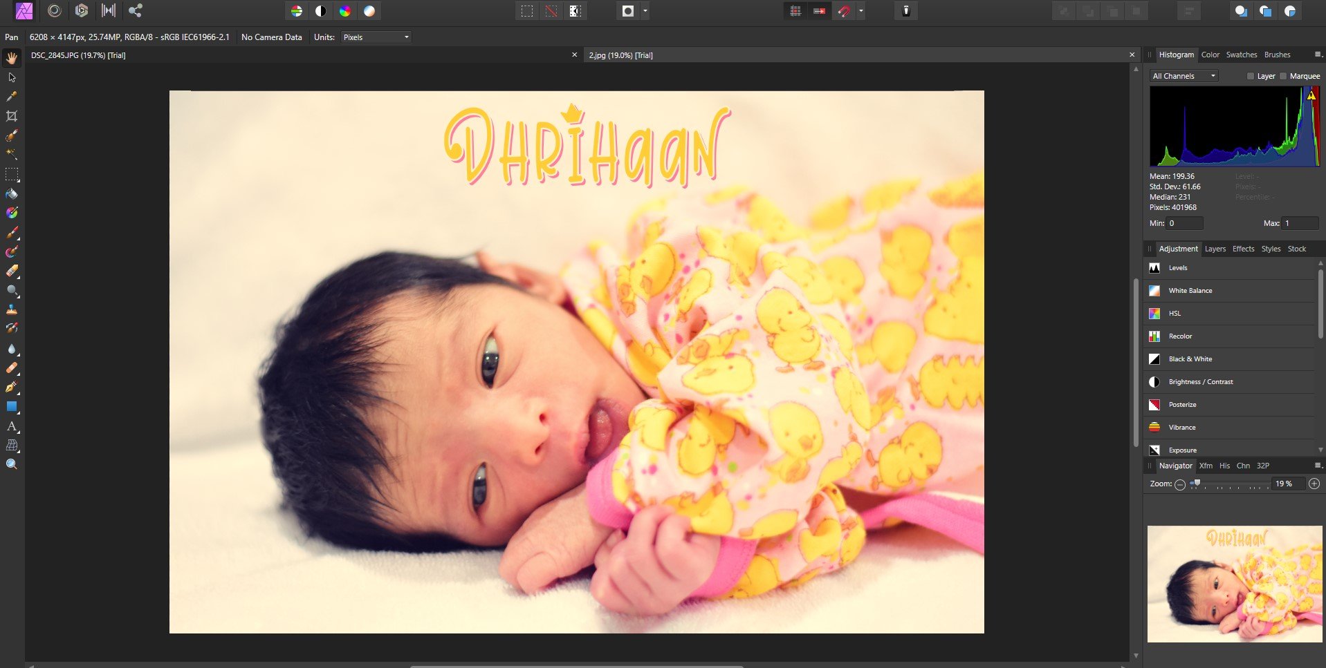
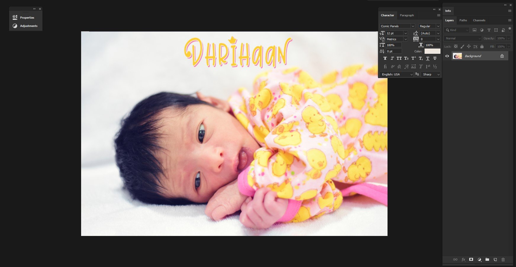
 I am opening a color book cover pdf in Photo. All colors are there except one in the graphic on the front & back cover. On the spine the logo vanished completely How do I see the green color in the graphic? Thanks
-
 I need some clarification on color modes available in Photo. Namely the RGB/16, is it integer or float and if float then how can I input colors below 0 or above 1? And then there is RGB/32 HDR, is it integer or float, and if float, how can I input colors below 0 and above 1? Also are these modes linear or gamma corrected? Another thing is the export to Open EXR (when I choose More... options). I can choose from 16 bit half and 32 bit float, what is 16 bit half, is it integer or float? One more thing: I have some HDR and EXR files, which I'm certain contain values above 1 (32-bit float), but Photo shows them as 1 (ie. 255 in each RGB channel in the Info panel). How to show the true value, if it's above 1 or below 0?
 -
Please, unify the color settings in Colour palette. For example in Sliders mode each slider has its own box for direct value entry, but there is no cursor (circle) in the color field with the selected color (even though you can adjust the color by dragging). While in Boxes mode, the cursor (circle) is, but you cannot enter a value (direct value entry is often useful). Tint mode direct value entry has, but again it has no color field. Personally, I think that instead of specific Tint mode, it would be preferable to give Tint as one item in Boxes mode, or/and in Sliders mode.
-
 Hello, my question is, how to change the backgroundcolor or stainer from Affinity Designer back to white. Mine is beige (235/235/235) when i start Affinity Designer and i can not change it. So all of my pictures get an old beige look to it, that i don't want. (pictures are all with default settings, i didn't change anything after application launch) I tried resetting it and uninstalling it but nothing helped. Thanks for you help.
-

Live Filter: Skin Tone Feature
Uncle Mez posted a topic in Feedback for Affinity Photo V1 on Desktop
Hello everyone ! Hello Team ! Well, i just want to make this request/suggestion that i believe will be of great interest for many in this community. We love affinity Photo a lot but still there are point we often disagree with and tends to make use of other tools but we end up lose a lot of time and some time lose it all. Among those so much wanted features i notice the precious Skin Tone Fine tuning. Well, there are tons of methods that we can use to fine tune our skin tone but when looking closely they are intended for Pro or peoples who have considerable experience with Photo software, but when it comes to newbie ... they just lose it all. So i propose a New Skin Tone Fine Tune - Live filter to be implemented; that live filter must allow us to work fast on skin tone applying quick and auto mask to the subject skin so we can work on it. A bit more ? Well, I suggest this : - an Auto detection of skin tone to be implemented the second we select that filter then a quick mask applied, allowing us to fine tune the mask because skin also share the same color as background and environment. - After mask is okay then we can play with the sliders few of them can be : Smoothing, Brilliance, Vibrance, clarity, sharpening, blemish correction and maybe Hue (for those playing the Hulk stuff) ... do not forget to add a color/picking tool to allow average color picking (kind of manual method for those wanting to select precise areas or ranges) - All this should happen in live mode so we see in real-time what we do and how is the output - When all necessary tuning are done, just click apply Making this a Live filter is a plus that will enable us to come back to it tuning again and again thus increasing the interest Newbie and learners (and even Pro) may have about Affinity Photo. Believe this: the day you will offers us such quick way of working a lot of people will be at peace. Please do not remove or delete the actual way of doing the same job as many people like to do things manually so they have to be satisfied. May another one in this forum fine tune this suggestion for the good. Blessings until this is implemented for the Good of Photography.-
- 1
-
-
- skin
- correction
- (and 7 more)
-
After using Designer for a few months now, I've gotten comfortable and efficient with the interface, much more so than with Illustrator. Occasionally, I'll find a small bump and realize that affinity likely has a solution, and sure enough, I either find a tool I had not been aware of online or by myself, following the increasingly familiar Affinity design logic. One tool I keep thinking exists but doesn't though, is color swapping between objects. I love how color swapping looks and works between fill and stroke, which is especially smooth and cool on iPad. As an extension to that, I find the impulse to select 2 objects and swap their fill colors, or their stroke colors. I believe this would come in quite handy and feel very intuitive. As an extension, perhaps cycling might be good as well, basically selecting various objects and cycling their color through each one. When designing, this would greatly help with and incentivize exploration and experimentation. Cheers!
-
Hello, I have tryed brushes, blanding modes an effects on paper surfaces. I think it is interesting to work free in Affinity. This one it is done in AffinityPhoto.
-
 In this video, We are going to show you, How to create Black and white to Color gradient effect in Affinity, This method works in both software (Affinity Designer and Affinity Photo).
- 3 replies
-
- 4
-
-
-
- black and white
- color
- (and 2 more)
-
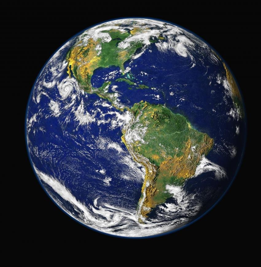
 I'm not sure how to do this but I am having difficulty removing a specific color on this image. I want to remove half of the water (blue) on this image. Or even change the color. What should I do? Thank you for the feedback.
-
 Hello, I suppose this feature is available, but don´t see how to get it. How can we set an existing swatch color to be global color and use as spot color? I already know how to add a global color, but what about changing an existing color? Thanks
 -
Hi, I write few pages about L*a*b* worflow for trying promote this space about decoupling Color & Lightness in L*a*b* here Lab.pdf this macros is on 1.7 version , not compatible with 1.6 Lab.afmacros Just read this answer Nothing new reinvent the wheel... But perhaps, some one, may have better understanding of this color space and more easy color apprehension, more easy color manipulation Sorry for my bad english, not my maternel language Have fun
-
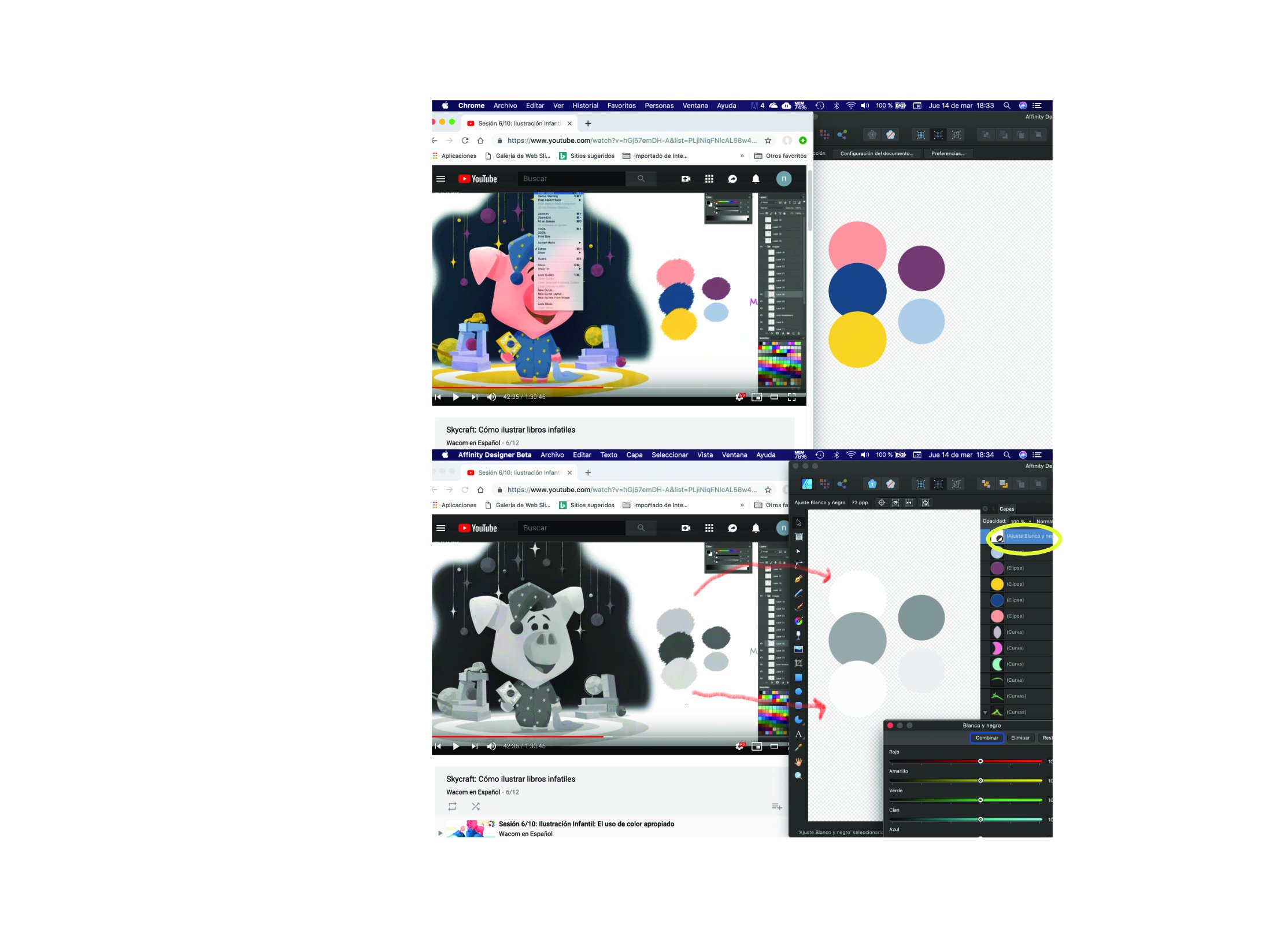
I`d like to have the ability to change a view (similar to contour view) but in black and white to check the contrast. I have tried with a B&W layer, but I have to adjust the brightness of individual colors. In the left side is how works this function in photoshop, in the right is with a b&W layes, as you can see the brightness do not correspond to the colors. Thanks
-
Hello Everyone ! I would like to know what is the easiest way to match colors on a Photo Montage/Composition in Affinity Photo without going all this crazy and too technical way. Is Serif thinking about bringing in the Color Match Live adjustment ? it is needed and may help shorten too long workflow or steps. Blessings !
-
The current colors are really ugly, and intrusive. The Bright colors are distracting from the main artwork... I recommend soft pastels instead of the current options (something that doesn't contrast too heavily from the UI interface too)
-
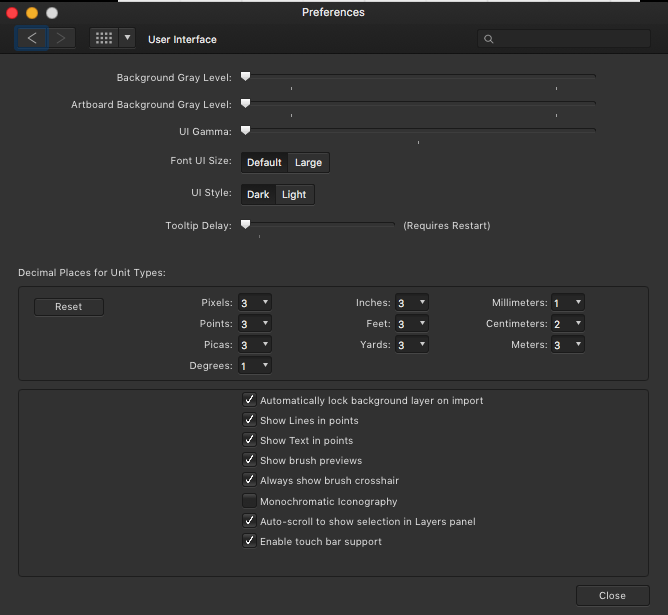
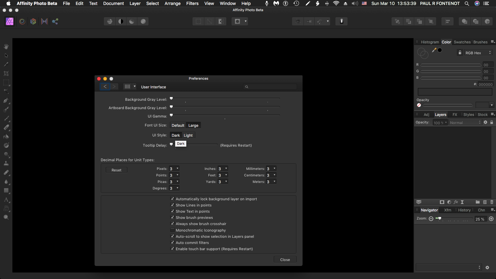
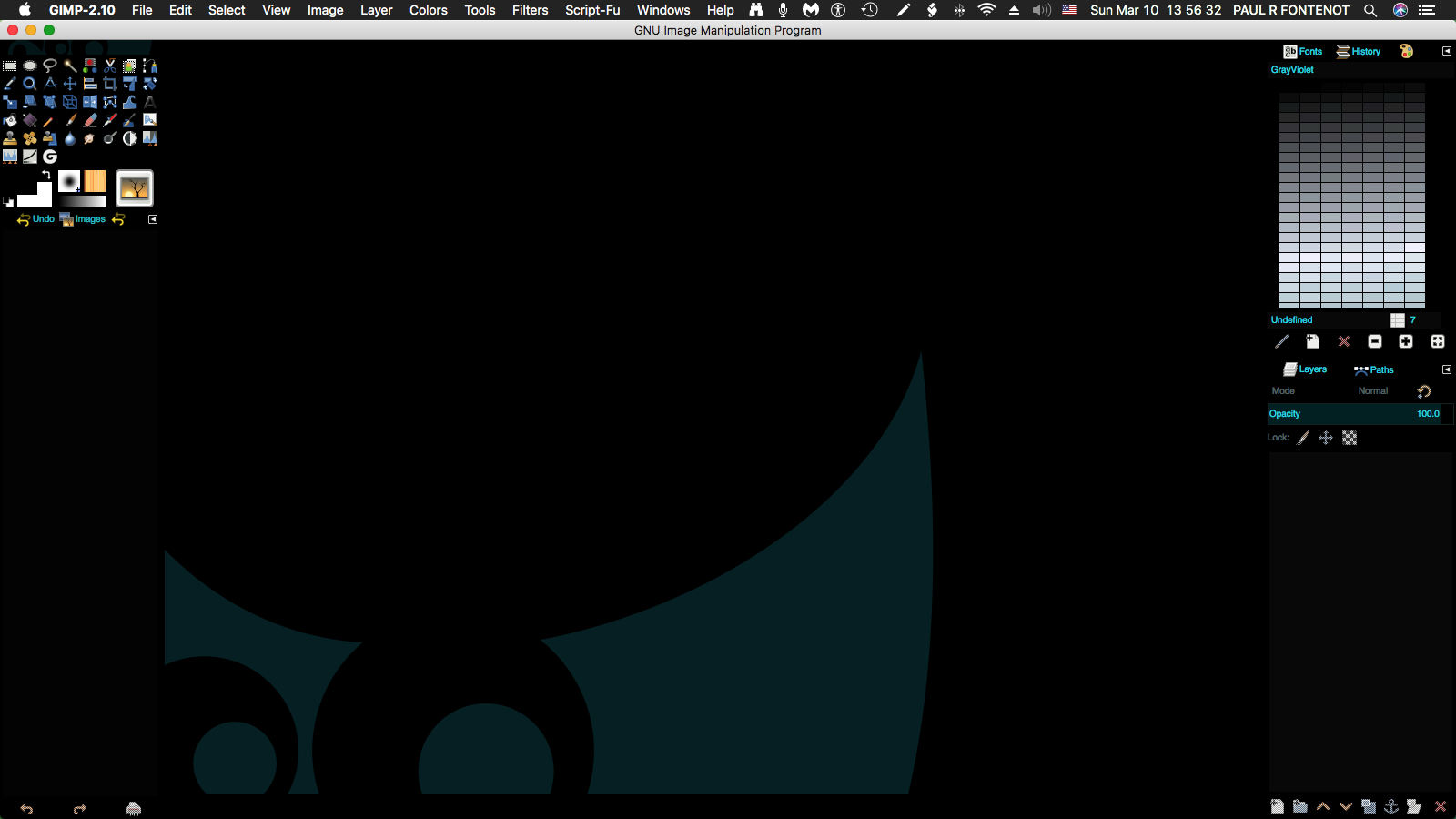
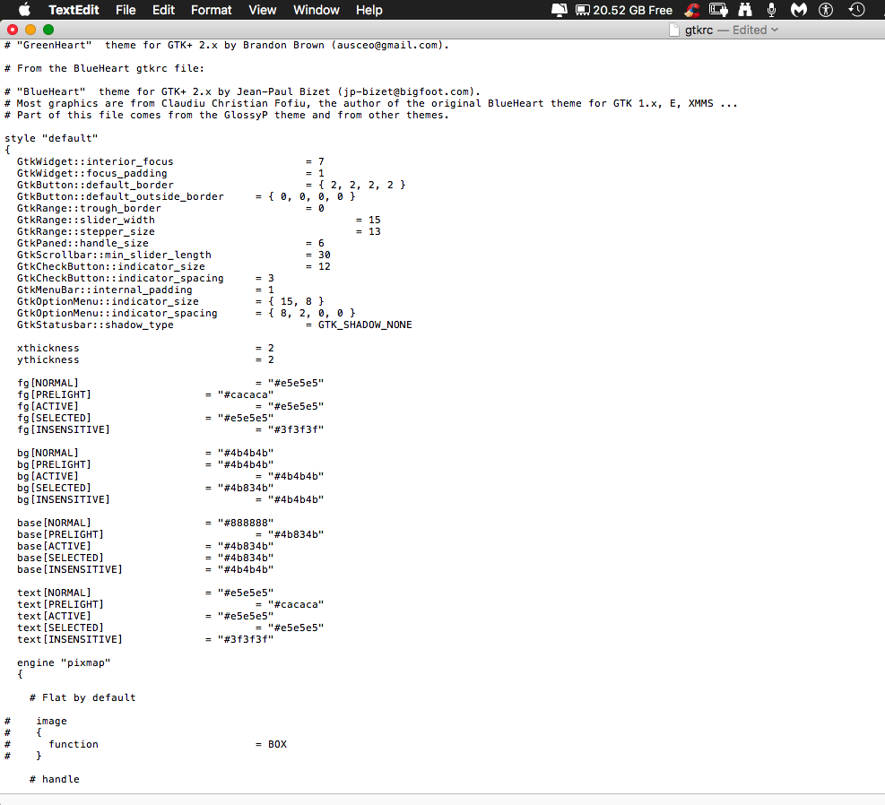
Feature Request -Make more theme colors available than Dark or Light. -Make themes available as in the example shown in the screenshot attached "Gimp Directory Structure" -consider adopting the use of gtkrc themes which are editable as in the attachment "Gimp black" and "Gimp Directory Structure" and "Gimp gtkrc" -(I know that somewhere in your directory structure, you have the equivalent of a gtkrc file; consider making that file location within the directory structure revealed and editable so that we could choose colors we like for the background color, insensitive color, UI color, text, unselected text, selected text and insensitive text.) (Note that there is abundant third-party theme support for Gimp app as portrayed in the screenshot provided called "Gimp Directory Structure" -GTKRC files are editable and can stipulate any hex # for background color, insensitive color, tooltip color, menubar color, text, insensitive text, selected text, etc. as demonstrated in the screenshot attached called "Gimp gtkrc". Notice how, by editing the gtkrc file, when you have the ability to select black (hex # 000000) for both the background color and the UI color, for example, everything just jumps off of the background like a 3D effect ) Cool!!! -Alternatively, you could make these colors selectable via menus like in the Windows Operating system theme colors which can be selected by hex # for all of the aforementioned categories. -I have provided a copy of the Gimp theme gtkrc file and a screenshot of the main variables called "Gimp gtkrc" for the " Gimp Black" theme for your examination and consideration. -At a minimum, allow us to select the UI GAMMA slider all the way to hex #000000; that can't be much of a stretch as you already have written the code to allow setting both the "Background Grayscale" and the "Artboard Background Grayscale" to hex #000000 gtkrc
-
 Hello. I’m at a loss.... I’ve been trying this find a way to adjust skin tones in my images by adjusting the RGB values of the original image to standard RGB values for flesh tones. I can’t for the life of me find a way to replace one RGB value in the image to another. I’m using Affinity Photo for desktop and iPad (both). So a way to do it in either would be greatly appreciated! Help!


.png.f18689a05ddc7d042c8b7e45f3f464bb.png)
.png.f8acd5ca1dc4da1d691179c9a5d8341f.png)