Search the Community
Showing results for tags 'Blend Modes'.
-
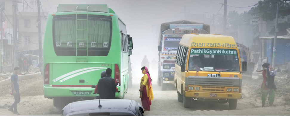
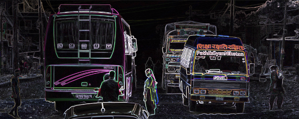
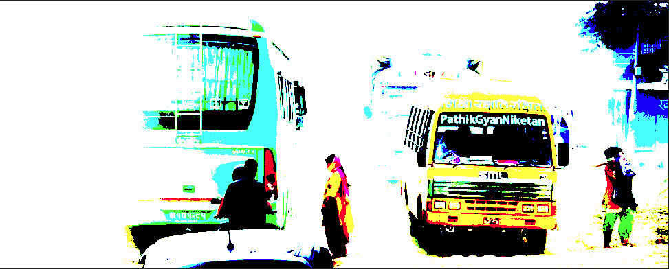
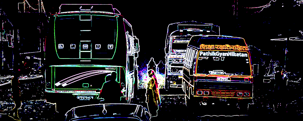
 Here's a novel way of detecting edges and creating a simple outline layer. Start with an image. Here's one taken in Kathmandu. If you do a 'detect edges' on it (Filters/Detect/Detect Edges), it looks like this: This can result in lots of little bits being selected too. What if you want to select less? One way is to use Levels or Threshold. Another approach is to go via blending. Duplicate layer and set Blend Mode: Hard Mix. This simplifies the picture. Now if you do a detect edges you get a simpler and slightly different set of lines. The result is similar to Detect Edges, but with a harder edge selection effect. Beyond this, you can Merge Down, Invert the layer, convert to b/w, do a Filters/Colours/Erase White Paper, play with Levels, Threshold, fx, Opacity, etc. Then you can use the line layer to darken, mask sharpening, etc. You can also replace the Hard Mix with other contrast-increasing blends, such as Colour Burn and LInear Light. You can also force a hard contrast with Levels, squeezing the black and white points close together. Even cranking up the basic contrast forces edges to be more distinct. Like many methods, it will work better on some images than others, and experimentation will help you figure out if and when you might use this.
-
 When I add a gradient overlay along with outline in the FX panel, I get no interaction. Shouldn't gradient OVERLAY be like a coating on top of everything? I can't get these two effects to blend at all.
 -
When I had to give up Corel Draw (a Mac OS upgrade issue) the thing I most missed is that it has Boolean And, Not and Or blend modes. I figured out how to do some totally unique things with these. If you introduced these I'm pretty sure AD would be the only other vector software to have them.
-
When I had to give up Corel Draw (a Mac OS upgrade issue) the thing I most missed is that it has Boolean And, Not and Or blend modes. I figured out hot to do some totally unique things with these. If you introduced these I'm pretty sure AD would be the only other vector software to have them.
-
Certain blend modes when set on a layer create a strange semi-translucent bounding box around the contents of the layer. So far I've noticed this effect on when setting an all white layer with the following blend modes against a colored background: • multiply • color burn • screen • color dodge • add • overlay • soft light • hard light • vivid light • linear light • hard mix • difference • exclusion • subtract • negation • reflect • glow • contrast negate (My guess is that this is happening on all blend modes, and I'm just not seeing any visible effect on some) I'm currently running the iOS 11 beta—can anyone confirm whether this happens on iOS 10 as well?
-
Here's my notes on blend modes. Any additions, corrections, pointers, etc. most welcome. Regards -- Dave ----------------------------------------------------- Update 10-Jun-17: Added version two of document _______________________________ Update 22-Jun-17: Added version three of document _______________________________ Updated 29-Jul-17: Added version four of document ---------------------------------------------------- Updated 16-Oct-17 in a separate post here. _______________________________ Blend modes notes V1.pdf Blend modes notes V2.pdf Blend modes notes V3.pdf Blend modes notes V4.pdf
-
UPDATE: New post including macros here: https://forum.affinity.serif.com/index.php?/topic/38379-luminosity-mask-selection-macros/ I've been experimenting with doing 'luminosity masking' with curves and blend ranges. Here's the result. Attached is a 'photo' file with three groups - just copy and paste one of these into any photo, either at the top level or as a child. Then open the group and double-click the curve to adjust just the named luminosity range (eg. 'mid tones'). As it's a curve you can also do it selectively by colour. It works by constraining the blend range on each curve. Click on the cogwheel to see this. There are three groups because I wasn't sure which way to chop up the spectrum, so I've done three ways: curved, rectangular and triangular. Please do try them and let us know here which works for you. I tried doing these as macros, but the macro system stopped me doing things like naming adjustment layers and grouping. I guess it's not mature enough yet for such actions. So I resorted to the cut-and-paste method. This forum also doesn't like you uploading .afmacros files (ahem). But if you prefer macros, I've put them on one of my websites here: http://changingminds.org/etc/affinity/Curve%20Blends%20V1.afmacros This is still in the experimental stage - please let me know what you think. Edit: Upated version in post below. Curve Blends V1.afphoto
-
 How do I get the live preview in blend modes automatically. Right now I have to click on each one instead of seeing it when I slide my mouse over them.
 -
 Hallo, In diesem Affinity Photo Tutorial wird ein Kino Poster im Stil vom James Bond Film "Spectre" erstellt. Keine Kopie, sondern eine Variante dazu. Ihr könnt mir Eure Varianten gerne posten oder twittern. I create in this Affinity Photo Tutorial a movie poster in the style of James Bond "Spectre". Not a copy but a variation. With English Subtitles. I would be happy, when you post or tweet me your variations. Viel Spaß Euer Jack Bauer
-
- 5
-

-
- Affinity Photo
- YouTube
- (and 4 more)
-
Had a great time with the new function - thanx alot for adding it. Worked very smooth, even with a huge pile of layers. As far as I can tell everything crisp and clean. :)
-
Ok, so the tv series does exist but if it did I would not mind having shot at doing the title graphics for it :) If I can do this in Affinity Designer I can't wait to get my hands on Affinity Photo! :P :o ;) This was all done in done in Affinity Designer and you can learn how you can do it check out my video. on youtube https://www.youtube.com/watch?v=AlX6_MWE56Q
- 5 replies
-
- 6
-
-
- blend modes
- textures
- (and 1 more)
-
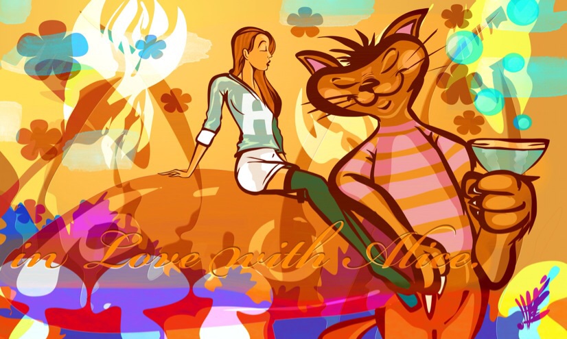
 Relaxed drawing of a classic topic. Wanted to get the outlines right so it took some time. Used 2 different textured brushes for overlays and clouds. Half of them with a 50% Gaussian Blur. Always thought that cat in the story is great - so it got a Martini ;)
-
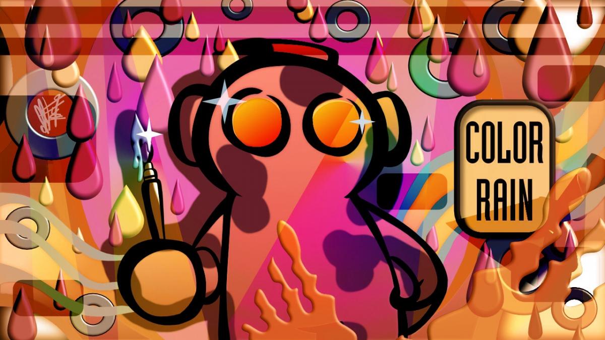
affinity designer Illu 4, RC-1 'COLOR RAIN', Candyshop style.
Lescot posted a topic in Share your work
Another fun piece, AD worked very smooth here. For the last layer some lagging of the vector brushes but not before. Minor bug: proportional rescale for export as PNG did not work ( not matter if I set it to ' lock ' or not ).