Search the Community
Showing results for tags 'Affinity Designer'.
-
This is going to be another Mk1 Golf GTI but from the front this time and a standard series 2 in Mars Red, unless I change my mind. The car is going to be what I think of as straight vector so no blurs just gradients and blend modes, but it’s still going to be fairly realistic. Also as with the first Golf the background might use blurs but perhaps not, we'll see. This time I thought I’d post a few progress shots together with some notes. I’m not sure how long it's going to take. Anyway stage 1 was blocking in areas either flat or with gradients (some of which are only temp. ones). The body gradient is a best guess/averaging, you can’t always see an obvious gradient but you can see if it’s generally lighter or darker. As last time the body colour uses a single global swatch, so all the highlights and shadows are done with blend modes (somewhere between white and black, not reds, obviously). So if I want to change the body colour it's easy peasy.

-
Hi, all, Something I think is worth showing before I put it aside. This is a transcription of a photo by Greek brothers named Zangaki, who worked in the later half of the 19th century. They are noted for there documentary work in Egypt. I came across their work about 8 weeks ago, and was impressed by the quality of the photos. My image was drawn from several reproductions, and the subject was sometimes identified as a scholar, or professor from Cairo. What I'm showing is a third iteration. Earlier ones used my own vector brushes, and/or various blend and opacity manipulations. Some promising effects, but definitely not ready for prime time. What is shown in this is AD pencil lines w. curve pressure variations. Mostly done with just a mouse, but some w. a Huion tablet. The layers were duplicated, and gaussian blurred to make the image somewhat more like a traditional ink on paper where the media bleeds a little. I was trying for something like I used to do w. crow's quill pens, or fine sable brushes. Time to move on to apply some of what I've learned to another subject.
-
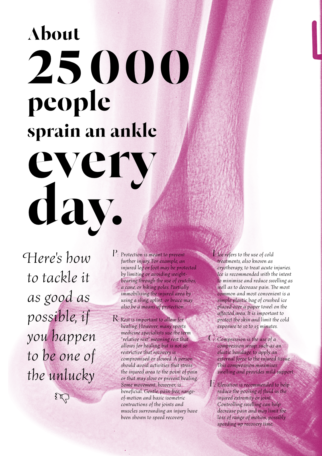
So I sprained my ankle exactly a week ago. No more longboarding for a while! Since I got my X-ray images on a CD, I thought it would be nice to play with them a little. I didn’t have anything particular in mind, this was freestyle, and somehow ended with a title page for a magazine, I suppose. I used Designer for the final layout, although the DICOM images were processed in Photoshop. It was my go to app and frankly, I didn’t think for a moment if Photo could handle DICOM, too. I wish there was a multi-column functionality in AD… In case you were wondering, the typeface used was Bona Nova family. It’s been released fairly recently and it’s a result of a tremendous collaboration between Andrzej Heidrich, the traditional graphic artist (who also happened to have designed banknotes in Poland among other stuff) and a young but already prominent type designer, Mateusz Machalski. If you’re interested, you can read more at http://bonanova.wtf. Cheers! Matt
-
 Hi, I will try to describe my issue as good as I can in english, I hope, someone will understand If I specify a pantone colour for a path/shape, and reopen the document later again or just reactivate the path/shape, where can I find informations about, which specific pantone-colour this path/shape has? If I open colour-palette, I find informations about RGB, CMYK and so on, but nowhere anything about the given pantone-colour. Any help appreciated.
 -
 I've just been going through a tutorial on Expressions, using the Transform tab to create mathematical patterns. I understand the basics of it, for example x+200 moves the Power Duplicated object 200 on the x axis, y+100 moves object 200 on the y axis, w*.5 reduces width by 50%, but what if I want a curved pattern? I'm trying to get a simple inward spiral using a simple ellipse. I want this to curve outward slightly, but gradually decrease in size inwards, in a spiral pattern. Can I use Expressions for this? The attached pic uses Expressions and Power Duplicate to gradually decrease size, but the spiral I have manually created.
-
Saxophone_WIP.afdesign
- 13 replies
-
- 11
-

-
 Hi there, I am missing a function during the export where I would like to be able to export several versions of a slice layer. I want ,for example, to hide/show some items for a layer slice and and have other slices from the same layer but with other hidden/shown sub-layers. It is already possible to hide some sub-layers today when you create a layer slice, but you cannot create other slices for this same layer. Would be very handy when exporting an image with several variations. For example, I am creating a splash screen (upper left) that will also be used in the "about" dialog (left bottom). The only difference is that there is progress bar. So during the export I would like to create two slices from the same upper left image: one including the progress and the other having it hidden. Could be very easily done by using two slice definitions from the same layer where one would just have the progress bar layer hidden and the other one not. I could so work on a single image instead of having to use 2 images that I need to maintain/edit...
-
I’ve brought this up before (but can’t find it anymore) and it has been kind of waved aside by staff but new observations have me bring this up again: I’m used to hit Cmd-D when the modal dialog comes up to dismiss unsaved work. This works with every program except Affinity Designer (and LibreOffice but that’s a different subject). I have to add that my OS language/locale is set to German but still, the shortcut is universal and works in every program I can think of right now except this one. Now, I don’t remember what Serif staff told me would be the reason for that but interestingly I can use the keyboard shortcut Cmd-R for “Replace file” in the respective dialog box when saving a file with the same name as an already existing one. So, why is that? I find it a major inconvenience that I can’t dismiss unsaved work with a keyboard shortcut.
- 20 replies
-
- 1
-
-
- mac
- key command
- (and 3 more)
-
 During trial, I was able to scroll the touch ring on my Wacom Intuos Pro for zooming ( couldn't do pinching as I always do in Illustrator). Today just purchased Affinity Designer, I can't zoom with anything. Rotating the touch ring only scroll up and down. Any fix?
 -
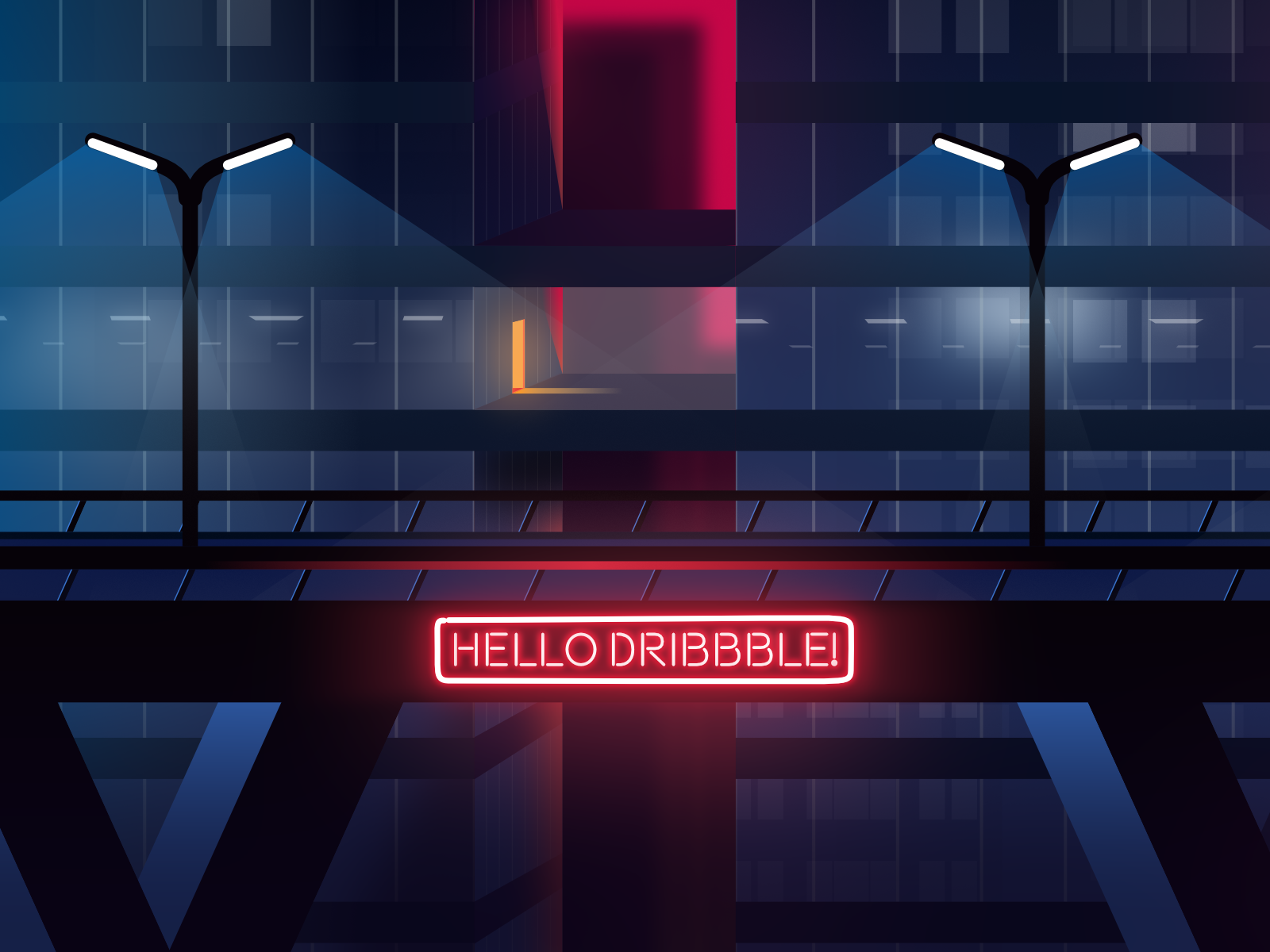
 Hello everyone! I've been working as a motion designer for 10+ years and I used Illustrator as a side software, mainly for pulling out usable bits from stock vectors to use in After Effects. Both Illustrator and Photoshop got bulkier and less responsive as they age, so I got used to drawing inside After Effects using the limited tools it has. Tried my luck in drawing with Illustrator a few times over the years to no avail, I don't have a single finished artwork from it. Luckily I saw one of the artists Serif commissioned while I was searching for some inspiration for my upcoming self project. I checked his other artworks, read the interview about Affinity Designer, then read some more reviews and user comments from Reddit. Installed trial, everything was buttery smooth and so much practical in comparison. Price was a bargain but it was even more so with the regional pricing in Microsoft Store, so I ended up buying it the next day. Long story short, I finished this piece yesterday for my debut illustration in Dribbble. I know it is not much and I definitely got influenced by the initial artworks where I discovered AD, but know that I'm an animator who couldn't draw a proper looking vector piece before. Really looking forward to drawing more in AD. I just wish there was a straightforward solution for importing inside After Effects with layers, just like the .ai files. Keep up the good work Serif!
- 12 replies
-
- 15
-
-
- illustration
- outrun
- (and 2 more)
-
The lion and the unicorn were fighting for the crown, The lion beat the unicorn all around the town. Some gave them white bread, and some gave them brown; Some gave them plum cake and drummed them out of town. I thought it would be much better if they made it up and went for a pint at The Crown. It's done in Designer, with a couple of brief excursions into Photo to blur the background and stop it competing with the important bits, and to reduce the brightness of the unicorn a little. The woodgrain and the badges on the beer pulls are bitmaps acquired online, but otherwise everything is my own.
-
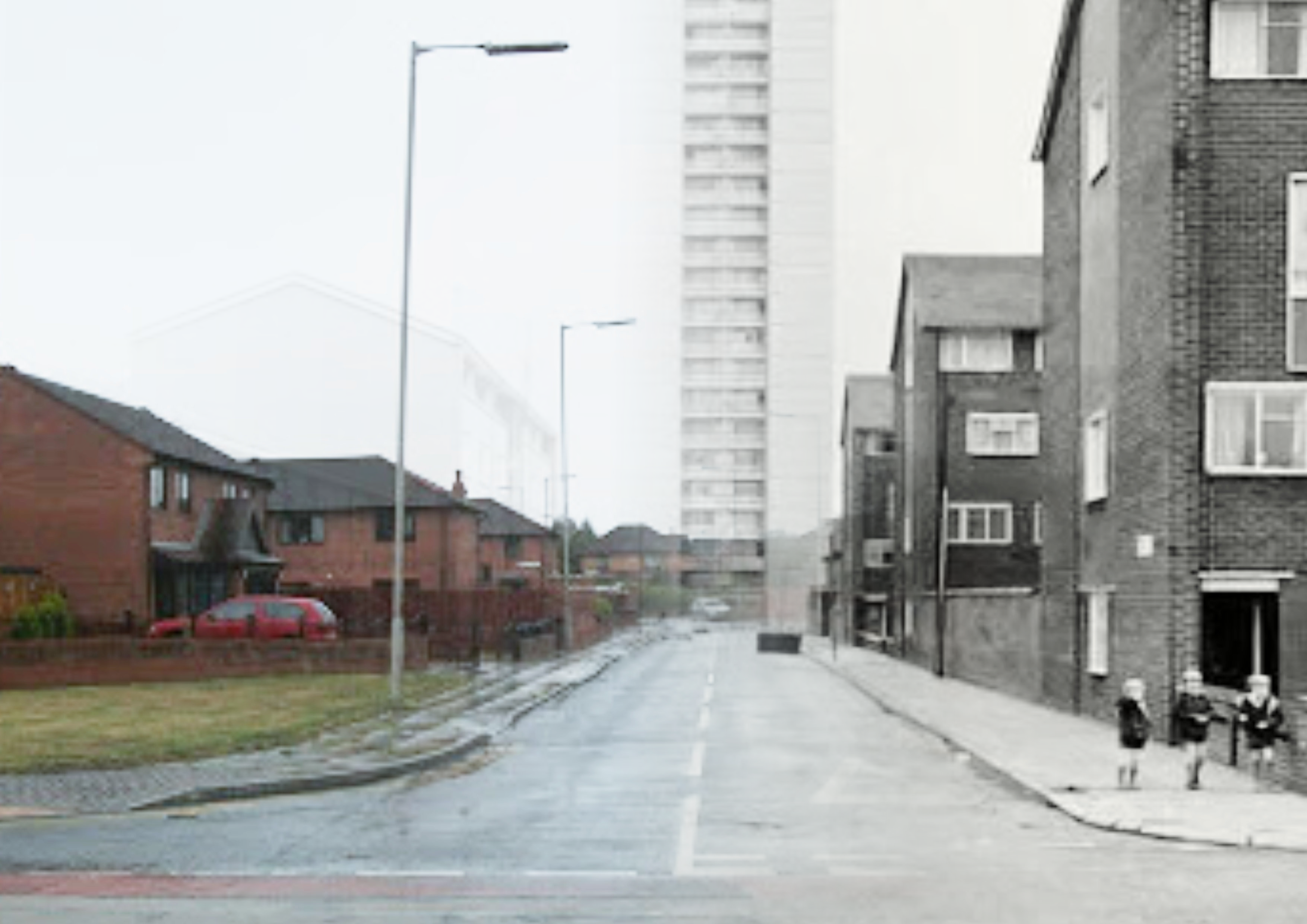
 This Easter I took advantage of free weekend access to Ancestry's website. After a lot of digging and cross referencing I finally found the evidence that Dad's mum's uncle was a Labour MP called Davie Logan, 1871-1964. I was told this about 10 years ago by her sister, but it was her son, my dad's cousin who posted this fact on a forum. It turns out that he was the leader Liverpool Labour Party and had a tower block named after him in his local area (Vauxhall Liverpool 5, otherwise known as Scotland/Scottie rd). This tower block has since been demolished. Housing in this part of the world, seems to either be a 100 years old or demolished after 30 years. I was born in 1970, so I never got to see either so I did some sleuthing and put the photos together, this way you can see how things have changed over the years. Just wondering, is there a better way of doing this in AD, as I haven't got APh? Logan towers then and now.pdf
-
Hi everyone, This is from a year ago or so. I'm now doing something else with this brand so I thought I should share the older ones. I hope you like it. Some older iteration:
-
 How do you do this? Been fiddling with slices in export persona but if you create a slice from layer it creates a massive bounding box around the whole layer and there is no option to clip it to the artboard.
-
- 1
-
-
- affinity designer
- slices
- (and 1 more)
-
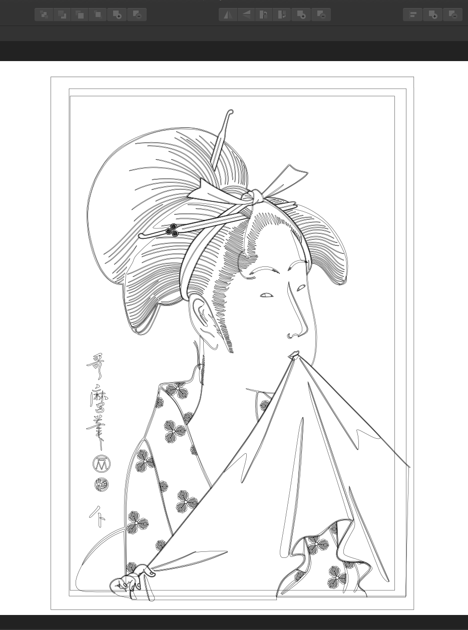
Thought I would share another Beauty of Edo. It was all done using Designer and it is all vectors (with some effects added). Thanks for checking out my work. Hokusai
- 9 replies
-
- 10
-
-
- utamaro
- recreation
- (and 2 more)
-
 Can Affinity Designer manage the optical alignment of margins and external punctuation? Thank you Fabio
- 2 replies
-
- 2
-
-
- affinity designer
- dtp
- (and 2 more)
-
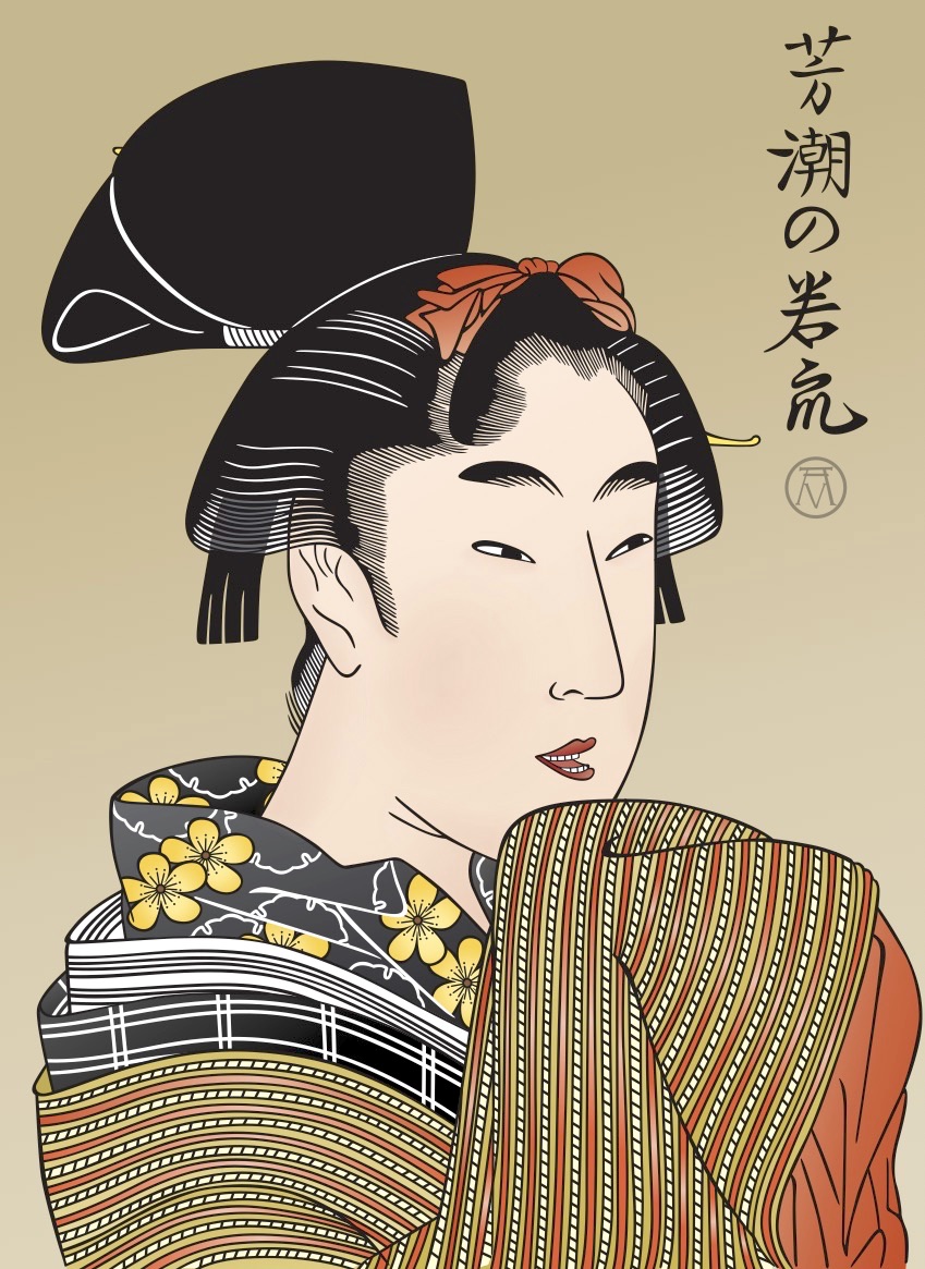
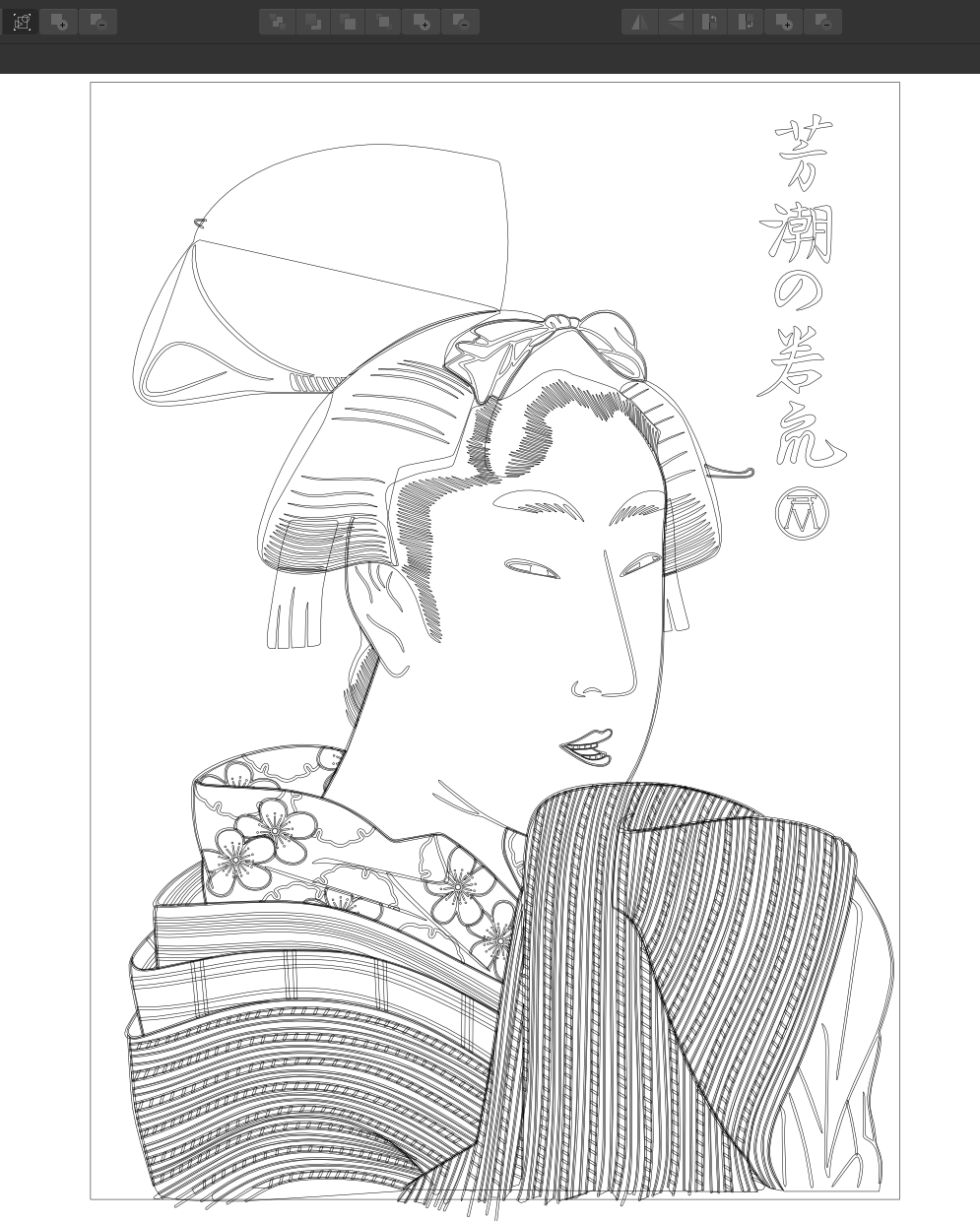
I saw this Utamaro print somewhere and I liked the print but it wasn't in very good shape, which is too bad because it is a nice print, so I recreated it using Designer and gave it sharper lines and new colours. I hope that you enjoy it. Thank you for taking the time to view my work. Hokusai
-
Glad to see. I want to share my work, for my personal project: In the work used Affinity Designer, Adobe After Effects. P.S: I really look forward to Serif releasing an analog After Effectts and more functional and fast. Thank.
-
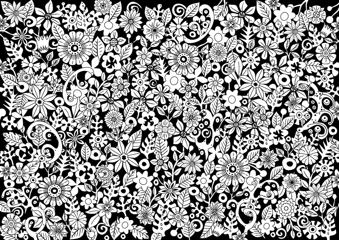
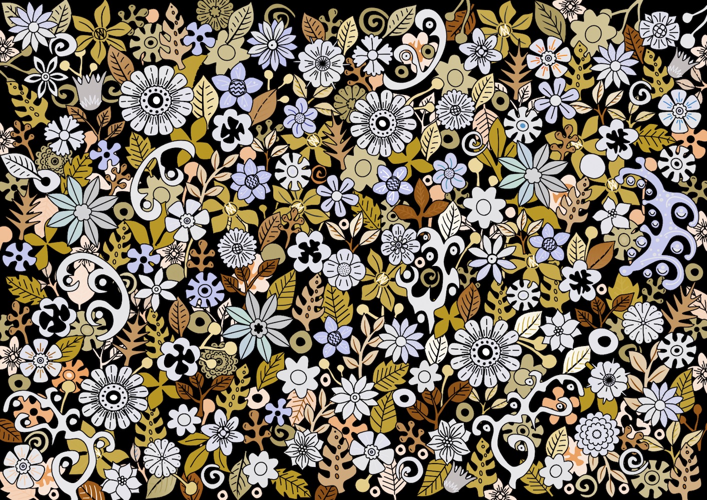
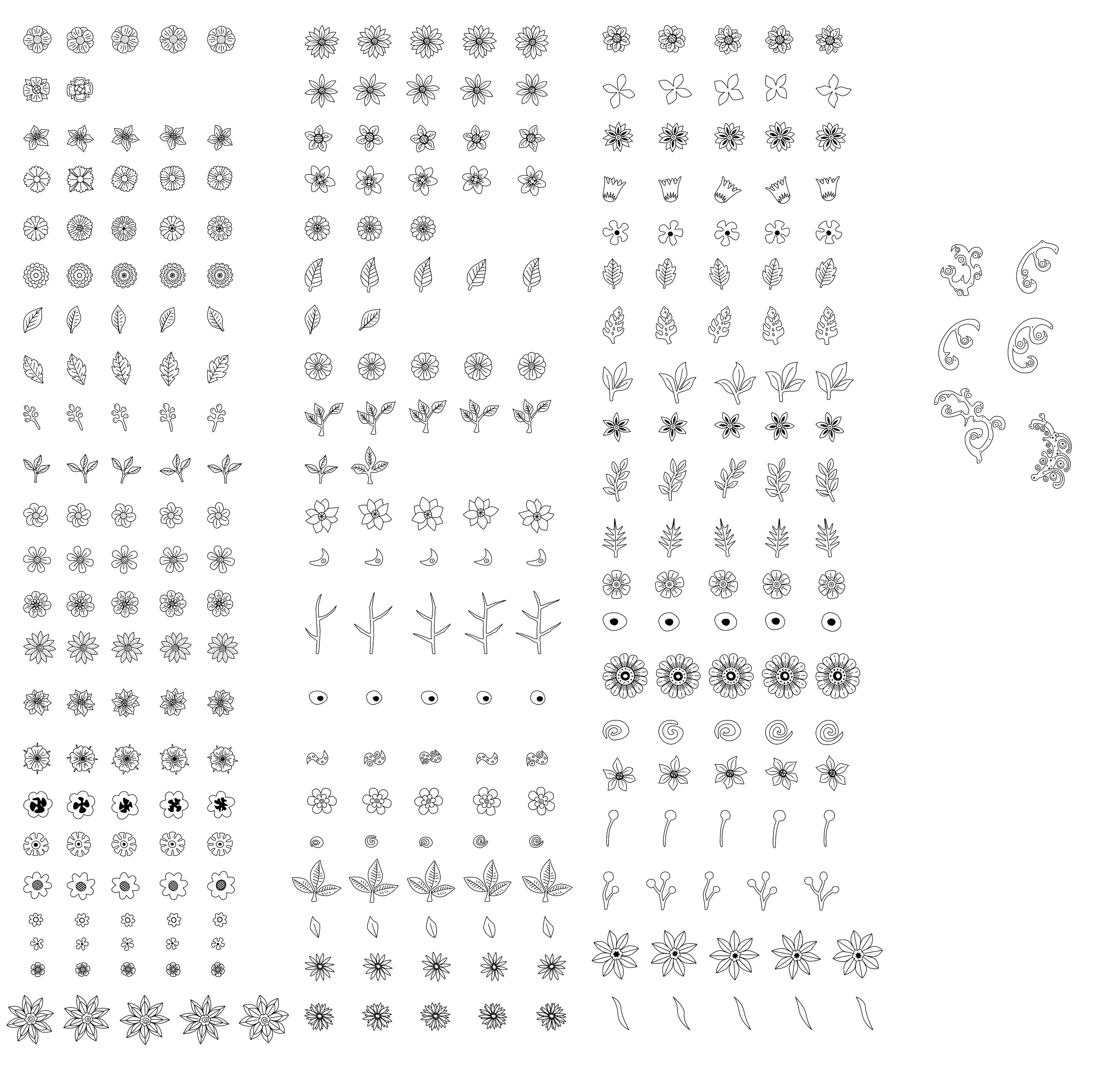
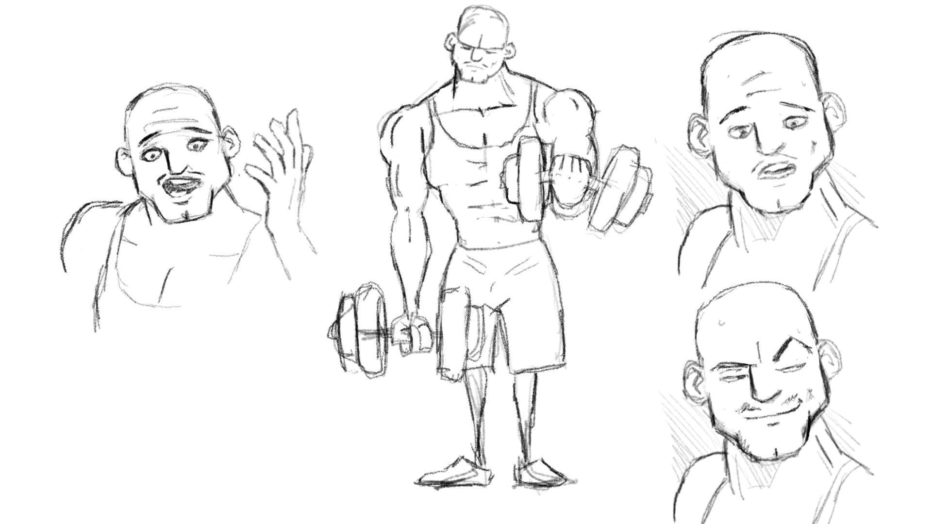
Looks I've been drawing using my trackpad too much and it's starting to give me thumb and bit of finger problems, not something I've ever had using a mouse. So I've been practicing with my other hand using my Intuos, with the MBP's trackpad disabled, to give that hand a rest. This was some messing around I was doing. It's hard sticking to the wrong hand perhaps I need to sit on it or lock it in a drawer or something. Anyway I did a doodling kit and thought 250 objects would be plenty (I originally hoped about 70 would be) but trying it out on A5 it looks like I need more, possibly a lot more, and some small things to help fill gaps.. You just Alt-drag them over to the work artboard then rotate etc as required. The second is just some conical gradients on the few layers I used. Oh the lines are 0.2mm, so as thought they're they're done with a fineliner.
- 29 replies
-
- 13
-
-
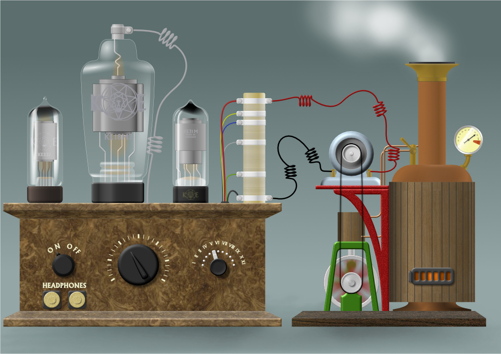
There was a suggestion of the Affinity Facebook page that I might make a tutorial on my 'Steam radio' AD job (see the link below). I thought about it and decided ... not to. But here are a couple of the things in afdesign format for you to look at. I'm sure you can work out how everything was done, and you can always ask if there's something not self-explanatory. Here is the left-hand valve/tube ... valve1.afdesign And here is the steam engine ... engine.afdesign I do need to add a brief explanation for this one ... The stationary flywheel spokes ('spokes (Curves)' layer) is turned off. I made the 'motion blur (Pixel)' layer by going to File/Edit in Photo, then rasterizing the layer and applying a radial blur. I did something similar with the connecting rod.
-
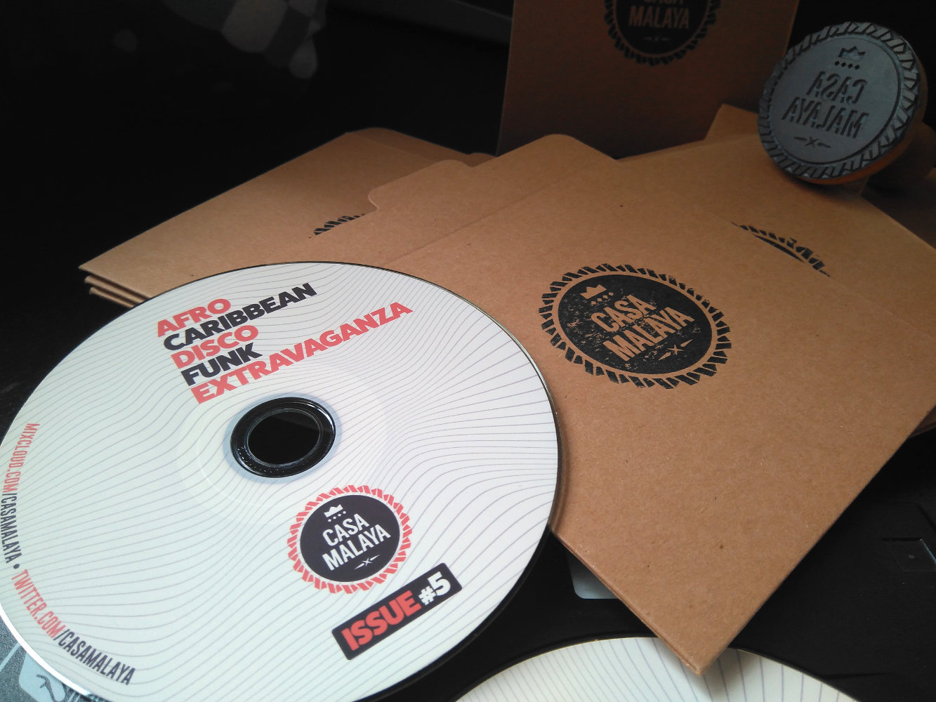
Going old school for a personal side project. You can check it out at Mixcloud if you are into funk basslines, caribbean rhythms and some disco decadence. https://www.mixcloud.com/CasaMalaya/afro-caribbean-disco-funk-extravaganza-5/
-
Attached a video with an example of this filter
-
So Affinity Designer, as it turns out, has a lot of potential for cel animation work. You can create a decent enough animatic in the bitmap persona using layers for onion skin, then just stick it all together in your editor of choice. My only request - could we have an "export selected layers as PNGs" feature please? That would save me having to go through toggling transparency and exporting one-at-a-time. animatic_scene2.mp4
-
Isn't it nice to have all the time in the world, a head full of daft ideas, and the means of bringing them into being? I'm old enough to call the bit on the left a wireless; my grandfather used to make 'em like that for his own amusement back in the twenties. He'd have been quite capable of setting up the steam generating set to drive it too! (You get better reception if you connect the headphones!)
- 6 replies
-
- 10
-
-
- steam engine
- dynamo
- (and 6 more)
-
Animated in After Effects admittedly, but all the artwork was created in Affinity Designer. It's all possible, you just need to think about the workflow a little bit. TV_kid.mp4