Search the Community
Showing results for tags 'Affinity photo'.
-
Just out of curiosity the texture line style is visible in APhoto in the stroke panel as an option. This has never worked for me in Photo. My question is " should this option/icon be here at all in APhoto"?
-
With all the hype surrounding Canva's acquisition, let's not forget it's Easter. Have a great Easter. Made with Affinity Photo, assets from @v_kyr.

- 5 replies
-
- 8
-

-

-
- affinity photo
- affinity designer
- (and 1 more)
-
 Hi everyone, I recorded this quick tutorial on how to create a watercolor portrait in Affinity Photo, using a median blur live filter, an empty mask, and watercolor brushes. I hope you guys find it interesting.
-
- 1
-
-
- affinity photo
- watercolor
- (and 1 more)
-
 Hi, I would like to export a collage I made in publisher with the pixels, as it is displayed in the program. (see sreenshot 1). But when I export the image, the pixels turn blurry. (screenshot 2) How can I adjust the export settings to prevent that? I think this article describes my problem (but for photoshop). https://www.hipsthetic.com/enlarge-pixel-art-without-blurring-in-photoshop/?expand_article=1 Thank you so much in advance!!
-
 @AffinityJules @iconoclast @firstdefence @carl123 @v_kyr @TrentL I am trying a new version of the ambulance scene composite I have been working on. I have changed the time of day to a day rainstorm to better match the opening of the film. I have updated the AI elements I created for the characters in the piece. Here is a preview hope you all like it:
-
I’ve asked this Image Resize question before – but still making a hash of it... Image is 3398 x 2903 x 72dpi (1196 x 1023mm) I want to resize it to 200 x 171mm, making it a smaller low-res image, that someone can’t simply magnify and print. …which I can do, but when I ‘save’, the pixel measurements are virtually the same: 3386 x 2896 and AP has increased the image dpi to 413 – so instead of creating a smaller low-res image, I’m making a fractionally smaller high resolution image – the exact opposite of what I’m trying to achieve.. I’m reducing the image by 993mm, but losing just 12 pixels? I’m expecting pixellation by reducing the image size but it's as sharp as a tack – perfect for magnification and printing... My questions are: How or why, by reducing the image size, does yet AF keep effectively making it bigger? Can someone tell me what I’m doing wrong here?? And how I make it into a smaller, low res image? Thanks
-
Does anyone have advice on how to improve the quality of the copy I have made? The original is the smaller, cool and clear toned print and mine is the larger, muddy, not very nice copy. My dad took the lovely original of my grandparents and I want to make a copy he can see more clearly. I've got myself thoroughly confused by colour profiles anyway, never mind how greyscale fits into this. I understand that I need to convert to a greyscale format as it seems to scan through as a colour format. After doing this and exporting it shows as Grey/8 Greyscale D50 but the print is not very nice at all, as shown in my attachment. I have looked through existing topics but have only become more confused 😒
-
Using various filter and layer to make a color sketch from a picture in Affinity Photo.
-
 Affinity Photo recompresses JPEG images when metadata is edited even though the image itself has no changes. Steps: 1. Make a copy of a test JPEG image as backup. 2. Edit metadata in one copy of the image in Affinity Photo. 3. Stack before and after images in layers and view as Difference.
 -
Made with Affinity photo, using the filter "Detect Edges" and framework from Daub Papers "Single Paper" .
-
My first macro photo, taken through double glass, is not yet perfect, so I still need a lot of practice.
-
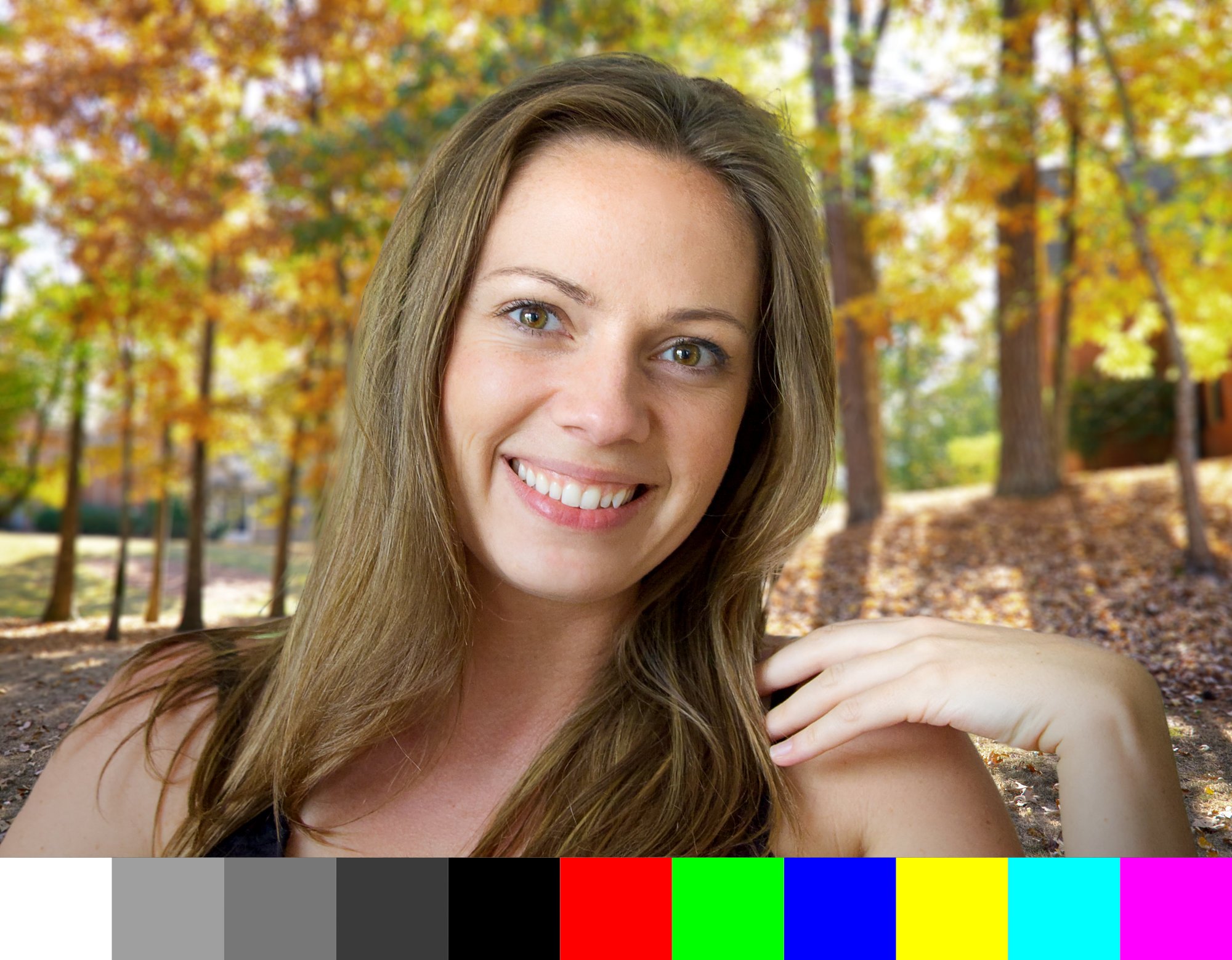
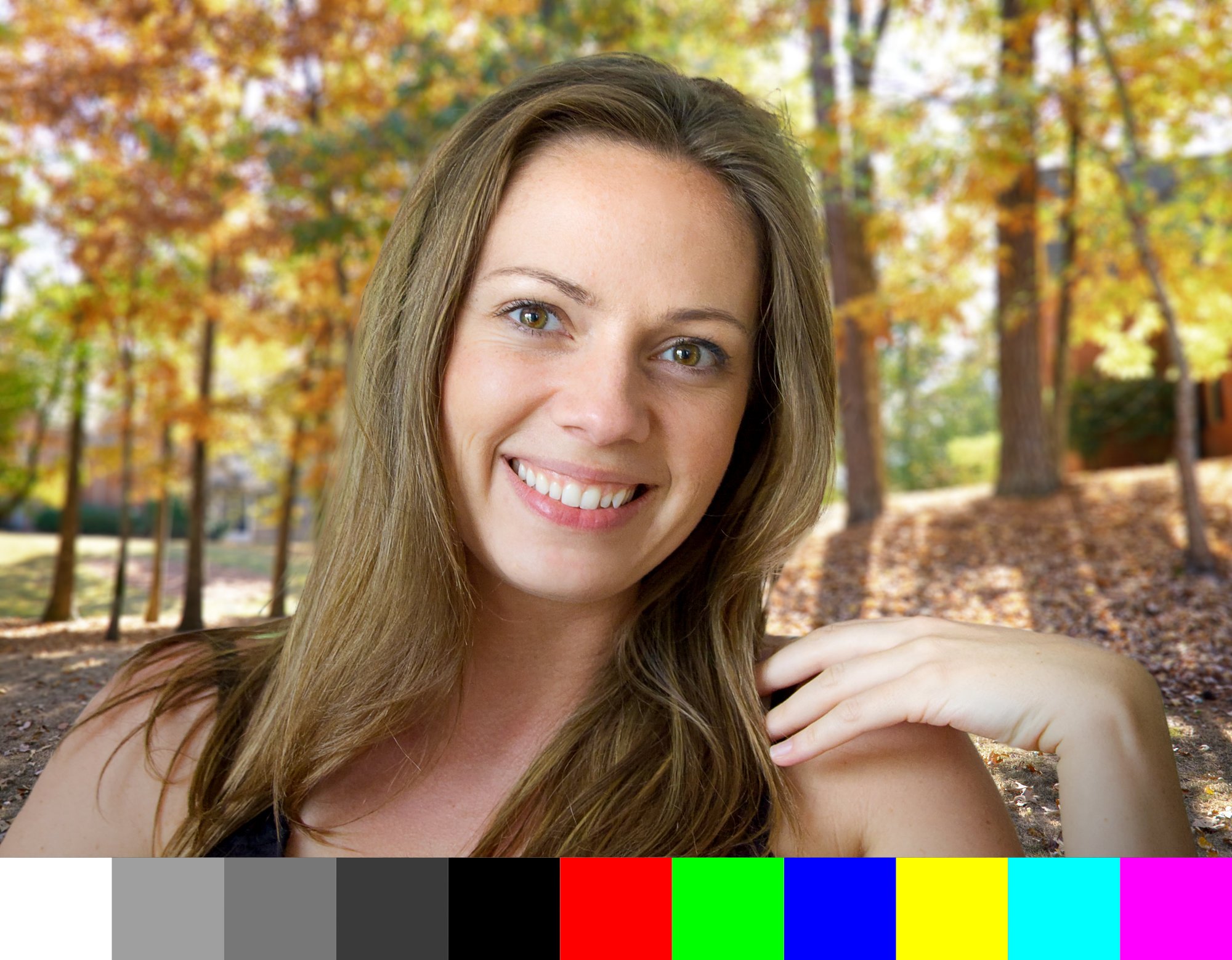
This is a Color Test (for my own illumination) and I'm sure others will have some wisdom to share. In the past, the safe route was to work in a wider gamut color space to preserve color and avoid premature clipping (ProPhoto RGB, Adobe RGB, P3, etc), then convert my small JPG files to sRGB for emailing and web posts to be sure other saw essentially what I saw (limited to sRGB, of course). That was a good approach for images heading to an inkjet or to a press too because sRGB whacked a lot of colors that can be printed using CMYK inks (not to mention additional ink colors and spot colors). I have a good friend who is an experienced, color management professional and it's his opinion that converting to sRGB is no longer necessary (with a few limited exceptions here and there). Most browsers and email clients are color managed these days. I respect his judgement, but it's always nice to test and get some confirmation and feedback, which is what this post is all about. I created a composite image in AP v2.4.0 and used Apple's Display-P3 profile in this file. I purposely chose an image that has skin tones, some subtle shades, some bright colorful portions, then added some grayscale and fully saturated color patches for evaluation. I wanted any differences to be visible if they existed. ( I haven't viewed the results on this forum yet, as I am still creating the original post.) I'll attach the original AP file, along with 3 different exported JPG versions, all 2000px on the long side, at 85% JPG quality. 1. First, I exported the Display P3 original from AP and embedded the Display P3 profile in my first export. On my Retina display, that is the brightest JPG of the three, since my display IS a P3 display. So, the color patches retain their original saturation and brightness. 2. Next, I exported the Display P3 file from AP, but on export, I converted the file to sRGB 1966 and embedded that profile in the export. As expected, the saturated color patches are less saturated because they are now clipped to the smaller sRGB gamut. The rest of the image looks pretty much identical on my Retina display and also on an old Viewsonic sRGB gamut LCD display (about 15 years old). That is what I was expecting and hoping for. 3. The third JPG image export I did differently. First, I converted my original AP file from Display P3 to sRGB. Then, I exported to sRGB. The color patches look the same as in No. 2 above, which I expected. My daughter also looks the same overall. However, I was a bit surprised to see that the foliage in the background showed a tonal shift (slightly darker) compared the the sRGB exported from a Display P3 working space. This was the same result on my Retina and Viewsonic monitors. As mentioned, I haven't seen the result as posted on the forum yet, but I will after clicking the "Submit" button. By the way, I chose Apple's "Display-P3" profile for this test. Why? It uses a tone curve that looks identical (or at least very similar) to the tone curve in sRGB. This should minimize any tonal changes between sRGB and Display P3 (which is why I was a bit surprised to see the foliage in No.3 above different from No. 2 above). DCI-P3 (at least the version I have) is an ICC v2 profile and was supposedly designed with cinemas and theaters in mind, so they use a very low white luminance and a gamma of 2.6. For the work I do, I felt Display P3 made more sense. BTW, the Apple Display-P3 profile I have is an ICC v4 profile. So, there it is. I suspect some people will have some interesting feedback, so bring it on!! I'm about to click Submit, so I'll get a look at the post at the same time you do. Thanks. P3-sRGB Test.afphoto
-
 Hi... I Paid Subscription of Affinity Designer V1 only i would like to know when i pay for an Upgrade of 25% off the sale price of the V2 Universal Licence... AM I GOING TO GET ACCESS ALL V2 APPS ? or its Only V1 Paid Affinity Design will be Upgrades to V2?
 -
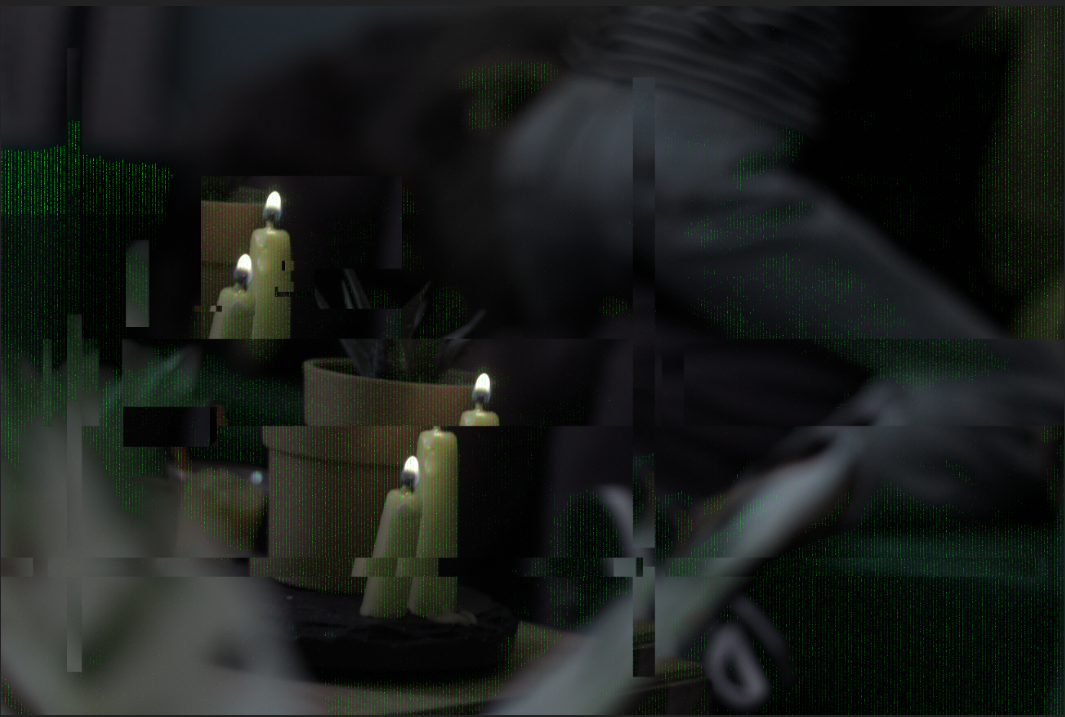
I had a weird glitch happen earlier today when I tried to edit some raw photos (thanks Alfred for the fix!!)- it looked really cool and out there so I played with it and figured out how to get some neat different effects with the sliders and other tools while I waited to hear back on how to fix it. Lead to some really fun images that are far outside my normal style- figured I'd share a couple here.
-
but a nice photo in springtime, isnt it ? Developed in Develop persona and than processed in Photo persona ( Contrast, Saturation in LAB, sharping with highpass filter, Vignette with Curves in LAB)
-
Hi everyone, I recorded this quick tutorial on how to create a sepia tone in Affinity Photo. I hope you guys find it interesting.
-
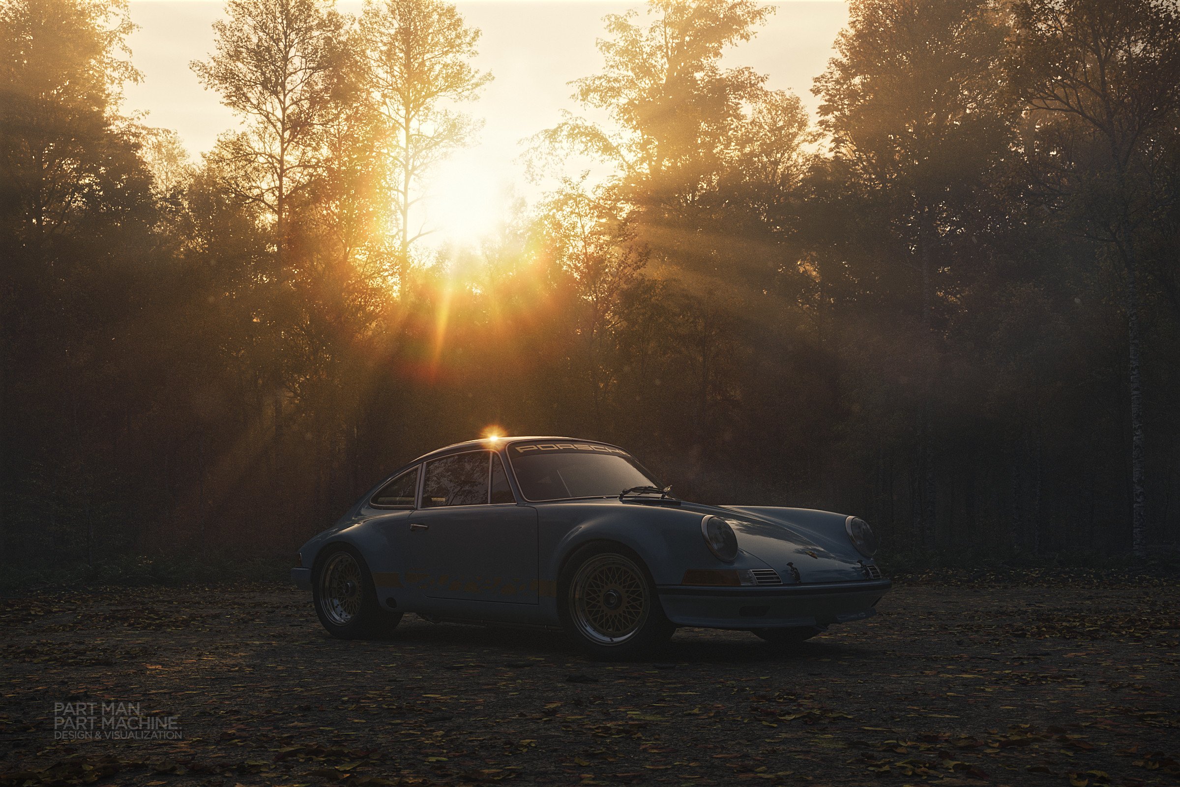
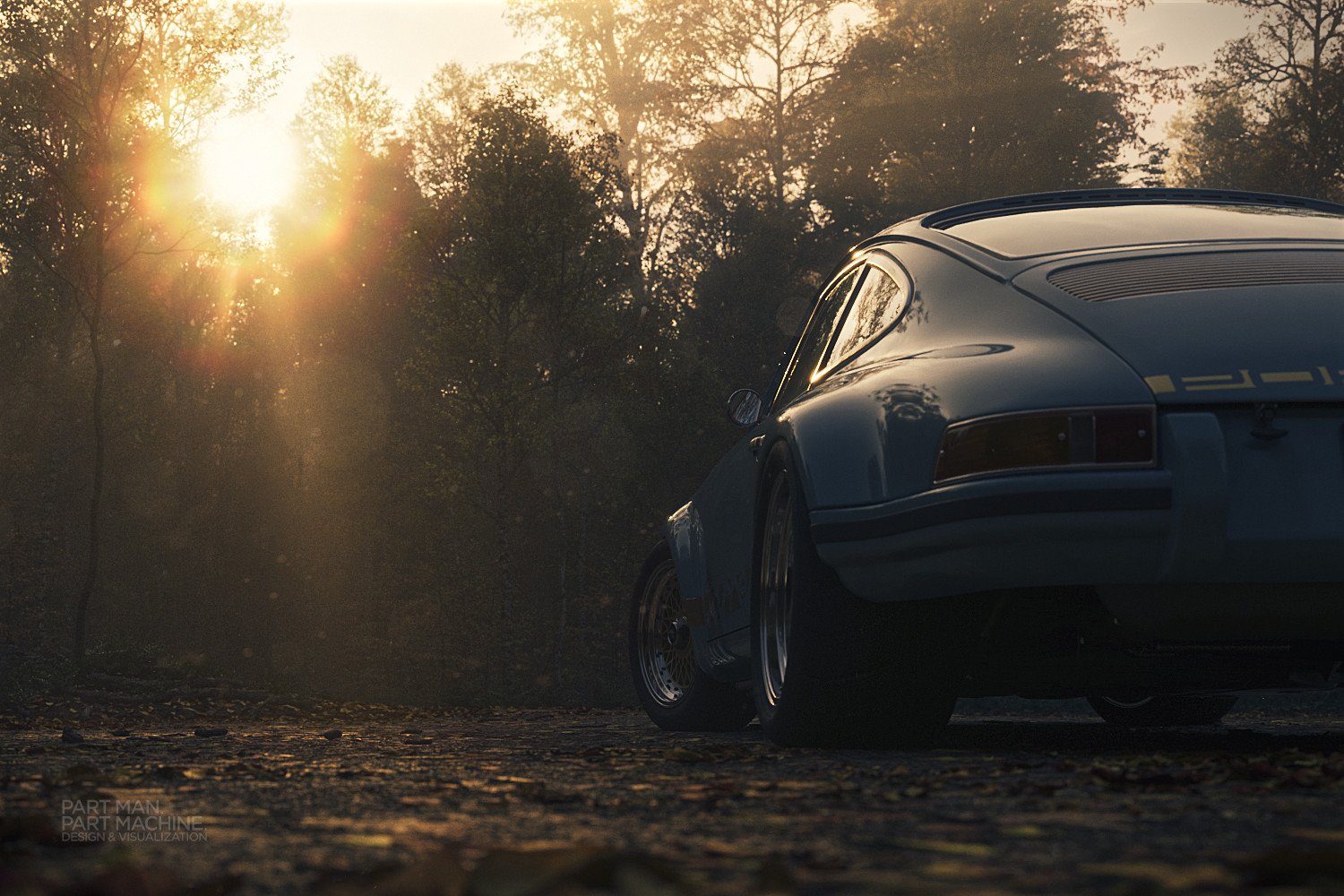
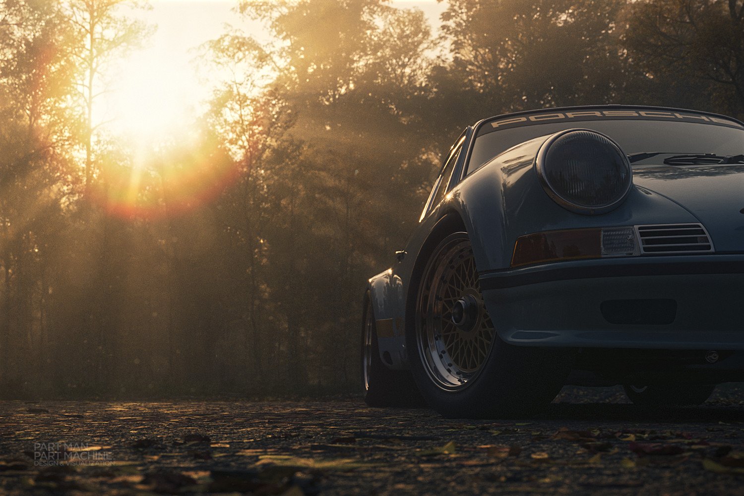
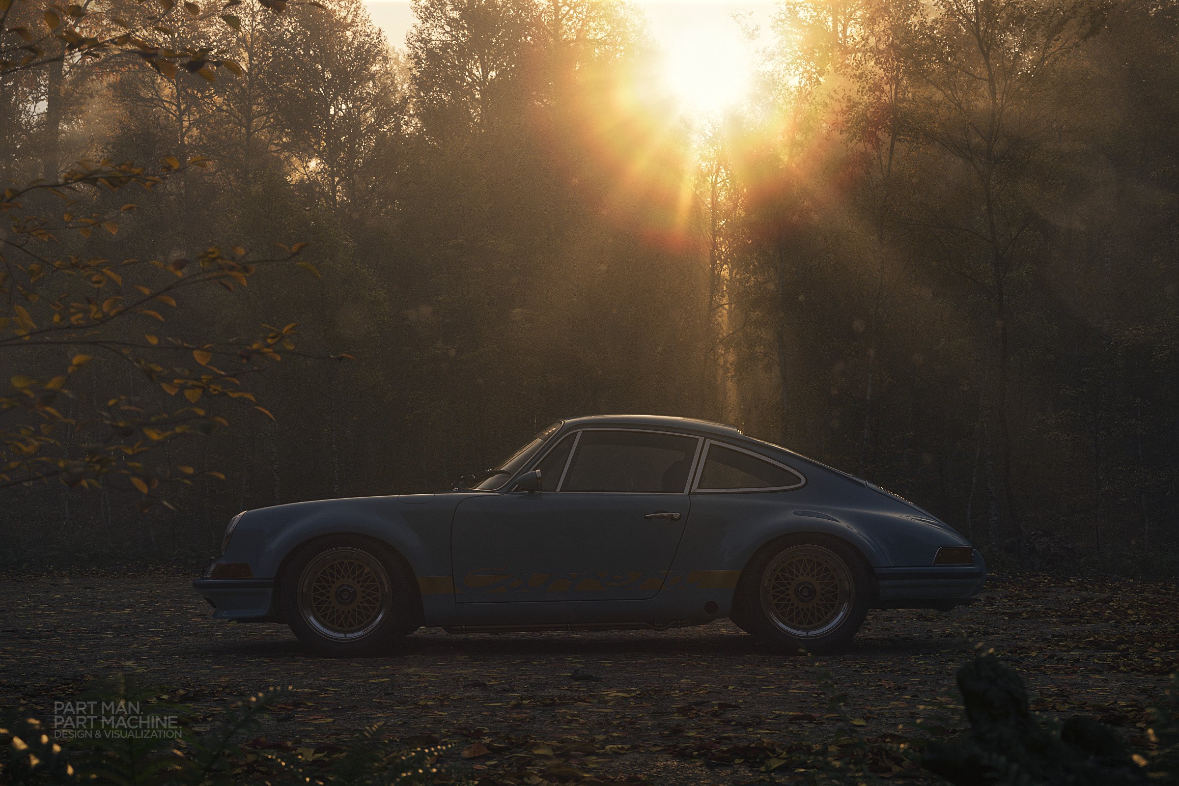
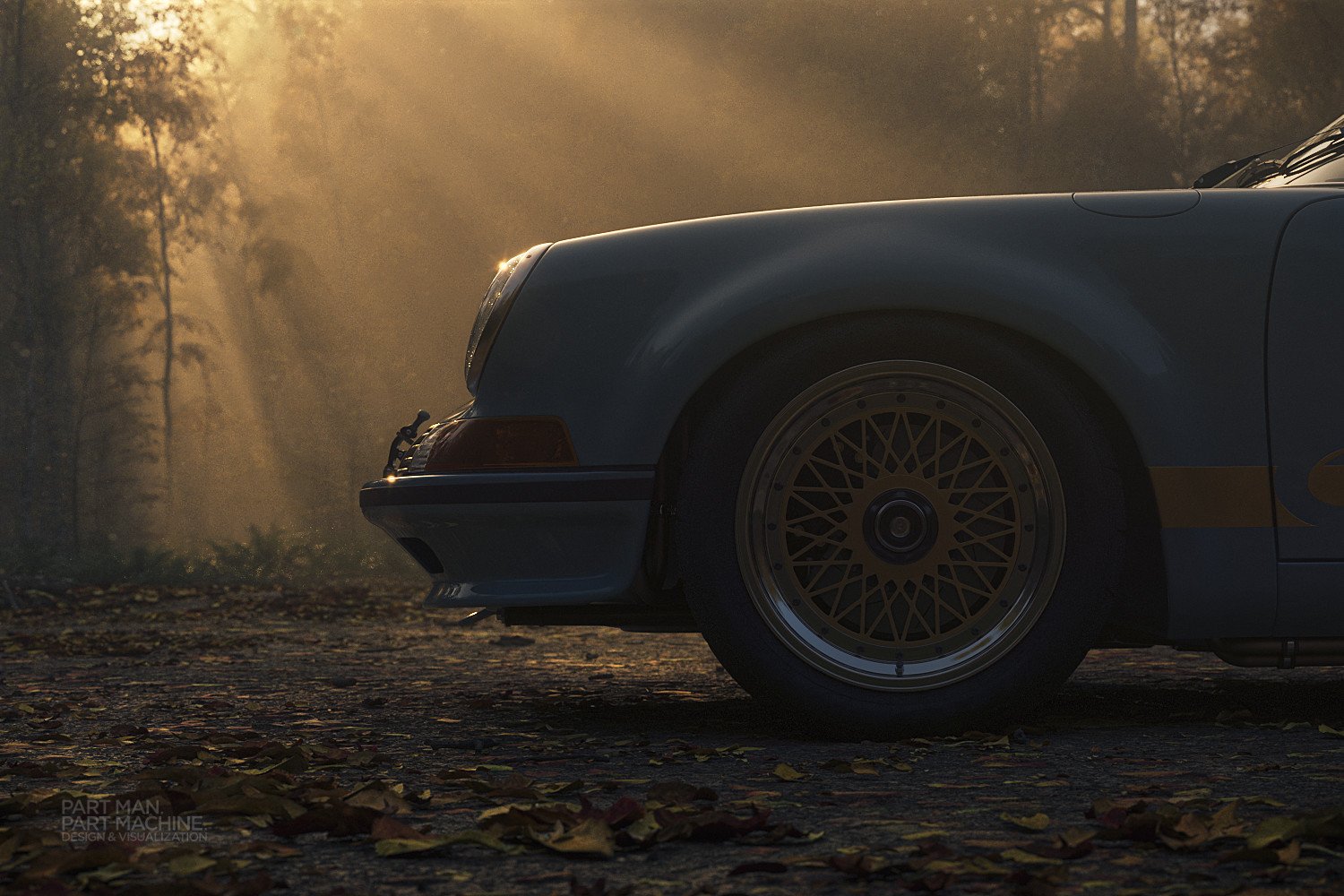
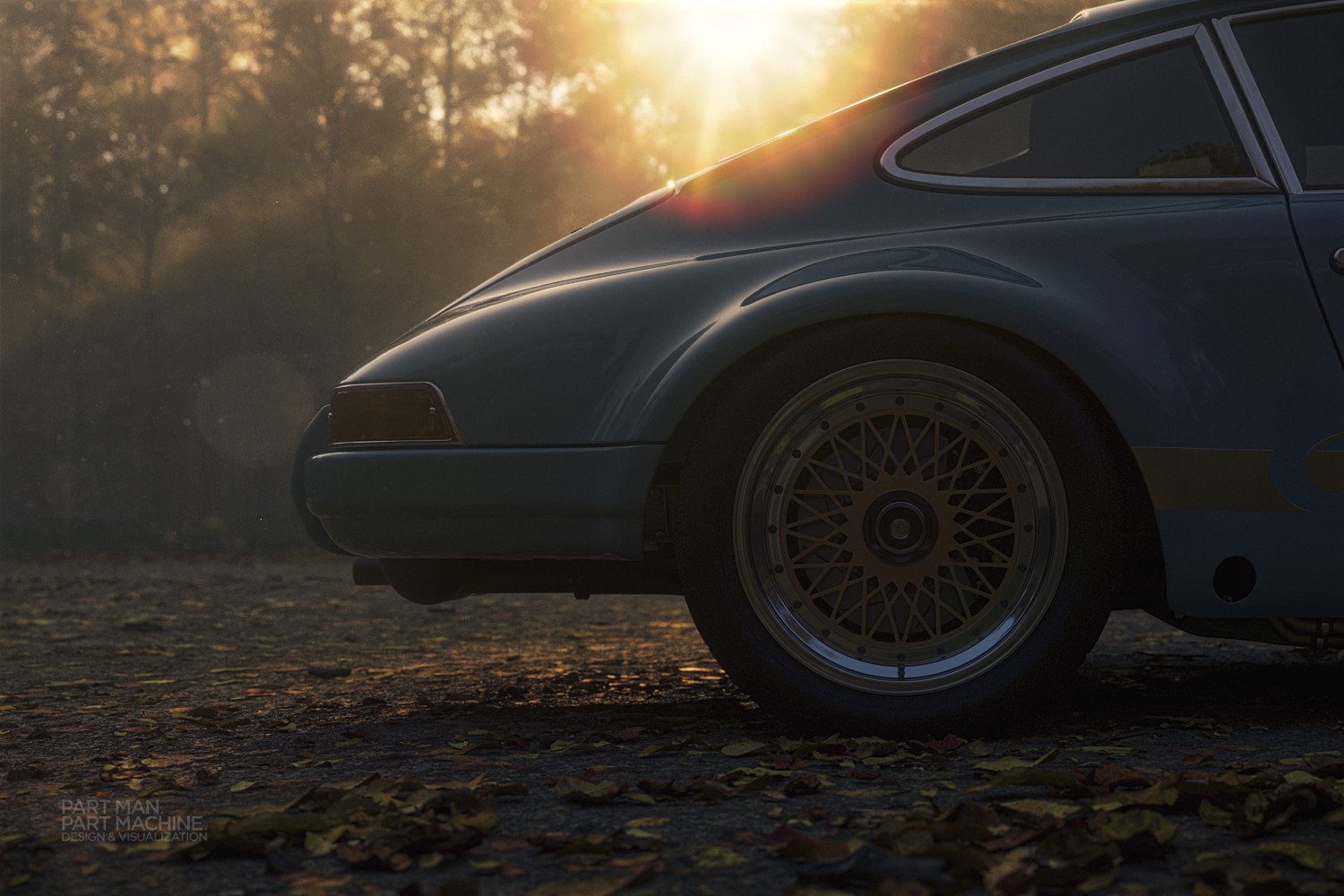
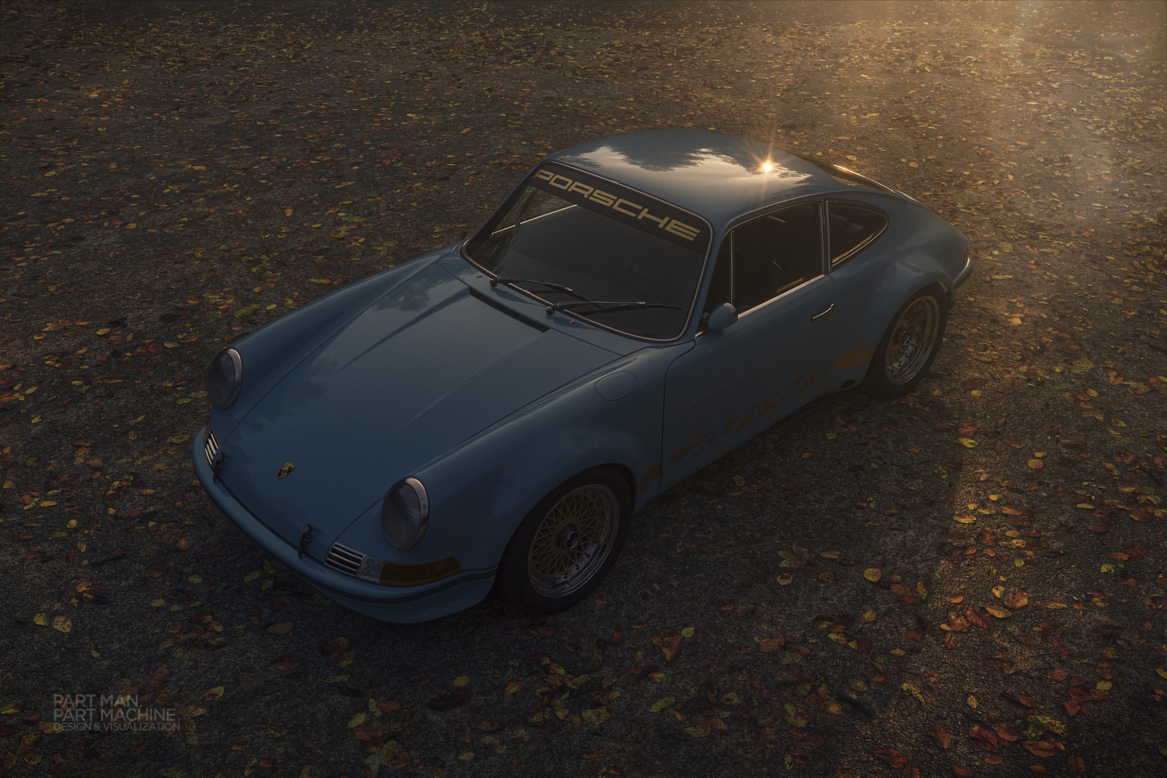
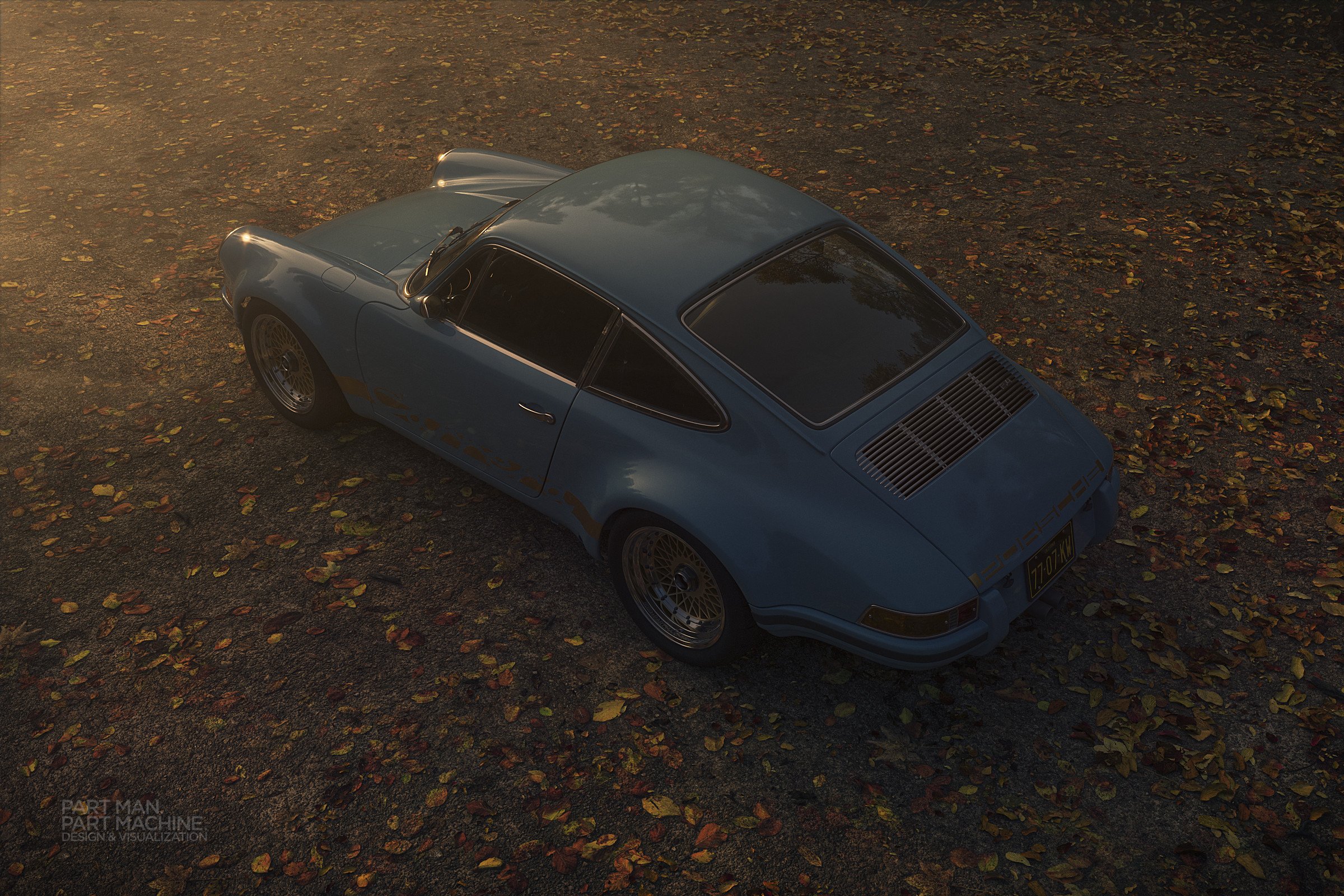
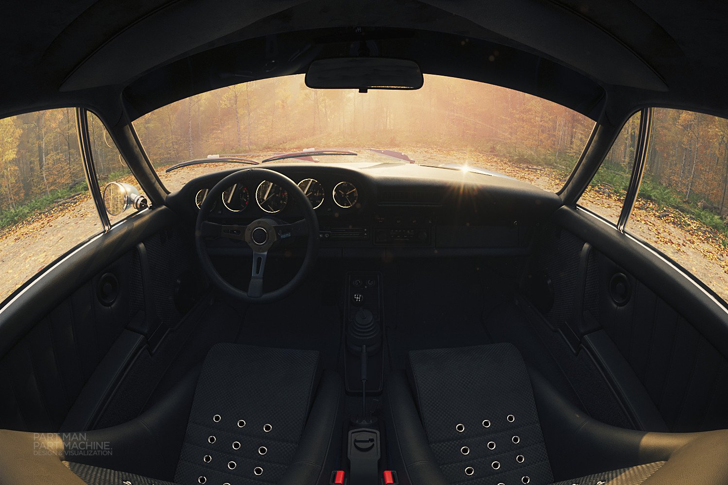
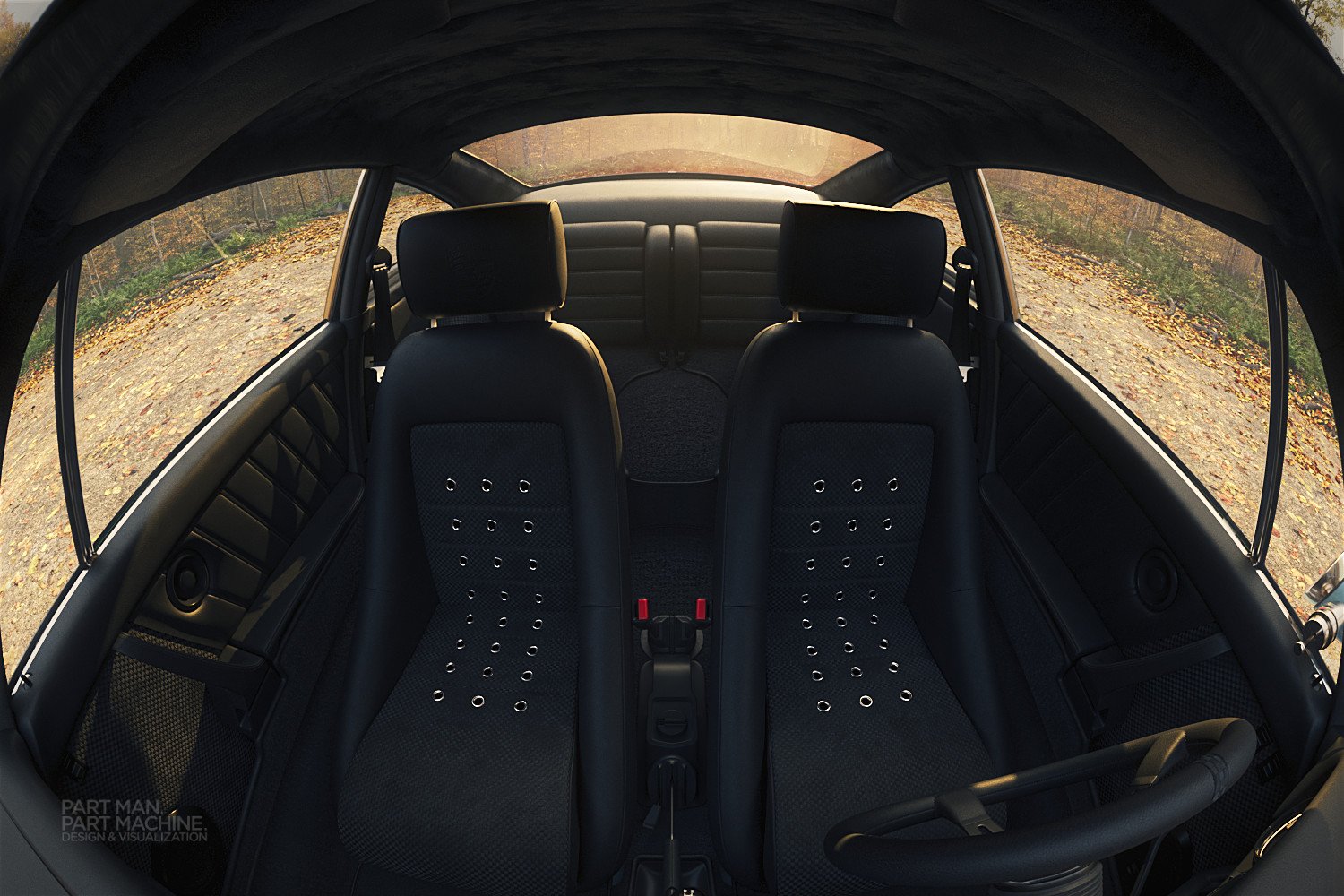
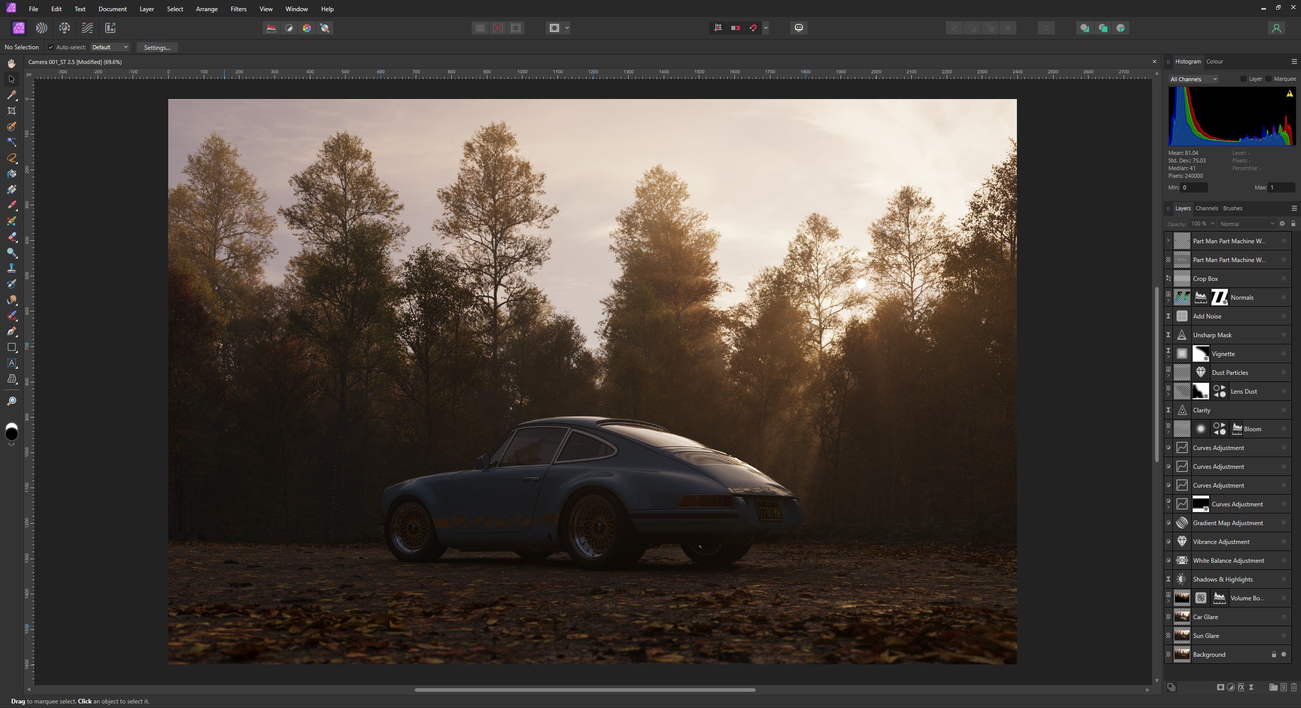
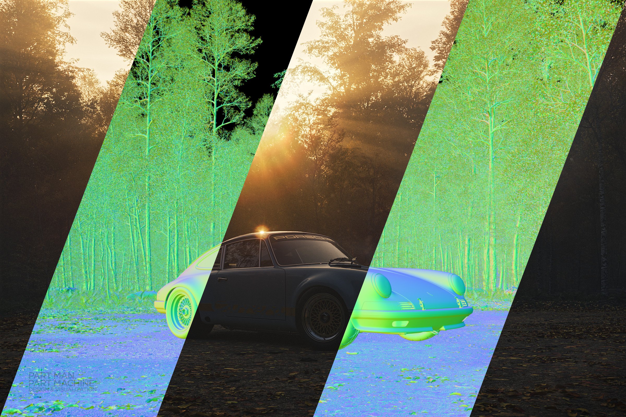
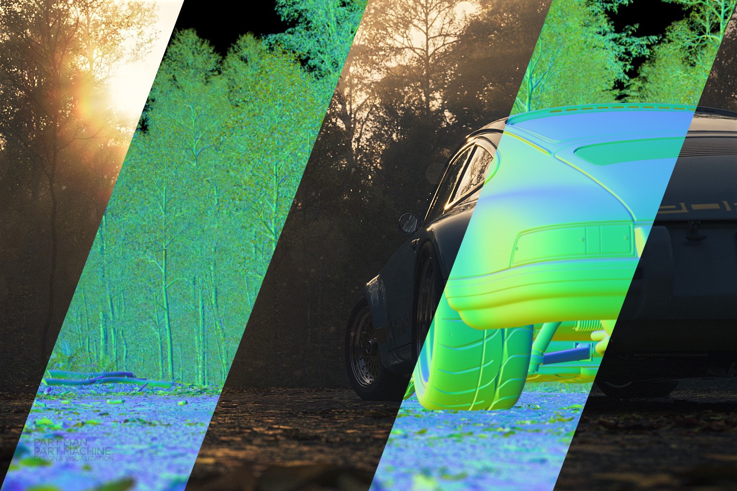
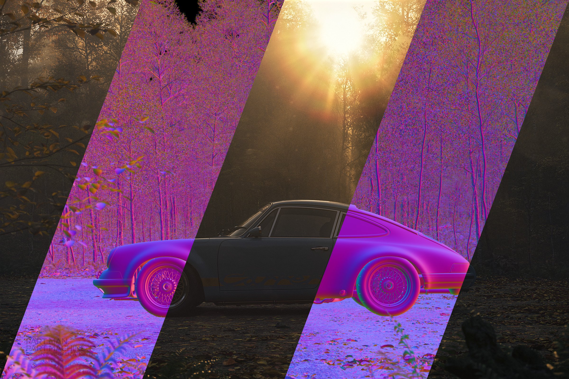
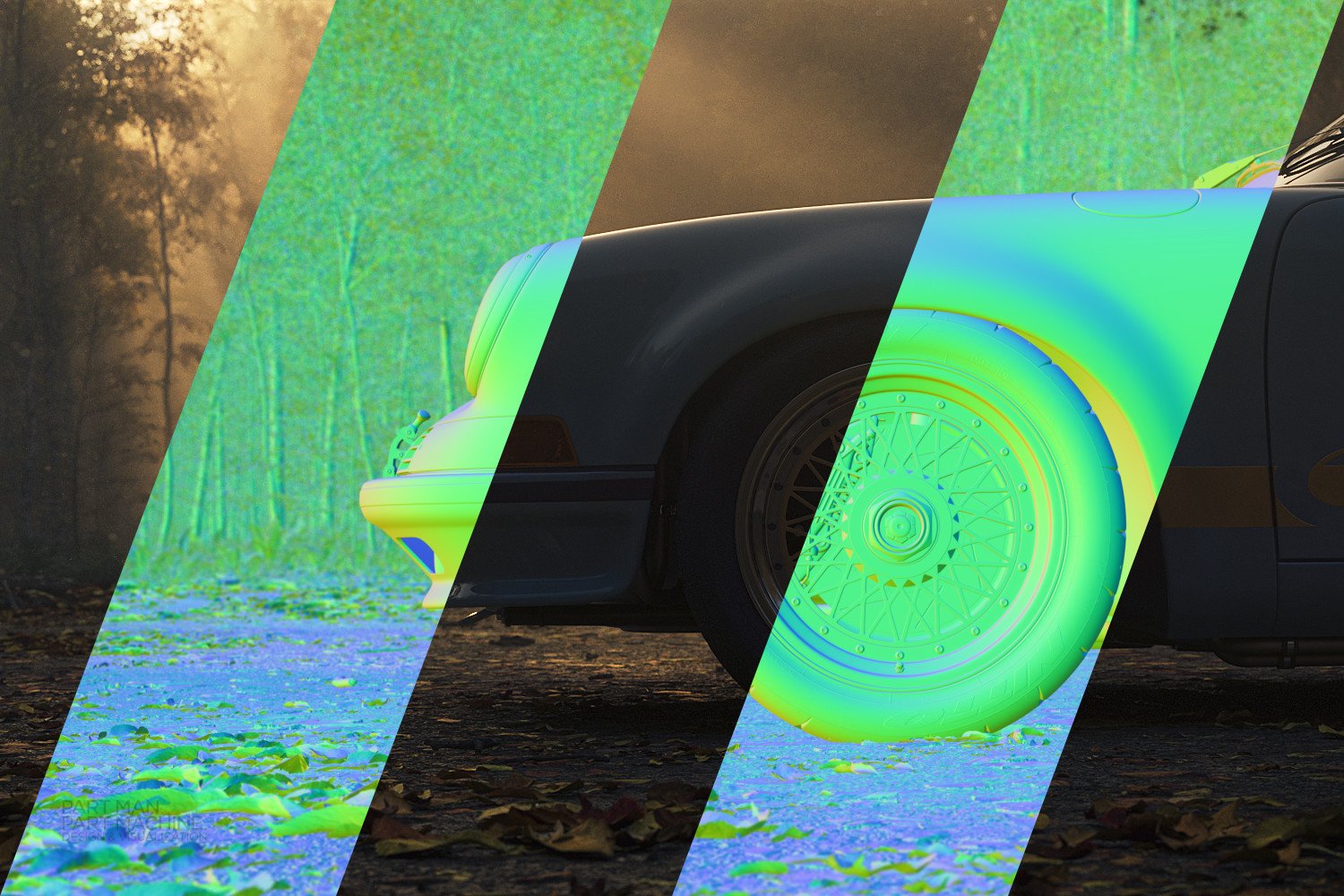
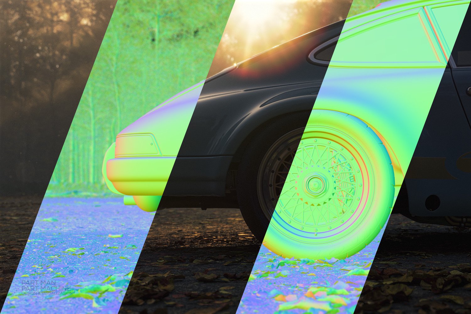
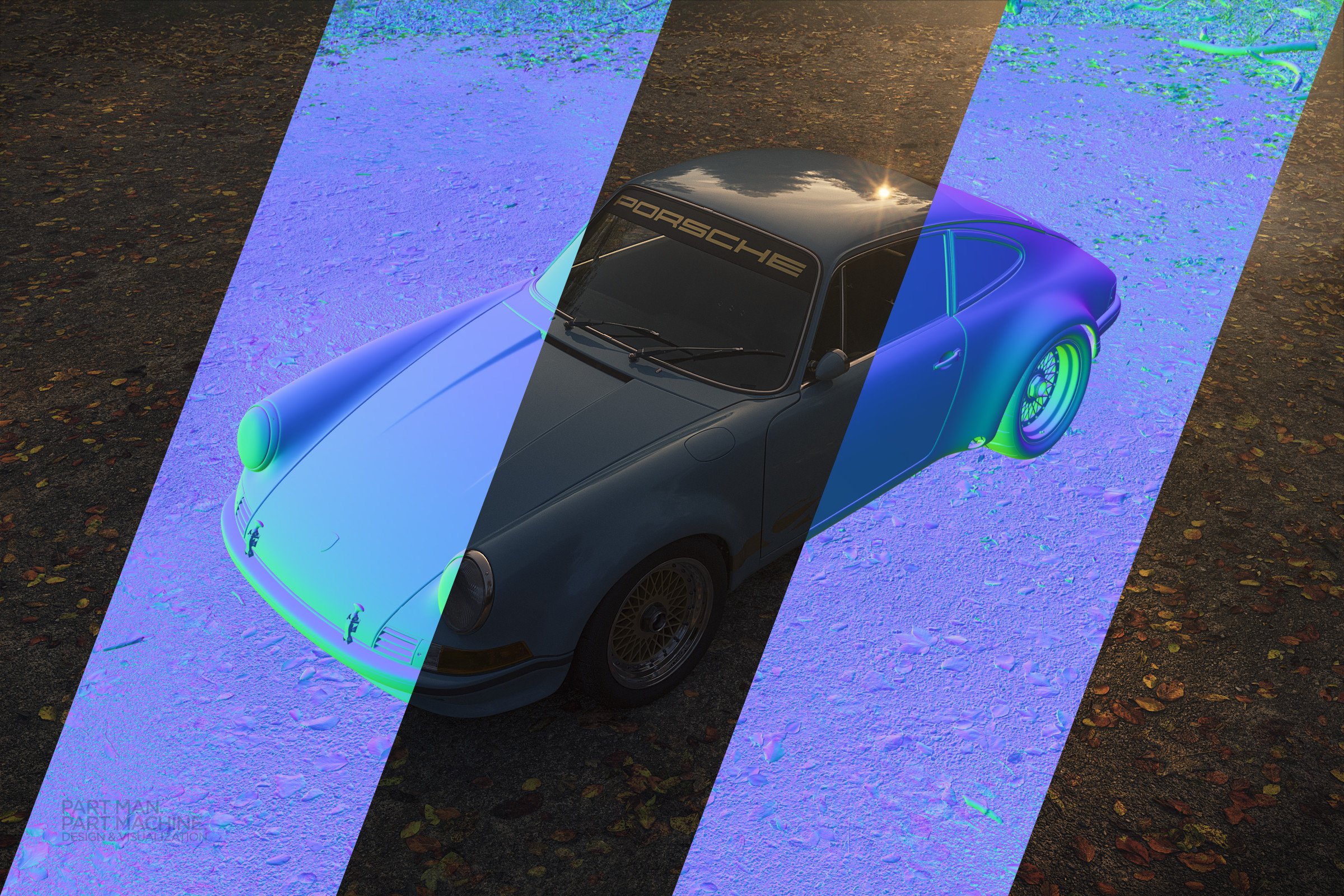
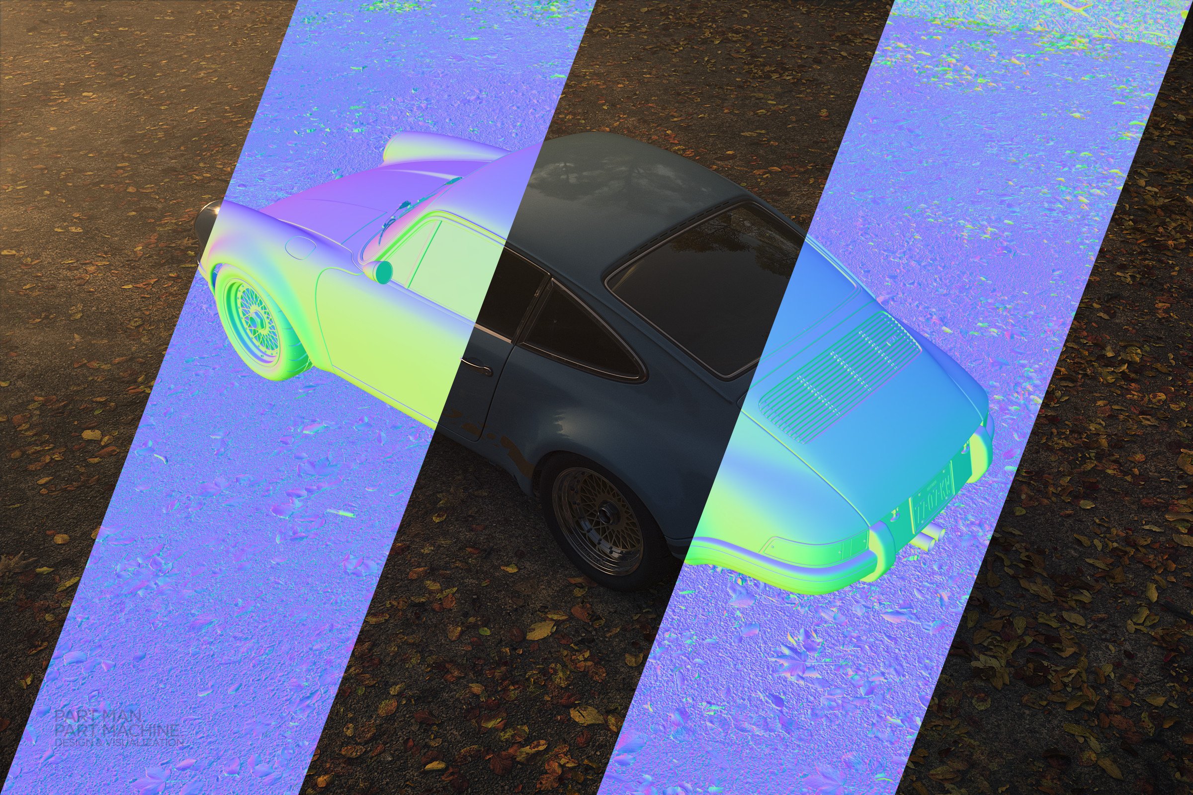
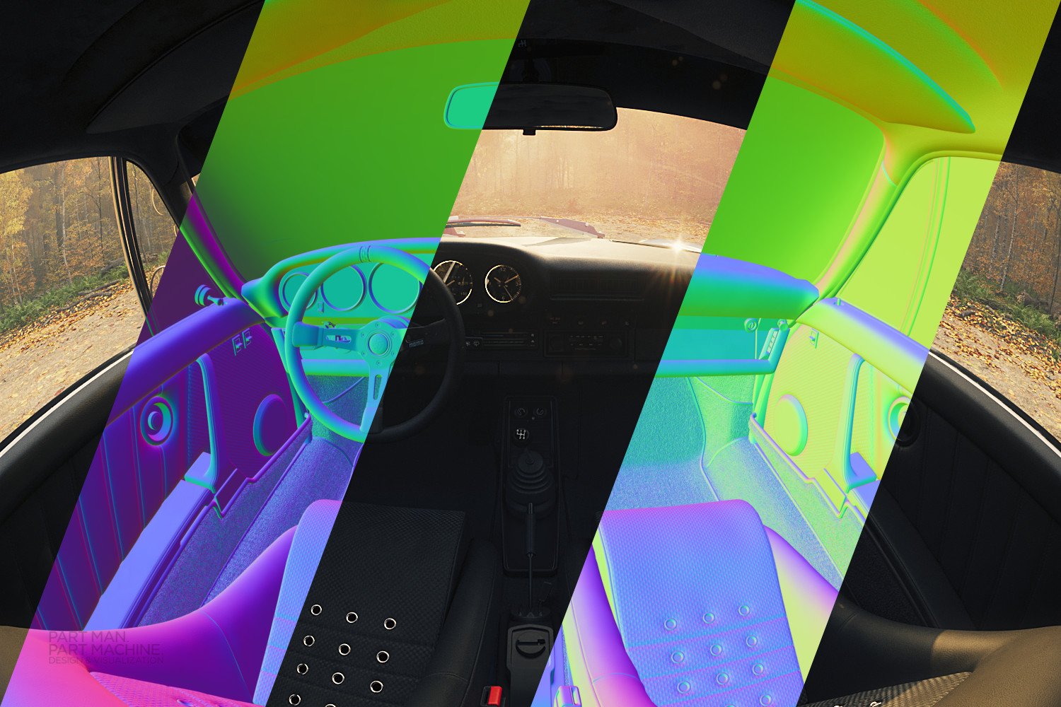
 After being made redundant last year and losing my access to a CC subscription I decided to switch to Affinity Photo and Designer for my personal work. I got to work in Designer immediately using it to put together a new CV & Portfolio which meant I was then employed as soon as my gardening leave ended. The one off payment made much more sense as for personal work as there may be weeks at a time when I don't have the need for image manipulation as I'll still be working on the 3D side of any project. I've found the switch very easy and have no plans to go back to Adobe for personal work even though I now have CC access again via my new job. This was my entry for the Automotive CGI Facebook group monthly competition where I tried to focus on a low key lighting setup. The Carrera & Porsche vinyl decals were created in Affinity Designer and all of the post production was finished in Affinity Photo. The base render was achieved in 3DS Max 2023 & Corona 11. I've included screenshots of the raw render and the layer stack so please feel free to critique.
-
Here is a painting of a seascape in thin acrylic using DAP Pro 8 and Affinity Photo. Video of creation included. Sea Scape_2.mp4
-
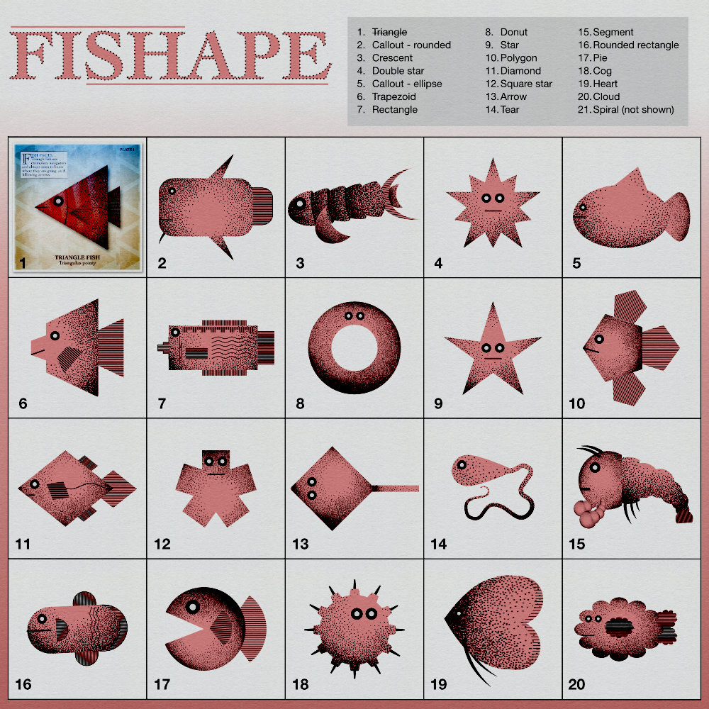
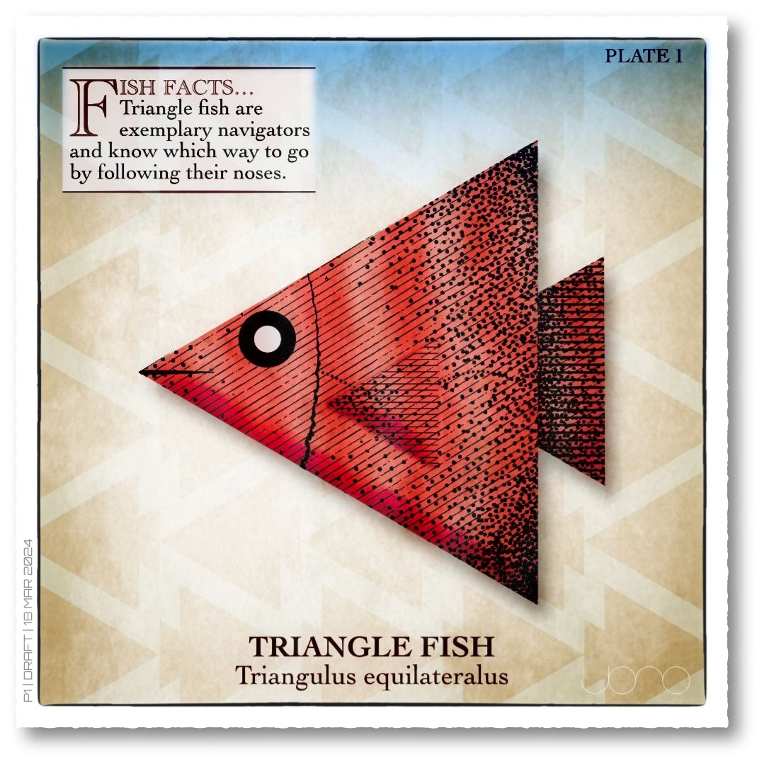
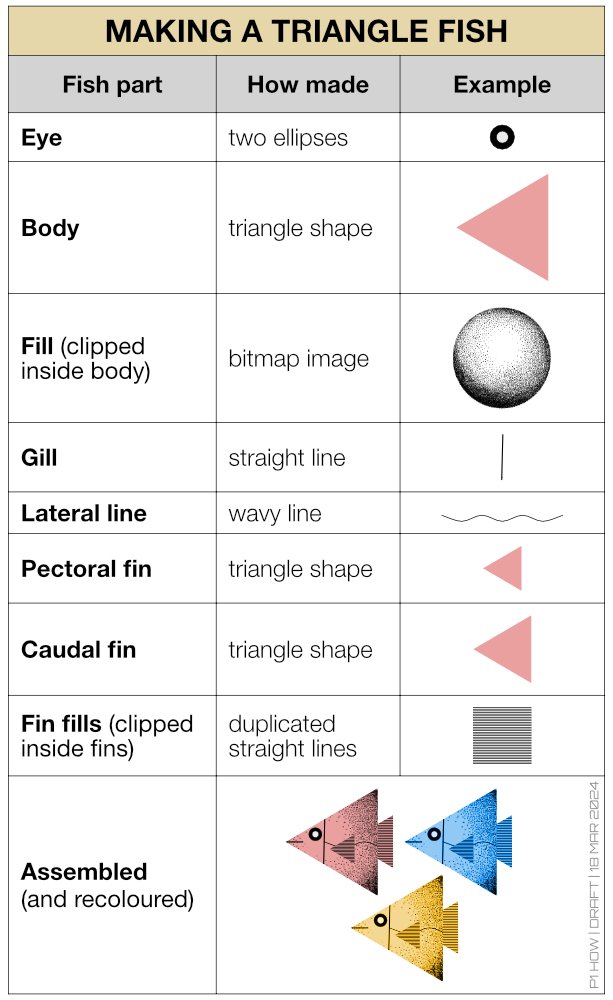
Hi all, I thought I'd give myself a quick project to explore Affinity's Shape tools and make a series of images. I've made some fish like creatures, but other themes could easily used, like monsters, faces etc. I was thinking this idea could help new users learn about the Shape tools and generally have some creative fun. When I get a few spare moments, my intention is to further embellish each shape with colours, different fills, backgrounds, text etc Note: the bitmap fill is from The Shizzle Style and Brush Pack (Grizzle 1), the paper texture is from True Grit Texture Supply (Folio-Vellum) and additional line shading is from Artifex Forge's Vintage Engraved Patterns (Pattern 6). Yes, I have splashed out on the Spring Sale offers!
- 8 replies
-
- 18
-
-
- affinity photo
- affinity designer
- (and 1 more)
-
affinity photo Aliens Ripley Character Study
privateEyeIllustration posted a topic in Share your work
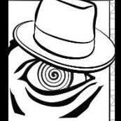
Ripley from Aliens painted in Affinity photo. One of my first times using Affinity after making the switch from Adobe. Experimented with various brushes, perhaps soft brushes set to low opacity. The fog is created with a smoke or fog brush, tons of options out there. I still prefer traditional pencils, charcoals, and blenders for anything in the "portrait" world. I remember reading in a tutorial that soft brushes can give your work a "plastic" look to it. The world is yours, create awesome artwork and keep learning!
- 1 reply
-
- 5
-
-
This design was created using Affinity Designer and Photo. Ehh the color and quality loss after uploading is painful and have had similar results on Pinterest. Anyway, Batman the Ride is one of the greatest coasters ever and had visited Six Flags over Texas and Great America last fall. There was no cool merch for the ride anywhere, so wanted to try and create something to do the ride justice. I created the outline using the pen tool in Designer with some vector fills to block in certain areas. I then imported the file into Affinity Photo and started coloring and adding detail with various brushes. I've had good results with the Nathan Brown brush packs. Thanks to Affinity for creating this great program, I will never go back to Adobe again. I WAS NOT commissioned by DC or Six flags to create this art.
-
Another video! When I lived on the Isle of Wight, we could hardly move without falling over a Morris Dancer. As a folksinger, I naturally met and made friends with a lot of dancers and musicians there. Some years ago, a lady name Helen Akitt wrote this funny song poking gentle fun at her Morris chums, a parody of the lovely song The Whitsun Dance, and I've been singing it ever since I discovered it. The assets in this still--the grass, trees and flowers--actually came from DrawPlus. I saved them as svg and imported them into AD. The unusual format with decorations down each side is because I made the 'pages' in A3 format with a view to printing them some time; YouTube resizes everything to 16:9, which would leave black bars at the sides. And now I'm going to have a rest . . .
- 1 reply
-
- 5
-
-
- movieplus x6
- drawplus
- (and 4 more)
-
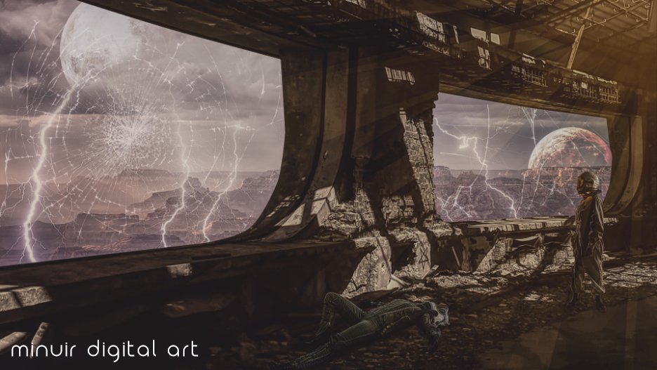
I saw a story about terraforming another planet for humans to live on. It was a very interesting story, but I think it is not possible in the near future. Because there are too many variables and humans are too weak. This time, I tried to express that kind of thinking. "The Last Day" Speed Art : https://www.youtube.com/watch?v=fVUItomYpFk
-
- 5
-
-
- minuir
- digital art
- (and 2 more)
-
1. It is not possible to set a date taken for old photographs. Try tagging a photo taken in, say, 1926. It will not be saved and will come back blank when the file is reopened. 2. IPTC fields are short, for example, some longer country names must be entered abbreviated rather than in their correct form.


.png.5287d4edda683f2426d889122711bec3.png)