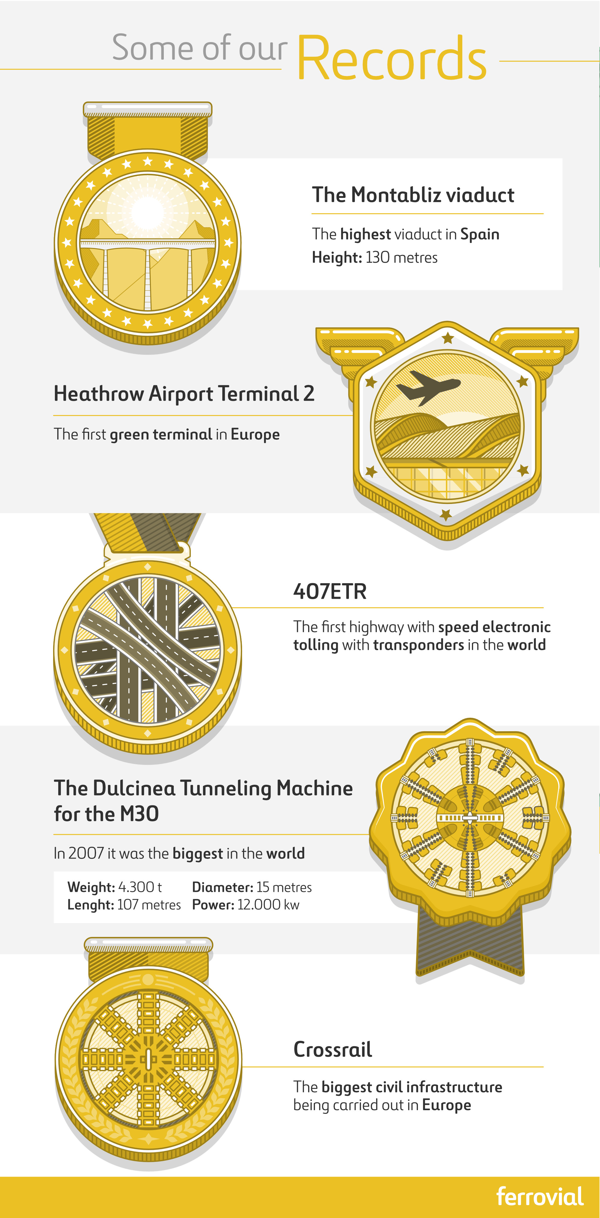
Search the Community
Showing results for tags 'Affinity designer'.
-
The robot who was once destroyed and sometime after re-animated by the evil will of technomancer. This guy is like a zombie but made of steel. Used new for me method of inking - vector brushes without any pressure sensitivity at all. You just create the shape you need and make a brush out of it. Having some brushes made in this manner results in nice and natural looking inks. The reason for using them is actually better predictability of strokes and much higher speed. The brush engine just does not spend time calculating size and opacity variability and you get much faster inks. For many inking tasks this is more than enough. Have you been using this method? How you feel about it?

-
Free Neon Elements you can use them conveniently thanks to the assets panel .afassets file included. You can use it in both personal and commercial projects for yourself, your company or your customer. hope it will be useful for you Download it from here http://www.affinitytemplates.com/neon-kit-resources-for-affinity-designer/
- 3 replies
-
- 5
-

-
- neon
- affinity designer
- (and 7 more)
-
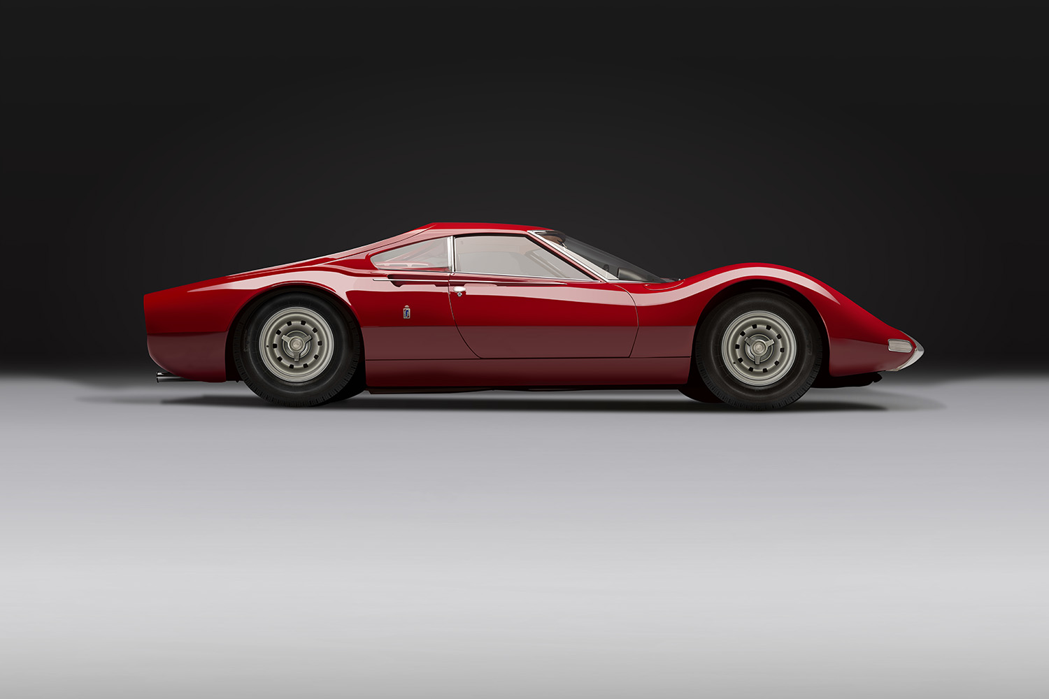
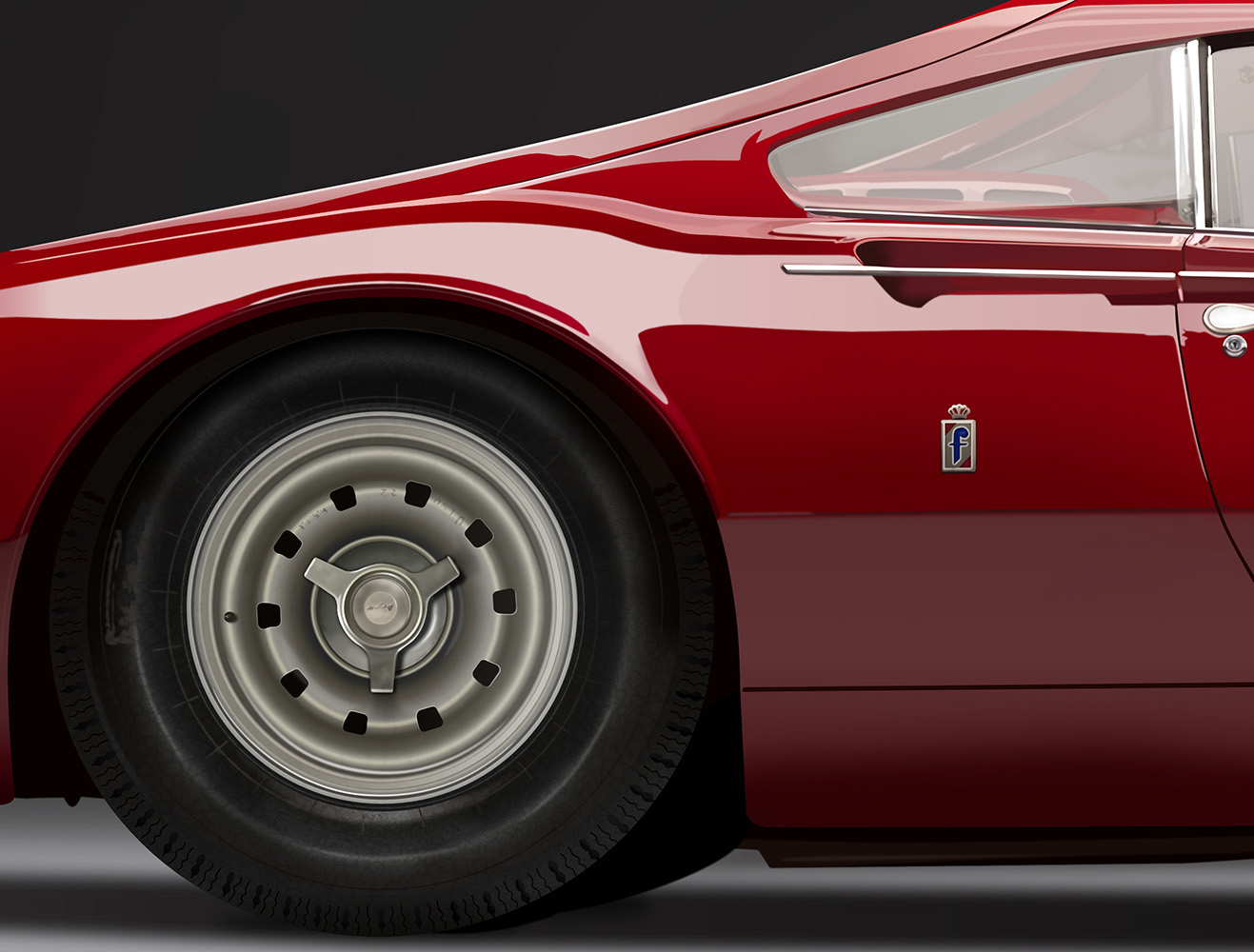
 “This is my Eiffel Tower. This is my Rachmaninoff's Third. My Pietà. It's completely elegant, it's bafflingly beautiful…” I think the last one I’ll do and post but it’s a goodie (well the subject is). The Ferrari Dino Berlinetta Speciale prototype was unveiled at the Paris motor show in 1965. In my opinion the side view is its best angle, I can’t say that I think the front is particularly pretty. It recently sold for a ridiculous amount of money, over £3.2m/$4m. As I wanted it to be photorealistic what looks like a fairly simple drawing was plenty of work. There’s a lot of fine detail, like the vector textures I made up for the tyres and wheels, that isn’t necessarily obvious, especially at this reduced size, but if it wasn’t there then it loses some of its realism. I'll probably go back to it in a week or two and see what bits I don't like. It’s also quite a large drawing, the full size output’s 88.5MP (11520x7680).
- 28 replies
-
- 43
-
-
Thought I would share the latest painting created in Affinity Designer Partial beta testing exercise Original size 430 x 600mm (300dpi) Again using mostly texture paint brushes and a few brushes from the vegetation section
-
 Hello, designers. I was wondering if it could ease the process of exporting assets for an Android project. After delving into it, I wrote an article. Exporting assets for Android using Affinity Designer
 -
A portrait as a handmade vector drawing is always associated with a lot of effort, but it's worth it. The drawings always have their own charm and offer what a photograph can't offer. And of course, the vector drawings can be enlarged without loss of quality http://b-bertuleit.de/vektorzeichnungen/
- 4 replies
-
- 2
-
-
- vector portraits
- vector
- (and 2 more)
-
For my tutorial Affinity Designer User requests Cut line - Overprint I needed this cutter knife for the intro.
- 4 replies
-
- 10
-
-
- vector art
- knife
- (and 1 more)
-
Leicester is red Stilton is blue Who doesn't love melted cheese? Weirdos, that's who. A piece for instagram.
- 38 replies
-
- 15
-
-
- illustration
- character
- (and 4 more)
-
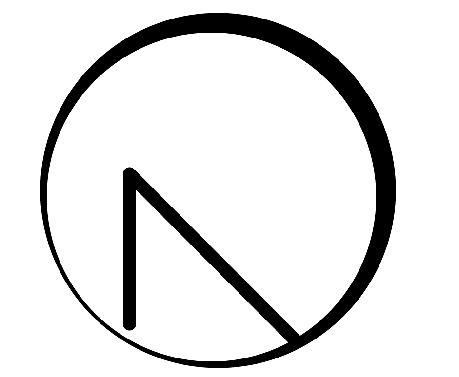
Hi, I'm currently remaking my personal logo for my portfolio. I would like your advice on which one do you prefer, because I don't really know what to do... Also, if you have some suggestions to improve my logos, feel free to share them. For the moment it's only draft and not final. I was looking something that represent me. My first name is starting with "N" and last name with "D", but really difficult to make a cool design with those letters. I really love nature, animals, space and aircraft. For my logos I was thinking about solar eclipse or how to introduce an aircraft for my logo. I prefer something circle since it's easier to put on a website or favicon. I don't know if it should be transparent or be filled up with colors. You can find all drafts in attached files. Here is my current logo that I want to remake. I think it was too simple. Basic questions : 1. What do you think? 2. Should I add colors? Gradients? 3. What should I add/remove or how can I improve my logo? Thank you for feedback.
-
 I drew this chocolate cake with Affinity Designer on the occasion of my 1st Twitter anniversary. The biscuit was baked with the wonderful Frankentoon Texturizer brushes. Keep on drawin' Norbert
 -
 Hello! A picture probably says more than thousand words. Please have a look at the attached image. I'm trying to recreate this "polygon" look. I know how to create a gradient over several objects by selecting them at the same time. Is it possible to add these artifical "steps" over the gradient's colors? Similar to the orange-to-red gradient in the attached image. Or is it all done manually? If you know any other hints on how to create this or similar polygon looks, I'd be happy to know them as well!
-

Transaprent Text Layer
RJH@ParcelFast posted a topic in Pre-V2 Archive of Affinity on iPad Questions
Hello, A have a plain coloured rectangle as the bases of my design. I want to add some text onto this layer but instead of the text being filled with a colour I would like the text to be transparent so that when I use the graphic the text will change colour depending on what it is layered above, is this possible? I find the simple things seem to be the hardest to do. #LovingAD Many thanks, Rob -
 HI, I've been using Affinity Designer for a couple of years now and it has become one of my favourite apps to use. But there are a few small issues that I've been hoping would be fixed with each release and haven't. Issues that just grate on me and diminishes my love for the app every time they come up. 1. Undoing an opt+drag copy just undoes the drag action and not the couple action. So my layers get littered with extra copies that I have to manually seek and destroy. A real time waster. 2. I use geometry a LOT, it drives me crazy the when I add/subtract/intersect shapes in a group, that the new shape skips out of the group and gets moved to the top of all layers. And then I have to grab and a put it back into the group it belongs to. 3. I've found that when I export an artboard, if the position of the artboard isn't set to a whole number, then the export process will add 1px to the dimension. If I have a 100x100px artboard and the artboard position within the document is set to x: 2.5 y:2.5, then the exported the image will be 101x101px. Make exporting really tedious when I have a lot of artboards, since I have to go in and move every artboard that's not positioned on whole numbers. 4. If I select an object by clicking it in the layers panel, when I press shift+arrow I expected it to super nudge (10px) the object on the artboard, but instead, it selects more layers in the layers panel. I use Designer a lot at my job and if it weren't for those 4 things, I'd be super happy with the experience and recommend it to everyone. But as it is, because it occurs with functions I use all the time, it wears me down. thanks -Pete
 -
 dear pundits, is there a way to create chapter initials in affinity designer, the same way as i could do in indesign? any help appreciated. greetings, tomas
 -
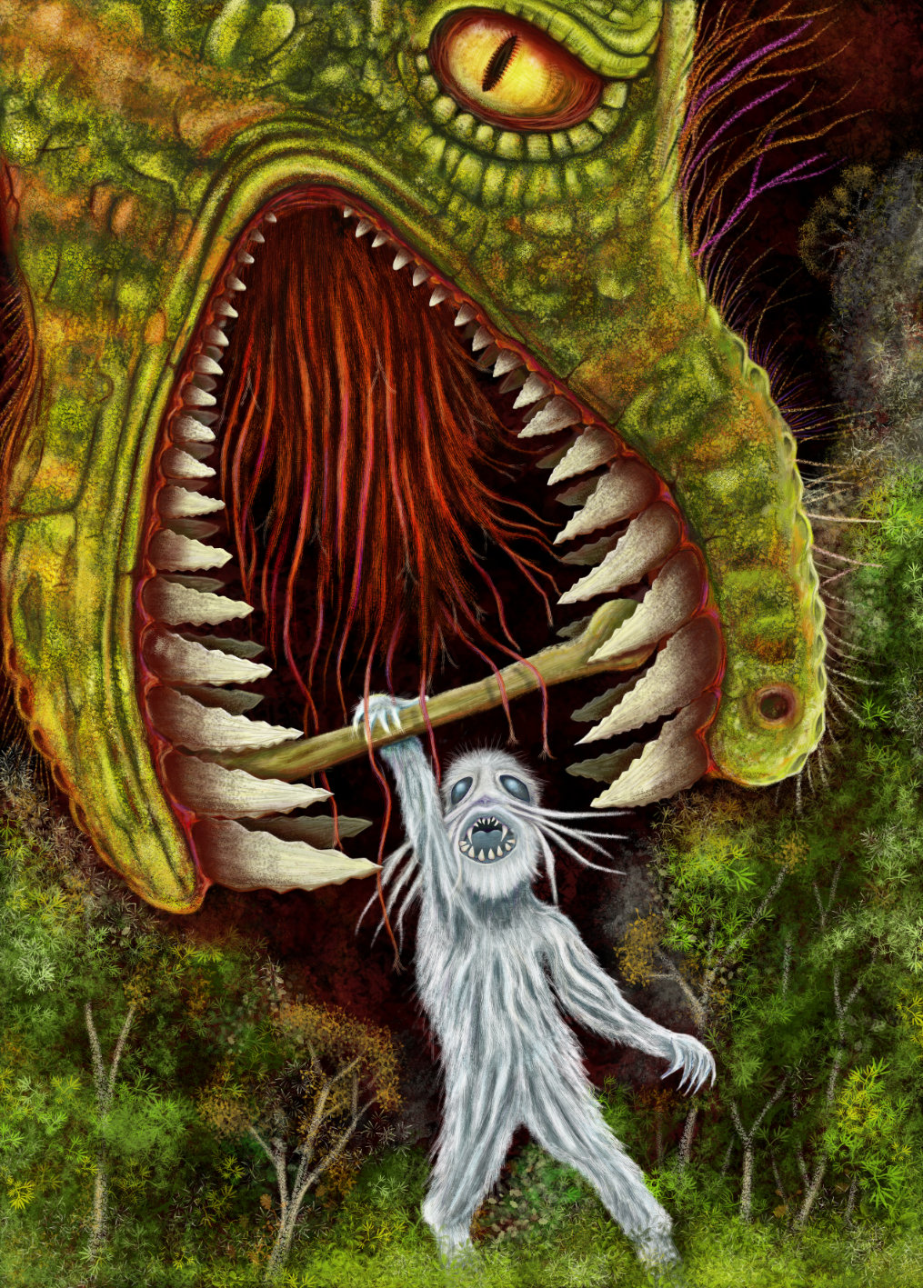
During the long winter nights i often look in the starry sky at the Andromeda galaxy, which can be seen through binoculars. It is so small from our Earth, but actually its a huge galaxy, and i'm wondering - maybe some kind of girl, who lives there, looks right now back at me questioning herself - is there somebody else in this huge space?.. So this is how i see this girl. Damn, i was trying to figure out someone more romantic, but my humorous mind just played a trick on me. Goodbye, Andromeda girl, from now i'm not sure if i want to believe in your existence. :-) Based on all those sci-fi fairy tales i've read in my younger years. Just a bit about the process - i suddenly realise what i want to draw, then i make few sketches on paper or digitally, or both (here Wacom Intuos Pro 2 paper edition was heavily used with its ability to convert paper drawings into digital sketches), then i make final sketch and trace it in Affinity Designer with vector brush. Colors are added after that... So like this.
-
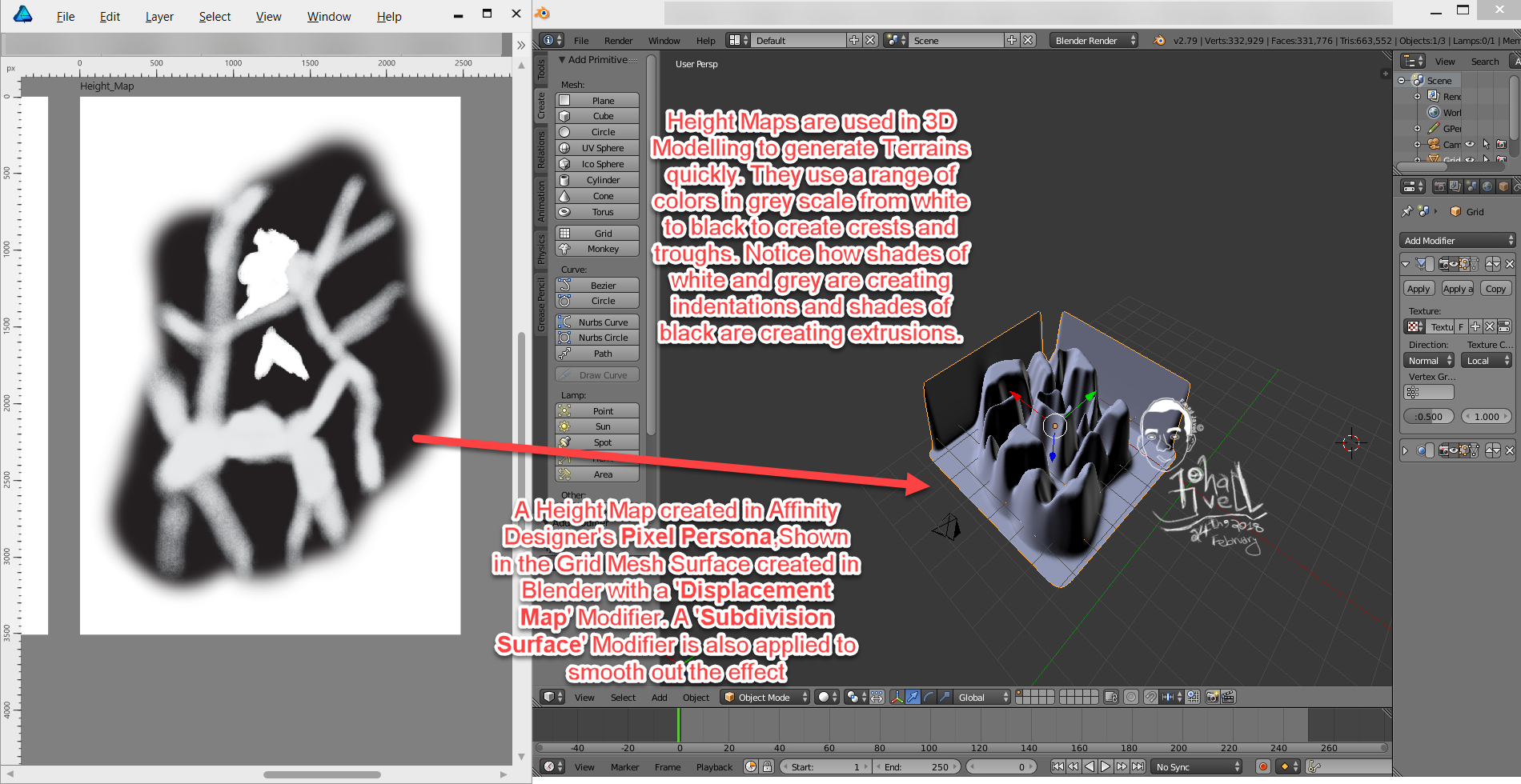
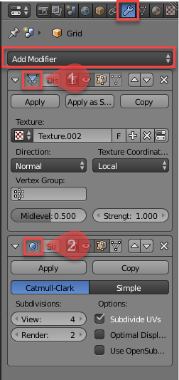
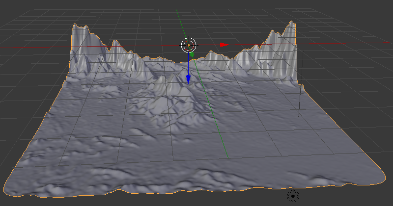
 The screen shot shows a roughly created height map in Affinity Designer's Pixel Persona[] using the Paint Brush tool[] and using grey scale values[] and how it is used in generating a 3D Terrain in Blender by applying this height map Image as a 'Displace'[] modifier on a Grid []Mesh Surface. For smoothness, i have applied a 'Subdivision Surface'[] modifier. Modifiers in 3D Modelling tools help modify an object's geometry. They can be accessed in the Tabs on the right side[] and have a 'wrench icon'[] . Just click the 'Add Modifier'[] dropdown to add the modifiers mentioned above. Notice, if you apply these modifiers by clicking the 'apply' button it will apply the effect and remove the modifier from stack of modifiers applied. If you want fine tune control over these without removing them from the stack of modifiers,don't apply them. [1] = Displace Modifier Added, [2] = Subdivision Surface Modifier Added [ >>>> [Source Files]] > The Height Map file in Affinity Designer has also been attached[File Name = Terrain_Height_Map.afdesign]. > The Blender Source File with the Height Map Applied has also been attached[File Name = Blender_File_with_Terrain_Created_Using_Height_map_from_Affinity_Designer.blend][Added on 27th February 2018] [ >>>> [Video File]] Here is a short video[around 3minutes and 26 seconds] that demonstrates the steps required:[Update: Added the Video on 26th February 2018] Blender can be downloaded from the following link: https://www.blender.org/ [ >>>> [Exercise]][Added on 27th February 2018] As an Extra Exercise,apply these concepts by making use of Real Terrain Height Maps[that contain Real World Elevation Data] generated by the following website for your own country or city: https://terrain.party/ Just search your city or country and press the Export Button[] to export a zip file that contains the height maps for the searched area. Extract the zip file and apply it to your own blender files. Notice how the grey scale values are used based on Real World Elevation data. Here is a sample of a terrain i generated using the Height Maps generated by this website: Happy Learning
- 1 reply
-
- 1
-
-
- greyscale
- fahadjaved
- (and 4 more)
-
I've spent the week on resources, there aren't enough, so creating swatches, gradients and styles, not the sort of thing I do very often so made a change. I ended up doing about a hundred text styles and tons of gradients and swatches. Here's a small subset of the text styles I've been playing with. I was sort of thinking of foil and seeing how much I could get done using the fairly limited AD fx's. Some weird combinations of gradients and blend modes I wouldn't normally use. For others there were quite a few things I just couldn't do or had to simplify, either the fx wasn't there or I needed to apply more than one of a certain type.
-
In this beginner tutorial I'll show you how to draw a parking disk with various tools and techniques in Affinity Designer 1.6.0. Although this tutorial is only available in German, you can hopefully follow the course of the video. The detailed table of contents in English inside the video description is hopefully a good guide for the single steps. Keep on drawin' Norbert
-
Just a bunch of icons for a telco.
-
The only reason I still have Photoshop is because of 3D Capabilities, and 2D animation to Gif capabilities. I know 3D is probably a hard ballgame to play but 2D gif timeline, drawing to frames and exporting as gif would be very useful.
- 1 reply
-
- 1
-
-
- affinity photo
- affinity designer
- (and 2 more)
-
Please make the outline icon solid (clickable) though it is hollow visually. Because the unclickable center does nothing to aid in selecting the ouline by mouse click. It only poroduces missing clicks.
-
Hi, I would love to see an option to optimise Affinity Designer’s files. What I have in mind is a way, once you have finished your composition to reduce the image size to match their use. You would need a few options to reduce the file without losing actual useful data. Depending on what you need you can define that the file images need to be downsized to 1x or 2x, that the images should be cropped to their visible portion or left to their full size, etc. I think this would be really helpful to avoid archiving huge files when you have a mostly vector file but with a few cropped images.
-
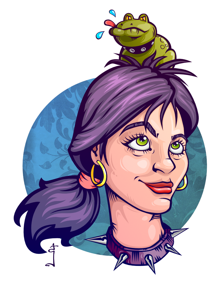
This girl loves her cute little pet toad so much she even lets it sit on her head! Affinity designer vector image.
-
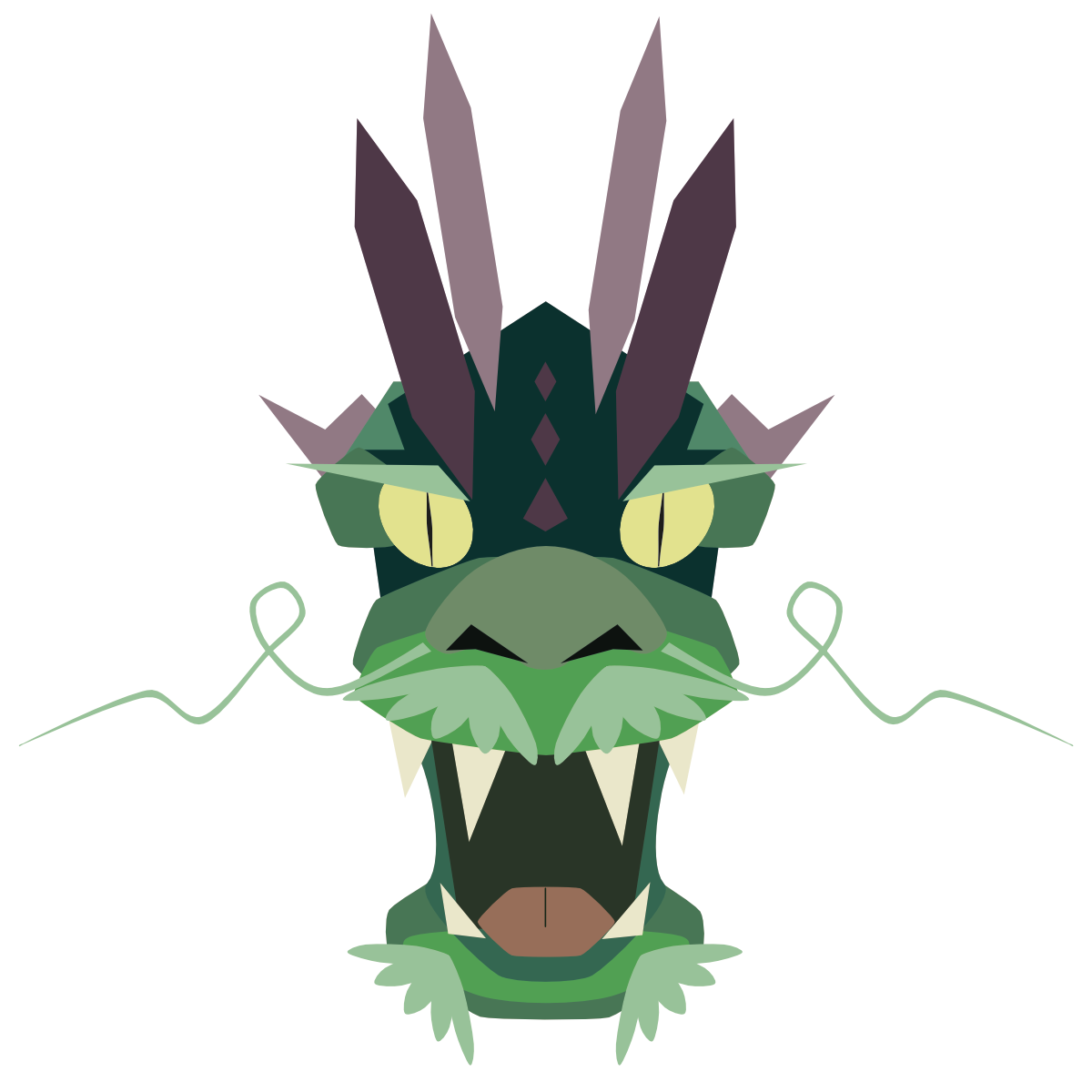
This one didn't make it to the final version: