Search the Community
Showing results for tags 'Affinity designer'.
-
 There's a Ressources manager in AD and AP, but not a Fonts manager and it's needed in those apps too. Also, the warning about missing fonts should occur when opening a document.
 -
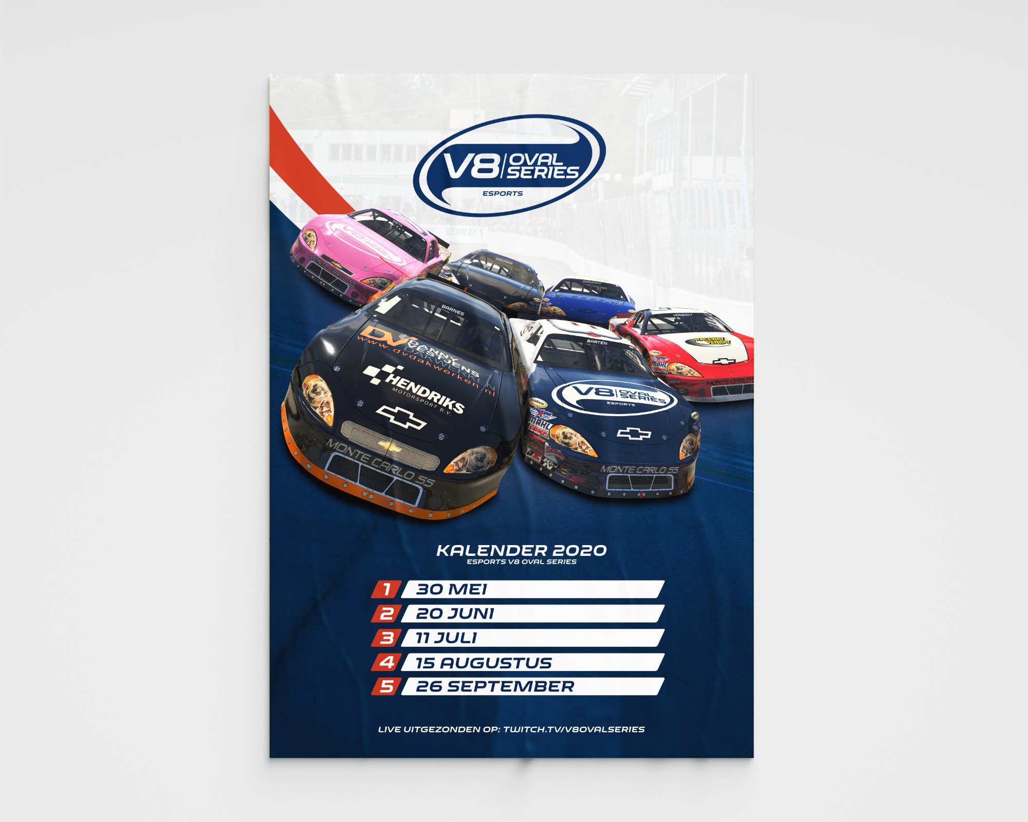
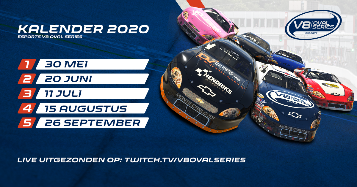
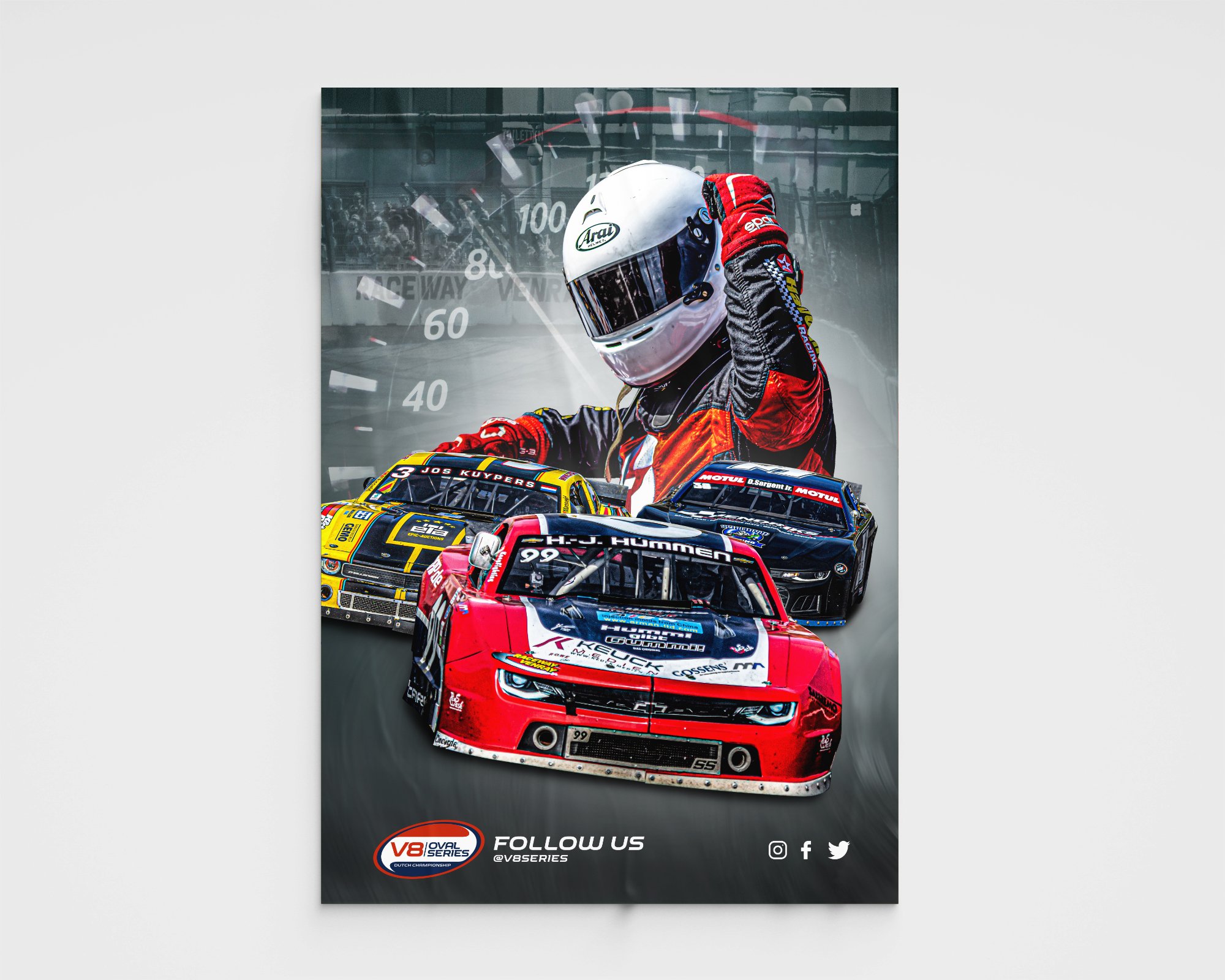
Used Affinity Photo, Designer and Publisher to make a poster for a digital racing event. I´ve used the Adobe software for 12+ years so this is my first project using the Affinity software, it took some time to get used to it but liked it alot! Alle cars where separate screenshots and I've worked them in one image. The main design can be used in several different sizes, like a social media posts or a wallpaper. I've used the same techniques as I used for this poster I made a year ago for the real life counterpart of this racing series. I hope you like the design

- 2 replies
-
- 5
-

-
- affinity designer
- sport
- (and 5 more)
-
 Well, first I'm sorry for my English, it's not my native language, so I'm sorry if I do not make myself clear. Second, I'm new to the Affinity suíte and here in the forum, so I'm sorry if the problem is simple to solve or if the issue has already been raised. My problem is that my artboards are not exporting at the correct size if my file is below 300 dpi in Affinity Designer. Like, I made a piece for Instagram on a 2000 x 2000 px artboard and 192 dpi and now I'm going to export it to send to the site. Then I go to Export Persona to create my PNG file, select the desired artboard, and adjust the preset to single PNG and size it to 1x to have my PNG in the same size as I created the piece, I hit the Export slices button and select the output folder. So far everything is fine, but when I open my exported PNG, the size has been reduced to half the original size, that is, 1000 x 1000 px. This only occurs when the dpi is below 300. I did a test with 298 dpi and the size of the exported file was cut, (scratch that, I mixed up the files) but when at 300 dpi or higher, the size of the exported file was correct. What can it be? Is it a bug or am I doing something wrong?
 -
Here is my attempt at creating a retro Art Deco style poster in Affinity Designer.
-
Affinity Online Help Hello all, we're happy to be able to offer you an online version of the in-app help! Access Designer, Photo & Publisher Help here: https://affinity.help Here are some of the additional features we're able to implement as a result of having proper browser support: Dynamic language switching: The help will determine your language and (if it's available) serve you a localised copy of the help. If you prefer to read in another language, however, you'll find a combo box at the bottom left which will enable you to change languages—and stay on the page you're currently reading. Print: Sounds simple, but with full browser support we can now implement printing of the topic pages. The print icon in the bottom left will give you a nicely formatted printout of the current topic. Share: Clicking the clipboard icon will copy the current topic's URL to your clipboard, which means you can easily point other people towards topics that may help them. Responsive: The help was responsive anyway, including off-canvas menu functionality so you could collapse the window and still read a topic, but this is taken further in this version of the help. The help is formatted nicely and usable even on a 4" iPhone SE screen. Search: we've implemented our own bespoke search for the online help which is fast and accurate. Access it via the tab system along the top left. Favourites: you can add topics to your favourites list to easily access them during future browser sessions. Simply click the + (plus) icon next to the "Favourites" tab to add the current topic. With this online version you'll be able to print out topics and view them on your tablets/phones, which are two of the most common requests when it comes to help feedback. As always, if you have any feedback or find any issues with this online version, please let us know! Hope you find it useful.
- 82 replies
-
- 20
-
-

-
 I used to a while ago play around with making some simple animation projects and wanted to get back into the swing of it. So since I have been building / painting Zoids this past couple of months I wanted to make an animation around it. Making A Zoid-HD 1080p.mov Programs Used: Affinity Photo (iPad Pro) Affinity Designer (iPad Pro) After Effect CC (M1 Mac Mini) Final Cut Pro (M1 Mac Mini) Still Images:
- 2 replies
-
- 4
-
-
- affinity designer
- ipad pro
- (and 1 more)
-
Hi, Why mouse scroll is not working with AD iPad? The click and other function is working well, but not the scroll. I'm using latest iPadOS and logitech MX 2 mouse. Thanks!
-
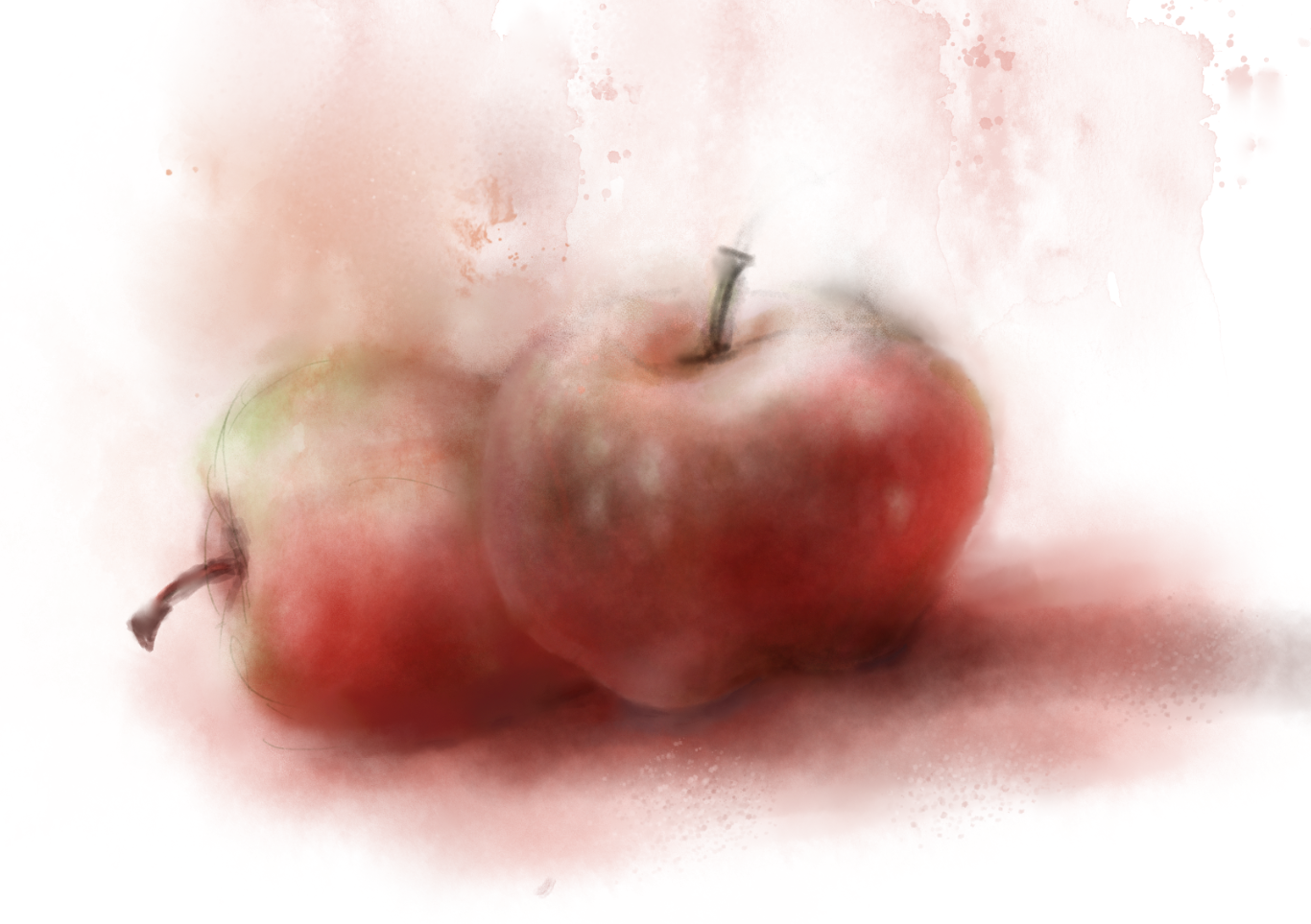
Painting with watercolor can be very difficult because I was fighting the urge to make it clean and trim. Mimicking the water spread and blots make it even more interesting.
- 8 replies
-
- 13
-
-
-
- watercolor
- flower
- (and 2 more)
-
 Whenever I hover over parts of the User Interface, they either disappear, or look abnormal. I have had this issue NON-STOP since I purchased my new PC pre-loaded with Windows 11. I don't think it's Windows 11 because I never had this issue on my old PC, which also had Windows 11. I'm running the following specs: i7 10th Gen NVIDIA RTX3050 Any help would be appreciated. I've messed with the GPU settings, nothing seems to fix this issue and it gets to be a hassle to use such a great program. Have always had great experience with Affinity up to this point. Issue occurs in both Designer AND Photo.
-
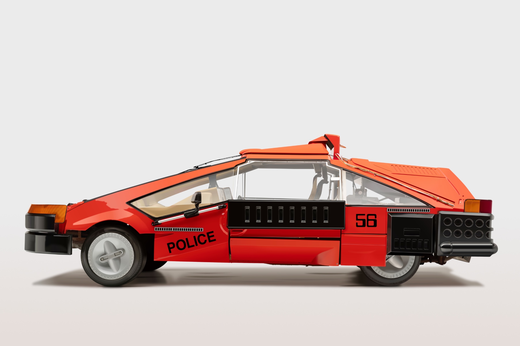
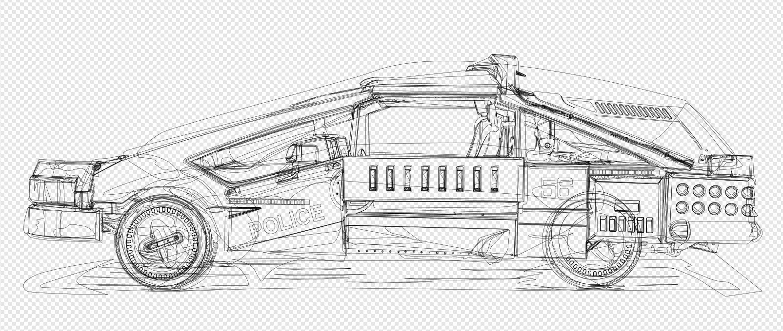
As part of a huge effort to put together a collection of 10,000 unique images, Affinity Designer was the primary tool and it was amazing. We are so please we swapped to Affinity. Thanks Affinity Designer! Samples: https://cryptobarbarians.xyz/ for more
-
Designed using mostly on IPad with Designer
-
I was trying to draw for a photo quality image using vector+Pixel brush for shading. Happy that I was able to it but it shows I need to do lot more practice. Hope to improve someday. I am a newbie and be happy for any suggestions to improve my work.
-
 Hello my friends! Check out this 2D art of a potion created in Affinity Designer! Perfect for gaming isn't it 😆? 🔥 Want to know more about 2D arts, visit the link https://www.vectorizeclub.com! kisses 😘 15_Potion.mov
 -

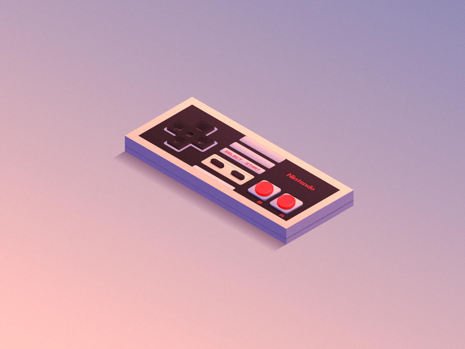
affinity designer Tools of The Trade: Nintendo Controllers
Slyhound posted a topic in Share your work
Hello Affiniteers! I am a long-time Illustrator user and now a recent convert to Affinity Designer and wanted to share what I've made with AD. I saw the sale that was going on about a month ago and decided to pull the trigger. Glad I did as Affinity Designer is a very well-oiled machine that already offers a robust set of features that have been brilliantly thought out and has immense potential for further features. Well done team Serif! One of the features that I was most interested in when I purchased AD was the isometric grid and its features. I started out with a simple project: The NES controller. It's just a cube at the end of the day so I figured it'd make for a great first project. The tools are pretty self-explanatory if you are familiar with other design software and everything felt incredibly intuitive. Anywho, I have a habit of droning on and on when I'm excited about something and Affinity Designer definitely inspires that side of me. So without any further ado, please enjoy some of my work. I hope you enjoy my work! I plan to keep on making more isometric controllers for the time being, with a Gamecube controller being the next piece. Like my work? Check out my Dribbble account where you can see more: https://dribbble.com/b_houtz I also just joined this hip new thing called "Instagram" recently in 2019 and if you're looking for an account to follow (hah) I would be honored to have you join me: https://www.instagram.com/sly_hound/ On some of these controller posts, I have thoughts on Affinity Designer for those who are interested in such things. Thanks!
-
Hey guys, here's my latest Affinity Designer masterpiece! Took me a few month to get all the icons done, but in the end, the result was worth it. What's this all about, you may ask? It is a minimalist icon pack designed in a retro style that works perfectly on your Windows taskbar or Dock. As you can see from the preview, the main idea is to use generic icons for various app categories without using specific app logos or icons (with some exceptions like the Browsers, Adobe Suite, Affinity Apps and Microsoft Office). Instead, the icons illustrate the actual purpose of the app using familiar design elements. For example, if you're a content creator, you will find different creative icons for your video or music editing apps. The same goes for gaming, where you have a bunch of icons for your gaming platforms to choose from. The icon pack currently includes the following app categories: Internet Browsers, File Managers, Audio Players, Video Players, DJ-ing Apps, Email Apps, Adobe Suite, Affinity Suite, Microsoft Office, Painting Apps, Vector Apps, 3D Apps, Video Editors, Music Production Apps, Code Editors, IM Apps, Gaming Platforms, Torrent Apps, Image Viewers, Calendar Apps, FTP Clients, Archiving Apps, Notes-ToDo Apps, Book Readers, Trading Apps, and Windows System Apps (Task Manager, Terminal, Calculator, Notepad, Settings). You can download a demo of the icon pack on deviantArt or get the full version on gumroad. Enjoy
-
 Hi everyone, I've several documents which share a set of "brand" colours for text and shapes. I now need to change the colours across all the documents. I'm expecting that this may not be the only time I'm asked to do this so I'd like to rejig everything so that it can be done efficiently on the second and subsequent request. The history: for the first document I created a "base" document with a document palette and used (standard?) colours defined in it. No Global or Spot colours (yes, I know - silly me). I then copied this document as the basis for the others and built the contents for each one. Then came the client change requests. So I'm now in the position where I have several text frames and artistic text strings, for example, spread across several documents that are the wrong colour and need to be changed across all of them. From my understanding I think I need a Global Colour in an Application Palette. However, this seems to be impossible to create. I can create Standard Colours in an Application Palette but this isn't bound to the objects that use the colour, instead it appears that the colour is copied from the palette when first assigned and after that the object's colour is independent. Is my understanding correct? I feel that I've unwittingly painted myself into a corner with this one and that there is going to be a truck load of work applying these change requests. If anyone has any suggestions of how to ease the pain then I'd appreciate hearing them. (As an aside, is there any fully comprehensive documentation that explains how the palette system works in AD, apart from the online help?) I'm using the latest release of Affinity Designer on Windows10.
 -
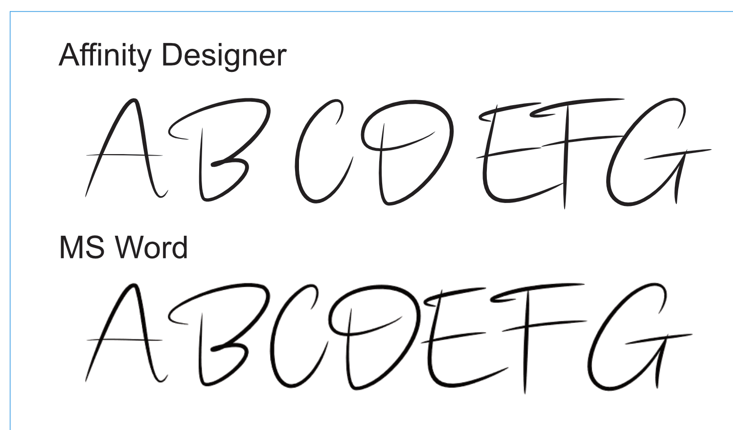
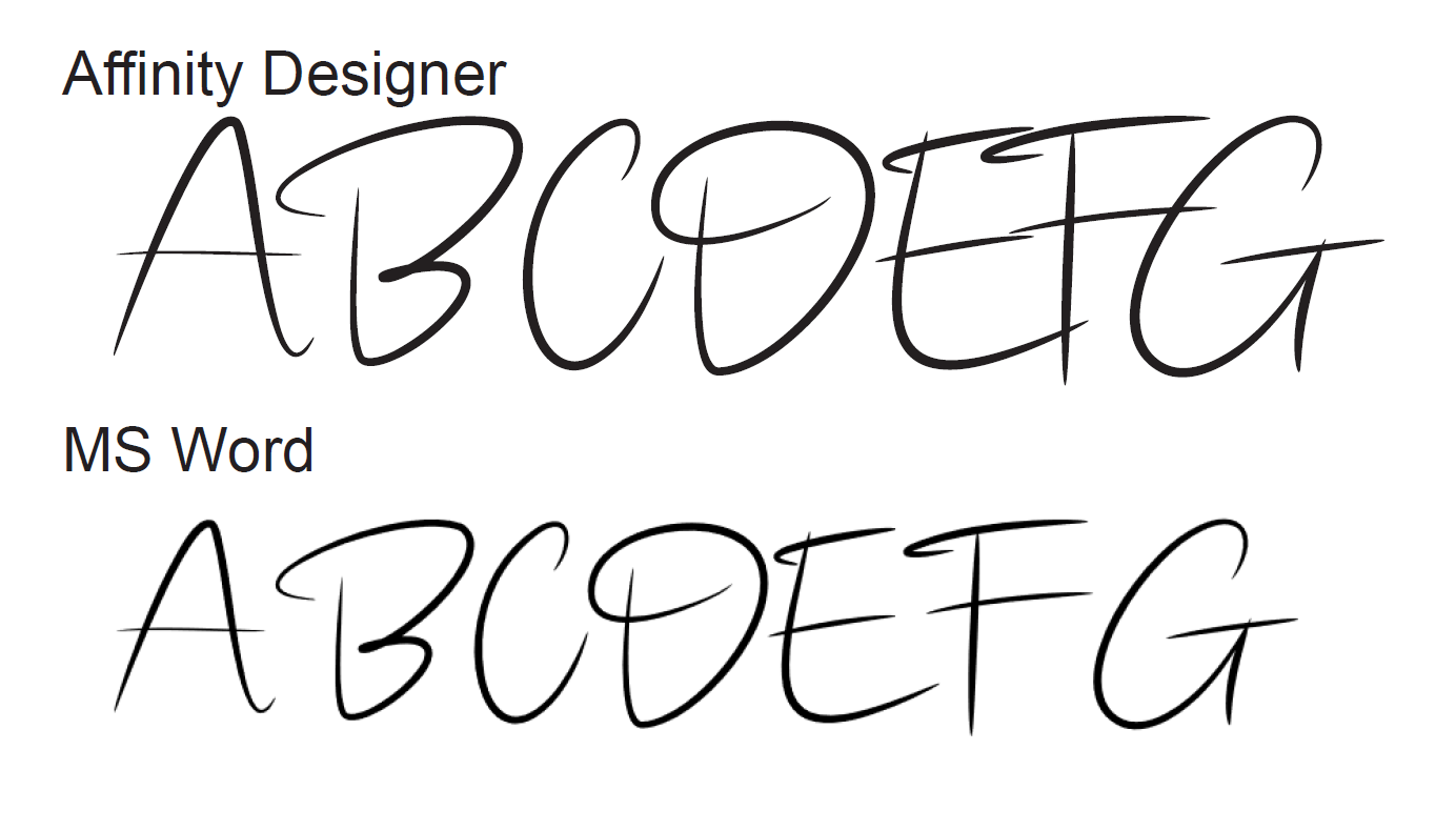
Hi everyone, I'm using a font for a personal project that appears to have a kerning issue. The font is called onelove and is a script font with strokes that overlap character cells. It appears at first glance that AD is using some form of kerning however it appears poorly done. I then tweak it using my own values for the kerning and everything looks fine for any bitmap exports but the PDF export looks like the kerning values have doubled up. Converting the fonts to curves solves the problem but it isn't what I want at the moment while things are unfinished. As a test I used the same font in MS Word and the default look is very different and no kerning was required. Note: the MS Word text is a bitmap screen grab from Word pasted into an AD document for comparison. I've a suspicion that the kerning is somehow mangled and that the changes I'm making are not necessary, but appear to be required from the on-screen image I'm working with in AD, and these changes then appear as extra offsets in the PDF export. Here's what the above AD file exports to PDS as: There is definitely a lot of movement here. I hope I'm doing something stupid here but can't for the life of me see what it is. Any thoughts?
-
Hello vectorizers! Get to know a little more about my work with this beautiful wolf 🐺! Interested? Then visit the link https://www.vectorizeclub.com and see this tutorial in its entirety! enjoy 😊 13_Wolf.mov
-
Nothing to say, it is what it is.
- 11 replies
-
- 18
-
-
-
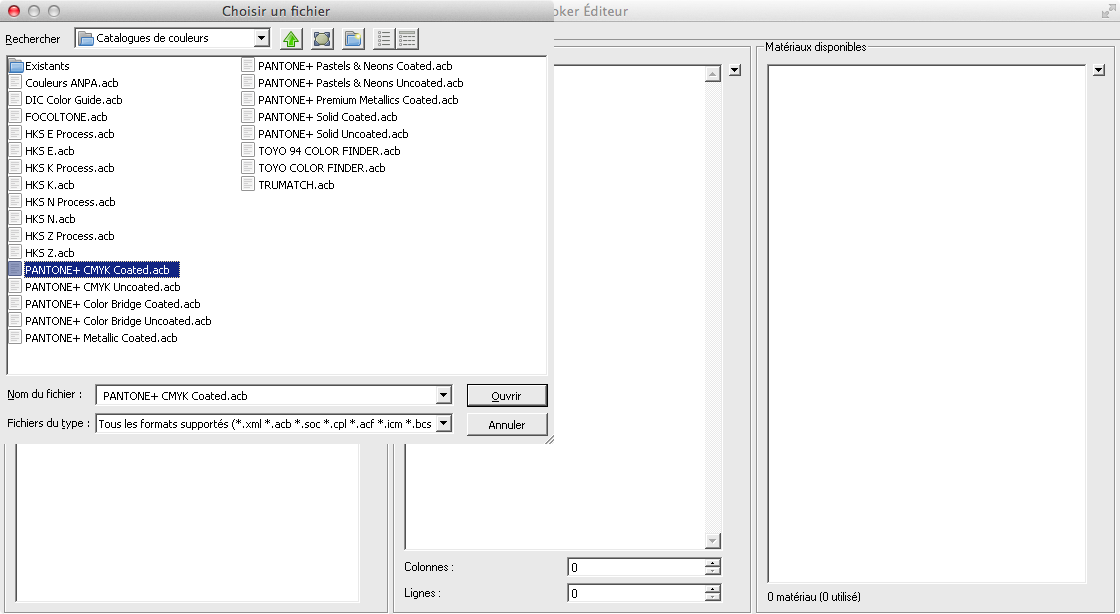
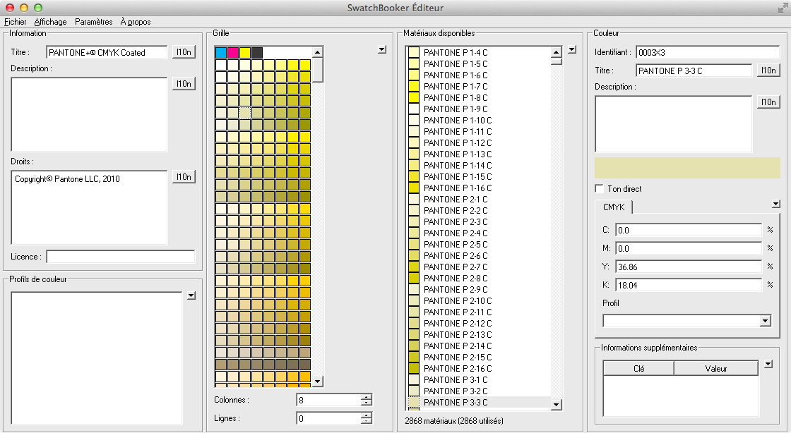
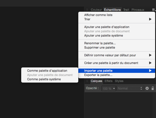
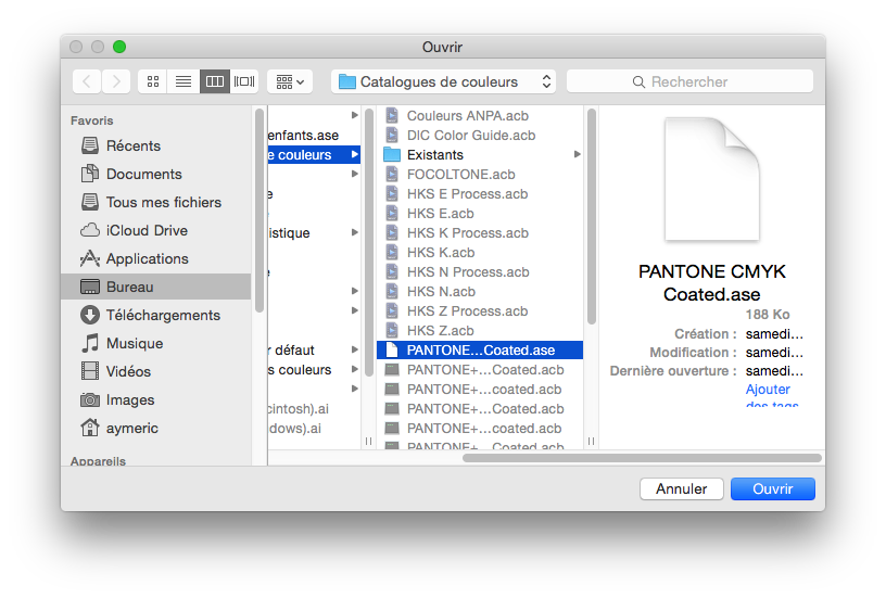
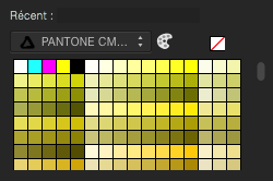
For those of you who needs Pantone colors support in Affinity Designer before the Serif team release an official support in it, here is a trick you can do. Firstly, you need an Adobe Illustrator licence to be able to do this, or install a demo version of Illustrator. Then you need to install SwatchBooker. http://www.selapa.net/swatchbooker/ Or you compile it yourself to get a Mac version, or you use it under Linux, or use it with Windows. Personally, I installed the Windows version into a CrossOver bottle and it works out of the box. Launch SwatchBooker Editor, in the File menu, select Open and choose one of your Pantone library in Illustrator. Then in the File menu, select Save as and select *.ase for the file format. Launch Affinity Designer and go to the swatches panel, click on the menu and choose import palette, as system or software, as you want. Select your exported *.ase color library. And that's it, you have loaded in Affiinty Designer your Pantone colors library.
-
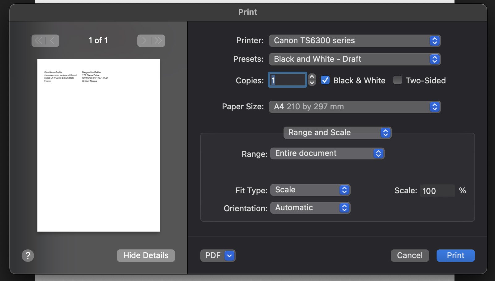
 Hello, I new to Affinity Designer. I’m trying to print something from Affinity Designer. I own a Canon TS6350 and I’m on a iMac 24 M1. The problem is that I can’t choose the rear paper tray from Affinity Designer. The option appears for me with no problem in all other apps, but not here. Can anyone help me on this one? Thank you so much. Regards,
-
Hello my friends! This amazing castle was created in a tutorial for Vectorize Club students! Visit the linkhttps://www.vectorizeclub.com and learn how to create your own castle from scratch! Bye Bye 12_Castle.mov
-
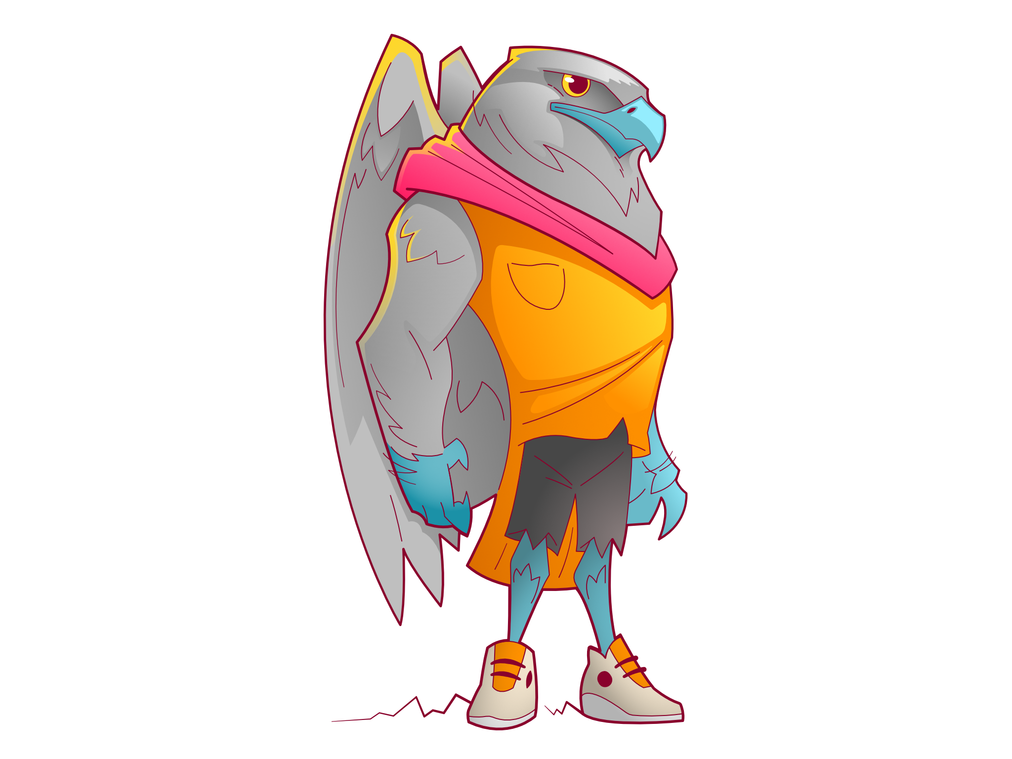
A ‘hawk man’ character design, sketched in Affinity Photo and finished in Designer on my iPad.
- 4 replies
-
- 9
-
-
- illustration
- character design
- (and 1 more)
-
I'll always be thankful to Affinity for coming along at the right time. Publisher is exactly what I was looking for after YEARS of being an adobe InDesign user and having to hobble along when they went to subscription mode (I never claimed aboard the CC for my freelance work). For those that point out shortcomings of Publisher, let's go back to when QuarkXpress just about gave up on the Mac platform and nipping at it's heels was InDesign. The first couple of years with InDesign was horrible as the company worked out kinks (essentially, 2-3 years of the public beta testing the software for the company!). It took almost 4 years for InDesign to stabilize and become a leader, basically supplanting QuarkXpress. Anyway, I'm preaching to the converted (at least I hope so). I find the Affinity suite to be far more intuitive and certainly more integrated than adobe's bloated offerings.
- 9 replies
-
- 5
-
-
-
- affinity photo
- affinity designer
- (and 1 more)
-
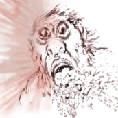
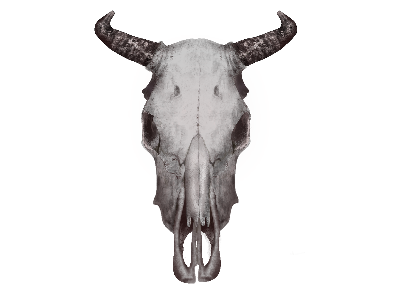
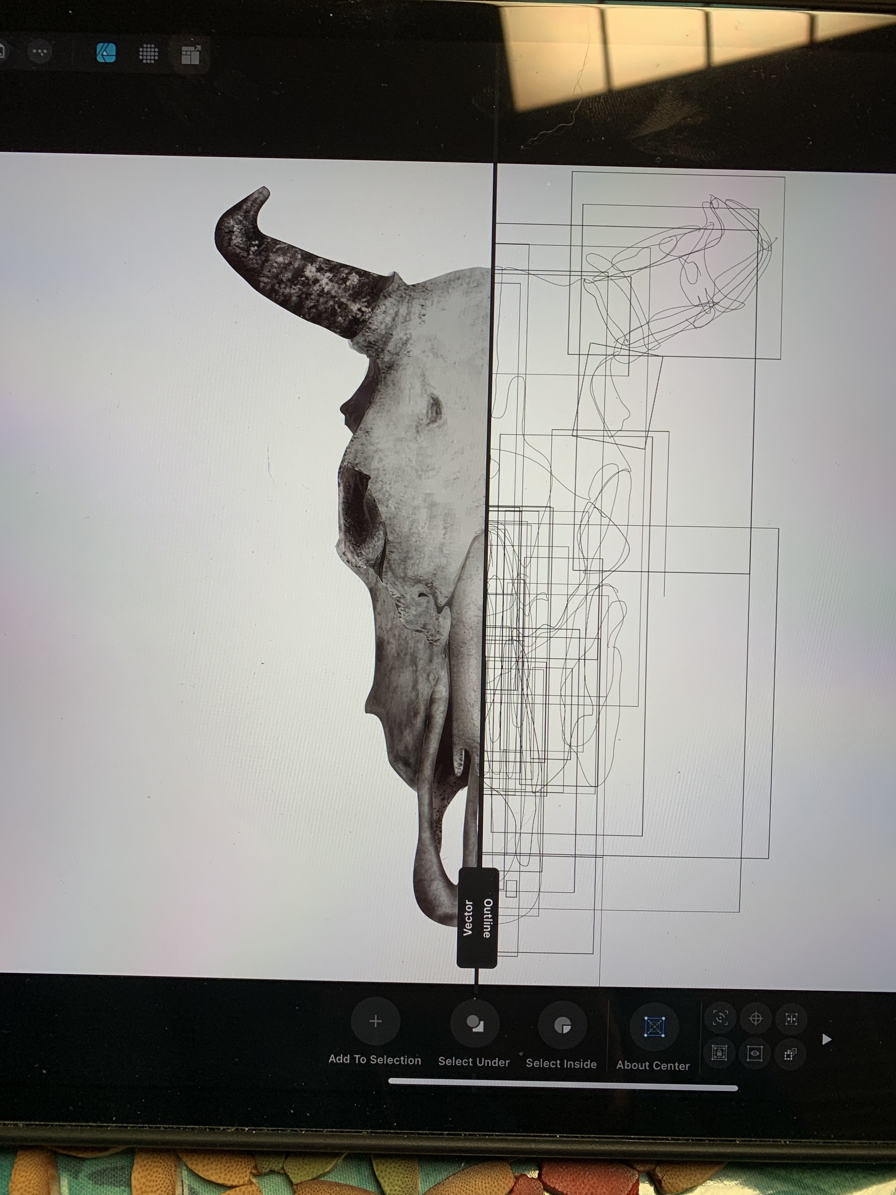
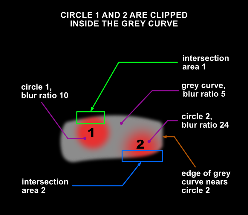
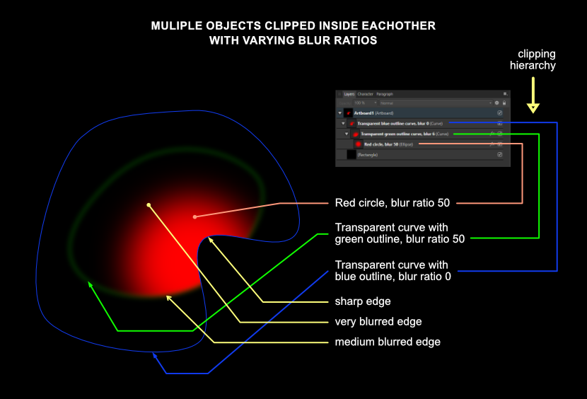
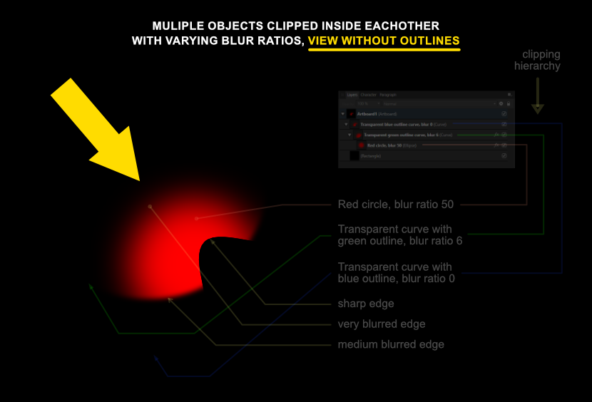
 For those prepared to dive deep into the functionality of Affinity Designer offers, I wrote a tutorial on how to create objects that have edges with a varied level of blurredness along their circumference, which is particularly useful when drawing realistic vector portraits or realistic (parts of) objects. This tutorial explains how vector objects are drawn, that have a variety of blur levels along their edges. This technique is useful when drawing realistic images in Affinity Designer, because hard edged objects rarely look realistic. This technique involves clipping of objects - placing one object inside an other - and gaussian blurring, which is applying a controlled blur ratio to objects. In addition gradient colour fills and gradient opacity can be applied to the objects to attain an appearance that makes objects look realistic. Apart from being useful in drawing realistic vector portraits, this technique has many other applications for artists who need to give their artwork a convincing realistic appearance. First some basics. In the image below this paragraph I placed an image in which the basic principle is shown. After that I will go into more complex techniques that are nonetheless based on the same principle. To give an object a blurred edge, click the fx button at the bottom of the Layers panel. In the dialog that pops up after clicking it, at the top of the dialog, the blur ratio can be set in rounded numbers and can even be set as precisely in decimal values. That is rather basic, but in reality most objects have edges that have a level of blur in their circumference that varies in a non-linear way. Circle 1 has a blur ratio of 10 (roughly medium blurry) and is clipped inside a grey curve that has a blur ratio of 5 (less blurry). Where the objects intersect, at the top of circle 1, the intersecting area inherits the blur ratio of the grey curve - blur ratio 5, while the rest of the circumference of circle 1 maintains its blur ratio of 10. So at the top of circle 1, the edge is less blurry than in the rest of the circle. Circle 2 that has a blur ratio of 24, which is more blurry than that of circle 1. Where circle 2 and the grey curve intersect, circle 2 will inherit the blur ratio of the grey curve, so the blurriness at the bottom of circle 2 is far less than in the rest of the circumference of circle 2; there is a greater contrast of blurriness along the edge of circle 2 than there is in circle 1. By moving the right edge of the grey curve, by selecting the nodes at the top and bottom of its edge with the Node tool, closer to or further away from circle 2, the level of blurredness at the right side of circle 2 can be set quite precisely. Basically, the further away the edge of the parent curve is from that of the clipped child curve, the less its blurriness affects the edge of the child curve. When the edge of the parent curve overlaps the edge of the clipped child curve, the latter inherits the level of blur of the parent curve in the area where the overlapping is defined. Below this paragraph I placed an image with a transparent curve with a blue outline (for clarity) that has no blurred edge, in which a transparent curve with a green outline is clipped that has a blur ratio of 6, in which a red circle is clipped that has a blur ratio of 50. The crux is that the parent object in a clip always determines the blurriness of edges. Parent objects can both be given a higher or lower blur ratio than the objects clipped inside of them. If the clipping parent objects have no outline - which is the practical way to work with such a technique - the image shown above would look like the image below this paragraph, indicated by the yellow arrow. The resulting appearance of the clipped red circle becomes clear and this is how clipping and blurring would be used by graphic artists and designers that aim to create realistic objects or parts of objects. In the reality that most people experience, areas that have different ratios of blurriness along their edges, are the majority of what occurs / appears in this dimension. Also objects rarely have one equal colour throughout their shape, which is what in addition to the above, can be applied to the mix by giving objects a gradient colour fill or even clip differently coloured child objects clipped into parent objects to mimic reality even closer. Although what I described in this blog entry is not always an obvious intuitive mode of operation, Affinity Designer is very capable of coming a long way in 2D design. Programs of Designer's competition may have Mesh Fill options, but creating those requires much more time and editing them afterwards even more. In the Vector page of my website you find examples that are created with the techniques described above: https://vectorwhiz.com/Vector.html This tutorial can also be viewed in my portfolio blog: https://communicats.blogspot.com/2022/01/varying-blurred-object-edges-in.html


.thumb.jpeg.6f143e8223547aba974205ef53397036.jpeg)