Search the Community
Showing results for tags 'Affinity Designer'.
-
 Hey community, I'm having issues getting files to stay linked in Affinity Publisher on my iPadOS, using Dropbox. When I link an Affinity Designer file on Dropbox with the Linked Services feature enabled and set up, the files don't stay linked at all. Plus, I'm unable to select other artboards within that particular Affinity Designer file. To provide more context: I was able to succesfully link other file types on Dropbox. iCloud isn't an option for me in this scenario, and I haven't explored it. I have tested the recent 2.2 update, no difference in behaviour, files are immediately marked as missing in the resource tab. This issue hasn't surfaced on either MacOS or Windows. There, linking works fine, and I can also select different artboards after I linked an Affinity Designer file on Dropbox. A speculation I have is that maybe when linking a file within Affinity Publisher on iPadOS, it loads the file just for placement and then deletes it right post-placement, causing the link to break. Given this, has anyone encountered something similar or can offer advice on what might be the culprit? It completely breaks my workflow over different devices. Many thanks for any guidance! Dennis
 -
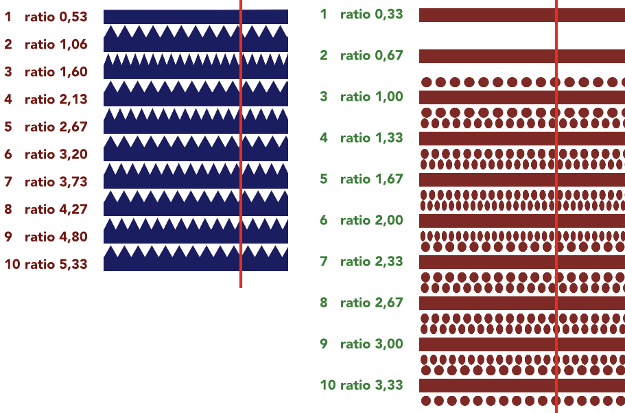
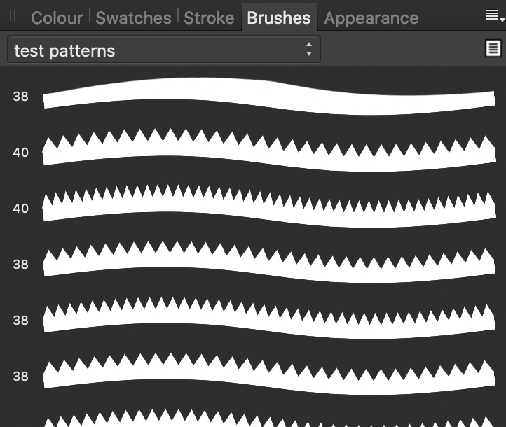
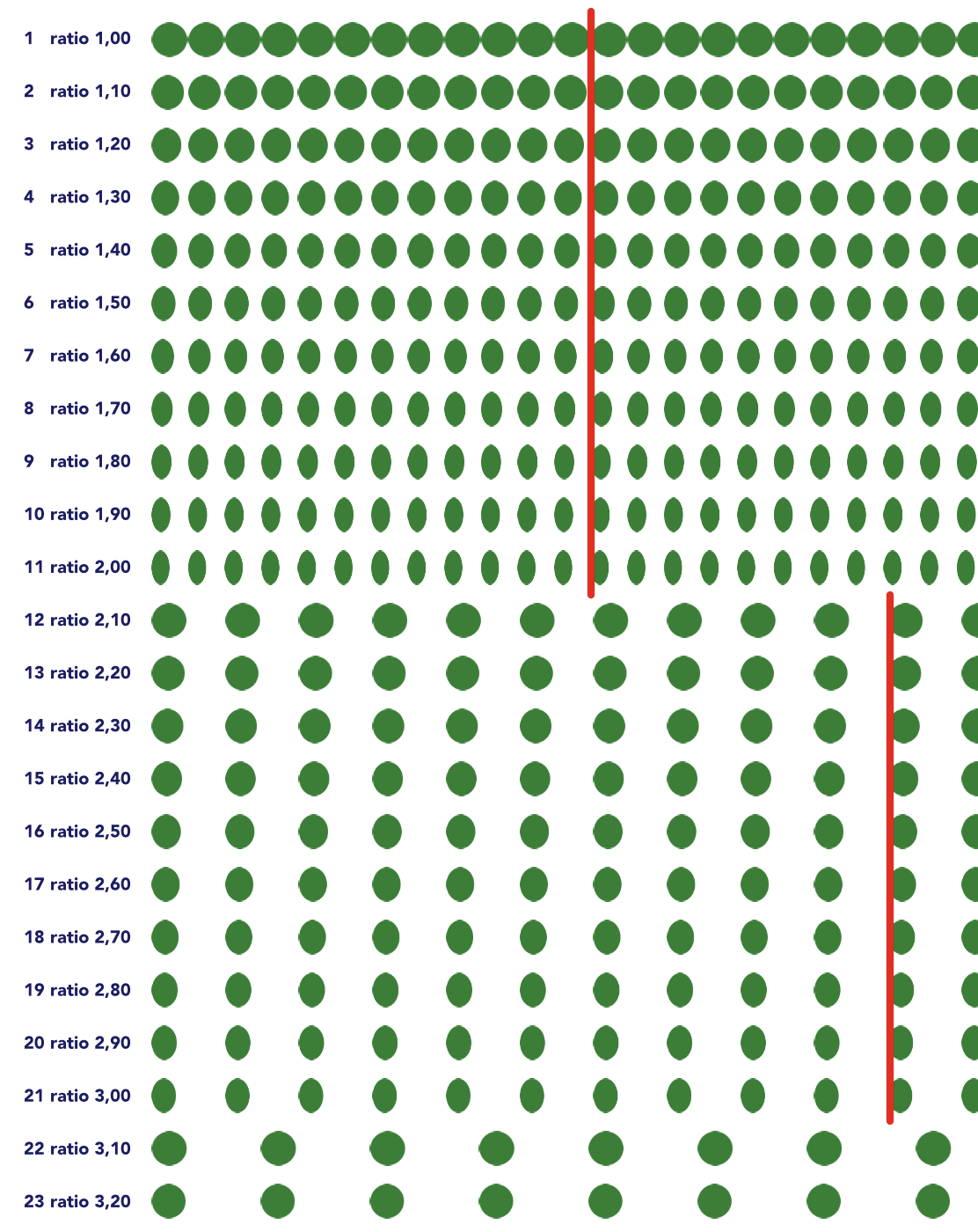
TL-DR: Textured Intensity Brushed act weird when using repeating patterns. There are work arounds. Do not create a source that is less wide than high, since it does not repeat. Mind the ratio beween width and height, because a lot of ratios cause deformation of the image used. Ratios that hardly show deformation are 1; 2,1; 3,1; 4,1; 5,1. Add black space above and under your pattern to get to a ‘safe’ ratio. I like working with custom made brushes. I love the Textured Intensity Brushes in Affinity Designer. Playing around with it I observed some unexpected behavior when using the Body: Repeat option. This setting is on the Brush panel that opens when you double click a Vector Brush in the Brushes Studio in the Vector Persona. I’ve seen a few other posts about problems with repeating patterns, mostly in the Questions section of the forum, so that’s why I put this here. But this is also a bug report. Now for the unexpected behavior. 1. Refusing to repeat If your source image's width is smaller than its height (e.g. W:120px; H:200px) the repeat fails, the pattern will be stretched, no matter what. From what I read in From what I read in https://forum.affinity.serif.com/index.php?/topic/62767-vector-brush-stretching-despite-choosing-repeat/ this problem has not yet been addressed. I tried working around it by repeating the pattern in the source image twice or more to make it wider that high. It works, but it brought to light other unexpected behavior (I’m fond of that term!). 2. Offset values don’t behave as expected Expected: when there’s no head or tail to the brush, offset values remain the default values as set by Affinity Designer on creation of the new brush. That is 0px for the Head Offset and the width of the source image for the Tail Offset. Observed: the repeated part has seams, like an extra column of pixels is added in between the occurrences of the pattern. I’ve marked the seam with a red circle. I’d expect it to look like what is shown in the green square. Work around: to have a pattern repeat pixel perfect, set the Head Offset to 1px and the Tail Offset to width-1pt (if the source image is 180px wide, set the Tail Offset to 179px). Trade off is that there is now an extra column of pixels at the start of the line, see where the yellow arrow points at. A better work around for sources with a relatively small width: have 3 repetitions in the source and define the first repetition as head and the last one as tail. So if the source image is 240px wide, set Head Offset to 80px and the Tail Offset to 160px. Now the numbers make sense. 3. Elements of the pattern get squished The first work around from problem 2 lead to experimenting with the ideal number of repetitions in the source image. I spend many lonely nights creating tests sets of patterns, counting repetitions on grids and creating spread sheets filled with the height width ratios of patterns. That sounds dramatic, but I was actually immensely enjoying myself. I like a good puzzle. I’m not the only one who noticed something was off. @LionelD started this thread: https://forum.affinity.serif.com/index.php?/topic/98456-textured-intensity-brushes-on-ad-ipad/. But it’s not about deformation to fit a curve. Of course you’d have deformation on a curve. But there’s also deformation of the pattern on a straight line. I observed that the amount of deformation varies with the ratio between width and height. Of course with a repeating body you’d always have to squish the repeating part a bit to fit it on a line that is not exactly a round number of times the length of the repeating part. But when a line is long enough, one might expect it to even out a bit. Well, it does not. I made test lines of 7200px and brush sources from 80px to 800px wide, incrementing in steps of 80px. The source format fits 90, 45, 30, 22,5, 18, 15, 12,86, 11,25, 10 and 9 times when applied to the line using the source file’s height as the Brush Width. Those are nice round numbers in 7 out of 10, but it does not help. It’s not the line length, it’s the width height ratio. By the way, the deformation and the refusal to repeat from problem 1 already reveals itself in the picture of the brush in the Brushes Studio. Now a ratio of 1 (same width and height) gives hardly any deformation: W:240px; H240px works and W: 427px; H:427px also works great. Another ratio that seems to work is W:800px; H:150px (ratio is 5,33). Other ratios I tried are off. They are off in varying degrees. Sometimes they are very off, 1,6 is a very bad one, as is 2,0. Next step was to observe what happens when the ratio is increased in small steps. I created a test source image of W:200px; H:200px and then 10 more, increasing the width in steps of 20px. So that is a series of ratios: 1,0; 1,1; 1,2 ... all the way to 2,0. I created 11 brushes. The 1,0 was looking very good. 1,1 a bit less and with each step the image got more squished. Actually, the sources all were squished into the same amount of space. Now there’s a pattern! The pattern of the W:400px; H:200px (ratio 2) brush got squished into a box of half its width! I had already tested ratios larger than 2, and at some point in the higher numbers found ratio’s that also looked pretty good, like 5,33. Another series 2,1; 2,2; 2,3 ... 3,0. Remember: 2,0 was squished to half its width. But 2,1 looks great! And from 2,2 it is getting worse and worse ... 3,0 looks the worst. Another series 3,1; 3,2; 3,3 ... 4,0. Now 3,1 looks great again! And 3,2 looks less great and ... well, it gets worse and worse going to 4,0. But 4,0 is less deformed than 3,0 and 3,0 has less deformation than 2,0. Conclusion: ratio 1 looks good, round numbers >1 go bad and a width just over the round number looks good. Next question: how much over the round number would work? Let’s see what happens if I create a pattern with a ratio 5,01, W: 1001px; H:200px. Hmmmm, interesting ... it’s a bit squished. Not very much, but notably. 5,1 is doing perfect, 5,0 is as much off as one would expect it to be off. So there seems to be a sweet spot near 0,1 past the whole number. By now I pretty sure what causes this problem. There’s a rounding error somewhere in the creation of the repetition. I’m not sure where exactly this happens, since I’m not familiar with the way this was programmed, but I know a rounding error when I see one (I’ve always wanted to say that!). Trust me, I’m a coder. I know how to err. For me I’m a near as I can get to creating patterns that look good in a Texture Intensity Brush. I’d advise the people at Serif to take a good hard look into the math used to create repetitions. I’ve added a brush file and a project file to this post. The work around This is how to create a repeating pattern with hardly any deformation: create something beautiful jot down width and height and calculate the ratio (width / height: e.g. 540/200=2,7) now find the previous value that fits to #,1 (so if your ratio is 2,7, go to 2,1) divide width by found value and you have a new, slightly higher height for the background (540/2,1=257) create a black rectangle (W:540; H:257) and put it behind the pattern, align the horizontal centers of the image and background select the background, export the selection with background to a png use the png to create the new brush set your offsets and such and set the Body value to Repeat When you look closely, you’ll quite often see that even the ‘good’ ratios (1; 2,1; 3,1; 4,1; 5,1 ...) deform a little bit. Just a few percent, but still ... But that’s normal. They have to fit a round number of times on the line. Now, there’s loose ends to this long story, for instance what happens in the ranges 2,0..2,1; 3,0..3,1 and so on? And why does sometimes the repetition on the screen shift on changing zoom levels? I spend some free time on this puzzle, over a period of weeks. Every week when I had diner with a friend of mine I updated her on my findings. She offered suggestions and we grumbled about the funny quirks of the applications we’re using. So now, if you ever see two middle aged, greying ladies talking over a meal: this is what we’re gossiping about. I use a MacBook Pro (13-inch, 2018, macOS) and Affinity Designer 1.7.3 test patterns repeating TIB.afbrushes test patterns repeating TIB.afdesign

-
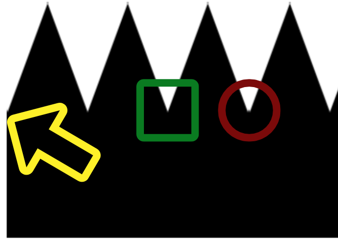
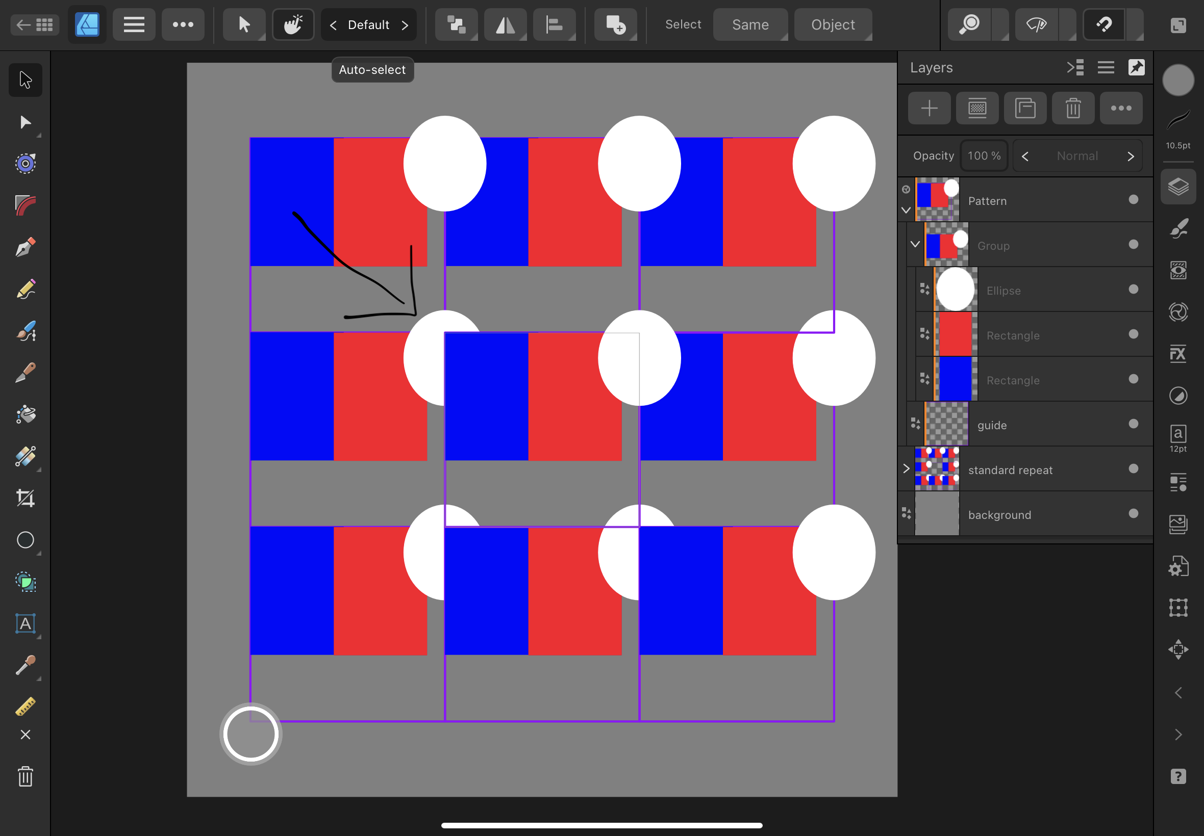
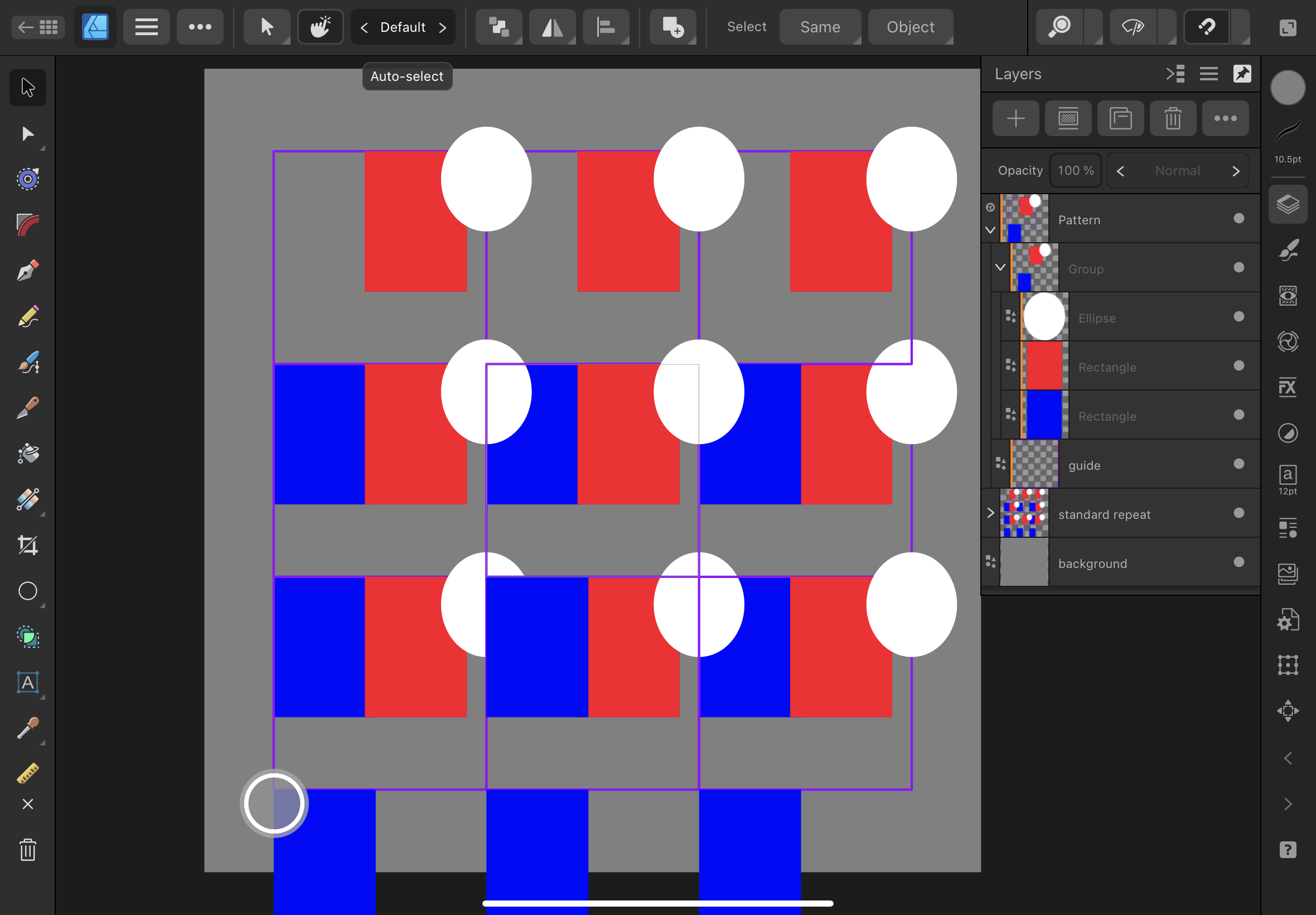
 I am a new Affinity Designer user, attempting to create seamless repeat patterns with the following technique: https://affinityspotlight.com/article/how-to-achieve-perfect-repeat-patterns-every-time-in-affinity-designer/ I keep running into the pictured layering issue. In this example, the purple lines denote the nine symbols. The guide symbol is in the center. In the first image, the white ellipse I've pointed to should be on top of the blue rectangle. This can be solved by shifting the blue rectangles down, as seen in the second image, but this voids the ability to see what the repeating pattern will look like. It's not a big problem with a simple design like this, but it is problematic with more complex designs. I'm wondering if there is a way to avoid this issue, or at least a better fix.
-
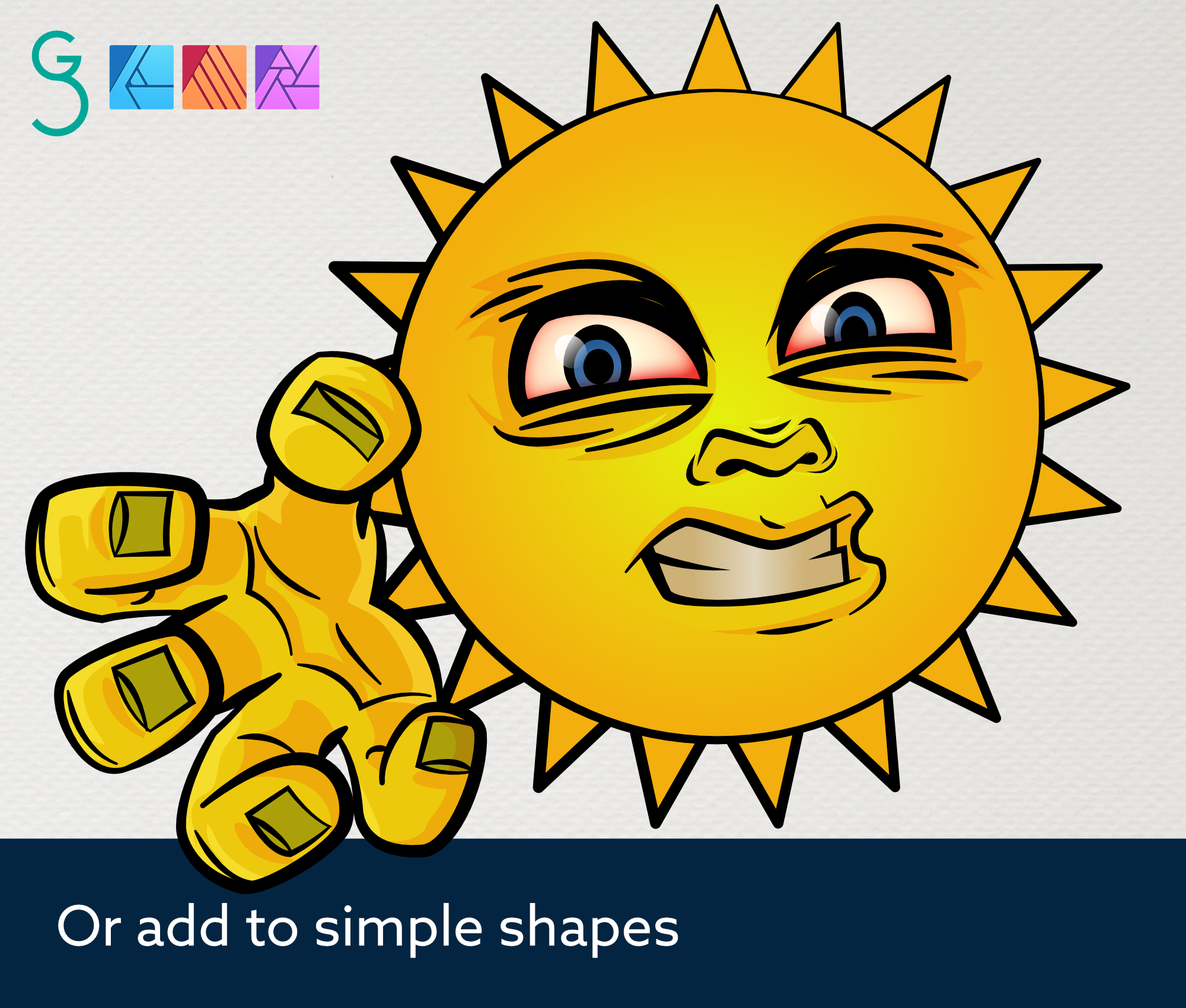
Hi, I thought I'd share this image, not because it's anything particularly special (it'll never fly!), but mainly to demonstrate a potential use for the Warp mesh tool when applied to a group of parallel lines. By adding nodes and moving them around the warp group, some interesting effects can be achived. In other design apps a blend tool might be used to do this, but using 'Power duplicate' and 'Mesh warp', maybe goes someway towards help make simple 'blend' like effects easier. Obviously this is no substitute for a proper blend tool. (thanks!) 🙂
-
I was going to simplify it but changed my mind. Have only finished the bottom left and top right of those windows. Still quite a few books window to redraw too. Who knew that bookshops had so many books! Back to using AD v1 as it's just nicer in a number of ways and as my requirements are simple it's no loss.
- 17 replies
-
- 10
-

-

affinity designer VECTOBIFY - OCTOBERS CHALLENGE WITH TEEK FOX
Teek Fox posted a topic in Share your work
VECTOBIFY WERE DOING WEEKLY CHALLENGES THROUGHOUT OCTOBER AS NOT EVERYONE HAS TIME FOR A DAILY CHALLENGE YOUR ENTREES WILL BE FEATURED ON MY LIVESTREAM AND ON MY WEBSITE AND IF YOU WIN WILL HAVE YOUR OWN SEPARATE WINNERS PAGE GOOD LUCK CANT WAIT TO SEE YOUR ENTREES
-
 Here is a design to mean however and here is a design to mean because The design to mean however is inspired by the first letter of the Latin word Tamen and then the idea that the word 'however' is used after stating something then either going back a bit in the opposite direction or going in another direction. For experimental use from an OpenType font, the code %881 is suggested. The design to mean because is inspired by the word 'because' being used after stating something so as to state clarification of the first thing that was stated, so I have used an equals sign followed by a second, linked, yet subsidiary, equals sign. For experimental use from an OpenType font, the code %882 is suggested. William
-
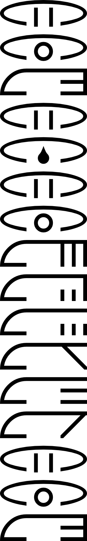
There has been discussion of a problem, but what follows seems more appropriate for Share Your Work, so a new thread, but with a courtesy link to the original thread. https://forum.affinity.serif.com/index.php?/topic/136552-bleed-area-issue-with-designer-bug-or-feature I am producing artwork to make what are notionally photo greetings cards, but I am making jpg files of the correct size at 300dots per inch CMYK colours and using those instead of photographs to produce one-off greetings cards, then uploading to the company's website and in due course receiving a card by post. https://www.papier.com/ https://www.papier.com/photos/photo-cards I have used https://www.papier.com/customise/landscape-photo-313 and https://www.papier.com/portrait-photo-315 I have found that the best way to do this is to work in pixels at 2171 by 1571 pixels, which is 7 inches by 5 inches with a 3 mm bleed area on each edge. The two that I have produced thus far were produced using PagePlus X7 as I was used to it, but they were basically simple images on a white background. This was because I was used to using PagePlus X7. I am now starting to learn how to use Affinity Designer, I am a beginner, The following is a png of a copy of a part of the new design, produced today. I have it in mind that this will be centred in a portrait format card, then using Affinity Designer to add colours at each side and into the bleed areas, with the intention that the finished card will have colour right to the edges. The image is of some language-independent glyphs, some used more than once, so as to produce a poem, with each glyph representing a whole sentence. I produced the designs as abstract designs, but if one knows the meaning of a glyph one can read the poem in any language that you know. I am wondering if readers who like a puzzle might like to try to work out the meaning of the poem. The designs are abstract but there are some clues. William These stars are so that if readers post their attempts or other comments, then the puzzle can still be new for new readers. * * * * * * * * * * * * * * * * * * * * * * * * *
-
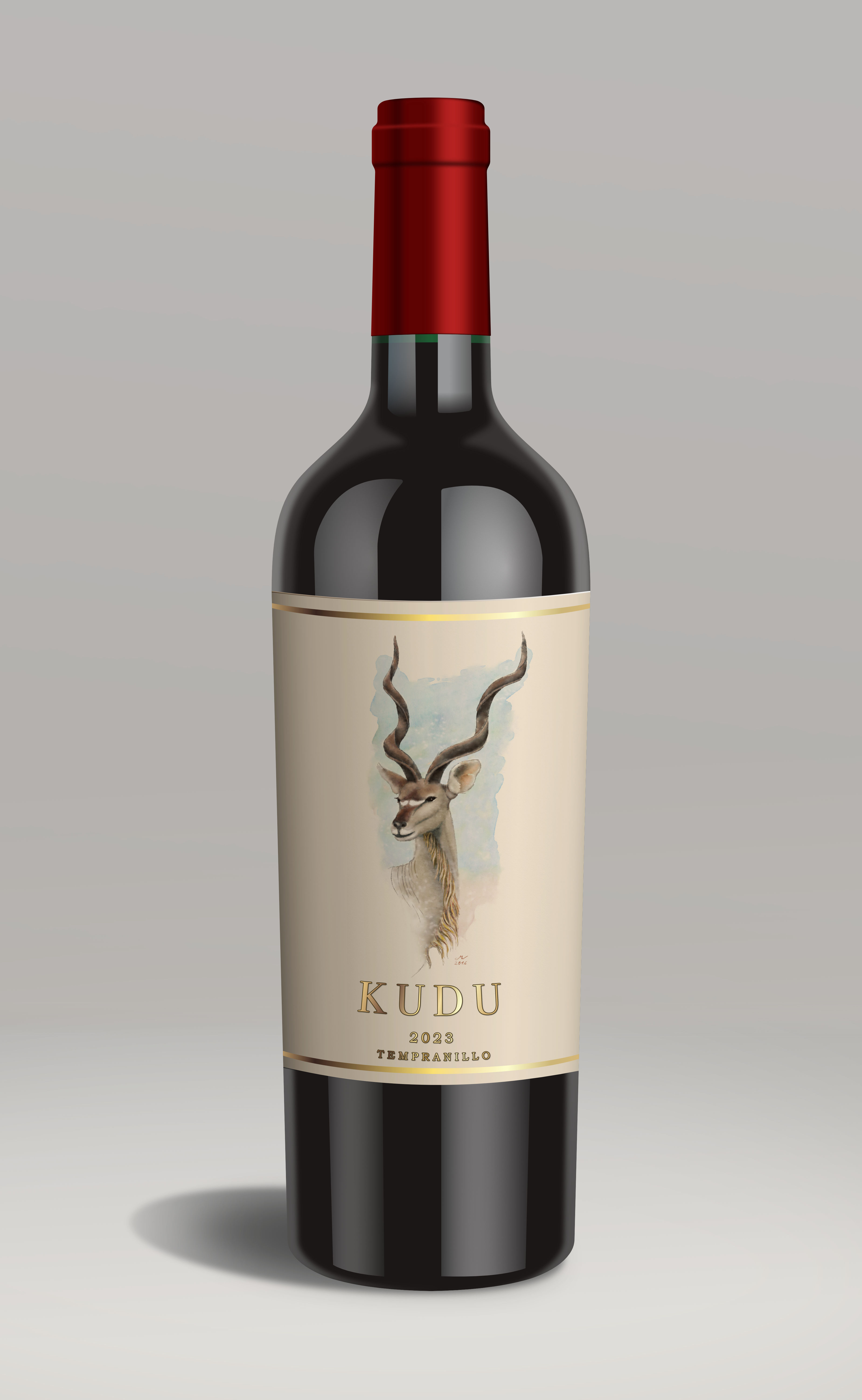
My first foray into a photo like vector illustration! All Designer apart from the watercolour of the Kudu which I actually painted back in 2016 with ArtRage (it's good to recycle!).
-

affinity designer New work - Our Lady of Brighthelmstone
Greggry P posted a topic in Share your work
New work - Our Lady of Brighthelmstone. This was my recent submission for a call to artists put out by a new gallery opening in the city of Brighton & Hove - sadly rejected. The theme was metamorphosis, so I painted the city morphed into a fabulous drag queen, in the style of an Uber-kitsch religious painting (taking “Our Lady of Guadeloupe” as my main inspiration - Brighthelmstone is the old name for the city of Brighton). There are a total of 33 visual “easter eggs” contained within the picture, some architectural, some cultural. If any of you are familiar with the place, have fun spotting them! (Created on Affinity Designer 2 for iPad)
-
It would be beneficial / useful if a node could be moved (slide) along the path of a curve. This feature is available on Adobe Illustrator and I have used it often. I really miss this feature in Affinity Design (iPad). Thanks for your consideration of adding this feature.
- 1 reply
-
- 1
-
-
- affinity designer
- nodes
- (and 5 more)
-
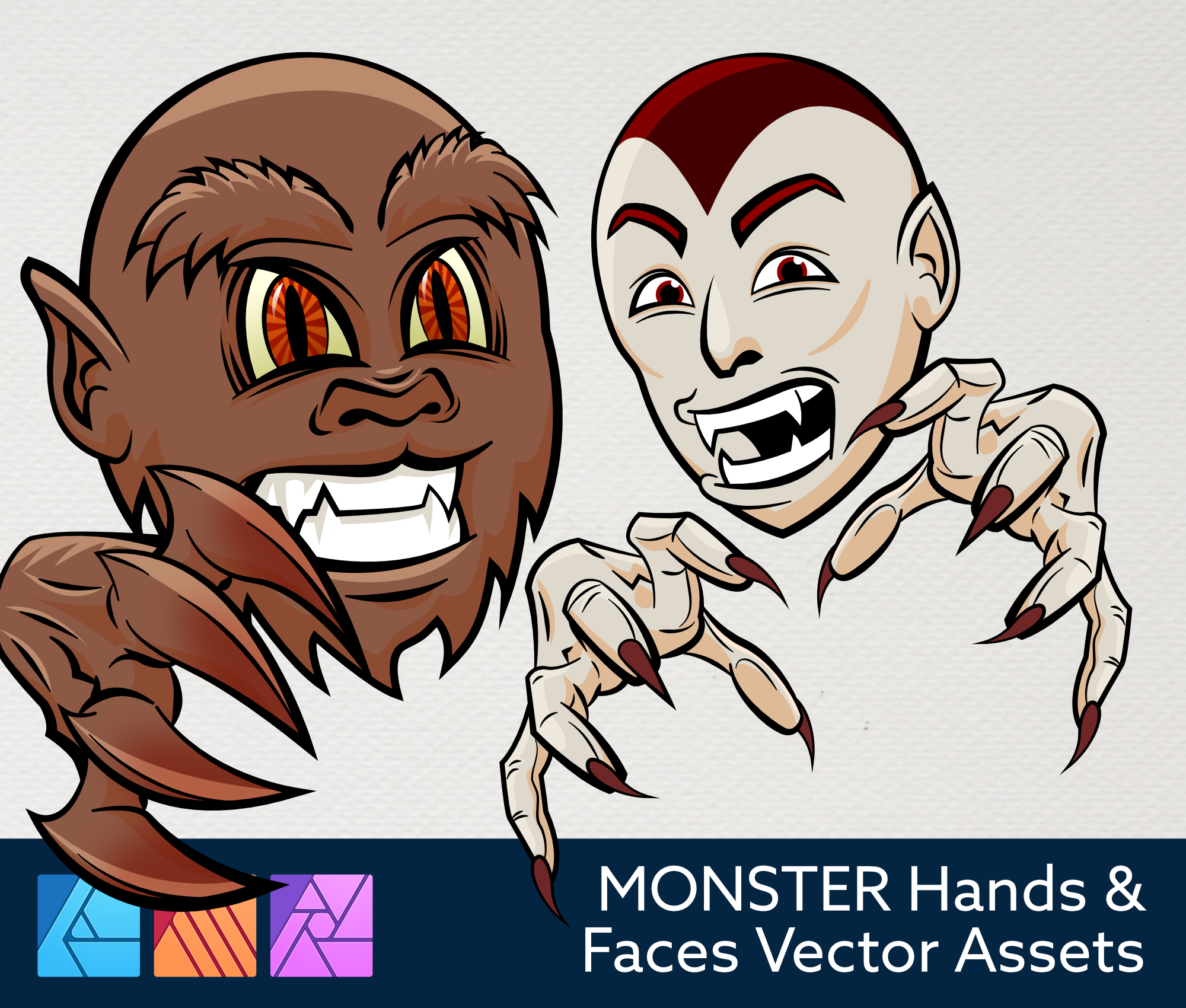
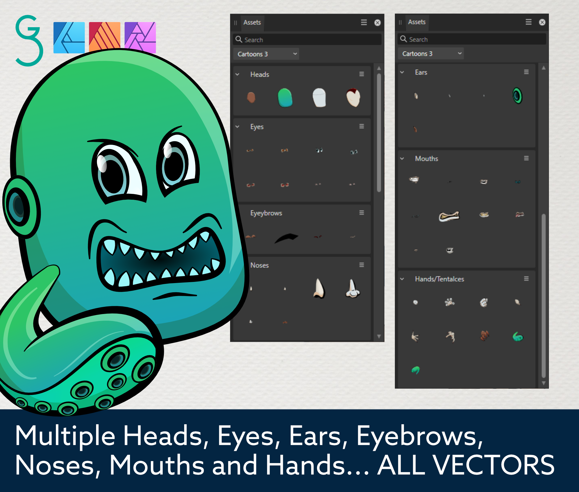
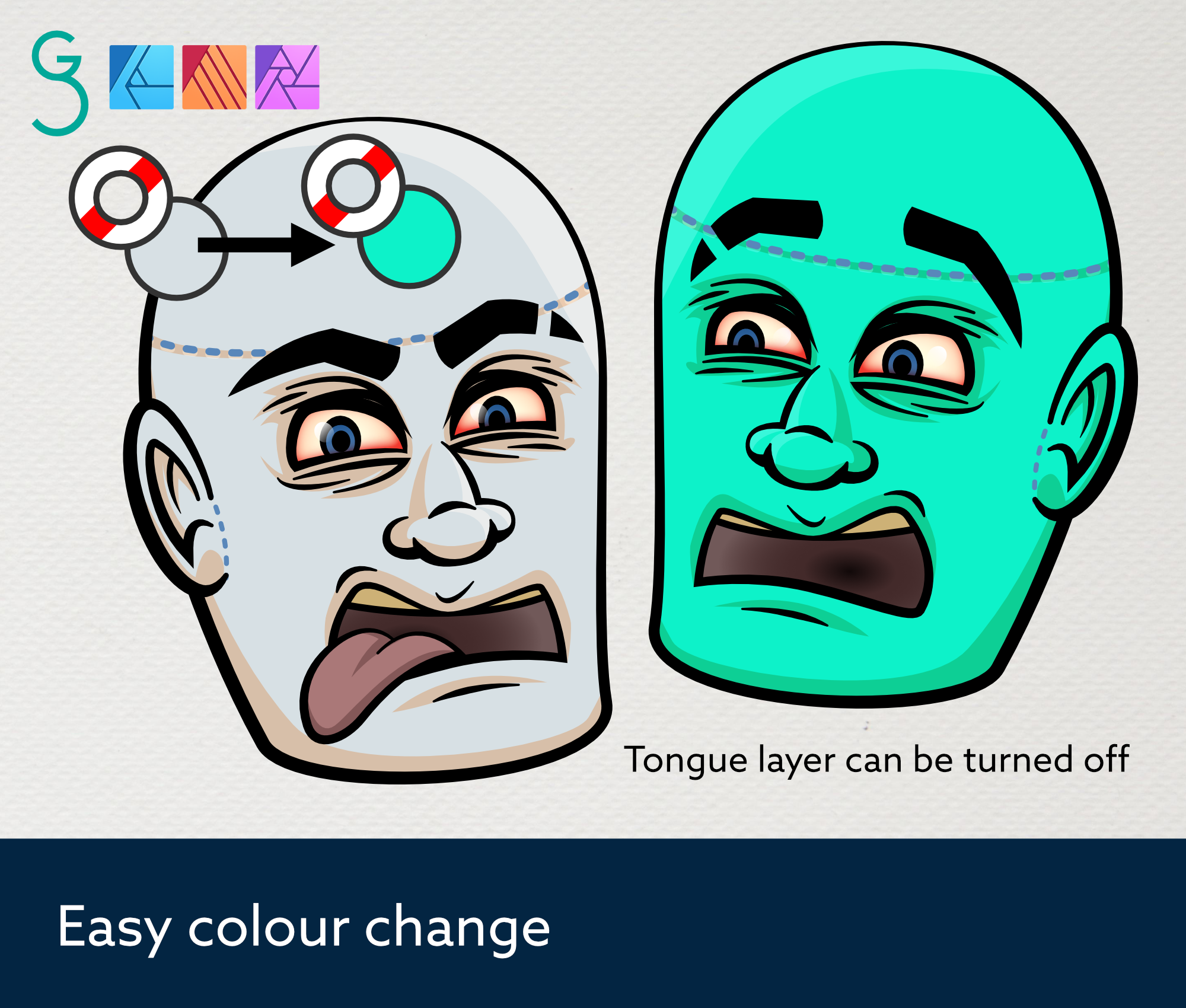
New Asset pack created in and for Affinity Designer (also work in Publisher and Photo), and in time for Halloween!!! https://gseawardart.etsy.com/listing/1572297003 gseawardart.etsy.com
-
Hey guys, I'm not an expert. I just started using the software about 3-5 days ago. I'm looking for any tips on my logos. I'm starting a new small business, so I want to get some shirts done. please help. Thank you.
-

affinity designer What to do when you're bored? Don't ask me!
Kasper-V posted a topic in Share your work
Bored. Bored, bored, bored . . . Inspiration! Do what all artists do when there's nothing to draw: a selfie! Result!! SIGH What am I going to do now . . . ?
-
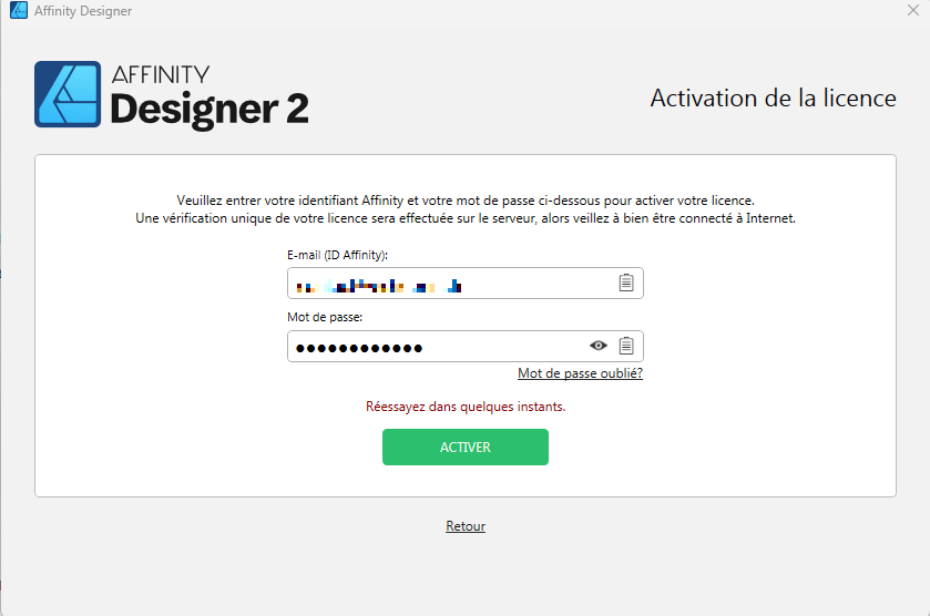
 Hello, I performed the 2.2 update this afternoon, and since then, Designer and Publisher no longer launches correctly. Either they close unexpectedly or I face an activation window where I can't log in ("Please try again in a moment"). I have already tried to run it as administrator, without success... I saw that other users were having the exact same problem, but without a solution yet... Does anyone have a solution to suggest? Thanks !
-
I have often the problem that AD is freezing when moving a layer. I have to restart the iPad. Is there a solution for this problem?
-
 I purchased Affinity suite 2, and cannot find a way to update from 2.1 to 2.2. The Affinity support site suggests there should be a "check for updates" option in the applications main menu, but in my versions of Designer and Photo, that is not the case (see screenshot). Any ideas of how to update my applications?
-
Affinity crashes when selecting multiple objects, one being a text frame. Steps to reproduce (works reliably) : Select a text frame "entirely" (not editing it) Click near it, changing the tool for the text frame tool. (Why does Designer have a range this big to select text ??) Click again (doing a double click essentially). The program will freeze (as I have seen, it can recover on small files if changing the focus window to anything else). It must be closed using task manager, simply closing the app brings the close menu, but it cannot be interacted, all unsaved progress will be lost. bug.mp4 This is not an edge case bug, I produce it regularly when selecting multiple text by not clicking precisely inside the text frame. I am using the latest Affinity Designer 2 version (2.1.1.1847) on Windows 11. Works both with hardware acceleration on and off.
-
 Hi, I was wondering if there is any solution for my problem. I am using Affinity Designer for creating documents for my clients, all of them are based on few templates. I have at least two artboards in each template and I export them to two filetypes - jpg and pdf. Here is my workflow: I am opening last saved document of some kind - e.g. document-1005, then I am editing it with new data and then I am saving it as document-1006. Then I am exporting (ctrl alt shift s) each artboard as jpg and pdf - because filename of Affinity Designer file is kept - its all easy for me to keep filenames constant (I have in one plce files document-1005.pdf, document-1005.jpg, document-1005.afdesign). What would be perfect for me is to use slices to export. Right now if I choose slices - I would need to change slices name everytime when exporting them. I am looking for some simple solution like what I created in Photoshop. Simple java script - it can create subfolders (when I need) and/or save file as jpg/png/psd with prefix or suffix added to original filename. Is it possible in any way? Regards, triforcesolutions
- 18 replies
-
- 2
-
-
- ad
- affinity designer
- (and 6 more)
-
 Why is the blue symbol appearing by my artistic text?
-
Greetings everyone! I've stumbled upon an unusual bug in Version 2.1.1. Here's the situation: I'm designing a four-pointed star-like shape by utilizing the negative space between four adjacent circles with the Shape Builder Tool. After that, I used the Corner Tool to give those sharp points some smooth rounded edges. At first glance, it's perfect. But when I attempt to mirror these particular stars the rounded edges unexpectedly revert. For context, I've mirrored other designs, like a random shape I created using the Pen Tool + Corner Tool, and they kept the rounded corners, like you'd expect. While I know there's the Star Tool for crafting similar stars, I firmly believe shapes like this created the shape builder tool should handle this as well. To be clear: I'd rather not bake or convert the rounded corners to nodes and keep them flexible/adaptable! For those who prefer visual explanations, here's a short clip to illustrate the problem. Corner_Tool_Bug.mp4 Maybe some of you might have faced and resolved this, or at least can confirm the bug? Any insights or solutions you can offer would be awesome! Here's my sample file, if you'd like to try. Corner_Tool_Bug.afdesign Thanks! Dennis
-
 The Curves Adjustment can be used in all programs in the suite to create bizarre colours, that normal people would not be able to invent, while being sober. The image below shows the end result: Years ago I drew this image in Designer, using a somewhat standard skull that I found on the web. I removed the background by drawing a shape around it with the Pen Tool and used that to clip the skull. The initial drawing looks like the one below: But when selecting the skull object inside the clip shape, its colour can be changed drastically, to stop the design from being blandly obvious. The RGB is edited in an uncommon way, the red is raised a notch and the green is lowered a tiny bit. Below is the Curves Adjustment dialog to see what settings I used to arrive at the end result: I gave the circular text a somewhat similar treatment as the skull with the Curves Adjustment tool. The text in the end result is the Hoffman font that I duplicated. I edited the duplicate with the Contour tool, so that the end result does not bore observers to death. Best of all is that such an effect can be achieved without using strong beverages or smokeable goods. I hope some of you find this tip useful. Cheers!
- 1 reply
-
- 3
-
-
- affinity designer
- affinity photo
- (and 1 more)
-
 Perhaps I’m stupid or I have forgotten but how do I add a point in the exact middle between two other points on a line/shape? I’m sure AD is smart enough to be able to do this (it’s so smart with other things)? Specifically, I have a circle, and that has four points by default, and I want to add points in between, so that I have eight points with equal spacing.
 -
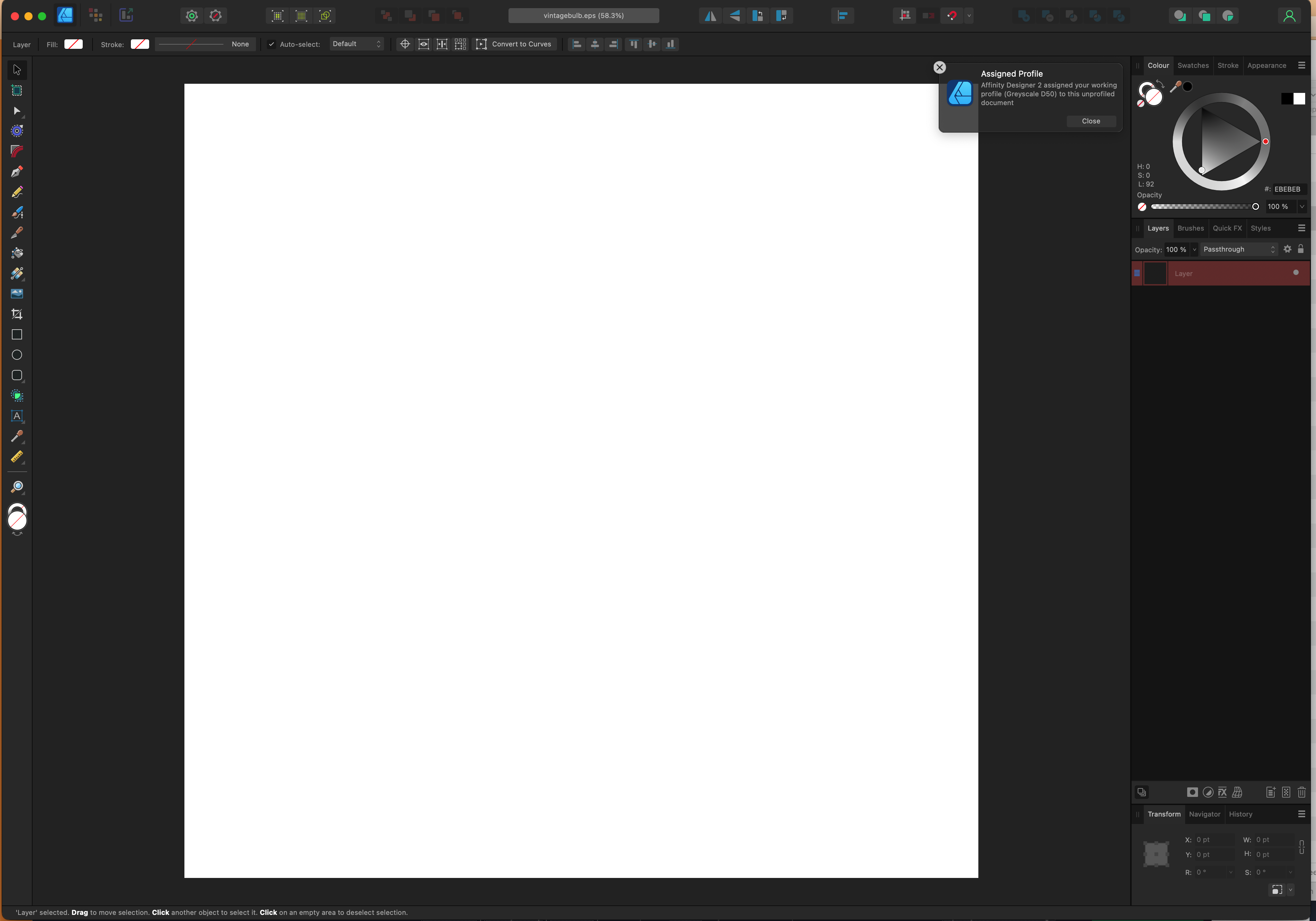
 Hello, I have an EPS file I got from Vecteesy (attached / link) and have been trying to open it with Affinity Designer or Photo, but when I try I get a blank page (also attached). I'm able to open it with Photoshop, so I know the file isn't corrupted. At the moment I need to work with those vectors in Affinity Designer. Does anyone know how to fix this? Thank you in advance. vintagebulb.eps
-
I don't know where these ideas come from, nor why they pick on me. But there we are; more unsolicited nonsense made flesh (digitally speaking). Mostly vectors with a few Effects here and there. First off: a mock-Tudor house, a style popular between the Wars, and the Lombardy poplars that were also all over the place. City gent in his working clothes and housewife in her posh frock. Next, the balcony of Buck House (that's Buckingham Palace to you) with a warm sunny queen and a damp soggy king. I have an idea or two more, which I'll post when I get round to them.