Search the Community
Showing results for 'wildlife birds nature' in content posted in Share your work.
-
Now...THAT's a tree! I just love Nature.

-
- 6
-

-

-
- affinity photo v2
- tree
- (and 3 more)
-
PROJECT: PORTRAITS TITLE: KOROM A series of portraits inspired by people, nature and ideas from all corners of our world. For this fourth one we share an idea/word known as KOROM. It is Kalenjin word that has a rich and multifaceted meaning. Its main concepts are strength, power, fierceness, difficulty and resilience. It is a versatile word that can be used to describe individuals, animals, objects, and natural phenomena that embody these characteristics. It signifies strength both physical and mental. It denotes individuals or things that possess the ability to endure hardship and overcome obstacles. This strength is not merely brute force; it is an unwavering determination, an indomitable spirit that refuses to be broken. Tools: Affinity Designer, Affinity Photo Let's connect: https://www.behance.net/bah-is-life https://www.instagram.com/bah_is_life/
- 1 reply
-
- 4
-
-
PROJECT: PORTRAITS TITLE: KAKA A series of portraits inspired by people, nature and ideas from all corners of our world. For this third one we travel to Zanzibar to meet KAKA. The word "kaka" is a Swahili word that means "brother." It is a ubiquitous term in Swahili conversations, used to address both older and younger brothers. It's a way of acknowledging the fraternal bond and establishing a sense of respect and camaraderie. The term extends beyond biological brothers, encompassing male friends, acquaintances, and even strangers. It's a term of endearment, often used to express affection, admiration, and support. The bond between "kaka" is characterized by mutual respect, loyalty, and a sense of shared responsibility. Tools: Affinity Designer, Affinity Photo Let's connect: https://www.behance.net/bah-is-life https://www.instagram.com/bah_is_life/
-
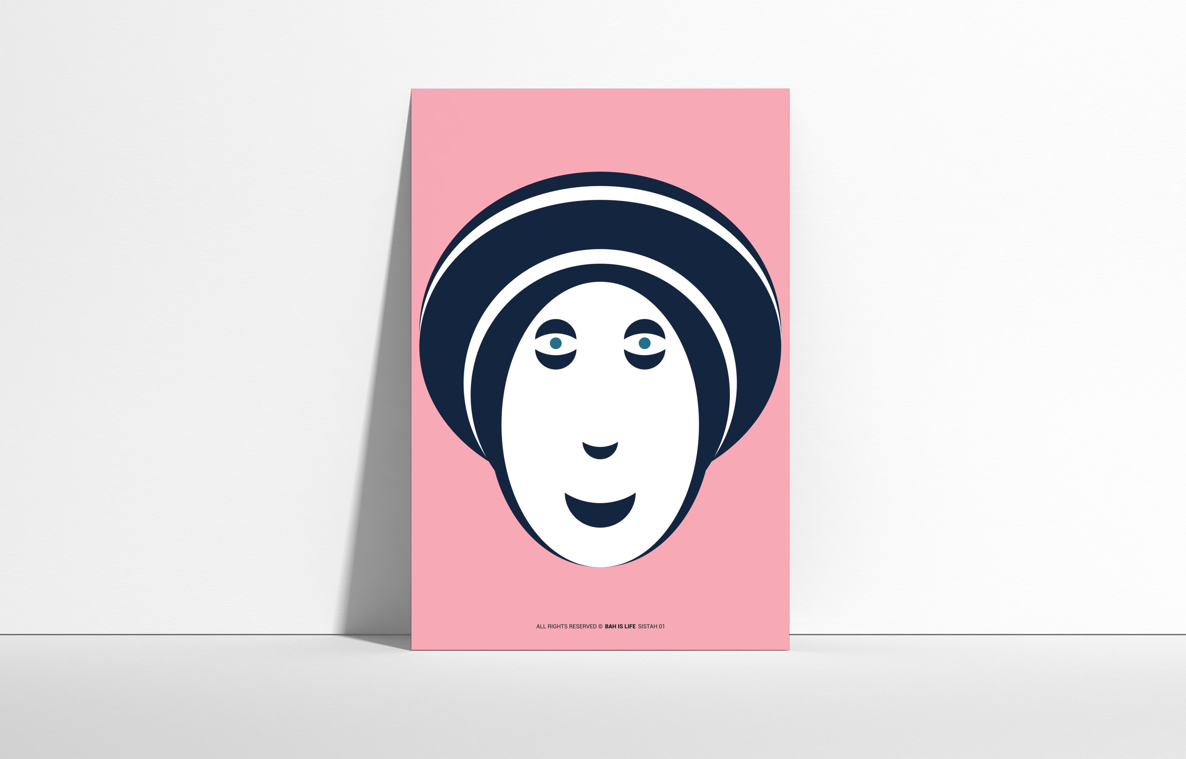
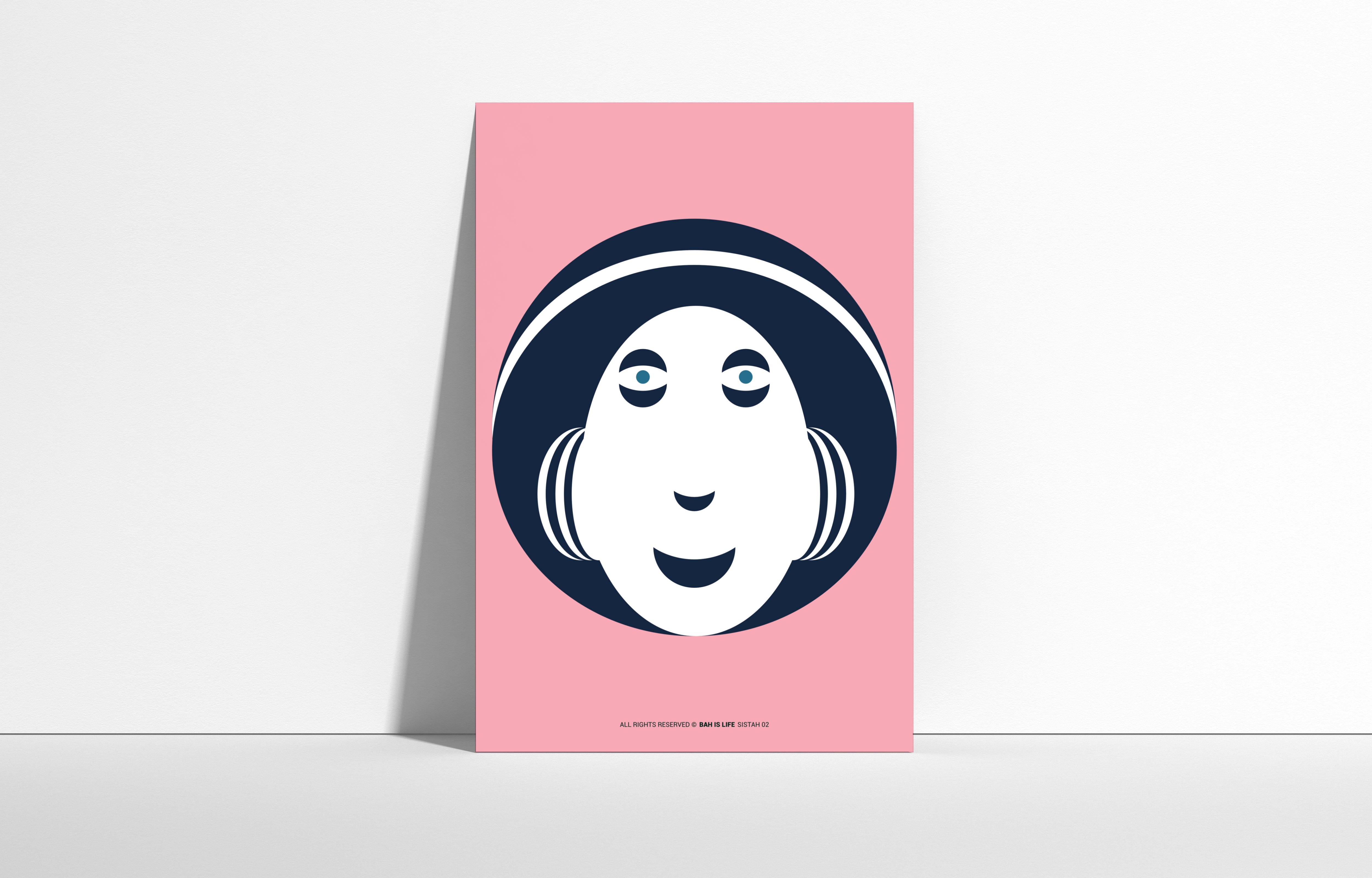
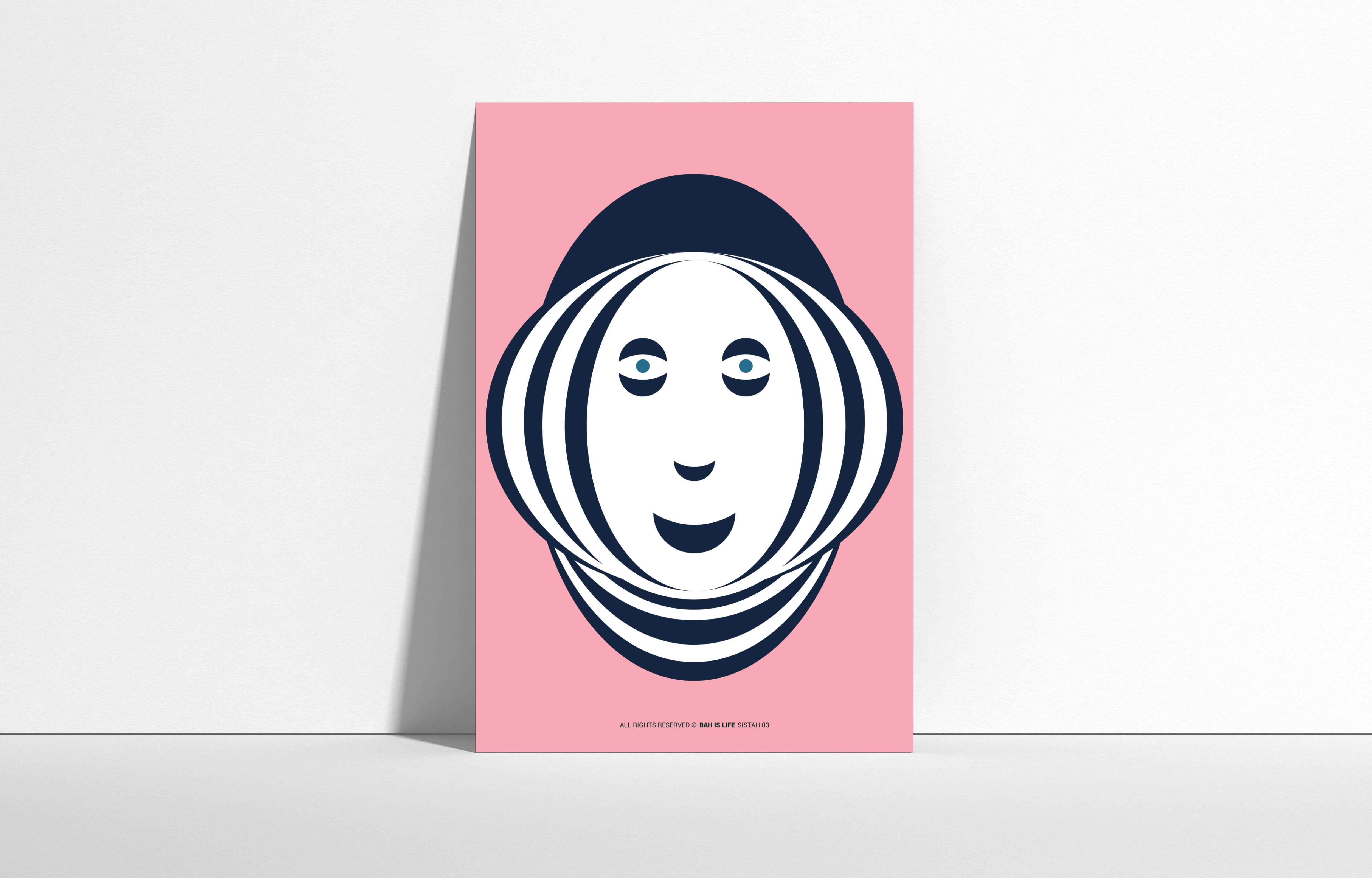
PROJECT: PORTRAITS TITLE: SISTAH A series of portraits inspired by people, nature and ideas from all corners of our world. For this second one we travel to the Caribbean to meet SISTAH. Sistah is a term of endearment used to refer to female friends, family members, and even strangers in Jamaican culture. It conveys a sense of closeness, respect, and affection. Sistah also represents a sense of sisterhood, camaraderie, and mutual support. It's a way of acknowledging and celebrating the unique bond that exists between women. It is a powerful symbol of Jamaican culture, embodying the strength, resilience, and unity of women. Tools: Affinity Designer, Affinity Photo Let's connect: https://www.behance.net/bah-is-life https://www.instagram.com/bah_is_life/
- 1 reply
-
- 8
-
-
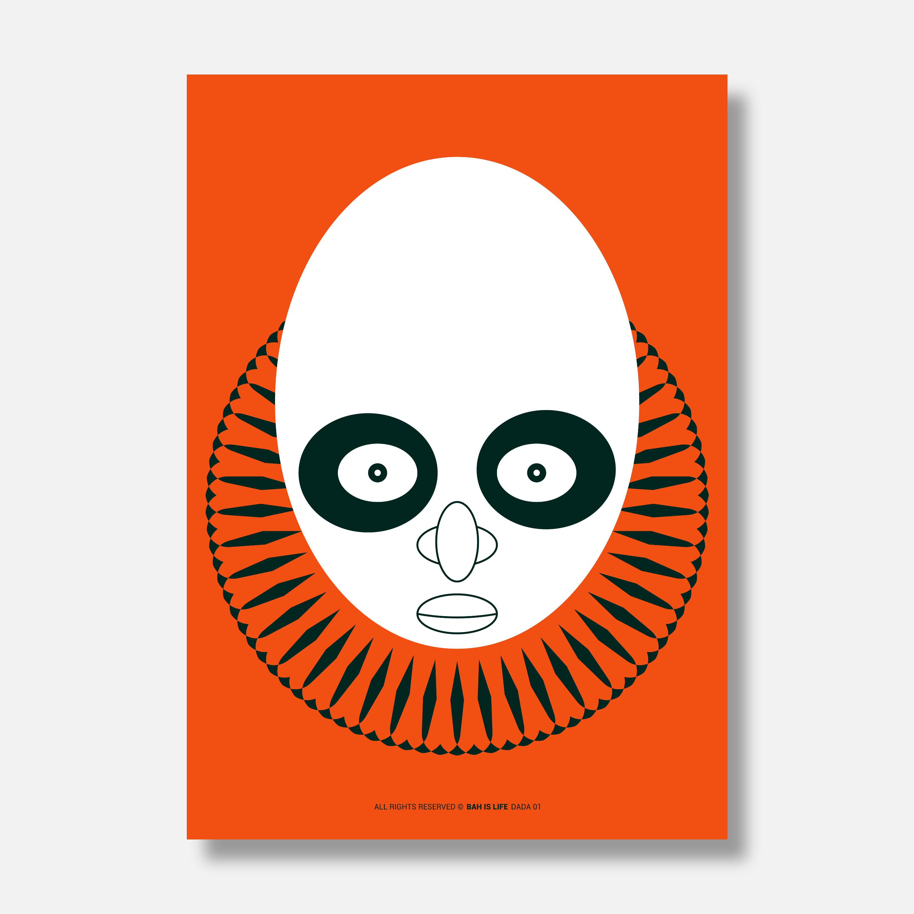
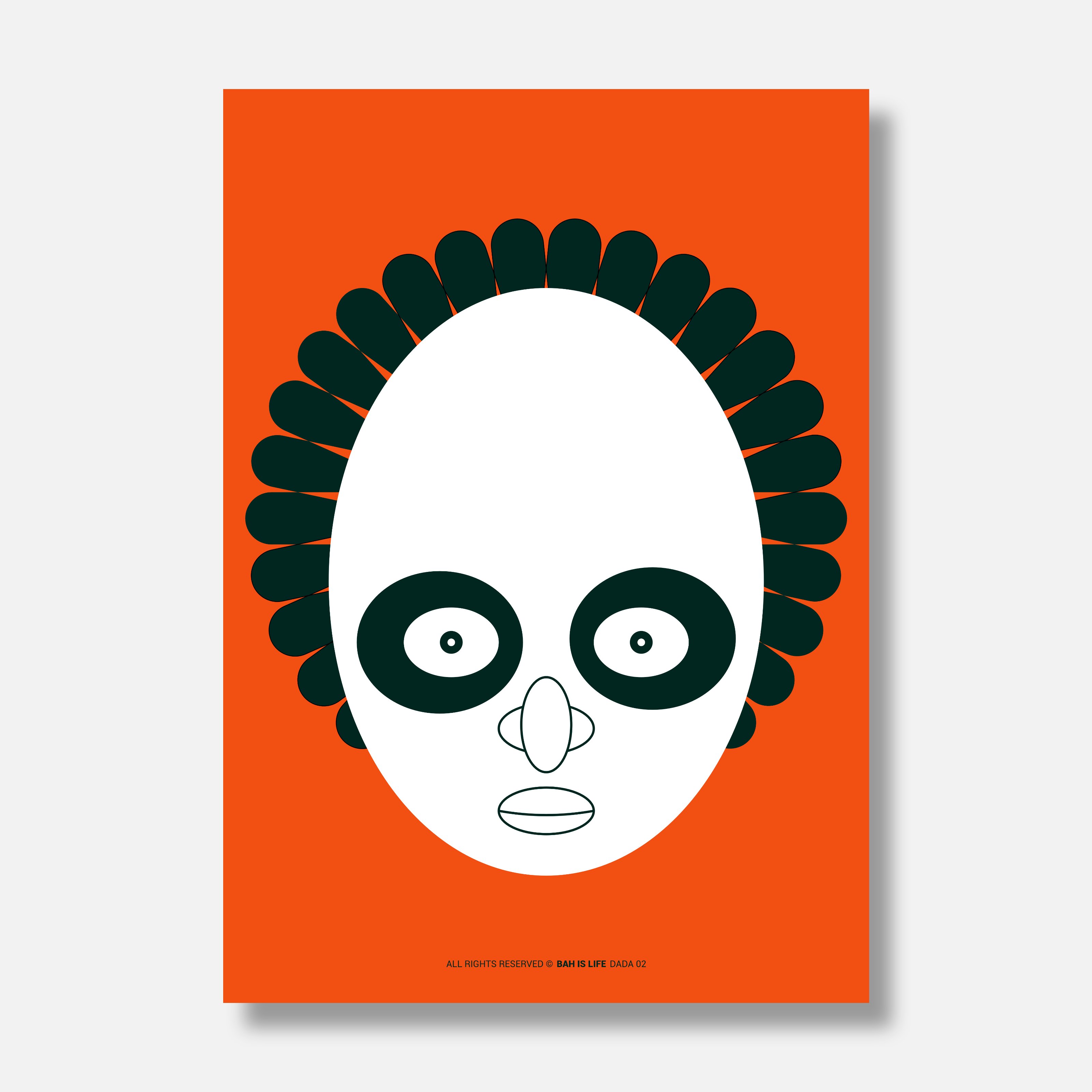
A series of portraits inspired by people, nature and ideas from all corners of our world. For this first one we travel to East Africa to meet DADA. Dada is a Swahili word which refers to a female sibling. It's a term of endearment and familiarity, often used within the family circle. The term conveys a sense of closeness and protectiveness. Dada can also be used to address any female friend or acquaintance. Similar to how "sister" can be used as a term of endearment in English, It's a way to express warmth and connection beyond familial ties. Dada is imbued with positive connotations, carrying a sense of affection, respect, and regard. When addressing someone as "dada," you're expressing a level of familiarity and care, acknowledging their presence and value. It's a way of showing that you hold the person in high esteem. Tools: Affinity Designer, Affinity Photo Let's connect: https://www.behance.net/bah-is-life https://www.instagram.com/bah_is_life/
-
 I looked for this this thread and found it on page 16 I received the A3 prints, several of each, and I have one of each displayed here. Gradually it occurred to me that the glyph itself could be encoded in a QR code, so I started to research how to do that. https://lists.aau.at/pipermail/mpeg-otspec/2023-November/003126.html Four more posts in the thread thus far, three of them from me, available on the following page. https://lists.aau.at/pipermail/mpeg-otspec/2023-December/date.html The present stage is that, using the two websites mentioned in the first post of the thread, I made a QR code and it is large, and when I tried to decode it, I could not get it to decode. So I am now looking at some form of compression of the way to express the information about the glyph into a QR code so that the QR code will be of a smaller type of QR code. An interesting side issue is to try to learn how the curves of fontmaking relate to the curves of Affinity Designer's Pen Tool, in that in fontmaking there are off-curve points yet in the Affinity Designer Pen Tool system, a rounded node is on the curve ---- Earlier this morning I asked bing chat ai Can a sign in an art gallery itself be a work of art? I received the following reply. > Absolutely! Art is a form of expression and is subjective. It can take on many forms and isn’t limited to traditional mediums like painting or sculpture. A sign in an art gallery could certainly be considered a work of art if it’s intended to be so by the artist. It could be the artist’s intention to challenge the viewer’s perception of what art is, or to make a statement about the nature of art itself. So, in the context of an art gallery, a sign could indeed be a work of art. It all depends on the intent and interpretation. Remember, “Art is not what you see, but what you make others see.” - Edgar Degas Then I asked the slightly different question and I received a different reply. Can a sign in an art gallery be a work of art? > Yes, a sign in an art gallery can indeed be considered a work of art. The concept of what constitutes “art” has evolved significantly over time and is often subject to interpretation. In the context of contemporary art, anything can be art if the artist intends it to be and if it provokes thought or emotion in the viewer. This includes everyday objects, installations, and even signs. For example, conceptual artist Joseph Kosuth’s work “One and Three Chairs” is a piece that includes a physical chair, a photograph of a chair, and a dictionary definition of a chair. Each of these elements, including the written definition (which could be likened to a sign), contributes to the overall artwork. So, in this sense, a sign in an art gallery could certainly be a work of art. However, it’s important to note that this is a broad interpretation and some may have different views on what constitutes art. ---- So is Art Gallery signs that are themselves art a new art concept? I will ask bing chat ai as that might provide some insight. William
 -
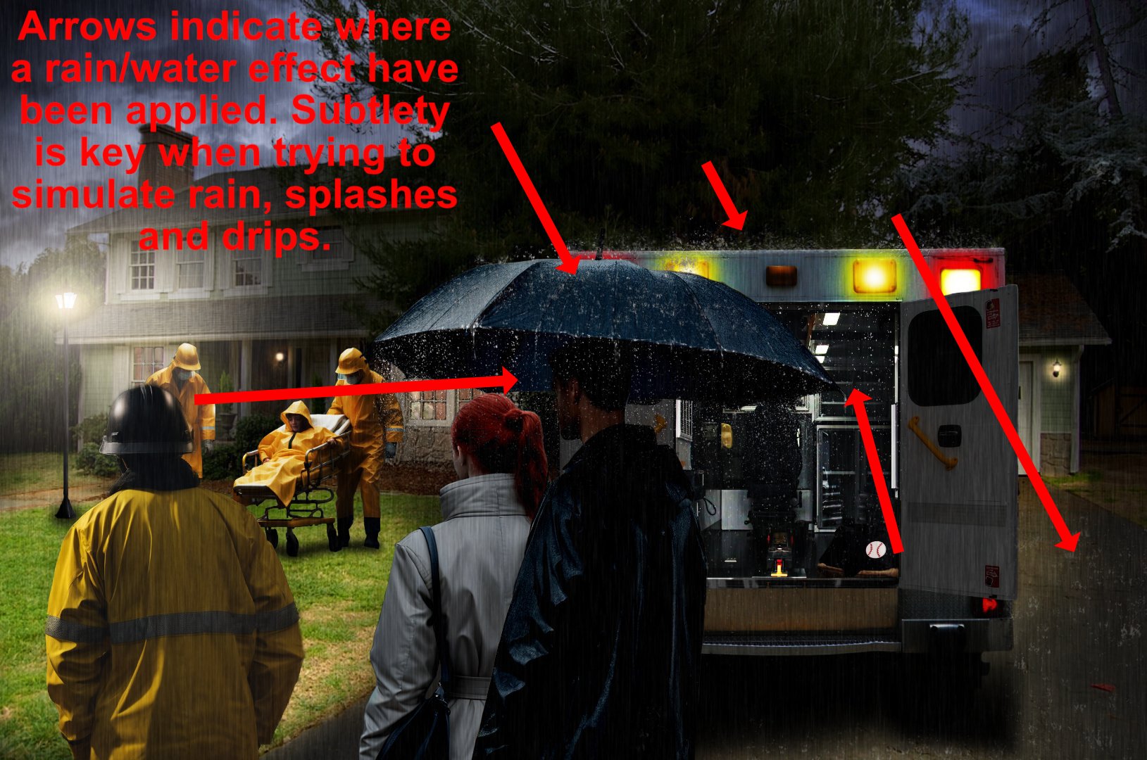
 You must be subtle when simulating rain in a composite; gray smudges will not sell the concept and will look like exactly what they are. A few comments on previous pages I mentioned whether or not what you're doing looked real enough to sell a concept to a viewer, or indeed yourself? I don't wish to keep repeating myself, but you and I both know what rain looks like out there in the real world, and when we do composites we are trying to approximate the visual aspect of what we know rain looks like. The picture attached is another quick/rough example of what you should aim for. You have chosen quite a difficult subject to portray in a composite, rain is never easy - apart from applying a block rain layer, there are all the little details that help to sell the concept. This is where you will have to decide how far you wish to take it in regards to realism. If you're not able to apply the subtle effects needed then you might consider rapping up the image and move on to something else. Personally, I haven't got the time to keep making these quick examples for your consideration, quick or not it does take up a lot of my time, but with dedicated practice, trial and error, you will slowly learn and get better with your composites. I am no expert, I draw upon what I have learned over the years along with some tricks I picked up. The best teacher of all is nature, study that in all aspects, light and dark, wet or dry, cold or hot, etc.. and then think about how it should look in your composite. And to reiterate, both you and I know if something looks realistic or not when creating a composite.
-
That is difficult to answer with any certainty. Adobe Photoshop has been around for decades and has always been a global leader in photo editing software. There are functions in photoshop that are not in Affinity Photo at the moment, but as with all software it is constantly under review and development. Some of the tools used in the video are foreign to me in the sense that I do not recognise them for what they are, or what they do? You can create custom brushes from water samples using Affinity Photo, but the danger therein is you are likely to create repeating patterns when you use it. Nature never repeats itself. So to use custom brushes effectively you will need to create lots of them from different samples to increase your options, and to decrease the risk of pattern creating. Brush creating in Affinity has a lot of options in the editing screen to change a behaviour of a brush when in use, but it will need some practice, trial and error, to produce exactly what you need. So. Is it possible to recreate what was created in the linked tutorial? The answer to that is limited by my own knowledge when using Affinity - I tend to stick with what I know and disregard the rest - especially the higher functions. Yes, it would be possible to recreate some elements in the tutorial, but not all of them simply because Affinity doesn't have the same tools/functions. In truth it will need someone far more advanced than myself to answer this question in its entirety.
-
Any light source - if strong enough, will cast a reflection on a wet surface. Any light source - if strong enough, will cast a shadow. The strength of the light source is an important consideration for length and depth, etc. A flash of lightning is exactly that - a momentary flash of bright light from high above. Yes, it would light everything below it, but it all comes down to how much (real) detail you want to include in your composite? You know how the real world works when it comes to the elements, use that knowledge to decide if it's really worth fretting over it. If you really want to include the flash from a lightning strike in your picture, you will need to light each and every element in your picture from the top down. Now that's a lot of work to take on. Another aspect is: is the night sky cloudy or clear - lightning will look different in each case. And, is the lightning directly above, or some miles away? That would affect the picture as a whole. I could go on forever, but as I said. . .you know how nature looks and works.
-
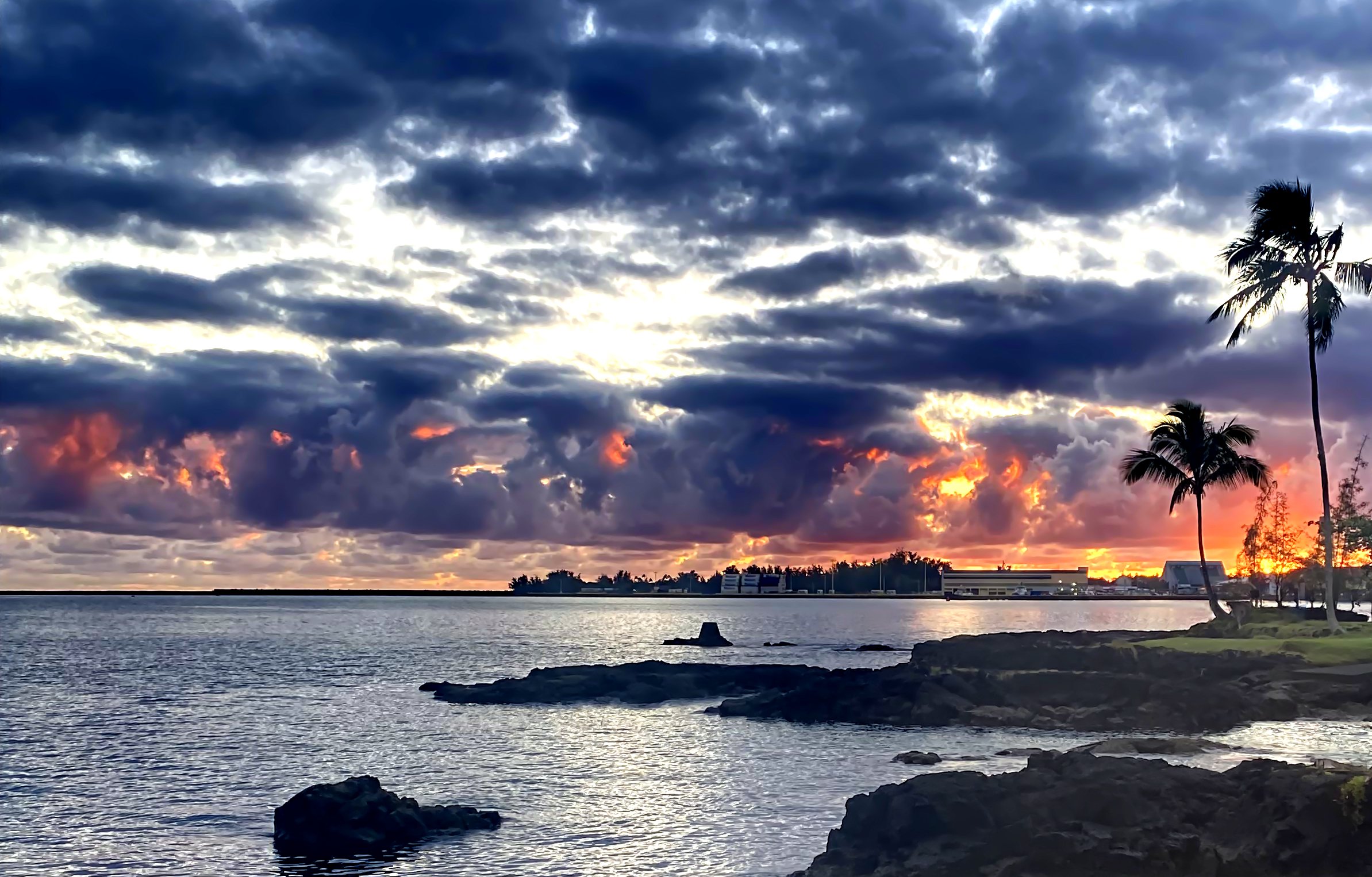
SUNRISE - Hilo Bay, Hawaii Oct.9,2023 (06:15AM Hawaiian Time) Picture take with iPhone 13, Adjustments: ('Live Denoise', Luminance 45%), ('Levels' boost Blacks 13%, Whites 81%) Strictly an amateur photog but the 'fire' in the clouds are done by Mother Nature.
-

affinity photo A Magical Creature of Nature
jmwellborn replied to Mortimer's topic in Share your work
@Mortimer what a glorious image! And what difficult birds to photograph without a blur of wings! Simply beautiful. -
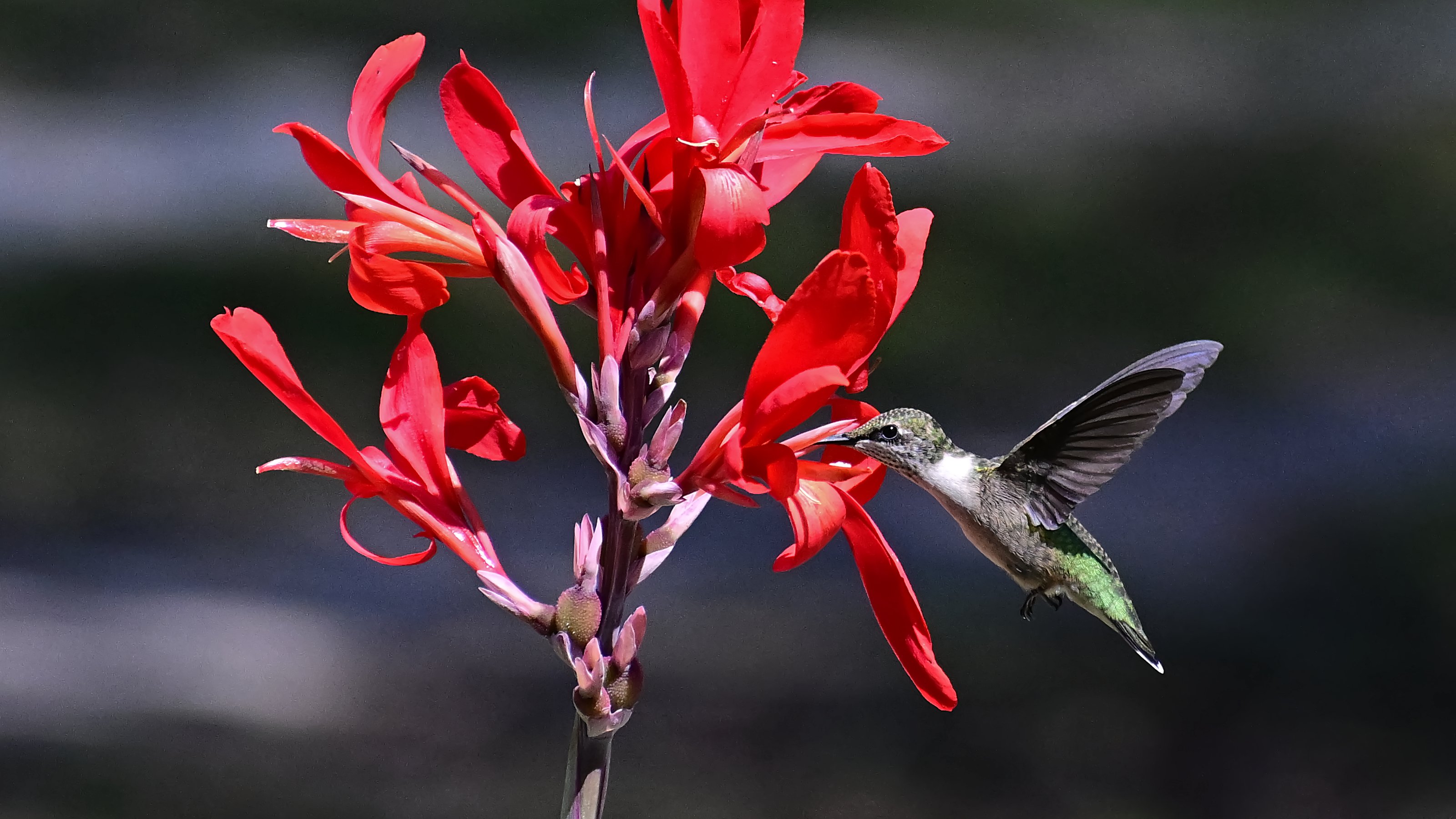
I waited all summer to catch this female of natural aviation at the lunch counter getting her fill up. I'm glad Affinity Photo was there when the waiting was over.
-
You are right, the nature plays the main role in almost all of my photos.
-
Surely nature can take some of the credit 😜
-

affinity photo Miniature Dachshund Illustration
DelN replied to Bobby Beetle's topic in Share your work
Yes, This is great! I had a Dachshund too and, as dannyg9 says, it captures their spirit so well, their inquisitive nature, theit beautiful faces so full of fun and mischief. The BEST dogs... -
@SrPx: Thank you for your comment. The explanation of the two arts is correct and I agree it is more Art Nouveau than Art Deco, even if some elements reflect the latter. I believe Gaudi was also influenced by Art Nouveau, which probably is the reason why the work on the Sagrada Familia is pain staking and time consuming. Mimicking the organic works of nature is a huge challenge.
- 12 replies
-
- 1
-
-
- art nouveau
- vector
- (and 1 more)
-
@G-F-H beautiful birds! Always amazing to learn how many varieties there still exist in this world.
-
Actually, they are two different creatures. For birds the air is their domain and they have probably seen a clear route upwards, over/through the land to the right For the deer, he has to find a ground route out of the danger zone and he's determined that is to be to the left. There's no way he can follow the birds' route out, unless his name is Rudolph and he has a big red nose.
-
Actually, the birds going one way and the deer the other, for me, capture in the image the panic. Unlike people in a workplace they will not have been taught what to do in a fire situation nor will they have participated in a fire drill and been informed of the gathering point after evacuation and there will not be signs on the trees indicating which way to go in the event of a fire. And although when staff in a human workpace all behave in an orderly manner in a previously announced fire drill, who knows what will happen if there is a real fire. The animals may not know which is the route to safety. They may not be aware that there is anywhere outside the wood, or they may have previously stood at the edge of the wood gazing at the open meadow beyond yet never ventured there. William
-
Ha-ha! Well spotted! While I was putting it together I did wonder whether, if the fire is raging rapidly through the woodland in all directions, leaping from tree to tree and setting alight to the undergrowth, do the animals, in their terror, follow the same route to safety as the birds or do they tear through the woodland in a blind panic, avoiding the fire and smoke as they come across it... And I agree with you: I don't see any similarity between Piero di Cosimo's wonderful painting in the Ashmolean Museum in Oxford and my own, but it was a great compliment to receive from William. But did you notice that one of the deer and wild boars in Piero di Cosimo's painting have men's heads?
-
Re: your original 'Fire in the Wood' paintings, I am intrigued that the deer and the birds seem to be fleeing from the fire in opposite directions! Artistic licence? I find that the painting from the Ashmolean does not connect in any way for me with your painting. John
-
 Hello all. This is a mockup for a YouTube channel I am working on every so often. Green is representative of nature along with some other things which is the reason for the color. If you would like to see more logos and branding I have done, they can be seen here https://www.behance.net/Statement-Design
-
Ha-ha! Yes, hodgepodge. What a great word from the past. You don't hear it used now. 'Hodge Podge' would be a great name for a character in a children's book 😊... I like to experiment with the brushes in Affinity Photo, creating image brushes using random sections of images that I consider will make really interesting textures, images like the underside of a toadstool, lichen on a tree branch, rust, peeling paint, tarnished gold, folds in an old sheet, satin, silks, mist, clouds, the texture on an old man's cap. Then I test the brush settings, spacing, rotation, change the colours (or re-do the brush if I'm not happy with it, changing the colour, cutting bits off. etc). Then I export little sections of random bits of a texture as .png files, then re-import them into the brush as variants to rotate, set specing, etc. You get some great brushes by experimenting... I have done some interesting 'Nature' scenes using the photobashing technique and matte painting scenes using my 'Nature' and 'Atmosphere' brushes. I study the colours in a sunset or dawn, sometimes create a colour palette or LUTs from it and create the background gradient and then paint the trees, rocks, background mountains using the brushes I created, grabbing sections of buildings from various sources, re-colouring. Applying textures to change them, build onto them, add lighting to the windows, etc. I am always experimenting. Perspective and distance is challenging, but 'Practice, Perseverance and Patience' usually pays off. It's a lot of fun...
-

affinity designer Renewable Energy logo (please critique)
VectorWhiz replied to Mr Lucky's topic in Share your work
The problem with logos that target a specific subject, that is diverse in nature, it is difficult to select one that is covers them all. There are all sorts of angles from which peers imagine it and review it. The same goes for visitors on which the logo is used. Simple assignments can appear to be more difficult to draw than things may seem at first glance. -
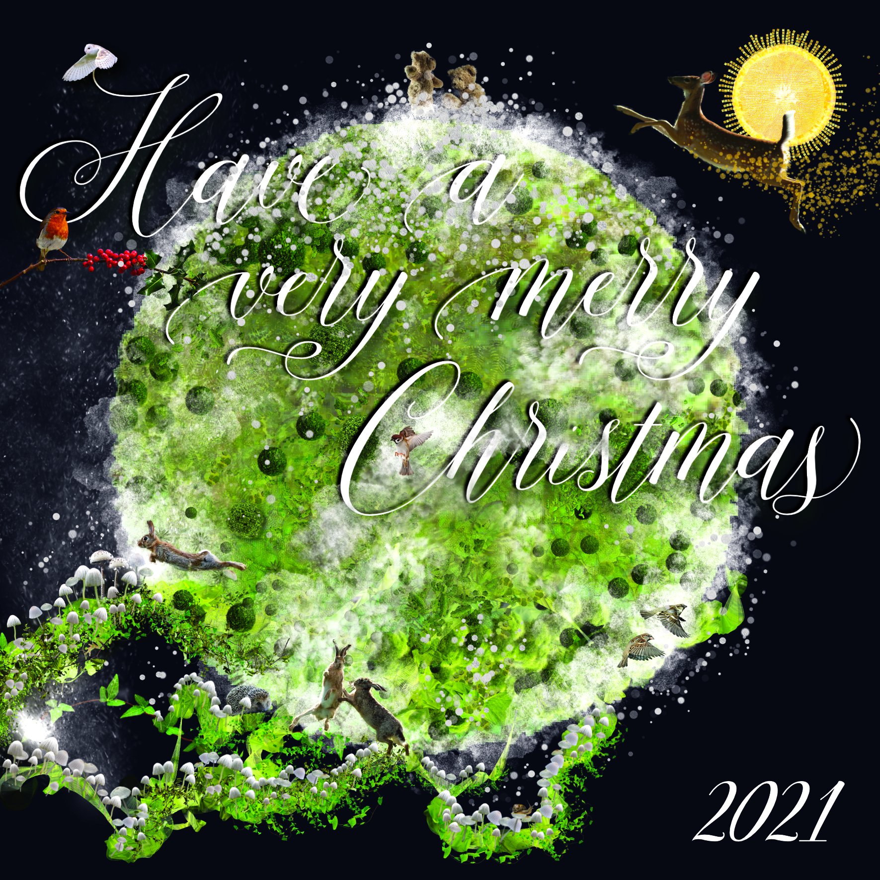
I created this back in Dec 2021, but forgot to post it... Christmas Card 2021 that I created in Affinity Photo using the 'Nature' brushes, with the help of a few animals and birds... 🙂 DelN CMYK for Print RGB for Screen