Search the Community
Showing results for 'swatches panel' in content posted in Feedback for Affinity Publisher V1 on Desktop, Older Feedback & Suggestion Posts and Feedback for the V1 Affinity Suite of Products.
-
 Whenever I go to select a fill color or stroke color, it brings up the color panel, with the color tab selected. I'd prefer to have the swatches tab selected by default. Is there a way to set this? Even if you cannot set the default tab, shouldn't the tab be whichever one you used last when selecting a color?
 -
 Yes, not one of the best places, but where to post else? Yes, this was reported before, but was never never fixed in the years before. Take it as a small reminder. It is a bug for sure, everyone saying this is a feature request is COMPLETELY WRONG. One of the things annoying me from when I started using Affinity: Affinity is (partly) not capable to memorize colour assignments from Swatches. Two examples ... 1. There is a rectangle filled with colour RED from the Swatches panel and there is a line with a stroke colour of GREEN from the Swatches. Now click the rectangle and look at the Swatches panel. Say you had luck and the Fill Colour Icon was on top, Swatches panel shows you the colour RED. Fantastic! Now click the line and switch to the Line Colour Icon (Swatches panel) and look at the Swatch Panel ... no colour is selected in the Swatches Panel. Mediocre! 2. Even worse: Say you define a drop shadow for an element. Select and click the colour from the Swatches panel. The colour assignment is instantly deselected VISUALLY. Yes, the assignment worked, but what colour was selected from the Swatches panel? Same applies to gradients. So the current workflow for Example 1 is: Switching the Fill / Stroke Colour Icons in the Swatches panel BEFORE I get the information which colour was used. One could say of course that I have to know my colours. No problem, if there are only a few distinguishable colours, but what if you have a lot of similar looking colours in the Swatches panel? Aside to that, lately I had a document converted from a PDF with loads of B/W drawings with fills and strokes. 50 % of them had a correct black colour assignment, for the other 50 % I was switching Fill / Stroke icons, clicking, deselecting ... No fun. So please dear developers ...
 -
 Coming from Adobe Illustrator, I am overwhelmed by Affinity's implementation of the swatches panel. • the colors can't be grouped together • can't select multiple colors that I want to delete • no ASE file export option • no color guides What I want to SUGGEST is a redesign of the color swatches panel to make it work similar to or even better than that of Adobe Illustrator. I like it to work in a more contextual way rather than looking at a separate panel to change colors. Also, an option to recolor the entire artwork or selected objects and adding these functions into one panel is superlatively glorious. It'll totally blow Adobe developers' minds.
-
I find this part of the Swatches panel unhelpful. If I want something to be black (K=100) I can't click the black square because I get 84, 84, 78, 99. Similarly with the grey square. I can see where these values come from but it makes the 2 squares not fit for purpose for me. I'd rather they weren't there at all.
-
 I'd like to suggest a few improvements to the Swatches panel: Ability to convert swatches from and to normal/global/spot. For example, convert a normal swatch to global, or convert a spot to normal, and so on. Fills should automatically rename when colour is edited. For example, a fill named C:0 M:0 Y:0 K:10 should change to C:0 M:0 Y:0 K:50 if I do edit the colour to be a 50% black. Ability to group swatches into folders. Global colours names should be their values (for example C:0 M:0 Y:0 K:0) rather than "Global Colour %n" A command to select/delete all unused swatches. Perhaps create a document palette by default for any new document? A "Merge Swatches" command that works like in Illustrator Select multiple swatches at once to delete/copy them Global, overprint and spot colour indicators should be larger, they're hard to see when the swatch is selected (see attached) All these are to help us manage & identify the colours, plus correcting mistakes all designers make eventually. :P Thanks!
-
 Is there anyway to change the default Swatches Colours panel from HSL (Hue Saturation Lightness) to CMYK (Cyan Magenta Yellow Black) so that all the defined colours are cmyk, a must for commercial printing. At least the 4 process colours should be defined. I know you can define and add your own colours to a document, but it seems against the grain that when you select one of the defined colours it is defined in HSL. I've been using Quark Xpress and InDesign for years and it seems odd that a professional Publishing program doesn't default to cmyk colour swatches.
 -
 When palettes have a lot of swatches in them, this triggers a scrollbar. The problem is when the scrollbar is invoked it takes up a column of swatches for itself and shifts the swatches as a result. This means if you have standardised your palettes to say 16 swatches wide, these will be messed up depending on the number of rows the palette has. Palettes should always remain a constant number of swatches wide and shouldn't be altered by the scrollbar, which was how it was operating in 1.5. Whereas as it is at the moment: - If you set the panel width so that palettes are correct when the scrollbar is present, then when the scrollbar isn't present they're messed up. - If you set the panel width so that palettes are correct when the scrollbar is not present, then when the scrollbar is present they're messed up. Without Scrollbar: With Scrollbar: ------------------------------------- Windows 10 - 16299.19 Affinity Photo - 1.6.0.89
-
 Hey there, what I'm missing so far regarding the swatches panel: - Easy renaming workflow of swatches with F2 and Tab, and to go further: something like Renamy would be even more awesome - Select and delete/copy multiple swatches. At least it should be possible to click/select and delete via DEL-key to easliy clear up the swatches - "remove unused colors"-option to quickly clean up a palette - usecase would be mostly the the document-related palettes - Convert already added swatches to Global/Spot-Colors - Ability to easily set spot-color-name the same as swatch-name and vice versa (without copy-paste, perhaps with a checkbox in the settings of each swatch) - Missing a direct "Add current color to palette as Spot Color" very much! - The to "Add current color to palette [...]"-Icons are not very distinctive. I would've added at least a big triangle in the left bottom corner of the button regarding the "add as global color" option to suit the appearance of those color in the swatch-list/grid below - Setting/checkbox/action to add swatches via "create Palette from document/image" directly as Global/Spot-colors. - Indicator to see in which Colormode the color originally was created and then have the ability to quickly switch color from RGB to CMYK-Mode and vice versa (perhaps even be able to determine the rendering/conversion while doing so) Greetings, Johannes.
 -
I'd love to have the ability to organize and view swatches better by being able to move individual swatches or groups of swatches (for instance tints and shades of various hues in my project) on to new lines. Thanks.
- 1 reply
-
- 1
-

-
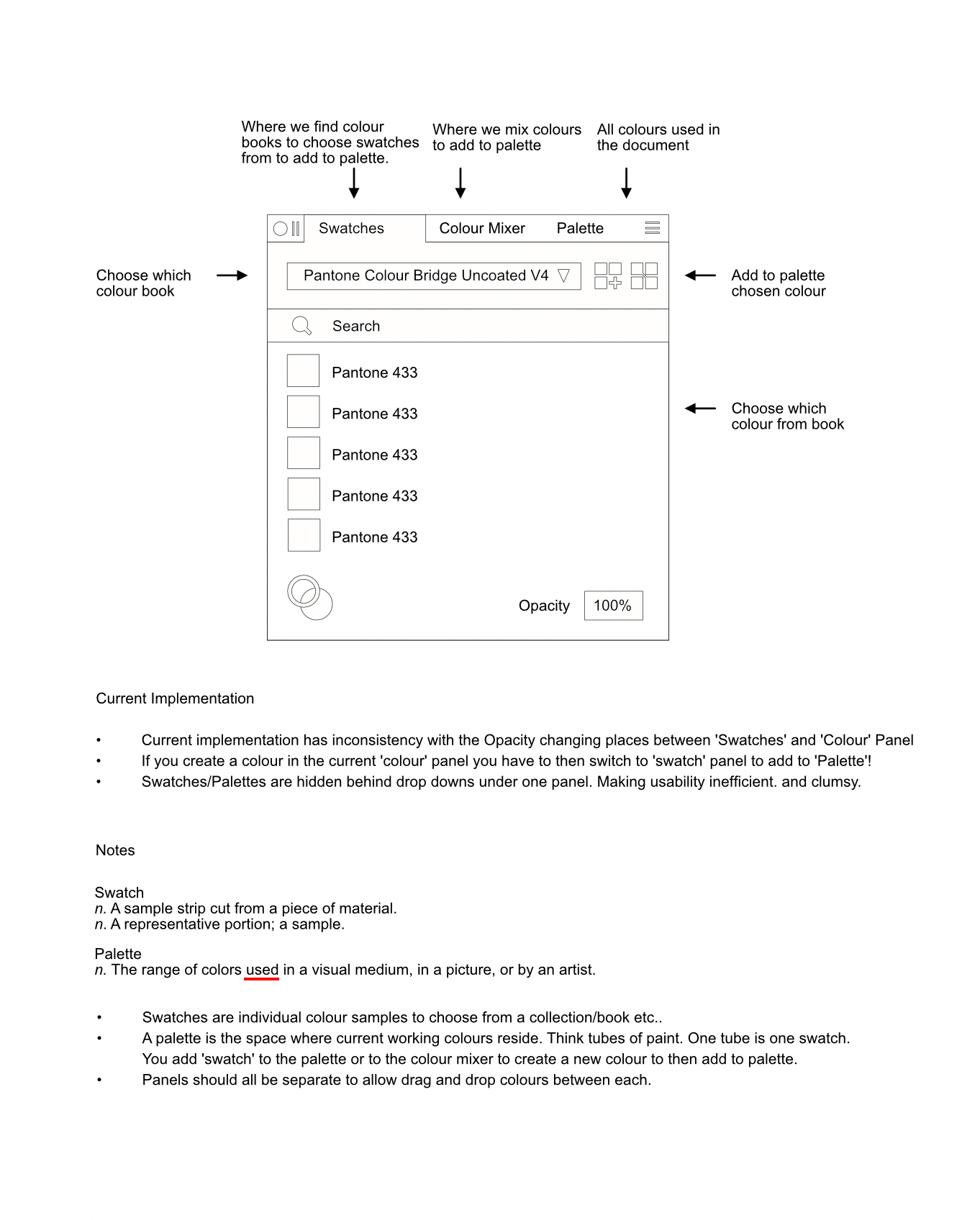
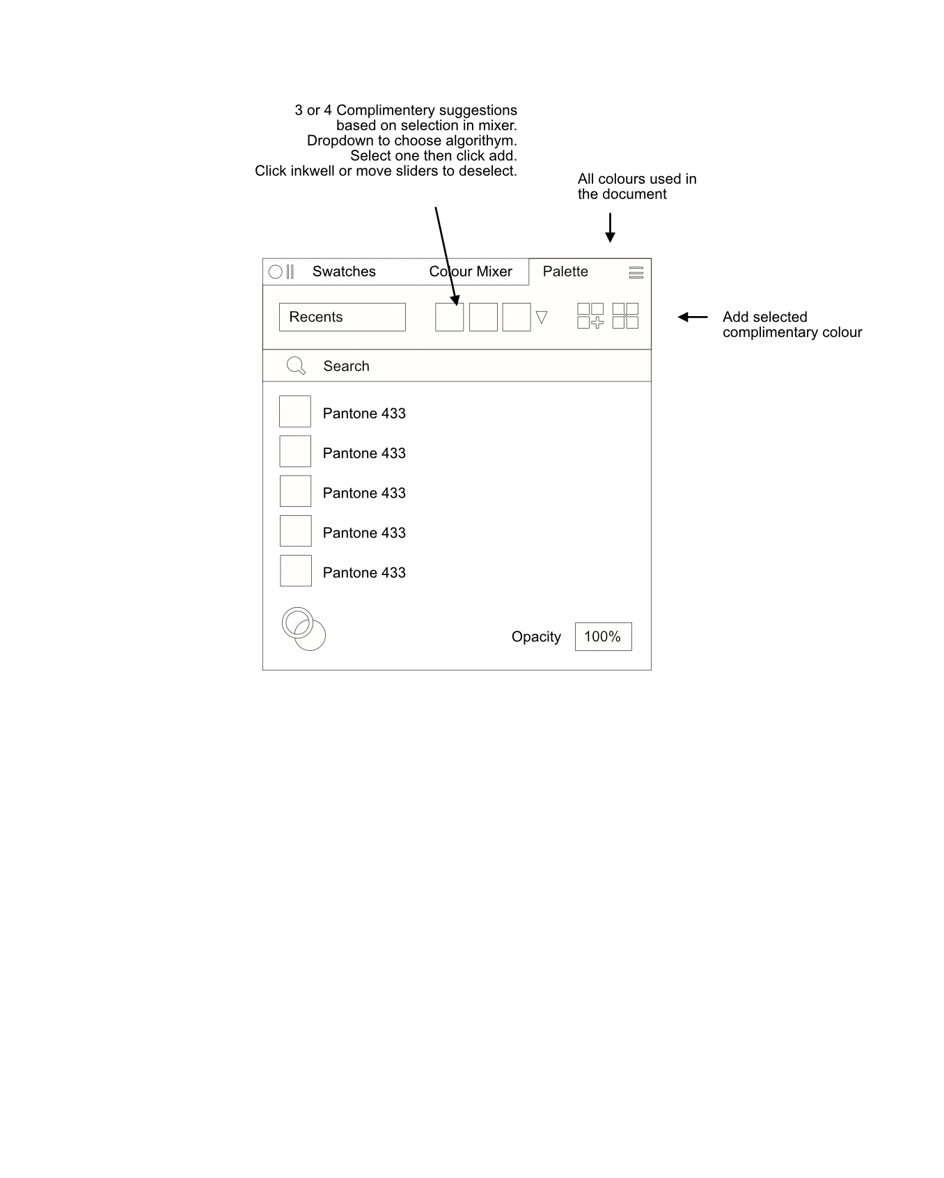
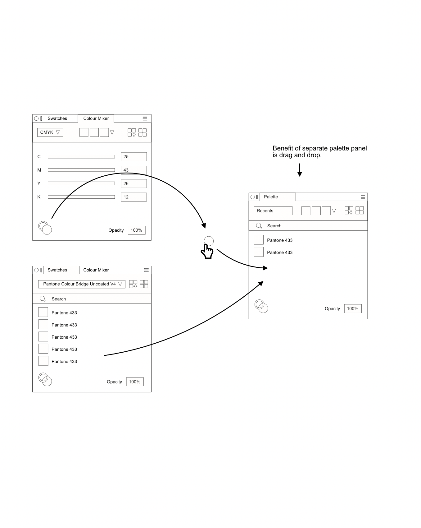
 I've always had trouble working with colours in Affinity. I believe in its current state it's a very clumsy and inefficient way of doing things. Not to mention frustrating. Im writing this post after posting a 'bug' which Sean P was quick to respond to, however I now believe it was ultimately my error in using the swatches/palettes panels. I do though, also believe that if the way swatches and palettes are implemented in Affinity were refined it could be much easier to work with colour not to mention much faster. Ive attached some screenshots of a way that, I believe (and feel free to pick this apart), Swatches and Palettes could/should work, for better clarity and efficiency. First of all the current implementation merges both swatches and palettes and they are almost treated as the same thing when I believe this should not be the case. You will see in my attachments that I believe Swatches are individual colours in a collection you can choose to work with and a Palette is the place to keep all the colours you are indeed working with. While this is essentially true in Affinity there is quite a bit of overlap between 'swatch' and 'palette' and both are hidden behind one drop down. At the moment it's all a muddled mess that hides information and slows down the user. I believe there should be 3 colour panels. One for a collection of Swatch books so you can choose 'Pantone Coated V4' for example and then choose a coated Pantone from that list to add to the (separate) Palette. There should be a colour mixer panel to mix colours with the usual sliders etc from there you can add to the separate Palette and then there should be the Palette itself. This will contain any and all colours within the document (raster images excluded unless you choose to add them from an image). As an aside, if you have an item selected on your pasteboard and you choose or mix a colour the item on the pasteboard will change accordingly and the swatch should also auto appear in the palette as it is now in use on the pasteboard. Also with these 3 panels being separate you are able to glance at your working palette useful while mixing another colour or choosing a complimentary spot colour from a colour book but the biggest benefit of all is being able to quickly drag and drop colours between each panel. I hope that makes sense when looking at the attached diagrams but let me know what you think. Also note the more consistent layout of the panels. Notably the search bar and Opacity. How do you find working with colours at the moment?
-
 Hello, I am working on documents that contain many shades of washed out colors and sometimes it's hard to differentiate the swatches. I wished that selecting an object whose color is a swatch would highlight the swatch on the swatches panel. Thanks, Fernando
 -
Please can we have a separate panel for the document colour panel and the swatches panel. Using colours in Affinity Publisher is a nightmare! How do you get a spot colour from the swatches book to your document panel without needlessly applying the colour to an element on the canvas first, then having to click back to your document panel (that you have to add manually) and then clicking 'add colour to palette'. As an aside in 1.8.4 on MacOS Add global colour to palette doesn't work so I have to jump through the hoops above then change it to global colour. Thats 6 clicks to add one single global colour to the document palette. Not including setting up the document palette in the first place and undoing the colour change to the element on the canvas just to help get the colour from one panel to the next. Having the panels all hidden behind a drop down menu is not efficient at all. We need panels side by side so we can simply drag and drop swatches between the colour books to the document panel. Ideally it would be beneficial if we could (if we wanted to) have all the colour books in their own panel all out at the same time. I have linked a YouTube video below to show just how poor the implementation is. This doesn't cover getting a colour from a colour book into the document palette but it shows getting 5 colours from a colour strip imported into Publisher. It takes him 3 minutes (with the video sped up!!!) to add 5 colours to the document panel!
-
 Affinity Publisher for Windows V1.7.2.471. Windows 10 Version 1903 Build 18362.295. Having installed the latest Publisher build, I have started working on a "real" project. One of my first steps when starting a new project, after setting the document size etc, is to create the swatches I will need. These will generally consist of some PANTONE spot colours, some process colours, and maybe some tints. So far I have some across the following issues... Adding Global Colours: When creating Global Colours... Having opened the "Add Global Colour" dialog, selected a PANTONE colour and clicked "Add", it would be very useful if the "Global Colour" dialog remained open so several colours could be added without having open the dialog again. At the moment the dialog disappears when "Add" is clicked. When adding PANTONE spot colours, it would be great of the name of the colour was taken directly from the PANTONE colour name by default. This will save much typing, and the colour naming in the Swatches panel will be clear and unambiguous. It would also save time if, once the PANTONE library was open in the Add Global Colour dialog, that I could select more than one colour by holding down the control key. They could then be added all together. Taking care of the previous point and automatically using the PANTONE name would facilitate this. Having selected some PANTONE colours to start with, I may want to add some more during the project. It would therefore be great if, when I return to the "Add Global Colour" dialog, it kept the settings from last time instead of always reverting to the HSL Colour Wheel each time it is opened. When choosing from any of the PANTONE swatches, with the exception of the CMYK libraries, surely the "Spot" attribute should be applied by default? For anything from the "PANTONE Solid Coated-V2" swatch library is by definition a Spot colour. Working with Tints: I usually create a few tints, usually of black, and add these to my set of swatches. I'm still finding my way around Publisher, so my methodology may not be correct. However in ID, I would select the BLACK swatch, and then choose New Tint Swatch from the fly out menu. With Publisher I have tried the following approach: Add Global Colour and choose "C:0 M:0 Y:0 K:90" using the CMYK sliders. In the swatches panel, I then "Rename Global Colour..." and then change the name to "Black 90%" (I find this much easier to read in the Swatches panel than the colour recipe). Right-click my new swatch and choose "Make Copy". Problem: The duplicate swatch has the same name as the original. Perhaps there should be a "(Copy n)" suffix? I now have two swatches called "Black 90%". I click select the lower of the two, and then right-click and choose "Rename Global Colour...", and then type in my new name of "Black 80%". Problem: It is not my selected swatch that gets renamed, but the one above it. Surely a bug? So I drag the renamed swatch below the copy, and the finally I can use "Edit Fill..." to change the tint to "Black 80%" I'm guessing that these issues apply to Designer and Photo too. I think that streamlining these swatch management issues will accelerate something that people may do several times every day. Thanks, Mike.
 -
 Working with vectorized images that typically contain way too many paths, I'd like to be able to Drag swatch A on top of swatch B to replace all visible instances of fill A with fill B Click on swatch A to select all objects using fill A If there's already a way to get the same result, my apologies: I'm an infrequent user, and can't seem to keep up to date with the ever-expanding capabilities of Affinity Designer & Photo.
 -
Hi, As title says, want to make it smaller, to have more space for other panels. Thanks
-
 I find it confusing that colour management (selecting, refining and defining colours) is spread across the Color and Swatches panels, and likewise the setting of a stroke colour is spread across the Color and Stroke panels. It should be possible to select the colour of a stroke in the Stroke panel (just as we can currently select the colour of text, text frames, tables in their respective panels). A single Color/Swatches panel would offer more advanced colour management options.
 -
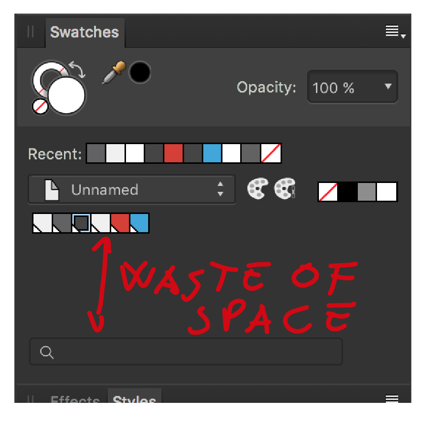
I think in AI the gradients are shown as a gradient swatch and not all the individual colours/shades one could pick from the gradient. Obviously anything raster based wouldn't add the palette. How I see it (and I could be overlooking something here) is if you created a triangle for instance and then set the colour to yellow. A Yellow swatch would then appear in the palette (much like it does with recent swatches panel). If you created another shape and made it red. A red swatch would appear in the panel. If you edit either the red or the yellow triangle to another colour, that particular swatch could update in the palette as not to have an overly messy palette with every colour you ever created in the document. If you have two yellow triangles and you edit one to be green. Instead of the yellow swatch updating, a green swatch would be added to the palette so now you have a green and a yellow triangle and the corresponding swatches are available within the palette for consistent use through the rest of the design. You could then choose if that colour is going to be a global colour or there could be a default option for any colour created to be global which would then stop the creation of a new swatch when having two or more elements like in the yellow triangles example above. Obviously in that instance if you change one of the yellow triangles to green and its set to add any new swatches as global then the second triangle would update accordingly and no new swatch is added to the palette.. The current recents panel is only useful up to a point. Especially if you're experimenting and you decide to go back to a colour you created but initially discarded and it was more than 10 iterations ago (which is quite easily done when choosing colours and shades). So if my idea above works we could do without the recents panel and have cleaner more useful and optimised colour palette/panel and there would be a lot less faffing about adding colours and breaking train of thought. Think that makes sense but again like I said maybe i'm overlooking something whereby maybe it wouldn't work because X.
-

Fix the colour palette system
thomaso replied to SamSteele's topic in Feedback for Affinity Publisher V1 on Desktop
If this flexibility results in faults, for instance ... ... different CMYK values in "Swatches Panel" versus "Color Panel" for the predefined HSL swatches of the palette "Colors" ... different color spaces & values for the predefined swatches of the palette "Greys" in "Swatches Panel" versus "Color Panel": K-only versus 4-c ... different vivid color appearance between an object's CMYK fill versus the same as swatch in "Swatches Panel" ... output/export of K-only as 4-c ... converting K-only into 4-c when handling different color profiles between document and resource then I really rather prefer bit less flexibility. And more usability. -
At the moment Swatches and Palettes are hidden behind a single drop down. What if I wanted to look at my current palette while choosing a new spot colour that suits said palette? You cant see both at the same time as I far as I can tell. If they were separate panels you could see them side by side and drag and drop between them. You could also create new swatch books by dragging from the palette to a new swatch book in a separate panel. Much quicker than current way of working as its more visual. After all aren't the type of people using this software visual thinkers? If you think about who the end user is and how they work then the solutions become much clearer. Trying to tuck things away because it looks cool with drop down or merging and classing similar but distinctly different elements then just causes confusion which slows down the brains train of thought. Yes its an extra panel but it is a clear distinction between palette and swatch books and offers a faster route between the two. UPDATE: Just looking at InDesign. Adobes way is similar to mine in that when you choose a new swatch from a colour book it opens up a new window so you can still see your 'palette' (they call it 'swatches') so in effect Adobe also have 3 panels too. The swatches panel, the colour mixer and the pop up for adding colours from a colour book. My idea is much more ingrained within the current UI and maintains a consistency with it. Even Adobe don't offer drag and drop though and I think they're missing a trick for quick adding of multiple colours.
-

Indexed colors needed
Aran replied to Aran's topic in Feedback for the V1 Affinity Suite of Products
As far as I understand a LUT is more like a 'look' one can apply to an image. What I am seeking is a recacluation or even reduction of an image to a certain set amount of defined colors - I come from Photoshop and there was the option of creating an indexed color palette from eg self-determined colors and the one could apply this indexed color range to any image. Since I quit using PS I cannot make screenshots or a vid of what I mean in detail. Thank you very much for the explanation and video 🙏 That helped me understand the swatches panel a bit more, now I can create own color palettes and even extract the colors from an image. Still I don't get the difference between the program-, document- and systempalette. That is all the same if applied to a singe document or as a modus operandi for batch editing and as a global preference. Still I would need to apply the created color palette to an image rather than from an image, there seems to be no option alike --- therefore the suggestion for implementing this option (or maybe there is actually a workaround?!) -

Japanese menu name correction request
omachi replied to omachi's topic in Feedback for Affinity Publisher V1 on Desktop
Version 1.7.3 add... Photo Persona Panel [段落](Paragraph) (Win)正当化 -> ジャスティフィケーション (Mac)両端揃え -> ジャスティフィケーション (Win, Mac)ビュレットと番号付け -> 箇条書きと自動番号 [文字](Character) (Win, Mac)位置と変換 -> 位置と変形 Designer Persona Panel [アセット](Assets) (Win)アセットのエクスポート -> アセットの書き出し (Win)現在のドキュメントに埋め込み -> 現在のドキュメントに埋め込む [カラー](Colour) (Mac)ホイール -> HSLカラーホイール [スウォッチ](Swatches) (Mac)グローバルカラーの追加 -> グローバルカラーを追加 (Win)デフォルトで削除 -> 次のデフォルト設定を削除 外観(Appearance) (Win)リスト -> リストとして表示 (Win, Mac)メディアム -> 中 (Win)パレットのエクスポート -> パレットの書き出し [スタイル](Styles) (Win)スタイルカテゴリの追加 -> 新規カテゴリの追加 (Win)カテゴリ名の変更とカテゴリの削除の順番が逆 [The order of changing the category name and deleting the category is reversed] (Win)スタイルカテゴリのインポート -> スタイルのインポート (Win)スタイルカテゴリのエクスポート -> スタイルの書き出し [境界線/ストローク](Stroke) (Win)ストローク -> 境界線 (Panel Name) [テキストスタイル](Text Styles) (Win)階層を表示 -> 階層表示 (Win)タイプでソート -> タイプで並べ替え (Win)すべてのスタイルの切り離しと削除 -> すべてのスタイルを切り離して削除 [ブラシ](Brushes) (Win)ブラシのエクスポート -> ブラシの書き出し [レイヤ/レイヤー](Layers) (Win)レイヤ -> レイヤー (Panel Name) ブレンドオプション(Blend Options) (Win)ソースレイヤ範囲 -> ソースレイヤー範囲 [段落](Paragraph) (Win)正当化 -> ジャスティフィケーション (Mac)両端揃え -> ジャスティフィケーション (Win, Mac)ビュレットと番号付け -> 箇条書きと自動番号 [文字](Character) (Win, Mac)位置と変換 -> 位置と変形 [変換](Transform) (Win, Mac)変換 -> 変形 (Panel Name) Publisher Persona Panel [アセット](Assets) (Win)アセットのエクスポート -> アセットの書き出し (Win)現在のドキュメントに埋め込み -> 現在のドキュメントに埋め込む [カラー](Colour) (Mac)ホイール -> HSLカラーホイール [スウォッチ](Swatches) (Mac)グローバルカラーの追加 -> グローバルカラーを追加 (Win)デフォルトで削除 -> 次のデフォルト設定を削除 外観(Appearance) (Win)リスト -> リストとして表示 (Win, Mac)メディアム -> 中 (Win)パレットのエクスポート -> パレットの書き出し [スタイル](Styles) (Win)スタイルカテゴリの追加 -> 新規カテゴリの追加 (Win)カテゴリ名の変更とカテゴリの削除の順番が逆 [The order of changing the category name and deleting the category is reversed] (Win)スタイルカテゴリのインポート -> スタイルのインポート (Win)スタイルカテゴリのエクスポート -> スタイルの書き出し [境界線/ストローク](Stroke) (Win)ストローク -> 境界線 (Panel Name) [テキストスタイル](Text Styles) (Win)階層を表示 -> 階層表示 (Win)タイプでソート -> タイプで並べ替え (Win)すべてのスタイルの切り離しと削除 -> すべてのスタイルを切り離して削除 [レイヤ/レイヤー](Layers) (Win)レイヤ -> レイヤー (Panel Name) ブレンドオプション(Blend Options) (Win)ソースレイヤ範囲 -> ソースレイヤー範囲 [変換](Transform) (Win, Mac)変換 -> 変形 (Panel Name) [目次](Table of Contents) (Win, Mac)すべてのテキストフレーム -> すべて (Win, Mac)テキストフロー -> テキストフローのみ See next thread. https://forum.affinity.serif.com/index.php?/topic/103987-in-the-japanese-edition-table-of-contents-panel-is-wrong/ to be continue. -
I've searched this topic but couldn't find anything going into the point I'd like to make, at least not directly. I feel the development cycle of Affinity products is unreasonably long. Version 1.6 was released on November 2017, version 1.7 was released June 2019. That's 1 year and 7 months! I think it's a lot more reasonable and useful to everyone involved to release one new feature or improvement every month or two months at latest. I understand that larger features take a lot of time to develop and sometimes require changes to the underlying architecture, these can't be pushed out monthly obviously. But a lot of the pain points of Affinity suite are often small naggy things that could be fixed/changed/added within a month. Take the Swatches panel for example. Renaming, editing colour value, changing global/overprint/spot status, are all done with different right click menus and dialogs... but Affinity already has a near perfect unified dialog for this, just go to Swatches > Add Global Colour. The finish dialog would need a toggle defining the colour as global/regular at the bottom, and a toggle to name with swatch with the colour value at the top. Then a very quick fix for this pain point would be showing this dialog when double clicking a swatch and get rid of all other menus and dialogs. Let's say Affinity replies "great idea, we'll do it!" … right next to "we'll show it to you in a year and half! Talk to you in 2021!"... Thanks I guess? I'm pretty sure this feature could be pushed in a 1.7.2 release instead since most of the work is already in place, it's just a tweak to the interface. Another confusing choice in the Swatches panel is this, create a global colour then right click it and do Add Chord to Swatches > Tints. All tints added are regular colours... if I right clicked a global colour and asked for tints, there's a very good chance I actually want all these as global colours too... I now have to right click and Make Global each and every single swatch... The fix for this is making the chord swatches the same type as the origin right clicked swatch. Again an easy fix. Affinity might think I'm some sort of brilliant UI engineer (as if...) and implement this, but if it takes waiting until 2021 to see it then it's not so great. This could be included on 1.7.3 instead. And so on with all the small fixes and changes here and there. This does not stop big features coming out as major point releases, these can still happen obviously. But bringing QOL improvements every month is a much better approach to deal with issues and difficulties that manifest on day to day work. Thanks!
-

Overprint preview
Lorox replied to jocstone's topic in Feedback for Affinity Publisher V1 on Desktop
No, obviously (and sadly) there is no separation preview yet. I wish there was, as these "details" as you put it are quite annoying to me , too. I'm actually a bit tired to have to run my Affinity exported PDFs through Acrobat Pro (which I fortunately have, but many among us may not) several times to hunt down those spots where these separation issues occur (most of due to Black not overprinting as it should). As to your example screenshot: are you sure that "Global Colour 155" you apllied to your text is actually just 100 % K and nothing else? More often than not I find that the colour applied to text that I was quite sure I had chosen Black (from the swatches panel) for wasn't actually 100% K but some "rich" Black containing degrees of CMY. I suspect that when I convert to or assign a CMYK colour profile to my document the grayscale swatches (including Black) don't get by default converted to just 100 % K (for Black) or percentages thereof (other grayscale tints). Or maybe elements which had been made "Black“ before retain their "old" mix-of-CMYK Black as those Grayscale swatches don't seem to be global by default. This certainly is harming me an my joy of using the Affinity apps, too, as each and every time when I finally check my PDFs meant for printing there seems to be some issue of this kind – something that has been an absolute exception during 15+ years of working in InDesign... -
 When using Illustrator, I can assign a global color swatch to a shape and then set its tint (eg. 50% of swatch X). If I then change the settings of swatch X, the shapes that have that swatch color assigned will also update. The problem with AD is that, yes, I can assign a global color swatch to a shape, but then can't change/set the tint when it's been assigned to an object. Instead I need to create tints in the swatches panel (7, including the original swatch and white...) and assign those individually. The tint swatches can be made global as well, but they won't update when the original swatch gets changed. In my mind, this defeats the idea of (global) tint swatches, especially as there doesn't seem to be a way to select all objects with a certain fill/stroke color applied. I would really like to see tints be added to the swatches' options. A simple slider would suffice, but it would be really sweet if you'd be able to create 'tint swatches' that are linked to the original swatch. My thinking is that these will update their 'base color' when the original swatch gets changed. At the same time, these tint swatches would behave as global swatches so if you change tint swatch Z from 15% to 38%, all objects with that swatch applied would change their tints.