Search the Community
Showing results for 'pixel art'.
-
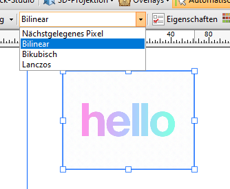
 I agree with @earl_grey. Affinity doesn't allow for sufficient control over layer sampling algorithm nor (anti-)aliasing control. These issues are the source for recurring issues and requests over the years since Affinity was first released. As an example of how this may be implemented, compare with PhotoLine and Krita: In PhotoLine the layer properties allow the user to easily control: the anti-aliasing (on or off) the resampling algorithm when a layer is scaled (also used when layers are exported) pixel snapping ...for each individual layer(!). The resampling method is set for bitmap layers only (for obvious reasons). And additional resampling algorithms are available that help retain crispness of scaled-down art (CatmulRom). In Krita: Again the resampling algorithm is easily controlled. And again transformation of the OP's example results in a straight transformed pixel row. Simple and effective. It'd be great if the Affinity devs would afford Affinity users the same level of control over the resampling method. That said, I am happy to see that we now have access to a Force Off anti-aliasing option for layers in Affinity. But that behaviour should be consistently implemented throughout other actions, such as transformation. When I transform pixels like the OP's example and stretch a column of pixels in Krita and PhotoLine, the result will be a simple repetition of those pixels when stretched horizontally. (In PhotoLine anti-aliasing is best turned off to prevent anti-aliased edges.) But that doesn't happen in Affinity. It still adds strongly blurred anti-aliasing and results in that strange blurred result. That makes it almost impossible to use for scaling pixel art elements or even stretching bitmap-based GUI elements. Which once more is a good example of "close, but no cigar". I've checked tutorials online, and the vague blurred edges are apparent in images like the one here: https://www.digitalcameraworld.com/tutorials/create-a-head-turning-pixel-stretch-effect-in-the-budget-friendly-affinity-photo Notice how the band of stretched pixels blurs toward the edges. Unless I am missing something here? Does an option exist to avoid this unwanted behaviour in Affinity (Photo)?
- 5 replies
-
- 2
-

-
- 2.3
- affinity photo
- (and 5 more)
-
 Hi, I know there was already a topic like this. But always, when I try to resize pixel art or old graphics (low resolution), it always destroys my work and creates blurred edges. Affinity Photo has a tool named Pixel Tool, and in Serif 2.3, they added a pixel grid. And I think Affinity can be good software for editing pixel art graphics, but having the ability to change interpolation during resizing would significantly enhance its capabilities in this regard. I do not want to rescale the whole document, I want to rescale one or two elements in the document. Like Draw Plus 😎 (bugged version with immutable german language as default): or like Gimp:
- 5 replies
-
- 1
-
-
- 2.3
- affinity photo
- (and 5 more)
-
Edit: I just hid a wall of text above (still there, but people would have to click it), as was not very on-topic; mostly I was talking about some nice things/tricks/uses I found in Inkscape, replying to Debraspicher about the matter. My usual take can come as weird, but I got these (bad?) habits of working with any number of tools in a project while in the game jobs. In the morning I'd be constantly switching between Max, Maya, the UV mapping tool, and like 2 or 3 worse than pre-alpha tools (now... those redefined for me the concept of "fest of bugs", geez. But I got used to it) coded by our programmers to integrate stuff in the engine, or engine editors, etc, and maybe in the afternoons, evening, night(some times till crazy hours) PS for the textures while alt tabbing with a 3D painting tool, pixel art for a mobile version, etc... So, in the end, I see it just as a bunch of pixels, vectors, or polygons that I move around, like in a cheapo tour around Europe. Caring only about the final result. One of the reasons I don't worry much about the Canva thing. I fully understand the small business owner with employees. But I would like to think that even in that case, you could do as I've seen done at some companies I've worked at. They would even lock down (to any exterior contact ) machines with an OS 20 years old, and similarly old software, to ensure the workflows were kept intact, and to avoid new investments in software (back in the day software was a lot more expensive, they would have paid Affinity's licenses yearly, and very happily). They could do that with 2.4 or 2.5 (or etc), if the worst happens (while I don't think it will). Even the more pessimistic assume that a v3 would happen, that's maybe some time ahead of updates and "normal" use. After that, the (small companies') teams with employees could do that "conservative" approach that I mention. I dunno, in my experience, things needed for the job in 2D, DTP, etc, are usually the same for almost decades. Hence why many people and companies could just stick to CS6 and even earlier, for so long.
-
 Pixel selections on artboards is broken in general. If you have multiple art boards you will encounter even more problems. All of these are part of an overall general problem of Art boards. There are many tools that just don't work correctly because they assume you are working in a document and don't properly set the bounds to the Art Board. I really wish Affinity would make it a high priority to fix as it would solve many other related issues.
 -
Agreed in everything, so, not much to discuss Although, I am afraid that a lot of younger artists (reading gazillions of posts and comments everywhere about AI and art) are feeling a lot of struggle (I was not expecting so much impact in their mood, honestly), not having certain "psychological defenses" and experience (both of which come with age) to avoid 'panicking', and I can't really tell them much to change their mood. And, crazy as it sounds, I have found some in severe depression due to this (or so they say...but some things are clear symptoms) ... I can say some inspiring words, but in those cases I tell them to go to therapy, ASAP. As, obviously, they have additional problems. Even having to learn an entire new job profile and in a drastically different field (I've done it so many times already, lol) ...even in such context, that should never happen, not solely for that reason, at least. But definitely, the whole situation doesn't help. BTW, I see it more complicated that AI would replace graphic designers (and developers). We've been always using tools to apply our composition, color and etc (serving to function, all that puzzle) in the most productive and smartest way, yet keeping a coherence and style; this seems like another iteration. But illustration (honestly, I identify more with this field even if I have worked a lot more as a designer at companies) would be more wrecked. I've seen several writers -even some that dealt with me in the past- that are now generating their book cover illustrations "for free". Less so with interior pages illustrations, as for now, iterations with a same character, many poses, really varied yet keeping the character through all the story, adding subtle personality details... (heck, even a same environment/building in different angles) this is a bit of a struggle yet with AI (for now). Mostly due to the seed mechanism and that it can't really "understand" what it is doing (again, for now. With AGI, we'd see). That and copyright/regulation/etc. But I am seeing already a percentage of "replacement". It's never going to be a 100%, I agree on that. And all that of "people need people", etc. But I am seeing already a lot of newbies and pros moving to other job fields. Through the years, I've always been "switching". From doing 3D, illustration, game art (and in there, everything from pixel art, to low pol to sculpting, UI art...), web design, graphic design, teaching or web coding. Depending on opportunities (long ago, but I've even worked in tech support, lol), or on if the thing dries up a bit in this or that, or etc. So it's not a drastic change. But... in artwork the things are more severe. In digital painting, as... traditional is even stronger, now! Time to go back to my oils 😅. I will check that new tool now. Surprisingly, I had not even heard about it. I use Substance 3D Painter less now, as I have been focusing mostly on 2D. 3D for game miniatures, 3D printed, if anything (isolated gigs that don't require texturing). Looking at that site right now, it looks interesting. Specially for those producing an indy game (or for triple A studios), as it seems to focus a lot in automation, procedural stuff... and with the number of assets even an indie game needs today, it looks convenient.
-
 I have no clue why MBHP exists. Users in general face 3 issues and need better support from Affinity apps: Avoid mis-alignment happens in the beginning Detect if mis-alignment has occurred (unintentionally, often unnoticed until orbits too late) Correct mis-alignment if possible. FPA helps to a certain degree. MBHP is superfluous if Affinity would offer 1/2 pixel alignments as new option. of course, other functions are required, too: a pure pixel art mode. Rejects any operation leading to misalignment, or gives a warning / approval request support to pixel art resize and rasterize for layers within a document (not the document with all layers) support to create pixel art lines (e.g. resample mode like nearest neighbor per layer setting) Merge down including resample of lower
 -
BTW - please forgive the double post in the thread here - but I want to also be constructive vs my earlier one on worry of subscriptions, etc. A feature from the "Serif" days - Draw Plus - the "Auto-Trace" which flattens an image like poster paint but a lot more wiggle room and makes them vectors that can be then used and modified in other software AND dropped into some HTML website construction engines like Xara! It's an imitator of the now dead (thanks Adobe...) Macromedia Flash's "Vector Trace" and even ancient ware it runs like greased lightning on modern Gigabytes, Gigahertz computers. Here's an example - Again this I WILL pay for - not subscription but UPGRADE package part of when you do V3. Make the $ a sane level and add features and I'll pay. Suggestions - for V3 what I'd pay to upgrade to and I'd even pay better part of US$100 for. (I'm current in Affinity now) 1 - well this - I want "Vector Trace" back - it was formerly in Draw Plus which is the predecessor of Affinity Designer - make sure to add tons of new sliders and options and to keep all the old vector formats to import and export! 2 - Full use of Photoshop Brushes and Filters 3 - Improved LUT construction and preview - via Humble Bundle I have tons of LUTs but it's tedious to just guess and load/undo this should be simple, IMO anyways. 4 - expand the filters section with perhaps allowing others to make (and sell?) 3rd party filter sets? 5 - Pixel Canvas - to work with the neo-pixel/retro arcade people - so you can edit pixel and sprite sheets even low resolution but it will adapt to it and pull it up full screen and allow modern images to be converted into them. 6 - Easier to lock objects - I've recently played with making Kaleidescope things in Designer - a bit tricky to set up but fun - what if you could lock shapes automatically in various ways to insert inside even if randomly across the board and change it? Maybe you can already, I'm learning there... 7 - - OBJ and other major 3D object direct unwrapping and support - perhaps some easy guide like I'll try to put a tatoo on a Poser figure but it's either ballooned or microscopic come render so a stretch or image ref layer? Again - keep your edge by NO AI - but consider an ethical AI module you subscribe to - that's a subscription I'd consider. But full privacy, NO censorship, you can have it work with your own LoRa's (Ai training modules) and other major formats. Keep it "Ethical" and the public domain + art gulags we'd get anything anyone would care about the whiners are really overrated. And 100% opt in to respect a lot of luddites I've sent this way due to No AI so make sure the language is 100% spelled out, anything full Opt-in, etc. Not demanding all of it but #1 is most important and 1-3 I'd welcome highly.
-
 Another hour wasted with this annoying behaviour. 100x100 art boards but can't get the slices to align, slices only can move by one pixel (good this is how things like artboard should move), I cannot by direct input get the slice origin to 0/0. Ohhhhhh the artboards aren't on a pixel boundary when the penny drops. I had I now realise used Align horizontally / Space horizontally and that had misaligned the art boards. An artboard never need to be off the pixel boundary no matter what you do. They are 0/0 origin spaces with their own local coordinate system so never should be sub-pixel. As you say they are independant canvases it like starting a new document at 0.25/-0.32. So Align horizontally / Space horizontally on Art boards should normalise then to the nearest whole pixel, please. To fix, I had move Force pixel alignment on as always and Move by whole pixels off as always. But they still went to sub-pixels so Force pixel alignment is flaky and took several moves and checks to make sure the artboards were finally on a pixel boundary.
 -
 The use case is still pixel perfect design, I know it could sound strange but sometimes you have to deal with non pixel perfect alignment too... If you set Force Pixel Alignment for new assets, you could need MBWP off to fix optical alignment or find a different anti-alias rendering for stuff which is off-grid by design. This is the case o certain fonts and logos, whereas pixel perfect is not possible and a trade off is needed. By Pixel Perfect design I do not mean pixel art, but mainly UI design for OEM.
 -
 I think i found something today I tried to make the first time pixel art in Affinity Designer and found out da my pixels not synced with the the grid or pixel grid. I was setting up the grid to 1 pixel but this wasn't helping much pixels stayed off the grid
-
Lower Resolution when Rasterize a Layer.
SrPx replied to Halex's topic in Affinity on Desktop Questions (macOS and Windows)
But... why the need of rasterizing so often? Usually it its better to keep working without doing it even once (Affinity treats things like Photoshop's Smart Objects, but it lets you work with a bit more flexibility than PS), specially if you are going to do many layer transforms, rotates, etc. I would rasterize if I am only going to solely paint with a brush for the rest of the project... and even so... I might not have a need to rasterize. Indeed, I mostly rasterize as a fast way to flatten a complex group of layers...if anything. The video has quite some compression (the menu options can't almost be read), so, it is difficult to see if there's clearly less resolution or not... but one old problem (I would recommend you to work with the latest 2.4 of all Affinity apps, indeed... they are very solid now, and much better, in my opinion, than 1.x) is that the internal engine does a lot of "viewing" optimization, to allow you to work fast. For a painter, this is not always an advantage, so, if you want to really be sure about if resolution is lost, or if some blur is happening, but all happening "virtually" (not in the real pixels that get saved to disk), to check that I would do an export to a TIFF, PSD or PNG, with resampling on and with a good method: Lanczos 3 separable or non separable. One is a bit too sharp, and the other method is a bit too soft... so, depends on your type of project (I tend to prefer the soft, and then do my own sharpening externally), to chose one or another. Then look at the exported files in an external viewer like Irfanview or XnView (both have free versions), as those don't have a view optimization engine... but disabling (at least in Irfanview) "resampling" in zooming and fit (top menu, under View/Display Options) as that can be doing a similar thing, maybe not convenient if you want to see the pure pixels. For line work, line art, though, like that shown in the video, I would recommend you to a) work in vectors (Affinity Designer), which eliminates this issue or, b) if like me you prefer Photo for drawing and painting, then for line art like this you might want to work at very high resolution (much higher than in the video), and then reduce the size only when needing a final export. This would let you work without any worries about blur or detail lost. Provided you make all transforms and everything while at high resolution, the reduction being only the previous step to export the final thing. And even so, I'd keep my rule (had it with Photoshop, also) of doing the fewer operations possible that would degrade the image quality. Llike multiple scaling, etc, specially AFTER rasterizing. Indeed, the multiple, constant scaling, rotation and etc in Affinity can be lossless in a way , due to how Affinity treats it as a smart object, but... I might be wrong.. the moment you rasterize, you are doing it the "photoshop way" (when it is not a smart object). Then it stops being a lossless procedure. And just like with any "lossy" operation, you are degrading the image quality each time. So, do not constantly hit the rasterize button (in my opinion). Keep it for only a really needed operation (which is in rare occasions). And I might be wrong, but what Tomasso is saying sounds very accurate to me. Having forced pixel align on also allowed me to see better "the pixel". When you then move layers, the movement is slightly different, but perfectly fine for this use case, IMO. If I am totally wrong, anyone, please do jump in... -
Never said that. I really think these are not tools for professionals for simple reason that are very limited to what you can do with it. For simple thing - simple tool. Let me ask you then - do you think every single visual job for these companies is made using Canva? Of course its good enough to slap photo with text on Instagram for ANY company. They are not making packaging or visualization in Canva. Its funny how you are going against what Canva itself stated. Maybe go to them end explain them how they are wrong according to you. @SrPx I understand you completely. Whats more I have a son in therapy now so my understanding of the issue is even deeper. I was raised in country (and times) where therapy was not an option. Not sure if it was better or worse - I just react differently to all that news. Also I am older so I have benefit of experience and perspective on things. I have seen many other "ends of the world", "nothing is going to be the same" etc. Certainly this is new and if anything gets me "depressed" is fact that people are so easy to manipulate, so quick to believe things without giving it a thought. Mantra now is "AI will dominate soon". And like I said - that magical "5 years" after which AI will dominate stays 5 years. No matter that two of these years has passed and really and truly not much has changed. AI was very quick to develop in the beginning and then seems like it reached plateau. But hype is still going strong, "nothing will be ever the same again" and "you will see in 5 years", blablabla. And if you are not buying into the hype - of course you are being ridiculed as "luddite" AI is just called that but it doesnt think. It has no idea about composition, colors, light, perspective... It doesnt know that if cable reaches one side of something should go out on the other side etc. It has no concept of making anything historically accurate because it is just mashing pictures together and if it was tagged "Roman helmet" it will use it even if its not. All it does is just copying and mashing iterations together. Sometimes better, sometimes worse. Its really far far away from replacing people for something more demanding. As all AI is - nobody solved main problem with it - hallucinations (I love how they are trying hard to anthropomorphize simple software error ) . Some AI tools would be nice to see, why not. I dont mind that automatic fill for pictures. Its like better content aware. Bring it on. Or automatic bitmap tracing powered by some "AI". Bring it too. Just dont bloat everything with some absurd AI toys like "automatic smile detection" or something. Can you replace SOME jobs with it? Sure. But how the heck moving to different field will solve anything? Arent we told that AI will replace nearly everybody everywhere? Unless they are moving from being to designer to being a plumber I dont see how it makes sense. Just because we have image spitters now people change their life plan? I dont know man, it all seems so silly. I guess I will stay that "luddite who will be replaced in 5 years" for couple more years Ha! You will be surprised how many similarities is between us I am also more into 3D sculpt that does not require texture, also for table top games, miniatures. Youre in Spain I see? So many fantastic miniature painters are from Spain. Mexico here although I am Polish so.. its a long story hahaha. Anyways, yeah I was also doing this or that - recently revived love for retro and pixel art. And who knows, maybe I will go more retro and get that oil painting going. I did few murals in my time. You cant paint a real wall in real world with AI. You can only pretend you did. Pretty much like everything with AI - you can pretend it was you who created it, pretend it is actually thinking... Its a pretending tool Saludos!
-
 Hi, I would like to export a collage I made in publisher with the pixels, as it is displayed in the program. (see sreenshot 1). But when I export the image, the pixels turn blurry. (screenshot 2) How can I adjust the export settings to prevent that? I think this article describes my problem (but for photoshop). https://www.hipsthetic.com/enlarge-pixel-art-without-blurring-in-photoshop/?expand_article=1 Thank you so much in advance!!
-
 Below is my list of written tutorials I have done over the years. The first few were done using early versions of Affinity programs but they should still be ok. Some menus may have changed or tools look different but the basics are the same. Also most are for Affinity Photo, but some could be done in Designer. Plus the "Beginners Look at Affinity Photo" ones will pretty much be the same in Affinity Designer and Publisher as all 3 programs have same basic functions. PhotoPlus and Affinity Photo – make a fake Starry Sky background https://www.dropbox.com/s/3la5z4amc11wcgx/starry-Sky-PhotoPlus_and_Affinity_Photo.pdf?dl=0 Affinity Photo – Silk Embroidery Effect https://www.dropbox.com/s/9h4mpso7i77z1oq/Affinity%20Photo%20-%20Silk%20Embroidery%20Effect.pdf?dl=0 Affinity Photo – Silk Embroidery Effect V2 https://www.dropbox.com/s/6usbza25vidgmck/Embroidery%20Tutorial%20v2.pdf?dl=0 Affinity Photo – Vintage Cabinet Frames https://www.dropbox.com/s/bj2dsmwmy0juazk/cabinet-frames.pdf?dl=0 Affinity Photo – Fake Evening Sky with Rain and Lightening https://www.dropbox.com/s/mlcdnducotitp1d/Fake_Evening_-_Lightning_-_Rain_-_Affinity_Photo.pdf?dl=0 Affinity Photo - Art Projects Shows 2 ways to make a blank canvas on an easel have what might be a painted image on it, from a photograph. https://www.dropbox.com/s/8fx18c77t2dnulb/Art-Projects-sept2018.pdf?dl=0 Infrared V2 – Affinity Photo 3 ways to make fake Infrared images I Needed a project to use in the Affinity Publisher beta, so I thought I’d update an old Serif PhotoPlus tutorial to an Affinity Photo tutorial. It basically shows 3 methods to get Infrared style images. https://www.dropbox.com/s/0c0mgqfrbrdv4q5/Affinity%20Tutorial%20-%20Infrared-v2.pdf?dl=0 Affinity Photo – Convert German Video – Film Strip Image in 3 parts pt 1 https://www.dropbox.com/s/iewleyt95a8qhdk/Photo_Film_Strip_-_German_Tutorial_pt1.pdf?dl=0 pt 2 https://www.dropbox.com/s/2j35gkvxr9emcq6/Photo_Film_Strip_-_German_Tutorial_pt2.pdf?dl=0 pt 3 https://www.dropbox.com/s/6yvxubgne0kqct4/Photo_Film_Strip_-_German_Tutorial_pt3.pdf?dl=0 Affinity Photo – False Water and Reflection https://www.dropbox.com/s/4sm0qqikvp0hs0a/affinity-photo-false_water_and_reflection.pdf?dl=0 Affinity Photo – Chinese Painting Styles in 2 parts pt 1 https://www.dropbox.com/s/uvqn9hf9mo2xwbr/Chinese_Painting_-Pt_01-_affinity-photo.pdf?dl=0 pt 2 https://www.dropbox.com/s/6ovc317ncjjosd0/Chinese_Painting_-Pt_02-_affinity-photo.pdf?dl=0 Affinity Photo – Beginners Look at Layer Masks https://www.dropbox.com/s/c0lsf9e7kdymdyd/A-Photo-%20Beginners%20Look%20At%20Layer%20Masks.pdf?dl=0 Activ8 issue 1 – Better Cloning https://www.dropbox.com/s/a1d283mn7icltzc/ACTIV8-issue1-BetterCloning.pdf?dl=0 Activ8 issue 2 – Spheres https://www.dropbox.com/s/igufcf3unu4z84b/ACTIV8-issue2-spheres.pdf?dl=0 Activ8 issue 3 – Affinity Photo - Select Tree - Replace Sky – 2 ways https://www.dropbox.com/s/lx0ko7f2xjqsg3r/ACTIV8-issue3-replacesky.pdf?dl=0 Activ8 issue 4 – Tri-Fold Image https://www.dropbox.com/s/1iyp59mr3bzjlri/ACTIV8-issue4-TriFold-image.pdf?dl=0 Activ8 issue 5 – Emboss With Lighting https://www.dropbox.com/s/t5r6tiz3c7k7o1s/ACTIV8-issue5-emboss-with-light.pdf?dl=0 Activ8 issue 6 – 3D Text https://www.dropbox.com/s/gif1x6xrtfrp2z8/ACTIV8-issue6-Three-D-Text.pdf?dl=0 Activ8 issue 7 -Affinity Photo, Designer and Publisher – A look at Styles This written tutorial, mainly aimed at beginners of any of the Affinity Software made for PC and Mac. It may work the same on iPad version but I don’t own one so can’t confirm that it will. It looks at what Styles are, how to make some Gradient Styles and some Styles made from images. Then how to Export and Import your newly made Styles. After that I do a basic overview of a couple of video tutorials I have made in the past. Using the Mirror Filter and the Equation filter to make new images, to then make Styles from. Lastly, another overview of a recent video tutorial, which looks at using the Vector Crop Tool in Affinity Designer to grab sections of an image to then make Styles from. The end of this PDF tutorial has interactive links to all the video tutorials and links to the downloads of all the Styles I have made in these video and written tutorials. https://www.dropbox.com/s/82szaatnflaw8fk/ACTIV8-issue7-Styles.pdf?dl=0 Activ8 issue 8 – Affinity Photo – Make Sketch Image With Just The Channel Mixer A while ago I made an Affinity Photo video tutorial about making a sketch image just using the Channel Mixer adjustment. I thought I’d up-date it slightly in this written tutorial, which can be done in Affinity Photo, Designer or Publisher. https://www.dropbox.com/s/6etmt3am6ljprwn/ACTIV8-issue7-ChannelMixer-Sketch.pdf?dl=0 Activ8 issue 8a – Affinity Software – 4 Creative yet simple ways to use Blend Modes This is a written tutorial update of a video tutorial I did in Feb 2018. They are fairly basic edits and will work best with an image that has a white background. So, I will use one I got from Pixabay, as are the other images used. Links to the video and image are in the written tutorial. The video was done in Affinity Photo but this will be done in Affinity Designer but I see no reason why it can’t also be done in Publisher. https://www.dropbox.com/s/sluebvjl86nuk8e/ACTIV8-issue8-Four-Uses-for-Blend-Modes.pdf?dl=0 Activ8 issue 9 – A Beginners Look At Affinity Photo part 1 Looking at opening images and saving your edits. Plus, file formats also a look at the Layers Panel and Colour selection Although tutorial is for Affinity Photo all will work pretty much the same in Affinity Designer And Publisher https://www.dropbox.com/s/7ztaxn4siom7evd/ACTIV8-issue9-Beginners%20Look%20at%20Affinity%20Photo%20pt01.pdf?dl=0 Activ8 issue 10 – A Beginners Look At Affinity Photo part 2 Looking at opening and setting up a new document other than an image. The Brush Tool and changing the Brush Tips. Then looking at the different types of Pixel and Vector layers you can make. Layer Masks and their use. Plus, a quick look at Text and Shape layers and the Glyph Browser. As with part 1, most (if not all) of the information in this tutorial will work just as well in Affinity Designer and Publisher as all 3 programs are so similar. https://www.dropbox.com/s/kourodnfojwq26l/ACTIV8-issue10-Beginners%20Look%20at%20Affinity%20Photo-pt02.pdf?dl=0
 -
 @NotMyFault Thanks for this tutorial. I have a few questions and would appreciate some guidance. I don't normally create small UI elements or icons in Photo (v.2.4.0 at present). I wasn't sure if your tutorial was aimed primarily at that type of work, or was also appropriate for general work. I occasionally use a grid, but not that often (usually only when constructing things that I want to be quite accurate). Most of my AfPhoto work originates with RAW camera images, but I do sometimes add vector art and lines from Designer (or using the pen tool in AP) and do some compositing, often with imported images or new pixel layers, etc. I don't want to introduce blurriness or softness unintentionally. Also, I want to avoid clear areas along edges of images when exporting. For general use... 1. Would you still advise setting the Pixel Decimal Places for Unit Types to a high value like "6" in Preferences for this type of work? 2. Should Force Pixel Alignment be left on most or all of the time? 3. Should Move by Whole Pixels normally be disabled? 4. What about Snapping options? Should snap to grid only be enabled when absolutely needed? Any other guidance is also welcome. Thanks!
 -
At last! A comprehensive linocut tool kit for Affinity Designer! SAVE 20% WITH OFFER CODE 'ADLC24' >>GET IT NOW<< Love the linocut look but don’t have the equipment or space to do it justice in reality? This comprehensive tool kit contains everything you need to have a go virtually! It gives you a range of options from intricate brushes to fast and effective patterns and edges so you can create super-convincing digital linocut illustrations and woodcut art. The pack contains elements generated using real ink and linocut textures to ensure your artwork looks authentic every time. We got messy so you don’t have to! Grab the pack and start creating realistic looking linocuts and woodcuts today! Here’s everything featured in this all-inclusive linocut toolkit: Linocut Brushes: Create a huge range of realistic looking marks including; undulating lines, arrows, tapers, rounded, square and slanted ends and more – this pack has everything! Pefect for creating linocut and woodcut art. For use in the Designer Persona. Seamless Patterns Styles: Use these as a handy shortcut and fill large areas quickly and easily. The designs offer a huge variety and include a solid ink texture. Printed Ink Edge Stamp Brushes: Add an extra level of realism to your design with these border brushes. Sourced from real inked edges. For use in the Pixel Persona. 8 Ink Background Textures: High resolution, authentic ink textures. These are the perfect base for your design. The sizes of these vary but most are around 5000 x 3500 px. Supplied in Tiff format. A Quick Reference File: Use this PDF guide to navigate the pack contents quickly and easily. An Example File: The bug image – learn how I created the composition by backwards engineering it. Instructions: A very thorough guide on how to use the pack is included. This includes a section on how to create a design from start to finish. SAVE 20% WITH OFFER CODE 'ADLC24' >>GET IT NOW<<
-
- 1
-
-
- resources
- affinity designer
- (and 4 more)
-
 Hey, I must say I do really like where the software is going and I think its pretty close to make the switch from photoshop but there are definitely some major pain points left. Huge improvement from A1 however. --------------------------------------------------------------------------------------------------------------------------------------------- 1. General Performance is not acceptable yet We tried recently making the switch from photoshop, Affinity 1 was very slow but 2 still has some big issues which lead to a lot of frustration When I copy a layer it takes a easily a second or longer for the layer to display its icon in the layer list as example on a basically empty file This is hugely disorienting since I don't know if my hotkeys work or If I did the right thing until a second after, which is very frustrating. Other things also seem to have small lags. We are on high end PCs with about the strongest single thread cpu you can buy and this is just an empty 2k image with 2 layers. I can't imagine how much worse this is going to get on a larger file. Ive had up to 3 sec waits for the image to show up. This is a big dealbreaker. --------------------------------------------------------------------------------------------------------------------------------------------- 2. Painting workflows are very inefficient and slow compared to photoshop There are 2 big differences that make Photoshop much much faster to use right now for using the paint brush and painting. We are not painters but even for us this is a massive slowdown. 2A. Color Picker is somehow not hotkeyable. Using color picker within a fraction of a second to pick a color and being ready to paint is a action you do unending times. Having to scroll over to the side with your mouse to click on the color window is very slow and adds up massively even in just a single session. I was in disbelief at first that you cannot call up the color picker. You can see how I can quickly switch colors in a second in photoshop and keep painting in comparison. In Photo, I have to swipe all the way, double click the color swatch, and manually confirm to close the menu, then swipe all the way back. This is a software to change colors of pixels on a canvas. Not having a baseline set hotkey for changing colors is very odd. This should not be an optional hotkey but baseline hotkey. Same for photshop, I don't understand the world where "crop" is more important to be on "C" than literal Colors 2B. Brushes can't be changed on hotkey? I must be mistaking some hotkey but that is completely crazy to me. Right click does nothing and I am really supposed to: - Mouse all the way over to layer panel - Switch to Brushes tab - Select the Brush I need within the drop down menu - Switch Back the layer panel Lets say we make a custom layout where the brushes are closer, but still this is a low of mouse path. We are not painters but switching a brush with right click is infinitely more efficient than this right now. Any real painter who uses brushes all day must have a massive speed downgrade from photoshop. Both of these things comebined make a completely massive difference in speed compared to photoshop. Great: I want to praise here however the amazing brush library which I find is the best affinity feature. They are high quality and photoshop is completely embarrassing itself to not provide something even close to this. --------------------------------------------------------------------------------------------------------------------------------------------- 3. Selections are very bad to work with I got extremely confused when trying to work with selections and had to give up on multiple attempts. 3.A Selections don't allow copy or cut and paste which is extremely inefficient. I don't even know how I am supposed to work with them. I just had to give up. I want to just crop a rectangular thing for this post and I literally can't figure it out. In photoshop I just select a rectangle, copy paste or cut paste to new layer, done. - Here I select a rectangle. Cut paste - Nothing. Copy paste to new layer - Nothing. - Ok lets try invert the selection to erase the other parts as a dirty workaround. Keep ing mind that the (up to 3 seconds delay, jesus) for showing my new layer icon in the layer stack make this a multitude more confusing as I don't know whats going on until the icon gives me confirmation. 3.B Also, Selections also do not support shift-adding multiple. I kept trying all hotkeys, and just couldn't figure it out. After a bit of searching I found that there is a button to add the selection. This works but is very inefficient compared to shift adding multiple. Edit: It seems you can switch the mode around, however having to click this every time is very tedious. --------------------------------------------------------------------------------------------------------------------------------------------- 4. Layer Visibility 4.A Smart Objects are hard to identify and understand Ok I tried now another cropping of a simple icon. Wow this is all confusing and unneccessary. I try to now crop it with my new found knowledge of Ctrl + Shift + I Dosnt work. Trying it multiple times, dosn't work. I get very confused. Turns out a image is not a pixel layer and can't be affected by a selection. It seems like in photoshop, if you copy paste in anything from clipboard, it is pixel, but if you drag in, it is smart object. This here seems to be some sort of smart object? However in photoshop the icon is extremely visible to be a smart object with a big icon. Here it is very understated. This should be more noticeable to not be editable. Smart objects / "Images" should not have a pixelated background if they are not pixel layered. The pixel layers also have a very noisy layer icon, which undermine all other icons. Pixel layers are the "standard" and should be lower opacity. Non standard layer types should stand out compared to the pixel layer, right now it all blends together making it hard to read. 4B. Layer Visibility Toggle Please switch visibility icons on layers to the left like in photoshop if possible. This is important to click and are being clicked many many times. Having the icon be all the way on the right adds to around 25% more mouse movement relative to the screen, really messes with photoshop muscle memory, and seeing the layer type icons is far less important than the visibility. Here we have a "hide" hotkey but not a "toggle visibility" hotkey. 4C. The Layer icon is hard to see The new layer icon is hard to identity. It is very low contrast and dosn't have a "+" 4.D The layer renaming field is too big I constantly rename layers by mistake instead of clicking them. The selection area is just too large and requires too much precision to not click it by mistake. --------------------------------------------------------------------------------------------------------------------------------------------- 5. Tool Confusion As new user, trying hotkeys for known tools is very unclear which tool you are having right now in your hand. Many tools have the same cursor icon as example. Suggestion: When selecting any tool, briefly pop up for 0.5s on the top or left on your canvas the name of the selected tool with the name as on the toolbar hover, quickly informing you what you actually pressed or have in hand, idealls with the icon shown. This would be a great usability improvement and help learn the tools. Or maybe it can be next to the cursor when switching tools. However right now its very confusing to what you actually are toggling through and you constantly need to glance to left and check what actually goes on. This is only marginally better on photoshop but a long standing issue there as well, however photoshop in general has better cursor icons. Affinity also dosn't show the current brush style well. 5.B Pressing "V" toggles back to previous tool This is super confusing. In photoshop if I press V I stay on dragging. Here I suddenly go back to paint bucket or whatever. This can be very disorienting. --------------------------------------------------------------------------------------------------------------------------------------------- 6. The alt+scroll rotation needs to be optional The alt + scroll rotation of the canvas dosn't seem to have any setting or bool somewhere and this really messes with muscle memory. We all constantly rotate and its very frustrating, all people in the team keep complaining about it. There should be navigation settings. --------------------------------------------------------------------------------------------------------------------------------------------- 7. Layer Styles? Layer styles are invaluable in photoshop. Sure, doing some cheesy bevel and glows etc might be very year 2000 but that's not the point. The default examples also seem to imply this idea and seem to be neglected or deemed not important. This concept that layer styles are for cheesy word-art effects is completely misguided. Layer styles are extremely useful for tons of everyday things such as having a color overlay, or a simple glow, simple corrections. They are on double click in photoshop for a reason and widely used. It is a must to quickly be able to change the style of a layer, even if its just a color overlay or drop shadow --------------------------------------------------------------------------------------------------------------------------------------------- Conclusion: Overall the jump from 1 to 2 is very impressive and It's "almost there" but there are some very important fundamentals which still need to be sorted out. Also Serif will have to act on the new Era of AI, Photoshop content aware fill was already one of the best features but now AI inpainting will be a massive advantage if Serif is missing the AI train, these things are not going anywhere, but first the core needs to work well before luxury stuff should be worked on.
-

Inksy art brushes with drips
Dan C replied to LeaS's topic in Affinity on Desktop Questions (macOS and Windows)
Hi @LeaS, Not to worry, I've moved your thread to the correct 'Questions' section of the forums. When first launching Affinity V1, you should have been prompted if you wish to transfer your custom content from V1 to V2 - provided both apps are installed on the same device. Alternatively, within V2 you can open the My Account dialog (the 'User' icon in the top right) and sign into your Affinity ID. Once signed in you will see a list of all your compatible add-on kits, including the Inksy Street Art brushes. Installing these through the My Account dialog will make the brushes available in Affinity - though please note you will need to be in the Pixel Persona to use these in Affinity Designer. I hope this helps
-
 Perhaps for pixel, I'll go and check it out. I'm switching back and forth between Affinity and Illustrator and much prefer Affinity but the 'remember last stroke' ('new art has basic appearance' on/off in Illustrator) would be really handy and prevent me having to adjust each vector/art Brush stroke afterwards. When not using the controller for pressure; The Pencil in Affinity remembers the width profile but NOT the last used vector/art-brush type OR its properties with each new stroke. The Vector/Art-Brush in Affinity remembers the width profile and last used vector/art-brush type but NOT the individual stroke properties (where the variable width actually happens). Having the option to remember the width profile AND brush properties in the vector/art-brush.......and the same in the pencil tool (+ vector/art-brush type) would solve constantly having to adjust each stroke after the fact......and having the option to leave the last vector/art-brush stroke active (like with the pencil tool) would also be handy too (as would a sculpt option for the vector/art-brush).
 -
Yes I well know... We've been using AD since 2014... 😜 It also creates problems with slices' dimensions in Export Persona. This is a long term glitch, and could be fixed to snap back to the closest integer (if the Force Pixel Alignment is ON), but could be very demanding for CPUs maybe? I guess switching complex vector art stuff could be tricky... Today I'm accustomed to the scroll-wheel over the input field to fix if weird things happen.
-
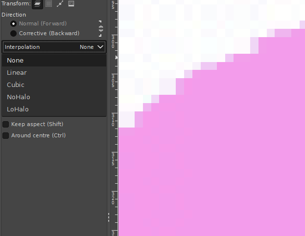
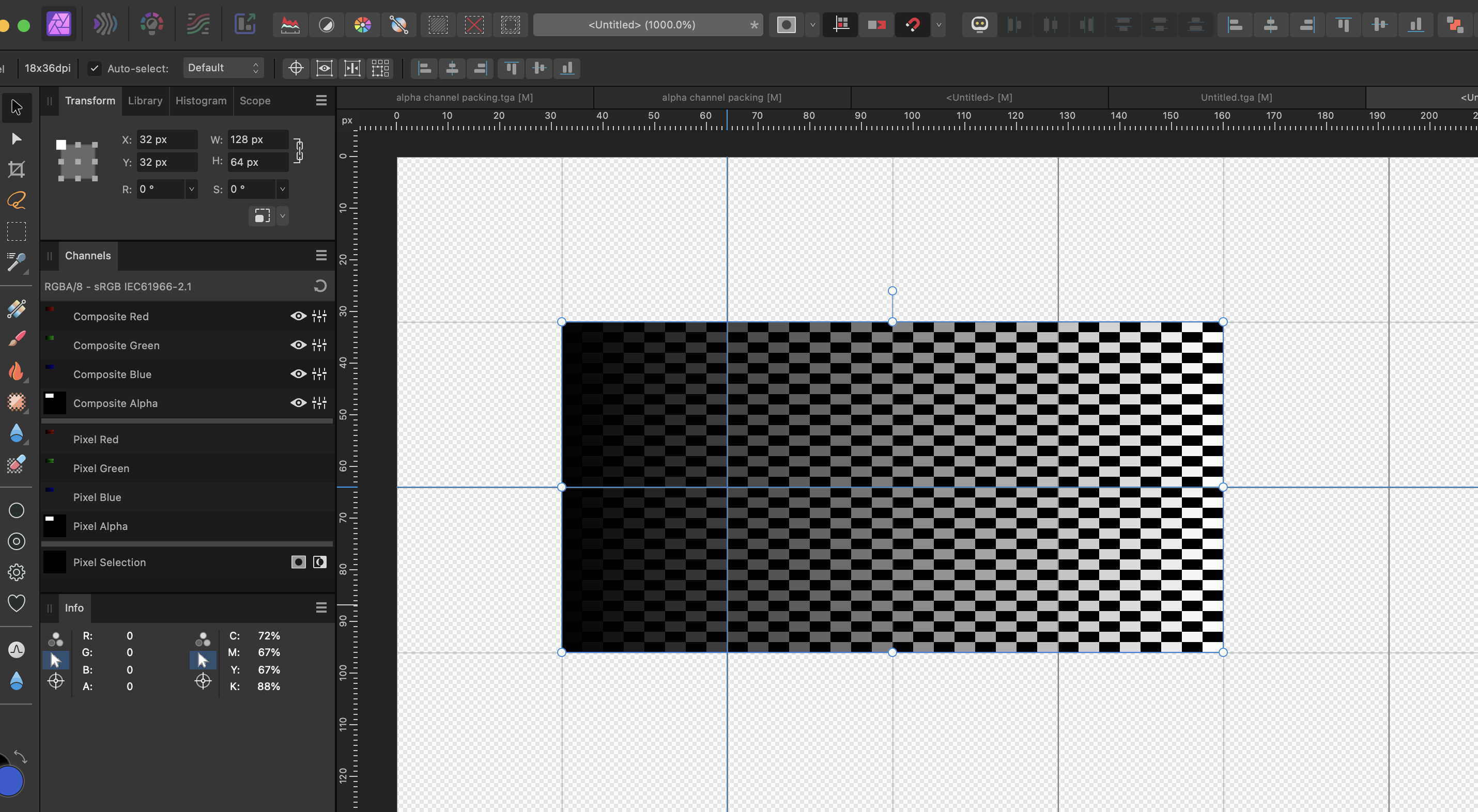
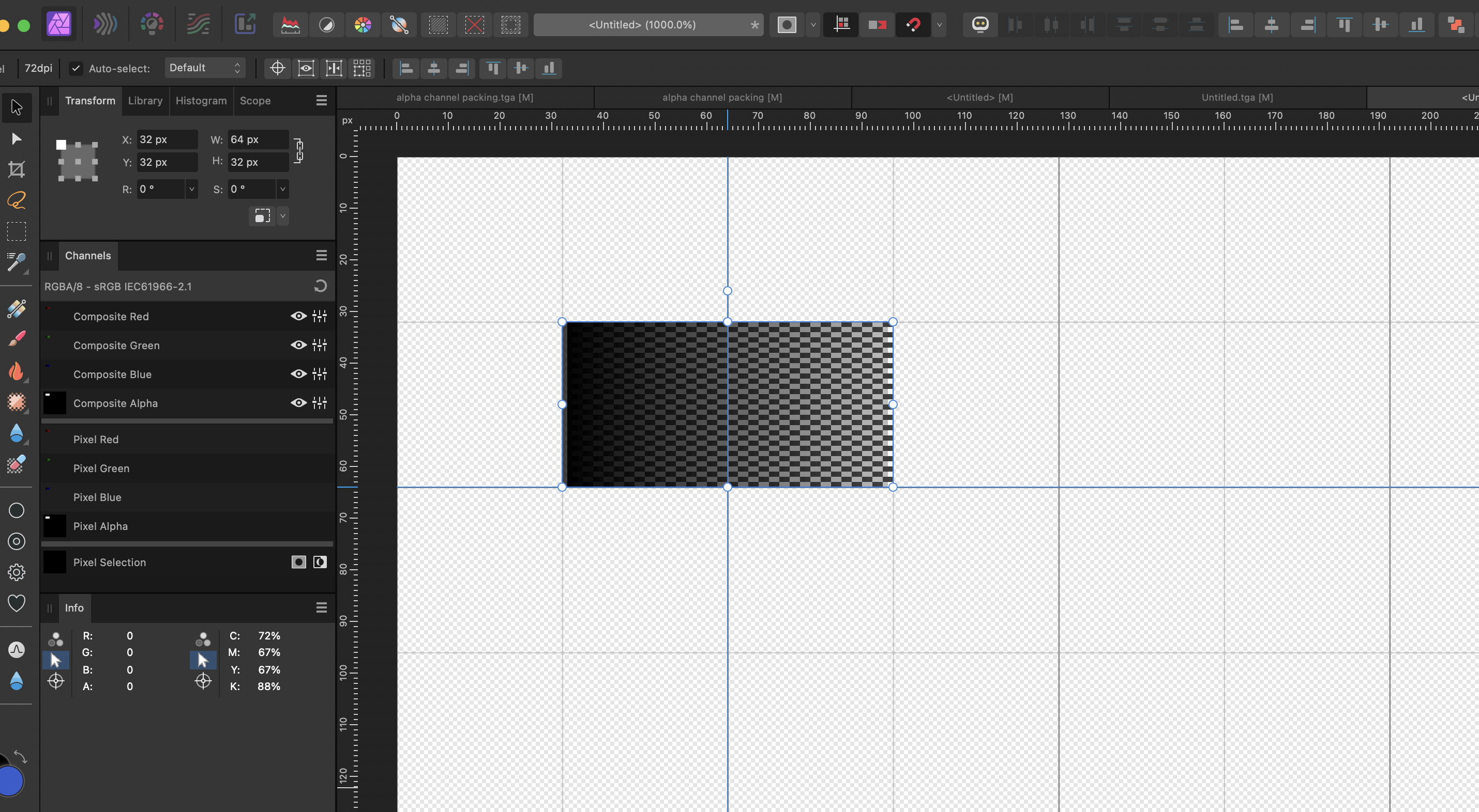
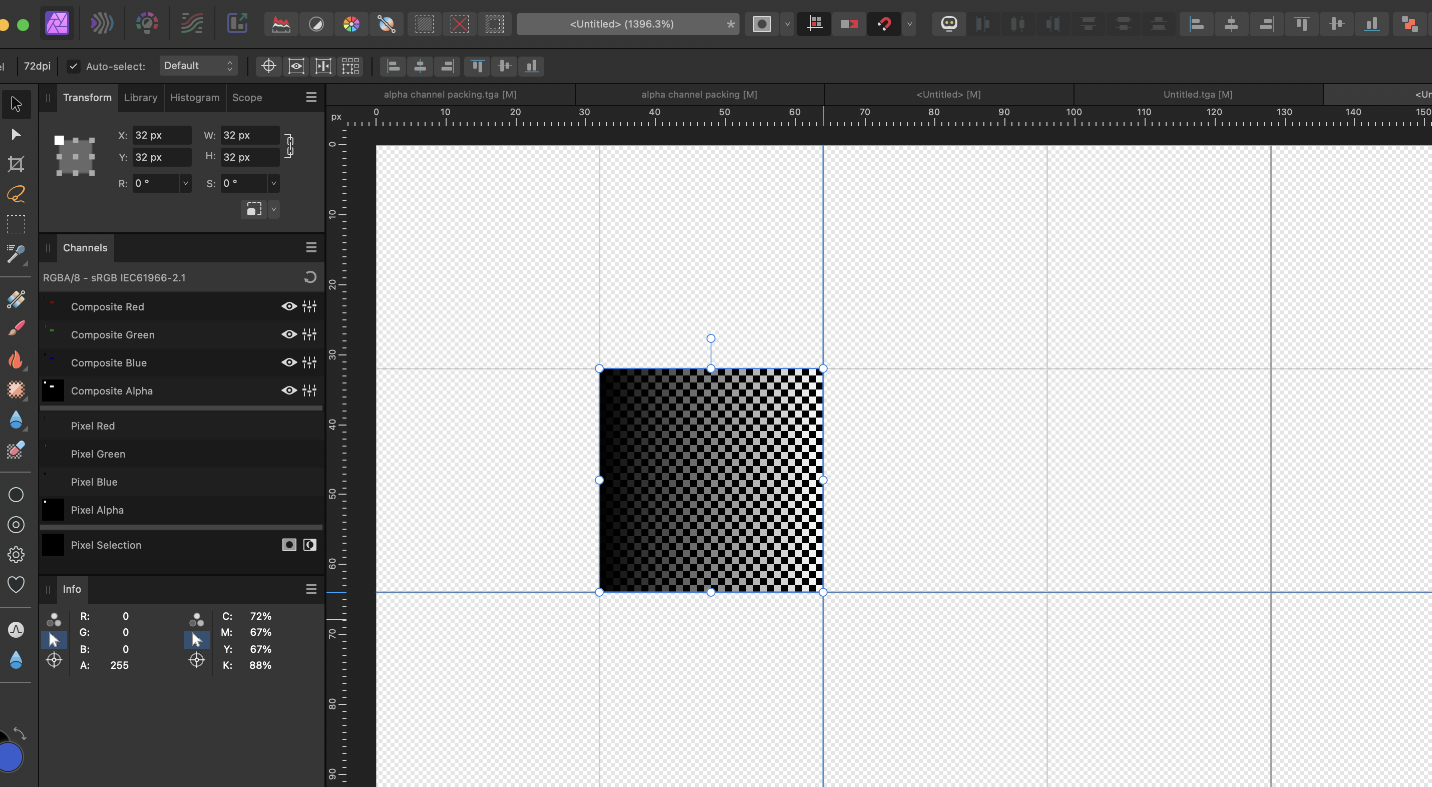
Hi, in case you want to scale a pixel layer containing pixel art, you often run into the issue of unwanted and unexpected blurriness, even if you scale by integer factors. contrast may get reduced (black becomes25% grey, white becomes 75%grey) Edge pixels become partially transparent As example, I try to scale a 32x32px layer to a 64x32px layer (x-axis factor 2, y-axis factor 1) 1. a 32x32px checkered board used as source 2. stretched to 64x32px: gets blurry, reduced contrast, including transparent edge pixels 3. You scale to double target size instead: 128x64, and rasterise 4. Then reduce again by factor 2 to target size 64x32px, and rasterise again: no blurriness This is intended as workaround until Affinity might provide a better out-of-the-box way to rescale pixel art,
-
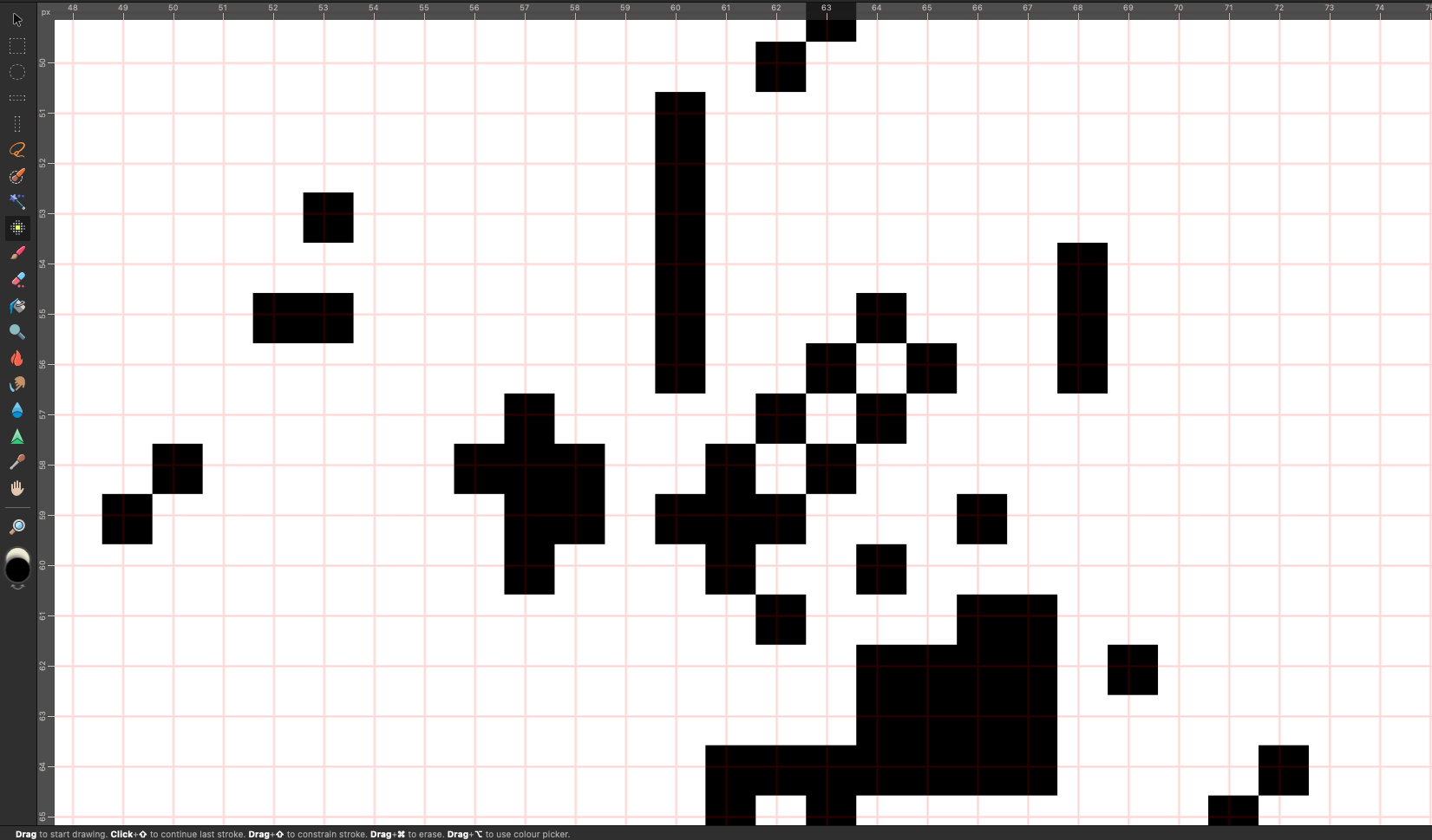
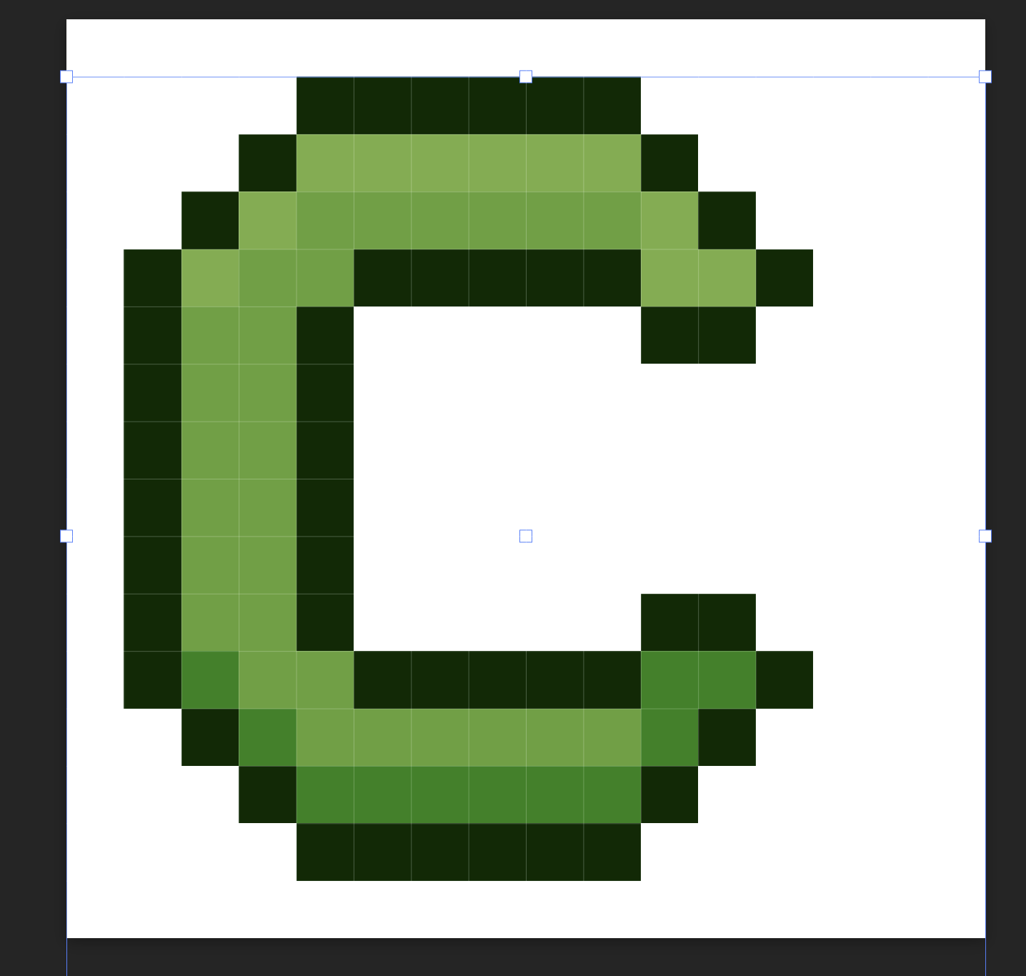
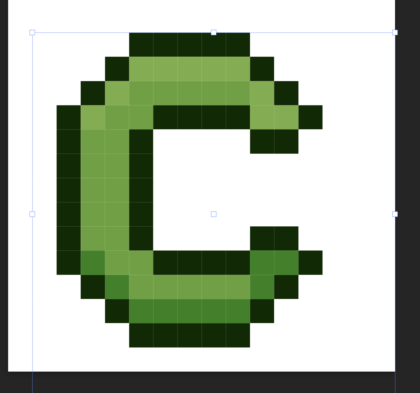
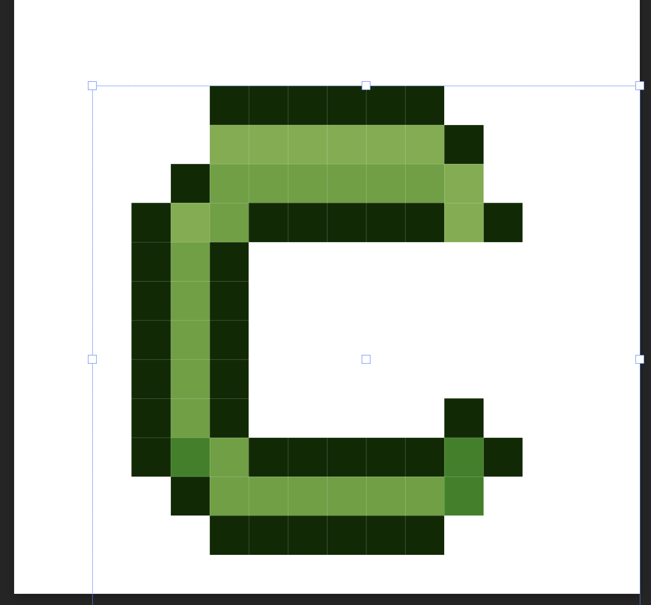
 Previously before using affinity I used a free software to create my pixel art. The software had this feature where when I scale an image it calculates and reshapes the pixels. It doesn't perfectly reshape but it does a pretty good job to retain the image. So attached, I have the letter C as an example. you will see that one is the original size and the other is scaled down. but scaling the image the software adjusts the pixels which helps me fill in the blanks. It's not perfect but it does a pretty good job. When I'm scaling my pixel art in affinity designer pixel persona, it does not adjust the pixels; rather, it just scales the image. Is there a way to get the same result as the free software i used to use? You will see in the attached image there is a picture that shows the image not respecting the pixel grid.
-
 Hello, as in the topic. I would like to upgrade Affinity to v2, but I want to make sure that I'm making a good choice. I'm usually working with pixel art (but not exclusively) and rather modify images than create something from the scratch. I purchased Affinity Photo v1 before, and I don't think it was not the best choice for pixel art. Which product would be best for me?
 -
I've noticed that AP really likes to blur graphic in numerous occasions. I work on pixel art a lot and it messes up everything. Is there any way to prevent it? I'm attaching png that was not moved or copied at all, and the one that I adjusted positioning. Notice the difference between top left sprite and bottom right. Move moving, more blurring (no size changing). Any ideas or solutions, my friends?
-
https://affinity.help/photo2ipad/en-US.lproj/pages/SizeTransform/pixelart.html The mentioned options are unavailable Before: Image upsampled 4x using Bicubic filter. Observe the jaggy edges and ringing. After: Image upsampled 4x using XBR filter. See how the edges are smoother and more refined. To resize using pixel art filters: From the Document menu, select Resize. Set the Resize option to Pixel. Choose from either HQX or XBR as the resampling method under Mode, and pick a Size multiplier from 2x, 3x or 4x.