Search the Community
Showing results for 'logo' in content posted in Share your work.
-
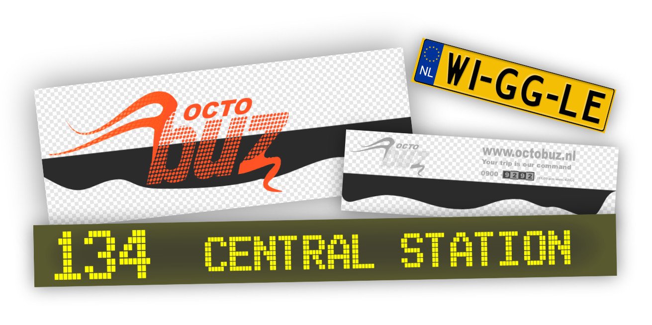
 I've completed designing, 3d modeling, surfacing/texturing and rigging a 3D City Bus for my upcoming Animation Short Film. Completely ready to animate, including rigs for the doors and to drive and steer the bus. Affinity Designer was used for all logo and texture designs. Here's a demo video
-
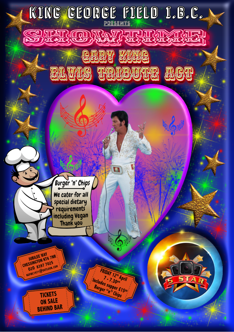
A5 flier, all done in Designer and Photo apart from the 5 star logo and Chef along with Gary's image. Colour laser printed (20 A5's for double sided Perspex table flier holders)(3 A4's for notice boards) (1 A5 emailed as an attachment to the membership)
-
I do graphic design and logo Making graphic logo.afdesign
-
If you would like to see more of my work go to my Youtube page where I linked my other socials. Let me know what you guys think and Thanks for any constructive criticism
- 1 reply
-
- 1
-

-
- youtube
- logodesign
- (and 2 more)
-
 I’ve always thought this was a particularly inspired piece of logo design:
-
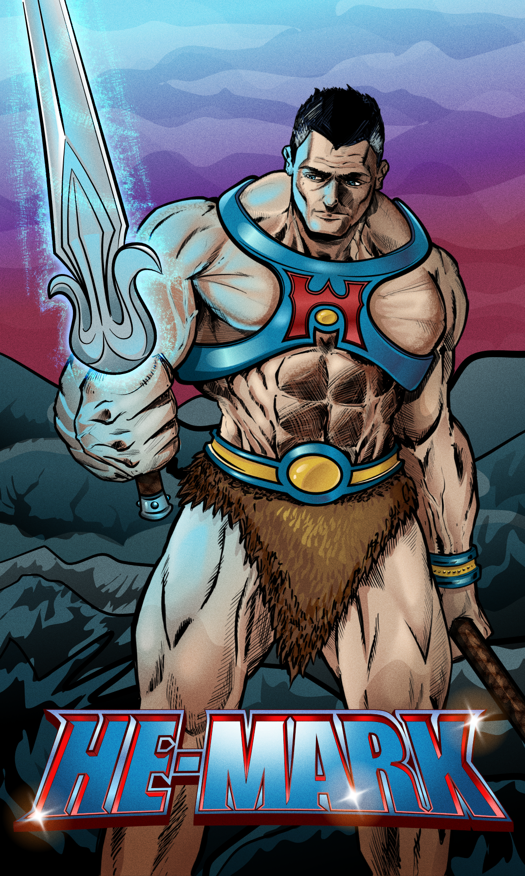
Millenia pass and with Mark as its Emperor the Viltrumite nation grows from strength to strength. With peaceful expansion now on his mind, Mark reaches out to the farthest corners of the universe, discovering new planets and lost civilizations… not all are thriving. On one new planet, darkness has taken over, and its Masters have gone. A whisper calls out to Mark as he wanders the baron land, drawn to a castle in the distance. Wedged in its mighty wooden doors is a rusty old sword. Mark reaches out to grasp the hilt of this leftover relic. A sentence screams into Marks mind… “By the power of Greyskull, I HAVE THE POWER!!” Don't know why but I felt compelled to create this! lol Initial sketch - Artflow Inks - Clip Studio (I did attempt to ink in Designer with vectors, but just wasn't happy the results) Colours and Logo created in Affinity Designer. I also used Affinity Photo do to some liquify and fix elements. It's not perfect, but I'm attempting to create more!!!
-
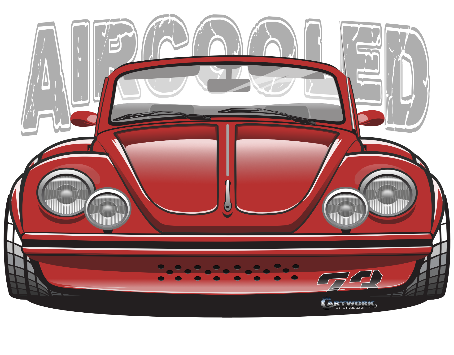
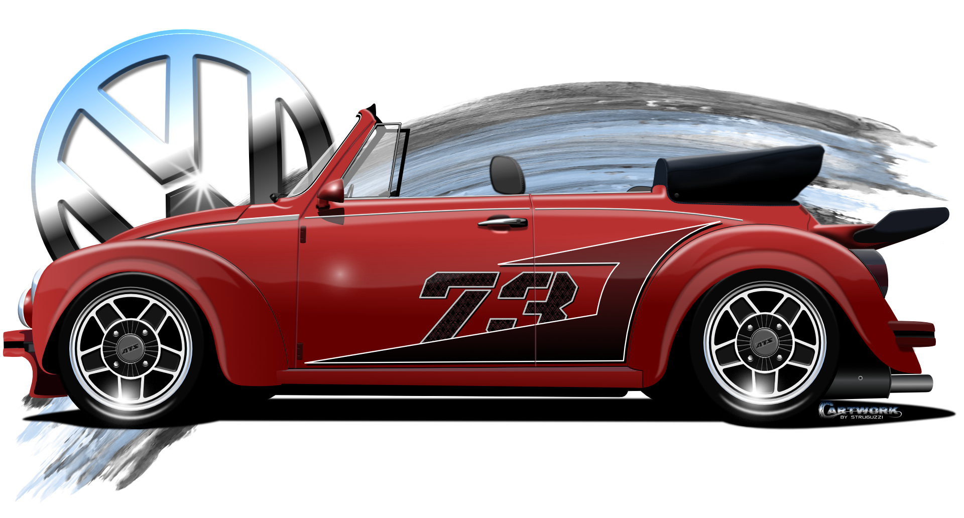
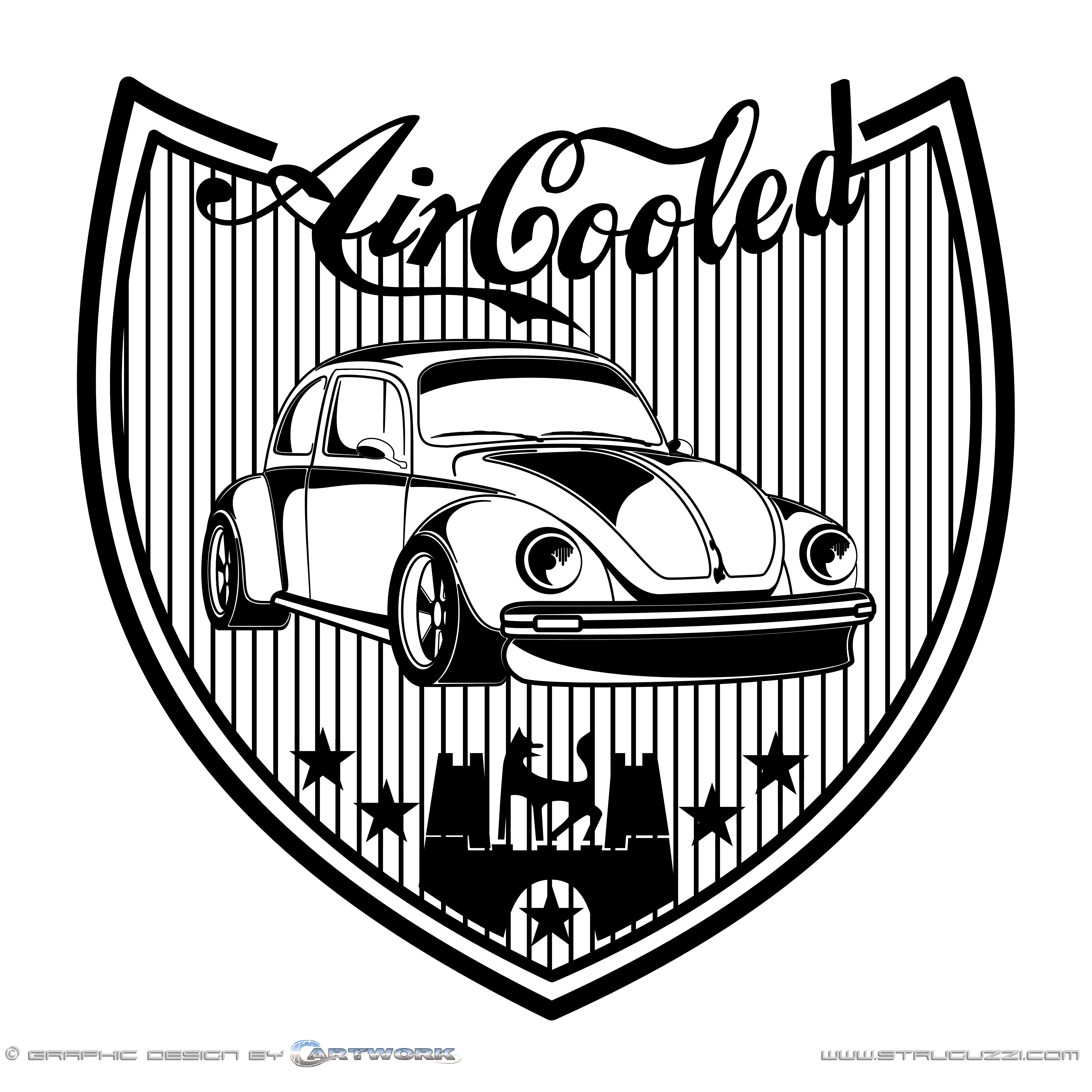
created with Affinity Designer 2 in reflection of a real VW Beetle Convertible driving around. Serves a Logo for a TShirt.
-
 . . . and yet another graphic completed with Affinity Designer
-
The cloud is the same shape, yet this is a filled white version, the original cloud is transparent, The clip art item is a logo for this project, art of its own genre, not intended as part of a font. William
-

affinity designer Diner logo and wall jukebox, designer vector
stojames posted a topic in Share your work
Wife and I went to a 50’s style diner (Bel Air) and they had a wall jukebox (brought back old memories of playing music on jukeboxes) at our booth. I took a photo of it and their logo signs. I thought I would try creating vector images of their logo and the wall jukebox. I put all the song text inside the jukebox. The letter and number keys really were not perfectly the same. The cards inside the jukebox with the song titles were in rough shape (I didn’t try to duplicate that). I then created a counter with stools and root beer floats and a neon style Diner sign to add something extra. Hope somebody likes it.
-
 Here is a new preview where I moved the Derry Sign down more so its readable, plus updated the bottom text to make it stand out more. Plus I added fog between the left and right houses, but behind the wellhouse. Plus I changed the fonts for the logo. Hope you like it
-
Inspired by an enamel sign from the 1950s to mark the 130th anniversary in 2016 of Coca-Cola Inc. In this Affinity Photo composing I used a pin up from Peter Driben (1903 - 1968) and a photographed and cropped Coke can. And the used font for the Coca-Cola word logo is Loki-Cola. Funfact: The font for the word mark Coca-Cola was never copyrighted for and by Coca-Cola Inc. The word marks Coke and Coca-Cola, on the other hand, are registered trademarks.
-

affinity designer Renewable Energy logo (please critique)
Mr Lucky posted a topic in Share your work
I am trying to design a logo for a site based around renewable energy, so I thought maybe a sun and (UK) electric plug combined could work, ie to symbolise electricity generated by the sun. I am quite please with its simplicity but I have a feeling that although the sun seems obvious, the plug could be mistaken for something else, e.g. a grand piano! Doesn't seem to help even when rotated. Bear in mind this is for a UK site, so the three pin plug is appropriate. I'm currently working on an alternative with a lightbulb, but I'd still like to make the plug work if possible Any help appreciated, thanks
-
 Hello all. This is a mockup for a YouTube channel I am working on every so often. Green is representative of nature along with some other things which is the reason for the color. If you would like to see more logos and branding I have done, they can be seen here https://www.behance.net/Statement-Design
-
To avoid contravening the BBC's Doctor Who Fan Art rules, I designed a Doctor Who logo for my own use. Retrospectively, it harks back to the diamond logo buy with bolder lettering more reminiscent of the Pertwee and McGann days (but not the same font). I decided to try and incorporate the regeneration effect into the lettering by the use of fire imagery and adding an outer glow. This was all done using Publisher and Designer. I will use this final version for the final poster design.
-
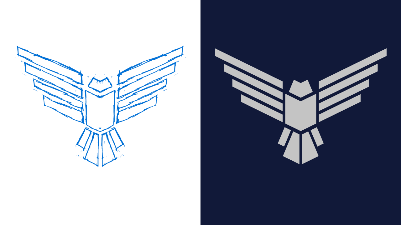
Hi i just made bird logo with affinity designer ipad. Timelapse:
-
Hi all; Having some fun with an old "propaganda poster", but wondering how to adjust the logo to the waving banner, so the logo looks more natural, moving with the banner, instead of straightened out... Any suggestion is welcome.
-
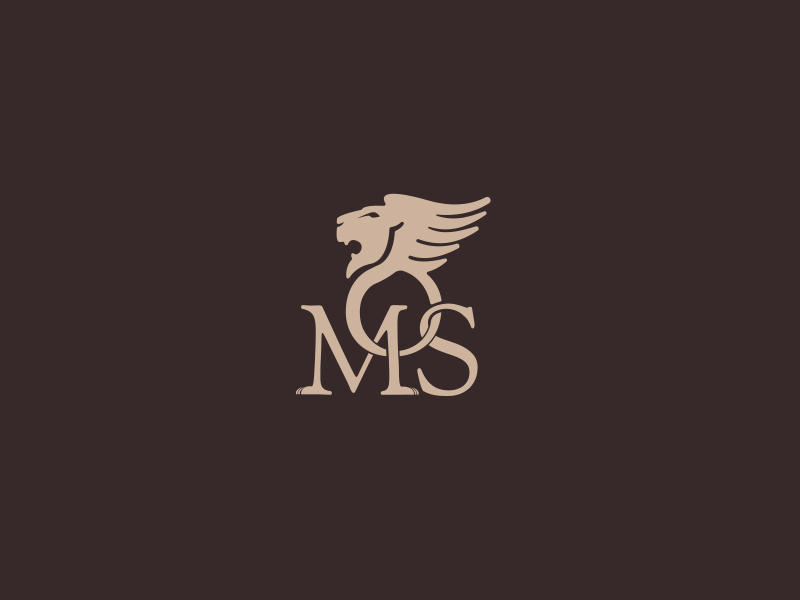
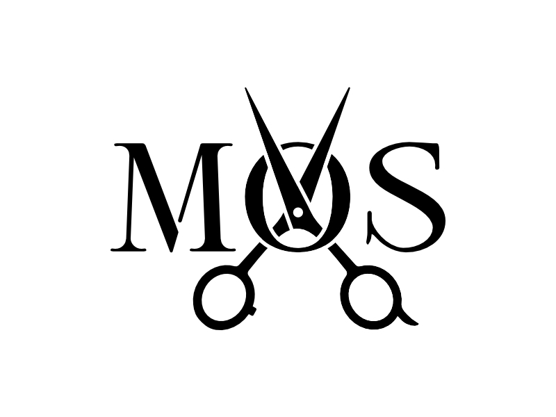
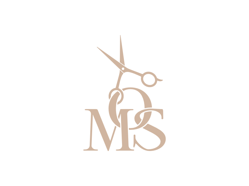
affinity designer Logo Design - MOS - quick and dirty progress
OllyH posted a topic in Share your work
Recently dealt with a small logo project for a barber. Was a cheap job and needed to be done 'soon'. Below is the progress... - 1. This was the original logo, not 100% clear on the 'MOS' initials, but this is what they wanted adapting. Remove the lion and add some scissors. The colour was also preferred to keep (a kind of 'gold'.) - 2. This was my first pass, thinking that the staggered 'MOS' wasn't clear, I went inline and moved the scissors over the 'O'. Traditionally, for a fairly simple logo I've always made sure the silhouette of it reads well before introducing colour. - 3. Unfortunately my initial idea was 'too far away' from the originally produced logo. This was my next attempt which was signed-off. I feel it's a fair representation of the original brief and proof that sometimes doing what you think is right is sometimes wrong. - I thought this would be worth sharing as it was a learning experience for me using Designer. Especially merging, splitting and cleaning up nodes (so many nodes) and the like.
-
 I am Adobe Illustrator user from many years and using Affinity Designer and Photo from beta but never made logo from basic to finish in Affinity. I was previously made basic vector in Adobe illustrator and then put some colour and gradient in Affinity Designer. oday i thought i sjould give a try to make this logo concept all in Affinity and i made basic drawing in Affinity Designer and then used Affinity Photo brushes to paint. Hope you like my first try
- 3 replies
-
- 5
-
-
- logo
- logodesign
- (and 2 more)
-
affinity photo Latest flier A4 in Affinity Photo
pioneer replied to pioneer's topic in Share your work
Good morning Gary. Thank you for taking the time to respond and for the feedback. The concept was to produce an old fashioned faded flier. It was designed to be Text based with as much information as possible. Diso's was a typo that got through sadly as well as the space in the URL I fully concur with you about the email logo. Est 1971 was asked for in the size shown as the club has not long celebrated its 50 year anniversary. As regards the stars its a matter of personal aesthetics. It has been through about half a dozen remakes and the board were happy (they did the final proofing) with this final result. Thanks once again -
Designed this business card and logo for a small indie studio that I am currently a part of. We wanted to use the one with rounded corners, but had to cut down on costs by going with sharp ones. Got to say that the features added in 1.9 were absolutely invaluable when designing ideas and creating the final version. The Contour Tool and Linked Layers in particular. The former helped a lot with adjusting text and the shapes of the logo and the latter helped a lot with repeating patterns like the waves at the top and elements across multiple artboard iterations of the final design. I really hope Linked Layers get fully implemented into Designer as well, because this feature is incredible when working with vector shapes (symmetrical vectors anyone?). ^-^
-
- 1
-
-
- affinity designer
- logo
- (and 1 more)
-

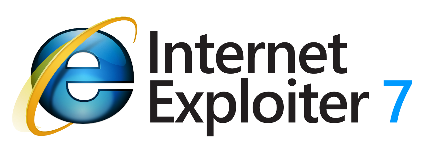
affinity designer [ADe] Tribute to a... legend? IE7 Logo
Mithferion posted a topic in Share your work
Hi there! Well, more than a legend in a good sense, the first try of Microsoft to bring Internet Explorer to the "present" back then. I must say, I always liked this kind of Icons, so, I had a little time to play a little and try to reproduce Internet Explorer 7's Symbol: May I will do Edge next... If anyone is interested, I attached the source file. Hope you all are doing well. Best regards! Internet Explorer 7.afdesign
-
I've recently started to get back into design on a freelance basis and decided to update my older logo with something that's a little more fun. Used Designer to cut up some basic shapes and created some overlays, etc. Also looking into a "worm" version that uses the curves as an inter-twined continuous line (harder to do nicely due to the ascenders in the logotype.) Might also do a version with some transparency for watermarking, etc.
-

affinity designer Logo usando os recursos do AFFINITY DESIGNER
Raytato posted a topic in Share your work
Fiz essa logo usando os recursos disponível no Affinity Designer,
-
It is a nice piece. I especially like the logo and the coloring under the Cape--nice gradient.


.png.df8f9616c2e5adf77932d79fca98cf7c.png)
.png.cea687f3611695e9d23cbf59375dc493.png)