Search the Community
Showing results for 'Your Search Here' in content posted in Feedback for Affinity Designer V1 on Desktop.
-
Having a dedicated pressure tool similar to Paint Tool SAI's would be a blessing. Currently, it's a bit frustrating to apply the appropriate amount of pressure to the correct areas using the existing graph system. Not to mention that I have to reset the pressure for every curve I make. Having a tool that allows you to adjust pressure at points along your curves would definitely be a huge step forward when designing at such detailed levels.
- 1 reply
-
- 1
-

-
- tool
- affinity designer
- (and 2 more)
-
 Is there a way to alphabetize your artboards? See, I'm trying to get into print on demand, so what I've done is I've created several artboards for each product dimension in one document. My issue is I created all these artboards at random. Theyre not alphabetized. The app organizes my artboards based on when they were created. So when it comes time to export an artboard its really hard to find that artboard when you have so many. So I have to look through this long list of artboards when I hit export. For example, I want to export the artboard called Backpack. I wish there was a way to alphabetize artboards in the layers panel and the export menu section. That way it would help me search for the letter B for Backpack and I dont have to go through this list of artboards to find it. I've attached 2 photos of all the artboards I've created. 1 photo shows the layers panel. I wish I could hit a button that would alphabetize my artboards in my layers panel. The 2nd photo shows the "Area" section in the export window. I wish my artboards were alphabetize in the "Area" list so I can go to the letter B and export the Backpack artboard. It would help find things easily.
-
Is there a way to alphabetize your artboards? See, I'm trying to get into print on demand, so what I've done is I've created several artboards for each product dimension in one document. My issue is I created all these artboards at random. Theyre not alphabetized. The app organizes my artboards in the order they were created. So when it comes time to export an artboard its really hard to find that artboard when you have so many. I have to go through a list of artboards. Ill find it eventually but it would be easier if the artboards were alphabetize so I can look for the letter of the artboard I want to export. For example, I want to export the artboard called Backpack. I wish there was a way to alphabetize artboards in the layers panel and the export area menu section. That way it would help me search for the letter "B" for Backpack, and I dont have to go through this list of artboards to find it. I've attached 3 photos this this post. The first photo shows the layers panel. I wish I could hit a button that would alphabetize my artboards in my layers panel. The 2nd photo shows the "Area" section in the export menu. Look at how all my artboards are not alphabetized and they're just in chaos. I wish my artboards were alphabetize in the "Area" list so I can go to the letter "B" and export the Backpack artboard I need. The 3rd photo is the swatch studio settings. The swatch studio settings actually has a setting where you can "sort" you colors alphabetical or by color. I need a "sort" setting for layers and for the "Area" in the export menu. I dont know how it would be designed. I dont know how it would look but I need a way to alphabetize my layers/artboards. It would help find things easily. For now, I'll just look through this chaos list of artboards.
- 1 reply
-
- 1
-
-
 Depending on your hardware, it can be more than a huge difficulty! On a Windows laptop that I used to use regularly, the ‘mouse’ buttons are below the opposite ends of a single piece of plastic (so it’s like a seesaw) which means that it’s physically impossible to press both buttons at the same time.
 -

Artboard ready-made sizes
Irupe replied to Designer1's topic in Feedback for Affinity Designer V1 on Desktop
I would agree with you that this could be a good workaround. But why should we use a workaround when from the beginning and in the help document we are told that we can create our own Presets (that are added at the end of the original list of New (documents)? And there is even a box where you can indicate if you may create artboards from them. The problem is that when you already created a new document from your own preset and want to add a new artboard, it only duplicates the original one, and all the options to resize your new artboard are grayed out and the only way to resize it is by dragging. At least, that is how it is working in my case now. The new artboard does not show any of the characteristics saved in the preset (margins, bleed, etc.), not even those of the 1st artboard that generated the document. If the Help document says you can create artboards from your own presets and you cannot, then it is a bug. Not something we wish it would be... If I start a document as a Print doc, then why those options are not included in the Doc Size menu and others for different devices are? It makes no sense to me. This is not something to be added as a new resource, but something to be reviewed. -

Support RTL languages
thomaso replied to HalHart's topic in Feedback for Affinity Designer V1 on Desktop
While I understand your disappointment, a lack of a software or a software feature like LTR is neither racism nor discrimination: Racism: "the belief that certain races of people are by birth and nature superior to others." Discrimination: "the unfair or prejudicial treatment of people and groups based on characteristics such as race, gender, age, or sexual orientation." https://www.merriam-webster.com/thesaurus/racism#thesaurus-entry-1-1 https://www.apa.org/topics/racism-bias-discrimination/types-stress There are many differences between certain global areas that differ in economic or legal aspects. For example, cow or camel milk is not available worldwide, beef, pork or dog meat is valued very differently culturally and legally around the world and cars are not allowed to drive on the left side of the road in every country or continent. There is freedom of choice in offering and purchasing software... and societies have the freedom to develop software according to their local needs, similar to a country's freedom to choose a particular writing system and an 'official' language. -
 Just to share a bad experience, even after almost 20 years in the creation process… Hope this can serve someone else than me. Hi dear Affinity Team, Almost since the beginning of your adventure, I'm a big fan of your apps. Bought them all, trash any single piece of Adobe files on my system, I just love your work. Well… until today… A few days ago, I've designed an Affinity Designer file, which contain 3 very precisely scaled shapes planned to be laser cut (document set in cm). The laser company needed separated files, so, for each of the three shapes to be cut: • I copied the group shape and pasted it on a new document (⌘ ⌥ ⇧ n). • Saved the new document for reference and exported it to PDF. • Sent it to cut to the company. I paid 209,33€ for the job (inox plates, 2mm thick) Today, I received the plates, and they are too small!!! I immediately checked my exported files, and indeed, they are too small!!! So: • Yes, this is my fault for not having double checked the exported files and the company has made no mistake, so their is nothing I can complain • BUT, YOU changed the scale during the copy/paste process!!! Why such a bug exist??? I was trusting you, didn't pay attention… This bug can be reproduced at will, cannot believe it!!! I'm absolutely revolted right now, both against me by my excess of confidence in the quality of your work, and by you because your lack costed me so much money! I don't know what to think anymore. Regards
 -
 For any moderator or developer of Affinity Designer who read this: The lack of important features for SVG/Vector graphics remain, the lack of those features makes it impossible to use the software for proffesional SVG, vector graphic designer. I really want this software to introduce those features to make it worthful to be used, but for now it remains useless for SVG vector graphics without those important features. If the software is doomed to be a raster software, it would be good to clarify it and stop lying about that this software is primarily vector graphic manager, because it is primarily raster image, it is almost the same than affinity photo but worse. The idea of mixing raster and vector images is very innovative but makes the goal of the software unclear. I would like to see a completely new software to manage vector graphic because it seems that the purpose of affinity designer wasn´t EVER to be used for vectors but raster graphics, which is a real shame since for that we already have affinity photo So the question remains, is Affinity Designer never intended to be used for vector graphics? Or is just an incomplete project that its goal is completely unclear? _ Related topic: And yes, I know it is a one time purchase, but I wasn´t aware that I was actually buying a raster graphic software when I bought Affinity Designer, I thought it was a software to manage professionally vector graphics, and not to use vectors as a kid playground with limited almost nonexistent features (for vectors), and the few it have are not optimized (In other words, the software is extremely simplistic to a point it makes it impossible to use). I also know that Affinity Designer is "New in the game" but the features the developers are focusing to introduce to the software are primarily raster features,like if Affinity Designer were meant to be Affinity Photo deformed brother which want to be Affinity Photo but is too derailed from its goal. How I would like to see the softwares of Affinity: A. Designer: Vector program A. Photo: Raster program A. Publisher: Publishing program But how I actually see the softwares of Affinity: A. Designer: Raster program A. Photo: Raster program A. Publisher: Publishing program The idea of mixing raster and vector graphics could be implemented much better if AD were completely a vector software and AP were completely a raster software, and if I need to have both, I would buy both, they could have a similar UI than affinity designer have right now, but instead, it would be a "mix of the both softwares in a single one", (All Affinity softwares would be in a single Affinity core software, and you can purchase separatedly AD, AP, APU, which would be added to the main software as "DLC" additions, with an UI similar to AD have right now) that would be DOPE, that would be much better and I totally would love to give my entire wallet money to have such innovative and excellent combination (You can buy a single software "DLC" if no need the rest) What I have now is a failed attempt of vector software and a failed attempt of raster software in a single software (That is what I think of the current Affinity Designer software) I know that is most likely that what I suggested above with bold text won´t happen, so what I suggest that is needed and feasible is to focus more in vector/svg graphic features and less in raster features for Affinity Designer
 -
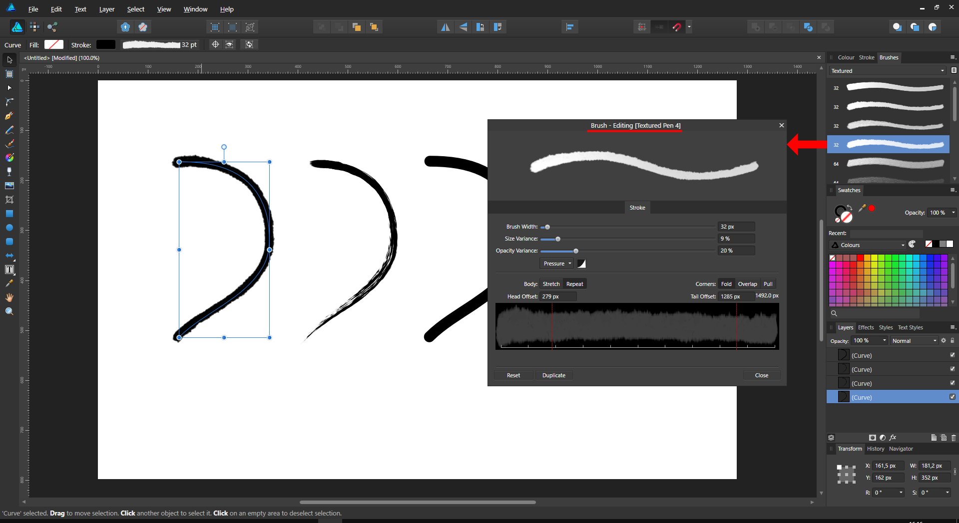
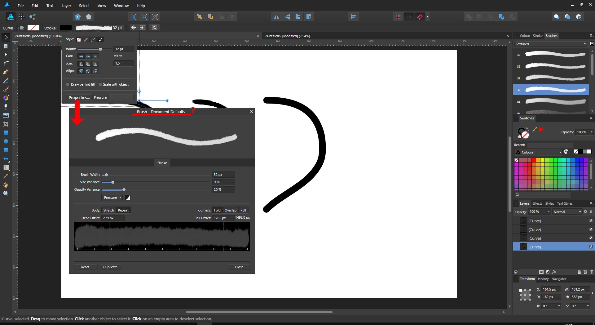
 Is it a bug or intentional? Every time to select a different brush, your storke with gets reset, making it a pain to check the look of individual brushes, as they mess up the object you're trying to apply the brush to. This just in... Helmar
 -

Auto Hyphenation for Affinity Designer
MikeTO replied to ramonbuzon's topic in Feedback for Affinity Designer V1 on Desktop
I don't understand the omission of hyphenation from Designer either. I understand the need to differentiate the products but even a photo editor like Photoshop has auto hyphenation. Fortunately there is are workarounds. Edit the document in Publisher and turn hyphenation on. Or create your text styles with hyphenation on in Publisher and import the styles into Designer. -
Artboard ready-made sizes
Irupe replied to Designer1's topic in Feedback for Affinity Designer V1 on Desktop
I understand what you mean. Well, in that case, I support that request!! This should work differently because it would save lots of time. I appreciate your kind help and the time you devoted to explaining all this. 🥇 -
Artboard ready-made sizes
Irupe replied to Designer1's topic in Feedback for Affinity Designer V1 on Desktop
When you create a new document, you go to File => New=> and choose a preset from the drop-down menu. Right? If the layout menu of a document preset includes a box for clicking "create artboard", it is because there is the option of creating an artboard from that preset. You start a new document from it and it says "Artboard 1" at the top. There is no other difference from starting a new document from a preset without that tick except for the "Artboard 1" at the top. I honestly don't find the gain in that. It is supposed that the tick will allow you to create artboards, not simply docs. Your saved presets are not even showing in the dropdown menu for new artboards. Not only those created by you but any other original preset (A4, A3, letter, etc). You can only choose devices, even when you are working in a Print or Press Ready document. -
Artboard ready-made sizes
Irupe replied to Designer1's topic in Feedback for Affinity Designer V1 on Desktop
When you create a new preset you have the option of indicating if those characteristics can be used as an artboard. This is an image taken from the New (doc) tab when creating a new preset. It works only when you create one artboard from scratch, but not when you want to add a new artboard to an existing document. Why not? Besides, when I add an A4 artboard to another A4 artboard in the same doc., it does not include the same characteristics of the original preset (margins, bleed, etc.). It should, if it is the original preset. Again, I understand that there are workarounds, but presets are supposed to help us save time, and this is not working that way. Don't misunderstand me. I really appreciate your help! I'm just asking. As a Beta tester, I have to! 😊
-
 Hi MEB :D Now that I know that I have to use layers to organize my files. At least it works much easier for me because of the selection issue we talked about here: https://forum.affinity.serif.com/index.php?/topic/24436-select-object-instead-of-its-parent-group/ I would really like to see a functionality to convert a group into a layer and vice versa. (As long as there is no "select object" ...) ...it could be helpful if you have to re-think and or reorganize all of your former work (imported .PSDs, etc). ;) Thanks a lot, Stefan
 -
Hi folks, I've been using Affinity Designer & Photo on PC for two years and both became main apps of my choice for graphic design, drawing illustrations and photo editing. I abandoned Adobe CC and didin't regret my decision! Thanks a lot for all your efforts – at Serif and on the forum – and keep my fingers crossed for a new version to come. There are really great tools in Designer but I found something that I'd love to find improved someday. When working with vector brushes in Draw Persona it's impossible to identify what brush is selected for a particular vector object. It's not highlighted in the Brushes Panel so finding the right one is a real problem, especially when working with 100+ of very similar looking brushes (eg. Grave Etcher by RetroSupply). I know it's easy to copy attributes from one object to another but I still can't figure out what brush name is selected. It would be great if one of the following is implemented: - show active brush highlighted in the Brushes Panel when particular vector object is selected or - show the active brush name in the Brush Properties window (it is actually present when you select particular brush in the Brushes Panel and start drawing – see attached picture A – but if you change object that has another vector brush and open the Brush Properties window (see picture B) the name is gone. Is anybody experiencig the same and perhaps you'd love to share how you deal with it?
- 31 replies
-
- 11
-
-

-
It has not (yet) been added to V2 but if you want to add your support for that, try the Feedback & Suggestions forum. Leaving a "+1" here in the Questions forum won't do much good since the developers as a rule do not follow topics here since that would take time better spent on actual product development.
-
I'm a graphic designer and prepress specialist. I've used Illustrator since version 1.1 on a Mac Plus (it came with a video tape with John Warnock himself showing you how to use it). I've used practically all the vector illustration tools that have come to market since. Thus, I have a pretty good idea about how such programs behave, and which were the ones for professional use and which were for dilettantes to make pretty pictures, but not for making a brand identity for a Fortune 500 company. I bought the whole Affinity Suite with the hopes that I could cut the cord on Adobe's pay-us-every-month-or-else scheme. What you have created so far is to be commended and I see a lot of bright potential. I really, really, really love StudioLink, for instance. Its amazing. But, man... there is so much. I am not making this topic to troll you. I am making it in the hopes that, from the perspective of someone who has done serious work for serious clients both on the creative end and the technical end, you guys can get some feedback to make both Designer and the whole suite something everybody wants to move to. My plan is to keep coming back to it and adding quirks, bugs, and major issues so that you can hone these apps. I hope to pay for upgrades with some of these things I say in them, and some things that are even better than what I suggest. Soooo... lets start with color. Because its bad. The problem is the paradigm. A person who is a web designer will have no issues with this, because it seems built to fit their needs. Make a quick graphic, mess around with the RGB sliders until its pretty, and your done. Professionals who work for big clients need their work to be repurposed to all media forms: web/screen, offset press, digital printing, signage, you name it. Thus, colors have to be carefully managed. What Designer uses is a color mixing panel, and a Swatches panel that has lots of different palettes in it for you to dig around and play with. What it needs is a color mixing panel, and a Swatches panel that automatically, and only, shows used colors from the document, whose view is set it "small icon list" by default. If you mix up a color and use it, it shows up automatically in the Swatches panel under a "Document" palette. You can have your "Application" palette, but anything you choose from it needs to show up in that "Document" palette. Knowing what you are using will be your first clue that you have mixed colorspaces and have too many instances of a particular "spot color." Graphic designers who have never worked on the technical side are horrendous with making graphics that will not separate correctly and come out with unexpected results when used in any medium other than on-screen display. One time I had some students come to my work and they brought their best artwork with them. I loaded them up on the Mac, and asked them to tell me what their intent was in making their work. I then ran it through the prepress workflow. None of them had their spot colors correct, and they actively mixed RGB, CMYK, and Spot versions of the same colors, and it showed how they would end up not matching if actually put onto product. (Consider this: Draw a large box, and then draw a a small circle in it. Make a CMYK blue, and assign it to the box. Then make an RGB blue color in the circle that visually matches the CMYK mix on screen. Send it to a commercial printer and have them make a professional proof of it. I can bet you will see the circle in the middle.) I then showed them how to fix these problems and prevent them. Most were gracious about it, but some were downright livid and thought I was trying to shame them. I was just trying to save their future careers. The morass of swatch pallets you have needs to be collected and renamed. You can still have them accessible, and I can see where people will use them. But you need to track those colors as people click on them in that Document swatch palette, and never let people confuse between the swatch palettes and the color choosers. Tinting should be more accessible and visible. Lets say you added PANTONE 286 C to your pallet, and you want to use the Fill tool to make a gradient with it. So, you have the 100% version already. To make a tint of it (and make sure that, unlike 98% of graphic designers out there with under 2 years experience, you end up turning most of your gradient to CMYK or RGB), make it so you can right-click and pop up the menu on the swatch and choose "Make Tint of this color..." Note that I did not say "Make Tint..." because this implies that it can be a tint of anything. (See where I am going with this? Professionals need control, and management, not just freedom.) You should then have the nice window you have for setting the tint, with an OK or Done button along with Cancel. Once that OK button is clicked, a new swatch should be added called "PANTONE 286 C 0%." AND IT SHOULD ALWAYS WORK. Right now you have to right click on a swatch, make a copy, and then right-click it, choose "Edit Fill..." and scroll all the way down to the bottom and choose "Tint." And god forbid if that color is a "Global" color, because as far as I can tell, you can't tint them. Frankly, this is sooooo CorelDraw. Nice cheap software for people to make pretty pictures at home for use on the church website and newsletter. Not for professionals who want to carefully create artwork that will color match anywhere. Back to that gradient. The tip of the gradients should be then filled with the 100% and 0% versions of the swatch, and if the designer gets silly and chooses the white swatch (what is the color definition of that swatch anyway? K 0%? C 0 M 0 Y 0 K 0? R 255 G 255 G 255?), a warning should pop up telling them that "Mixing spot and process color will result in the gradient being converted to process using the document colorspace!" That will hopefully ward off that bad practice. AND ONE MORE THING: colors used in between those two swatches in that gradient should not show up in the Document palette as used swatches. I had that happen to me once and had no clue why. Then you need to choose Separation Preview and look at your list of channels, turning them on and off to make sure you did it right. What Separation Preview you say? The one you didn't put into Designer and Publisher, but is in Illustrator and InDesign. That's what. Have it show overprinting by default without the ability to turn it off. Next you need to save gradients into that Document swatch palette automatically too and have a means to locate where they are used and be able to edit them and reuse them. But that's another issue, and I am done for now. Just keep this in mind: your competition isn't Microsoft Publisher and CorelDraw. Its Adobe InDesign and Illustrator. Be different, but be better. People like me will pay you for it. See you when I have more time to give more feedback. You really have a good thing going; it just needs a lot of polish.
- 8 replies
-
- 12
-
-
-
 Three years on and an AD2 out, nothing has changed and AD/Serif still doesn't understand that units of measure are a choice of the user, not a property of the document, and should be set somewhere in the global properties of the application. My "poor workflow" is like JCD's, it requires me to use physical units of measure. Always. Whatever document I open with AD. It shouldn't be complicated to understand. The piece of software has to do the computations for you, it's first grade mathematics. I don't earn a living using AD (otherwise I'd probably use something else). But years of not addressing elementary requests... I find it fascinating to set and run a feedback forum, and not use it as a way to improve your product.
 -
I would like for you to provide a new program geared more towards scaled drawings. The Ap would have all of the features as Affinity Designer, but with more capabilities. The drawing could be drawn to scale and have the ability of measuring drawn objects along with having a dimensions tool. It should be capable of drawing limited 3D objects similar to the old Adobe Illustrator Ap. Even Illustrator did not have scaled drawing or dimension capabilities. Some of these capabilities are available in CorelDraw, however they no longer allow purchase of the Ap and is subscription only. Once you quit paying your are left with nothing. Last year you could purchase the Ap, but no longer. They also do not update their Ap when the Mac OS is updated. Unlike you folks do. I know such a program would not be cheap, nor should it be. However, being able to purchase your program, your support and updates to your programs are second to none. I think this could be an additional revenue stream for your company. The program could be used for architecture, mapping, drafting and more. Thanks for your consideration. Dave
-
 There are 2 version of each of the Affinity apps, MSIX and EXE I believe each can co-exist on the same PC So, it's possible you inadvertently installed the wrong version when you "updated". Resulting in a second installation of the same app Best course of action is to uninstall the last version you installed (the 2.2.1 version) and to correctly install/update your MSIX or EXE version - depending on which you installed originally
 -
 OK, I'm very aware that maybe most of the designers and users of the awesome Affinity Designer are not into scientific posters, books or documents, but I'm a mathematician and I love the app myself, as much as I understand and use it. :) Hence, I got a small, but important feature request: a plugin/native support which would allow one to use the power of "local" LaTeX typesetting for symbols, fonts and other scientific notations. I am aware I could use the great LaTeXiT + drag & drop, but still, I envision my workflow as follows: When I have a complicated figure to draw, I fire up Affinity Designer and I draw, but for annotations and everything font or math symbol related, I'm not quite covered. I have installed some versions of the native LaTeX fonts (CMU) to use system-wide, but some are missing and still doesn't feel the same. So for symbols, equations etc. I would like to be able to input a LaTeX formula (delimited by the well-known dollar-signs) and Affinity would typeset it locally, using the fonts included in the LaTeX distribution installed on my Mac. What do you think? Honestly, I think that such a feature would be useful for all kinds of technical drawers, although they may use CAD-style apps. But you'll never know when you need a formula on your piece of art, right? :) Moreover, in perspective, I'm sure this would provide immensely useful for the future Publisher app, with inter-operability. Thank you for the support and the awesome apps!
- 38 replies
-
- 15
-
-
-

Find & Replace Tool for Affinity Designer
loukash replied to UkeyD's topic in Feedback for Affinity Designer V1 on Desktop
That doesn't make a difference. Publisher won't touch your existing content of an artboard based document. It will only add its own exclusive features. To put it simply: The Affinity suite is technically – under the hood – just one app and one document format. The three file extensions only exist to define the default app to open a document. Use each app freely as you see fit to add or use any of its exclusive features as you see fit. Similarly, change the default app to open an Affinity document simply by changing its suffix, e.g. from *.afdesign to *.afpub. Or use the File > Edit In… menu command to seamlessly switch back and forth. Or use Publisher's personas. Whatever suits your workflow the best. Don't limit your creativity by limiting your mindset… -
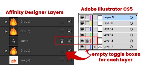
I made a post about this a while back, but I need to talk about it again because it really is frustrating. I need the lock icon to be on all layers/artboards created. I need it. I just can not be going to the top right corner of the layers panel and hitting the lock icon to lock something. I CAN NOT. It is so annoying. It is so annoying to want to lock something, go to THAT layer in the layers panel and realize I cant because the lock icon isnt there. Instead, I have to go to the top right corner of the layers panel and hit the lock icon there because thats where the lock icon is. Like, what is going on? If I want to hide my layer, I would just go to THAT layer and hit the checkmark icon to hide it. Simple. Very easy to do. If I want to lock my layer, I would go THAT layer and then hit the lock ico----oh.......thats right. There is no lock icon because I have to go to the top right corner and hit the lock icon there to lock it. Like? Ugh! What is this design!? It is bad design, and I'm so tired of it because my work flow is being interrupted. My workflow is forcing me to go to the top right corner of the layers panel. I dont want to go to the top right corner of the layers panel! This top right corner movement is problematic. Its this top right corner thats interrupting my workflow. If my workflow is being interrupted then there is an issue there and that issue is the placement of the lock icon being at the top right corner. I need my lock icon next to my layer so that I'm not doing this top right corner movement. This movement is interrupting my workflow. So heres that solution. I can not be doing this top right corner movement. This top right corner movement to get to the lock icon in the layers panel is the issue. I shouldn't be moving to that top right corner. I should be going to my layer and hitting the lock icon there. So what we need to do is bring that lock icon down and place it on each layer. HOWEVER! Thats another issue. I DONT WANT TO SEE A VISIBLE LOCK ICON ON EACH LAYER. Why? Because thats too many lock icons on each layer and its not pleasant to the eye to be seeing all these lock icons. So what do we do? We do what adobe illustrator cs5 does. They take the lock icon and add it to each layer BUT they dont show the lock icon on each layer. Instead, they provide an empty toggle box on each layer that when toggled on will lock your layer. THATS WHAT WE NEED. We need an empty toggle box on each layer/artboard that is going to represent a layer being lock and when I click on this empty toggle box the lock icon will appear to show that that layer has been locked. This is the solution. This is the solution because the empty toggle box solves the issue of not having my layers flooded with several lock icons but it also allows me to lock my layer ON MY LAYER. Theres no going to the top right corner of the layers panel and locking my layer there. Its all done on my layer. So if I click the empty toggle box on my layer, a lock icon will appear to indicate my layer is locked. And when I want to unlock my layer, simply click that lock icon and my layer will unlock but there will still be an empty toggle box icon on that layer. This is what needs to happen because I cant be going to the top right corner of the layers panel all the time. It is so frustrating. And this is also the solution because when you lock a layer/artboard in affinity desiger, a lock icon appears on that layer. And when you unlock that layer, that lock icon disappears. So clicking this empty toggle box will make a lock icon appear to indicate that your layer is locked and clicking that lock icon will unlock your layer BUT there is still a visible empty toggle box on your layer to let you know that this toggle box is for locking or unlocking your layer. Below is an image of the solution. No more going to the top right corner of the layers panel to lock your layer and your layers are clutter free of lock icons because an empty toggle box will help you lock and unlock your layer.
-

Astute Graphics Technology
Rees Maxwell replied to kaseopea's topic in Feedback for Affinity Designer V1 on Desktop
N. van der Walle... you’re really blowing it here. The way you condescend makes me embarrassed to say I like the products you are pushing. Seriously, is there anyone else from Astute who can come in here and at least talk from a place of respect? The way you talk as if everything Astute does is all for the benefit of everyone else is BS. And again, I gladly paid a ton of money for your products out of my own pocket to save my non-profit some money, and then when Astute refused to just upgrade them to make them 64-bit or whatever the macOS / Adobe tech change was that would have required a total rewrite... your company opted to use that as an opportunity to make a new cash grab by making all your customers either stop using your plugins that they’d bought (because they stopped working with the new version of Adobe), or force them to pay for them all again unto eternity with your rental model. And to make matters worse, Astute dragged their feet on it, causing your customers who upgraded their Adobe suite to have to work without any functional plugins from Astute for a very long time, and all the queries from me and others in your forums would not be answered with anything other than new versions were coming out. No date, no timeline, and certainly no advance warning that you all were going to make us keep paying to rent the plugins we’d already purchased, in perpetuity. it is disingenuous to tout Astute as an angelic corporation as you insinuate here. And it’s heinous the way you tell people with valid viewpoints that they are being emotional. Do you treat your family the same way, just touting your ideas and beliefs as reality and 100% accurate and putting down other people’s as simply “an emotional opinion”? Must be frustrating to be around you if this is your usual way of being. I hope for your family’s sake that you actually listen to and value their opinions and don’t treat any opinion contrary to yours as “emotional.” Your words here in this forum have greatly devalued Astute for me. I have a real nasty taste in my mouth after watching you repeatedly belittle others here. I am no longer too keen on your company and certainly don’t wish to contribute to the financial success of your company if you are at all the product of their culture. If I don’t hear from someone higher up than you on this forum, I will be looking into phasing out my use of your plugins, and seeking other means to adjust my workflow. Maybe your condescending attitude here is a blessing in disguise as it may be the thing which finally causes me to totally rework my workflow so I can get rid of Astute and Adobe for good and instead work entirely with a company who values their customers and listens to their customers. And I’m guessing I’m not the only one who now feels this way. -
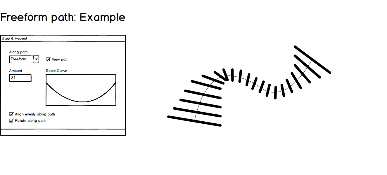
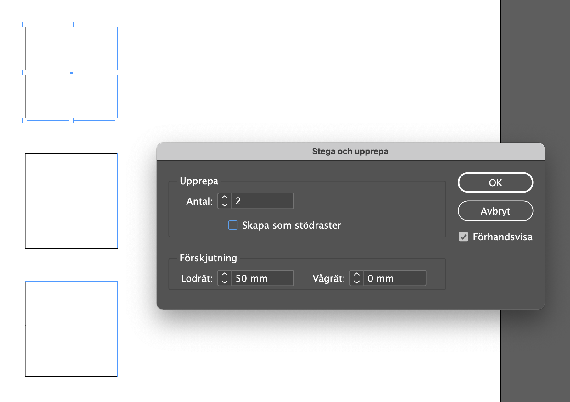
 I see in different topics here the demand for the Step and Repeat tool found in InDesign. Glad to see there are others than me that misses this terrific tool. Replies refer to the duplicate tool and the alignment tool but even though they sort of can do what the step and repeat tools does, I just cant see them as handy. They need several steps, copying layers, clicking ctrl-x for each copy needed an so fourth. And maybe the biggest disadvantage: What if you want to adjust the spacing between your items. Then you have to undo all steps and start from the beginning. With the Step and repeat tool, you just change the spacing value and everything re-renders. You can easily experiment with different values until you are satisfied. Current Step and Repeat tool That brings me to my Feature request. To add the Step and repeat tool into Affinity Software would be nice but why not expand the tool while your at it. The Step and repeat tool in InDesign offers a way to repeat an item as many times you want horizontally or vertically or both. You set the step value for the x- and y-axis and it renders out your items. Nice and easy. If you change the step values, it renders your items again. A perfect way to experiment with different values. New feature Request: Step and repeat along path What if it also was possible to align your items along a circle. You add number of copies and chose circle and set the radius value of the circle. An option here could also be "distrubute evenly along path" so that it automatically set the right spacing between items for a full circle. An other option could be to set the rotation value 0-360 if you dont want a full circle. With this tool it would be easy to for instance make an analog clocks minute och 5-minute marks. If you add an option to make your items rotate along path it would be perfect for the clocks minute lines so the lines also correctly angles along the path as expected. While where at it, why don't we make it poosible to align items along any path. Square, triangle of freeform or whatever. You can do it with text today, why not make it possible to do with other objects as well. More options There are many more transform options that could be added here. I thought of a few. One is a scale curve where the items scales accordingly to the scale curve as they are added. Another transform option would be color change after preset colors or a color gradient. Finally i have added a few sketches to illustrate examples of how this tool could be used. If you like my idea, please comment.