Search the Community
Showing results for 'Your Search Here' in content posted in Feedback for Affinity Designer V1 on iPad.
-
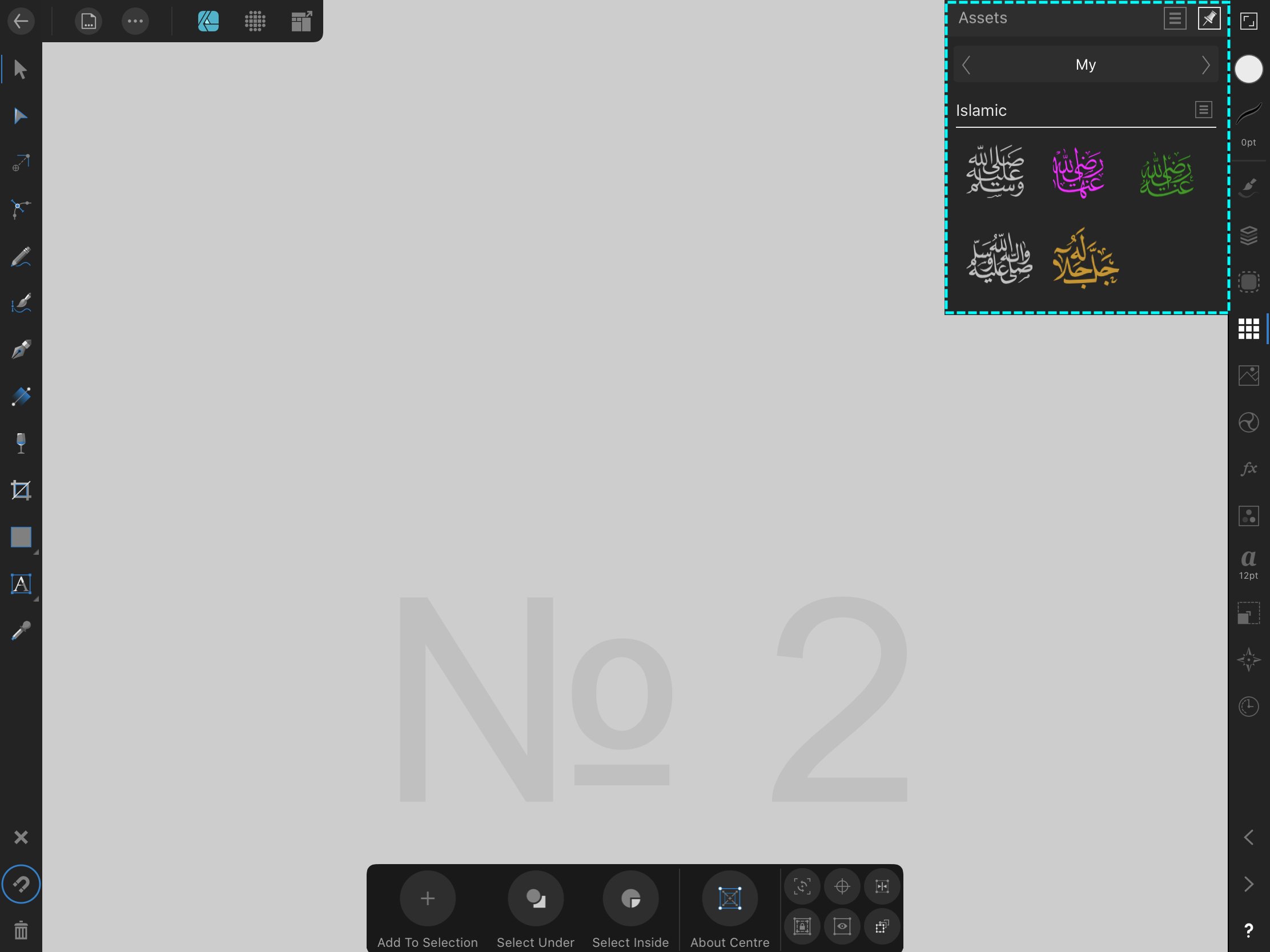
 Add: 1) Search string for fonts 2) The ability to customize, add sub-categories for your fonts and mark them as favorites, (see picture № 1) How it is implemented in resources, “Assets” (see picture № 2) • Searching among many fonts is not convenient. Add already the ability to write in Arabic, from right to left! — / For Affinity Designer and Affinity Photo / __________________________________________________ Сделайте: 1) Строку поиска для шрифтов 2) Возможность настраивать, добавлять под категории для своих шрифтов и отмечать их в избранное, (смотреть картинка № 1) Как это реализовано в ресурсах, (смотреть картинка № 2) • Искать среди множества шрифтов не удобно. Добавьте уже возможность писать арабским шрифтом, с права на лево! - / Для Affinity Designer и Affinity Photo /
-
 Hi affinity team, I have a features request and it’s really really simple. I have designer on my iPad but since I am a Quadriplegic (paralyzed from neck to below extremities) and doesn’t have a finger function, I am having a hard time panning because there are no panning options in the toolbar and it lets me use my 2 fingers to Pan the workspace which is I find it hard to do since I can only do 1 touch at a time hehe. But Affinity Photo have this option. Could you guys please add this feature to your next update? It would mean a lot to some people like me who aspire to become a graphic artist but with limited physical disability. I am promoting your products to our fellow Quadriplegic who have the same condition as me Thank you!
 -
I would really like a way to create my own fonts in affinity designer. I don’t want to have to pay for another app to do this like “iFontMaker”. Adding this feature would be really great. I don’t know if other design apps like photoshop or procreate can do this on the iPad but I could care less. Affinity Designer is my go to so adding this feature would be a game changer for me and for other designers that utilize the iPad marketplace.
-
 Editing some works while away from office is important especially for this kind of Pro app. I noticed there’s fill percentage for each Pantone colour on desktop version, but there’s lack of control on iPad. After I chose a Pantone colour, the colour studio only give me CMYK / RGB etc. etc., but I cannot set to like 50% of certain Pantone colour. That’s a bit frustrated. Also, it’s really difficult to browse through the whole Pantone list just to find the colour I need. I hope these functions could be added in iPad version soon.
- 1 reply
-
- 1
-

-
I can't believe o one have said that. Why theres no search on ipad files? I have 80+ files there and now it becoming hard to look in them to find the file i want
-
Hi team, As iOS list views often have a search bar at the top of the list, that’s out of view initially, and brought into view by a quick small pull down on the list. How about implementing this in studios like Assets, Fx, and Adjustments? This could cut down times in finding what you are looking for, and focus more on the creations. This can help Affinity Photo as well. Hope this helps
-
 Hi there. First of all a huge thank you to the great Affinity team with this 1.7 release is another amazing huge step for professional people like me that decide do work just on mobility on iPad. I read that the bug of not displaying the bleed on an exported PDF is already taking into consideration. I have few suggestion for the team. As a packaging designer I’m missing the spot and overprint option for colours. Would be great if we can like the desktop version select the option when we create a colour. Another great suggestion would be the option to search for colour instead of scrolling through the long Pantone list for example. 3 simple extra feature that would make the app on iPad complete or at least closer to the desktop. Well also these are really important feature for productivity. Hope anyone will reply and share the same needs. Marco
 -
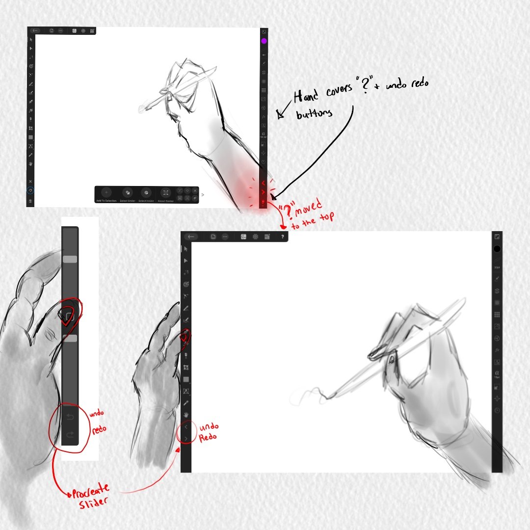
 In a previous post, I had said that the "?" tool tip icon at the bottom right corner of the interface should not be there because it triggers when you enter persona mode to draw. Your wrist is triggering the "?" icon and its disrupting your workflow. So nothing should be there at the bottom right corner of the interface. You can read all about it in this forum post I made below. However, i wanted to make a post dedicated to the undo and redo buttons because they too are located at the bottom right corner of the interface and they shouldnt be there as well. I did leave a comment about the undo/redo buttons in the post below, but I want to talk about them here in THIS new dedicated post. The undo/redo buttons should not be at the bottom right corner of the interface. They shouldnt. They shouldnt because our wrist is going to trigger them and theyre going to disrupt our workflow. Its the same situation with the "?" icon. In the preferences, you can turn off the undo/redo buttons. Which is great because now your wrist wont trigger the undo redo buttons but you still shouldnt have them at the bottom right corner if users are going to want to turn them on. Heres why you REALLY shouldnt have them on the bottom right corner of the interface. Its because of the way digital artists work on tablets/cintiqs. If youre right handed, your right hand holds the stylus(apple pencil) and then what you do is you use your left hand thumb to slide against the left side of the tablet/cintiq to press buttons that help your workflow. So your left hand thumb should be on the left side toolbar of the interface to easily and quickly toggle through your tools. On your toolbar, the undo and redo buttons should be moved there so you can press them with your left thumb. Thats how it should be. You use your left thumb to press the undo and redo buttons while you work. If you have the undo redo buttons at the bottom right corner of the interface you cant really touch them with your left thumb. You have to use your stylus to tap them which is going to be bad because your stylus is dedicated for your work and now it has to take on this new task of undoing and redoing. It shouldnt be like that. Right hand stylus is dedicated for building your work while the left hand thumb is dedicated to toggling through your tools and undo/redo button. So I need the serif team to take the undo redo buttons and move them to the left side toolbar and place them at the bottom of your tools. Not at the VERY, VERY bottom but at the bottom of your tools. Which is still going to be problematic because now you have to use your left thumb to go ALLLLL the way down since theres so many tool but I was hoping Serif could give us users the feature to remove unwanted tools from our toolbar. That way as you remove tools the tools in the toolbar move up, get shorter, and your undo and redo buttons can move up so that theyre at a closer, reachable range for your left thumb. I want to also note that procreate places their undo/redo buttons on their sliders so they should be placed here on the left side of our toolbar as well. Bellow is an attached image of what I mean.
-
I love my fonts and the ability to search quickly and easily. Sadly this feature isn’t available on the iPad version - not sure if it does on the desktop - in photoshop the font name is editable to help find it. I have a good few hundred. It’s a bit of a pain having to remember exactly where it is - especially when its a new font and i cant fully remember the name. Will this feature happen?
- 1 reply
-
- 1
-
-
I would like the option to have the light ui on my iPad AD. If this is a redundant ask then please close. I searched and did not find any requests for this—which makes me fear my request puts me in the minority (or my search skills are rusty)
- 52 replies
-
- 14
-
-

-
I madly believe this. The color studio and stroke studio need to combine. They need to combine. I don’t know how but they REALLY do need to combine. Its not a debate. They need to combine. Before I go into any further details, the main issue for this reason of these 2 studios combing is because multiple studios can NOT be opened at the same time in the app. Only 1 studio is allowed to be opened. Its this rule in the app where only 1 studio can open at a time due to the iPad having less screen real estate and not being able to have every studio open. Thats the real main issue here. Please let me explain. An object. We work with objects. You create it and then you can change 2 things about it. The fill of that object or the stroke of that object. This object that you created has 2 properties. A fill and a stroke property. Remember that. Whats happening in the app is my properties are being divided into 2 studios by the serif team, the color studio and the stroke studio. You can only open 1 studio at a time in the app. You can only edit 1 property of your object at a time. It shouldn’t be like this. It shouldn’t be like this because its limiting. Its slow. Its too much toggling back and forth between these 2 studios and its slowing my workflow down. Its making me do extra taps when it could be less taps in 1 studio. This workflow of having 2 studios is splitting my brain up into 2 sides. 2 work flows. What do I mean by this? If I have an object, my brain splits that object into 2 studios. My brain is saying “ok. If I want to edit the color of this object I have to go to the color studio. If I want to edit the stroke I have to go to the stroke studio.” It shouldn’t be like that. I should look at my object as a whole and say “ok. I have my object selected. Now I can edit the color and stroke in this one studio that holds my color and stroke properties. I don’t have to do any toggling. All my object’s properties are here in this 1 studio.” So everything is being changed inside this 1 studio that has combined the color and stroke studio. On the desktop version of AD its a different workflow. Theres more screen Real estate there so you’re able to have all your studios open. Theres no limit to just having 1 studio open. Everything is wide open. Everything is there. There are no rules. Its this whole studio of several studios in it. The screen is a studio and you have all these studios open inside your studio. You can have layers, fx, color, stroke, and other studios all open at the same time. Its awesome because you’re not limited to 1 studio being open like in the app. You’re free. You can have any studio open. So when you have the color and stroke studio open on the desktop version you pretty much have these 2 studios combined into 1 studio because you can freely have them open. If you need to change the color you go to the color studio. If you need to change the stroke you go to the stroke studio. Theres no toggling or opening up these studios. They’re already open and you can go into them with no issue. On the app, you can’t have that. You can’t have them both open. You can only open 1 studio at a time and its so annoying. I have no issues with the other studios. My issue is specifically with the stroke and color studio because these 2 studios are IMPORTANT. They relate to my objects and I need to have them both open at the same time so I can make my changes to my object. I can’t be toggling between them. They need to be combined. They need to work together. I need to be able to click my object and change its stroke and color easily. No toggling. No opening 2 studios. Just going into this 1 studio and changing everything there. I can do that on the desktop version with ease but not the iPad app because the iPad app forces me to open up the color and stroke studio individually and its all this toggling and closing. Its really slowing down my workflow. Its limiting. I should be able to click my object, tap 1 studio, and have my color and stroke studio inside this studio. I don’t know what to call this studio. I was thinking the Properties Studio, a studio that has the color and stroke studio combined inside of it where you can change your objects properties with ease and not toggle between 2 studio. Its all done inside this 1 studio. Heres why I bring this issue up. Lets say you want to change the color of your STROKE. Ok. So If Im working with my STROKE then I need to go to the STROKE studio and change it there. Nope! You have to go to the color studio to change your STROKE color there. Ok. Now lets lower the opacity of your STROKE. Ok. Let me go to my STROKE studio to change the opacity of my STROKE there. Nope! You have to go to the color studio to do that. …….Ok. You finished changing your color and opacity for your stroke. Now I want to change its width. Is it in the color studio? Nope! I have to go to the stroke studio and change it there. Its like why? Why are my properties divided? Why am I toggling between these 2 studios. Why are my stroke related properties in the color studio? Why aren’t they in the stroke studio? Why are you diving my properties, serif? This is why they need to combine. Its all this toggling. Properties are every where. Users are being forced to work like this. Its not ok. Its not. The color studio and stroke studio REALLY need to combine. They need to combine. Users should be able to click their object and change anything fill or stroke related to that object inside this 1 studio that has combined the color and stroke studio. The serif team needs to break this rule of having only 1 studio open at a time in the app SPECIFICALLY AND ONLY for these 2 studios. Like, the whole serif team needs to all raise their hand up in the air and say, "We, the serif team, break this limiting ipad app rule of studios being open 1 at a time by combing the color and stroke studio so that users have a better workflow." They slam their hands on the desk and the rule has been broken for users. An override is need for this rule, for the color and stroke studio. The color and stroke studio need to combine. You know what else? For some reason the color studio and the stroke studio are specifically grouped together and are divided from the other studios. Its almost as if they work together. Like they should combine. You can not separate these 2 properties. They correlate to each other. They work together to make up an object. This is not a computer. This is an ipad we're working on. They need to be combined. Also, you know how you can 1 finger gesture over the icons of the studios? Like, if you 1 finger gesture over the color studio you can change the shade range of your color. or if you 1 finger gesture over the stroke studio you can change the width of the stroke? Okay. Since youll be combing these studios that 1 finger gesture wont be available since it will now be 1 studio with a different icon. Dont worry about this 1 finger gesture feature. Its a cute feature. It would just be better to trade in this feature for a better workflow for users. Maybe you can even keep this feature by putting it some where inside the newly design combined studio? I will upload some images to show what I mean below.
-
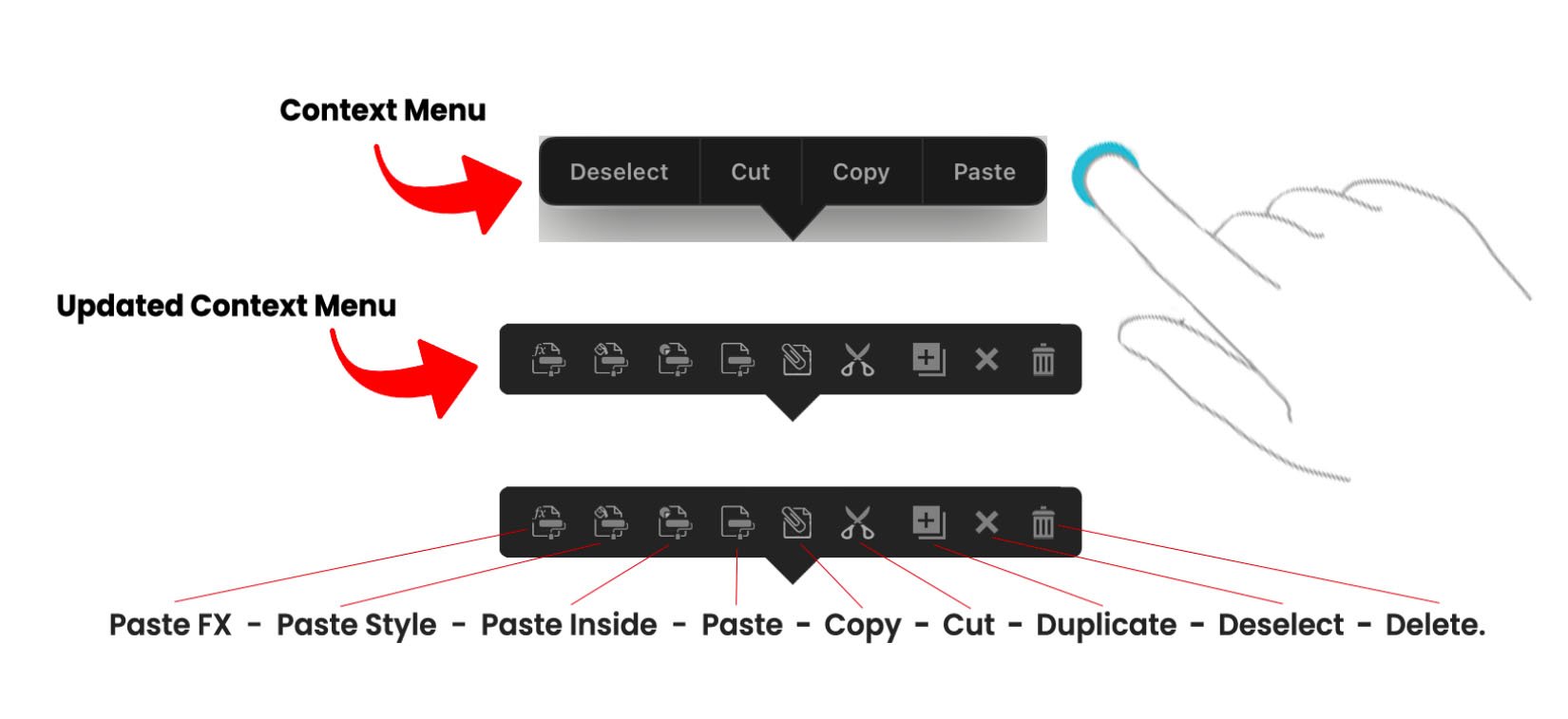
So right now there is something called the “Context Menu.” I think its called the context menu. The way to bring out this menu is to press down with 1 finger on the screen, release, and a menu should appear with deselect, paste, copy, and cut in it. This is called the Context menu. Its has your basic copy paste actions. I like the menu, but I don’t like it design wise. The reason why is because its designed in a style that doesn’t belong in the app. Its like a menu from the very earlier ipad apps. Right when apps were just starting to take off. I also don’t like it because there are some actions that I want on this menu that aren’t on the menu. I want to see those actions on this menu. I also don’t like it because its a “spelled out” menu meaning instead of using the icons for cut, copy, paste, and deselect the menu has been spelled out for you. I hate when things are spelled out. Its just wordy and over time you prefer icons because you know what the actions do already that you don’t need them spelled out for you anymore. Plus, icons take up less space. This menu is needed. Very needed. I saw an affinity designer user use this menu the other day and it just blew my mind how they used it in their workflow. It was so awesome that it made me love this menu a little more. So this menu needs the following updates done to it. 1. I think it should be called the “Clipboard Context Menu” because it has “clipboard” actions in it. 2. It needs to be redesigned in the style of the toolbar which is just a thicker gray/black bar. 3. Other clipboard actions need to be added to it. 4. Its needs to be turned into icons. No spelling. Just all icons. So! I did it. I updated it. I redesigned it, added other needed clipboard actions, and just used icons instead of words. The way it works is you select an object and then press down on the screen with 1 finger. You release and your clipboard context menu appears. Its going to give the following actions. Paste FX, Paste Style, Paste Inside, Paste, Copy, Cut, Duplicate, Deselect, and Delete. So what you do is select your object, finger press release, hit the copy button, finger press release again, and then just paste it. Or you can select your object, finger press release, hit the copy button, select a different object, finger press release again, and then just Paste FX, Paste Style, or Paste Inside. Or you can just select your object, finger press release, and just cut, duplicate, deselect, or delete it. Everythings right there at your fingertips. Its this finger press down release gesture that youll be doing in your workflow to get to your actions. The reason why these actions are in this clipboard context menu is because Fitts Law. You can’t be having users go to the top left corner to the edit menu and reach these clipboard actions. Its too the edge and it requires an extra click to get to them. Its a lot for a simple action. This work flow of going to the top left corner to reach the edit menu to reach your actions is slow and too much. Its better if users just finger pressed on their screen, release, and all their clipboard actions are there in finger reach. Theres no reaching to the edge. Theres no clicking the edit menu icon. Its just finger press down, release, and all your actions are there. So users can easily duplicate, deselect, delete, copy, cut, and paste an object, style, or fx. I want to note that I did redesign the icons the serif team uses in their app here in this context menu. Ill make a whole post later called “The clipboard paste command icons need to be redesigned" and ill explain why. Right now I’m focusing on updating the clipboard context menu. Let me know what you think. Below is an image of the old context menu and the updated context menu.
-
LOL. I laugh because I know your frustration. It is so frustrating to want to lock something, go into the layer studio, click your layer, click the layer options, then click the lock icon, then have to exit the layers options just to lock your layer. And when you unlock it in the layer studio and want to lock it again you have to go through the whole process again. 🤕 I made a post here where i brought out that lock icon so you can easily lock/unlock your layers. If you dont want to go into the layer studio to lock/unlock your layer then i have created this post where I talk about the move tool needing a new context toolbar. On that toolbar will be a lock icon so you can lock unlock objects without going into your layer studio. If youre talking about adding a lock icon to each layer so we can easily toggle it off. Ive requested that on the desktop version and someones response was NO because then there would be TOO MANY lock icons in your layers, it would too be distracting to look at, so just deal with it. Yeah........adobe illustrator cs5 does it how you want it and Ive always loved it. I wish theyd add it here. 😌
-
I saw that. Its a 1 finger gesture side swipe to select. Theres 2 workflows. Working on the canvas and working inside the layer studio. What youre trying to do is work in both workflows at the same time. Its not good, Its not good because you should really focus on 1 workflow. You have your mind focused on the canvas but its also focused on the layer studio. So your mind is at these 2 places at once. Just focus on 1 workflow. Your attention is either on the canvas or the layer studio. If you 2 finger gesture an object and move it, it will duplicate it and in your layer studio it will show that you now have 2 objects. If you select your object in the layer studio and hit the duplicate button it will duplicate your object and show 2 objects in your layers. So this 3rd way of working is just not it because theres a button already in the layer studio for you to duplicate your object and you are working as if the layer studio IS the canvas. The layer studio is not your canvas. I hope I make sense. Also, it wouldnt work because in the layer studio we use our finger or apple pencil to scroll! Theres scrolling. Scrolling would make your version hard to duplicate objects.
-
So when you select an object with the move tool, at the very bottom you have a context toolbar that appears for the move tool. On that toolbar is a "+" icon called "add to selection." This icon you have to turn on by hitting it and then what you can do now is tap other objects on your canvas and its combing other objects to your selection. So it allows you to "add to your selection." It lets you select multiple objects so that you have this 1 big selection of objects. OR there is a gesture for it where you select your object and then use a 1 finger modifier to select your other objects to "add to your selection." My issue is sometimes the gesture works. Other times it doesnt work because your pencil has trouble selecting your objects. Like, the app doesnt want to select your object. Its weird. It works and then it doesn't so it needs reworking. I guess like a bug is there or something. Its just not letting me select objects. I have to tap a couple of times on the object to select it so this gesture needs fixing My other issue is you dont need that "+" icon called "add to selection" on the context toolbar if theres a gesture for it already. Remove it. Its not necessary and no one works that way. No one says, "oh! i need to select multiple objects. let me turn on this button, select my objects, and then turn off the button since I now have my selection." No one works like that. Just use the gesture. Its easier. On top of that making users turn on the "+" "add to selection" icon is not good. Its not good because you have to turn it off. If you dont turn it off you now have us making all these selections and wondering why that app is behaving this way. Why cant I select a single object and why is the app selecting multiple objects. Why is it behaving this way? Oh! Thats right. I have "add to selection" turned on and i have to turn it off. I completley forgot I turned it on. I wish the app had turned it off for me. A lot of users are going to go through this. Youre going to confuse us. I already know it going to happen so its best to not have this turn on/turn off button to make a selection because its going to confuse users. Let us turn on/turn off this "add to selection" operation through a 1 finger modifier . Its better. 1 finger turns it on. Removing the finger turns it off. The gesture is already in the app. It just needs reworking or fixing. Also, remove "add to selection" from the context toolbar of the move tool.
-
I was using adode illustrators context toolbar as a guide for this design. They didnt use divider on theirs so I didnt use them here. I also didnt want to use dividers because the studios and tools in the affinity designer app dont have dividers between them. They have this big spacing instead. i think the spacing here in my photo is too squished that IT NEEDS A DIVIDER so maybe I should space them out a bit more? I do too! I love the context menu when an object is selected. Its badly needed here in this app. I made a whole post about it here which youve already read. Im currently designing a context toolbar for the move tool. Im debating if I should add the alignment and distribution buttons. Ill explain why in another post where I will tag you. Exactly! To the serif team, specifically the coders, Im sorry for all the redesign Im doing in these forum post but things arent working and its for the best. Theres A LOT that needs to be changed and improved. Im trying to make the app better for users. I know exactly what you mean, my friend. For now, I just went with something basic and simple. I tried following this design. I cant get too advanced but its fun and exciting! The possibilities! 😊 Exactly. I keep saying the serif team is playing this game of hide and go seek with its users. I dont want to play this game. i dont want them to hide our basic functions and have us go seek them. Its not fun. Im trying to bring out those basic functions by making all these helpful forum posts.
-

Just bought AD, a few comments
Jowday replied to VectorVonDoom's topic in Feedback for Affinity Designer V1 on iPad
On the desktop I am - as always - building the layer structure with discipline and named layers and therefore I often suggest that as a minimum a "Search layers" search field in the layer panel would mitigate the problem on both desktop og tablets. We are after all using... computers... And then of course some tablet specific usability tricks so navigating quickly through the list is easier on tablets. CorelDRAW shows the way - search is the first item in the equivalent to the layers panel.
-

Affinity Designer for iPad - Rulers
Tadd replied to paulstar08's topic in Feedback for Affinity Designer V1 on iPad
It seems like a good application but that it has no rules in my case makes the application useless. I spent hours searching the program until I decided to search the forum and get here and see that the rules do not exist for iPad is disappointing. -
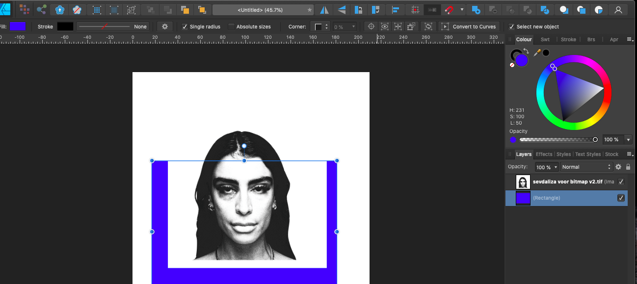
 Sorry I don't know the name for it and I looked If anyone already requested it, but can't find it (problably because of search terminology). But in Illustrator it is possible (just like in iPad Affinity Designer) to place a tiff/bitmap. But in Illustrator it is possible to put (for i.e.) a square behind it in color and you will see that color through the (bitmapped tiff). But in Designer it will not appear if you put it to the background (the bitmap/tiff will stay the primary color). Is there a solution or is this a feature request and I think the last one 🙂 Kind regards
-
So I was using the app the other day, and I wanted to try out each boolean operation. The boolean operations are Add, Subtract, Intersect, Divide, and Xor. So what I did was I created 2 squares on top of each other and those were the shapes I was going to boolean. I wanted to see the results of all 5 boolean operations so I told myself to duplicate the 2 squares 5 times for each boolean operation. So what I did was I selected both squares, moved them with my move tool, and then did a 1 finger modifier on the screen to duplicate them. What happened next was my squares were not being duplicated. They were being moved at a 45 degree increment. I quickly realized that the gesture to duplicate an object requires a 2 finger modifier. Not a 1 finger modifier. I dont know what i was thinking but I had this mindset that if I just selected my shapes, did a 1 finger modifier, moved my shapes to duplicate them i could just duplicate my shape multiple times. I think the reason why i had this mindset, in this moment, was because I use Photoshop. In photoshop, if you select the pixels you want to duplicate, if you just hold down on the Alt key and move your selection you can make several duplications of the selected pixels. Its easy. You just hold down Alt and drag to duplicate. So I had this mindset that holding down a 1 finger modifier resembled my Alt key in photoshop and dragging with my apple pencil would just duplicate my squares. So it got me wanting to change my gesture for duplication because I dont want to use a 2 finger modifier to duplicate. I want to use a 1 finger modifier to duplicate. For me, a 1 finger modifier would be better and easier to duplicate. Im going to be doing more duplication operations in my work more than I am going to be moving objects at a 45 degree increment so allow me to change my duplication gesture from a 2 finger modifier to a 1 finger modifier for a faster workflow. I already have this 1 finger duplication motion mindset from using photoshop, so I'm requesting that users be allowed to change their gestures for certain tools and actions. Specifically here the gesture to duplicate. I had already talked about the need to allow users to change their gestures in other posts but I wanted to give the serif team another reason why changing gestures are needed for users in the app and how I personally needed a gesture change for the duplication operation here in this moment. So the issue is having pre set gestures for certain tools and actions that were put there by the serif team. The solution is to allow users to change those preset gestures to their liking. For me, here, the duplication gesture. I dont know how to go about it. My solution was to create a "Gestures" category in the preferences, there you would lay out all the gestures for each tool and action, and there users could change/swap the gestures to their liking. Ill sketch something up later.
-
I need to push this request and want to include a request for a general better colour palettes management in AD ipad....including better pasting of colour codes, deleting Pantone Palettes and a search function e.g. I do all my artwork in AD ipad and in more than two years of doing that I have amounts of colour palettes with no possibilty to sort them, importing/exporting palettes and so on... I own AD desktop as well (and AP ipad) but dont want to make strange workarounds as I only use the ipad version...
-
Sorry if this has a ready been brought up here, but I thought this now deserved its own dedicated thread. I am seeing a lot of issues that appear to have simple fix’s and finding threads that are years old with still no fixes. Two recent examples are below and you can see the threads below with the dates that the threads were started. If you have more Ignored topics please post them as a reply here. Why is affinity just ignoring these issues - there is really no point in starting these forums at all if your not going to listen to the issues that people post here. Affinity admin > why do you keep ignoring these issues?
-

iPad UI text size and colour
Sandi replied to dv8.info's topic in Feedback for Affinity Designer V1 on iPad
I agree. I much prefer the light background on the PC and was hoping it would be the same on the ipad version. Here's hoping!! -
'Free speech' does not have the same precedence on a private forum, we at Affinity can choose what we do and don't allow users to post here, which is covered in the Forums Guidelines. GarryP is not a part of the Affinity Staff, but even if they were, that would in no way excuse the rudeness towards this member in your comment. They are simply trying to keep the Forum a 'tidier' place, by following the Forum rules. I can see you have since edited your post to remove the most hateful part, and I'm grateful for this - but please familiarise yourself with our Guidelines above, as continuing to post such angry comments towards other Forum members will not be tolerated and may result in your Forum account being banned. We appreciate your feedback here, and we understand you may have frustrations with the Affinity app - that does not give you the right to take out this frustration on other Affinity users. We have a multitude of threads regarding RTL support, which Garry has shown in their screenshot above. I would recommend posting in one of these pre-existing threads, should you have any more to add to this conversation, as I will be locking this thread from further replies. Our developers are aware of users requests for this feature, and have also confirmed it would require a complete rewrite of the Text Engine, and therefore is not something we've provided any timescale or guarantees for. Should you have any issues with the locking of this thread, please don't hesitate to contact me directly using the direct message feature on the Forums.
-
Hi there. First of all a huge thank you to the great Affinity team with this 1.7 release is another amazing huge step for professional people like me that decide do work just on mobility on iPad. I read that the bug of not displaying the bleed on an exported PDF is already taking into consideration. I have few suggestion for the team. As a packaging designer I’m missing the spot and overprint option for colours. Would be great if we can like the desktop version select the option when we create a colour. Another great suggestion would be the option to search for colour instead of scrolling through the long Pantone list for example. 3 simple extra feature that would make the app on iPad complete or at least closer to the desktop. Well also these are really important feature for productivity. Hope anyone will reply and share the same needs. if I have to pay a full desktop price to get the same complete complete experience I would ... as a pro it’s important for me to be able to work in the same way you can do on a desktop but on my iPad! Marco