Search the Community
Showing results for 'ROMM RGB'.
-
 @Lolalam RGB is simply an acronym for the additive color model wherein the colors of electronic displays (like you smart phone, desktop computer, or television) are described by mixtures of Red, Green, and Blue light contributions. Red + Green makes Yellow. Green + Blue makes Cyan. Blue + Red makes Magenta. The presence of Red, Green and Blue at full strength makes White. The total absence of Red, Green and Blue makes Black. Not all electronic displays are capable of displaying the entire range (or gamut) of colors the human eye can perceive. Various electronic displays are capable of displaying a specific subset of the full range (or gamut) of visible color. Manufacturers measure and describe the range or gamut of color their displays are capable of reproducing, and the industry has developed names for these measurable color gamuts. These named color gamuts are also known as color spaces. sRGB is one such color space. sRGB does not offer the largest color gamut, but is considered to be the most common color space across the world of electronic displays. So, it's a standard RGB color space that most content creators target for images that need to be displayed as widely as possible. Adobe RGB and ROMM RGB are much larger RGB color spaces. Some prefer to work in these larger color spaces at the beginning of their design/development workflows to preserve maximum color gamut before exporting out versions for print (CMYK) and web (sRGB), which are smaller color spaces. When in doubt, keep things simple: build your images in sRGB. That way you're already in the correct color space for the web, and you can always export out a version for print in the smaller CMYK color space.
 -
 I can reproduce this, though, with several TIFF and JPG images that I have in my collection. They are all sRGB, but if I set my working space color to ROMM RGB in Preferences, Photo 2 loads them as ROMM RGB rather than sRGB.
 -
 I just updated to Affinity Photo 1.7 In the previous version of Affinity Photo in Develop Persona you had the option of choosing romm RGB Profiles in the pull down menu. What happen to it? Do you have to reload it some other way? Never mind....I was able to load the ROMM RGB into Develop Persona Profiles
 -
 This is a difficult one, I hope I can explain my confusion. In general it is about: "How does AP 32-bit Preview work under the hood?" In more detail: Starting point: I have a linear exr out of the iray render engine. The exr uses sRGB primaries. I have a the same image as png - tonemapped within the render software before saving as png. Monitor is calibrated to sRGB with gamma 2.2 (not gamma sRGB). First two examples show what I understand. 32-bit Preview does what I expect it to do. First example: Affinity Photo Preferences 1: RGB Color Profile is sRGB for none 32 bit files RGB Color Profile is ROMM linear for 32 bit files Conversion is set to "do not convert". But I see that AP assigns ROMM anyway because it is the default color space for 32 bit images. What I did in 32-bit Preview and why: Exposure to -8.4 because the EV setting in the render engine to create the png was around plus 8.4. So, the 32-bit Preview uses the same EV as the render output. Gamma to 2.2 because the exr is linear. Display Transform off. Examples with it ON come later. Result: Left is the normal png, right is the exr. I get what I expected. The tonemapped png and the exr mapped via the 32-bit Preview look the same. Second example: All is the same except for Color Space Conversion in preferences. Result is the same. Both images look the same. I expected that, because the ROMM color space was used in the first example as well. Now comes the part I am unsure about: Third example: Same images but a change in the 32-bit Preview. I use ICC Display Transform and set the gamma to 1 instead of 2.2. I understand the gamma change. I think ICC Display Transform already does the 2.2 gamma for me. So, I need to set my "custom 2.2 gamma" back to 1. What I don't understand is the change in the colors. The exr is still in ROMM color space, it still has sRGB primaries. Why does ICC Display Transform change the colors? There is a color mapping going on, but I don't understand how and why that happens. Regarding the color information in the exr. I know two things from the exr specification: an exr can contain tags describing its rgb primaries and whitepoint if those tags are missing, sRGB / REC.709 primaries and whitepoint should be assumed by the software opening the exr. My exr has those tags. They describe the primaries and whitepoint as sRGB / REC.709 and the gamma as 2.4. If the ICC Display Transform does some kind of color mapping should'nt it read those primaries and leave the colors where they are? Forth example: This time I changed the 32 bit working color space to sRGB linear. As a result the png and exr look the same again. Conclusion: My point of confusion is the color change when ICC Display Transform is active and the 32 bit color space is not the same as the intended sRGB output space. Can anybody help to solve this confusion? (I think I read all articles about the subject and watched all videos; yes, the one about filmic blender as well, but none mentions the influence of the 32 bit working space.) !!!!_TM-off_SR-off_REC.709_Beauty.exr
-

Images in RAW Persona seem "off"
RichardMH replied to J. Web's topic in Affinity on Desktop Questions (macOS and Windows)
I note Affinity Photo thinks your image is sRGB. Might want to change to a larger colour space. ROMM RGB is good. Suspect NX Studio is at least Adobe RGB. -
.thumb.jpeg.6f143e8223547aba974205ef53397036.jpeg) I think it helps to simplify things as much as possible. In this case, clipped tones are essentially colour values that do not fit within the available output colour space (such as the default sRGB profile), usually because they are too intense. There are a couple of solutions to this: you could change the output profile to something wider such as ROMM RGB (notice how the histogram shifts when doing so), or you can use a combination of exposure, brightness, black point, saturation/vibrance, shadows and highlights to “compress” or make the tones fit within the available range of colour values. The first solution of using a wider colour profile does introduce potential pitfalls with colour management (such as the infamous colour shift when viewing images with a wider colour space in an unmanaged view). Most web browsers are colour managed nowadays, but it’s still often recommended to convert to sRGB during export to ensure maximum compatibility. The second solution usually means you end up compressing the tones more, typically when using the highlights slider. This is fine, but just keep an eye on the actual image rather than the histogram—this leads me onto the next point… Outside of some edge-case workflows (such as high end VFX), the whole concept of clipped tones lends itself to more of a creative decision—you might have some intense red and blue colour values, for example, that cannot be represented in sRGB, and so will simply be clipped to the maximum channel value. This isn’t necessarily the end of the world! You can most likely craft a perfectly good image within the constraints of sRGB as it does tend to represent the majority of colour intensity values seen in everyday life with reflected light. I wouldn’t spend too much time worrying about it, to be honest. Does the image look good on screen in sRGB? If not, and you’re happy to involve wider colour spaces in your workflow, try a wider profile such as ROMM RGB. But don’t get bogged down with it too much! The time worrying about whether some clipped tones are compromising image quality is arguably better spent learning some useful post-processing techniques for the kind of imagery most likely to have intense colours (e.g. low light, urban scenes with artificial lighting). HSL, Selective Colour, brush work on pixel layers with blend modes are just a few ideas, but there are many more. Hope the above is helpful!
I think it helps to simplify things as much as possible. In this case, clipped tones are essentially colour values that do not fit within the available output colour space (such as the default sRGB profile), usually because they are too intense. There are a couple of solutions to this: you could change the output profile to something wider such as ROMM RGB (notice how the histogram shifts when doing so), or you can use a combination of exposure, brightness, black point, saturation/vibrance, shadows and highlights to “compress” or make the tones fit within the available range of colour values. The first solution of using a wider colour profile does introduce potential pitfalls with colour management (such as the infamous colour shift when viewing images with a wider colour space in an unmanaged view). Most web browsers are colour managed nowadays, but it’s still often recommended to convert to sRGB during export to ensure maximum compatibility. The second solution usually means you end up compressing the tones more, typically when using the highlights slider. This is fine, but just keep an eye on the actual image rather than the histogram—this leads me onto the next point… Outside of some edge-case workflows (such as high end VFX), the whole concept of clipped tones lends itself to more of a creative decision—you might have some intense red and blue colour values, for example, that cannot be represented in sRGB, and so will simply be clipped to the maximum channel value. This isn’t necessarily the end of the world! You can most likely craft a perfectly good image within the constraints of sRGB as it does tend to represent the majority of colour intensity values seen in everyday life with reflected light. I wouldn’t spend too much time worrying about it, to be honest. Does the image look good on screen in sRGB? If not, and you’re happy to involve wider colour spaces in your workflow, try a wider profile such as ROMM RGB. But don’t get bogged down with it too much! The time worrying about whether some clipped tones are compromising image quality is arguably better spent learning some useful post-processing techniques for the kind of imagery most likely to have intense colours (e.g. low light, urban scenes with artificial lighting). HSL, Selective Colour, brush work on pixel layers with blend modes are just a few ideas, but there are many more. Hope the above is helpful! -
 Thank you for the reply. Very strange...the prophoto rgb profile resides in the window OS default folder but is not being recognized. What is also strange is that prophoto is an option for preferences once an image with the embedded prophoto profile is opened, but that profile is not available if you just open preferences with no image opened... I think I will just "stay happy" with using the ROMM RGB profiles. I am going to assume that they are exactly the same profiles...or close enough. BTW, I can import the profile using the File>import icc menus, but the icc does indeed exist in the windows/system32/spool/drivers/color....folder already. Weird that the profile is not always available. Learning a new program is always fun...!
 -
Color Space
RichardMH replied to CharlesG's topic in Pre-V2 Archive of Affinity on Desktop Questions (macOS and Windows)
When I accidentally sent a ROMM RGB image to my local printer then e-mailed to say I'd made a mistake he said it was OK and he could print it. He has ink jet printers for art printing and wants RGB rather than CMYK. My home printer set up will print ProPhoto/ROMM RGB images. -
Color Space
RichardMH replied to CharlesG's topic in Pre-V2 Archive of Affinity on Desktop Questions (macOS and Windows)
As far as I know, ROMM RGB is the largest color space. I have that set in Color Preferences. For print I use Adobe RGB (1998) or ROMM RGB (a lot of printers can handle it) and for the web sRGB. I've been told to use the largest color space for editing then convert for whatever use, (and use soft proofing) -

Getting ICC profiles to work on Win 10
v_kyr replied to VolkerMB's topic in Affinity on Desktop Questions (macOS and Windows)
I like that good synonymous comparison! Another point here is, that all better cams (Nikon, Canon, Sony ...etc.) do internally offer to use also Adobe RGB and on some it's the defaut setup. - Though RAW converter software usually operate/work internally in/with even much higher gamuts (color spaces) like ROMM RGB/ProPhoto RGB for the RAW development of photos. Webbrowser software is usually not the best in terms of color management support, they mostly offer just plain sRGB here. Other software like a bunch of freeware, opensource and even commercial software uses LittleCMS as their underlayed color engine (as does the Affinity software), since it's free and since it's not trivial to implement a good one here on your own. - Though one of the best and entirely implemented on it's own stems from (no surprise here) Adobe. Their apps like PS/PSE etc. handle all the color management on their own with their own color engine. -
 I looked in the forums and google but i couldn't really find a solid answer. Im working on an album cover and normally for all my work (regardless of if i plan to print or not i) just set it to "print" when i open a new document. I may have fiddled a bit with the profiles in the past but i cant remember what the default is. does it make any difference?
 -
I did notice you are using sRGB colour space. As far as I can ascertain, Develop Persona is ROMM RGB. Maybe change to RGB/16 ROMM RGB and see what happens. (Can set RGB profile to ROMM RGB in Preferences then select it in the Document menu)
-
Thank you for the response. So when I "send to" AP from On1 I get a window that verifies the format/settings to send over... As you can see here, it comes over with a different profile...the prophoto profiles is not listed here. ProPhoto is also set in preferences with warning checkbox checked. The "convert to" or "assign to" dialogue boxes show srgb Changing the profiles in the Color Preferences to ProPhoto or ROMM RGB doesn't "stick". When I open the window again it shows as srgb again
-
 I'm still not seeing any loss. FWIW, I have the 32bit RGB Profile set to ROMM (basically for working with HDR). In the Develop Assistant I have the RAW Output set to RGB 16bit.
 -
 I have been working with Affinity 1 in LAB colour space, with generally satisfactory results, but my confidence is undermined by seemingly strange behaviour of the Curves tool in the LAB space. To illustrate my problem, see the enclosed pdf. To generate this, I opened a RAW photo file and changed the colour profile to ROMM RGB, developed it, and converted the Document format to LAB/16. I added a pixel layer over the original photo, before deleting the photo pixel layer. So I had just one transparent pixel layer in LAB format. Then I used a brush to add swatches to the pixel layer. Then I opened a Curves tool, and located the input (X-axis) coordinates using the curves tool picker. I noted their values by did not change the output (Y axis) values. I reset the tool, and repeated for the A opponent and B opponent channels. Screen shots of the swatch panel and Lightness, A opponent and B opponent channels of the Curves tool are shown in the .pdf. The swatches contain three values of L, A and B in various combinations. L : 0, 100, 50. A and B: -128, 0, 127. I expect, therefore, three peaks in the curves channel histograms - and indeed, that is what I see. My problem is that the points identified by the Curves picker are strange in two respects: 1. The X (input) values of the points are the same for all three channels, and none of the points lie over the histogram peaks. The grey50 point is at X=0.47, not X=0.5. 2. On the swatches, the text overlay shows the L,A,B values of the brush used for each swatch, and beside (for the black, grey50 and white swatches), or below (for the colour swatches), the Curves X value. The the brush values and Curves values agree for the black, white and grey channels (taking into account the origin shift and re-scaling of the Curves axes compared to the brush colours). The Curves values for the colour swatches, however, follow no relationship that I can discern to the brush colours. My expectation was that the values found by the Curves colour picker for each channel would lie on the appropriate peaks of the Curves histogram for that channel. Do I have a misunderstanding? Can you explain this behaviour? Thanks, John LAB test 2.pdf
 -
 It seems that Affinity apps basically define PANTONE colors in terms of sRGB (rather than in Lab color space). This means that their visual appearance is limited to sRGB even when the document color space allows a larger gamut, like e.g. when using ROMM RGB, as below (note that the forum narrows the color space of any screenshot to sRGB, but the difference shows relatively): Note that InDesign, on the right, shows the PANTONE colors in Lab color space no matter what. Above the InDesign document has sRGB and ISO Newspaper assigned as RGB and CMYK color profiles but the PANTONE colors are shown purely, in terms of Lab color space, and realistically as long as the display color gamut allows it. However, within Affinity apps, when the document is in CMYK color mode, the sRGB based PANTONE colors are shown simulated (as a kind of a proof print) using the active document CMYK profile, below ISO Coated V2: This is of course inaccurate and highly misleading, but basically expected whenever a color definition is made in terms of (s)RGB, not considering the spot colors as specific inks but rather as part of the process color space.
-

Lab channels (split)
PhotoHobby replied to PhotoHobby's topic in Affinity on Desktop Questions (macOS and Windows)
@Callum Just now checking with two photos. This only applies to AP2 for the purpose of discussion. I open an ARW file and go to develop personna. I use ROMM RGB by default. I can currently at least change the profile from Document/convert doc/ICC Profile in the menu and a composite version of Lightness, AOpponent & BOpponent are available in Channels. If I first rasterize the background file which for my purposes has not carried over the naming convention from AP1 but instead simply refers to the open file as "Imagename.arw", than I get Composite versions of Lightness, AOpponent, BOpponent plus what used to appear in AP1 filename Lightness, filename AOpponen, filename BOpponent. I"m quite certain there were no choices for the LAB channel properties for Lightness, AOpponent or BOpponent when I wrote the initial question unless I rasterized the file. For the sake of discussion as long as I can get the results I want from rasterizing I'm good. If there's anything else let me know. Thanks... -
Thanks for chiming in and taking the time to explain. You already mentioned "assign" vs. "convert". Please let us know if there is a missmatch of those two in either 32-bit Display Transform or by opening the exr. This is what I get if I "assign" the ROMM to the png. Now exr and png are similar again (ignore the brigtness - and ignore ROMM, I tried various other ones as well). The part where I am still not sure after reading your information is the one about rgb primaries and the whitepoint: From the exr specification: The IlmImf library defines a “chromaticities” attribute, which specifies the CIE x,y coordinates for red, green and blue primaries, and white; that is, for the RGB triples (1, 0, 0), (0, 1, 0), (0, 0, 1), and (1, 1, 1). The x,y coordinates of all possible RGB triples can be derived from the chromaticities attribute. ... . The chromaticities attribute is optional, and many programs that write OpenEXR omit it. If a file doesn't have a chromaticities attribute, display software should assume that the file's primaries and the white point match Rec. ITU-R BT.709-3. From https://chrisbrejon.com/cg-cinematography/chapter-1-color-management/ (great read and a lot of information to digest). "... I thought it would be worth mentioning that 16 or 32 bits files do not give you magically access to infinite color ranges. You still have to take into account the primaries (or gamut) you are working in." If I check the primaries in my exrs I see that the various presets write corresponding tags. RGB primaries and whitepoint differ for sRGB, ACESCG, REC.2020. I interpred this in a way, that an exr, even though being scene linear, indirectly carries a color space information with it. The question is, what is a software doing with this information? If the exr says "I was made with REC.709 red" is AP taking this information into account somehow? (The puzzle is slowly coming together for me but some pieces are still missing )
-
I believe it’s the document’s color space that determines what can be displayed in document, regardless of whether or not one uses a larger color model to define colors. CMYK < sRGB < Adobe RGB < ROMM RGB < Lab. What seems to be missing from the color palette is a warning when one chooses a color outside the gamut of the document’s color space. Also a clear explanation of how and when to use the Lock.
-
I think its a change in preferences (I have a PC not a mac). Edit->Preferences->Colour and where it says RGB colour profile put ROMM RGB. And in Document-> Convert Format/ICC Profile check that its Format RGB/16 and Profile ROMM RGB. If you have the context toolbar visible (check it in View if its not there) you can see the documents colour format. Softproof is in Adjustments. I have a sRGB preset in the jpeg export settings. That should cover everything.
-
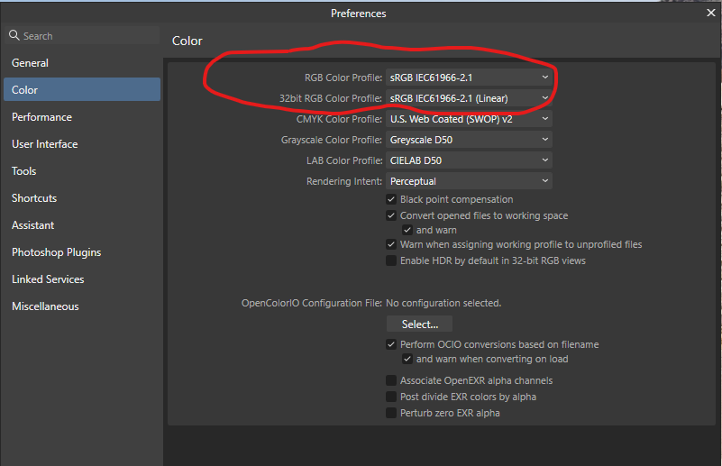
I suspect from that screenshot that image in the release version is 32 bit linear so its a different sub-set of profiles based on that image type. I understand that ROMM RGB is similar
-
 I want to create a preset so that the default color space is ROMM RGB. I saved a preset on the Basic tab in the Develop Module with Profiles set to ROMM RGB and Brightness set to 5%. When I bring up a new raw photo (Nikon NEF file) the Brightness is set to 5% but the Profile is Adobe RGB. Why won't the preset maintain ROMM RGB? Is there a fix? Thanks very much.
 -
 Expected behavior: In Affinity Photo, apply a scanner profile to a raw scan with no profile, then convert to a working space such as ROMM RGB. 1) Results should be very similar to doing the same steps in an external app (I don't expect that they'd be pixel-perfect, but any differences should not be perceptible). 2) There shouldn't be any visible color casts in the result. Actual behavior: Results are perceptibly different between Affinity Photo's result and argyllcms' cctiff. Given a scanned IT8/7.2 target with the profile applied and then converted to ROMM RGB (once in Affinity, and then once with cctiff on a copy of the image), for Affinity Photo the dark grey rectangles in the image have a reddish color cast to them, whereas the output of cctiff has those squares as a neutral grey. Repro steps: To generate the Affinity Photo output: Open the unprofiled image ("raw0010_2019-5-20-downsampled.tiff"). Document->Assign ICC Profile... then Assign the desired scanner profile ("2019-10-27_qh_as_u"). Document->Convert Format/ICC Profile... then Convert to the desired working space profile ("ProPhoto RGB"--see Note 1). Rendering Intent is Relative Colourimetric. Black Point Compensation is on (it also repros with BPC off... doesn't matter). Observe that the grey rectangles at the bottom of the image have a reddish color cast to some of them, #19-21 in particular. (The RGB values confirm that there's more red present.) To generate the cctiff output (can use GIMP instead--see Note 3): Install cctiff. I downloaded the source code, v2.1.1, at https://www.argyllcms.com/downloadsrc.html and compiled it on my Mac. Run cctiff like so: ~/Argyll_V2.1.1/imdi/cctiff -e ~/Argyll_V2.1.1/icc/ProPhoto.icm -ir /PATH/TO/2019-10-27_qh_as_u.icc -ir ~/Argyll_V2.1.1/icc/ProPhoto.icm /PATH/TO/raw0010_2019-5-20-downsampled.tiff /PATH/TO/2019-5-20-downsampled-output_of_cctiff.tiff Observe that the grey rectangles at the bottom of the image are all neutral grey. Notes: ProPhoto.icm (which displays as "ProPhoto RGB" in Affinity Photo) is argyll's included ProPhoto color profile (which I imported into Affinity's color profiles by just opening some existing file that already had that profile embedded). However, this still repros if I instead convert to the included ROMM RGB profile in Affinity. The scanner profile was generated by argyll separately (scanin and colprof). (I actually used this exact raw image to generate the profile.) I can also generate the expected output (i.e. no reddish color cast in the dark greys) with GIMP (it's using argyllcms under the hood). Just apply the scanner profile, then convert. I don't have Photoshop so I can't do this experiment there. I'm on Affinity Photo 1.8.3, but this repros on 1.7.x as well. I've also attached the output of Affinity Photo's Preferences->Color menu, just in case those settings matter. ProPhoto.icm 2019-10-27_qh_as_u.icc raw0010_2019-5-20-downsampled.tiff 2019-5-20-downsampled-output_of_affinity_photo.tiff 2019-5-20-downsampled-output_of_cctiff.tiff
-

RAW Output
CharlesG replied to CharlesG's topic in Pre-V2 Archive of Affinity on Desktop Questions (macOS and Windows)
I am editing for printing and plan to have the colour profile as sRGB for the printers, should I edit in Adobe RGB or ROMM RGB and then export in sRGB? What about soft proofing? -
RAW Output
RichardMH replied to CharlesG's topic in Pre-V2 Archive of Affinity on Desktop Questions (macOS and Windows)
You have sRGB in Photo Persona. It is a smaller colour space. Suggest you change Colour Profile to Adobe RGB or ROMM RGB in preferences. (Edit->Preferences->Colour)