Search the Community
Showing results for 'ROMM RGB'.
-
 As @James Ritson mentioned, the development process itself is always done using 32 bit float & ROMM RGB. The output of that process to the Photo Persona can be set to 16 or 32 bit, & the color profile can be set to sRGB or ROMM RGB, depending on the Develop Assistant settings. IOW, it isn't contradictory because there is a difference between how the process is done internally & how the results of that process are sent to the Photo Persona. So you are right, in the sense that 32-bit development processing and working in ROMM RGB in the Photo Persona are two different animals.
 -
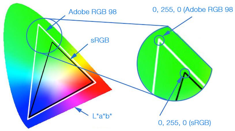
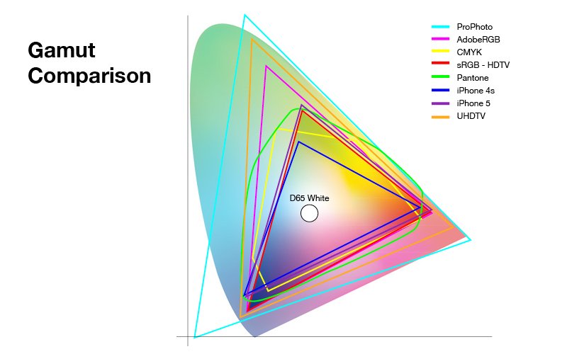
 Hi, even it says/reads sRGB there it should be operational an unbounded space, so usually a full-float linear RGB working space, thus with a gamut (color space) similar in wide to ProPhoto (ROMM) which goes much beyond Adobe RGB. Comparison of sRGB/Adobe RGB/ProPhoto gamuts ... Typical color projection in L*a*b* ...
-
 First, I apologize that I have different aspects of this problem in different topics. Summary of Problem: On my MacBook Pro 17", to which a Thunderbolt Display is connected, I have developed a RAW file in AP Develop and specified the ROMM RGB for output. In the Photo persona I changed the Document | Colour Format to RGB (16 bit), setup my adjustment layers and live filter layer, then export the document as a JPG, 100% quality, using the ROMM RGB profile, which should be embedded. When I compare the exported file and the document in AP, both at full size, both either on the laptop display or on the Thunderbolt display, the JPG is much darker than the document as displayed in AP. Both displays have been calibrated using basICColor display and an X-rite i1 Display Pro. I have several color profiles for each display, D50 L* 160 cd/m², D50 2.2 160 cd/m², D65 L* 110 cd/m², etc. Regardless of which one I use, the JPG is alway much darker than the AP document when both are viewed at full size on the same display. Only when I set the color profile to the factory default does the document in AP become as dark as the JPG, which does not seem to change much. (☚ Thanks to @owenr for the suggestion after doing some valuable tests!) Clearly, the take-home message cannot be, so just use the factory profiles, especially given the ages of the laptop (late 2011) and the Thunderbolt display (bought second-hand several years ago). Testing my Understanding: For some time I have been assuming the the export must be the culprit, but @owenr graciously tested my .afphoto on his (her?) Mac and verified that the JPG as displayed by Preview is identical to the document as displayed by AP. My understanding is, on Mac's applications don't need to worry about monitor profiles, that is the job of the OS. So AP only needs to worry about the working color space, described by the ROMM RGB profile, when rendering the document, and the target space when exporting, which, in this case, is the same. And, since Preview is color profile-aware, I should be seeing identical images, regardless of the monitor profile. But perhaps AP is doing something else when displaying the document? Or, not for the first time, my understanding is faulty. Can anybody explain what I am seeing and perhaps suggest how I can profile the monitor(s) so that the JPG and the document in AP are identical? For anybody interested, the .afphoto, a .jpg and a .tiff are here: https://www.dropbox.com/sh/l5oaidwrbn4xiot/AADQ32NVF14neGoV_fqEYV8Xa?dl=0 . Thanks
 -
Well ICC/ICM profiles are usually operating system wide installed (like fonts too) and thus it also depends on what additional icc profiles you have installed on your system. Romm RGB and ProPhoto RGB are pretty similar wide gamut profiles, if not to say the same child with just another calling name. - However you can find ProPhoto RGB downloads all over the net if you do a Google search after those... RGB-Profile Download «rgb_profiles.zip» (contains among common others "ProPhoto.icm") ICM Profiles (The profiles are in a single ZIP file, ICCProfiles.zip) ... and so on ... See also on Wikipedia: The ProPhoto RGB color space, also known as ROMM RGB (Reference Output Medium Metric)
-

RAW To LAB?
Max P replied to irascible's topic in Pre-V2 Archive of Affinity on Desktop Questions (macOS and Windows)
my NEF for me is in SRGB, or Adobe-RGB, in the APN! (some APN have different raw Nikon D4 is in YcbCr, linear mode ) S for small, I choose adobe RGB, L*a*b* is a large Space In fact, the only solution, for this RVB linear => L*a*b* we must have this intermediate step (step visible or not ... ) a linear space to l*a*b* Unlucky no XYZ option in my APN and in Aph. OK I choose a linear profile Romm (prophoto like) or, adobe linear or a icc linear generate by xrite after calibration is better ? Here Developp > basic > Profiles the last item below Developp and after switch to L*a*b* See https://www.youtube.com/watch?v=ERcKNCIhmUg&feature=youtu.be Yess, I see ROMM RGB is define for 8/16 bit… I think at this time on one side we have the space Linear, If mode is linear we could applied the transformation and on other side colour precision 8 or 16 or 32 bit. other link very interesting, see this with APh, if you use L*a*b*, you know the importance of the gray layer Human are https://en.wikipedia.org/wiki/Middle_gray The human eye knows better how to distinguish different luminosities than different colors (more technically, it has a better luminance resolution than chrominance). -
@Dan C I don't have a camera that shoots RAW but I have been testing with files in various RAW formats that I downloaded from the web. With the Develop Assistant set to use the RGB (32 bit HDR) RAW output format, while the Develop progress bar is displayed I also see the sRGB profile displayed when I click the Develop button. Immediately after the bar disappears, it changes to whatever color profile I have set in Preferences > Color > 32 bit RGB Color Profile. So, considering what @Andy Somerfield said about using something "very similar to ProPhoto," would I be correct in assuming that if I set that preference to ROMM RGB: ISO 22028-2.2013 (Linear), development is not actually using the narrower sRGB profile as some sort of intermediate profile & I would end up with the wider ROMM/ProPhoto profile without clipping out-of-gamut colors, or color shifts or whatever because the profile is similar to but not identical to ROMM/ProPhoto?
-
 Thanks, I've noticed Affinity does crash sometimes - maybe this was the reason. I guess sRGB? ROMM RGB was the default that came with the system - I very much doubt I changed it!
 -
 Any reason for using sRGB? ROMM RGB is a bigger colour space.
 -
 Hopefully some one can help. I am trying to get a much better all round understanding of 'Colour Profile & Colour Format'. When I open a new RAW Image, I see, along with all the other sliders and adjustments at the bottom is a icon for Profiles ~ When I check this box, it shows ~ Output Profile - sRGB 1EC61966-21 and, if I open up the box, there are a hole host of other profiles with names and numbers (including one, which I have calibrated for my iMac using an i1Studio calibrator). I have seen or read that a much better profile to use is one with a Larger Gamut such as ~ ProPhoto RGB or ROMM RGB. So, at this point am I better to leave it with the sRGB 1EC61966-21 or should I switch the profile to either my latest i1Studio calibrated version? ~ or ~ use as suggested, either the ProPhoto RGB or ROMM RGB.? If I then switch to any of these New / Different profiles, whilst I'm in the Develop Persona, do I have to switch-back-later-on to the sRGB 1EC61966-21 before I print? And, if that's the case… How do I go about this? Normally when I've finished editing an image I go File ⇢New⇢ a 'New Document' dialogue box appears and because I am unsure what to enter in the Colour Format or Colour Profile boxes shy away and just check that the size of paper is correct and click okay. (My bad I know) My prints to date are always slightly disappointing and so perhaps a better understanding of 'Colour Profiles & Colour Formats'. Will help get me to where I should already be. Hopefully someone out there can guide me through this latest post processing maze.
 -
 Hopefully some one can help me out…. I am trying to get a much better all round understanding of what 'Colour Profile & Colour Format'. is/are. When I open a New RAW Image, I see, along with all the other adjustments an icon for Profiles ~ When I check this box, it shows ~ Output Profile - sRGB 1EC61966-21 and… if I open up the box, there are a hole host of other profiles with weird names and numbers (including one profile, which I have calibrated for my iMac using an i1Studio calibrator). I have seen or read somewhere that a much better profile to use is one with a Larger Gamut & the ones suggested were ~ ProPhoto RGB or ROMM RGB. So, at this point in the RAW Development process am I better to leave it with the ~ sRGB 1EC61966-21 or, should I switch the profile to either my latest i1Studio calibrated version? ~ or not that then ~ use as suggested a larger Gamut such as ProPhoto RGB or ROMM RGB.? If I then switch to any of these New / Different profiles, whilst I'm in the Develop Persona, do I have to switch-back-later-on to the sRGB 1EC61966-21 before I print? And, if that's the case… How do I go about this? Normally when I've finished editing an image I go File ⇢New⇢ a 'New Document' dialogue box appears and because I am unsure what to enter in the Colour Format or Colour Profile boxes shy away and just check that the size of paper is correct and click okay. (My bad I know) My prints to date are always slightly disappointing and so perhaps a better understanding of 'Colour Profiles & Colour Formats'. Will help get me to where I should already be. Hopefully someone out there can guide me through this latest post processing maze.
 -
 It's likely because your original document is using a ProPhoto RGB (ROMM RGB: ISO 22028-2.2013) document colour profile. Then whatever you're viewing the exported PNG file with is probably ignoring or stripping the ROMM RGB colour profile and assuming that the document colour profile is sRGB. For this particular document try clicking the 'More' button in the PNG export settings, setting the 'ICC Profile' to 'sRGB IEC61966-2.1' and ticking 'Embed ICC Profile'. This will try to export it as sRGB as best as possible—however it will still likely be different to the original. It would better to start off with the document colour profile set to 'sRGB IEC61966-2.1' when you first create the new document.
 -

Stacking RAW files
dkj replied to dkj's topic in Pre-V2 Archive of Affinity on Desktop Questions (macOS and Windows)
I came up with this process: Select File:NewBatchJob on the menu. Add the RAW files to the list. Check Save As TIFF with these settings: Pixel Format: RGB 32 bit. Resampler: Bicubic. ICC Profile: ROMM RGB Compression: None. Select Save Into and select or create a directory for the TIFF files. Then use the TIFF files to create the stack. The new images will have the ROMM RGB profile. I'm hoping this will preserve the colour data present in the original RAW file. Is there some way to check whether this is so? -
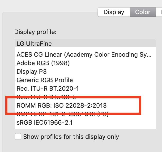
ProPhoto RGB also goes by the name ROMM RGB (Reference Output Medium Metric). On Macs, a ROMM RGB profile is installed at path /System/Library/ColorSync/Profiles/ as part of the default OS installation, & is available to Affinity Photo (& any other app that can access color profiles at that system domain path). In Affinity on a Mac, you should see it listed by its ASCII profile name: "ROMM RGB: ISO 22028-2:2013," where the ISO suffix refers to the official ISO version identifier. I don't know if a similar file is installed on Windows systems.
-
 I'm creating a panorama in Affinity Photo (version 1.8.3 at the moment) from DNG files. These files are the native format of my Pentax K-3 II camera. The program will always create a panorama photo in RGBA/16 with the sRGB color profile. Therefore highlights and shadows are easily clipped and I'm wondering if I can make Affinity Photo to create a panorama photo with a wider color space. I have set the ROMM color profile for both RGB and RGB/32 photos in the settings (I'm on Windows 10 btw). It doesn't seem to have an impact on the panorama creation process, because I end up with an sRGB photo all the time. I know I could process my RAW photos before stitching, then export them as TIFF files with a color space of my choice. Then Affinity Photo would end up creating a panorama picture with the same color space. But I often want to see first, how well the stitching will work, before investing too much time into editing the photo. I would also prefer to stitch the DNGs in Affinity Photo, export the result as TIFF and import it into Lightroom for further management and editing (unless there are edits I need Affinity Photo for). Does anybody know, why Affinity Photo ignores the wider color space of DNG files when creating a panorama? Is this a defect?
 -
 I don’t know whether I am doing something wrong or what is going on. My problem: convert a raw file in DxO PL2 (doesn’t matter whether it is a Canon or (old, non-X-trans) Fuji. The tiff is exported as 8 bit and sRGB. If I open these tiffs in Photoshop Elements 2019, they are fine. If I open with Affinity, the colours are weird and grossly over-saturated. This is almost the reverse of the known issue with Viveza and Affinity. If I process the raws in Affinity, the colour closely matches what I get from PhotoLab. (The colour rendering in Affinity of Canon raws converted to tiffs in Canon DPP, and of Fuji raws converted to tiff in Fuji/Silkypix, is not problematic). ADDED I have now discovered that this only happens when I open a tiff by browsing to the file within Affinity. If I use the “Export to application” command in PhotoLab, and choose Affinity Photo this way, the program opens and displays the colour correctly! ADDED I have discovered that I’d got the RGB Colour Profile set to ROMM RGB in error. Presumably launching AP from within DxO causes the program to display the tiff as sRGB, but opening AP and then opening the file causes it to display as ROMM.
 -
Hey ms.fuentecilla, Does this happen if you try using other ICC profiles or just ROMM RGB? Do you have a monitor that supports the wider gamut with ROMM RGB? I've tried a few different raw files from a Sony but not your specific model so a sample image would be appreciated.
-
Hey Fritz_H, Do you have a monitor that can correctly display the wider gamut from the ROMM RGB profile? If I use ROMM RGB on my 4k Dell panel the colours look way too saturated—almost like I'm using a LUT or filter. My iMac handles this much better than the 4k Dell panel I'm using.
-
Hi, 'Teachers!'
R C-R replied to the student's topic in Pre-V2 Archive of Affinity on Desktop Questions (macOS and Windows)
If you are using the Mac version, ProPhoto RGB will be listed as "ROMM RGB," most likely as "ROMM RGB: ISO 22028-2:2013." This version is one of the several icc profiles installed in the /System/Library/ColorSync/Profiles folder as part of the standard OS X ColorSync package. I am not sure why you can't choose any profile listed, but note that ProPhoto RGB (as ROMM RGB) will only appear if the color space (color format in Affinity speak) is set to one of the RGB ones. -
@Chris B Thanks for your reply. In the meanwhile I found out, that the color-issue only occurs, when Color-Prefs are set to ROMM RGB - regardless if the Input-Pictures are JPG or RAW (NRW). Maybe I misunderstood this Video on YT: https://www.youtube.com/watch?v=Hx-l7Avm8Bs (Published early June 2019) Since I saw this I switched my working-profiles to ROMM RGB to take advantage of the wider color-spectrum when working with RAW... On the other hand: When I open the panorama-pictures individually the Sky-Color is displayed correctly: Strangely I did not notice any of these color-Issues with Versions of Photo prior to 1.7.2.x In case I am not smart enough to understand all this color-management-stuff: just say it Scaled down Test-Images attached. kind regards Fritz
-
If that was true, why would the Soft Proof Adjustment offer such a wide variety of proof profiles, including Adobe RGB & ROMM RGB (a.k.a. ProPhoto RGB) among many others? (Not a rhetorical question.)
-
For me it also works in 32bit ROMM RGB.
-
In the Operating System's System Preferences is the ROMM RGB available to you in the monitor settings? I am grasping at straws here...
-
There must be a 32bit version, because the version exist in the past. And if I temporary remove the configuration of Affinity Photo I can select Romm RGB.
-
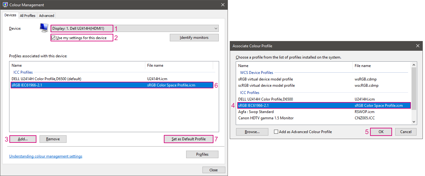
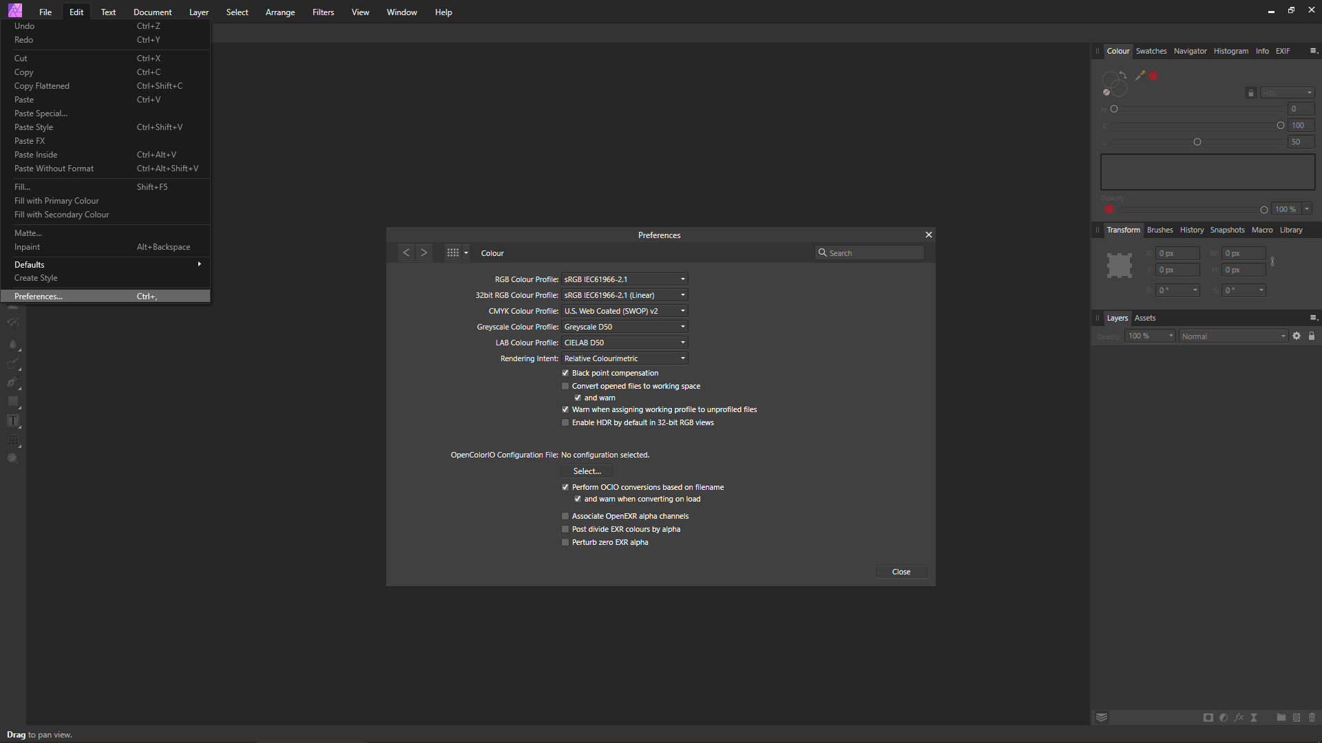
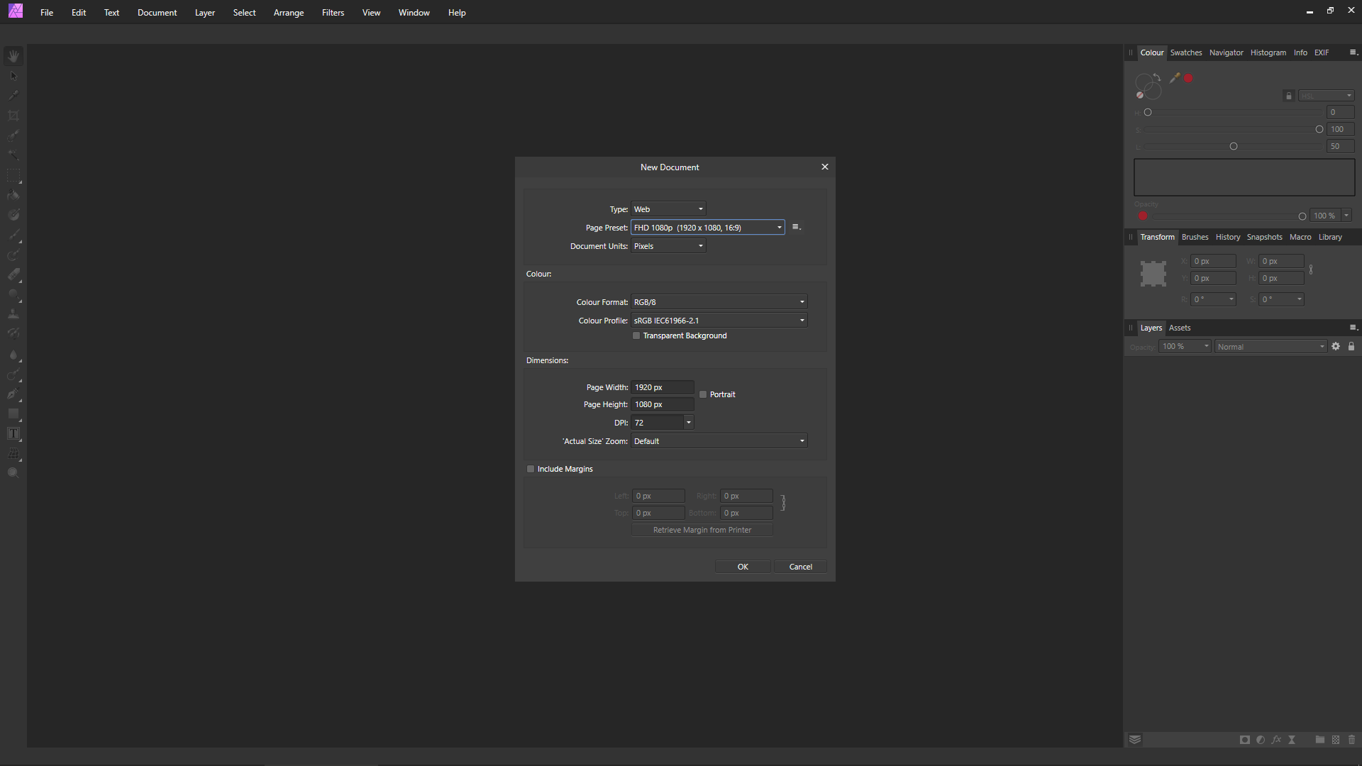
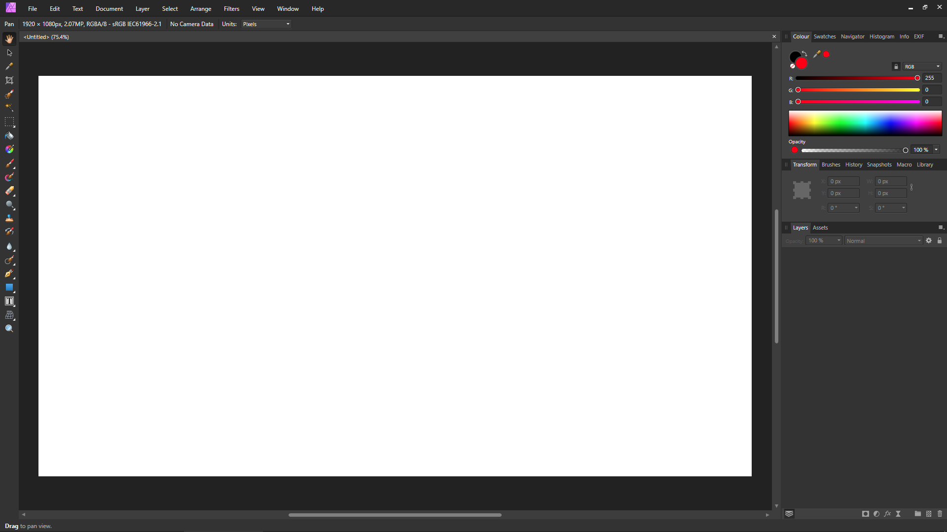
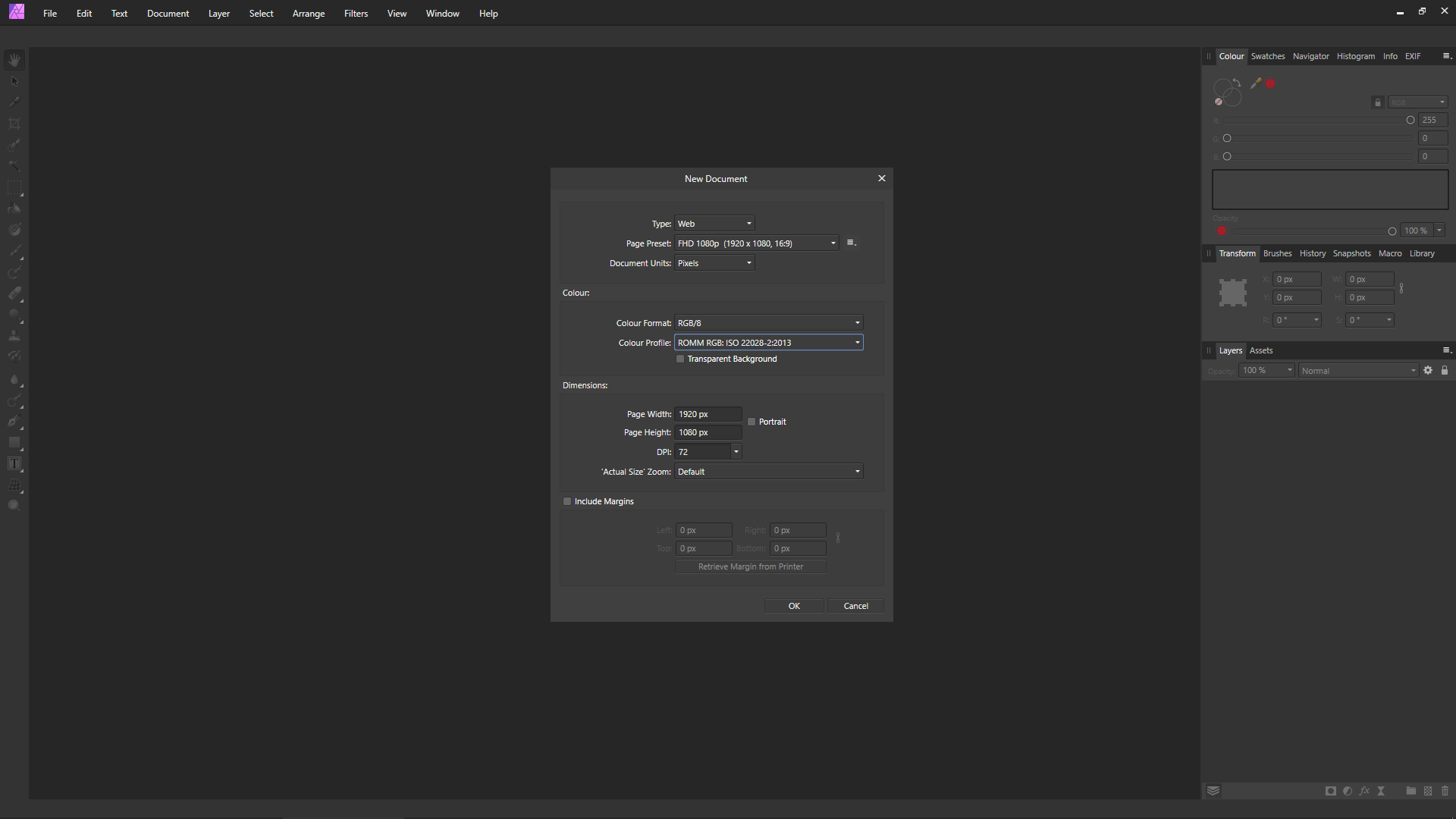
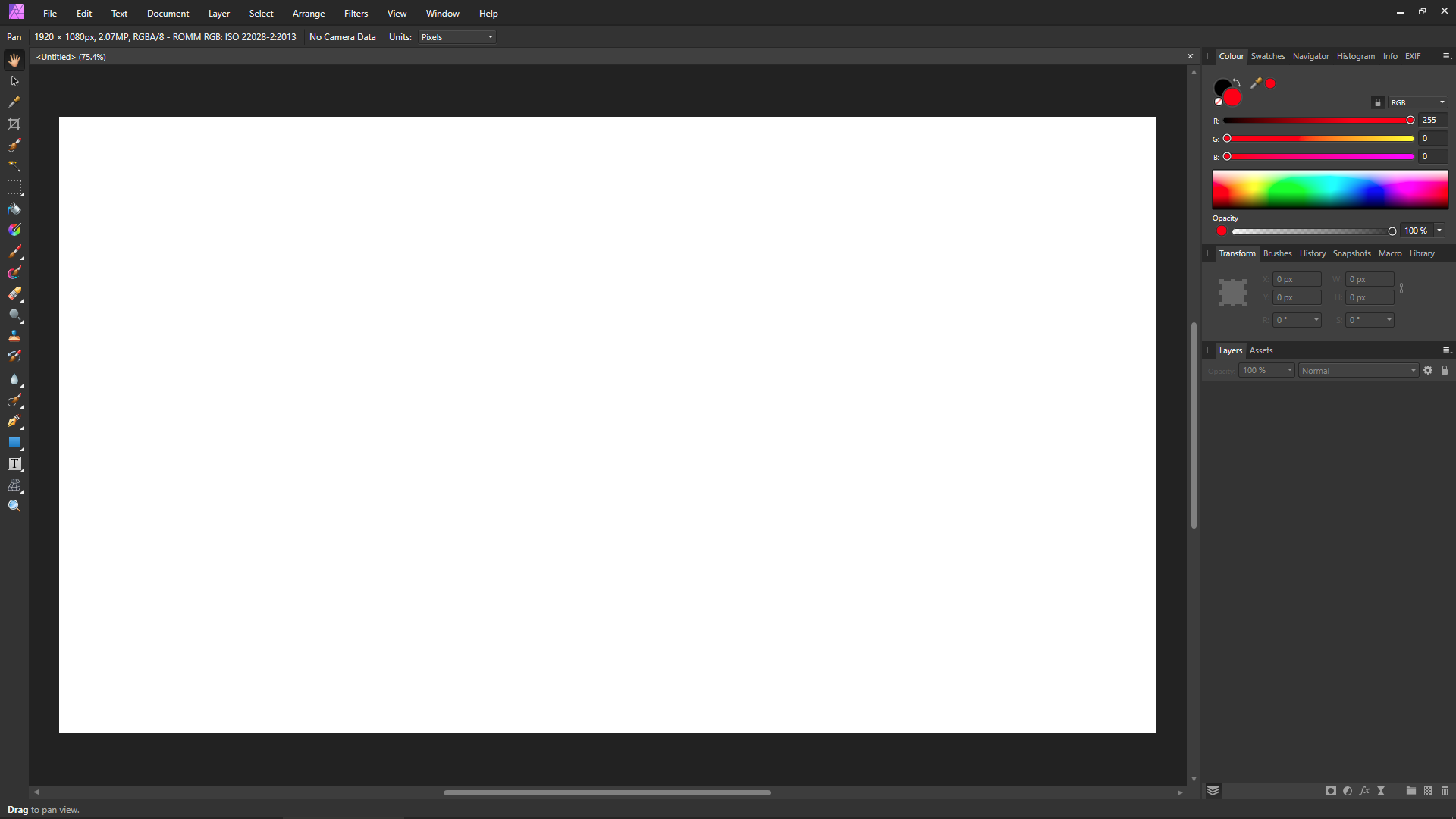
Similar to what Walt suggested, I would go right-back to basics to try and isolate where the issue lies from there. Assuming you've already installed the latest version of Affinity Photo (1.7.1.404), try doing the following: 1) Go to [Edit > Preferences > Colour] and set the settings to the same as in the below screenshot: 2) Go to [File > New] and open a new blank document using the same settings as in the below screenshot (pay particular attention to the 'Colour Format' and 'Colour Profile'). In this case the document is using a 'sRGB IEC61966-2.1' document colour profile: 3) Does the red show correctly (red, not orange) in the colour panel, like the following screenshot? 4) Go to [File > New] and open a new blank document using the same settings as in the below screenshot (pay particular attention to the 'Colour Format' and 'Colour Profile'). In this case the document is using a 'ROMM RGB: ISO 22028-2:2013' document colour profile: 5) Does the red show correctly (red, not orange) in the colour panel, like the following screenshot? 6) If in both cases above (I.E. using either a 'sRGB IEC61966-2.1' document colour profile or a 'ROMM RGB: ISO 22028-2:2013' document colour profile) the red is still not showing correctly, then it's possible there could be an issue with your monitor colour profile. In which case, go to [Windows Control Panel > Colour Management > Devices tab]. Make a note of what colour profile is set for 'Display 1'. Also make a note of what colour profile is set for any other displays as well—if you have more than one display (I.E. 'Display 2' in the drop down menu). Then temporarily set the monitor profile for the monitor(s) to use the generic 'sRGB IEC61966-2.1' ICM colour profile as the default profile for your monitor(s). This will use a generic 'sRGB IEC61966-2.1' colour profile instead of your monitor's colour profile. 7) Try from Step 2 again and see if red shows correctly in the colour panel now when using a generic 'sRGB IEC61966-2.1' monitor colour profile instead of your monitor's colour profile. 8) If the colour shows correct when using a generic 'sRGB IEC61966-2.1' monitor colour profile instead of your monitor's colour profile, then that would indicate there's some sort of issue with the monitor colour profile. In which case, you may be able to see if your monitor manufacturer has drivers on their website that contain a different ICM profile that you can try, or maybe see if you still have the discs that came with the monitor and get them from that, however these will possibly be the same as the ones you're already using. If you know someone with a monitor hardware calibrator, you could also try creating a custom monitor profile with that and using that profile in Windows Colour Management.
-
sRGB! - Usually if you create a new doc that's the default applied. Or when you open a photo which hasn't an assigned/embedded icc color profile, that's the default assigned. sRGB is here the common smallest common denominator for all sort of display devices. ROMM RGB (aka ProPhoto RGB) in contrast has a much wider gamut than sRGB, ROMM RGB is a good use as a photo software internal manipulation working color space and as far as you have a wide gamut monitor to make most visable usage out of it's wider color spectrum. But for an usual exchange of images, the Web or looking the images on smaller portable display devices etc. sRGB is the defacto standard they (all monitor devices) at least understand.