

Daviddesign
-
Posts
9 -
Joined
-
Last visited
Reputation Activity
-
 Daviddesign reacted to Wosven in My logo idea for container warehouse
Hi,
M favorite is the first one, since it'll stay readable at smaller format or low resolution .
-
Daviddesign reacted to GarryP in My logo idea for container warehouse
I agree with Wosven, the first one has better reproducibility at different sizes and the typeface gives an impression of 'solidity'.
The second one is too detailed and the typeface doesn't look right to me. Nice graphics, just not right for a logo.
The third one is nice but isn't great at smaller sizes.
One small issue I have with the first one is that it looks like the containers have fallen over, maybe there was bad weather at sea. That may not be the image the company wants to give out.
Also, on a related note, have you thought about a black and white or grey-scale version of the logo? What does it look like when the colour has been removed? Does the logo still 'work' when there's no colour?
All-in-all though, some nice ideas there.
-

 Daviddesign got a reaction from Wosven in My logo idea for container warehouse
My logo design idea! For warehouse company.
-
 Daviddesign got a reaction from VectorWhiz in Nail studio design!
My last work for nail studio. Plan/printed
Logo design
Windowshop design
namecard design
-
 Daviddesign got a reaction from 276ccm in Nail studio design!
The logo design idea is the flower because the name “bellis” latin word it means daisy flower. thanks for youre feedback i want to learn because i want to better and better designer
-
 Daviddesign got a reaction from GarryP in Nail studio design!
My last work for nail studio. Plan/printed
Logo design
Windowshop design
namecard design
-
Daviddesign reacted to 276ccm in Nail studio design!
And at last.. why is this the only line without capital letter?
If it is a continuation of the previous text, I think it should be more close..
but as I said, I don’t understand what is says :-)
-
Daviddesign reacted to 276ccm in Nail studio design!
In my personal opinion, the text isn’t very well placed in the wooden frame.. I think it’s way to close to the frame edge, and the space between the top text and the rest is way too much.
The beige part (bottom right corner) takes way too much attention and makes the text and the pictures disappear.
For me, the design, even the “nails” (if it is) in the logo, disappear a little in the crowd.
I don’t usually go and fix my nails tho, but I’m not sure I would choose this place, if I did..
business cards looks alright tho :-)
-
Daviddesign reacted to 276ccm in Nail studio design!
Not sure what all the text says, but my eyes says it’s more space between the text here (look the red lines) than the rest.. but maybe it’s a reason if I understood the text.
-
Daviddesign reacted to Frozen Death Knight in Nail studio design!
I think that that image is an older version of the sign. If you look at the image at the very top of the thread, you can actually see the letter being in capital already.
-
 Daviddesign got a reaction from jmwellborn in Nail studio design!
My last work for nail studio. Plan/printed
Logo design
Windowshop design
namecard design
-
Daviddesign reacted to firstdefence in My vector logo work some example
With all design there has to be a relationship between the elements of that design, how the background interacts with the letters, if you just put elements together without considering such things it can look... stuck together instead of being a considered design where each element is a part of the whole.
I think on the last one, a stronger image would be had by changing the large D's I don't think those D's work, they are neither different enough to make a statement nor close enough to the smaller letters to give a consistency.
I'm also not sure on the colours, what do they mean, what's their story?
The curves that make the colour background could be reworked to better effect as well, they look like they were just put there, they are not in a symbiotic relationship with the words and letters.
-
Daviddesign reacted to Alfred in My vector logo work some example
Or by changing the small ones! I agree that they don’t work well together.
The word ‘DESIGN’ needs to be moved up a little. At the moment it looks as though it’s falling off the bottom of the background shape.
-
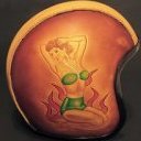
 Daviddesign got a reaction from Alfred in My first minimal logo design for gallery
Thank you guys for advice!
-
Daviddesign reacted to Alfred in My first minimal logo design for gallery
I think I like the third one best. I quite like the first one, too, but the contrast is rather low since the background is so dark.
-
Daviddesign reacted to Wosven in My first minimal logo design for gallery
Same as you Elfred,
but the first one can be part of a graphical chart, with usual colours to use with the logo, or on wall, etc. since this give a rich feeling.
-
Daviddesign reacted to Wosven in My vector logo work some example
Hi,
The first one is too more like a show of pkayinf around with nices features, but lisibility is difficult and we can begin of ways to have it simpler... It looks more like a rought than a final logo.
The second one is interesting, but there're lisibility problems too : it'll be difficult to read at a smaller size.
The third is best : easy to read, and we can find elements we can reuse to have smaller but easily reconizable and rzadable version, and we can imagine through time other simpler versions using part of the design, of the colours, etc. A smaller version wirh only the shapes, colours ans Ds... A next one in few years with another version of DD as modernisation, etc.
That's the one with more possibilities and the more interesting for me