A GREP style for the Runts is just an annoying workaround. But the great advantage is the automation.
The alternative is to change as Bhikkhu pointed out to change manually the tracking.
However, having an automated process (GREP) is from my experience much better to get rid of runts.
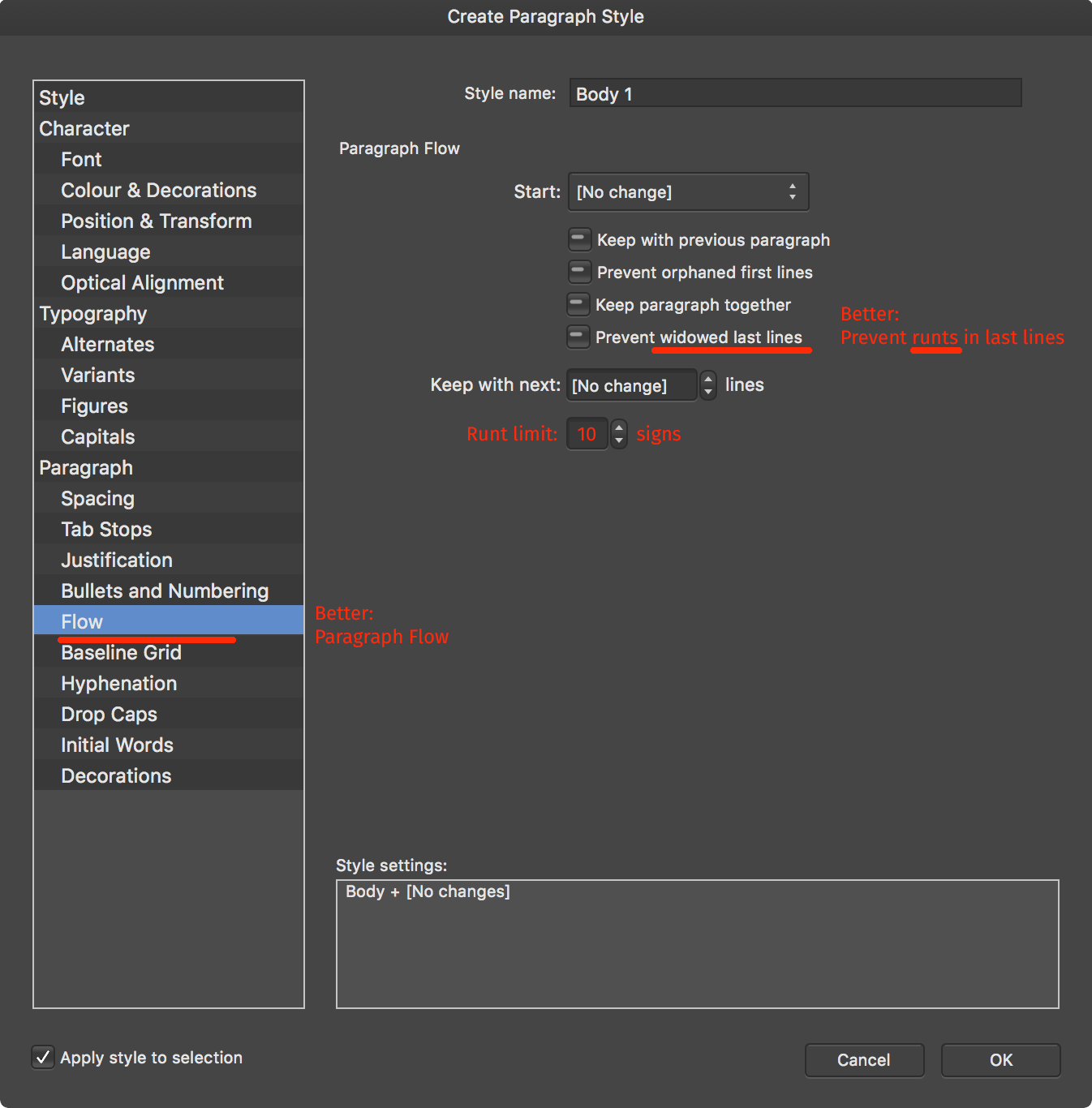
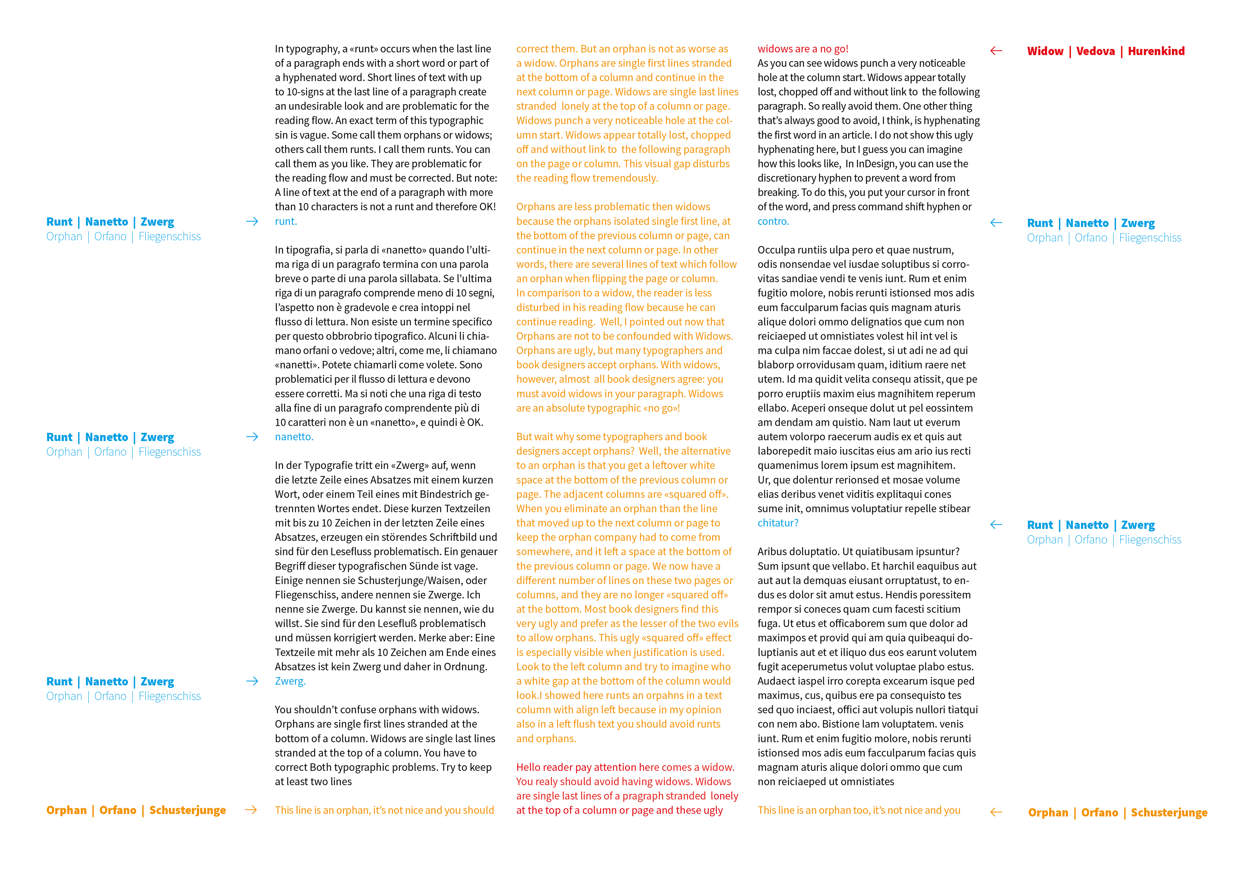
For runts, I intend max. 10 characters at the end of a paragraph / not at the end of a column which is an orphan.
For runts, iD does not offer an easy 1-click automated process which is annoying.
Would be great if AD would have this one day.
Dave: If you force two words/runts in the last line of a paragraph with a No Break to stay together... from my experience, they do not make the line before to loose or too tight (Paragraph Composer)... If you made the right settings in the Justification pane (see below my standard settings).
In ID the Paragraph end zone in the Hyphenation section effects only left-aligned/ right-aligned/ text.
The Paragraph end zone has non-effect on a justified text.
There are other two hyphen related functions which I could imagine that many designers
would be thrilled to have as automation in AP:
1.
A checkbox which prevents hyphening a Word in the 1st line of a column!
This automation ID does not offer. Would be great if AP would offer this possibility in the future.
2.
The possibility to force-prevent a «SINGEL LETTER LAST WORD» in a line. This issue I also solve in ID with a GREP.
I don't know how you think about this issue going manually through the text to eliminate these 1-letter last words especially in
left-aligned columns this is very annoying and time-consuming.
Bhikkhu:
For a Body Tex (justified) I use usually these settings for a line length between 45-75 characters:
Justification Word Spacing
Min 80% Desired 100% Max. 135% Letter Spacing
Min -3% Desired 0% Max. 3% Glyph Scaling
97% 100% 103%
> a Glyph Scaling somehow between 1-3%; you practically can’t see with the naked eye. Everything over 3% /-3% is problematic.
In ID justification pane:
The %values are very abstract (at least to most of the designers I know).
But you can approximately convert the %-values into EM-units to get a better feeling for what these %-values mean.
The Letter Spacing has the most significant effect, followed by the Glyph Scaling; the Word Spacing has the slightest impact. The average Word Spacing in a font is 1/4 of an EM, which is 250 units. A 10% Word spacing equals a Tacking Value of 25 (units). Most fonts have a Word Space somehow between 200 and 300 units. Therefore a 90% Word spacing (-10%), equals a Tracking somehow between - 20/-30, depending on the font. By experience, I found this Rule of thumb: a Glyph Scaling of -1% (99%) has the same effect in space optimisation as a - 5 Tracking Value. Another Rule of thumb: a Letter Spacing / Tracking between 5-10 is trouble-free and hard to recognise with the naked eye. A tracking between 10-15 is still OK but perceivable. Everything over 20 might do more harm than good.
A good question to which I've no good answer is, how to convert the %-Letter Spacing in EM units. This is quite hard because the kerning/ derning classes differ quite a lot. However, in a font, the side-barings of the lower case «n» is between 20 -90 units of the EM («n» and «o» are usually the reference letters for the letter spacing of a font; therefore, they are good candidates to get a rough idea of how a typeface is generally spaced). I know it's a bit abstract discurse but might be of interest to get a better feeling of what these values do.

 A GREP style for the Runts is just an annoying workaround. But the great advantage is the automation. The alternative is to change as Bhikkhu pointed out to change manually the tracking. However, having an automated process (GREP) is from my experience much better to get rid of runts. For runts, I intend max. 10 characters at the end of a paragraph / not at the end of a column which is an orphan. For runts, iD does not offer an easy 1-click automated process which is annoying. Would be great if AD would have this one day. Dave: If you force two words/runts in the last line of a paragraph with a No Break to stay together... from my experience, they do not make the line before to loose or too tight (Paragraph Composer)... If you made the right settings in the Justification pane (see below my standard settings). In ID the Paragraph end zone in the Hyphenation section effects only left-aligned/ right-aligned/ text. The Paragraph end zone has non-effect on a justified text. There are other two hyphen related functions which I could imagine that many designers would be thrilled to have as automation in AP: 1. A checkbox which prevents hyphening a Word in the 1st line of a column! This automation ID does not offer. Would be great if AP would offer this possibility in the future. 2. The possibility to force-prevent a «SINGEL LETTER LAST WORD» in a line. This issue I also solve in ID with a GREP. I don't know how you think about this issue going manually through the text to eliminate these 1-letter last words especially in left-aligned columns this is very annoying and time-consuming. Bhikkhu: For a Body Tex (justified) I use usually these settings for a line length between 45-75 characters: Justification Word Spacing Min 80% Desired 100% Max. 135% Letter Spacing Min -3% Desired 0% Max. 3% Glyph Scaling 97% 100% 103% > a Glyph Scaling somehow between 1-3%; you practically can’t see with the naked eye. Everything over 3% /-3% is problematic. In ID justification pane: The %values are very abstract (at least to most of the designers I know). But you can approximately convert the %-values into EM-units to get a better feeling for what these %-values mean. The Letter Spacing has the most significant effect, followed by the Glyph Scaling; the Word Spacing has the slightest impact. The average Word Spacing in a font is 1/4 of an EM, which is 250 units. A 10% Word spacing equals a Tacking Value of 25 (units). Most fonts have a Word Space somehow between 200 and 300 units. Therefore a 90% Word spacing (-10%), equals a Tracking somehow between - 20/-30, depending on the font. By experience, I found this Rule of thumb: a Glyph Scaling of -1% (99%) has the same effect in space optimisation as a - 5 Tracking Value. Another Rule of thumb: a Letter Spacing / Tracking between 5-10 is trouble-free and hard to recognise with the naked eye. A tracking between 10-15 is still OK but perceivable. Everything over 20 might do more harm than good. A good question to which I've no good answer is, how to convert the %-Letter Spacing in EM units. This is quite hard because the kerning/ derning classes differ quite a lot. However, in a font, the side-barings of the lower case «n» is between 20 -90 units of the EM («n» and «o» are usually the reference letters for the letter spacing of a font; therefore, they are good candidates to get a rough idea of how a typeface is generally spaced). I know it's a bit abstract discurse but might be of interest to get a better feeling of what these values do.