William Overington
-
Posts
2,389 -
Joined
-
Last visited
Everything posted by William Overington
-
HKS colour table integration?
William Overington replied to Michail's topic in Feedback for Affinity Publisher V1 on Desktop
Could someone possibly explain why there is both HKS-K and HKS-N please? William -
Thank you. William
-
Oops. I had move the swatches panel onto the publication, which was just a test and I did not save it. I started a new document and I seem to have lost the Swatches Panel. I closed Affinity Publisher, started it again and started a new document. Yet there is no swatches panel. I have looked to try and turn it back on but I have not been able to find how to do it. Can anyone help please? William
-
Oh, it is meant to be three bars! Ah. Well, for me at least, it would be a lot clearer if the symbol were twice as high and two or three times wider. What you say is a pulldown arrow, before you explained, I wondered what that "full stop" was doing there! It can only provide a hint if one first realizes that it is a pulldown arrow! William
-
Thank you. It seems that one needs to click that strange little squiggle over to the right at the top. If you have got the panel pulled out onto the page area, the strange little squiggle is just to the left of the x that I is at the top right. Maybe the word Preferences rather than the strangle little squiggle would be an improvement? William
-
I am trying to add the two .ase files for HKS colours, mentioned in a thread about HKS colours. I have the Swatches Panel open and the Affinity Publisher help facility says about Panel Preferences quote To import a color palette: Click Panel Preferences and select a palette type from the Import Palette sub-menu. Locate the file you want to import and click Open. The newly imported palette will now be available to choose in the palette pop-up menu. end quote Yet I cannot seem to be able to find Panel Preferences. Can anyone advise me on this please? I have tried right-clicking on the Swatches Panel but nothing is shown. William
-
HKS colour table integration?
William Overington replied to Michail's topic in Feedback for Affinity Publisher V1 on Desktop
I had not known of the HKS colours before reading your posts, but as it is about colours I decided to try to find out. I found the following. https://en.wikipedia.org/wiki/HKS_(colour_system) There is a link to an official website and the website has a drop down selection box so that a version in English becomes displayed. https://www.hks-farben.de/ https://www.hks-farben.de/en_us/ Just a note in case this is new to anyone else too. William -
Have you noticed the date?
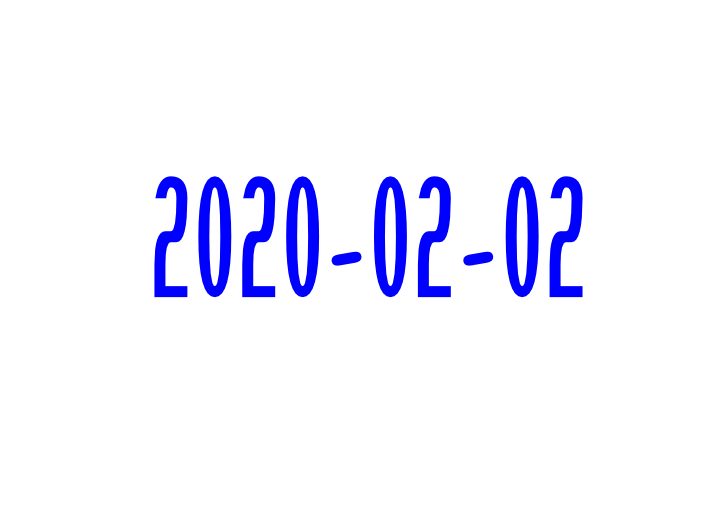
William Overington replied to William Overington's topic in Share your work
Here is the PDF (Portable Document Format) document. William 2020-02-02.pdf -

-
multi Fifty word science fiction stories
William Overington replied to William Overington's topic in Share your work
The story in the previous post contains a puzzle. Yet the seemingly magic trick can be done without any magic at all. Can you work out he could do it,? William -
multi Fifty word science fiction stories
William Overington replied to William Overington's topic in Share your work
-
multi Fifty word science fiction stories
William Overington replied to William Overington's topic in Share your work
&page=2#.url
-
multi Fifty word science fiction stories
William Overington replied to William Overington's topic in Share your work
Thank you. In mine, actually the whole paragraph was justified, from the original, and the word 'being' went onto the next line at one stage, but after that it seemed to do it only on the highlighted line, notwithstanding that there was no line break between the two lines. With poetry the layout is often different right from the start and I too use line breaks for poems. William -
multi Fifty word science fiction stories
William Overington replied to William Overington's topic in Share your work
Oh, I had replied some hours ago, it looks like I did not click send. The text appears to have been lost, but it was something like the following. Thank you. I did not know about it before. I have had a go at this and, probably because of me being new to it, it seemed somewhat hit and miss. I started with a copy of the original .afpub file so that I still have the original. I tried the technique and at one time the word 'being' went to the next line! However, I got the following so I decided to export a png graphic file and post it into the thread. Is it the case that the width of each of the glyphs is not altered but that what happens is that some of each of the five spaces between the words is distributed into the twenty-six gaps between the letters within the words? Thank you again. William
-
multi Fifty word science fiction stories
William Overington replied to William Overington's topic in Share your work
-
Suggestions for creating a website to show off portfolio?
William Overington replied to CT-Scott's topic in Share your work
Hi I know nothing at all about the facilities being discussed so I do not comment on them. However, I am still, happily, using a "free with dial-up internet" webspace started in late 1997. Alas, the supplier is not accepting new customers for the webspace facility, it is just a legacy matter from a company they took over which had along the way taken over the company which originally offered the webspace. The "dial-up" facility was closed about five years ago, but I have been allowed to keep the webspace. In fact, broadband has been used from around 2004, but also kept the dial-up going, even though not actually using the dial-up itself, just to keep the website (though there is a webmail with it too, though largely unused now, just for sending myself emails with an attachment as a extra back-up facility). So why am I mentioning this here? The reason is that I have produced the webspace entirely using raw HTML (hypertext markup language) and I am pleased with what I have got. The webspace loads quickly, carries no advertisements for anything else not under my control, and it is "all my own work". Not flashy, animated can-cause-some-people-issues flashing things, no stuff designed to impress management in a quick demo yet quickly become a nuisance for anyone else viewing the site in its regular operation. So the service provider is doing just that, providing a service of a clean, accessible webspace hosted on their server, the rest is up to me, subject only to legal obligations over content that apply to everybody, however they produce a webspace with whatever provider, must adhere. My webspace has always been, and always well be, entirely suitable for family viewing, so no problem there. So, if you can find a provider that can provide you with that basic, quality service for a fee then I suggest, if I may, that you consider using basic HTML. The following page gives the nearest page to the sort of thing that you might like to do, as regards layout. I am not one for knocking my own stuff but the graphics are just bits of pieces of my own hobbyist work, the link is not included here to showcase my graphics as such, I am just trying to give an idea of what could be done using raw HTML to showcase a portfolio. Near the top of the page are links to PDF (portable document format) documents, some of which contain graphics, further down the page are some graphics displayed as images upon the page as well. http://www.users.globalnet.co.uk/~ngo/library.htm Here is a link to a set of linked pages from some years ago that shows some photographs in a sort-of-interactive setting. http://www.users.globalnet.co.uk/~ngo/cloc1909.htm The link to the home page of the webspace is as follows. http://www.users.globalnet.co.uk/~ngo/ These days, I produce the HTML pages using WordPad and saving as a text file, not using any fancy rich text format at all. I then upload using an ftp (file transfer protocol) link, item by item, from Windows 10. The website is safe to use. It is on a server run by PlusNet PLC, a subsidiary of BT. The following thread may be helpful. It certainly helped me enormously. https://community.serif.com/discussion/106030/using-ftp-on-windows-10 William -
I have just noticed a question about this that was posted in the High-Logic forum recently. https://forum.high-logic.com/viewtopic.php?f=10&t=8171 It is about the artboard. However, @janndk mentions Affinity Designer, and I do not have that program, so it might be that it cannot be done using Affinity Publisher. Could someone possibly explain please? There is also a related thread. https://forum.high-logic.com/viewtopic.php?f=10&t=8172 William
-
affinity designer Forest Camping Site - Isometric Design
William Overington replied to Phillipp's topic in Share your work
Thank you for posting. I have watched the first two minutes of it so far. I know it says Speedart. However. I liked the initial picture showing what you have produced, but the other was just far too fast, in my opinion, for me to learn from it. Also, in common with many other videos from other people, the writing is far too small.I realize that it would make the video longer but for me I would rather have a, say, one hour video, of a live recording of you doing it, at a slow pace such that someone who is new to using the software can follow what you are doing. Too many videos from many people show a click on the menu bar, a drop down menu and something chosen and moved on before I get a chance to take in what is being done. For me, if instead of a musical background you were providing a running commentary, speaking, slowly, as to what you are going to do just before you do it then that would be good. For example, "I am now going to choose NAME1 from the menu bar." then do it, pause for the viewer to take it in, then "Now, I need to select NAME2 from the drop down menu", then do it, and so on. Maybe it needs a series of videos, such as, say four videos, namely overview, drawing the tent, drawing the trees, putting it all together. Quite what can be done about the tiny lettering is a difficult problem. If you have video editing software, could you overlay an enlarged version of the current drop down menu in the lower left corner of the final video. As it happens, I use Affinity Publisher and I find the white on black menu and so, for me, awful frankly. So I always use the option of the light background with the black lettering. I accept that is a matter of choice which choice any user makes, it is good that Serif allows us that choice. As it happens I learned some very basic isometric drawing using a program called AutoCAD, and so the complexity of the result that you produced impressed me. William -
multi Fifty word science fiction stories
William Overington replied to William Overington's topic in Share your work
Over 26 hours and 110 views since my previous post. Stuck for inspiration? If so, how about having a go at creative writing by continuing from one of the following? ---- She gazed up at the gibbous moon in the sky and wondered if She had always struggled learning languages, but putting the bracelet on her wrist she found she could suddenly speak and understand Portuguese. Now she Now that petrol for cars has been banned, he looked at the classic car in his garage and ---- No need to post if you don't want to, but this is not a competition, and all posts are welcome. William -
multi Fifty word science fiction stories
William Overington replied to William Overington's topic in Share your work
-
multi Fifty word science fiction stories
William Overington replied to William Overington's topic in Share your work
Each of the stories that I have published in this thread were prepared using an A5 landscape page, starting with the Frame Text panel the same size as the margins that appear by default. I export as a png file making the height 512 pixels, which makes the width become 726 pixels. William -
multi Fifty word science fiction stories
William Overington replied to William Overington's topic in Share your work
The font used in the passive starship story is Aldine 401 BT, which is like Bembo. The font is at 30 point. There is no leading between the lines (that is, in Affinity Publisher parlance, Paragraph Leading is the same as font size). William -
multi Fifty word science fiction stories
William Overington replied to William Overington's topic in Share your work