William Overington
-
Posts
2,336 -
Joined
-
Last visited
Everything posted by William Overington
-
affinity designer Logo review (IT Company)
William Overington replied to Lafonia's topic in Share your work
Until you mentioned it I had not realized that the logo was intended to be d and p. If you want to convey d and p then maybe have a longer ascender on the d and a longer descender on the p. I quite like the multicolour versions but maybe the plain one is more practical. Though you could have both, for use in different contexts. Maybe also one done in outline to avoid messy printing where the solid colour might not come out well? Would that be an outline of the whole logo or outlines of each of the parts of the shape? Maybe a large (approximately two metres by approximately two metres) version of the outlines of all the parts of the shape made up of bronze rods as a sculpture could be a work of art in the foyer of your offices if the business grows. William By the way, I am not a professional designer, just a hobbyist, so the above is just me chatting as a hobbyist. I am not trained in art and design. -
multi December challenge - Festive fever
William Overington replied to z3z's topic in Share your work
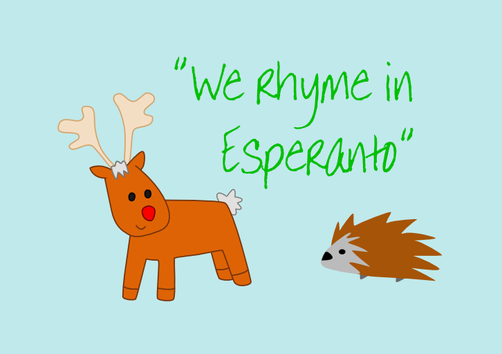
@z3z Hi. Just as a hobby I like to write original song lyrics sometimes. Most are in English, though I have written two songs in Esperanto and one in French. Years ago I was looking for rhymes for the word paco (which means peace) and I went through the dictionary that I had available to try to find Esperanto nouns ending in -aco. I found various, including boaco, cetaco, erinaco, glaco, graco. https://translate.google.com/ Those words shaped the lyrics of the song. I cannot find the original text at present, it is on a print out in a box somewhere, but I have got a bit of it on the web. http://www.users.globalnet.co.uk/~ngo/lingvo_de_paco.htm The key part in relation to this discussion is as follows. Kiam neĝas se vi imagas la branĉkornojn de boaco Se vi dolĉe respektas la vivon de erinaco When it snows if you imagine the antlers of a reindeer if you sweetly respect the life of a hedgehog I used the word dolĉe rather than gentile (kindly) because it has two syllables and I wanted the sort of "tang" of the last two letters of dolĉe The thing is, I would not have thought of having a reindeer and a hedgehog in the song if the song was in English, the imagery is thus of the language. William- 27 replies
-
- 2
-

-
- affinity designer
- show your art
- (and 2 more)
-
multi December challenge - Festive fever
William Overington replied to z3z's topic in Share your work
I used some clip art from Serif PagePlus X7. In PagePlus I enlarged the reindeer and I flipped the hedgehog horizontally. I set it all out in an A5 horizontal publication in Affinity Publisher. The text is in the Annie BTN font, which was bundled with PagePlus X7. I initially typeset using Arial but changed the font as Annie BTN is narrower setwise so I could use a bigger point size so as to fill the space better. I set it all out on a plain background first then added a large rectangle, changed the fill colour and then moved the rectangle to the back. I exported the whole page as a png, setting the height as 512 pixels. William -
multi December challenge - Festive fever
William Overington replied to z3z's topic in Share your work

- 27 replies
-
- 2
-
-
- affinity designer
- show your art
- (and 2 more)
-
Yes, but I seem to remember there was a team of four people, including those two people. Indeed there was one episode where a group of four criminals dressed up similarly and went around misrepresenting themselves as the real team and they all met up at the end. William
- 8 replies
-
- 1
-
-
- illustration
- isometric
- (and 1 more)
-
multi Translation to Czech
William Overington replied to czech.kuba's topic in Feedback for the V1 Affinity Suite of Products
Alright. -
multi Translation to Czech
William Overington replied to czech.kuba's topic in Feedback for the V1 Affinity Suite of Products
Could someone at Serif possibly say please, as long as it is not a proprietary secret, how does the word File get onto the menu bar in Affinity Publisher please? For example, is it sort of like the following. Lettering(20, 100, "File") where Lettering is a function either within the program or supplied by the compiler system. The reason I ask is because I am wondering if in the special version that I am suggesting that that could be replaced by something like Lettering(20, 100,LocalizedVersion("File")) where LocalizedVersion would be a function in the program with a parameter of a string and a returned value of a string, and the LocalizedVersion function would search the customized text file for the string File| and if it found it then use the text after the | character on the same line in the customized text file as the returned string and if it did not find it then return the input string. By doing it that way the method would not depend upon the word File being on any particular line of the text file, so more searching would be needed to find strings but there would be the benefit of the customizable file for each Affinity program would be much simpler to construct and any errors in making a customized version of the customizable file (such as accidentally deleting one line of it) would tend to have only a minimum, more easily detectable, effect rather than a major effect. Certainly in principle the search would be through the file but in practice maybe the file could be rad in to the program at the start and thus the searching could be done by searching a data structure in the software rather than keep opening the file as such William -
multi Translation to Czech
William Overington replied to czech.kuba's topic in Feedback for the V1 Affinity Suite of Products
Would it be practical for Serif to produce a special version of Affinity Publisher that at run time gets all its labels by looking in a customizable file? For example, suppose that there were a text file that has the following File|File New|New Open...|Open... Open Recent|Open Recent Close|Close and so on and then there could be a version of the text file that had been customized for Czech where the text after the | is changed for the same meaning in Czech, and there could be a version of the text file that had been customized for Latvian where the text after the | is changed for the same meaning in Latvian, and so on for various languages. If that facility were available then the versions of the text file could be produced by community effort, so that Serif would not need to make a commercial outlay for each separate language. Then it would be a matter of using the correct customized version of the file and at start up the special version of Affinity Publisher would become customized to that language. The words are put twice in the original version of the customizable file so that by default the original English would be used. So if, say, someone starts to make a customized version of the file for Czech then those labels that have been set up for Czech would be displayed in Czech and the rest would be in English rather than be blank. That way, successive versions of the customized version of the file could gradually be produced over a period of time. The customized files could be made available in the forum. William -
If you were to start a new document in Affinity Publisher, landscape format, wide but only as deep as needed and include each character that you want to include then produce a PDF document, then the PDF document could be used as a typecase for an end user to select a character and copy it onto the clipboard and paste into a document. It is not a good a solution as what you request, but you could do it now and it would have the benefit of all the characters for one topic being in the same document so that an end user would not need to already know in which Unicode block the character is listed in the glyph browser. Here are some samples of similar things that I produced some years ago. They can be very useful sometimes. These were produced using PagePlus. Affinity Publisher has the advantage that the PDF can include characters from al, of the Unicode planes. Using the copy and paste can be a bit clunky at times as it may well be necessary to format it all to the correct font. http://www.users.globalnet.co.uk/~ngo/typecase_welsh_accented_characters.pdf http://www.users.globalnet.co.uk/~ngo/typecase_esperanto.pdf A possible benefit of trying the above is that the results produced by community effort could help Serif if Serif wants to implement your suggestion, because Serif could then use such PDFs as a guide to how to provide what you request without needing to do all of the specialist linguistic analysis themselves. William
-
'Regarding the picture of Ferdinand Magellan. It is very good. When I saw the thread listed, I wondered if there would be any reference to the Magellanic clouds. https://en.wikipedia.org/wiki/Magellanic_Clouds I first leaned of them in the 1950s. I had a book possibly about A4 size pages or so, and it was not like a text book it was more like a serious subject comic-style book and it was black and white text on paper and also large line drawings and throughout it were also blank squares about 2 inches by 2 inches or so each with a number near it and in the centre was a double spread pull out sheet of numbered stickers printed in full colour on glue-backed-paper, like the glue on old fashioned envelopes, to cut out and stick in the squares, thus producing quite a colourful book. One of the pictures was of men on Magellan's ship looking up at the sky and one pointing at what are now known as the Magellanic clouds. I am just wondering whether you might like to consider making a second version with the Magellanic clouds in them as well. Your picture already has a black background, it would perhaps being more a matter of deciding how to feature them. William
-
Traditional Mongolian Support
William Overington replied to Tengis's topic in Feedback for Affinity Publisher V1 on Desktop
Google translate gives the following translation, detecting the language as Chinese. > Hello, my name is Tengis, a typeface designer in China and Inner Mongolia Autonomous Region. My main font design direction is traditional Mongolian. Traditional Mongolian is left-to-right, top-to-bottom text, so the font will use the Mirror version when arranging the article, and then reverse the text box...I feel comfortable when using Affinity Publisher. I have already helped me a lot. If there is further support in traditional Mongolian, I think it will be cool. If you are willing to do such an update, I am willing to participate. -
@Pattou Thank you. William
-
@Pattou Very nice. You have made it so that it looks like it is a photograph of a painting, perhaps sort of like a painting by John Constable. Could we possibly see what you started with as well please? William
-
The requested tag has now been added. Excellent. Thank you. William
-
I have just seen the following. I am on the lady's e-mailing list for her new posts. https://www.michellesblog.co.uk/autumn-leaves-2/ William
-
Well, I cannot play a musical instrument. Also, although I can think of a tune for a song and I sing various of my songs when I am doing housework and so on, I cannot go from a tune to producing written musical notation. So I find it often quite easy to have a tune for a song, it seems to sort of emerge as I write the lyrics. A solution that I have used is to record me singing and publish the result within a document in the hope that maybe someone who can sing well could hear my singing and thereby understand the tune that I intend and its speed and so on and then, based on that understanding, could produce a good performance. For examples, http://www.users.globalnet.co.uk/~ngo/the_mobile_art_shop.pdf and http://www.users.globalnet.co.uk/~ngo/cyberspace_cafe.pdf which were produced using Serif PagePlus. To do that I needed to embed a .wav sound file into a PDF document, which is possible using PagePlus - I needed to choose an output level for the PDF that is more than the basic level so that Adobe Reader will play the sound file. Playback of the sound depends on the way it is played back. I have found that playback online on the web often does not work depending upon how the we browser tries to read the PDF document, but downloading to local storage and then using Adobe Reader works well, both for me and for people who have reported their results to me. If one has a musical score written out in music notation it would in principle be possible to typeset some musical notation in Affinity Publisher. It needs a music font. There are some about. I have not looked at them in detail and I am not knowledgeable about musical notation beyond the basics, such as for single notes such as are used in music for a recorder. William
- 50 replies
-
- 1
-
-
- affinity photo
- affinity designer
- (and 2 more)
-
The article about Peter Quince refers to quoins. The word 'quoins' is one that I have known for over fifty years, but only in the context of letterpress printing. I was unaware of other uses until now. https://www.lexico.com/en/definition/quoin William
-
When I wrote the song I included the line > as quince fall to the ground instinctively without thinking about it as a plural, as if one quince, two quince. The fact that I used the word 'fall' rather than 'falls' and no use of 'a' shows my intention that 'quince' be taken as referring to a plural. Since writing and publishing that I noticed that @John Rostron referred to Quinces. Quince is not a word that I have ever used much, if at all, though I had known of a Quince tree and there is the character Peter Quince in a Shakespeare play. https://en.wikipedia.org/wiki/Peter_Quince So I went in search of the answer. https://www.lexico.com/en/definition/quince It appears that adding an 's' is the way to form the plural, yet interesting the word quince was originally a collective noun centuries ago. The third example of use stated in that dictionary I found particularly amusing! Yet if I added an 's' in the song it would add an extra syllable to the line. I wonder if the fact that adding an 's' means that an extra syllable is produced somehow in some way caused me to think that the plural would not have an 's'. With apple, pear, plum adding an s does not add a syllable, peach has peaches as the plural yet not quite the same as just adding an 's'. William
- 50 replies
-
- 1
-
-
- affinity photo
- affinity designer
- (and 2 more)
-
So there are now two pictures in the thread produced using Affinity Publisher. An extra tag at the top of the page to go alongside the tags for affinity designer and affinity photo perhaps? William
-
Thank you. I only have Publisher from the Affinity range. I had a trial copy of Designer but have not as yet bought it as I hardly used it apart from trying it out. I have a number of the older Serif programs from the Plus range. There is a drawing program, DrawPlus of which I have a not-the-latest version and I hardly ever use it. Most of what I produce is text based and I use PagePlus (a desktop publishing program) for that and PagePlus has been extremely good as it has enabled me to produce PDF (Portable Document Format) documents. I appreciate that Affinity Publisher is a more recent product and can also produce a PDF document - indeed a PDF document with even better support for typography than PagePlus, which has good OpenType support - but thus far I have not used Affinity Publisher very much, mostly just for learning about it. This challenge specifically needed use of a program from the Affinity range, and I wanted to participate in the thread and I wrote the song so as to participate. Had I started with having written a song and I was wanting to produce a publication, the motivation for the project being thus different, I would have used PagePlus, simply because getting the song lyrics published would have been the goal and I am more used to using PagePlus. However, if it were not for this challenge and the suggested theme this song would not have been written in the first place. However again, now that I have written the song I shall try to include it somewhere in the novel that I am writing. William
- 50 replies
-
- 1
-
-
- affinity photo
- affinity designer
- (and 2 more)
-
I have written the song after reading your post earlier today and having looked at the images posted thus far. This image was produced using Affinity Publisher. William
- 50 replies
-
- 5
-

-
-
- affinity photo
- affinity designer
- (and 2 more)
-
Thank you. So I suggest that Jablonec nad Nisou be typeset in full on the map, perhaps in a green colour as suggested in my previous post. https://en.wikipedia.org/wiki/Jablonec_nad_Nisou It seems that this is a similar naming construction to Stratford-upon-Avon in England. That name helps to disambiguate from Stratford that is part of London, the places being around a hundred miles apart. William
- 6 replies
-
- 2
-
-
- liberec
- jablonec nad nisou
- (and 3 more)
-
I like the inclusion of the transliterations of the names from Cyrillic Script to Latin Script. I remember learning that there are at least two formats for the transliteration from Cyrillic Script to Latin Script. This may well account for why Chebyshev polynomials in mathematics use the letter T in their designation, because the transliteration into Latin Script of the first letter of the name in the Cyrillic script of the mathematician after whom the said polynomials are named using the German translation system starts with a T whereas using the English transliteration system it transliterates it starts with a C. There was an interesting thread about seventeen years ago in the Unicode public mailing list where this was mentioned and an interesting thing that emerged was that the mathematician, a Russian, had a less than common first name and someone wrote and explained that the name was indeed Russian. It turned out that the mathematician had been born a few miles from a church named for a saint of that name and born within a few days of the saint's feast day. I have been trying to search for the thread so as to be able to post one or more links here, but I have not found it yet. Cyrillic is associated with Russian, but it is also used for Ukrainian and Bulgarian. I seem to remember that at least one of them has an alphabet with a few more Cyrillic characters than does the Russian alphabet. William
- 4 replies
-
- 1
-
-
- transit map
- transit diagram
- (and 4 more)
-
Would it be an improvement to put the names of the railway stations in a darker colour? Not black so as to avoid confusion with the tram stops: maybe blue? Would the names of the places be better in a darker colour: maybe green - not r=0; g=255; b=0; as that might be a bit bright, but a green that is darker yet still green enough so as not to look like almost black? Also, what does n.N. in Jablonec n.N mean please? Maybe it is always written like that but if it is just an abbreviation of something not that long would it be better to have it in full as there is quite a lot of blank space. Maybe n.N. could be spelled out on a line beneath Jablonec? William
-
Unicode Inc. seeks designs
William Overington replied to William Overington's topic in Share your work
http://www.unicode.org/mail-arch/unicode-ml/y2019-m10/0098.html William