William Overington
-
Posts
2,389 -
Joined
-
Last visited
Everything posted by William Overington
-
Well, I'm not sure. It is an 11 inch Hewlett Packard laptop that cost £199. Nothing exotic. I am enclosing a print screen image. William

-
I have just accessed the thread https://forum.affinity.serif.com/index.php?/topic/138654-artwork-for-greetings-cards/ again so as to add a post, but find that the posts are all squashed to the left and there is a column over to the right with some details about the thread. Maybe I have unwittingly selected an option, maybe it is a feature, maybe a bug. Can I get back to the unsquashed version please? Something else I noticed was that the views count has gone to 2.5k rather than a specific number, which means that I cannot note interest easily anymore. William
-
affinity designer Artwork for greetings cards
William Overington replied to William Overington's topic in Share your work
I have just accessed this thread again so as to add a post, but find that the posts are all squashed to the left and there is a column over to the right with some details about the thread. Is that going to be there all the time now or can I get rid of it somehow please? William -
affinity designer Artwork for greetings cards
William Overington replied to William Overington's topic in Share your work
Ah, you asked what swatch. It is the Pantone CMYK one for uncoated. But I cannot look it up at present to get the precise name becaus somehow I have got Designer into a mode with just the image and nothing else and I don't know how to get out of it. I closed down and restarted but it is still the same. How do I get back to Designer in its normal layout please? William -
affinity designer Artwork for greetings cards
William Overington replied to William Overington's topic in Share your work
Well, orange and green are often two of the extra colours in 12 colour archive printing. But the hardcopy print of that poem with the colours (my third card) has the green quite good. More the apple green of some of the LNER locomotives than the green of some British Railways steam locomotives in the 1950s, which I think may have been the same green as used by the Great Western Railway. One or both was, I think, called Brunswick Green. On that card, at the right part of where the orange watercolour brush effect overlaps the red watercolour brush effect it is quite like an orange fruit. Now it is supposedly CMYK. I suppose that it is possible that it got printed with something more exotic if that is the word. Maybe, just maybe, someone saw it and gave it an upgrade, or maybe every card has that upgrade. In any case the printing equipment is probably in a different league to what is usually available in a home or office setting. William -
affinity designer Artwork for greetings cards
William Overington replied to William Overington's topic in Share your work
Well the card with the colours had quite bright colours on the actual printed card. A bit muted from the one's displayed on screen, some more muted than others. There does not to seem to be greens in that swatch, maybe it is me or this computer or maybe I missed them. William -
affinity designer Artwork for greetings cards
William Overington replied to William Overington's topic in Share your work
Though looking through it there do not seem to be the bright colours that were on the card with the poem that was in language-independent glyphs. I am wondering why, or have I missed them? William -
affinity designer Artwork for greetings cards
William Overington replied to William Overington's topic in Share your work
I have just checked on the Papier website and the Paper Quality for the two card templates that I am using are listed as follows. > High white premium quality paper (350gsm) with an uncoated finish So I would be using a Pantone uncoated palette, probably the one with CYMK in its name.# William -
Then there is turquoise. https://en.wikipedia.org/wiki/Turquoise So if I copy the glyph for cyan and add a vertical line at the right, to complete the triangle, turquoise can be represented in that way. So still to design are teal, aqua, royal blue and dark blue. I am wondering how these colours tie in, if at all, with Pantone colours. https://www.pantone.com/ Affinity Designer has Pantone colours, but I think only the print ones. Alas Pantone seems to focus support on Adobe products and it seems that the palette files may now only be accessed by subscribers to Adobe products. Pantone colours have some for print and some for fashion and home. Using Pantone colours in a standard might be problematic as Pantone is proprietary, though I notice that the blue used in USB 3.0 sockets in specified as a Pantone colour. William
-
affinity designer Artwork for greetings cards
William Overington replied to William Overington's topic in Share your work
In another thread, colour is being discussed. https://forum.affinity.serif.com/index.php?/topic/140122-colours/ In this thread, if I used Pantone colours in producing artwork and then produced a jpg file for the purpose of sending it to Papier to print, would the fact that they are Pantone colours be lost in producing the jpg or would Pantone information go through? The greeting cards do not go through a varnish process as do cards from at least some other suppliers, which is why I use Papier. Also having Papier on the back as an imprint is fine, it adds provenance. I would not want some of the 'hip' names used elsewhere as an imprint on my art. Though I suspect that that is not the same as coated and uncoated as used in Pantone swatch names. So if I check whether the card used by Papier for these photo greetings cards is coated or uncoated, if I use the Pantone CMYK palette or that type of paper, would the Pantone names simply be a feature of the source file rather than the jpg file,? In a similar sort of way that grouping object in an Affinity Designer afdesign document does not go through to the jpg. I am thinking that using the Pantone CMYK palette might be a good way of documenting my artwork. I am new to this, so I may have got it muddled. William -
Looking at the Unicode document I think that I need to add light blue as a necessity. I currently have blue as horizontal lines, and sky blue as horizontal lines with a vertical at the right. So light blue could be horizontal lines with a vertical at the left. I could add light green as the same as green with an added vertical at the right to complete the triangle and light magenta as the same as magenta with an added vertical at the left to complete the triangle. Gold could be done with a detached circle below the horizontal bar that is at the top. Silver could be done with a detached lozenge below the horizontal bar that is at the top. I can think further so as to have copper, bronze and brass separately. William
-
New out yesterday is the following document. https://www.unicode.org/L2/L2021/21075-heart-emoji-coverage.pdf I am not sure if this is the correct place in this forum to post about it - but I chose here as it seems to me that this is where people using colour in designs might be most likely to notice it. For comparison, my localizable sentences research currently uses fifteen colours, and I have most, but not all, of those listed in the document, and a few more. They are listed on page 4 of the following document. http://www.users.globalnet.co.uk/~ngo/localizable_sentences_the_novel_chapter_005.pdf So I need to consider adding a few more. William
-
affinity designer Artwork for greetings cards
William Overington replied to William Overington's topic in Share your work
The software unicorns appear in my recent novels, one completed in 2019, one over half completed.. For example, in the following. http://www.users.globalnet.co.uk/~ngo/localizable_sentences_the_novel_chapter_021.pdf http://www.users.globalnet.co.uk/~ngo/localizable_sentences_the_novel_author_note_after_chapter_021.pdf William -
affinity photo Oktoberfest beer price analysis title pic
William Overington replied to gre_sch's topic in Share your work
What!? Oh yes. Well spotted. William -
affinity photo Oktoberfest beer price analysis title pic
William Overington replied to gre_sch's topic in Share your work
Ah it is fusily in bends for Bavaria. https://en.wikipedia.org/wiki/Variation_of_the_field William -
affinity photo Oktoberfest beer price analysis title pic
William Overington replied to gre_sch's topic in Share your work
First impressions? Colourful, imaginative use of the blue and white check pattern, Would you click on the image/ article? Probably not, but I am both teetotal and vegan so no interest in the topic! But if someone were interested in the topic might well do if there were some indication that there is an article rather than the analysis being thought to be all in the graphic. Does it need a shape with the text 'Please click for article' upon it? What would you do differently? I would not have had the relative positions of beer and chicken histograms counterchanged in the middle panel. I would have made that centre panel brown at left and yellow at right so as to be consistent. Also, as in two panels brown is at the left, would the title be better as 'Beer and chicken price analysis' so that the words 'Beer' and 'chicken' are in the same relative positions as in the histograms? I would add a shape with the text 'Please click for article' upon it. I notice that the sixth chess board from the left is over the rightmost panel. Is that deliberate? It does seem to add a bit of liveliness to the design. Is the light blue and white check design based on the lonzengy check design that refers in some way to Munich? William -
affinity photo Digital Painting
William Overington replied to rafatparvez's topic in Share your work
Looking at those vertical poles, they give me the impression that a plan view of that scene would show that the poles are set out along curved lines. William- 1 reply
-
- 1
-

-
affinity designer Artwork for greetings cards
William Overington replied to William Overington's topic in Share your work
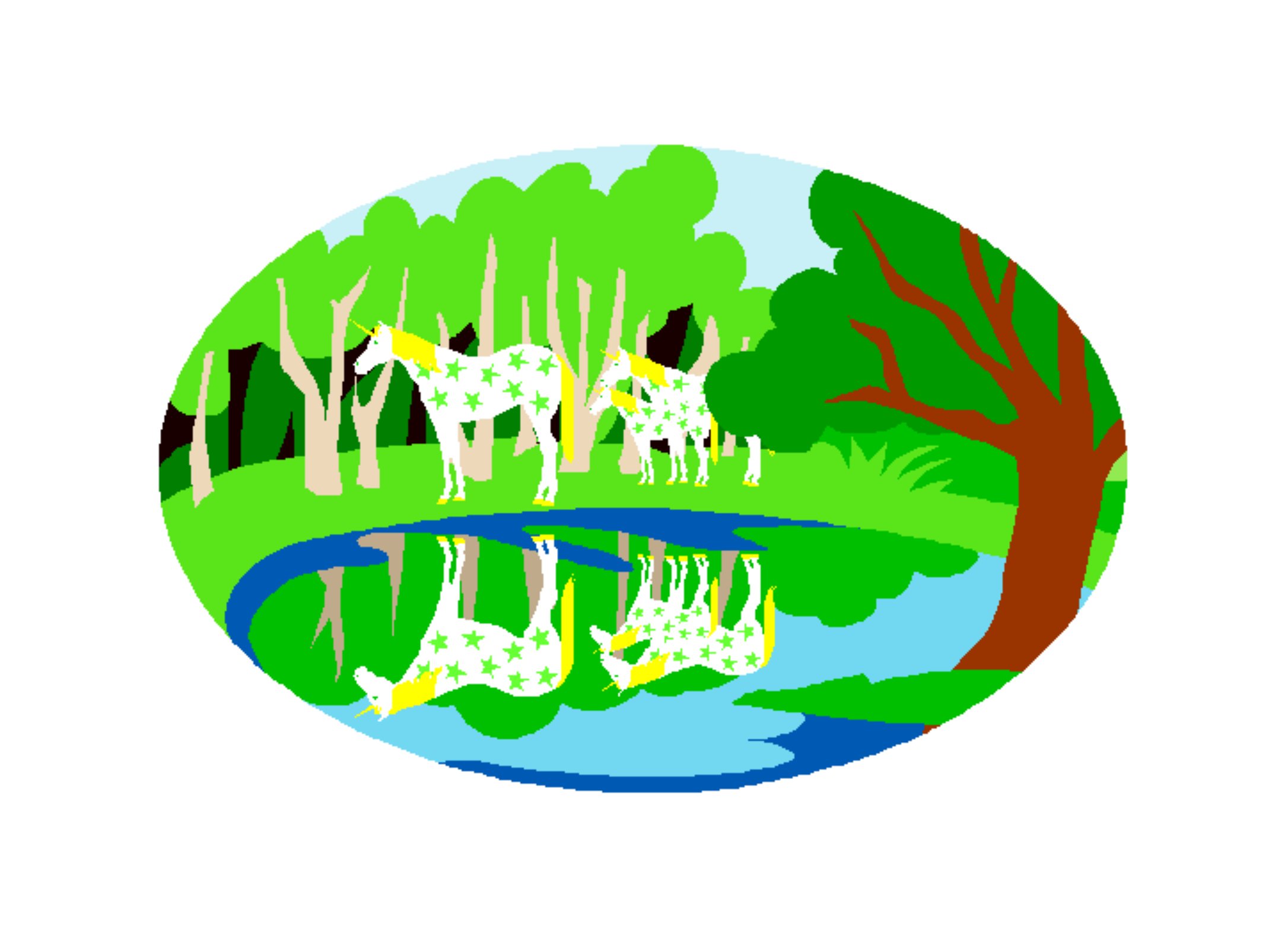
I have now placed an order for a print of Software Unicorns reflected in a Lake. I produced the jpg file by setting up an Affinity Designer document 2171 pixels wide by 1571 pixels high, which includes the bleed areas. So a card 7 inches wide by 5 inches high. I placed the gif file and it was 565 pixels wide y 397 pixels high. So I changed that to 1695 pixels wide by 1191 pixels high, which is exactly 3 pixels for each original pixel linearly in each direction, so nine times (9 = 3 x 3) the area of the original. I then aligned the image centred in the document both horizontally and vertically. I then exported as 300 dots per inch. I expect that the colours will be darker on the print than on the computer. I uploaded the image to the Papier website and I added some text where the greeting appears when the facility is used to produce a greetings card. I used Garamond for the text. Here is the image. Of necessity given the scaling process that I used a bit blocky but I will get something. The image is 300 dots per inch so maybe it will look reasonably good, maybe better than that. I am hoping to frame the result. That does mean that the text inside in hidden but it does give the framed image provenance as to title and so on. I am hoping to produce an improved version based on the vectorized version of the original image that Mike kindly supplied. William
-
affinity designer Design created with data
William Overington replied to gre_sch's topic in Share your work
I have just been reading your article to which you provide a link. If I may say so, your style of providing detailed information about the steps you took and the specific choices you made is great - people can follow your steps if they choose. I notice that in that article you write as follows. > Clearly, I am out of my league here, but it allowed me to try something new and I could definitely learn more about vector editors. Yet it now is in your league. It gives me the idea that I could perhaps use an SVG file written directly in WordPad to produce computer art. Sort of programming the image as source text and then Affinity Designer could effectively run the program (that is, Affinity Designer loads an SVG file) and maybe whoosh colourful computer art. Maybe start off with Affinity Designer, draw a rectangle, fill it with some colour and then produce an SVG file. Copy that design and add a second rectangle, fill it with a different colour and then produce an SVG file. Compare the two files manually. Make a copy of the second one and then use WordPad to add more rectangles. Save the file. Load it into Affinity Designer. That could be fun if I can get it to work. William -
affinity designer Artwork for greetings cards
William Overington replied to William Overington's topic in Share your work
I have this evening been unpacking the card from the cardboard sleeve in which it arrived. It arrived on the Thursday of the previous week, but I have only opened it this evening as it was in quarantine for a week as a precaution due to the pandemic. The print quality is superb. The sixteen language-independent glyphs are really solid black. As expected, the colours are darker than on the on-screen display in this thread. The colours go right to the edge of the card in the style of the commercially printed greetings cards that are available for purchase in shops and online. As the card has thickness, the card has a spine where it is folded from the original flat print and the colours cover the spine. The colours on the left side of the card are really solid and bold. The colours at the right side have various, (depths, is that the word?) as a result of the water colour effect of the virtual brush provided by Affinity Designer. With the exception of the yellow area, brush strokes are clearly visible. However, checking back to the original artwork as displayed in page 1 of this thread, there is not much in the way of brush marks in the right side yellow area, yet there is the quite prominent arc at lower right of the yellow area, but I could not see it even knowing where it is, though I tried again tilting the frame this way then that and I think that I did catch a glimpse of it in the expected place. At the right side there are five areas where a later colour of the rainbow has been applied over the previous colour of the rainbow. Orange over red shows strongly as a deep orange. Yellow over orange is hard to make out, but is there if I look closely. Green over yellow is much the same but a bit easier to see. Blue over green I found very hard to detect as the blue is quite dark. Magenta over blue is about the second strongest, but nowhere near the strength of the orange over red, but the strength of the blue itself makes it look as if the blue is over the magenta. On the inside, the text has printed really clearly. I have framed the card using one of the following frames. https://www.tesco.com/groceries/en-GB/products/251929289 Total cost £8.26, being £3.50 for the card, 76p for postage, £4.00 for the frame. The frame is not, unlike most of the others available, listed as a photo frame. They are probably intended for framing an A4 size certificate. So they were probably not intended framing a smaller card, but I have found that such use does work well. I used five sheets of A4 white card behind the card and in front of the back piece of the frame works well. Fortunately I had an almost full pack of A4 white card handy, having bought it in a specialist stationery shop maybe fifteen years or so ago. William -
affinity designer Artwork for greetings cards
William Overington replied to William Overington's topic in Share your work
Some readers might like to know that the poem featured in the first post in this thread and in some of the early designs is the poem in the following chapter of my first novel. http://www.users.globalnet.co.uk/~ngo/localizable_sentences_the_novel_chapter_034.pdf That chapter is part of a story in the novel that continues over several chapters and if you want to follow the story after the above chapter the chapters are individually linked from the following web page. http://www.users.globalnet.co.uk/~ngo/novel.htm On a separate matter, the twelve inks used in the framed prints may include such colours as light black and light light black. I was wondering why and I am thinking of including in a future artwork an area in CMYK colour format with K=1 and everything else zero in order to discover if at that low value of K using just four ink colours whether a speckled pattern of dots will be noticeable as maybe one dot in 100 will be solid black, so approximately one dot every 10 in each axis. At 300 dots per inch that might mean black dots just under a millimetre apart. Having a light light black ink in a 12 ink system would I am thinking avoid that happening. William -
affinity designer Artwork for greetings cards
William Overington replied to William Overington's topic in Share your work
The concept of auto-trace got me thinking. I often put on YouTube videos Sometimes an advertisement pops up and I usually skip them. But the other day one came up and I watched it all the way through, wondering how they managed to do that. I made a note of the link to the business. In particular because they do custom kits from a customer-supplied photograph. https://masterpiecebynumbers.com/products/masterpiece_by_numbers_custom_paint_by_numbers_kit https://masterpiecebynumbers.com/ The online auto-trace to which Andy05 kindly provided a link also displayed the colours used in the image in a sort of palette area below the image. I am wondering how they get the numbers into the image and remove the colours. -
affinity designer Artwork for greetings cards
William Overington replied to William Overington's topic in Share your work
Yes, I just tried it on the two graphics of the software unicorns. The results look very good. It is a pay service, but the cost is £10 for 100 credits, each download costs a credit, but the credits expire after a month, so if I bought a minimum quantity most would be wasted. William -
affinity designer Artwork for greetings cards
William Overington replied to William Overington's topic in Share your work
I just got my Legacy product keys and the latest DrawPlus I have is DrawPlus X5. I had wondered if there might be a download, but they are only for X6 and X8. Maybe X5 did not do autotrace anyway. Does anyone know please? I certainly have not thrown it away, so if I have a look I may find it quickly, not at all, or somewhere in between. William -
affinity designer Artwork for greetings cards
William Overington replied to William Overington's topic in Share your work
Well, I have got a version, but not the latest version, but it is on a disc somewhere, but that computer has very little space left on it. On that computer I have the three Affinity programs, and also PagePlus X7, FontCreator, Scanahand, and little else otherwise. This computer is also full as it is a basic machine that I got when the other one lost its wifi capability, but using this computer to download a new copy of the wifi driver enabled me to fix it by copying the .exe file over to the other machine, which was still working well apart from the wifi, using a USB memory stick. I got this one because I need to be able to order grocery deliveries as a priority need and this computer is good for that and many other things but there is little of the 32 Gigabyte memory available and it is a Windows 10 S machine and I have thought best not to unlock it from the S version due to that priority need. William