William Overington
-
Posts
2,329 -
Joined
-
Last visited
Everything posted by William Overington
-
Sign Post software
William Overington replied to GRAPHITI's topic in Affinity on Desktop Questions (macOS and Windows)
I pasted your post into Bing Chat ai. Here is the response ---- I found some information that might be helpful. There’s a discussion about the “Sign Post” software for vinyl cutters on the Affinity Forum1. However, it seems that the software might be quite old and not readily available. For Mac users, there are other options for vinyl sign making. For instance, Graphtec and Roland offer basic MAC-compatible software and Adobe Illustrator plug-ins2. This allows Apple computer users to still buy vinyl cutters and make signs2. Another software you might consider is SignMaster3, which is a standalone software for designing and making signs, T-shirts, lettering, pinstripes, logos, decals and even cutting out card to make boxes and a variety of other designs, all using a vinyl cutter3. However, you would need to check if it’s compatible with Macintosh. Please note that software compatibility can change over time, so it’s always a good idea to check the latest system requirements before making a purchase. I hope this helps! ---- I hope this helps. William -
No. The title of the thread made that clear. Using Affinity Designer to prepare a jpg image produced by Bing Chat AI for printing William
-
Oh I was not claiming the picture to be my work. I was just claiming producing the nicely set out A4 PDF document as my work. I never claim the work of others as mine. William
-
I have always thought that what is being referred to there is stuff "not fit for family viewing" as people say. Nothing I produce is of that nature. What we are talking about here is output that is regarded as not using features of an Affinity product sufficiently for the thresholds set by the moderator and some members of the user community. The art being produced by the Bing Chat AI system is available in the following thread, there are at present twenty-five pictures available in the thread and some notes too. https://punster.me/serif/viewtopic.php?id=526 We have found a phenomenon that Bing Chat Ai can answer questions about some things yet not act on that information when producing pictures. For example, ask it what the word gibbous means and it will tell you about a gibbous moon, yet asking for a gibbous moon in a picture does not work. Likewise, one can receive information about the 1813 steam locomotive "Puffing Billy" but thus far it will not paint a picture of it. Some people have been quick to say that what I have posted is not good enough for the Share your work forum, yet thus far nobody has told me what would be good enough. William
-
Alright then, to those who have criticised not only the post that has been removed but also other things that I have posted in the Share your work forum, and to anyone else who wants to participate, please advise me, on a good-natured basis of sending by you and receiving by me, of the sort of post that you consider would be worthy of being in the Share your work forum if I could produce it. Please be specific, set a challenge if you wish, but not say to look at what other people do, what, if I can manage to produce it, would you consider worthy and good enough for you to like it. I am not saying I can do it now. I am not saying that I can learn how to do it. But I will have a go. William
-
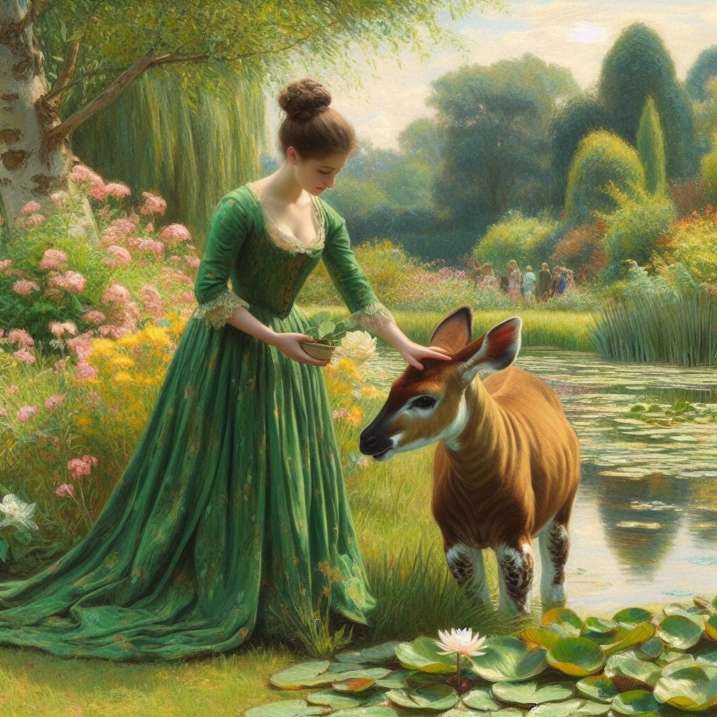
It appears to not be quite like that. I asked Bing Chat AI a few days ago and it appears that the AI system is trained - that was the word used - on licensed training databases and learns the styles and then produces an original artwork using that style. I decided to ask for pictures of a lady in a long green dress feeding an okapi as I hoped it would be so unusual that direct copying would not be possible. However, when looking at what the Bing Chat AI system could do with poetry, after the AI had produced such things as a sonnet in the Italian style and brought the name Lucy from the text that I had presented to the AI into the sonnet and I was amazed, I asked for a nineteen line poem and the AI got in a muddle, producing poems with more or fewer lines, such as twenty or sixteen and purporting them to be nineteen line poems when they clearly were not. Yet when another person found an established nineteen line poem form that is called a villanelle - I had not known of a villanelle until then - the AI system was good at writing villanelles. I think I understand what you are meaning, yet I think that the term artwork actually means the item that is being produced without reference to any assessment of artistic merit. But in the spirit of your question, I did not produce the art, the Bing Chat AI system did, though I did have input into the process. Now can the input into the process that I contributed be regarded as artistic input? I did not produce the image, yet the image only exists because I wrote the text that influenced the production of the picture. I don't think that I claimed having had artistic input, yet I suppose that I did have a little as the picture is based on my input as well as input from other sources such as knowledge of the impressionist painting style. I used Affinity Designer and I now have a PDF document and a copy of that PDF document is now in the basket at Viking Virtual Print House ready for printing. I consider that that is use of Affinity Designer. A phrase such as "virtually non-existent" is relative to what some other people produce using Affinity Designer. Nothing to do with how I used Affinity Designer. There is no certainty about it. The intention that you state was not being stated at the time that I posted. The moderator accused me publicly and my opinion is that my post was within the stated rules at the time. Intended rules, unwritten rules, "understood" rules, retrospective rules and the like should not be part of it. The post was polite, not unsuitable for family reading and viewing, and in my opinion was locked and removed unfairly. I shared my work in the Share your work forum and my contribution was snubbed. William
-
I am not avoiding answering. I am thinking about it. Would you like to rephrase the exact question that you ask me please so I may answer as a superb diplomat? William
-
Alas, I realize that what I wrote can be interpreted that way. What I was trying to convey was that I used Affinity tools to produce the artwork and the files, but I am not doing it to show my ability to apply some particular Affinity feature, I am using the Affinity tools to produce the artwork for what I am trying to express. For some of my use of Affinity products I do use special purpose fonts that i have made using High-Logic FontCreator and then used those fonts in text frames in Affinity Designer. https://forum.affinity.serif.com/index.php?/topic/138654-artwork-for-greetings-cards/&do=findComment&comment=766058 In that artwork I used a special font in a text frame, filled shapes that if I remember correcly I used the Pen Tool, and a watercolour brush. So Affinity tools used in that one. In this one though https://forum.affinity.serif.com/index.php?/topic/169391-language-independent-signs-for-art-galleries/ Well, in the light of your comments, I suppose I just used a special font that I had made using High-Logic FontCreator, a font not supplied by Serif for the exclamation marks and the digits and QR code images from elsewhere. I had thought of it as using Affinity Designer to make some signs to progress my research. In fact, one each of A3 colour prints on 350 gsm paper are on display here. And, they make me happy. Having Affinity Designer enabled me to get those prints. But, thinking about what you have written I suppose it is not Affinity Designer related in any sort of significant way for you and some others, but I had thought of it as artwork that I had produced using Affinity Designer. I suppose that I used some of the layout and output facilities of Affinity Designer to arrange artwork pieces generated elsewhere. I suppose that I could have generated the language-independent glyphs in Affinity Designer, but having them available in a font is more convenient for some uses. i now understand what you mean by > Also just framing some print outs is nothing artful, or no great achievement whatsoever at all here. I suppose "here" is the key word in that. Sort of like in the song. It might not be much in the world at large but for me it was significant.
-
Well there's a challenge then isn't there! 😁 William
-
After writing the above I went back to having a go at producing images using Bing Chat Ai. Eventually, in a sequence that I hope to describe elsewhere, I did a restart and asked the following. Please produce an original impressionist painting of the 1813 British locomotive named "Puffing Billy". In the event it produced four pictures, none of which are of Puffing Billy, all of locomotives from, at a guess, about 1870 or so. One of them though is rather splendid in its own right as an impressionist painting. BUT upon close inspection there is something that looks like a wheel and tyre from a 1960s type scooter, a sort of small motorbike up near the front of the locomotive, at track level. AND There is something peculiar on the boiler between the chimney and the brass dome Can Affinity Designer be used to remove that wheel and tyre the peculiar thing on the boiler and blend in the background so that the picture looks better please? If so, how please? William

-
If anyone would like to have a look at the image that was used in the presently hidden Share your work forum post, the image is in the twelfth post of the following thread. https://punster.me/serif/viewtopic.php?id=526 The impressionist style image, rather beautiful in my opinion. William
-
Actually I had a go at using the Eliza program in the 1970s on a terminal attached to a mainframe computer. The thing is, I use Affinity products as tools to progress other things. Previously the same with some of the Serif Plus software products. For example I have framed prints of various artworks that I have produced, where the image is not about Affinity products at all, yet I have used Affinity products to produce the necessary files to upload to websites so that prints are made and sent to me by Royal Mail. Sometimes a jpg graphics file, sometimes a PDF document. We, as people, are each as we are, some people delight in learning all the details of Affinity software. Each to his or her own choice and situation. You mention trivial, there is no statement by the management on what is the threshold level of application of the Affinity products for acceptability for posting in the Share your work forum, unless they need to be "fantastic", as in > Share your work > Post your fantastic designs for all to see. Maybe the image of the lady in a long green dress feeding an okapi is fantastic. Hello @Alfred I am glad that you are participating in this thread. I would value your opinion on this topic please, valued regardless of what is that opinion. William
-
There is if one does not yet know how to do it and would like the chance to learn. A gentle discussion in a forum thread can be a good way to learn. Well, how is the discussion determined to be related to the Affinity applications or not until the discussion gets going? People post photographs and adapt them using Affinity products, so maybe some people might have ideas of how to adapt AI produced images using Affinity products. Not everybody can get out and about with a camera. Is this experts in art and using Affinity products "pulling up the ladder" and raising the bar? The thread that I started in the Share your work forum was a good thread, but it got locked, the author criticised publicly, then the thread was later hidden. In my opinion as there is no obvious limit on the number of threads it was an unnecessary removal and public criticism of a harmless thread that had been produced and posted by someone who had used Affinity Designer to get a result. William
-
So, as in the title of this thread What is appropriate to post in the Share your work forum please? What is the threshold of what needs to be done using an Affinity product for an item to qualify as acceptable? Both to the moderator and to others. As far as I am aware I did not break any forum sharing guidelines or any other forum guidelines that existed at the time. I used Affinity Designer to get a result. The software did not object that I did not use any of the drawing or painting tools. The thread was locked within a few minutes. If that had not happened, if the moderator had not criticised, then there might have been an interesting discussion. What is appropriate to post in the Share your work forum please? What is the threshold of what needs to be done using an Affinity product for an item to qualify as acceptable? William
-
Not obsessed, just interested. True. The thread had a clear title as to its content. The fact that there was a prominent note that the thread included a post by Patrick Connor may have increased the view count greatly. Serif provides a view count for threads, why be whatever that I look at the view count that Serif provides. William
-
In which case you could have hidden it straightaway and written to me privately. I used Affinity Designer to get a result. I have no other way to get that result. (For completeness, I add that I could have used Affinity Publisher. I have Affinity Photo but have hardly used it so I do not know at present whether I could have used Affinity Photo to produce the A4 size PDF document. I had the goal of producing the A4 PDF document so I used Affinity Designer as I knew how to achieve the result using Affinity Designer.) Affinity Designer produced a good result. Certainly the artwork was not produced nor modified in any artistic way using an Affinity product. It was a splendid, beautiful thread. William
-
The thread has now had 73 views. Perhaps because the most recent post in it is listed as by Patrick Connor and people are viewing the thread to read what Patrick wrote rather than what I wrote. Well, in fairness it does state Share your work Post your fantastic designs for all to see. and what I posted cannot be reasonably described as "my ... design". At best I sort of commissioned for free a virtual artist to produce a picture for me based on my general wishes of what I wanted and left most of the decisions to the artist. It just seemed to me that as I had used Affinity Designer to go from a 1024 pixel by 1024 pixel image to having an A4 PDF document ready for printing and then being able to frame a print that that process would be of interest to some readers. I am not one for self-knocking of my abilities but artistic talents vary and Serif does not require a level of artistic talent to be able to purchase a licence for Affinity Designer. Well, they don't do they! I tend to think that as there is no obvious limit on the number of threads and the post that I made is not unsuitable for family viewing as they say, and people have a variety of levels of talent, why is there such indignation over what is basically a harmless post in what is supposed to be a community of users of Affinity software. If the thread had not been locked there could have been a discussion. I just do not understand the indignation of some people who are talented artists and expert users of Affinity products. 82 views for the thread now, 3 likes for Patrick's post and still nil points of likes for my post! William
-
35 views of the thread and Patrick has got a Like for his post in the thread. Nil points for my post at the moment though! William
-
I prepared and posted a new thread in Share your work. https://forum.affinity.serif.com/index.php?/topic/196901-using-affinity-designer-to-prepare-a-jpg-image-produced-by-bing-chat-ai-for-printing I included a png and a PDF document in the thread. Within a few minutes the thread was locked and I was referred to the Sharing Guidelines. As far as I aware I have not breached the sharing guidelines. I am rather concerned that I have been told "Please do not abuse the Share Your Work forum" as I consider that I have not done so and locking the thread means that I cannot reply to that in the thread. I posted an image that was not produced in Serif software - people post photographs - yet I used Affinity Designer to be able to produce an A4 size PDF document, the process including enlarging the image with pixel precision. I recognize that my input to the generation of the image was one sentence of text and in this particular use by me of Affinity Designer I have not used any drawing or painting tool that Affinity Designer provides, but I have used Affinity Designer facilities to be able to make an A4 PDF document so that I can get some prints printed - just a few. I am grateful to Patrick for not deleting the thread. The thread, clearly labelled as to what it is about has already had 25 views. I feel that I used Affinity Designer as a tool to get a result for something I wanted to achieve. William
-
-
I am trying to produce prints that have something of the the look of linocuts printed letterpress yet are produced using Affinity Designer and a laser printer. This image full size is A4 with a 7 inch by 5 inch linocut block aligned centred. I would do this by exporting a PDF document. Yet this picture, if I can get it right, will just be to give in this forum an impression of what I am trying to achieve. I am thinking of exporting a monochrome black PDF document and it being printed "black and white" on light blue paper. The faux linocut image is produced using a filled black rectangle upon which is a closed loop filled white that was drawn using the Pen Tool and then the positions of the points adjusted, some numerically using the Transform Panel and some manually. Some points kept sharp, some made smooth. What I need to do is to make the fill of the closed loop to be transparent and cut through the black background so that the blue background shows through so that the impression is of the forest at dawn, so the things in the forest are not distinguishable but the tree is visible in silhouette against the light blue colour of the sky. William
-
affinity photo At the Rijksmuseum: Modern Art
William Overington replied to Ashcat's topic in Share your work
Two pictures displayed side by side. The picture at the right depicting items from the then future. Does that picture exist, whether or not at that implied size, whether or not displayed in the Rijksmuseum? I asked Bing Chat AI the following. Is there a picture of a swan at the Rijksmuseum:? Here is the answer Yes, there is a picture of a swan at the Rijksmuseum. The painting is called “The Threatened Swan” and was created by Jan Asselijn around 1650. The painting depicts a swan fiercely defending its nest against a dog. In later centuries, this scene was interpreted as a political allegory: the white swan was thought to symbolize the Dutch statesman Johan de Witt (assassinated in 1672) protecting the country from its enemies12. This painting was the very first acquisition to enter the Nationale Kunstgalerij (the forerunner of the Rijksmuseum) in 18801. It is currently on display in the Gallery of Honour1. The dimensions of the painting are 144cm high and 171cm wide. https://www.rijksmuseum.nl/en/collection/SK-A-4 https://en.wikipedia.org/wiki/The_Threatened_Swan William -
I suggested what I hoped would be regarded as a diplomatic solution. As it happens my suggestion has not been accepted so there we are. No, it does not actually mean what you say it means, I was trying to be diplomatic to find a solution. However, I now recognize that posts of resources to inspire use of Affinity products and of resources to help end users apply electronic files output from Affinity products are not wanted by Serif management in the Resources forum and I will respect that policy of Serif management. Thank you for allowing discussion of this topic and for ruling on the questions raised. William Overington Tuesday 2 January 2024
-
I am thinking that two additional forums with names such as Resources for inspiring creativity in using Affinity software programs and Resources for applying the output of Affinity software programs would be a good solution, as then people who wanted to contribute to those forums and read those forums could do so. That would mean three Resources forums and would support end users in using the software and applying its output. I make this suggestion knowing that people who use Affinity software have various situations, some in business, some elderly hobbyists, at home. Maybe some are living in a care home and using and applying Affinity software is helpful to them. William